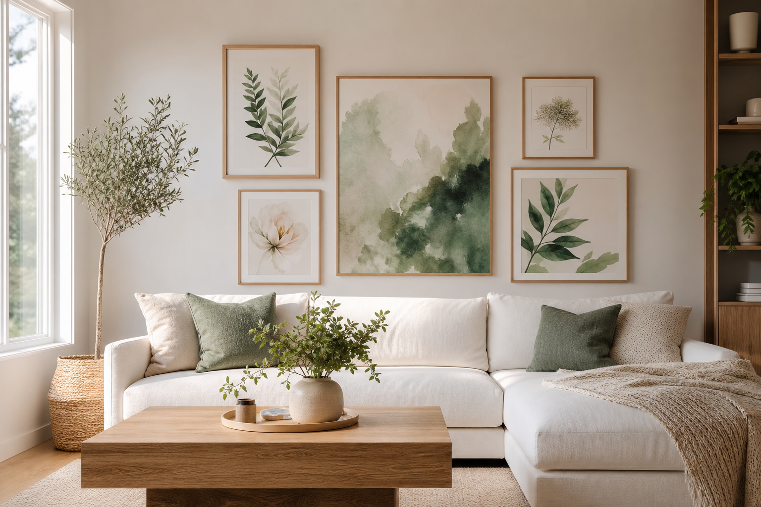
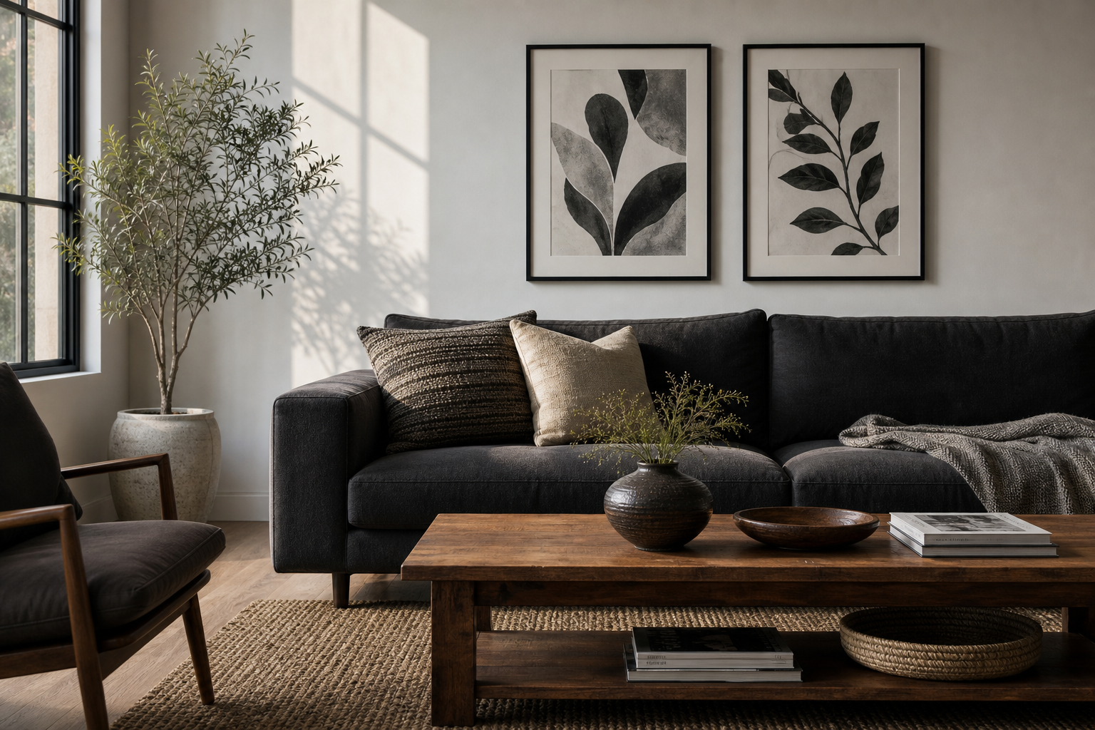
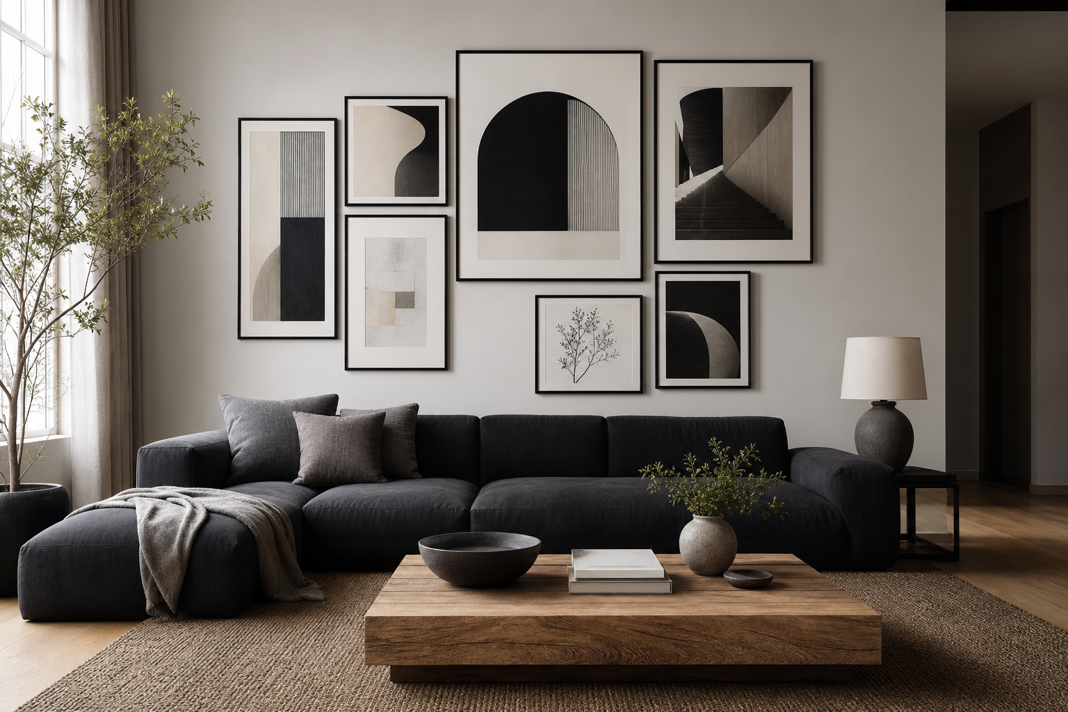
Botanical posters vintage bring two things modern rooms often lack: softness and structure. The natural subjects keep the look calm, while archival-style drawings, faded greens, sepia stems, and muted florals add visual detail without shouting for attention. In rooms filled with straight-edged furniture, glass, and plain painted walls, that balance matters.
The strength of our botanical collection is its flexibility. A detailed flower study can feel traditional, but the same piece in a slim oak frame can sit comfortably in a contemporary apartment. That is why botanical posters vintage work so well across styles — Scandinavian, classic, rustic, even pared-back modern spaces.
Why Vintage Botanical Art Still Feels Fresh
Vintage botanical art was designed to be observed closely. The line work is precise, the compositions are often centered, and the colors tend to stay within a restrained range of sage, ochre, cream, dusty rose, and brown. That restraint makes these prints easier to live with than louder decorative art.
A second advantage is subject matter. Leaves, herbs, blossoms, seed heads, and fruit branches have recognizable forms, so they ground a room quickly. Unlike trend-led motifs, they rarely date badly. If you want a classic starting point, look through our vintage art prints and illustrated wall art for pieces with clean backgrounds and strong botanical silhouettes.
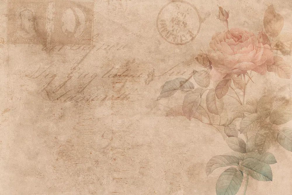
A piece like Vintage Rose Botanical Poster shows why this category lasts. The floral subject feels familiar, but the aged palette and study-like composition make it decorative and archival at once. It suits both a traditional chest of drawers and a simple modern shelf.
Choosing the Right Botanical Prints for Your Space
Start with motif before color. Flower studies tend to feel softer and more romantic, which makes them useful in bedrooms, reading corners, and living rooms. Herb illustrations and wheat stems feel cleaner and more restrained, so they work especially well in kitchens, hallways, and home offices. Dense repeating patterns create more energy, while single stems or isolated blooms feel quieter.
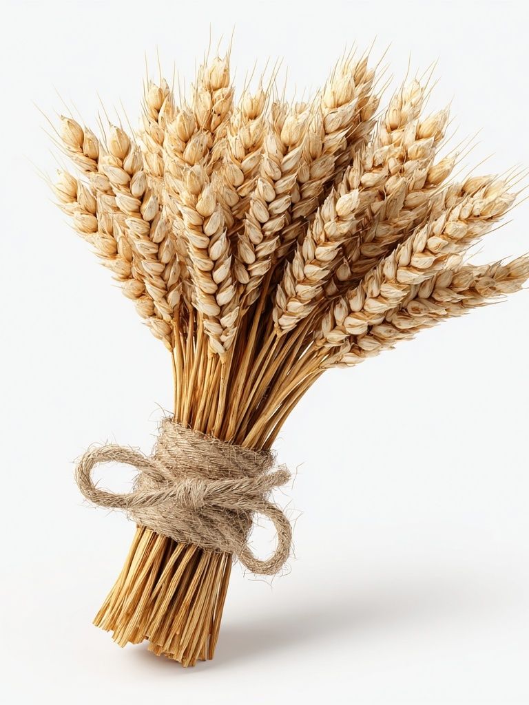
If the room already has warm materials — walnut, rattan, brass, terracotta — choose prints with cream backgrounds, faded reds, olive greens, or golden yellow. If the room is cooler, with black metal, grey upholstery, or white walls, choose botanical art with more negative space and clearer outlines. Wheat Bouquet — Botanical Print is a good example of a neutral piece that can bridge both warm and cool interiors.

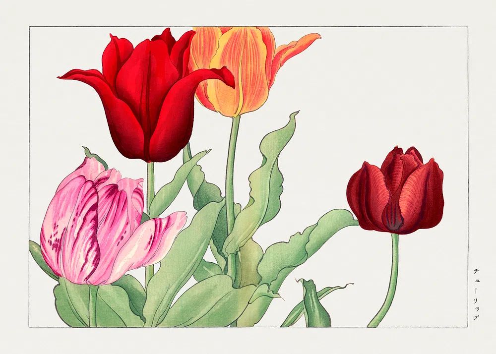
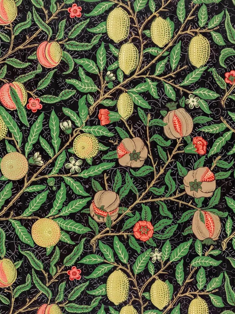
For more decorative rooms, pattern-based work from William Morris adds density and rhythm. William Morris's vintage pomegranate flowers and Green Tulip by William Morris are better choices when a room needs movement rather than a minimal focal point.
Where Botanical Posters Work Best
Living rooms benefit from botanical art when the wall feels bare but you do not want heavy contrast. A pair of medium frames — for example 40 x 50 cm each — above a console, or one larger 50 x 70 cm print above a sofa, is usually enough. If the sofa is 200 cm wide, aim for art that spans roughly 100 to 140 cm in total width.
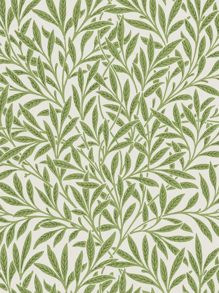
Bedrooms suit softer botanical subjects because they support a slower visual rhythm. Place one print centered above a 140 to 180 cm bed, or use two smaller works above matching bedside tables. In these spaces, rose, tulip, and willow motifs tend to feel more restful than busy all-over patterns.
Kitchens and dining areas are ideal for herb, fruit, seed, and field subjects. Botanical art here feels relevant rather than purely decorative. A narrower wall near shelving can handle a vertical print, while a breakfast nook often works better with a grouped set of three or four. If you want to widen the look of a compact wall, hang pieces with 5 to 7 cm spacing between frames.
Hallways and home offices are often overlooked, but both benefit from botanical structure. In a hallway, repeating framed studies create rhythm along a long wall. In an office, nature-based imagery can soften screens, shelves, and task lighting. If you like a slightly broader nature story, our nature wall art pairs well with botanical work when palettes are kept muted.
How to Style a Vintage Look Without Going Overboard
The easiest mistake is making every element in the room feel antique. Botanical posters vintage look strongest when they are balanced by cleaner shapes — a plain linen sofa, a simple oak desk, a matte black lamp, or an unornamented cream rug. That contrast keeps the room from slipping into a themed look.
Use no more than one or two visibly ornate elements in the same zone. If the print has a dense Morris pattern, keep nearby textiles simpler. If the room has patterned curtains, choose a botanical piece with a plain background. A useful rule is 70/30 — around 70% calm surfaces, 30% decorative detail.
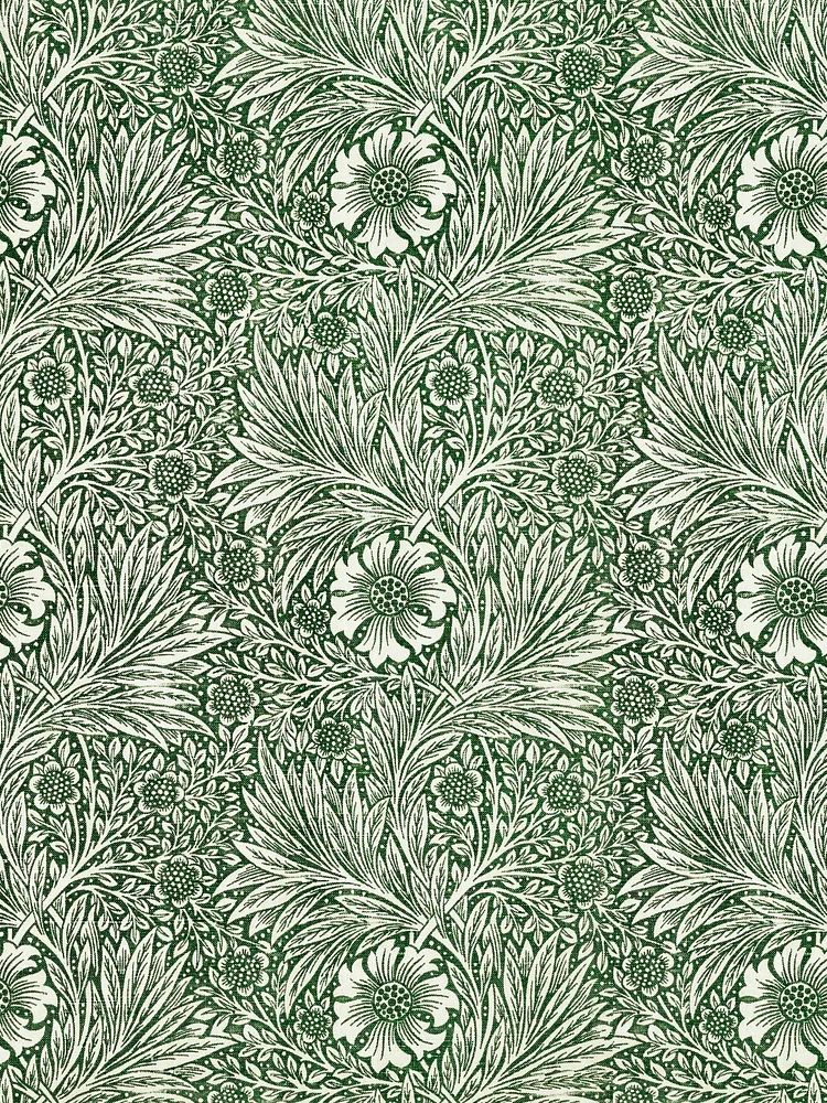
Marigold by William Morris (1875) works well when a room needs historical character, but it should be given space. Let one rich piece lead, then support it with restrained furniture and fewer accessories.

Frames, Finishes, and Paper Choices
Frame choice changes the mood more than most people expect. Oak and ash feel lighter and more Scandinavian. Dark walnut adds depth and formality. Black frames give botanical prints a sharper edge, which can be useful in modern rooms with metal accents. For a timeless result, keep frame widths between 1.5 and 3 cm unless the artwork is very large.
Mounts are worth considering for smaller prints. A 30 x 40 cm artwork in a 40 x 50 cm frame with a cream mount can look more substantial and more archival. Cream or off-white mounts usually suit botanical art better than bright white because they echo aged paper tones.
Glass also matters. Standard clear glass works in low-glare rooms, but acrylic or anti-reflective glazing is useful in bright spaces opposite windows. If you are mixing pieces from our fine art collection with botanical studies, consistent framing will help the group feel intentional even if the subjects vary.
Gallery Wall Ideas and Simple Pairings
A botanical gallery wall looks best when there is one clear connection: subject, palette, frame finish, or layout. The easiest arrangement is a 2 x 2 grid using four frames of the same size — often 30 x 40 cm or 40 x 50 cm. Keep the spacing consistent at around 6 cm for a clean, collected effect.
You can also mix botanical prints with adjacent categories. Old-world florals pair well with Swallows in Flight — Illustration Print because both have an archival, drawn quality. Botanical studies also sit naturally beside portrait or impressionist pieces when the color story overlaps — muted yellow, sage, cream, and dusty blue work especially well.

If you want more personality, add one contrasting piece rather than four unrelated ones. A single bird illustration, a landscape in washed greens, or a delicate portrait can stop the wall from feeling too predictable. The key is proportion: let botanical work make up at least 60% of the arrangement so the theme still reads clearly.
Shop the Look: Building a Botanical Collection Over Time
A strong collection does not need to be bought all at once. Start with one anchor piece that you would still enjoy in five years — usually a floral study, a wheat composition, or a heritage pattern in a palette that already exists in your room. Then add supporting pieces over time in related tones and sizes.
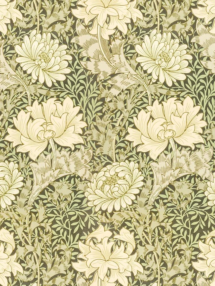
If your first choice is detailed and ornamental, add something quieter next — for example, a simpler bloom or a more open composition from the Botanical category. If your first print is soft and minimal, you can later introduce a denser pattern such as William Morris's vintage chrysanthemum flower to deepen the mix.
Think in sets of use, not just sets of four. One 50 x 70 cm piece for the living room, two 30 x 40 cm prints for the hallway, and one smaller work for a shelf can still feel like a collection if the palette and framing relate. That is the most useful way to approach botanical posters vintage — not as a one-time styling trick, but as a group of pieces that can move with you from room to room.
Final thoughts
Botanical posters vintage work because they combine observation, softness, and order. They reference history, but they also solve practical decorating problems — warming up blank walls, adding muted color, and making modern furniture feel more layered.
Choose the subject first, keep the framing consistent, and let the room breathe around the art. A few well-placed botanical pieces will always look more convincing than a crowded wall full of competing styles.
Frequently Asked Questions
What frame color is safest for vintage botanical prints?
Natural oak is the easiest all-round option. It suits cream backgrounds, green tones, and both modern and traditional furniture.
Do botanical prints work in small rooms?
Yes — especially single-stem or light-background designs. In compact rooms, choose one 30 x 40 cm or 40 x 50 cm print instead of several busy pieces.
Should I use a mount with botanical wall art?
If the artwork is detailed or smaller than 40 x 50 cm, a mount usually improves the presentation. It gives the image breathing room and creates a more archival look.
Can I mix botanical art with modern furniture?
Yes, and the contrast often looks better than matching everything to one period. Clean-lined furniture helps vintage botanical imagery feel edited rather than nostalgic.
How high should I hang botanical prints?
Use eye level as a starting point — the center of the artwork should sit around 145 to 150 cm from the floor. Above furniture, leave 15 to 25 cm between the frame and the top edge of the piece below.