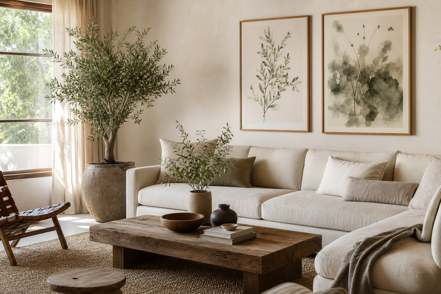
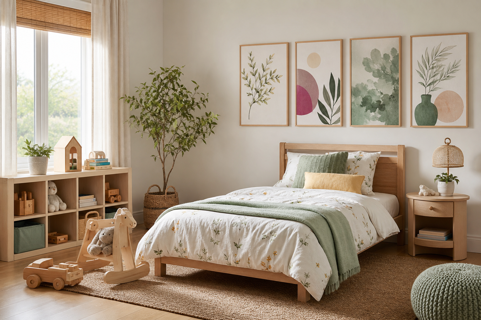
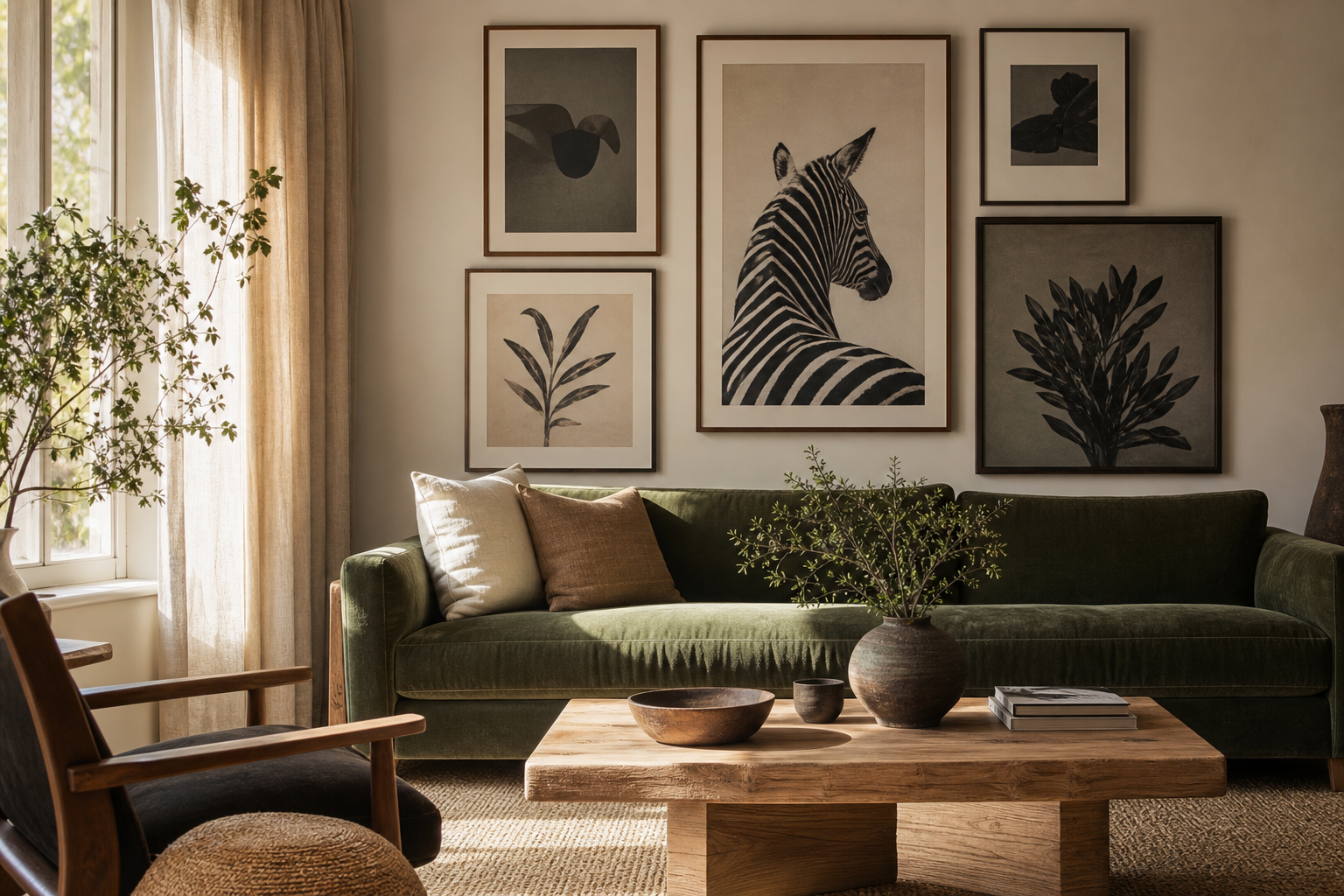
Botanical posters do one job exceptionally well: they soften a room without making it feel busy. Leaves, stems, blossoms and garden studies bring organic structure to walls, which is why they work in homes that already mix hard surfaces such as glass, metal, concrete or painted plaster. Even one framed print can make a room feel less flat.
Unlike trend-led motifs that peak quickly, botanical posters stay useful across seasons. Fresh green leaf studies suit spring and summer, while deeper florals, seed heads and vintage patterns carry a room through autumn and winter. If you want artwork that can move from bedroom to hallway to living room without looking misplaced, start with our botanical collection or pair it with pieces from nature-inspired wall art.
Why Botanical Posters Work in Modern Homes
Modern interiors often rely on clean lines and restrained palettes. Botanical imagery adds curve, texture and movement, which balances boxy furniture and plain walls. A simple branch drawing above a console, for example, introduces shape without demanding strong colour.
These prints are also unusually flexible. In a Scandinavian room, soft stems and minimal blooms echo pale woods and off-white walls. In a traditional home, dense florals and heritage patterns sit comfortably with darker timber and layered textiles. If your space already includes woven baskets, stoneware, linen or rattan, botanical posters will usually feel immediately connected rather than added as an afterthought.
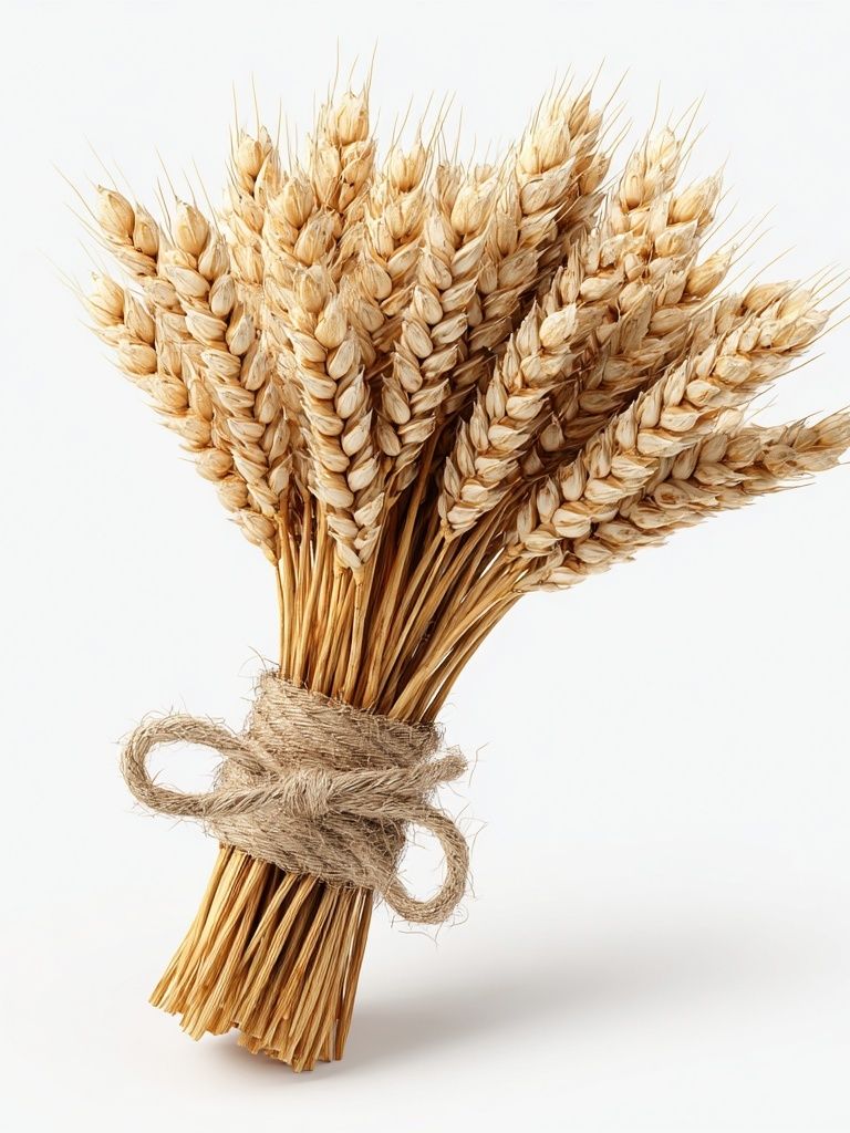
A practical advantage is that botanical art rarely clashes with everyday objects. Kitchens already contain herbs, fruit bowls and ceramics. Bedrooms often lean on soft fabrics and neutral bedding. Living rooms hold plants, books and natural textures. That makes Wheat Bouquet — Botanical Print a smart example of artwork that can bridge minimal, rustic and classic spaces.
Choose a Botanical Style That Matches Your Space
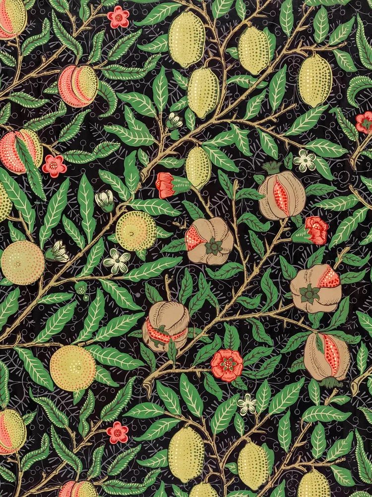
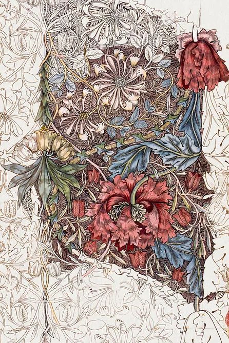
Not all botanical posters create the same mood. Vintage florals feel richer and more decorative, especially in rooms with moulding, darker paint, brass or patterned textiles. If you like heritage character, pieces such as William Morris's vintage pomegranate flowers or Honeysuckle by William Morris (1874) bring detail and rhythm that fill a wall beautifully.
Minimal botanical work is better when the room already has visual weight. Line drawings, silhouettes and pared-back floral forms leave breathing room around furniture. In a home office or narrow hallway, that lighter approach can keep the wall from feeling crowded. If that is your direction, explore minimalist art prints alongside botanical pieces.

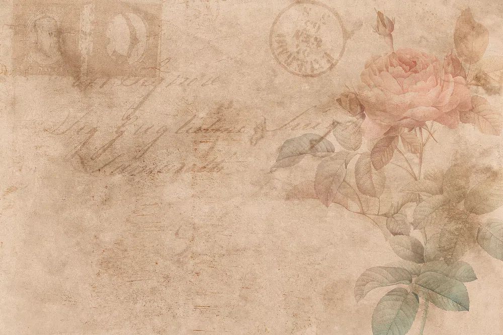
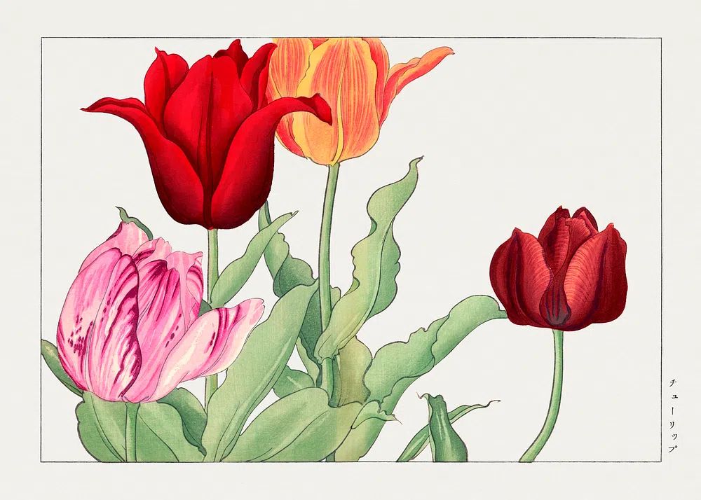
Lush greenery works best when you want more saturation. Large leaves, layered stems and garden-inspired scenes suit rooms that need colour but not harsh contrast. For a brighter, more romantic look, floral studies such as Vintage Rose Botanical Poster or Tulip Bouquet — Botanical Print add pinks, reds and greens without tipping into childish sweetness.
How to Pick the Right Size and Placement
Above a sofa, aim for artwork that spans around 60 to 75 percent of the sofa width. If your sofa is 200 cm wide, your total arrangement should land between roughly 120 and 150 cm. That can be one large 70x100 cm print, two 50x70 cm frames side by side, or a grid of smaller pieces with 5 to 8 cm between frames.
In a bedroom, botanical posters work best when they reinforce calm. Above a double bed, a pair of 50x70 cm prints is often easier to balance than one oversized piece. In smaller bedrooms, a single 40x50 cm print above a nightstand can be enough. Keep the bottom of the frame around 15 to 25 cm above the headboard so the arrangement feels anchored.
Hallways and kitchens benefit from narrower formats and sets. A corridor with limited width can take three 30x40 cm prints in a row. In kitchens, hang art away from direct splashes and heat — near a breakfast nook, shelf wall or pantry corner is usually better than above the hob. Botanical subjects feel especially natural there because they echo ingredients and garden produce.

If you are unsure whether to choose one large print or a set, use distance as your rule. From 2.5 to 3 metres away, one strong image reads clearly. At closer viewing distance — beside a bed, desk or dining bench — a pair or trio can add detail without overwhelming the wall.
Framing Ideas That Elevate Botanical Prints
Frame choice changes the tone more than most buyers expect. Oak or light wood frames make botanical posters feel relaxed and Nordic. Black frames give even soft floral art more definition, which helps in rooms with dark lighting, charcoal accents or contemporary furniture. White frames are best when you want the wall art to blend into pale interiors rather than stand out.
Glazing matters too. In bright rooms with large windows, acrylic or glass with reduced glare will make delicate details easier to see. A mount can also improve proportion. A 30x40 cm print with a generous off-white mount inside a 40x50 cm frame looks more considered and often more expensive.

For vintage or patterned botanical pieces, wood with visible grain usually feels more authentic than a glossy finish. For simplified forms such as White Flower Silhouette — Minimalist Print, thin black or white frames keep the presentation crisp. If your room includes wicker, linen and earthy ceramics, you can also bring in bohemian floral art to create a softer, collected look.

Build a Palette Around Leaves, Blooms and Neutrals
Botanical posters are useful colour anchors because they already combine greens, creams, ochres, browns and muted reds in proportions that feel natural. That gives you a ready-made palette for cushions, throws, rugs and painted furniture. Pull one dominant shade, one secondary shade and one neutral from the artwork, then repeat each two or three times in the room.
For calm interiors, use sage, olive, mushroom and warm white. For richer rooms, choose burgundy, deep leaf green, ochre and walnut. If you want a lighter spring palette, tulip pink, butter yellow and soft green work well against ivory or pale grey walls. A piece such as William Morris's vintage willow leaves can guide a softer green scheme, while denser floral prints support more layered colour.
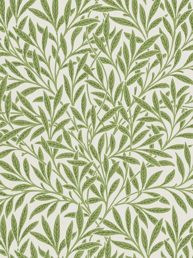
Botanical posters also handle accent walls better than many other subjects. Against clay, muted green or dusty blue paint, floral and leaf studies feel grounded rather than sharp. If your room already has strong wall colour, choose art with some cream or beige background so the composition still has air around it.
Styling Botanical Posters as Part of a Gallery Wall
A botanical gallery wall works best when one element stays consistent. That can be the frame colour, the mount width, the palette or the subject matter. Without one repeated feature, mixed walls quickly look accidental. Start with two botanical pieces, then add one abstract or one bird or landscape image for contrast.
Botanical art pairs especially well with fine art prints that share a similar palette and with illustration prints that include natural subjects. For example, florals and birds often create a classic, collected arrangement because both draw from garden imagery.

A simple formula is 4 to 6 frames arranged around an invisible rectangle. Keep gaps between 5 and 7 cm, and place the centre of the total grouping at around 145 cm from the floor. If one piece is more decorative — such as Marigold by William Morris (1875) — balance it with simpler works nearby so the wall does not become too dense.
Final Styling Tips for a Fresh, Natural Look
Choose botanical posters the same way you choose textiles: think about scale, tone and texture first. A small, intricate floral can disappear above a large sofa, while a bold leafy composition may overpower a narrow hallway. Match the artwork size to the furniture below it, keep frame finishes consistent within each room, and repeat one or two colours from the print elsewhere in the space.
If you want a safe starting point, begin with one vintage-inspired botanical, one simpler floral, and one lighter neutral piece from the botanical posters collection. That mix gives you enough variation to style a wall that feels layered, but still easy to live with for years.
Frequently Asked Questions
What frame colour suits botanical prints best?
Natural oak is the most versatile because it warms greens and florals without competing. Black works well for modern rooms, while white is best for very light interiors.
Can botanical art work in a room without real plants?
Yes. Botanical wall art adds the visual softness of nature even if you do not keep houseplants, and it is often easier to maintain the room’s look consistently year-round.
Should I choose glass or acrylic for larger frames?
Acrylic is lighter and safer for sizes like 50x70 cm and above, especially in hallways or kids' rooms. It is also easier to hang securely on standard wall fixings.
Do botanical prints pair well with patterned wallpaper?
They can, but choose artwork with a clear background and less dense detail than the wallpaper. Keep the frame simple so the wall does not feel overloaded.
What is the easiest way to hang a pair evenly?
Measure from the centre line, not from the frame edges. Mark the midpoint above the furniture first, then space each frame equally 5 to 8 cm apart.