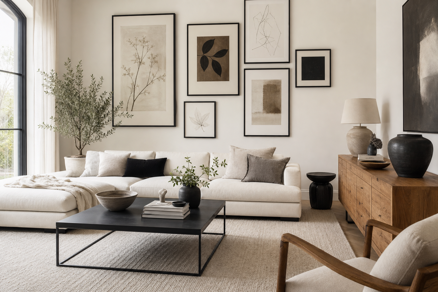
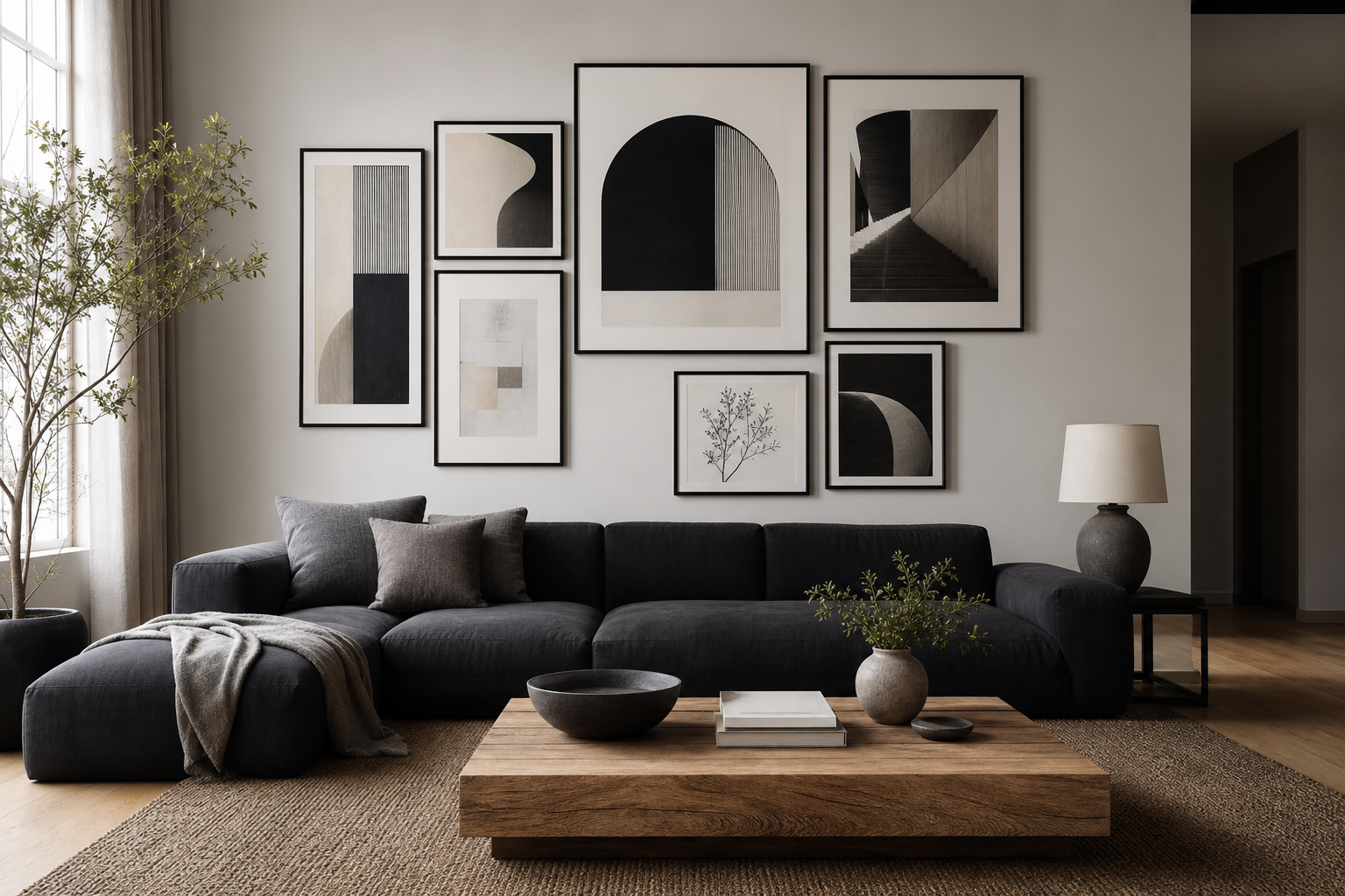
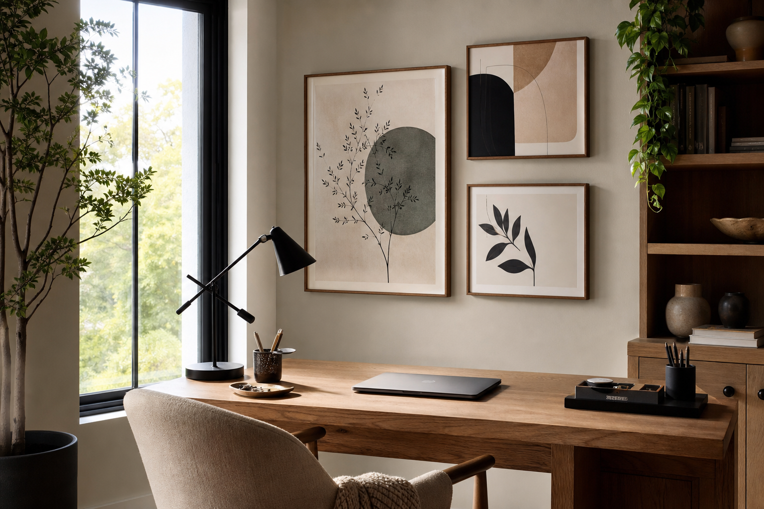
Why Black & White Posters Never Go Out of Style
Black & white posters hold their place because they rely on contrast, not trend. A room may shift from warm oak to chrome, from boucle to linen, or from minimalist to eclectic styling, but black and white still reads as intentional. That high-contrast palette gives walls definition, especially in rooms where the furniture is quiet in tone — beige, walnut, cream, gray, or black.
They also solve a common design problem: how to add visual interest without introducing a new color story. In a living room with three to five dominant finishes, monochrome art keeps the palette controlled. That is why our Minimalist collection and black-and-white photography prints work so well in spaces that already have strong materials such as marble, dark wood, concrete, or brushed metal.
Minimal monochrome pieces often feel calm rather than stark when they include texture. Torn edges, fabric grain, plaster surfaces, and soft gradients break up the flatness and make black & white posters feel layered instead of severe.

A piece like Torn Paper Black and White works because it mixes crisp contrast with tactile detail. If you want a softer route, Torn Paper Black and White pairs easily with natural wood frames, off-white walls, and warm fabrics.
Choosing the Right Mood: Graphic, Minimal, or Photographic
Not all black & white posters create the same effect. Graphic styles — bold shapes, strong lines, obvious contrast — make a room feel sharper and more architectural. They suit clean interiors with straight silhouettes, such as low-profile sofas, black side tables, or grid shelving.
Minimal monochrome art is quieter. It works best when the room already has texture: boucle chairs, limestone-look surfaces, ribbed glass, or matte-painted walls. In these spaces, low-contrast pieces from our Abstract collection or textural minimalist prints add depth without demanding attention first.
Photographic black-and-white art adds story. A city alley, a portrait, a watch detail, or a close-up natural form can make a room feel more personal and editorial. Photography tends to work particularly well in home offices and hallways because it gives viewers something to study at close range.





A good rule is to choose one dominant mood for 70% of the arrangement, then let 30% introduce contrast. For example, if most of your wall is soft and minimal, one sharper photographic image can keep the set from feeling flat.
How to Place Them for Maximum Impact
Placement changes how black & white posters read. Above a sofa, they create structure. The most reliable setup is one large horizontal piece or a pair of medium vertical works centered over 60% to 75% of the sofa width. Over a 200 cm sofa, aim for art spanning roughly 120 to 150 cm total.
Above a bed, monochrome art helps anchor the headboard without making the room feel busy. Bedrooms benefit from softer subject matter — textural abstracts, quiet photography, or light fine-art imagery from our Fine Art collection rather than high-drama, high-detail compositions.
In a workspace, black-and-white art should sit within your peripheral vision, not directly in the main task line. One vertical print beside a desk or two smaller pieces stacked above a cabinet often works better than a wide arrangement above the monitor. Hallways and stairwells are ideal for repeated monochrome frames because the palette keeps a multi-piece display cohesive even when the subjects vary.
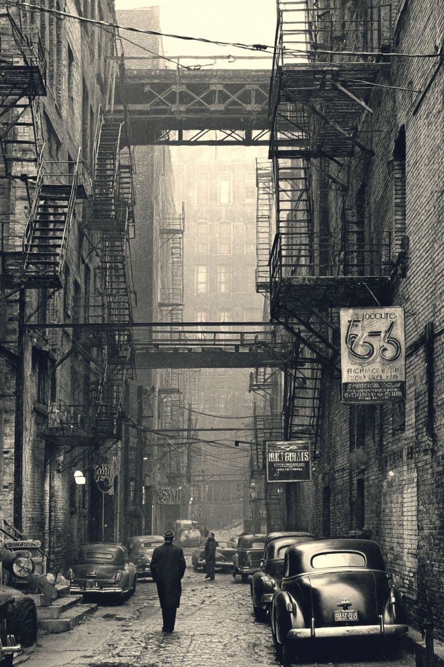
A photographic piece like Vintage Urban Alley adds depth in narrow spaces because perspective lines visually extend the wall. It is especially effective in entryways, corridor ends, or beside a console where you want the eye to travel further into the room.
Sizes, Spacing, and Gallery Wall Balance
Size is where many gallery walls go wrong. Small art on a large wall looks hesitant, while oversized art in a tight area feels crowded. For a single statement piece, 50x70 cm is a dependable starting point for apartments, while 70x100 cm gives more presence in larger living rooms or above king-size beds.
For a balanced gallery wall, keep spacing consistent — usually 5 to 8 cm between frames. If you mix orientations, repeat at least one dimension. For example, combine two 30x40 cm frames with two 50x70 cm frames, or build around a central 70x100 cm piece with smaller vertical companions. Repeated dimensions make the arrangement look deliberate.
Black & white posters are forgiving when subjects differ, but they still need one common thread. That thread can be frame color, border size, photographic grain, negative space, or tonal balance. If one piece is 90% black and another is 90% white, place a mid-tone work between them to smooth the transition.

Frames and Finishes That Elevate the Look
Frame choice decides whether monochrome art feels soft, modern, classic, or gallery-like. Black frames increase contrast and sharpen the whole composition — best for graphic work, urban photography, or rooms with metal accents. Oak frames warm things up and stop black & white posters from feeling cold, especially on off-white or greige walls.
White mats are useful when the art itself is dark or detailed. A 4 to 7 cm mat gives the image room to breathe and makes even a 30x40 cm print feel more substantial. If the piece is already airy with generous white space, skip the mat and use a thin frame for a cleaner look.
Paper and finish matter too. Matte paper is usually the best choice for monochrome because it reduces glare and lets texture show properly. That is especially true for works with subtle surface variation, such as textured white abstract art or fabric-inspired minimalist prints.


Textured White Abstract is a strong example of a monochrome piece that benefits from a matte finish and simple framing. Its quiet tonal shifts suit bedrooms, calm entryways, and pared-back Scandinavian interiors.
Room-by-Room Styling Ideas
In living rooms, use black-and-white wall art to create a focal point that ties together mixed materials. If your sofa is light and your rug is patterned, choose art with stronger black areas to ground the space. If the room already has black furniture legs, iron lighting, or dark shelving, repeat that tone in the frames.
Bedrooms need more restraint. Stick to two or three pieces above the headboard, and lean toward softer imagery — draped fabric, nature-inspired forms, or low-contrast scenes. A monochrome bedroom looks most polished when at least one other element repeats the palette, such as black bedside lamps, charcoal bedding stripes, or a simple black bench.
Home offices benefit from cleaner, sharper compositions. This is a good room for typography prints mixed with photography, though keeping the set mostly monochrome avoids visual noise during work hours. Entryways, meanwhile, are ideal for one punchy vertical print or a narrow pair that gives the space a clear identity in the first two seconds.

In entryways or offices, Sleek Black Watch brings precision and polish. It works particularly well with black metal hooks, smoked glass lighting, or a walnut console because the product-like close-up feels crisp and intentional.
How to Build a Timeless Monochrome Collection
A timeless collection is rarely built from identical pieces. It is built from related contrasts. Mix one textural work, one photographic image, one more graphic composition, and one quieter negative-space piece. That variety keeps the wall interesting while the limited palette keeps it cohesive.
Start with one anchor piece you would still want in five years. Then add supporting works that match either its tone, subject category, or level of contrast. If your anchor is architectural or urban, look at urban black-and-white photography for companions. If your anchor is softer and more tactile, browse minimal monochrome art prints and light, airy fine-art pieces for balance.
The easiest mistake is choosing every print at maximum contrast. Rooms need rhythm. Too many hard blacks can make the wall feel heavy, especially in north-facing rooms. Aim for a mix where roughly half the pieces are medium-tone or light-dominant. That balance is what makes black & white posters feel timeless instead of thematic.
Final thoughts
Black & white posters work because they do two jobs at once: they add contrast, and they simplify a room. Whether you choose minimal textures, architectural photography, or soft monochrome fine art, the key is to balance scale, spacing, and tonal range.
Build slowly, repeat one or two visual cues, and let each piece earn its place. Done well, black & white posters can move from room to room and still feel right years later.
Frequently Asked Questions
What frame width works best for black-and-white art?
For most prints, a frame width of 1 to 2 cm looks clean and current. Go up to 3 cm for larger sizes like 70x100 cm if you want more presence.
Can I mix black, oak, and white frames in one gallery wall?
Yes — but keep one finish dominant at around 70% of the arrangement. The other frame colors should repeat at least once so they look intentional.
Do monochrome prints work on colored walls?
They do, especially on muted greens, warm taupes, slate blues, and clay tones. Use a white mat if the wall color is dark so the artwork stays crisp.
How high should I hang black-and-white wall art in a hallway?
Place the center of the artwork at about 145 to 150 cm from the floor. In stairwells, follow the upward line of the railing rather than keeping every frame at the same height.