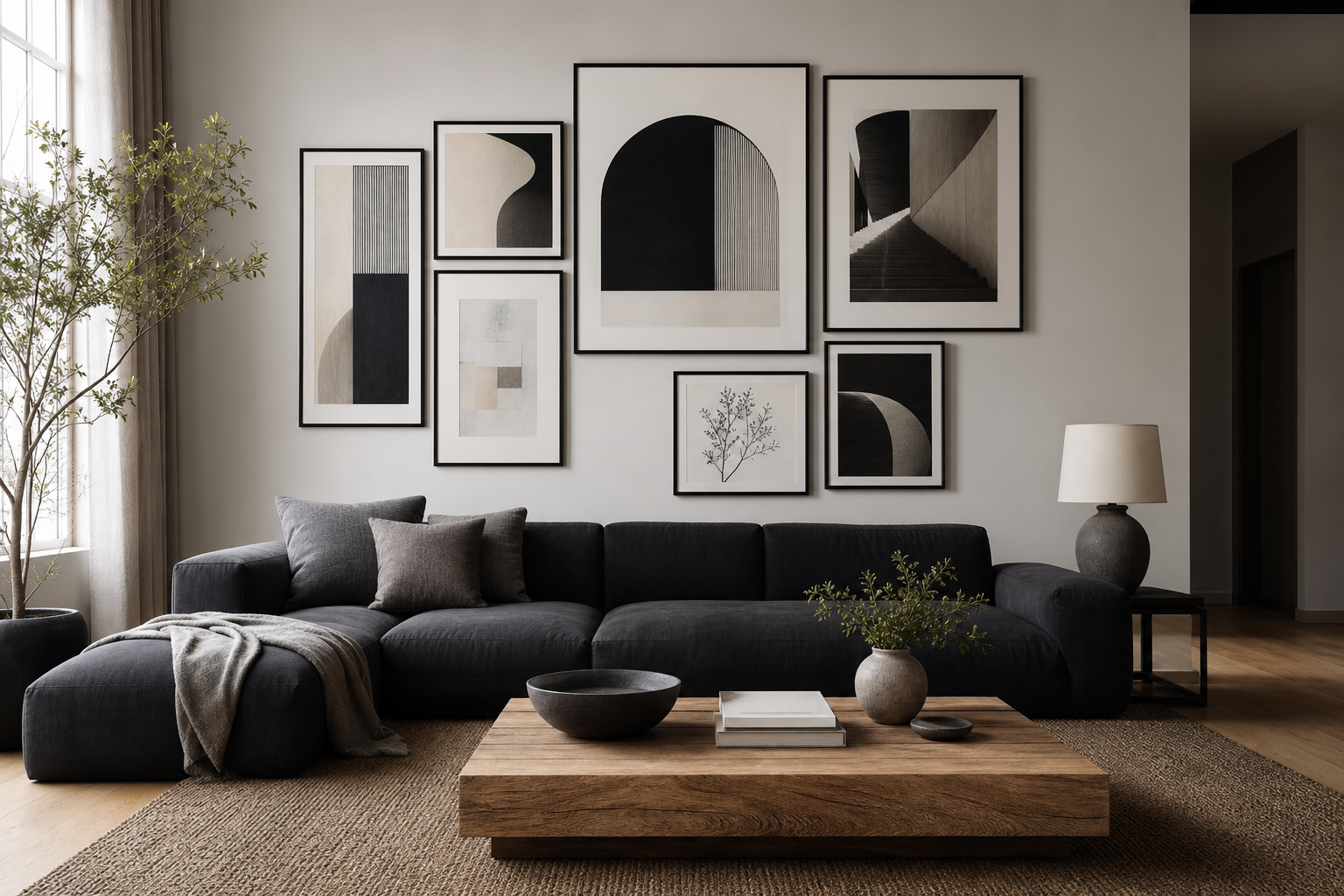
Why Black and White Posters Never Go Out of Style
Black and white posters work because they solve two design problems at once: they add contrast, and they reduce visual noise. In a room with warm wood, beige upholstery, stone, or painted walls, monochrome art creates a clean focal point without fighting the rest of the palette. That balance is what makes black and white posters feel just as natural in classic homes as they do in sharp contemporary interiors.
Monochrome art also ages well. Trend-led colour palettes can shift every 2 to 3 years, but black, white, and grey stay useful across decades. A simple photographic print, a line drawing, or a textured abstract can move from a first apartment to a family home and still look considered. If you already gravitate toward calm interiors, our Minimalist collection is a strong place to build a wall that stays relevant long term.
A second advantage is flexibility in layering. Black and white pieces sit comfortably beside timber frames, metal lamps, boucle chairs, concrete finishes, and linen curtains. They can sharpen a soft room or soften an industrial one. Pieces with texture, such as Torn Paper Black and White or Textured Concrete Wall, add depth without introducing another colour decision.

Choosing the Right Look for Your Space
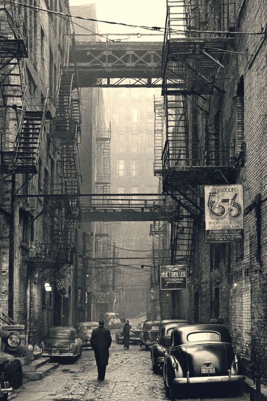
Not all monochrome art creates the same mood. Black-and-white photography tends to feel crisp, urban, and slightly editorial. It works especially well in entryways, offices, and living rooms where you want structure. A piece like Vintage Urban Alley brings stronger contrast and architectural rhythm than a softer botanical or fabric study.
Abstract and texture-led designs are quieter. They are useful when you want the wall to feel finished but not overly styled. Organic forms, shadows, and layered surfaces pair well with Scandinavian furniture, plaster walls, and neutral textiles. Elegant White Fabric and White Cream Texture are good examples of monochrome pieces that rely on tone and material rather than hard contrast.
Animal and figurative prints create more personality. They are often best used as a single feature piece or as the anchor of a small grouping. If your room feels too restrained, one image with a strong silhouette can bring back character fast.




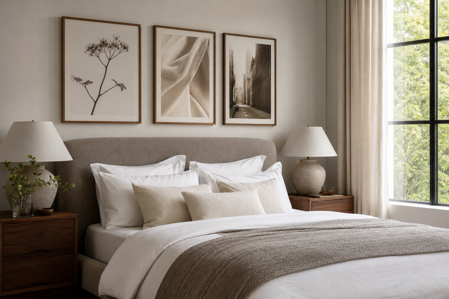
How to Style Black and White Posters in Every Room
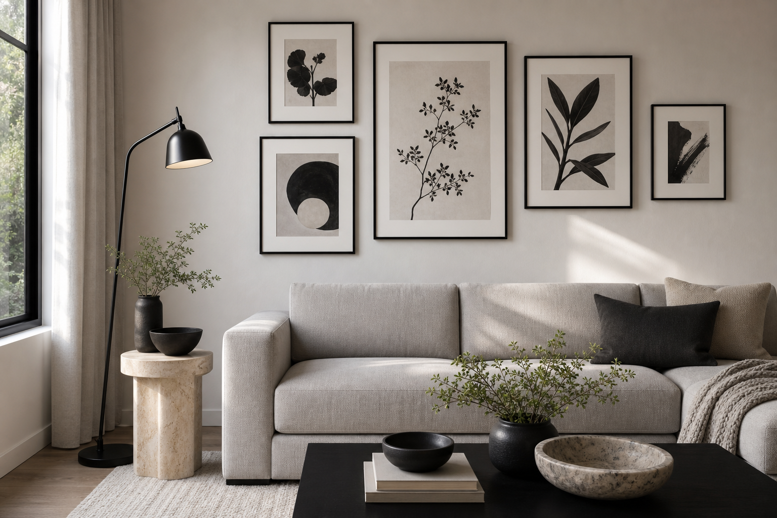
In the living room, go larger than you think. Above a 200 cm sofa, the ideal art width is usually 120 to 160 cm total — around 60 to 80% of the furniture width. That can mean one oversized piece or two to three aligned frames. Black and white posters with bold negative space read clearly from across the room, which is why they perform so well over seating areas.
Bedrooms benefit from softer monochrome choices. High-contrast black can feel energising, which is useful in a home office but less so over a bed. In sleep spaces, lean toward grey-based photography, delicate botanicals, or tonal abstracts. A print like White Flower Silhouette keeps the palette calm while still giving the wall shape.
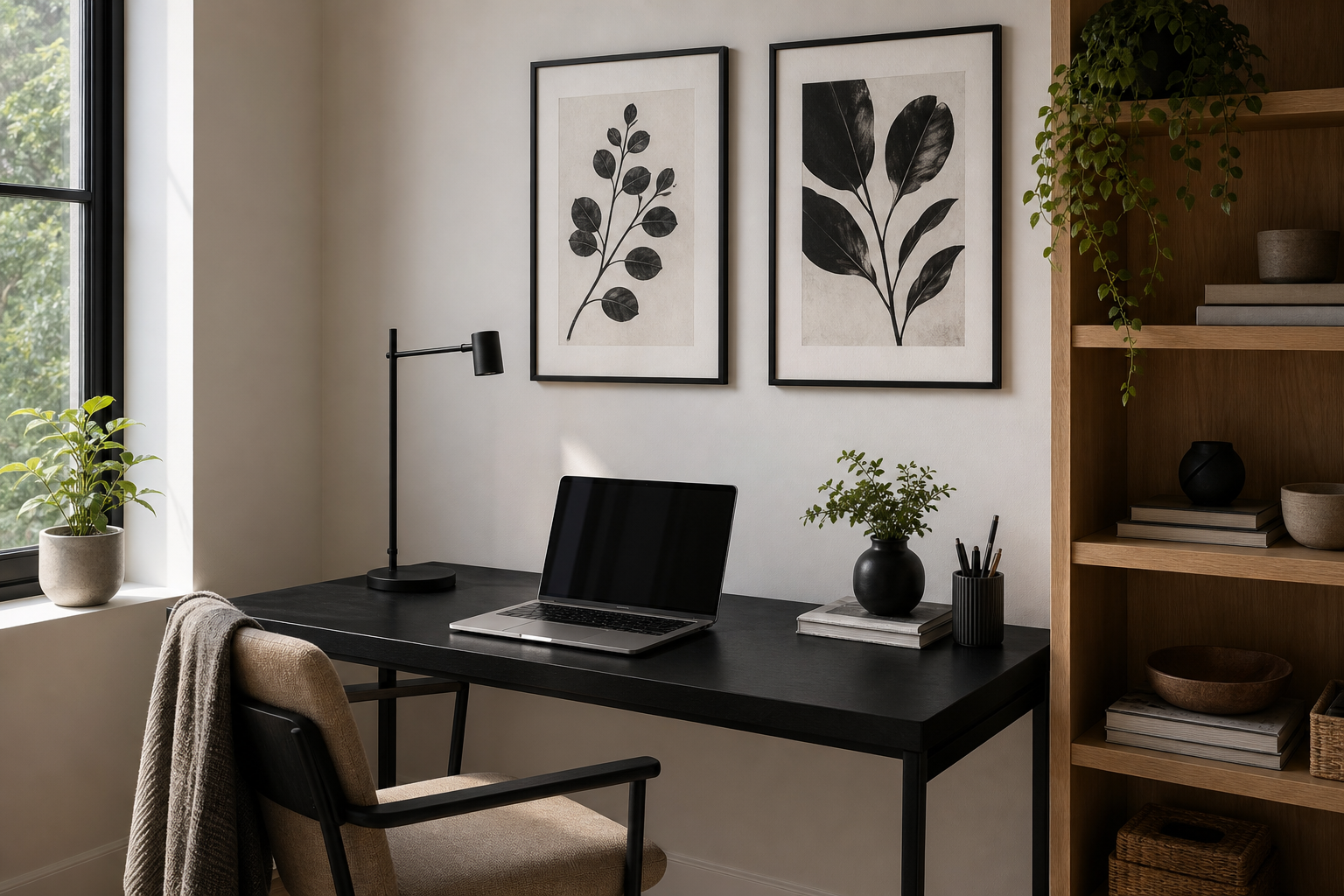
Kitchens and hallways suit graphic pieces because these are passing-through spaces. A narrow hallway can handle a sequence of 30 x 40 cm frames with 5 to 7 cm spacing, while a kitchen wall often looks best with one 50 x 70 cm print near a dining nook or sideboard. In a home office, stronger imagery helps concentration by creating one defined visual zone behind the desk. Photography, line-driven illustration, or a structured abstract tends to look clean on camera during calls and less distracting in daily use.
Picking Sizes, Layouts, and Wall Combinations
The cleanest monochrome walls are usually the most disciplined in proportion. For a single statement piece, 70 x 100 cm or 61 x 91 cm works well above a console, bed, or desk. If you want a pair, two 50 x 70 cm frames hung side by side with 6 to 8 cm between them create a strong symmetrical look. For a gallery wall, keep one rule fixed: either equal spacing, equal frame finish, or a single shared palette of black, white, and grey.
A useful formula is to build around one large anchor and add smaller supporting pieces. For example, one 70 x 100 cm print with two 30 x 40 cm works better than six small frames scattered loosely. Too many similar mid-sized pieces can flatten the wall. Black and white posters need enough breathing room for the contrast to read properly — usually at least 5 cm between small frames and 8 to 10 cm between larger ones.
If you are mixing content, combine one detailed piece, one soft-texture piece, one graphic silhouette, and one quieter filler image. That prevents the arrangement from feeling repetitive even though the palette is limited.
Frames, Paper Finishes, and the Details That Matter
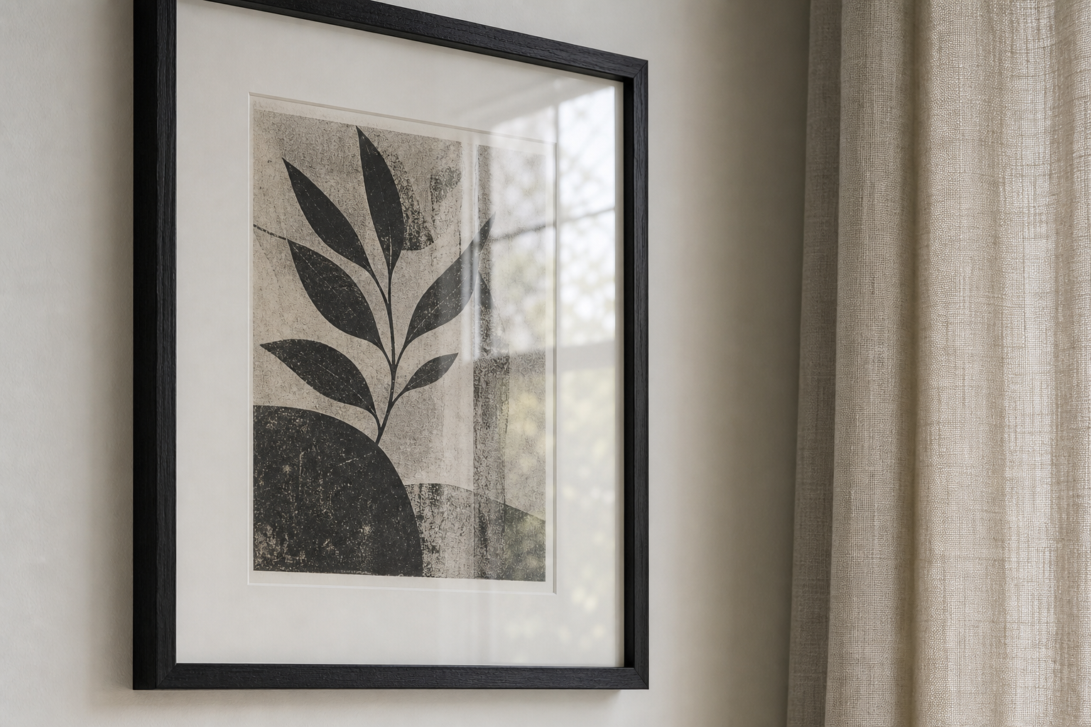
Frame colour changes the whole effect. Black frames create the sharpest outline and suit architecture, photography, and graphic prints. White frames feel lighter and work well against coloured walls or in rooms with less natural light. Oak frames soften monochrome art and make it easier to connect with wood flooring, walnut furniture, or woven textures. If the room already has black furniture legs, iron lighting, or dark hardware, black frames usually feel the most integrated.
Mounts matter more than most people expect. A white mount of 3 to 6 cm gives black and white art extra breathing space and makes even a 30 x 40 cm print feel more substantial. This is especially useful for detailed images or darker pieces, where the mount prevents the frame from feeling visually heavy.
Matte paper is generally the safer choice for monochrome walls because it controls glare and keeps blacks looking deep under daylight and ceiling lighting. Gloss can increase punch in photography, but it also reflects windows and lamps more aggressively. Texture-led pieces often benefit from matte finishes because they reveal subtle grey shifts better at close range.

How to Build a Monochrome Gallery Wall That Feels Personal
The strongest gallery walls mix store-bought art with something specific to your life. A travel photograph, a family portrait converted to black and white, or a meaningful quote can sit comfortably beside minimalist art if the tones stay consistent. The trick is to edit hard. If one image introduces sepia, blue undertones, or cluttered backgrounds, it can weaken the whole composition.
Start with 4 to 7 pieces, not 12. Lay them out on the floor first and aim for a visual triangle: one darker piece, one lighter piece, and one medium-tone piece distributed across the arrangement. That gives the eye a path to follow. If you want cohesion, pull in works from the Minimalist range and pair them with one or two personal photographs rather than building the wall from unrelated images.
A good personal monochrome set might include one texture study, one botanical, one photographic scene, and one statement animal image. That combination gives variation in subject while keeping a controlled palette.




Shop Tips for Creating a Lasting Black and White Display
Plan your collection before you buy the first piece. Measure the wall, mark the maximum width with painter's tape, and decide whether you want one focal point or a grouped arrangement. That simple step prevents the common mistake of buying frames that are each attractive on their own but too small once hung together. For most medium walls, total art coverage between 110 and 150 cm creates presence without clutter.
Choose at least one anchor print with enough visual weight to lead the scheme. Then add quieter supporting pieces. If every print is dramatic, the display can feel busy even in black and white. If every print is very faint, the wall loses structure. A balance of roughly 30% bold imagery and 70% subtle imagery usually works well.
When buying for longevity, focus on subjects you will still want to live with in five years: abstract texture, natural forms, city photography, and classic silhouettes. Black and white posters are most effective when they feel edited, not crowded. That is why fewer, better-sized pieces nearly always outperform a wall filled edge to edge.
Final thoughts
Black and white posters give you one of the simplest ways to make a room feel modern, calm, and intentional. They work across changing furniture, shifting paint colours, and different homes because the palette stays disciplined while the imagery can still show personality.
The best results come from proportion, restraint, and material detail — the right size, enough spacing, and frames that suit the room. Build slowly, choose pieces with contrast and texture, and your monochrome wall will look current now and polished years from now.