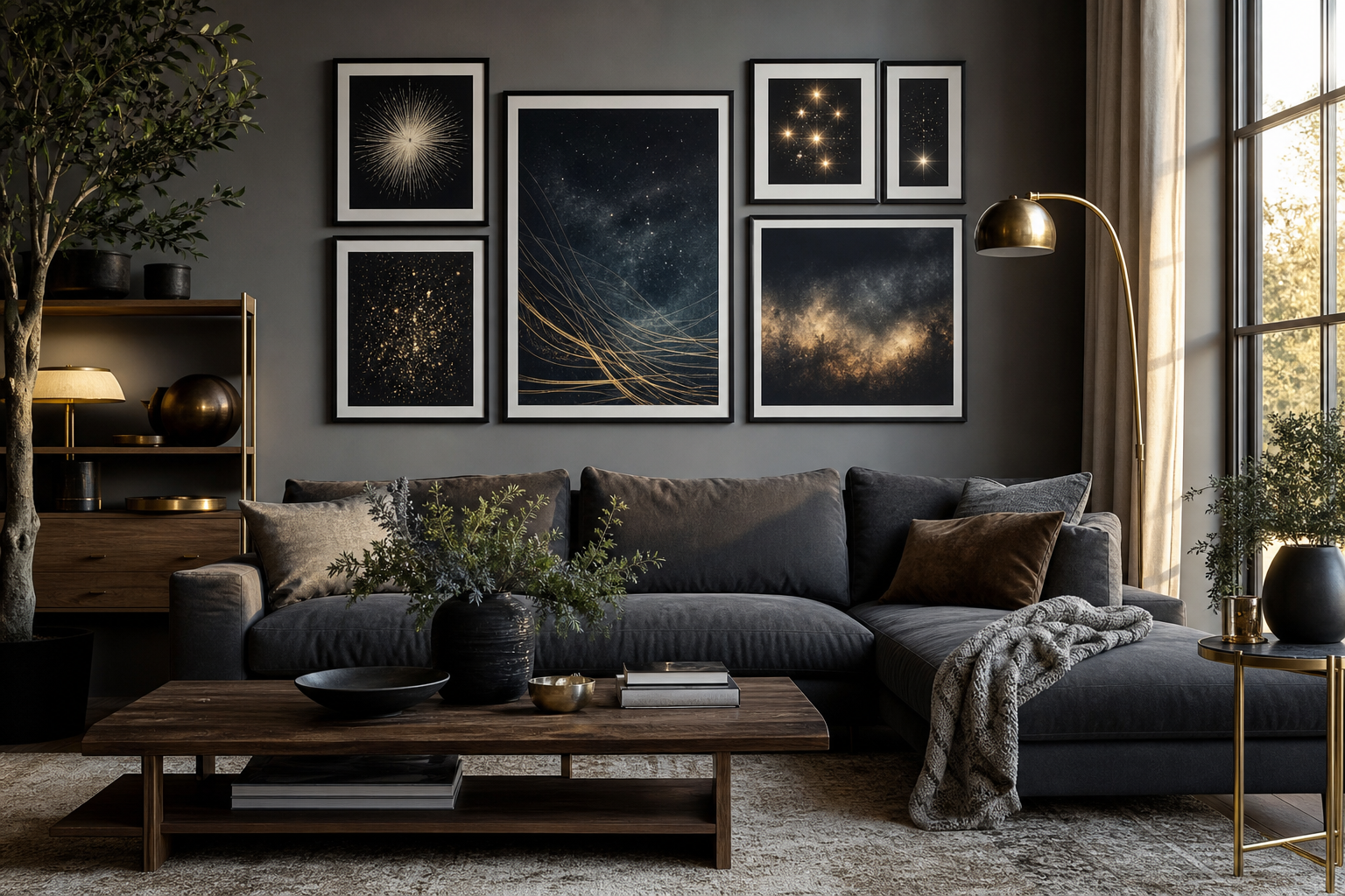
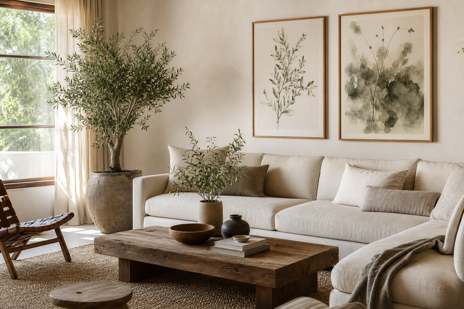
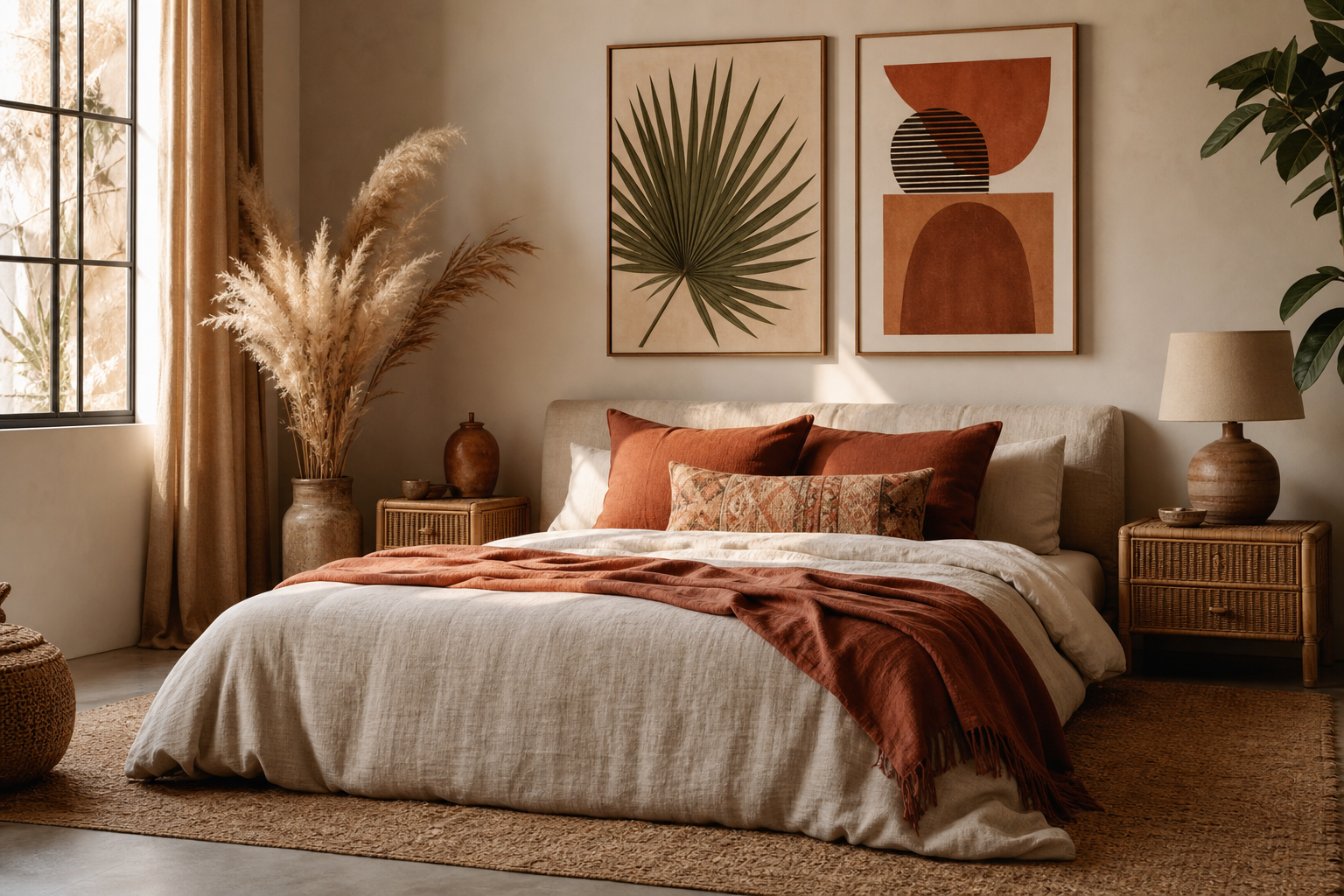
A botanical poster brings shape, softness, and a sense of order to a room. Leaves, stems, flowers, and garden-inspired patterns feel familiar, which makes them easy to live with for years. If you want wall art that looks polished without feeling rigid, a botanical poster is one of the safest and most versatile choices.
Why Botanical Posters Work in So Many Spaces
Botanical art works because it bridges styles instead of locking you into one. In a modern room, clean leaf forms add organic contrast to straight-edged furniture. In a classic interior, floral studies and heritage patterns echo traditional textiles and wood tones. In relaxed spaces, they reinforce the natural materials already in the room—linen, oak, jute, cane, and matte ceramics.
Color is another reason botanical prints adapt so well. Most designs sit in workable tones: sage, moss, cream, muted yellow, dusty pink, and earthy brown. Those shades pair easily with minimalist art prints, richer vintage wall art, or a wider botanical collection if you want to build a layered look rather than hang a single piece.
If your room already has texture but lacks focus, botanical art can act as the visual anchor. A patterned work such as William Morris's Honeysuckle (1876) gives a plain wall more depth without introducing harsh contrast.

Choosing the Right Botanical Style
The right style depends less on the subject and more on the room's existing lines and colors. Vintage botanical illustrations suit traditional furniture, brass accents, dark woods, and layered textiles. Their detail makes them especially effective in dining rooms, hallways, or studies where you want more visual richness.
Minimal botanical art is better when the room already has strong architecture or a reduced palette. A single stem, silhouette, or pared-back floral form gives you the natural feel of botanicals without crowding the wall. If you lean clean and quiet, look at White Flower Silhouette or Vase with Flowers for a lighter interpretation.
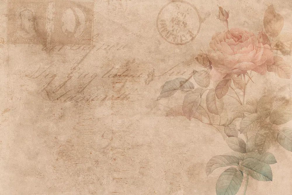
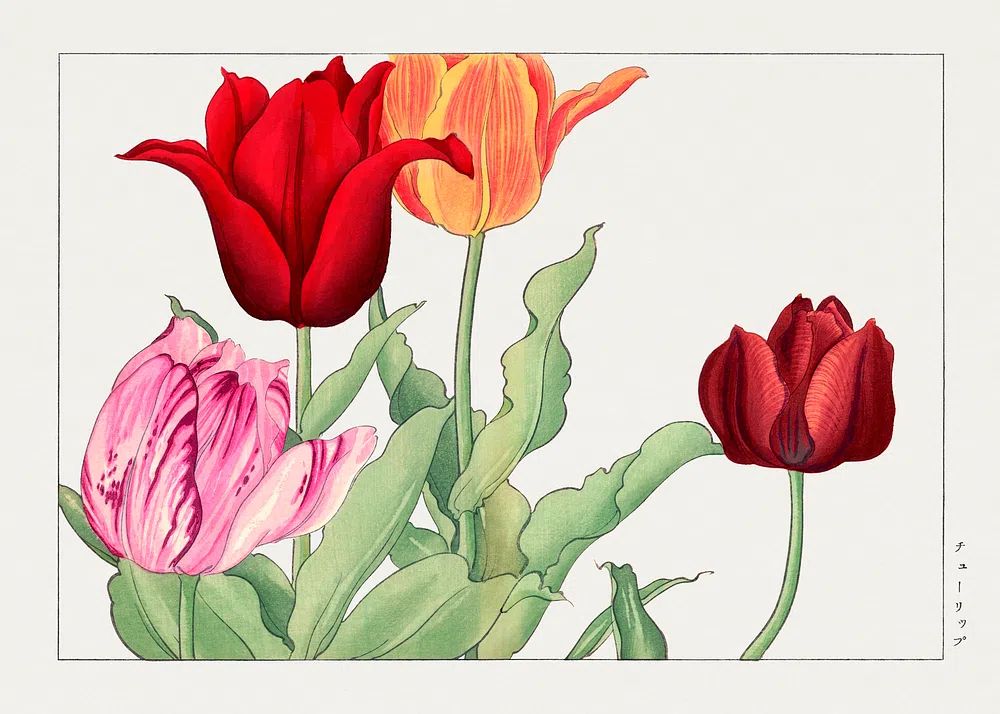
For homes that need warmth, choose fuller foliage, bouquets, or decorative heritage patterns. Prints like Vintage Rose Botanical Poster or Tulip Bouquet — Botanical Print add color gently without turning bright or loud. Muted floral work also connects well with bohemian prints if your room includes terracotta, rattan, or woven textures.

Picking Size and Placement That Feel Intentional
Size is where most walls go wrong. A single print above a sofa or bed should usually cover around 50% to 70% of the furniture width beneath it. Above a 180 cm sofa, that means roughly 90 to 126 cm total visual width. One large piece can do that on its own, or you can combine two medium pieces with 5 to 8 cm between frames.
Eye level matters just as much. The center of the artwork should land around 145 to 150 cm from the floor in most homes. Above furniture, keep the bottom edge roughly 15 to 25 cm above the top of the sofa, headboard, console, or desk. That distance makes the art feel connected to the furniture rather than floating.
A single botanical poster works best when the image has enough internal detail or strong negative space. If the wall is wide, a pair or set of four often feels more resolved. Symmetrical arrangements suit formal interiors, while a looser grid feels softer and more current. If you are building around one hero piece, combine it with smaller companions from nature prints or select floral works from fine art prints in related tones.
Frames, Mats, and Finishes That Elevate the Print
The frame changes the entire mood of a botanical print. Oak and ash frames make greens and warm neutrals look softer and more organic. Black frames sharpen delicate florals and work well in modern interiors with stronger contrast. White frames are useful when you want the wall art to feel lighter—especially in small rooms or narrow hallways.
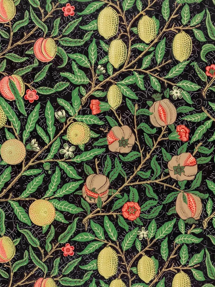
Mats give a botanical poster room to breathe. For small to medium prints, a mat of 5 to 8 cm creates a more gallery-like finish and makes even a detailed pattern feel calmer. This is especially helpful with dense decorative work such as William Morris's vintage pomegranate flowers or Green Tulip by William Morris.
Glazing and paper finish matter in bright rooms. If the print will hang opposite a window, low-reflection acrylic or glass helps preserve the details without glare. In kitchens and hallways, a smooth, protected finish is easier to wipe down than heavily textured surfaces.


Room-by-Room Botanical Poster Ideas
In the living room, place one larger botanical work above the sofa or create a pair over a sideboard. Green-based prints connect especially well with beige, olive, rust, and charcoal upholstery. If the room already has patterned cushions or a textured rug, keep the wall art palette quieter so the space does not compete with itself.
In the bedroom, softer compositions work best—pressed flowers, pale florals, muted leaves, or minimal silhouettes. Hang art 15 to 20 cm above the headboard, or use two matching vertical pieces above each bedside table for a balanced setup. A botanical poster in a bedroom should feel restful first, decorative second.
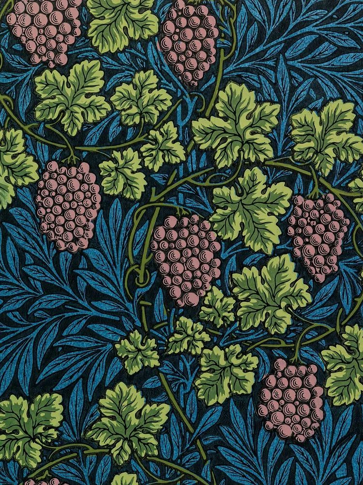
In kitchens and breakfast corners, choose smaller pieces with warmth and character. Florals, herbs, fruiting branches, or heritage patterns suit shelves, banquettes, and narrow wall sections well. Hallways benefit from a series of smaller frames—three or four works at equal spacing of about 6 to 8 cm creates rhythm without clutter.
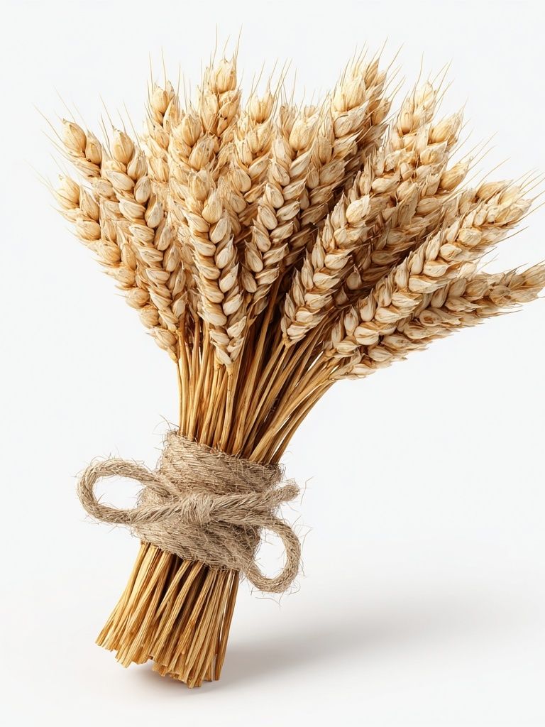
For a home office, use botanical art to soften task-focused furniture. A desk, lamp, shelving, and laptop create many hard edges, so one natural form on the wall prevents the room from feeling clinical. Prints like Wheat Bouquet — Botanical Print are especially useful in workspaces where you want visual calm rather than bright energy.

How to Build a Calm, Collected Gallery Wall
A calm gallery wall needs repetition. Repeat at least two elements across the arrangement—frame color, mat width, palette, or subject. That is what keeps a mixed wall from turning messy. If one print has sage green, bring that same green into one or two neighboring works, even if the subjects differ.
Start with one botanical poster as the anchor, then add supporting pieces with lower visual intensity. A good ratio is 60% botanical, 20% minimal or fine art, and 20% nature or illustration. That mix gives variety while keeping the wall coherent. You can pair a floral study with Swallows in Flight for movement or with Water Lilies — Fine Art Print for a softer painted feel.
Layout matters more than perfect matching. Keep the outer edges of the arrangement aligned in a rectangle, square, or loose column so the overall shape reads clearly from across the room. Between frames, leave 5 to 7 cm for small works and up to 8 to 10 cm for larger ones. On the floor first, test the arrangement before hanging anything.

Final Styling Tips for a Fresh, Finished Look
A botanical poster looks best when the rest of the room acknowledges it. Pull one or two colors from the print into the space through cushions, ceramics, throws, or a rug border. If the wall art includes olive, ochre, or dusty pink, repeat that shade once or twice—no more is needed. Real or dried greenery nearby also helps, but keep it restrained so the room feels edited rather than themed.
For the most polished result, think in layers: wall color first, art second, frame third, accessories last. When those elements relate in tone and scale, even a simple botanical poster feels intentional. If you want a starting point, browse our botanical wall art collection and combine one detailed floral with one quieter companion for a balanced display that still feels easy to live with.
Frequently Asked Questions
What frame color works best for botanical prints?
Oak is the easiest all-rounder because it warms greens and creams without overpowering them. Black works better for crisp, modern rooms with stronger contrast.
Can I hang botanical art in a bathroom?
Yes, if the room has decent ventilation and the print is framed behind protective glazing. Keep it away from direct steam and splashes.
Do botanical prints work with colored walls?
They do, especially on sage, warm white, clay, muted blue, or greige walls. Use a mat if you need extra separation between the wall color and the artwork.
Should I choose one large print or several small ones?
Choose one large piece for a clean, architectural look and several smaller pieces for a softer, collected effect. The decision usually depends on wall width and how much detail you want to show.
What decor pairs well with a botanical poster?
Linen, wood, cane, matte ceramics, and brushed brass all pair naturally with botanical art. Keep finishes mostly matte or lightly textured for a calmer result.