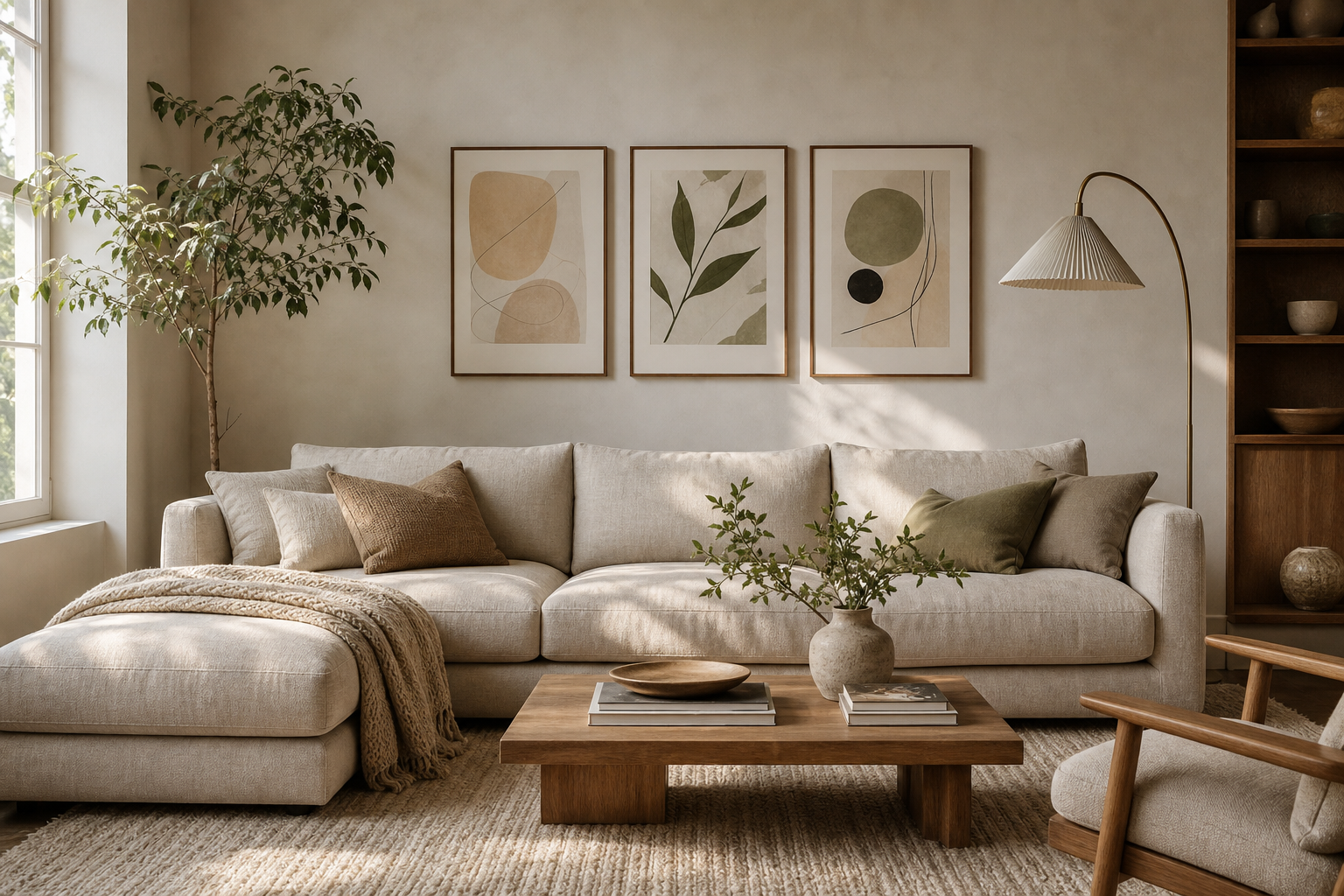
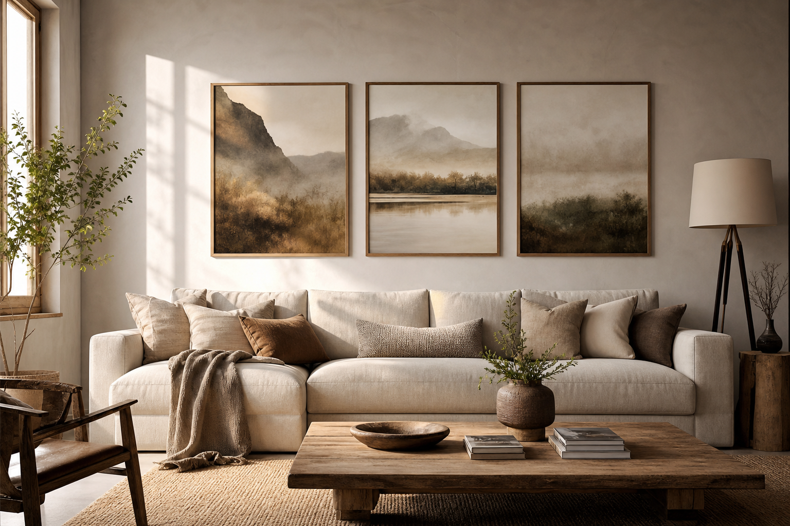
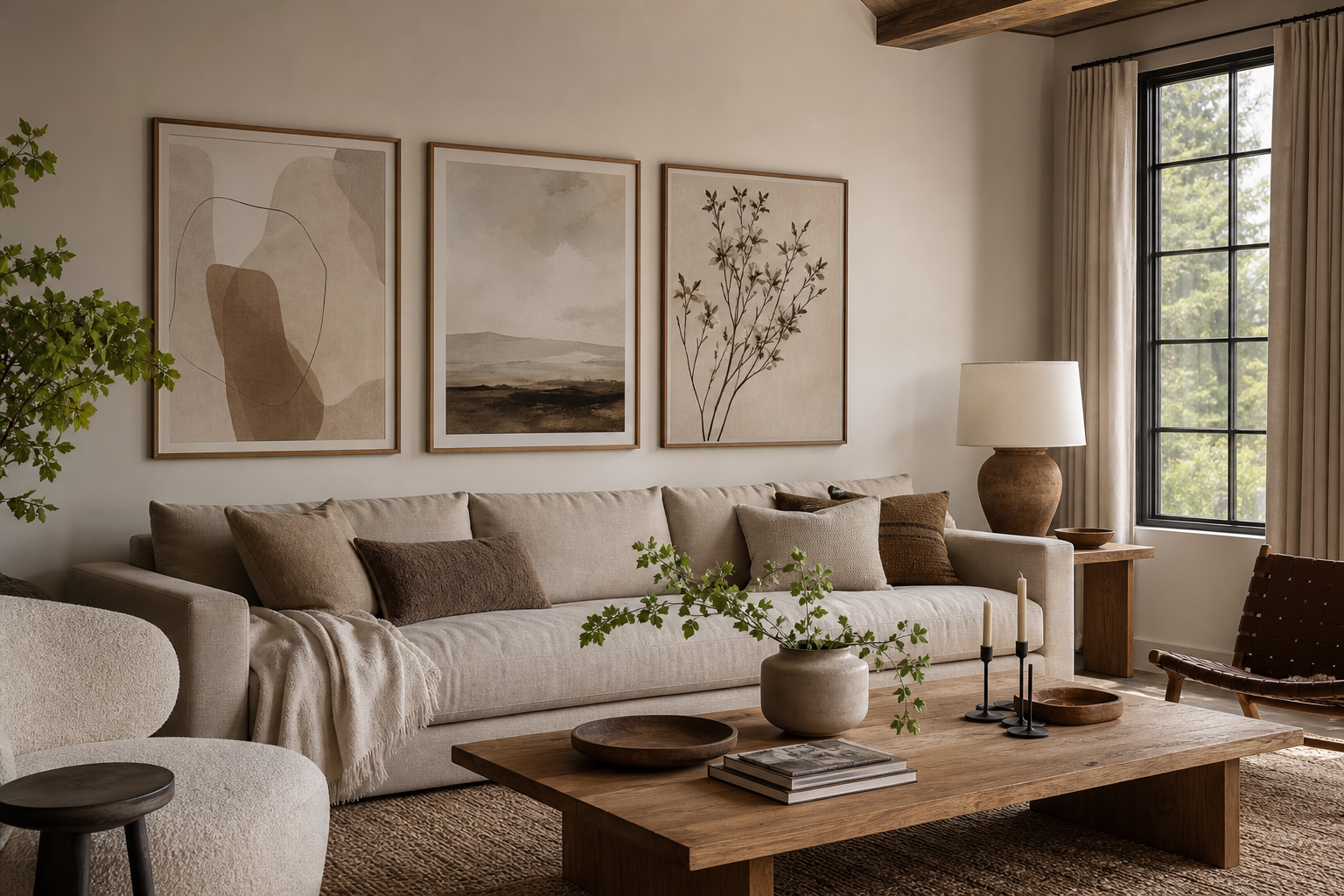
Botanical for the living room works because it adds structure and softness at the same time. Leaves, stems, blooms, and garden motifs introduce organic lines that balance the hard edges of sofas, media units, and coffee tables. In practical terms, botanical art suits almost every common living room style: classic rooms benefit from detailed vintage prints, Scandinavian spaces look cleaner with simplified green forms, and more layered interiors can handle richer floral compositions.
A second advantage is longevity. Unlike trend-led motifs that date a room quickly, botanical subjects have been used in interiors for well over a century. That makes them easy to pair with our botanical collection, quieter minimalist art prints, or painterly pieces from the fine art category without the wall feeling disconnected.
Why Botanical Art Works So Well in Living Rooms
Living rooms need artwork that can be seen from different distances. Botanical imagery does this well because it reads clearly from 2 to 4 meters away, yet still offers detail up close. A branch silhouette, a tulip form, or a repeating floral pattern creates movement without visual noise. If your room already has textured upholstery, boucle, wood grain, or a patterned rug, botanical art often feels calmer than geometric designs of the same scale.
Botanical for the living room also helps bridge indoor and outdoor references. Even in rooms with no plants, it creates a fresh, natural note. In rooms that already include olive trees, trailing vines, or fresh flowers, it echoes those shapes and makes the decor feel intentional rather than assembled piece by piece.
Choosing the Right Botanical Style
The best botanical style depends on your furniture, not just your favorite flower. Vintage botanical illustrations and Arts and Crafts patterns suit traditional, collected living rooms with wood sideboards, rolled-arm sofas, brass lamps, and woven textiles. If your space includes walnut, oak, or antique brass, detailed heritage prints usually look more integrated than ultra-modern line work.

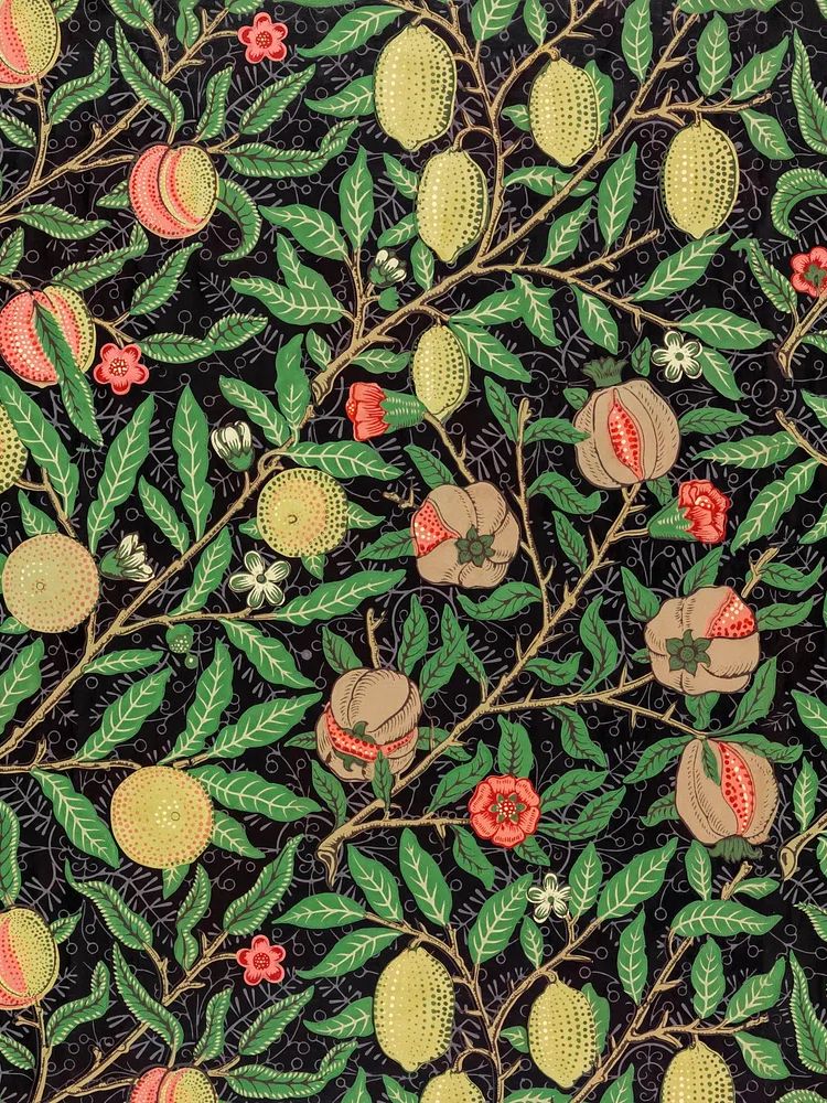
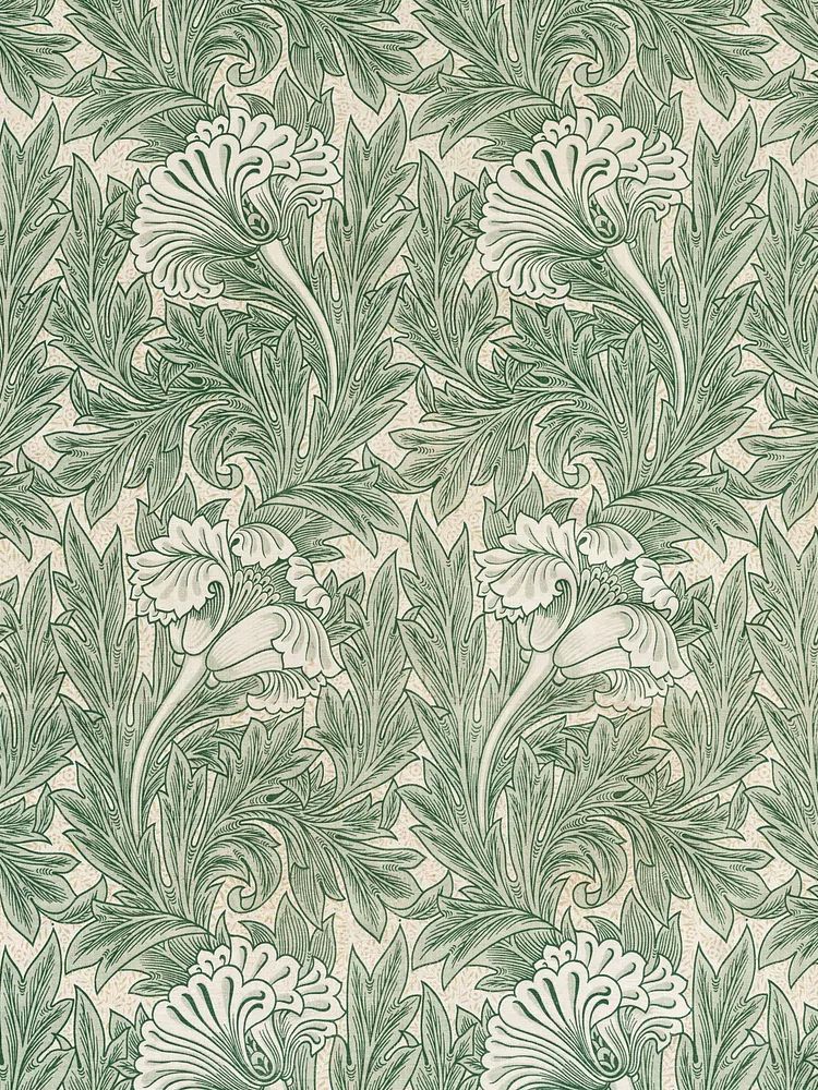
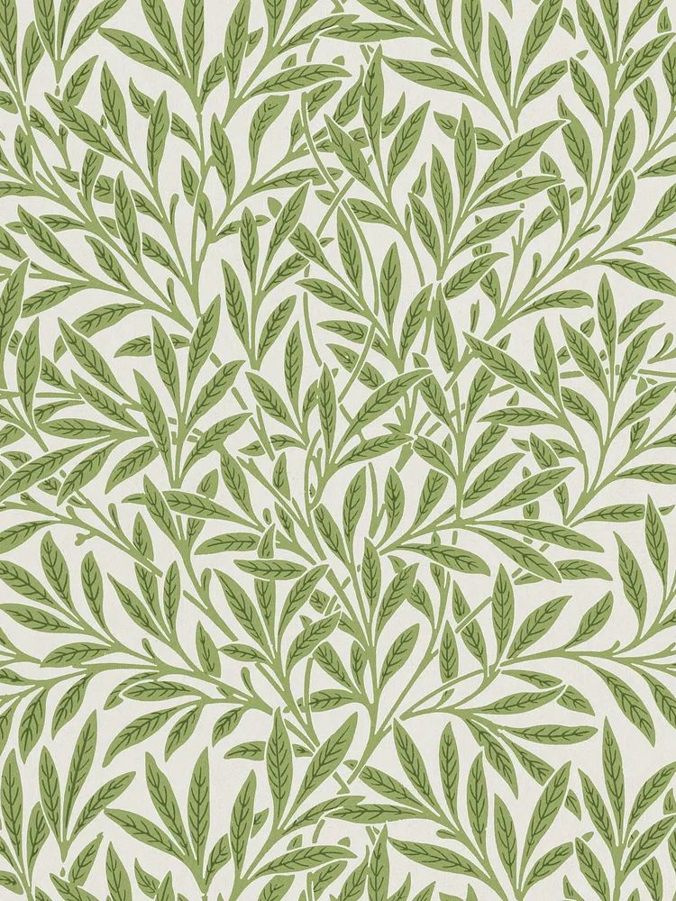
One strong example is a Morris print, which carries enough pattern to anchor a room on its own.

If your living room is simpler — think low-profile sofa, pale walls, black accents, and fewer accessories — choose cleaner botanical pieces. A single stem, a bouquet with open background space, or a restrained floral illustration will feel sharper and more modern. Rooms that already use curved lamps, boucle chairs, or sculptural tables can also benefit from pared-back illustrative wall art instead of dense pattern.
Florals sit in the middle. They soften contemporary rooms and warm up neutral spaces, but scale matters. Small scattered blooms can get lost above a 220 cm sofa, while larger flowers or fuller arrangements hold the wall more confidently. For a relaxed, easy look, start with one hero print and build around it.
Picking Colors That Feel Cohesive
Color is usually where botanical styling succeeds or fails. The easiest approach is to repeat one or two existing tones from the room. If your sofa is oatmeal, beige, taupe, or warm grey, artwork with sage, olive, moss, muted rose, or soft cream will feel integrated. If your room is cooler — charcoal sofa, stone walls, black metal accents — choose eucalyptus greens, dusty blue-greens, and off-white backgrounds rather than yellow-heavy florals.
A useful guideline is the 60-30-10 rule: roughly 60% of the room in a dominant base tone, 30% in supporting tones, and 10% in accent color. Botanical art usually works best when it picks up the 30% and 10%, not when it introduces a completely new color family. A green leaf print can echo cushions, a rug border, or a ceramic lamp base and make the whole room feel tighter.
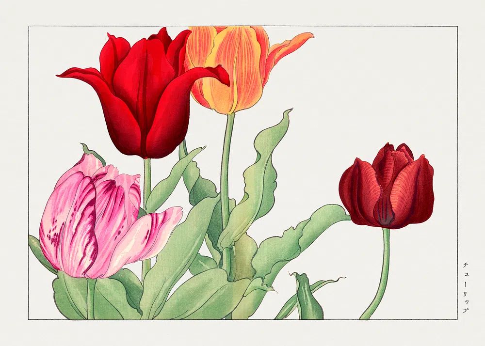
For warmer, layered interiors, vintage pinks, pomegranate reds, ochre, and leaf green create depth. This is where heritage-inspired work can be especially effective, particularly if you already use timber furniture and tactile fabrics.

If your room needs brightness more than depth, choose lighter botanical pieces with more visible background. They reflect light better and keep compact living rooms from feeling visually crowded. For homes with cream walls and limited natural light, soft works from our botanical wall art range or airy pieces from nature-inspired prints often perform better than dark, heavily saturated designs.
Sizing and Placement Tips That Make an Impact
Above a sofa, art should usually span 55% to 75% of the sofa width. For a 210 cm sofa, aim for a total art width of about 115 to 155 cm. That can be one large 70 x 100 cm piece, two 50 x 70 cm prints side by side, or a tighter gallery arrangement. Hang the center point around 145 cm from the floor, then adjust 5 to 10 cm based on ceiling height and sofa back height.

For console tables, keep the bottom edge of the frame 15 to 25 cm above the surface. For empty corners, one vertical piece in 50 x 70 cm or 61 x 91 cm can add height without introducing more furniture. If you are working with a large blank wall, a pair often looks more architectural than one oversized work, especially in symmetrical living rooms.
When you want a softer composition, use a salon-style grouping with three to five pieces — but keep spacing consistent at 5 to 8 cm. If the room is already busy with open shelving, patterned curtains, or multiple plants, stick to one or two pieces. Clean placement gives botanical art more presence than crowding the wall.
A wheat motif, for example, works especially well in narrow vertical spaces beside a bookcase or near a reading chair.

Framing Ideas for a Finished Look
Frame choice changes the tone more than most buyers expect. Oak and walnut frames make botanical prints feel warmer and more established. Black frames sharpen edges and suit contemporary rooms with iron, smoked glass, or graphic contrast. White frames work best when the wall color is deeper than the frame itself, creating crisp separation.
For vintage florals, wood tones are usually the strongest option. They echo the natural subject matter and connect well with woven baskets, side tables, and linen upholstery. If you are styling around Honeysuckle by William Morris or another heritage piece from the Botanical category, a medium oak frame is often more convincing than stark black.

Matting can also help. A white mat of 3 to 6 cm gives smaller botanical prints more breathing room and makes them look more substantial on bigger walls. Skip heavy matting if the artwork already has a wide border or if you want a denser gallery-wall look.
How to Layer Botanical Art With Other Decor
The easiest way to make botanical art feel curated is to repeat materials, not just imagery. If the wall art includes green foliage and warm neutrals, bring those tones into cushions, throws, glazed ceramics, or a textured rug. If the print is detailed and ornate, keep nearby accessories simpler. If the print is sparse and minimal, you can add more tactile objects around it.
Real plants help, but they do not need to match literally. One tall plant with broad leaves, plus botanical wall art showing finer stems or florals, often creates better contrast than duplicating the exact same shape. A good living room formula is one large plant, one stack of books, one ceramic object, and one framed artwork cluster. That gives variation in height and texture without filling every surface.

Botanical pieces also layer well with adjacent styles. A floral work can sit next to bohemian wall art if the palette is earthy, or near a minimalist floral print if you want more contrast and negative space. The key is to repeat either color, frame finish, or subject family across the grouping so it reads as one story.
Final Styling Tips for a Living Room That Feels Fresh
Start with the wall that matters most — usually above the sofa or console — and choose botanical art that matches the room's scale before worrying about small accessories. If you get the size right, repeat one existing color, and use a frame finish that relates to your furniture, botanical for the living room will feel settled quickly.
For most homes, the safest formula is simple: one large statement print or a balanced pair, a palette tied to the room, and enough empty wall around the art to let it breathe. If you want a more layered result, build from timeless pieces in Vintage Rose Botanical or heritage-inspired designs from Green Tulip by William Morris and add texture through frames, textiles, and plants rather than adding too many competing artworks.
Frequently Asked Questions
What frame size should I choose for a 50 x 70 cm botanical print?
A 50 x 70 cm frame gives a clean, modern look. If you want the piece to feel more substantial, use a larger frame with a mount so the overall size increases without changing the artwork.
Do botanical prints work in dark living rooms?
Yes — choose lighter backgrounds, softer greens, and glass that does not create heavy reflection. Pale mats and natural wood frames also help brighten the overall effect.
Can I mix floral and leaf prints on the same wall?
Yes, if they share one common element such as frame finish, background tone, or a repeated green. Keep spacing consistent so the wall looks deliberate rather than mixed at random.
What wall color works best with botanical art?
Warm white, soft greige, muted sage, and light stone are the easiest options. These shades support green and floral tones without fighting for attention.
How do I stop a botanical gallery wall from looking cluttered?
Limit the palette to two or three main tones, repeat the same frame style, and leave 5 to 8 cm between pieces. Mixing too many frame finishes is usually what makes the arrangement feel messy.