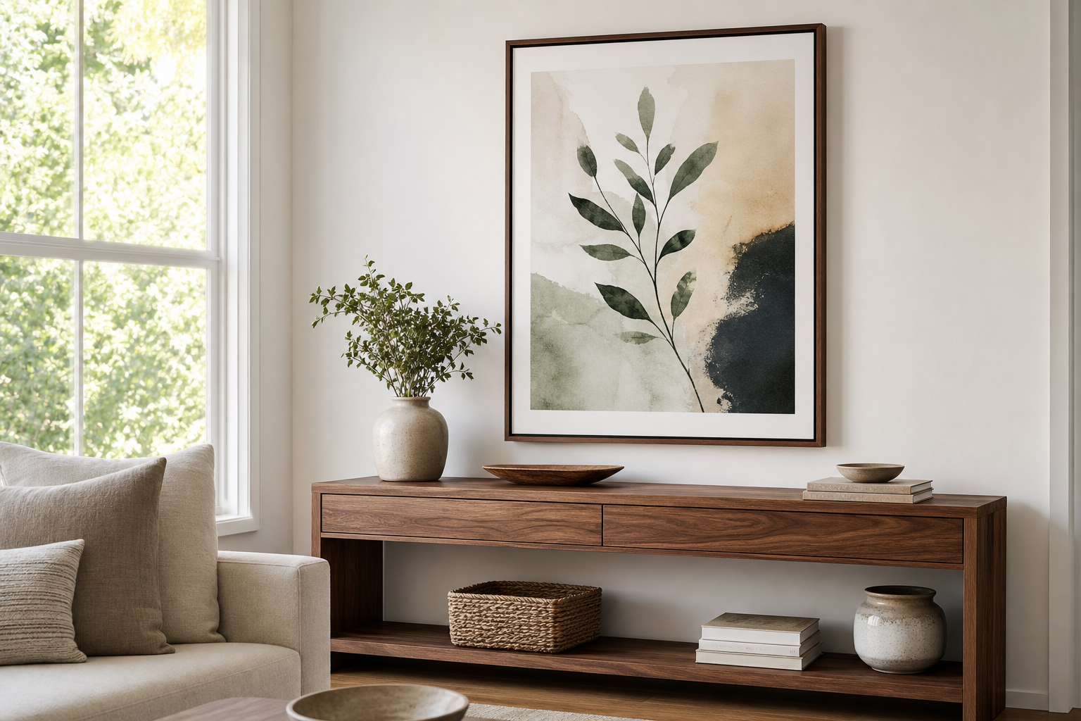
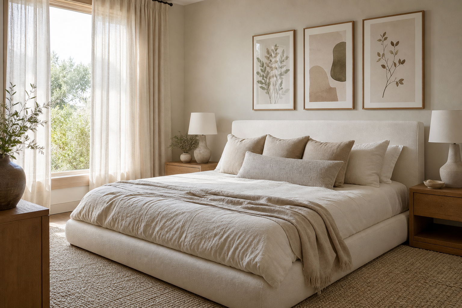
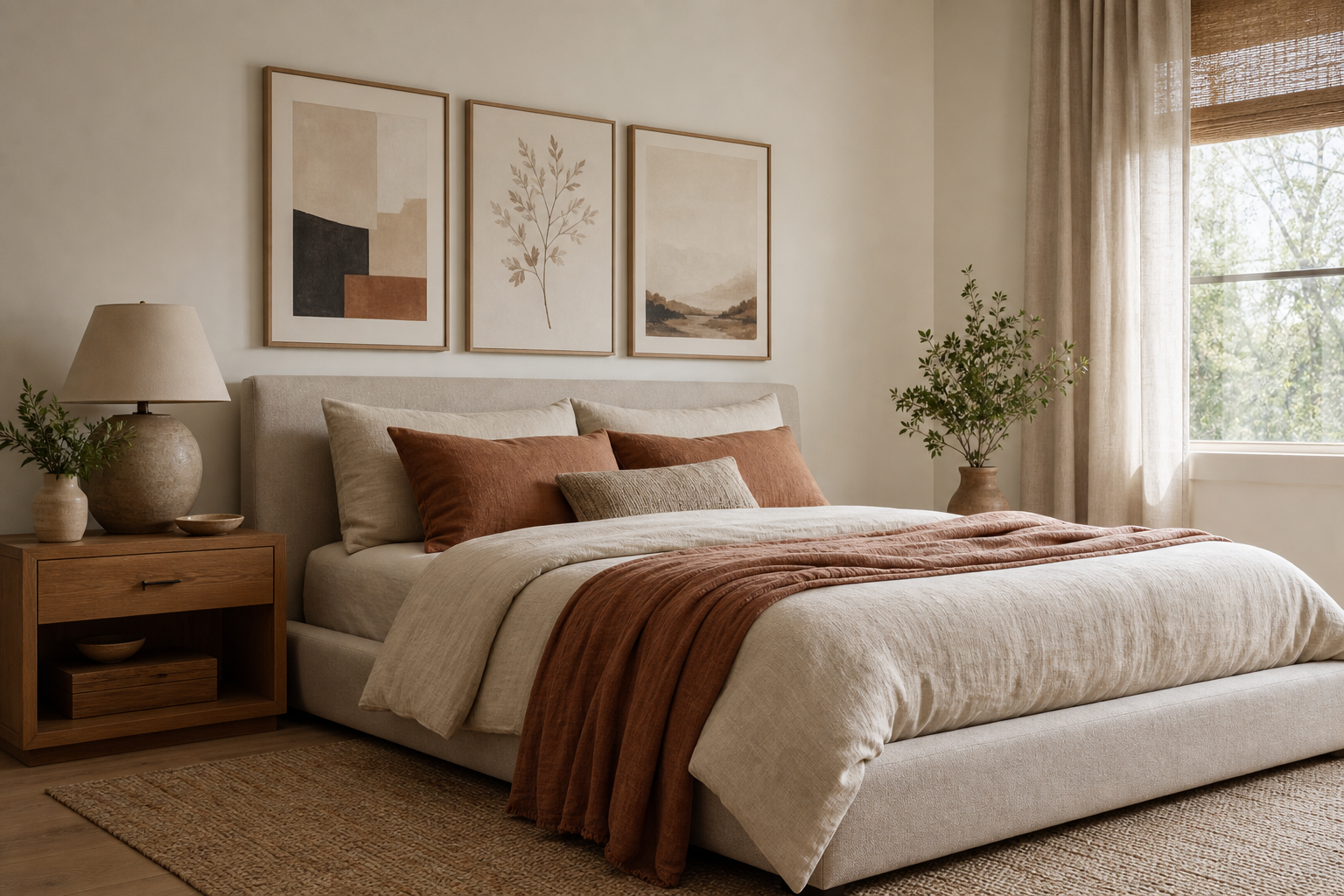
Bohemian posters work best when they feel collected, not crowded. The strongest boho interiors usually limit the palette to 3-5 grounded colours, repeat two or three natural materials, and leave enough blank wall around the art for each piece to breathe. That balance is what keeps bohemian posters expressive rather than messy.
A good starting point is to build around one dominant mood. If your room already has oak, linen, jute, or cane, lean into warm and organic artwork rather than introducing sharp black-and-white graphics. Our Bohemian collection pairs especially well with softer materials, while selected pieces from vintage wall art and nature prints can add depth without breaking the look.
What Gives Bohemian Posters Their Look?
Boho wall art is defined less by one strict style and more by a shared visual language. Think earthy pigments, hand-touched textures, botanical shapes, global textile references, ceramics, sun-faded florals, and relaxed asymmetry. A piece does not need every one of these traits, but it should feel tactile and slightly imperfect.
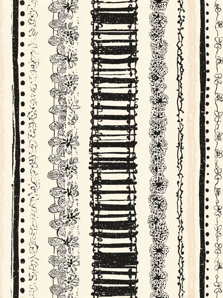
Patterns inspired by weaving, mosaic, stripes, or block printing are especially useful because they echo real materials already found in bohemian rooms. That is why prints with visible texture or craft references tend to look more convincing than overly glossy or ultra-digital designs.
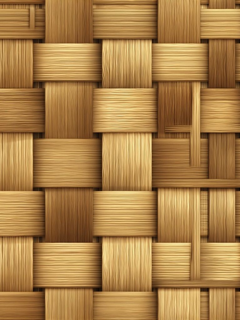
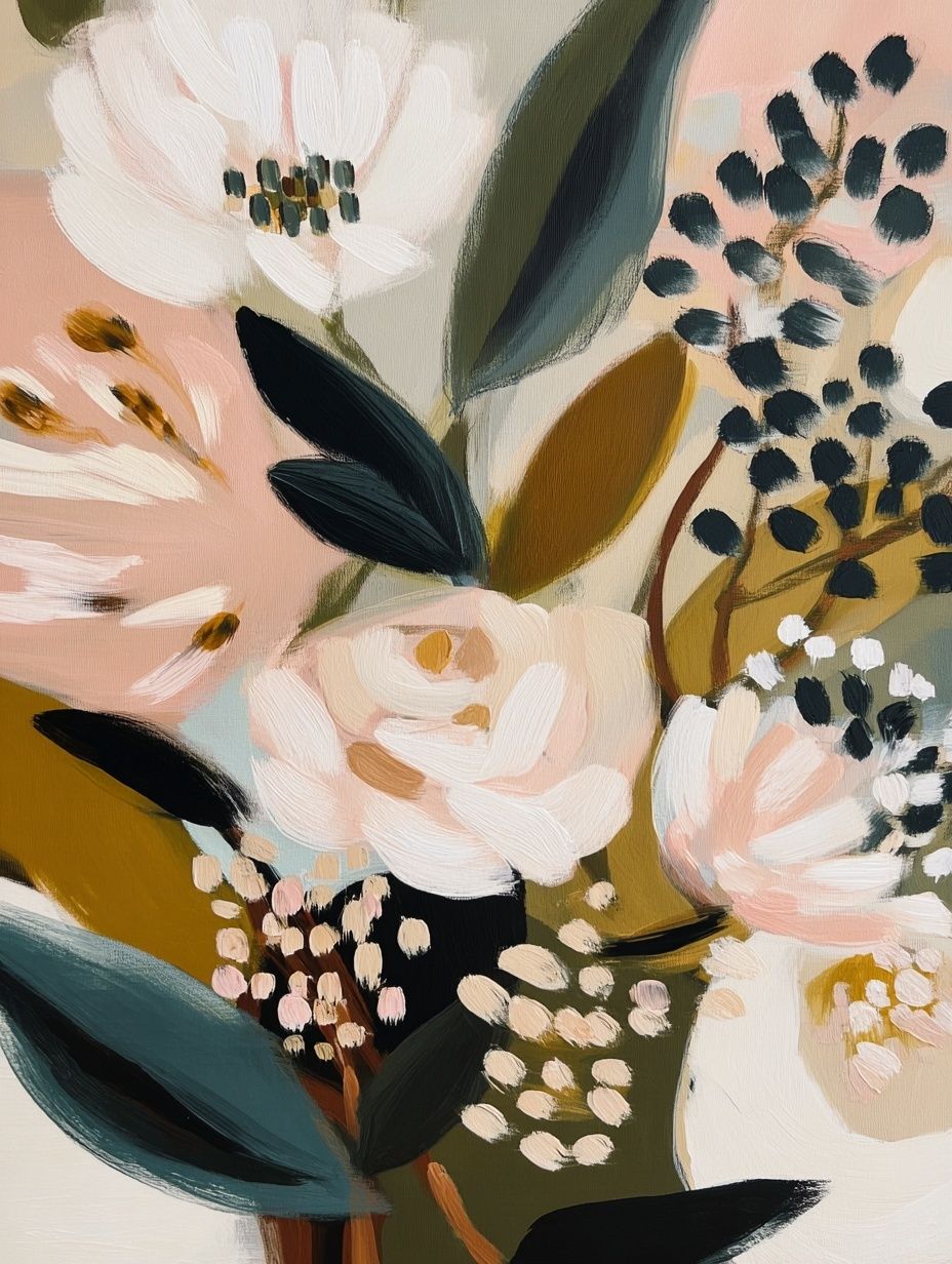
For a room that needs subtle structure, texture-led art is often the smartest first layer. Woven Bamboo Texture Poster brings in that handcrafted rhythm without competing with rugs, cushions, or throws. If you want a softer figurative option, Floral Portrait Bohemian Print gives the same free-spirited mood with a more romantic finish.
Choosing Colours That Feel Warm and Natural
The easiest boho palette starts with sand, clay, rust, olive, and off-white. Those shades sit comfortably beside walnut wood, beige upholstery, and dried botanicals. If the room feels too flat, add one muted jewel tone — deep teal, dusty plum, or amber usually works better than bright primary colours.
A useful rule is 60/30/10. Let 60% of the room stay neutral, 30% carry the warm earthy tones, and 10% deliver contrast through darker frames, a patterned textile, or one richer art print. This keeps the wall from becoming visually heavy.

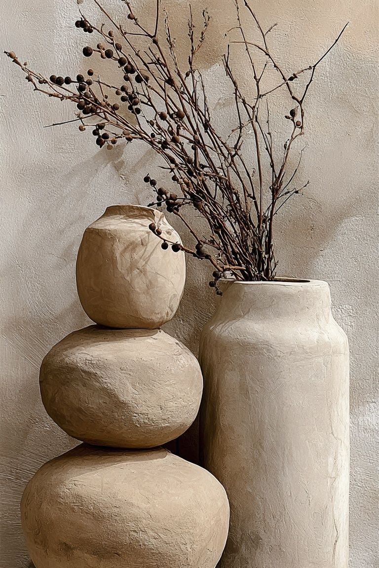
If you are styling around terracotta or rust, choose art that repeats those tones at least twice across the arrangement. Ceramic Vases with Dried Branches — Bohemian Print is an easy fit for this because it reflects clay, beige, and muted brown in one piece. For lighter rooms, Blush Watercolor Abstract Poster softens a boho scheme without making it sugary.

How to Mix Patterns, Textures, and Art Styles
The cleanest way to mix is to combine one pattern print, one organic subject, and one calmer supporting piece. For example, a striped or checkered artwork can sit beside florals and a minimal vase study. That gives you variation in surface and subject, but still a controlled rhythm.
Keep one element consistent across the group. That might be frame colour, paper tone, or a repeated accent like rust red. If every piece differs in colour, scale, and style, the arrangement reads random. If one thread ties them together, it feels curated.
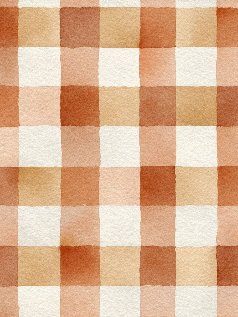
Pattern-heavy work such as Watercolor Checkered Pattern Poster looks best when it is offset by quieter neighbours. Pair it with a restrained floral, a ceramic subject, or even a piece from our minimalist art prints collection to create space around the eye. For homes with woven baskets, kilim cushions, or carved wood, this approach keeps texture layered but not overloaded.
You can also mix categories if the tones align. A print from illustration wall art or fine art prints can soften a purely decorative boho wall. The key is to avoid more than two busy patterns in one sightline — especially above a sofa or bed where you view the grouping from a distance of 2-3 metres.
Best Rooms for Bohemian Posters
Bedrooms are the easiest place for bohemian posters because the room already supports softness. Above a 140-180 cm bed, a pair of 50x70 cm frames or one 70x100 cm statement piece usually feels balanced. Choose calming subjects — dried branches, faded florals, gentle landscapes, or warm abstract forms — rather than highly detailed motifs.

Living rooms can handle slightly bolder combinations because there is usually more visual weight from the sofa, coffee table, and rug. A horizontal arrangement above a 200 cm sofa should cover roughly 120-150 cm of width — about two-thirds of the furniture below. Pieces like Ceramic Pots — Bohemian Print feel grounded in these spaces because they echo common living-room materials such as clay, wood, and woven fibre.
Hallways and creative corners are ideal for more playful pieces. Here, a single 30x40 cm or 40x50 cm frame can be enough to add character without turning a narrow wall into a gallery. If your workspace or reading nook needs energy, Bohemian Woman Portrait Print adds personality while staying within the boho mood.
Sizing, Framing, and Wall Layout Tips
Scale is where many boho walls go wrong. Small art scattered across a large wall creates visual noise. Instead, use fewer pieces with clearer presence. For most homes, 50x70 cm and 70x100 cm are the most effective anchor sizes, while 30x40 cm works as a supporting layer on shelves or in tighter corners.
Frame finishes matter just as much as subject. Oak, walnut, and light wood support a natural bohemian look better than glossy black in most cases. Black can work, but usually only as a thin frame used consistently across all pieces. If your room already has plenty of texture, choose simpler frames and wider mats so the art does not fight with the furnishings.

When hanging a group, leave 5-8 cm between smaller frames and 7-10 cm between larger ones. For a shelf-led arrangement, overlap heights slightly but keep the colour story tight. For a formal gallery wall, map the outer edges first so the whole composition reads as one shape rather than separate floating pieces.
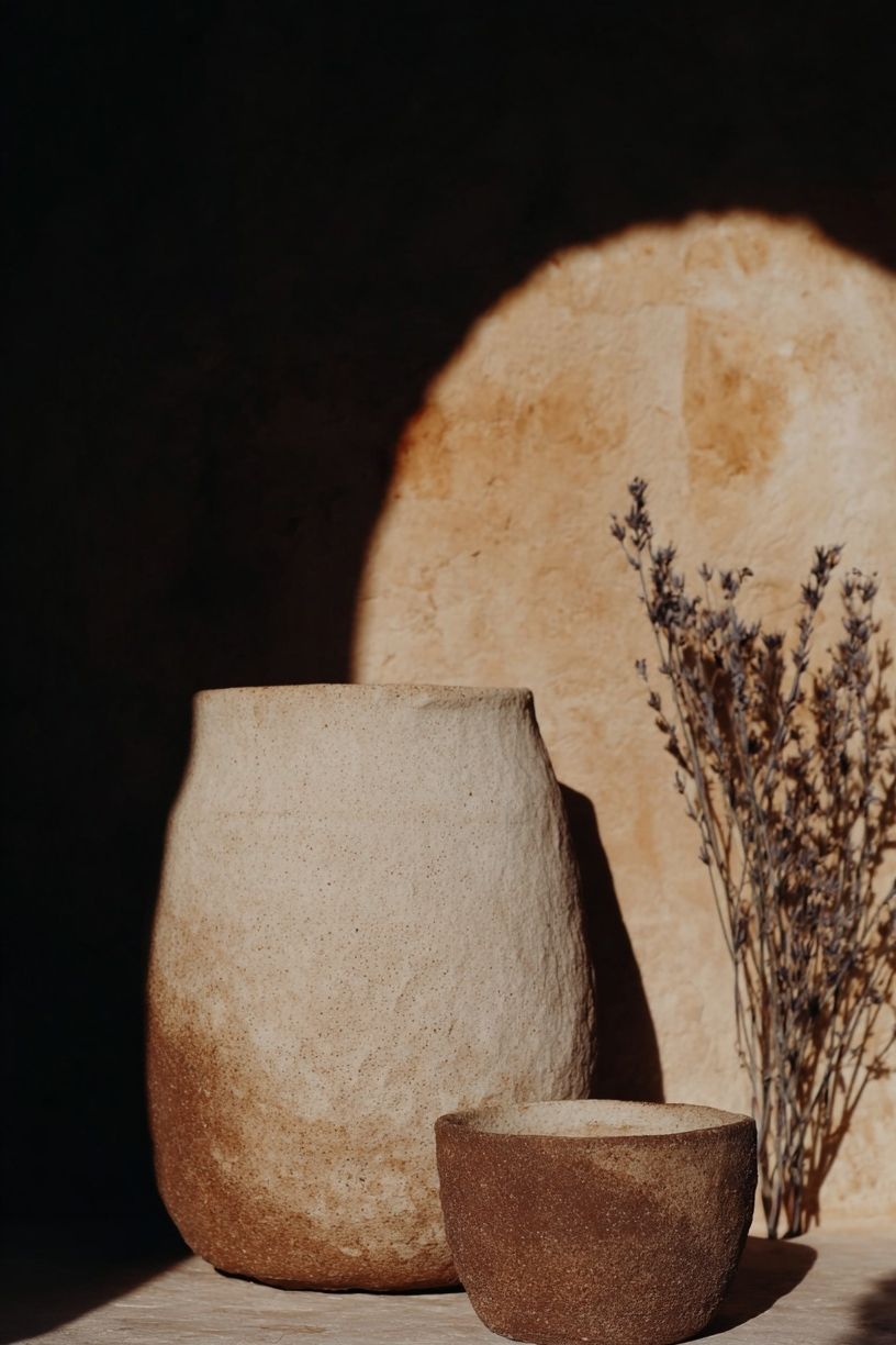
If you want movement without chaos, combine one vertical, one square-feeling subject, and one softer horizontal line inside the same zone. A trio such as ceramics, stripes, and botanicals often does this well because each piece plays a different visual role.
How to Finish the Look With a Curated Boho Touch
The final layer should support the wall, not compete with it. Around bohemian posters, the most effective styling pieces are usually practical and textural: one woven basket, one ceramic vase, one stack of books, and one soft textile in a related tone. Stop before every surface is filled. A boho room still needs negative space.

Refreshing the look is simple when the palette is disciplined. Swap one print seasonally, change the cushion cover, or move a smaller frame from hallway to bedroom. That flexibility is one reason bohemian posters are so useful — they bring character quickly, but they are easy to restyle when the room evolves.
Final thoughts
The best bohemian posters feel warm, tactile, and slightly collected over time. Focus on a tight palette, mix only a few art styles, and choose sizes with enough presence for the wall. That is what gives a boho interior its relaxed richness without tipping into clutter.
If you want an easy route, start with one texture-led piece, one floral or figurative print, and one quieter supporting design from our bohemian posters collection. Keep the frames consistent, repeat natural materials nearby, and let the wall breathe.
Frequently Asked Questions
What frame colour works best with bohemian wall art?
Light oak, walnut, and natural wood are the safest choices. They echo rattan, jute, and linen better than high-shine finishes.
Can I mix bohemian posters with modern furniture?
Yes — keep the furniture shapes clean and let the art add warmth. This works especially well when the room already has one or two natural textures such as wood or woven lighting.
Should boho art be centred on the wall or offset?
Above beds and sofas, centring usually looks cleaner. In corners, hallways, or shelf displays, a slightly offset layout can feel more relaxed and natural.
Do bohemian posters work in small rooms?
They do, but use fewer pieces and clearer shapes. One 50x70 cm print often looks better than four small frames on a compact wall.
What pairs well with floral bohemian prints?
Ceramic subjects, soft abstract stripes, and subtle nature scenes pair well because they add variety without introducing harsh contrast.