Why 16x20 Works So Well
16x20 prints and posters sit in the most useful middle ground for home styling. They are large enough to read clearly from 6 to 10 feet away, but still compact enough to fit above a nightstand, desk, console, or narrow section of wall. On most walls, a 16x20 piece feels intentional without demanding the full visual weight of a 24x36.
That balance matters in real rooms. If a wall area is roughly 30 to 40 inches wide, a single 16x20 frame usually looks properly scaled with 5 to 10 inches of breathing room on each side. That makes this size especially effective in apartments, guest rooms, hallways, and home offices where oversized art can crowd furniture lines.
Another reason 16x20 prints and posters work so well is flexibility. You can hang one vertically to emphasize ceiling height, or horizontally to echo the line of a bed, bench, or sideboard. If your style leans quieter, pieces from our minimalist collection or classic fine art prints often feel polished at this format because the size gives detail enough room without overwhelming a small room.
Best Rooms and Wall Spots for 16x20 Prints
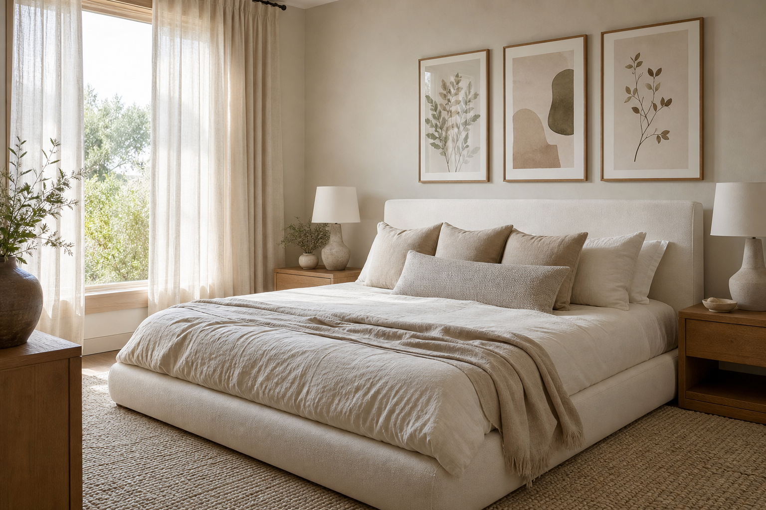
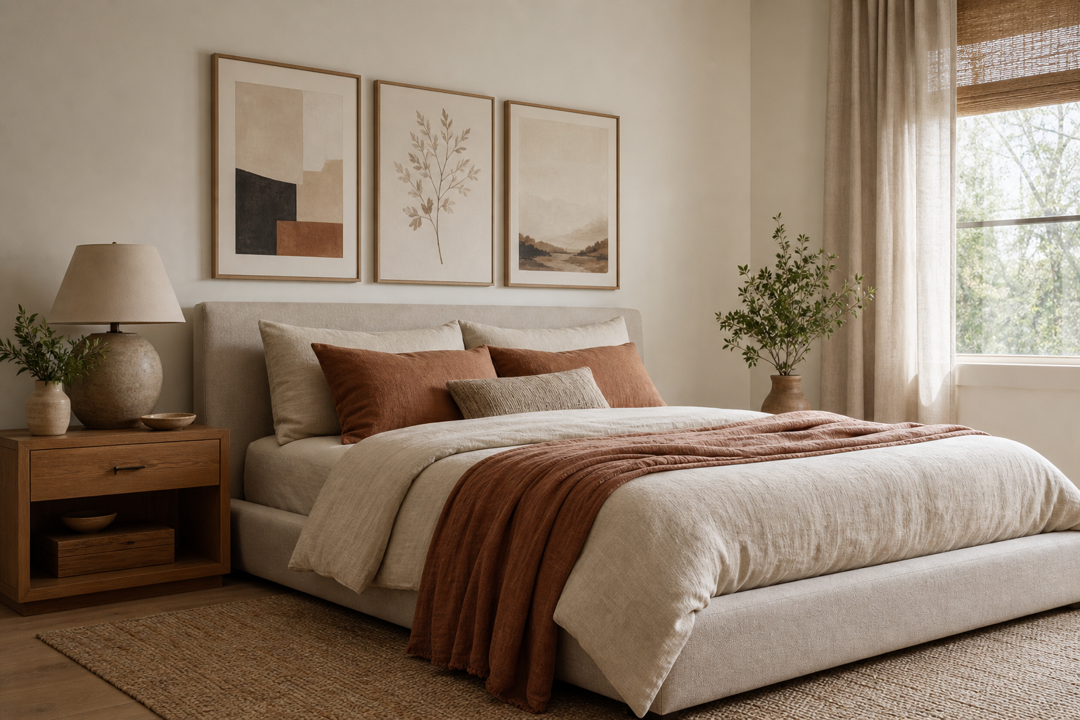
In bedrooms, a 16x20 piece works best above a nightstand, dresser, or on a side wall where a king- or queen-size bed has already claimed the room's visual center. If you hang one above a dresser, keep the frame about 6 to 8 inches above the furniture top. That gap looks connected, not floating.

Hallways are another strong fit because wall depth is often limited. A 16x20 frame on a hallway wall gives enough impact to break up a long corridor without projecting too much visually. For narrow passages, hang the center of the artwork around 57 to 60 inches from the floor so it reads naturally at eye level.
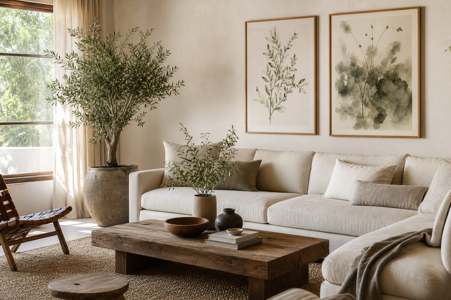
In living rooms, use this size on smaller wall zones rather than the main sofa wall unless the room is compact. A 16x20 works especially well above a reading chair, bar cart, or slim console. If your room has clean lines and muted upholstery, a restrained piece like Elegant White Fabric can add depth without making the space feel busy.
For desks and home offices, this size is one of the easiest wins. A 16x20 frame above a desk 40 to 55 inches wide usually feels proportional, especially when paired with a lamp, stacked books, or a shelf nearby. If you want visual energy for work zones, explore abstract art prints with stronger contrast or movement.

Choosing the Right Frame and Finish
The frame can either sharpen a 16x20 piece or dilute it. For minimal and contemporary interiors, a thin wood or black metal frame around 0.5 to 0.75 inches wide usually looks cleanest. Thicker profiles can work, but at this size they tend to feel heavy unless the artwork itself has strong visual density.
Matting is useful when the art needs extra breathing room. A 2- to 3-inch white mat can make a 16x20 print feel more elevated and slightly more gallery-like, especially for Starry Night or other painterly works with rich detail. If your room is already soft and tonal, skip the mat and use a full-bleed presentation to keep the look contemporary.

Finish matters as much as frame style. In bright rooms with multiple windows, matte or anti-glare acrylic is often the better choice because it reduces reflections that can wash out detail. In darker spaces, standard glass can add a bit more crispness. If the artwork is textured or painterly, natural oak and walnut frames tend to bring out warmth; black frames create stronger contrast and work particularly well with minimalist wall art and monochrome designs.

How to Pair 16x20 Art with Other Sizes
A single 16x20 is useful, but this size becomes even more valuable in mixed arrangements. In a gallery wall, treat it as an anchor piece and build around it with smaller formats like 8x10 and 11x14. A simple formula is one 16x20, two 11x14s, and two or four 8x10s with 2 to 3 inches between frames. That creates structure without looking too rigid.
If you are hanging above a sofa, use a 16x20 as part of a wider grouping rather than on its own. The total arrangement should cover roughly 60 to 75 percent of the furniture width. For a 72-inch sofa, aim for a grouped art span of about 43 to 54 inches.
Layering also works well on shelves and consoles. Lean one 16x20 frame at the back, then overlap a smaller piece in front by 2 to 4 inches. This gives depth and keeps the setup relaxed. For eclectic interiors, combining vintage prints with softer modern pieces creates a more collected look than matching everything exactly.




Colour, Mood, and Subject Matter
The easiest way to make 16x20 prints and posters feel right in a room is to match the artwork's visual energy to the room's job. Bedrooms usually benefit from softer palettes — creams, taupes, dusty greens, pale blues — because the wall art sits within your line of rest. Pieces from our minimalist range or airy works like Window with Sheer Curtain suit that slower mood well.
In living rooms and entryways, you can push further. A 16x20 abstract with strong contrast or a vibrant fine art print will hold attention at eye level and make a smaller wall feel finished. If the room is mostly neutral, one saturated artwork can carry the colour story for the whole space rather than forcing colour into every accessory.

Subject matter also changes scale perception. Landscapes and impressionist scenes often feel expansive even at 16x20, which makes them useful in smaller rooms. Portraits create intimacy, while abstract forms bring rhythm and movement. If you want a room to feel calm, choose lower-contrast pieces with two or three dominant tones. If you want sharper impact, look to Colorful Stained Glass Abstract or similar high-contrast artwork that can energize plain walls fast.

Shop Smarter: Tips for Buying 16x20 Prints and Posters
When buying 16x20 prints and posters, start with the wall, not the artwork. Measure the exact width of the furniture below and the open wall around it. A frame that looks perfect online can feel too small or too dominant depending on whether it sits above a 24-inch nightstand or a 60-inch sideboard.
Paper and print quality should come before trend. Look for crisp detail, consistent colour, and a finish that suits the room lighting. Painterly works and vintage-inspired art often benefit from a softer matte surface, while graphic images can carry more contrast. If you're building a lasting collection, choose pieces you would still want to see every day in two or three years, not just what matches this season's cushion covers.
Budget in layers. A common approach is to spend more on the frame than the print if the piece is staying for years. A good 16x20 frame with solid construction and clean glazing changes the result more than most buyers expect. If budget is tight, buy the artwork first and frame it in stages — but stick to standard sizing so replacement or upgrades stay easy.

It also helps to buy with pairing in mind. If you think you may build a gallery wall later, start with one versatile 16x20 and save the palette, frame finish, and subject direction. A piece like Swallows in Flight can bridge traditional and modern rooms, while something from our abstract collection gives more freedom to add colour-driven companions later.
Final thoughts
16x20 prints and posters are popular for good reason: they solve more placement problems than most art sizes. They are substantial enough to add presence, yet flexible enough to move from bedroom to hallway to office without looking awkward.
If you want the safest route, match the frame to your room's hardware or wood tones, keep the artwork centered about 57 to 60 inches from the floor, and leave enough negative space around it. A well-chosen 16x20 does not need a huge wall to look polished — it just needs the right scale, finish, and subject.
Frequently Asked Questions
Should I choose portrait or landscape orientation for a 16x20 print?
Use portrait orientation on narrower wall sections or to emphasize height. Choose landscape above desks, benches, or consoles where you want the artwork to echo the furniture line.
Is a mat necessary for 16x20 artwork?
No. A mat adds a more classic, gallery-style finish, but full-bleed framing often looks cleaner in modern rooms. If the art is visually busy, a white mat can help it breathe.
What frame colour is the most versatile for 16x20 prints?
Natural oak is usually the easiest all-round option because it works with warm neutrals, whites, and softer colour palettes. Black is better if your room already has strong contrast or dark accents.
Can I lean a 16x20 frame instead of hanging it?
Yes — it works especially well on consoles, shelves, and mantels. Place the larger frame at the back and overlap it slightly with a smaller object or artwork for a layered look.
How much wall space should I leave around a single 16x20 piece?
Aim for at least 4 to 6 inches from nearby furniture edges and 5 to 10 inches of visible wall on each side when possible. That negative space helps the artwork read as deliberate rather than squeezed in.