Why Bedroom Posters Work So Well
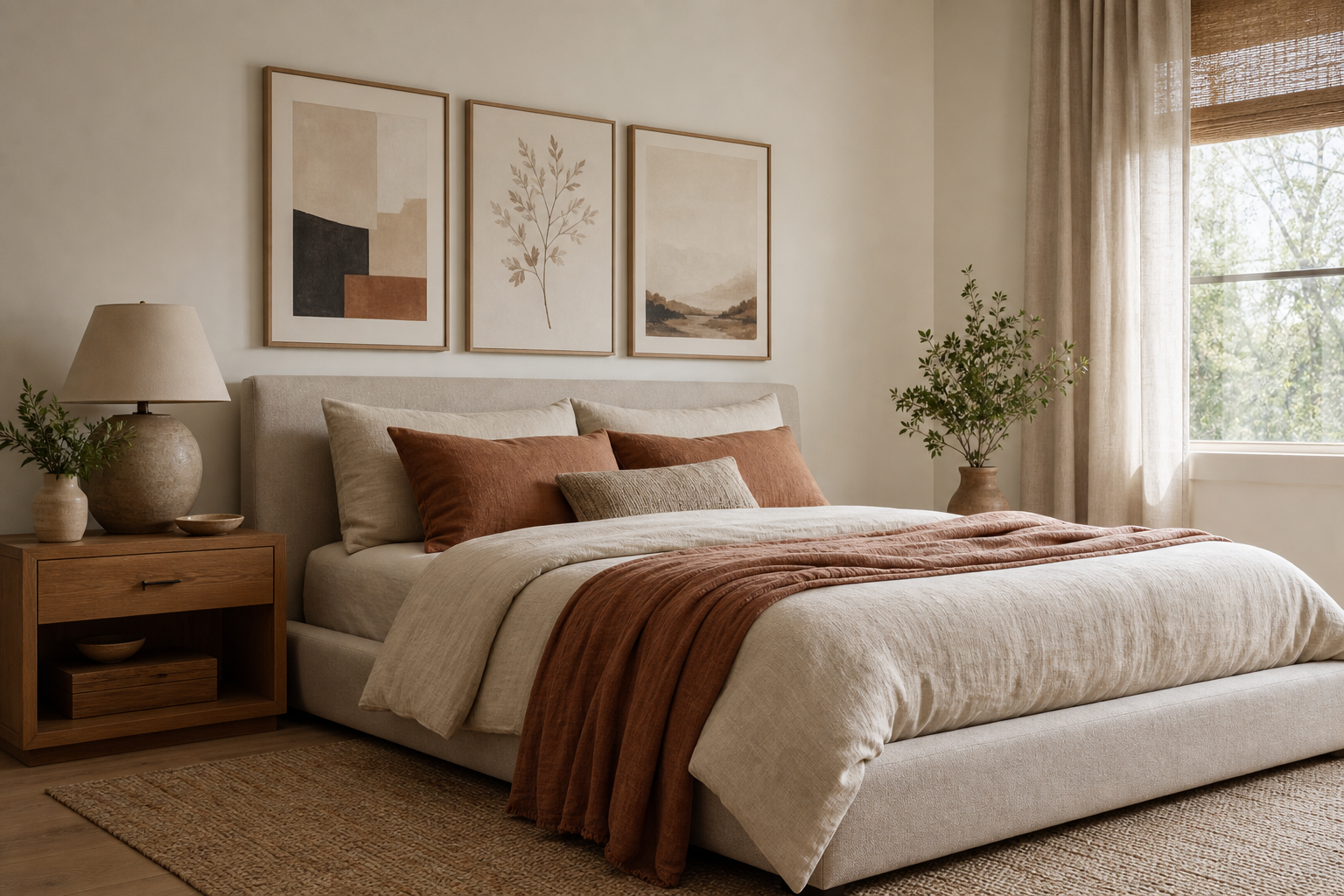
Bedroom posters do something that large furniture cannot: they shape mood at eye level. A bed, rug, and curtains set the base, but wall art gives the room its emotional tone. Soft abstract forms, quiet landscapes, or restrained line work can make a bedroom feel more finished in a single afternoon without adding visual weight.
They are also flexible. In a bedroom, that matters because tastes change faster than furniture does. A 50x70 cm framed print above a dresser is easy to swap, and a pair of 30x40 cm pieces beside the bed can shift the room from cool minimal to warm romantic with almost no disruption. If you want a restful look, start with art that has open space, limited contrast, and no overly busy detail. Our Minimalist collection and Fine Art prints are especially useful for that quieter approach.
A second reason bedroom posters work well is proportion. Bedrooms often have one large wall above the bed, one mid-sized wall near a dresser, and a few smaller sections around windows or corners. Art fills those gaps cleanly. Compared with shelves or mirrors, framed prints usually project less into the room, which helps smaller bedrooms feel calm rather than crowded.
Choose a Mood Before You Choose the Art
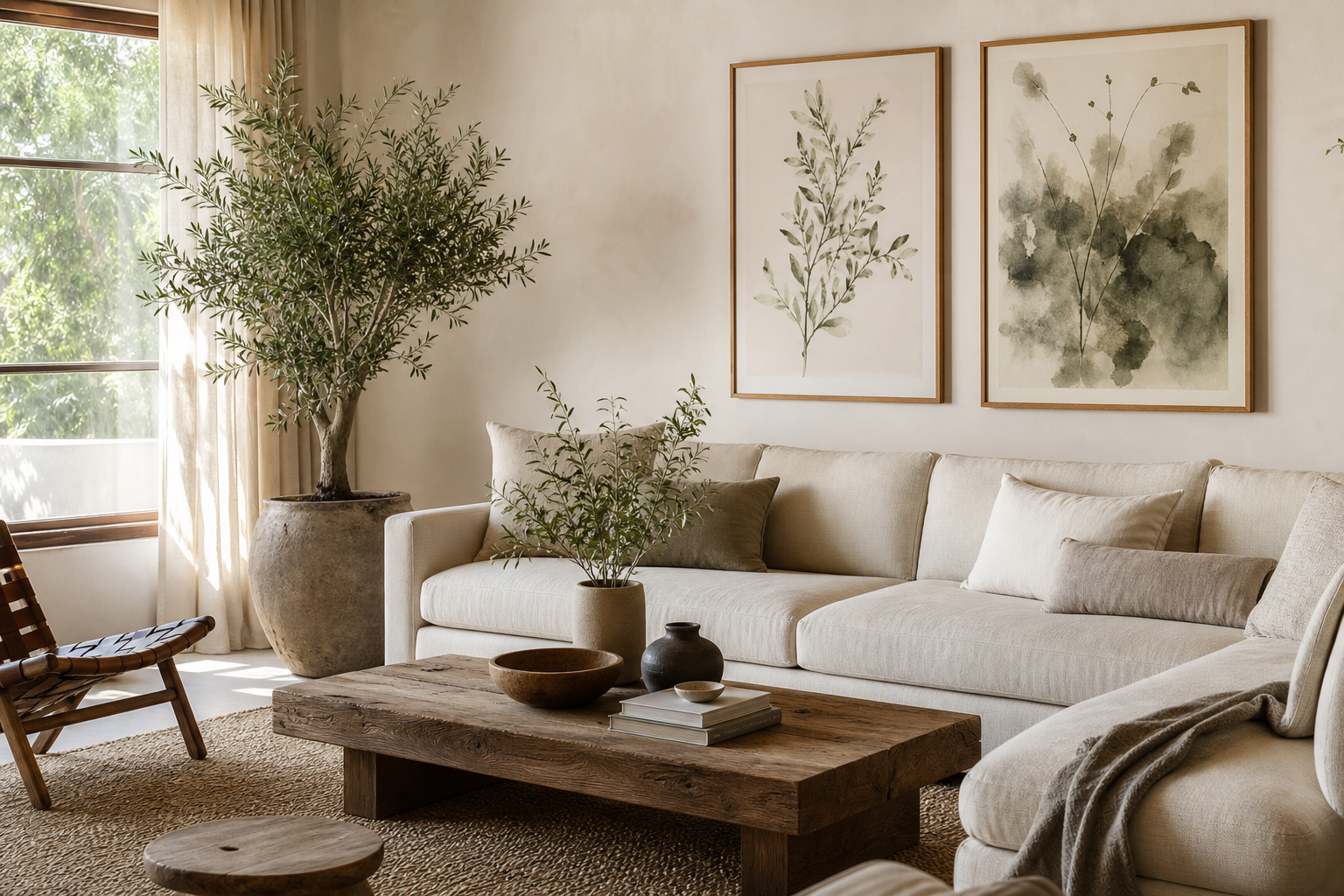
The best bedroom posters are chosen by atmosphere first, subject second. If you want the room to feel calm, look for a narrow palette: cream, stone, pale taupe, dusty blush, muted sage, or washed blue. If you want more personality, use one expressive piece as the lead and keep everything else quieter around it.
For a soft, meditative bedroom, tonal textures work better than high-contrast graphics. A piece like Elegant White Fabric has movement without noise, which is exactly what many bedrooms need.

If your room already has strong materials — dark wood, velvet, black bedside lamps, or a charcoal bed frame — choose art that softens those edges. Blush Watercolor Abstract or Window with Sheer Curtain can introduce lightness without making the space feel bland.

For bolder bedrooms, the rule is simple: one statement direction, not five. A deep teal abstract, a floral figure, or a romantic black-and-white silhouette can work beautifully — but only if the remaining palette repeats that same mood. In practice, that means using no more than three dominant colors across the art, bedding, and textiles. Browse Abstract wall art when you want color with a softer edge, or Love Romantic prints for bedrooms that need warmth and intimacy rather than stark minimalism.
Best Sizes and Placements for Bedroom Walls
Above the bed is the obvious position, but it is not the only one — and often not the most interesting one. If you are hanging art above a queen bed, aim for a total width of around 100 to 140 cm. Above a king bed, 120 to 160 cm usually looks balanced. That could be one 70x100 cm piece, two 50x70 cm prints, or a small gallery of three frames with 5 to 8 cm spacing between each.
When hanging over a headboard, keep the bottom of the frame 15 to 25 cm above the top edge of the bed. Any higher and the art starts to feel disconnected. If the wall is tall, resist the urge to "fill" it all. Empty space is useful in a bedroom — it makes the room breathe.
Beside a dresser, art can be slightly smaller and more vertical. A single 40x50 cm or 50x70 cm print works well centered over furniture that is 80 to 120 cm wide. For awkward corners, use one narrow vertical piece or lean two smaller frames on a picture ledge. This is a better solution than trying to cram a wide composition into a tight area.



A useful rule for bedroom posters is coverage: your art grouping should take up roughly 60% to 75% of the width of the furniture below it. Less than that can look undersized; more than that can feel top-heavy. If you prefer a cleaner look, one larger print often beats a busy gallery wall in sleeping spaces.
How to Build a Cohesive Bedroom Poster Palette
A restful palette depends on repetition. Pick one main tone from the room — perhaps the oatmeal in your headboard, the rust in a cushion, or the soft black of a lamp base — and repeat it in at least two art pieces. That single move makes bedroom posters feel connected instead of collected at random.
Neutrals are the easiest starting point, but neutral does not have to mean flat. Cream, chalk white, sand, greige, faded terracotta, and smoky blue give more depth than plain beige-on-beige. If your bedding is mostly white, add art with texture or brush movement so the room does not feel sterile. White Cream Texture and Textured White Abstract are good examples of low-contrast pieces that still hold attention.

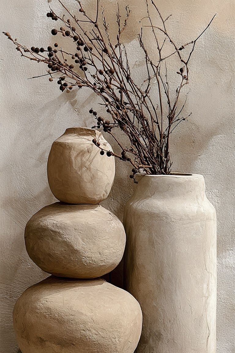
If you want to mix categories, keep one visual thread consistent. For example, a Bohemian print with dried branches can sit comfortably beside a minimalist floral if both share the same sandy palette. A fine art piece can work too — but pick one with softened edges and natural colors rather than dramatic darks.

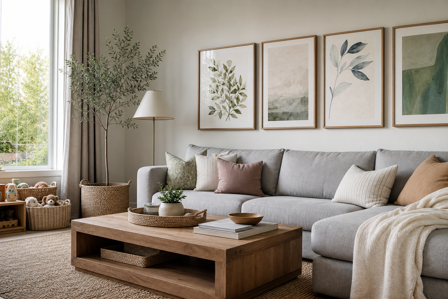
The quickest way to make a bedroom wall feel busy is to mix too many color temperatures. Warm beige, cool grey, bright pink, olive green, and strong navy can work in a living room, but in bedrooms they often compete. Stay within one family — warm or cool — and then add one accent color at no more than 15% to 20% of the total look.
Framing, Materials, and Finishes That Suit Bedrooms
Frames matter more in bedrooms than in hallways or offices because the room is viewed up close and at slower moments. Thin oak, ash, black, and off-white frames are the safest options because they support the art without making the wall feel heavy. In softer rooms, 1.5 to 2 cm frame profiles usually look cleaner than chunky, deep-set mouldings.
For finish, matte is usually better than gloss. Bedrooms often have lamps, windows, and low evening light, so glare can become distracting. Art behind non-reflective acrylic or glass feels easier on the eye, especially across from a window. Paper finish matters too: textured or matte paper tends to suit bedroom posters better than highly glossy surfaces, which can look sharper and cooler.

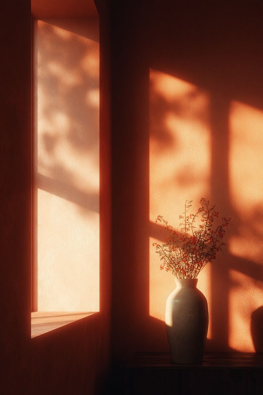
If your bedroom leans minimal, choose clean-edged frames and broad mats only when the art is small. If the room is warmer and layered, slightly organic finishes like oak or walnut will feel more natural. For a soft botanical note, Vase with Flowers or Ceramic Pots can bring shape and texture without overwhelming the room.
Easy Styling Ideas for Every Bedroom Type
In small bedrooms, keep the art concentrated. One 50x70 cm print above the bed or dresser is often enough. Too many small frames can break the wall into pieces and make the room feel tighter. Choose art with light backgrounds and soft edges, especially if the room gets limited natural light.
In shared bedrooms, symmetry helps. Use a pair of matching 30x40 cm or 40x50 cm prints above each nightstand, or hang one centered triptych above the bed. Matching frame color across both sides of the room creates order quickly, even when bedding and accessories differ slightly.
Minimalist bedrooms need contrast through texture, not clutter. A single print like White Flower Silhouette or a subtle coastal piece such as Sailing Boat Minimalist Wall Art gives enough visual interest without breaking the calm.
Cozy layered bedrooms can handle a little more warmth and romance. Mix one floral, one abstract, and one texture-led piece, but keep them within the same earthy range. If you want that softer, lived-in look, a combination from our Fine Art collection and Bohemian wall art often feels richer than using only one style family.

Shop the Look: Simple Rules for Picking the Right Poster
Start with one anchor piece you would still want in two years. That is the easiest filter for buying bedroom posters that last. If you only like a print because it matches this month's bedding, it is probably too temporary.
Then check three things: scale, palette, and contrast. Scale should suit the wall; palette should repeat at least one tone already in the room; contrast should feel moderate rather than sharp. Bedrooms are usually best with art that reads clearly from 2 to 3 meters away but does not shout when seen from the bed.
If you are building a set, use one hero print, one supporting print, and one quieter texture or botanical. That ratio is more reliable than choosing three equally dominant pieces. And if you are unsure, start lighter — it is easier to add depth later than to calm down a wall that already feels overstimulating.
Final thoughts
The best bedroom posters make the room feel settled, personal, and easy to live with. They do not need to be dramatic — they need to fit the pace of the space, the colors you already have, and the way you want the room to feel at the end of the day.
Choose mood first, keep the palette disciplined, and give the art enough breathing room. Do that, and even a simple framed print can make a bedroom look far more considered.
Frequently Asked Questions
What frame color is safest for bedroom art?
Light oak, black, and off-white are the most versatile choices. Oak suits warm palettes, while black works best when your room already has darker accents like lamps or hardware.
Can I hang art above a bed without a headboard?
Yes — just use the bed width as your guide and keep the bottom edge of the frame about 20 to 30 cm above the pillows. Make sure the piece is securely mounted rather than simply leaned.
Do matte prints look better than glossy ones in a bedroom?
Usually yes. Matte surfaces reduce glare from bedside lamps and windows, which makes the artwork easier to enjoy in softer lighting.
What kind of art works best in a dark bedroom?
Choose prints with lighter backgrounds, soft whites, sandy neutrals, or muted blush tones. They reflect more light visually and help the room feel less enclosed.
How many pieces should I use in a small bedroom?
One larger piece or two medium-sized pieces is usually enough. Keeping the arrangement simple helps the room feel calmer and more spacious.