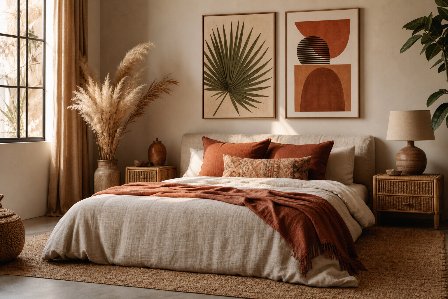
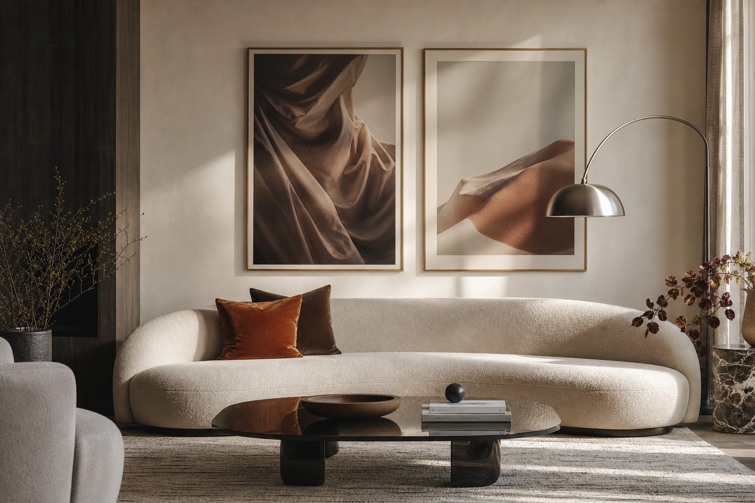
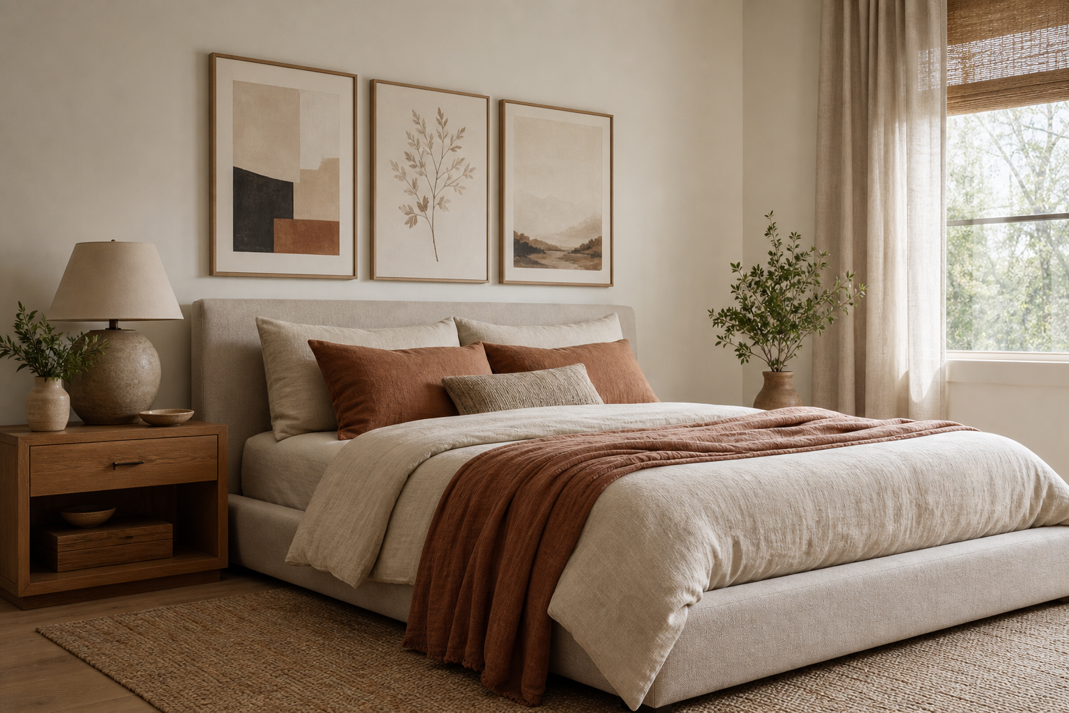
Boho posters work best when they look collected rather than matched. The goal is not perfect symmetry or a strict color formula. It is a wall that feels warm, lived-in, and layered through earthy color, organic forms, tactile materials, and a few pieces that look as if they were found over time. If you want a strong starting point, browse our Bohemian collection alongside botanical wall art and earth-toned abstract prints so the mix feels relaxed instead of theme-heavy.
What Gives Boho Posters Their Look?
The look of boho posters comes from a combination of soft structure and visual texture. You will usually see sun-faded colors, handmade-looking patterns, floral or botanical references, curved shapes, and subjects tied to craft or nature. A boho wall rarely relies on one motif alone. It combines 3 to 5 visual notes — for example, a textile-inspired print, a botanical pattern, one simple abstract piece, and one object study such as ceramics or dried branches.
Vintage influence matters too. Boho styling often borrows from Arts and Crafts textiles, folk pattern, and natural still life. That is why pieces from William Morris's Honeysuckle or vintage pomegranate flowers by William Morris sit so comfortably next to looser, modern designs. The shared thread is ornament, warmth, and a slightly imperfect rhythm.
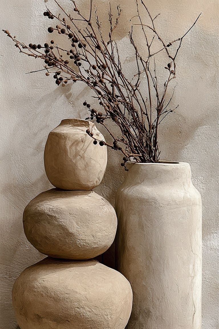
A good rule is 70/30. Let 70% of your wall feel calm and grounded — neutrals, muted greens, soft browns, faded terracotta — and let the remaining 30% bring detail through pattern, floral forms, or a stronger accent. That balance keeps boho posters expressive without turning busy.
Choose a Palette That Feels Warm and Natural
Color is what makes boho posters feel settled into a room. The most reliable palette starts with sand, oat, clay, rust, olive, and cream. These shades echo natural fibers and warm plaster tones, so they blend easily with wood, linen, cane, and wool. If your room already has beige upholstery or oak furniture, add contrast with rust or muted green rather than introducing cold black-and-white graphics.
For a softer wall, stay within a 4-color range: cream, terracotta, sage, and walnut. For a richer look, add one deeper accent such as aubergine, indigo, or burnt red. Patterns inspired by woven surfaces or mosaic detail can carry those deeper tones in a controlled way, especially when the surrounding pieces are lighter. You can see that balance across woven bamboo texture art and Moroccan mosaic patterns.

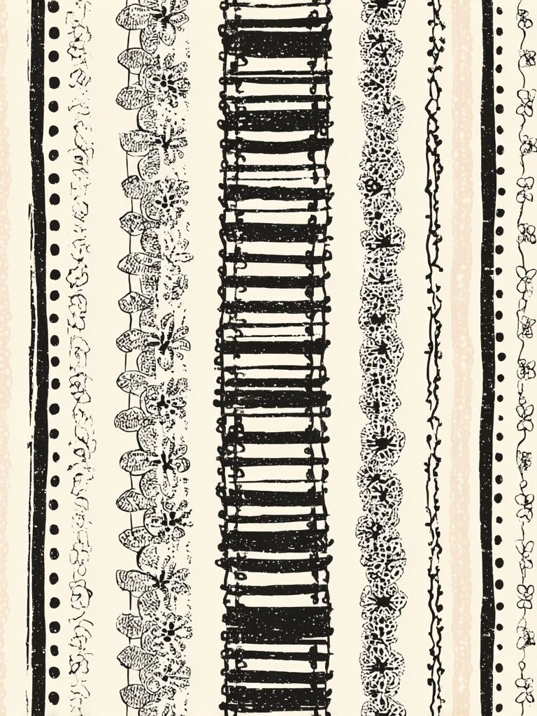
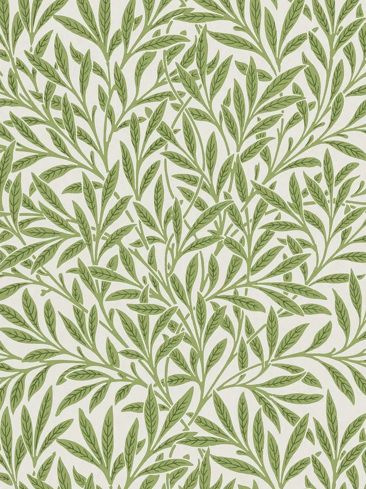
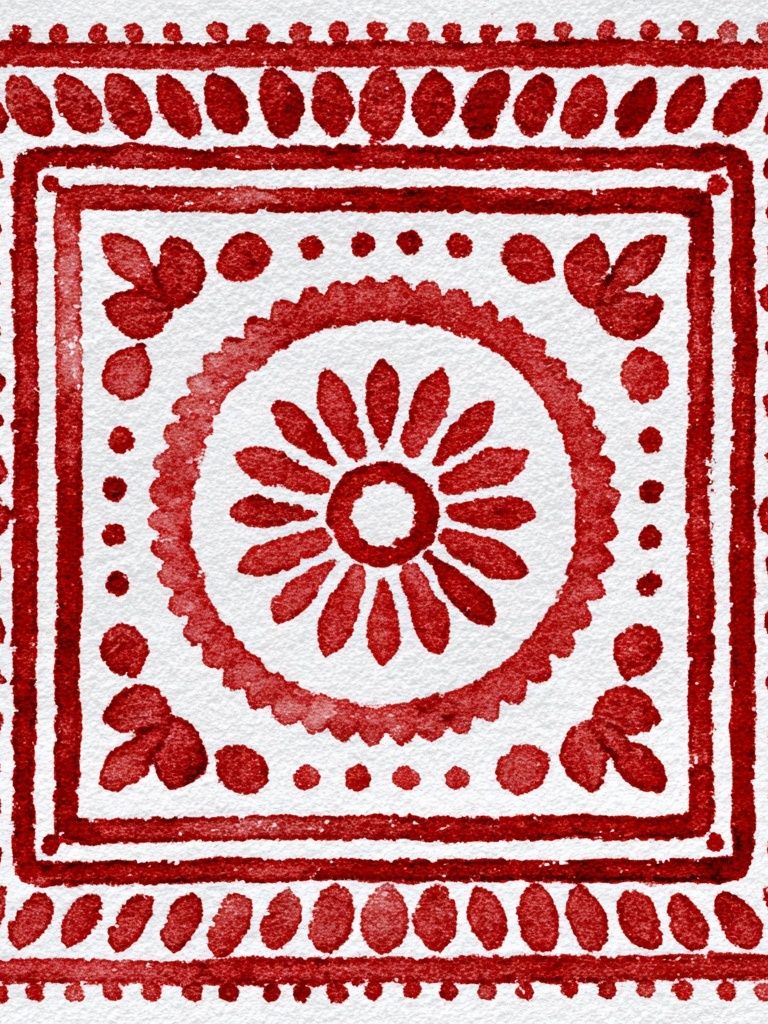
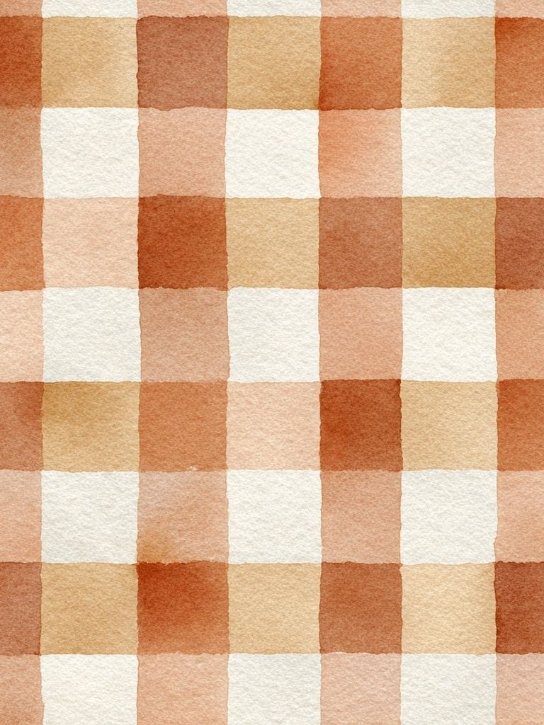
If your walls are white, choose prints with at least one mid-tone so the arrangement does not wash out. If your walls are warmer — off-white, greige, pale clay — use cream-based prints to create depth through subtle contrast. This is where minimal bohemian stripes can be especially useful: they keep the palette grounded while giving the eye a place to rest.
Mix Motifs for a Layered, Collected Feel
The easiest way to make boho posters feel intentional is to mix motifs from different families while keeping the palette related. Start with one anchor subject, then add supporting pieces. A practical mix for a set of four is: one botanical or floral pattern, one abstract shape-based print, one object or still-life piece, and one texture-driven design. That combination gives variation in scale and rhythm without visual conflict.
Line work, botanicals, celestial references, ceramics, woven textures, and vintage florals all pair well because they share an organic quality. A floral textile print from our floral bohemian art can sit comfortably beside ceramic forms in soft neutrals or a classic piece from fine art landscapes and botanicals. The key is to vary the density. If one print is intricate, place a quieter one next to it.
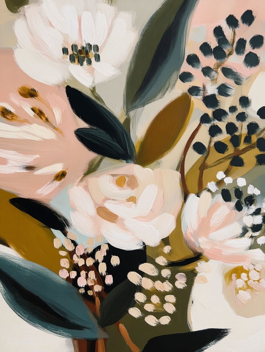
Try to avoid using four highly patterned pieces of equal intensity in one row. Instead, alternate "busy" and "calm". For example, pair an ornate botanical print with a simple stripe or abstract field. If you like stronger pattern, use two statement pieces and keep the other two more open. That creates the loose, curated pacing associated with boho posters.
How to Hang Boho Posters in Different Spaces

In the living room, hang the center of the arrangement around 145 cm from the floor — slightly lower if the wall sits directly above a sofa. Keep 5 to 8 cm between frames for a close, gallery-style composition. Above a 200 cm sofa, a total arrangement width of 120 to 160 cm usually looks balanced. Wider than that can feel detached unless the furniture below is substantial.
In the bedroom, boho posters look strongest when they span roughly two-thirds of the bed width. Over a 160 cm bed, aim for 100 to 110 cm total width if using two or three frames. If you prefer a softer effect, offset the arrangement instead of centering it perfectly — especially effective with dried branch and ceramic artwork or other gentle still-life subjects.
Hallways and reading corners benefit from smaller groupings. Use two 30x40 cm prints stacked vertically, or one 50x70 cm piece paired with a small shelf and a woven wall basket. In narrow spaces, leave more breathing room — closer to 8 to 10 cm between frames — so the wall does not feel cramped.
Frames, Finishes and Textures That Elevate the Look
Frames matter as much as the prints. Natural oak, walnut, ash, and light wood finishes suit boho interiors best because they echo the materials already present in rugs, baskets, stools, and woven lighting. Black frames can work, but they give a sharper edge. Use them sparingly — usually as one accent within a mostly wood-toned arrangement.

Matting adds calm. A white or warm off-white mount of 4 to 6 cm can make a detailed floral or patterned piece feel more breathable. Floating mounts also work well with airy designs, while edge-to-edge framing suits bolder textile-inspired imagery. If you want more texture, combine framed art with a nearby rattan mirror, a rough plaster wall, or a shelf styled with ceramics and dried stems.
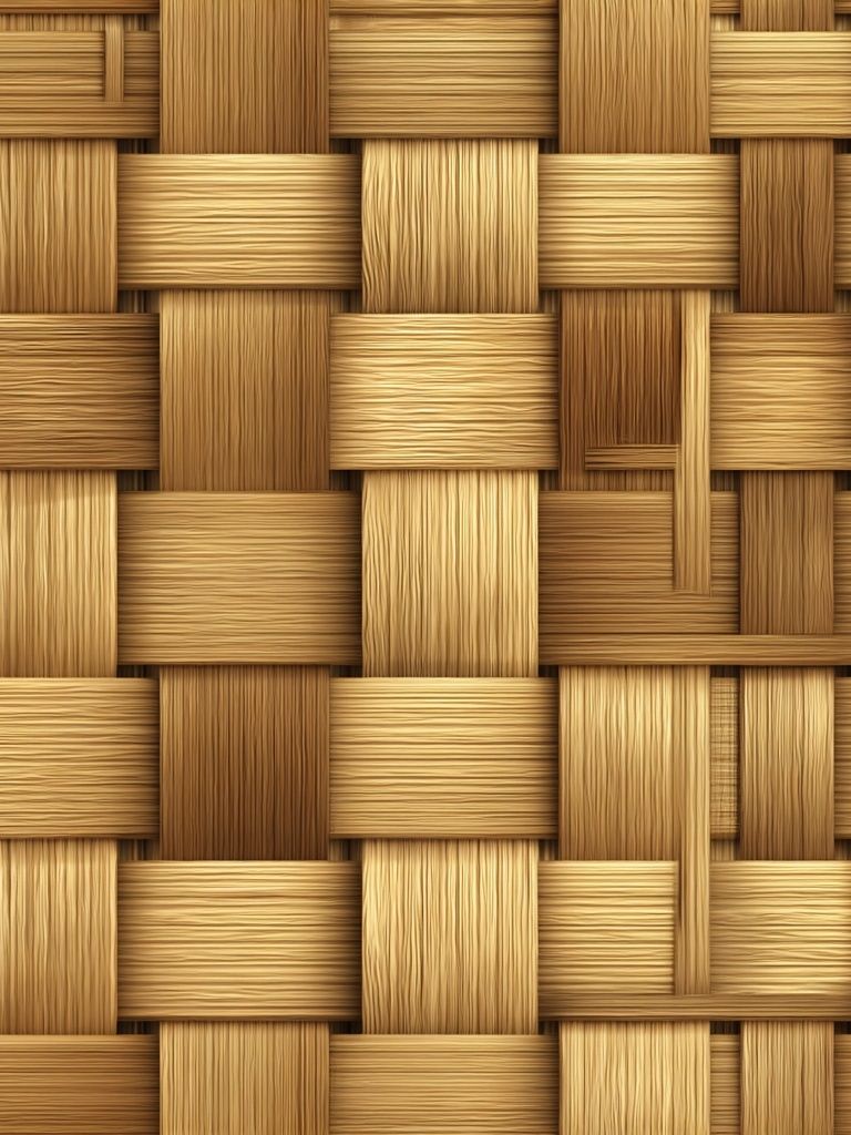
This is also where product choice becomes practical. Texture-forward designs such as woven bamboo-inspired wall art or vintage pattern pieces like Marigold by William Morris gain warmth from wood frames rather than gloss-heavy finishes. The softer the finish, the more cohesive the wall will feel.
Easy Styling Ideas for a Cohesive Boho Wall
The best boho walls include at least one non-art element nearby. That might be a mirror, a slim oak shelf, a hanging textile, or a ceramic lamp under the arrangement. The layered effect comes from combining flat surfaces with tactile ones. If every element is framed and rectangular, the result can feel too formal.
Use odd numbers when possible — 3 or 5 pieces are easier to balance organically than 4 in a rigid grid. For a casual gallery wall, start with the largest piece slightly off-center, then build outward with smaller works. Keep the outer edges irregular by 10 to 20 cm so the arrangement feels collected rather than boxed in.

If you are styling a shelf wall, lean one medium print at the back, overlap a smaller one by 3 to 5 cm, and add a vase or candlestick in front. This works especially well with ceramic-themed bohemian prints and vintage vine and leaf patterns. The mix of object, print, and texture is what gives the wall depth.
Shop the Look: Simple Ways to Build Your Boho Wall
If you are building from scratch, start with two versatile pieces and one accent. One safe formula is a texture print, a botanical pattern, and a floral or ceramic subject. That gives you enough variation to feel layered while staying within a warm, natural palette. Add a fourth piece only if the wall is wide enough or the room needs more visual weight.
A strong starter mix is one calm stripe or texture, one vintage botanical, one earthy still life, and one richer patterned print. That is why collections such as our bohemian wall art selection pair so easily with the botanical collection and selected works from our fine art prints. The materials and colors speak the same language even when the subjects differ.
Final thoughts
Effortless styling is usually structured behind the scenes. Keep your boho posters within a warm, natural palette, vary the motif density, and use wood frames or tactile accents to soften the overall look. When the wall includes a balance of calm space, pattern, and texture, it reads as collected rather than crowded.
The most successful boho posters are not necessarily the boldest ones. They are the pieces that connect with the room's materials — linen, oak, cane, wool, clay — and make the whole space feel warmer by a few degrees.
Frequently Asked Questions
What frame color works best for boho wall art?
Natural oak, walnut, and ash are the safest choices. If your room has darker wood furniture, medium walnut usually creates the most cohesive transition.
Can I mix boho posters with minimalist art?
Yes — keep the palette connected. A good ratio is two organic, detailed pieces for every one simple minimalist print.
What size should I choose for a small reading corner?
One 40x50 cm or 50x70 cm print is often enough. If you want a pair, use two 30x40 cm frames stacked vertically.
Should all the frames match in a boho gallery wall?
No. Matching tones work better than identical frames — for example, two oak frames, one walnut frame, and one light wood frame in similar warmth.
How do I hang a boho arrangement without damaging the wall?
For lightweight frames, use quality picture strips rated for the frame weight. For larger pieces above beds or sofas, wall hooks with proper anchors are more secure.