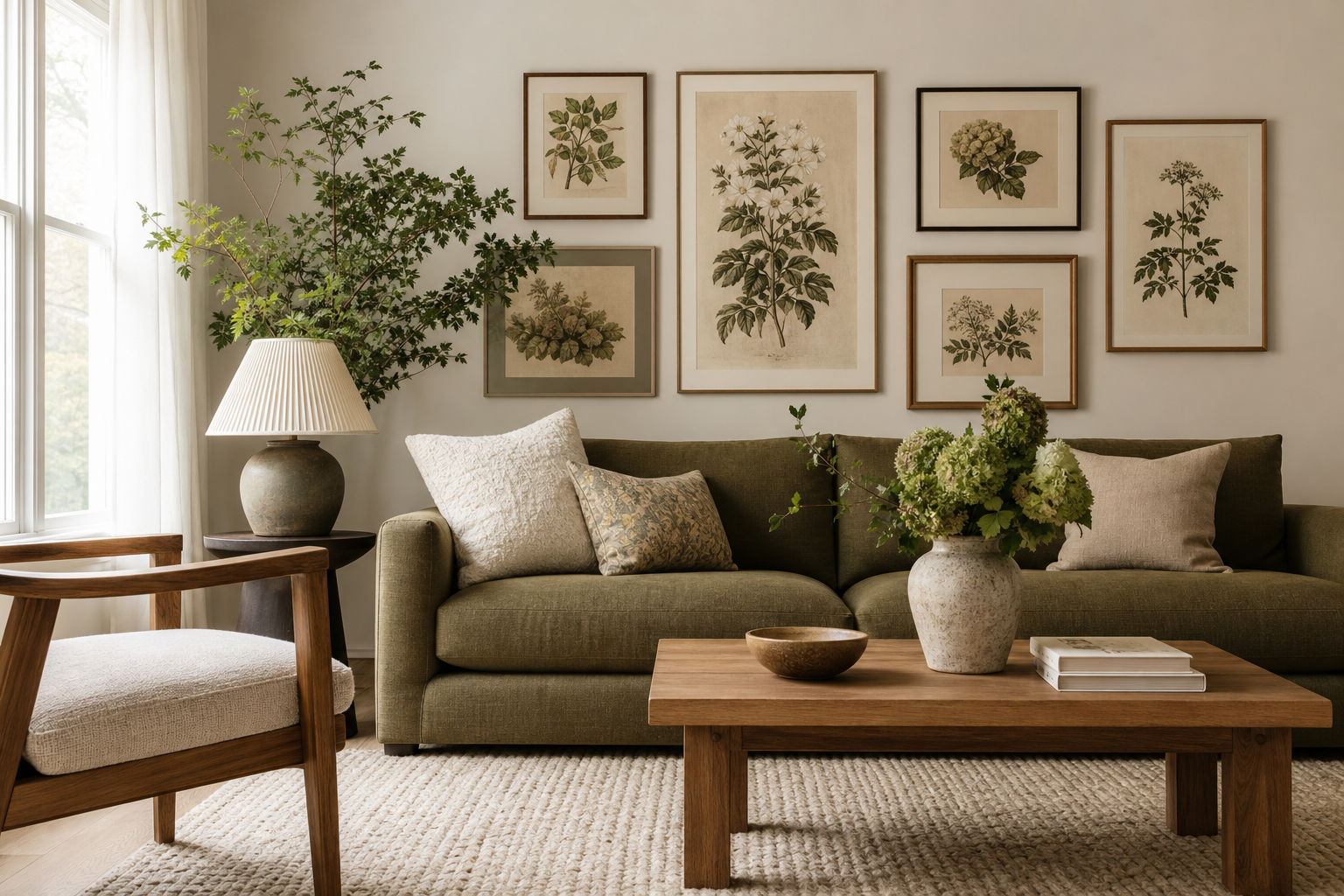
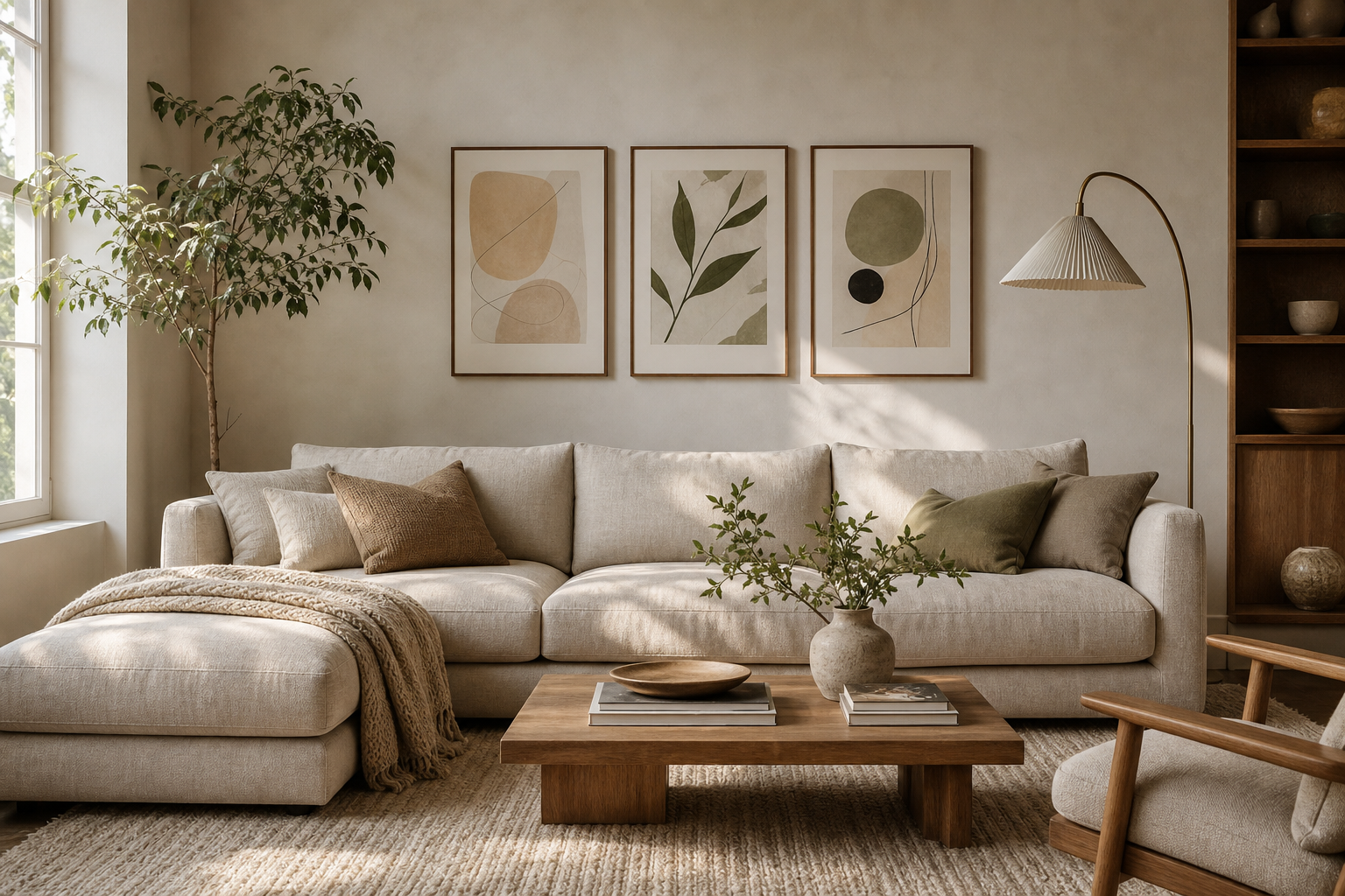
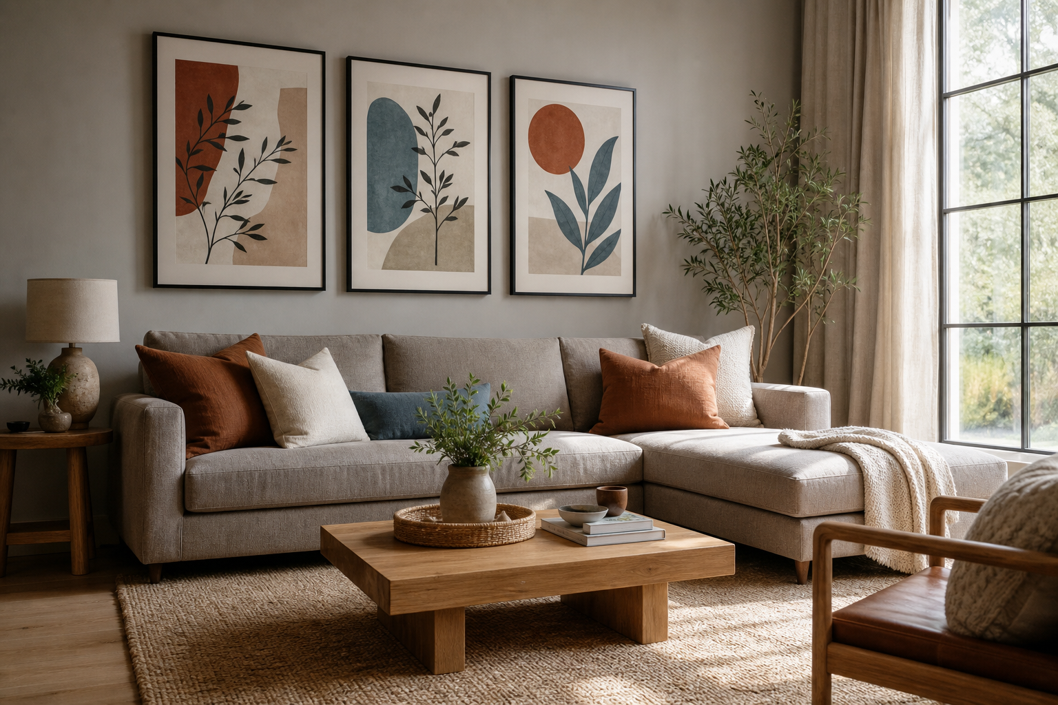
A blank beige background is one of the easiest starting points in interior styling because it already carries warmth. Unlike stark white, beige softens contrast, hides minor wall imperfections better, and works with both cool and warm materials — from pale oak and linen to black metal and dark walnut. That makes it useful in modern apartments, classic townhouses, and pared-back minimalist rooms alike.
The main advantage of a blank beige background is flexibility. It can support tonal styling with ivory, sand, and taupe, or it can take stronger accents like forest green, rust, or matte black without looking harsh. If you want art that keeps that calm mood intact, start with pieces from our Minimalist collection or browse softer tonal work in our Abstract art prints.
Why a Blank Beige Background Works So Well
Beige reflects light in a gentler way than pure white. In north-facing rooms, it prevents the space from feeling cold; in sun-filled rooms, it stops glare from becoming too sharp. A blank beige background also makes natural materials read richer — oak looks warmer, boucle feels denser, and stone surfaces gain more depth.
Another reason beige works is that it sits comfortably between styles. Clean-lined interiors benefit from its restraint, while more decorative spaces use it as a quiet pause between wood grains, textiles, and shaped furniture. In practical terms, beige is especially strong when 60% to 70% of the room is neutral and the remaining 30% to 40% comes from art, lighting, and smaller accents.
Choosing Art That Brings It to Life
A beige wall needs art with enough definition to create shape. That does not always mean bold color. It can be tonal photography, layered abstract work, or fine art with visible brush movement. The key is contrast in value, texture, or subject matter, so the wall feels intentional rather than faded.
For a refined tonal scheme, choose prints with cream, warm white, stone, or dusty gray areas, then add one darker element through the frame or nearby furniture. Pieces like White Cream Texture Poster and Textured White Abstract Poster work well because they keep the palette quiet while still giving the eye something to read.
If you want more movement, look for fluid shapes, washed pigment, or atmospheric imagery. A blank beige background handles soft-edged compositions particularly well because there is no jarring switch between wall tone and artwork. Our Blush Watercolor Abstract Poster is a good example of how a little blush can warm the wall without taking over the room.

Subject choice matters too. Landscapes, water studies, curtain scenes, and minimal textures tend to suit beige better than high-saturation graphics because they echo the wall's softness. If you prefer traditional art, browse Fine Art prints for pieces with natural light, muted greens, and soft skies.




Best Color Pairings for Warm, Calm Spaces
The strongest beige rooms usually rely on three supporting shades. A reliable formula is one deeper grounding tone, one mid-tone natural color, and one crisp accent. For example: chocolate brown, sage green, and black. This keeps the room layered without making it busy.
Brown is the easiest partner. Walnut frames, cognac leather, and dark wood side tables make a beige wall feel finished. Green adds freshness — especially olive, eucalyptus, or muted moss. Black should be used sparingly, often no more than 10% of visible accents, through lamp bases, thin frames, or a single sculptural object. That small amount of dark contrast prevents beige from drifting into monotony.
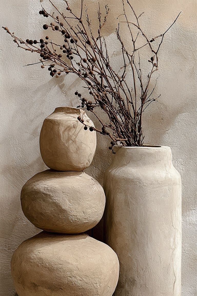
Rust, terracotta, and clay also work well when you want a warmer look. If your room already has woven materials, textured linens, or handmade ceramics, explore our Bohemian wall art for pieces that bring subtle earth tones into the mix. Prints such as Ceramic Vases with Dried Branches can echo the palette of cushions, throws, or tabletop decor without introducing visual clutter.
Sizing, Spacing, and Placement Tips
On a blank beige background, scale matters more than people expect. Small art on a large neutral wall can look lost. Above a sofa that is 200 to 240 cm wide, aim for artwork or a grouped arrangement that spans roughly 60% to 75% of the furniture width. That usually means one piece around 100 x 140 cm, two pieces at 50 x 70 cm each, or a grid built from 40 x 50 cm frames.
Spacing should stay tight enough to read as one composition. For pairs and gallery walls, leave 5 to 8 cm between frames in smaller rooms and up to 10 cm in larger ones. Hang the center of the arrangement around 145 cm from the floor, then adjust slightly if the room has unusually low seating or very tall ceilings.
A single oversized work is often the cleanest solution when the wall itself is the feature. A diptych works well for long walls, especially in bedrooms above a 160 cm or 180 cm bed. If you prefer a more layered arrangement, combine different orientations but keep either the frame color or the tonal range consistent. That is where textured minimal pieces from our Minimalist art prints and softly atmospheric pieces from our Photography collection pair especially well.
Framing and Texture Choices That Add Contrast
Frame choice determines whether beige feels polished or sleepy. Oak frames give the most seamless, warm result. Black frames create the sharpest definition and suit more modern rooms. Brushed gold can work, but only when the rest of the room includes similar warm metal notes — for example, brass sconces or cabinet handles.
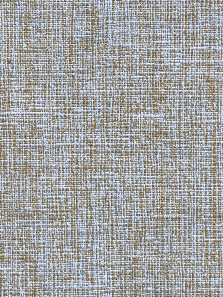
Texture is just as important as color. A blank beige background comes alive when the art includes visible grain, brushwork, fabric-like surfaces, or stone-inspired patterns. That is why pieces like Textured Fabric — Minimalist Print and Textured Concrete Wall — Minimalist Print are effective on neutral walls: they add structure without relying on loud color.

If the room already has many soft surfaces, choose a cleaner frame profile to avoid everything blurring together. If the room is hard-edged — stone floor, metal table, angular joinery — use art with visible softness in the image itself. That balance is what keeps beige sophisticated.
How to Style Beige in Different Rooms
In living rooms, beige walls benefit from a clear focal point. Use one large piece above the sofa or a balanced pair, then repeat one tone from the art in cushions or a rug border. A beige wall behind a console can also carry a vertical arrangement of two 50 x 70 cm prints if the room needs height.
In bedrooms, the best approach is usually quieter. Choose low-contrast imagery with cream, taupe, soft blue-gray, or muted green, and keep frames light oak or thin black. Fine art and soft photography work particularly well here — pieces like Window with Sheer Curtain — Fine Art Print support a calm, restful mood without making the headboard wall feel empty.

Hallways need more rhythm because people move through them quickly. Three matching frames at 30 x 40 cm or 40 x 50 cm usually read better than one tiny piece. Home offices need slightly more contrast so the space does not become visually sleepy — try a print with stronger lines, a dark frame, or a more defined abstract composition.
If you want a room that feels warm but not flat, pair beige walls with natural-fiber decor and one or two works that have visible movement. A piece such as Woven Bamboo Texture Poster can be especially effective in hallways or studies where the architecture is simple and the wall needs a bit more tactile character.
Final Styling Tips for a Finished Look
A blank beige background works best when you treat it as a foundation, not an afterthought. Build in contrast through size, framing, and texture first, then use color accents with restraint. One well-scaled arrangement, one dark note, and one tactile material are often enough to make the wall feel complete.
Start with art that matches the room's light and furniture tone, then refine from there. If the space is soft and tonal, stay within cream, sand, blush, and muted green. If the room needs definition, introduce black frames, darker wood, or stronger abstract shapes. Beige is forgiving — but the best results come from deliberate choices, not just safe ones.
Frequently Asked Questions
What frame color is safest for a beige wall?
Light oak is the most versatile because it keeps the warmth of beige intact. Slim black is the next best option when you want sharper contrast.
Can I mix warm and cool tones on a blank beige background?
Yes — keep one side dominant. If your beige leans warm, use cool accents sparingly through soft gray-blue or sage rather than bright icy tones.
What paper finish looks best in a calm beige interior?
Matte finishes usually suit beige interiors better than glossy ones because they reduce glare and make texture more visible. They also look more consistent in daylight and lamplight.
How far above a headboard should I hang art?
Leave 15 to 25 cm between the top of the headboard and the bottom of the frame. That keeps the composition connected to the bed rather than floating too high.
What decor pairs well with beige walls besides art?
Try linen curtains, wool rugs, travertine or ceramic accessories, and wood in either pale oak or walnut. These materials add depth without competing with the wall color.