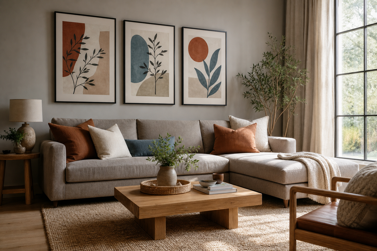
Color matching wall art starts before you look at a single print. The strongest choices come from the room you already have: wall color, sofa fabric, wood tone, rug pattern, metal finishes, and even the light coming through the window at 9 a.m. versus 6 p.m. When the artwork repeats or responds to those details, the room feels finished rather than decorated in layers that do not speak to each other.
Start with the room’s existing palette
Read the room in three parts: dominant color, secondary color, and accent color. In most interiors, the dominant color covers about 60% of what you see — walls, large rugs, big upholstered pieces. The secondary color usually sits around 30% — curtains, side chairs, bedding, cabinetry. The last 10% is where accents live — cushions, ceramics, books, throws, and wall art. That simple ratio helps you decide whether your print should support the room quietly or add a sharper note.
If your living room has beige walls, a taupe sofa, walnut wood, and black metal lighting, your palette is already warmer and more grounded than it may first appear. A print with sand, cream, charcoal, and a small amount of rust will feel integrated. A bright icy blue may still work, but only if that cool note appears somewhere else — perhaps in glassware, a patterned rug, or a vase. This is the practical core of color matching wall art: identify what is already repeated, then choose art that either echoes it or intentionally offsets it.
A good shortcut is to take a phone photo of the room and blur it slightly. When details disappear, the main color blocks become obvious. That makes it easier to compare pieces from our Abstract collection or Minimalist art prints without getting distracted by subject matter first.
Decide whether your art should blend or stand out
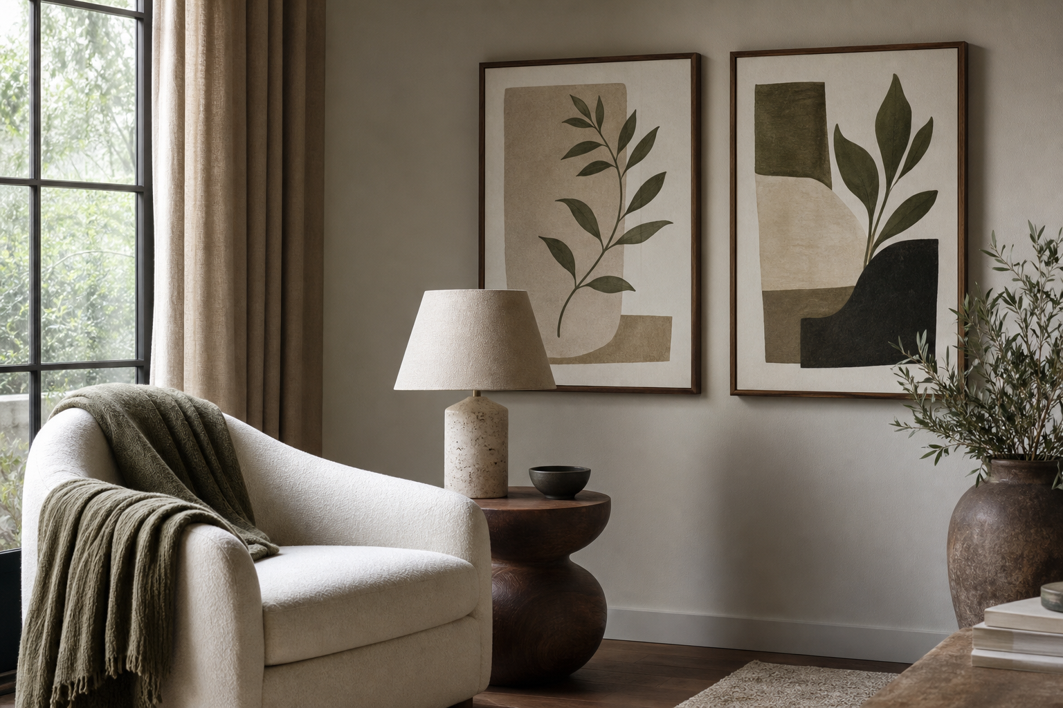
There are two reliable directions. The first is tonal matching: the artwork shares the room’s main shades for a calm, cohesive effect. The second is contrast: the art introduces a stronger or less-used color so it becomes the focal point. Neither is better — the right choice depends on how much visual energy the room already has.
For a quieter scheme, keep at least 70% of the print within colors already present in the room. In a soft neutral bedroom, that might mean ivory, mushroom, warm gray, and faded clay. Prints like Blush Watercolor Abstract work well because they add movement without disturbing the palette.

For contrast, choose one art color that is 2–3 steps stronger than the room around it. A largely neutral interior can handle a deep teal, ochre, or oxblood accent on the wall — especially if the rest of the room is low pattern. In a space with beige upholstery and black accents, Yin Yang Teal Abstract creates definition because the teal pushes forward while black lines connect back to existing metal details. This is still color matching wall art — just through controlled contrast rather than direct repetition.
Use color temperature to set the mood
Warm colors — terracotta, caramel, blush, ochre, muted red — make a room feel more intimate. Cool colors — slate, teal, blue-gray, sage, icy white — create calm and visual distance. The direction of natural light affects how those temperatures read. North-facing rooms often flatten warm neutrals and make cool colors look sharper. South-facing rooms intensify creams, tans, and reds.
That means a print should be chosen for the room’s light, not only its sofa. In a cool, shadowed room, warm-toned wall art can restore balance. In a sunny room with honey wood and cream plaster walls, cool artwork may prevent everything from blending into one warm wash. If you are styling a calm office or bedroom, our Fine Art collection and neutral minimalist prints are useful starting points because they often rely on restrained temperature shifts rather than loud color blocks.



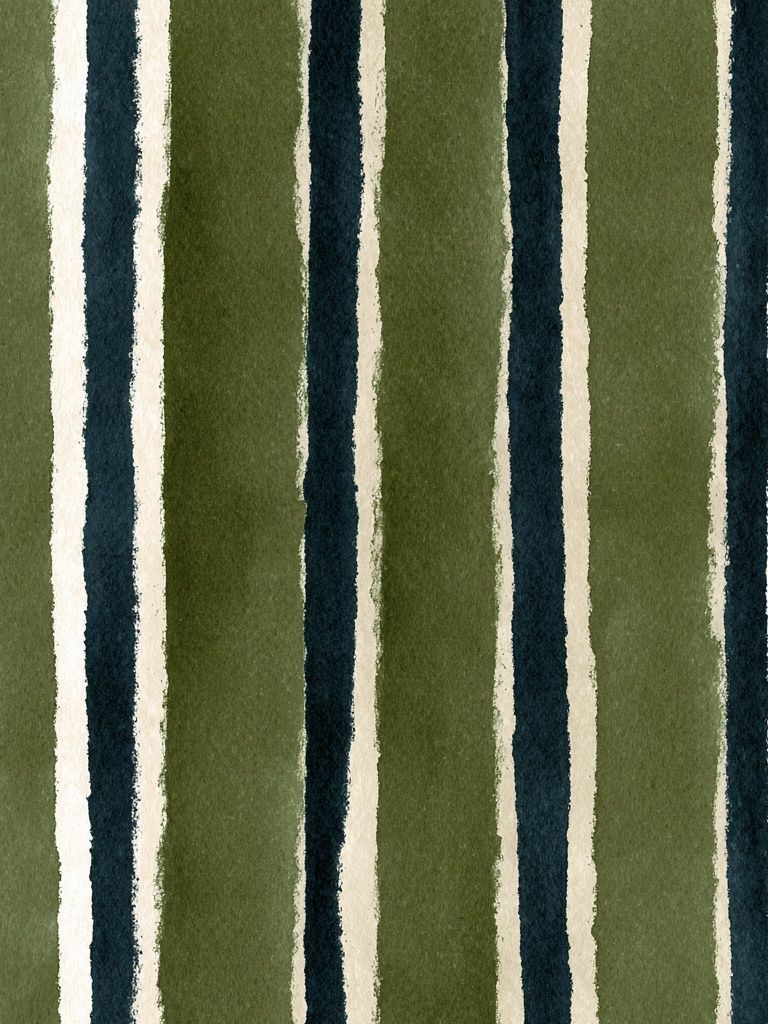
One useful test is to compare the artwork in morning and evening light. A creamy off-white print can turn yellow under warm bulbs. A blue-gray piece can look almost silver in daylight and flat at night. If your room uses 2700K bulbs, warm art generally reads richer; with 4000K lighting, cooler art keeps its edge better.
Choose frames and mounts that support the palette
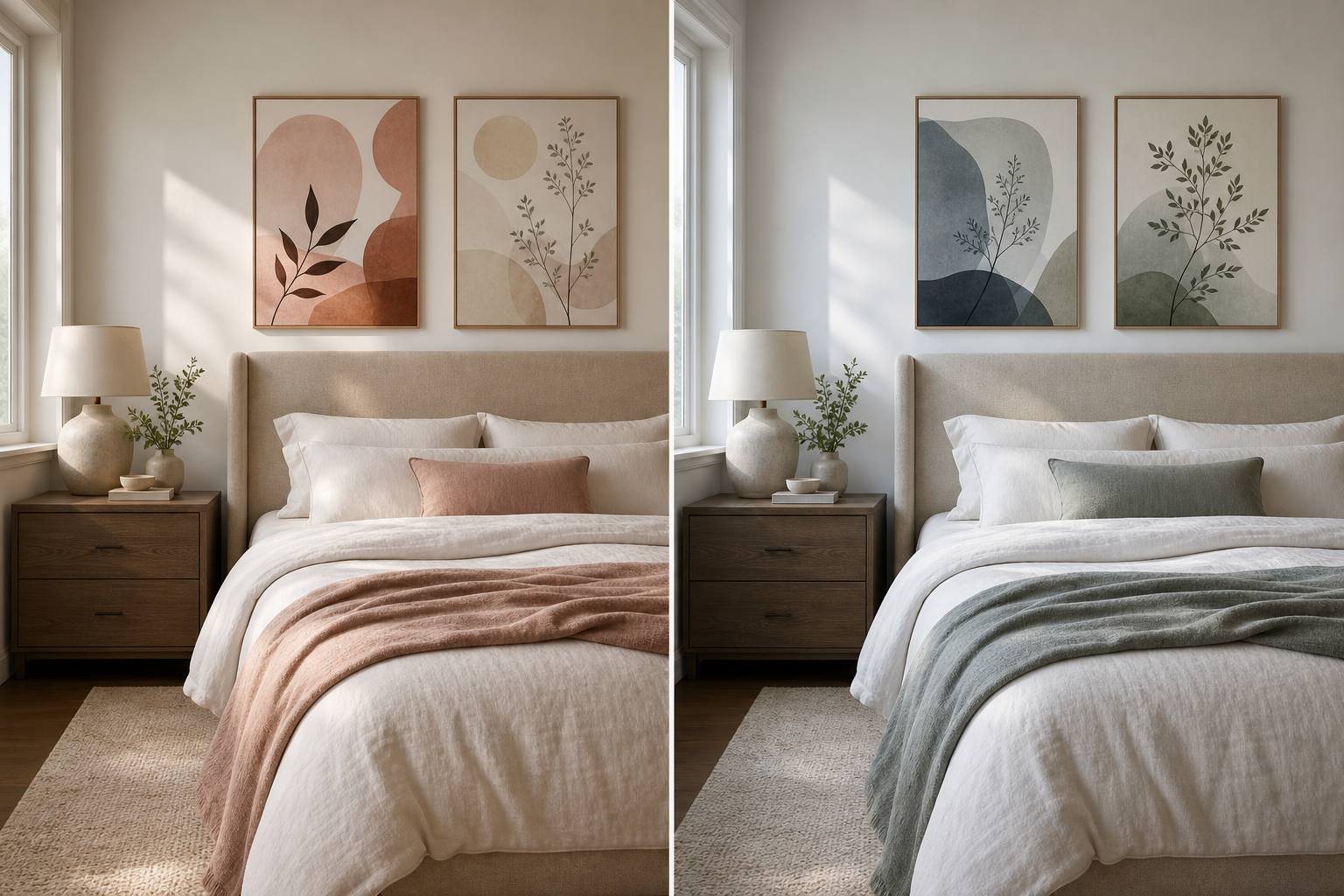
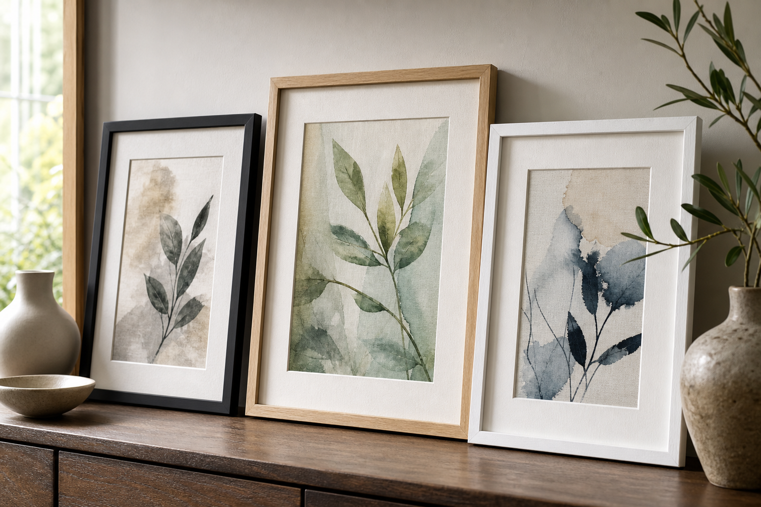
Frames do more color work than most people expect. Black frames increase contrast and define edges. Oak frames soften a print and connect it to wood flooring, shelves, or furniture. White frames reduce visual weight and suit pale walls or airy interiors. A mount can also shift the reading of the artwork: a wide white mat gives breathing space and makes saturated colors feel more curated.
If the art already contains strong contrast, keep the frame simple. A busy piece in a heavy ornate frame often feels louder by 20–30% than intended. If the print is quiet and textural, a darker frame can give it enough presence to hold a larger wall. For clean, tonal rooms, pieces such as Elegant White Fabric or White Cream Texture pair especially well with white, natural oak, or slim black profiles.

A frame should also match the room’s finish language. If you have brushed black hardware, matte black frames will feel deliberate. If the room is full of warm oak, rattan, and linen, try natural wood with off-white mounts. For more earthy spaces, our Bohemian wall art often pairs naturally with oak and walnut frames because the palettes lean terracotta, sand, olive, and clay.
Match wall art to specific rooms and styles
Living rooms usually benefit from one of two strategies: either pull one or two colors directly from the rug and cushions, or use one stronger art color to anchor the seating area. Above a 200 cm sofa, a single large piece around 70 x 100 cm or a pair of 50 x 70 cm prints usually feels balanced. Abstract works from our contemporary abstract prints are often the easiest fit because they can bridge several materials at once.
Bedrooms need lower visual tension. Keep contrast softer than in the living room and stay closer to the bedding, curtains, and headboard tones. Cream, dusty rose, pale sage, greige, and blue-gray tend to work well. If the room is minimalist or Scandinavian, Textured Waves — Minimalist Print or related neutral pieces keep the mood restful.
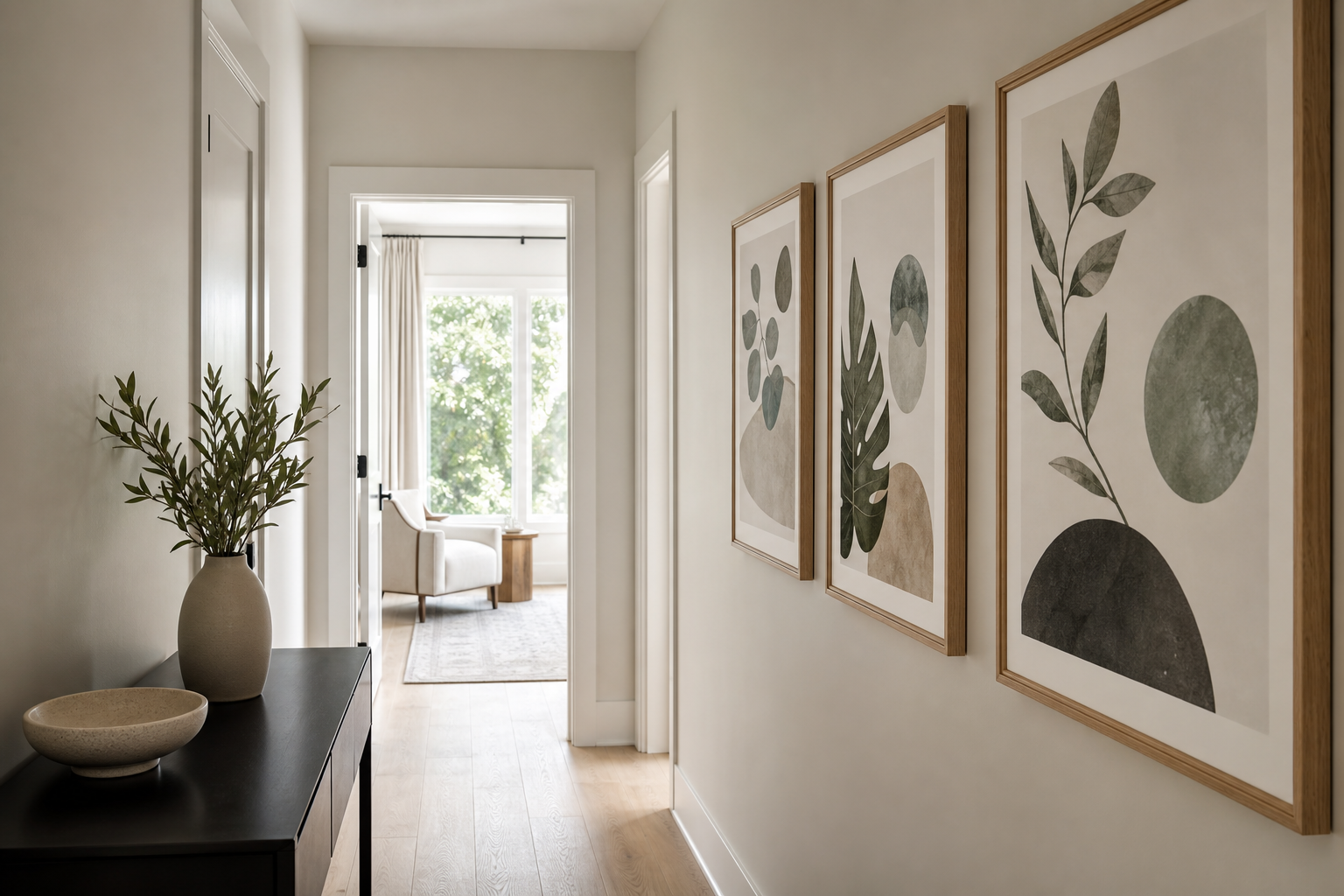
Kitchens can handle more pattern and more saturation because cabinetry and tile already create structure. Repeating one cabinet tone in the artwork is usually enough. If the kitchen has terracotta tile, brass hardware, or open wood shelving, warmer boho and abstract pieces make sense. Hallways, by contrast, often need brightness. Pale backgrounds, high contrast frames, and clearer shapes help art read well in narrow spaces with inconsistent light.
Style matters too. Minimal interiors work best with restricted palettes — often 2 to 4 colors total. Bohemian rooms can carry layered warm tones and pattern mixing, especially if the materials are natural. Mid-century rooms often suit mustard, teal, rust, walnut, and cream. Fine art reproductions can soften more traditional spaces where the architecture already has detail.
Common color-matching mistakes to avoid
The first mistake is overmatching. If your sofa, walls, rug, cushions, and artwork are all the same beige, the room can lose depth. You need variation in value — light, medium, and dark — even inside a neutral scheme. A room built from cream, taupe, oatmeal, and black usually feels stronger than one built from four nearly identical shades of warm off-white.
The second mistake is ignoring undertones. Gray can lean blue, green, violet, or brown. White can lean crisp, creamy, pink, or gray. Wood can read yellow, red, or ash. When artwork fights those undertones, it looks wrong even if the main color seems close. That is why a cool gray print can feel harsh against creamy walls, while a soft greige piece feels natural.
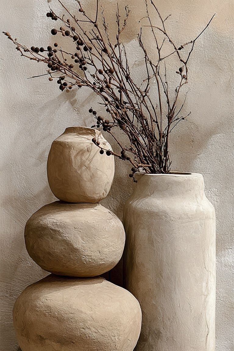
The third mistake is forgetting surrounding texture. A glossy print beside nubby linen, matte plaster, bouclé, and raw oak may look disconnected. Textural art often solves this. Pieces like Textured White Abstract or woven, organic motifs from the boho range can connect better to tactile interiors than a slick high-saturation image would.
Final checks before you buy
Before you commit, compare the print to at least three fixed room elements: wall paint, the largest upholstered piece, and one hard finish such as wood, stone, or metal. If the artwork only matches a cushion that may be replaced next season, it is not anchored strongly enough. Viewing the piece on your phone beside those materials is helpful, but printed paint swatches and fabric samples are better.
Check scale and color together. A palette that looks subtle at 30 x 40 cm can dominate at 70 x 100 cm because the color field becomes much larger. If you are deciding between options, hang paper templates on the wall first and look from the main doorway and your usual seated position. A print should still make sense from 2.5 to 4 meters away.
Final thoughts
Good color matching wall art is less about finding a perfect one-to-one match and more about building a clear relationship between the print and the room. Repeat one or two existing shades, respect undertones, and decide early whether the art should calm the space or lead it.
When you treat wall art as part of the room’s full palette — not as the last item on the list — the result is more cohesive, more intentional, and easier to live with for years.