Why Black & White Never Goes Out of Style
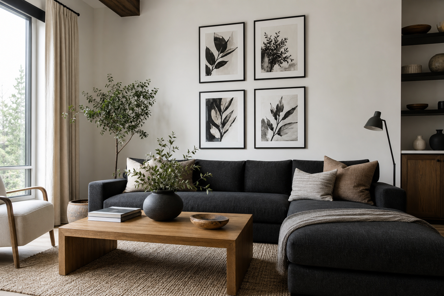
Black & white prints and posters work because they solve several styling problems at once. They add contrast to pale interiors, bring order to busy rooms, and stay relevant when furniture or accent colors change. A monochrome piece can sit comfortably beside walnut wood, chrome lighting, boucle upholstery, or painted walls in olive, rust, or navy without looking tied to one short-lived trend.
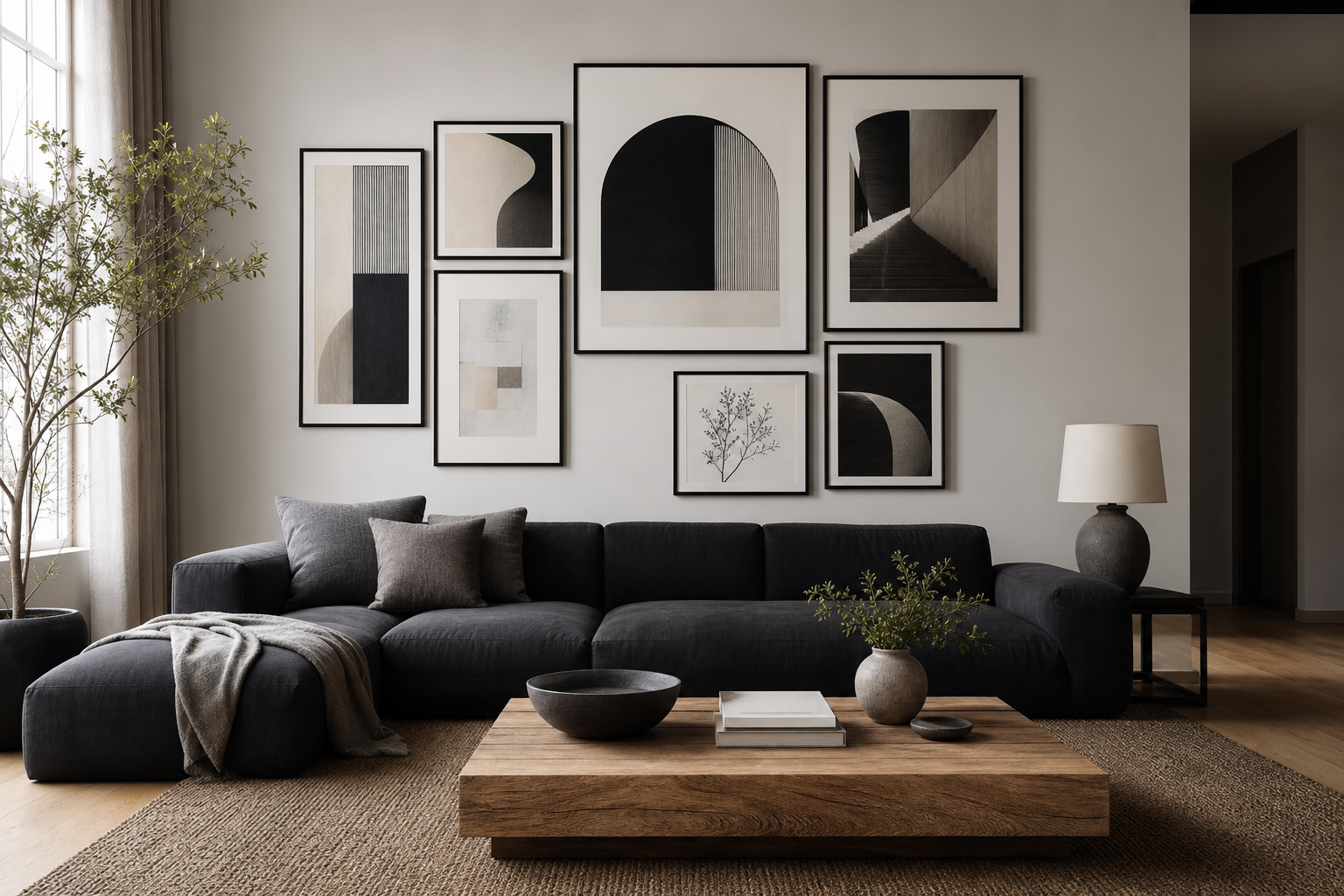
This flexibility is why monochrome art appears across our minimalist collection, black-and-white photography prints, and abstract wall art with strong contrast. The same black-and-white palette can read sharp and modern in a loft, restrained in a Scandinavian room, or collected and classic in a traditional hallway. If you want wall decor that still looks right five years from now, black & white prints and posters are one of the safest and most stylish choices.
A second reason they last is proportion. Black anchors a wall visually, while white gives the eye room to rest. That simple balance helps a room feel finished even when the furniture is minimal. In practical terms, a single 50 x 70 cm print can bring enough definition to a blank wall that would otherwise need several decorative objects to feel complete.
Choosing the Right Mood for Your Space
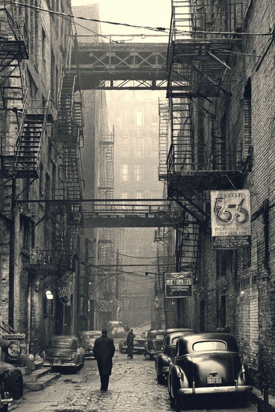
Not all monochrome art creates the same atmosphere. Black-and-white photography tends to feel grounded and observational. Architectural scenes, street photography, and landscape studies add structure and realism — useful in living rooms, entryways, and offices where you want the room to feel composed. A piece like Vintage Urban Alley brings depth through shadow and perspective, which is especially effective on narrow walls or above slim consoles.
Abstract monochrome work feels different. It is less about narrative and more about rhythm, movement, and texture. That makes it a strong fit for spaces where calm matters more than subject matter, such as bedrooms or reading corners. Soft tonal pieces from our abstract collection or tactile designs from minimal monochrome art can quiet a room without making it feel flat.

Line art and minimalist motifs are ideal when the room already has plenty of visual detail — patterned rugs, fluted cabinetry, open shelving, or sculptural lighting. They keep the wall refined instead of crowded. White Flower Silhouette is a good example of a lighter monochrome direction: crisp, airy, and easy to place in smaller bedrooms or dressing areas.

Portraits and vintage figures create more character. They suit spaces that need a touch of drama — darker dining rooms, masculine studies, or hallways with antique wood and brass. For that mood, our vintage print selection offers monochrome pieces with a more collected, editorial feel than purely minimalist art.
How to Pair Monochrome Prints with Color
Monochrome wall art is often most effective in rooms that are not monochrome at all. In a room with strong color — forest green walls, rust velvet, cobalt ceramics — black and white acts like a visual pause. It gives the eye one clear resting point and stops the palette from feeling overworked. If your sofa, rug, and cushions already carry three or four colors, choose art with 70 to 80 percent neutral space so the wall does not compete.
In neutral interiors, the job is different. There, black introduces definition. Beige, cream, oatmeal, and pale gray rooms often need at least one crisp note to avoid looking washed out. A monochrome print above a sofa or bed can do that more elegantly than adding another dark furniture piece. This is where textured works such as Textured White Abstract or Torn Paper Black and White perform well — they keep the palette soft while adding contrast.




Black & white prints and posters also bridge mixed materials. A room with oak, black steel, marble, and linen can feel disconnected if every piece has a different finish and temperature. Repeating monochrome art across two or three walls creates continuity. Even a small pair of 30 x 40 cm frames can echo black lighting, dark chair legs, or white curtains and make the whole room read as intentional.
Sizing, Spacing, and Placement Tips
Size matters more than most people think. Art that is too small is the main reason a wall looks unfinished. Above a sofa, aim for artwork that spans around 60 to 75 percent of the sofa width. For a 200 cm sofa, that means a total arrangement width of roughly 120 to 150 cm. You can reach that with one large 70 x 100 cm piece, two 50 x 70 cm frames side by side, or a tighter gallery wall.
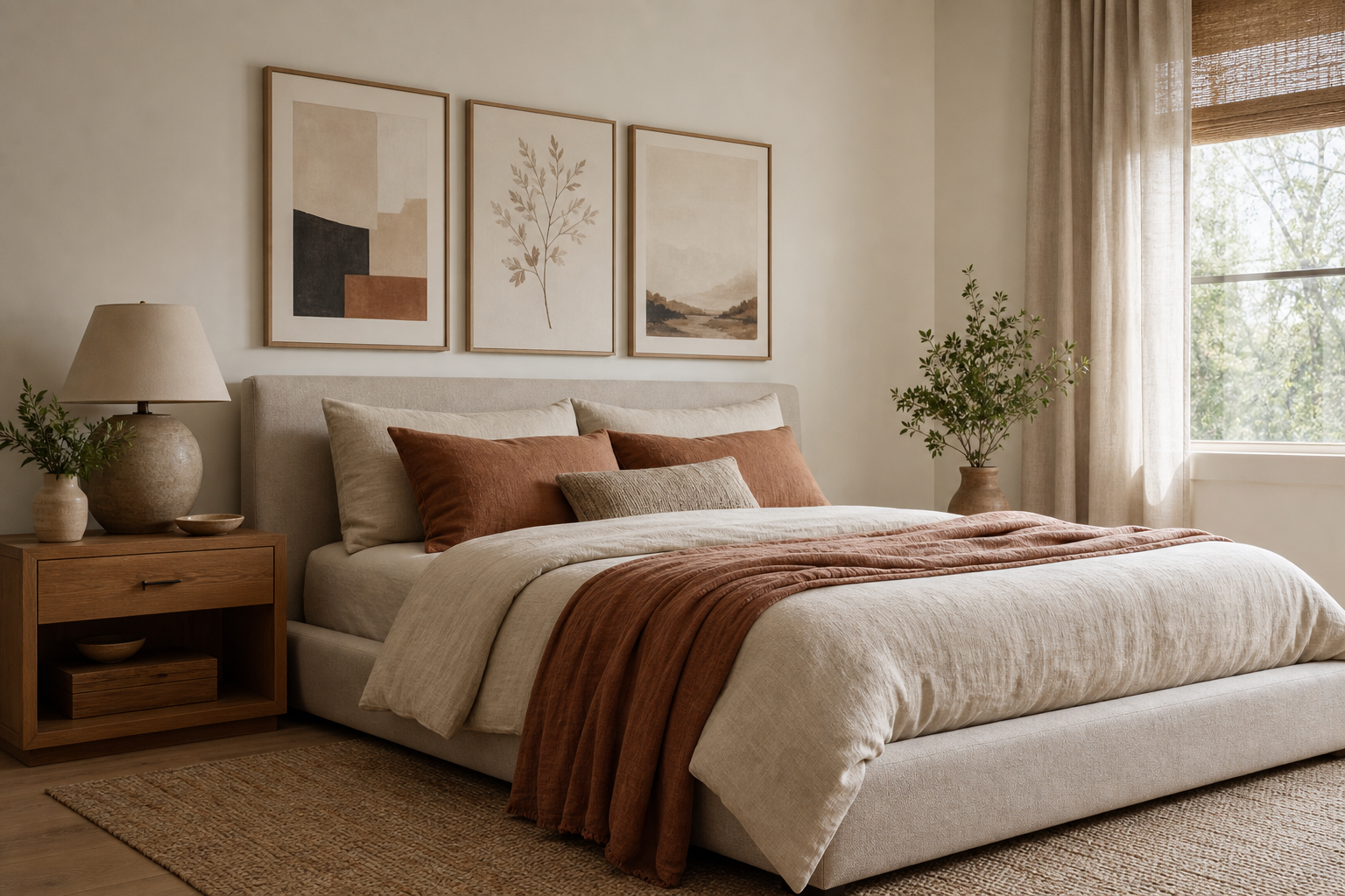
Above a bed, keep the composition slightly narrower — around 50 to 70 percent of the bed width. Over a queen bed, two 50 x 70 cm prints or one 70 x 100 cm print usually sit well. Hang the bottom edge about 15 to 25 cm above the headboard or furniture below so the art feels connected to it, not adrift.

For gallery walls, keep spacing consistent — 5 to 8 cm between smaller frames, 8 to 10 cm between larger ones. If all pieces are monochrome, you can mix subject matter more freely because the palette already unifies them. A snowflake study, an alley photograph, and a minimalist texture can sit together if the frames and margins match.

Entryways, kitchens, and home offices benefit from narrower formats. A single vertical print works well between a doorway and a mirror, while a pair of 30 x 40 cm frames can sharpen up the wall above a desk. If the wall is short on width but tall, choose vertical pieces from our photography category or fine art prints with quiet tonal detail rather than forcing a wide composition.
Framing Choices That Make a Difference
Frame finish changes the personality of monochrome art immediately. Black frames look cleaner and more graphic. They suit photography, line work, and higher-contrast abstract pieces. Oak or walnut frames soften the look and help black-and-white art sit more naturally with warm interiors, especially if the room includes wood flooring, cane, linen, or vintage furniture.
Mats are equally important. A white mat of 5 to 8 cm gives smaller pieces more presence and makes detailed work feel more gallery-like. This is useful for intricate imagery or vintage-inspired subjects such as Vintage Aviators Black-White. No mat creates a more contemporary, edge-to-edge effect and is often better for bold abstracts or close-cropped photography.

Glass finish also matters in bright rooms. If the wall faces large windows, acrylic or anti-reflective glazing can help darker monochrome prints stay readable throughout the day. Standard glass is often fine in hallways or bedrooms with softer light, but glare can wash out shadow detail in high-contrast pieces.
Styling Ideas for Every Room
In living rooms, go larger than feels comfortable at first. Monochrome art needs scale to create presence, especially above wide seating. A large black-and-white photograph or a set of two substantial abstracts can replace the need for extra shelves or cluttered accessories. If your room already has a lot of texture, choose simpler imagery; if the furniture is very plain, introduce a more atmospheric photographic subject.
Bedrooms benefit from softer monochrome choices. Think tonal textures, fabric studies, botanical silhouettes, or calm landscape-style compositions. Pieces like Elegant White Fabric or Window with Sheer Curtain keep the mood restful while still giving the wall definition.
Kitchens and dining nooks can carry sharper contrast. Black-and-white urban photography, vintage imagery, or architectural lines cut neatly through tiled surfaces, painted cabinets, and open shelving. In hallways, a sequence of two to four matching frames works better than one tiny print. Repetition brings order to transitional spaces.
Home offices respond well to art with structure. Minimalist geometry, city scenes, or focused photographic subjects can make a desk area feel more purposeful. If the room is small, a single vertical frame placed 15 to 20 cm above the desk is often enough. If the office is open-plan, repeating monochrome art on the adjacent wall helps define the workspace without adding visual noise.

Simple Ways to Shop Smarter
Start with one anchor piece, then build around it. That first artwork should set the tone — photographic, abstract, vintage, or minimalist. After that, add supporting pieces that share one common trait: palette, frame finish, subject, or level of contrast. You do not need exact matches. A collection feels cohesive when about 60 percent of the pieces share a clear visual language.
Mix formats carefully. One large horizontal print, one vertical piece, and two smaller supporting works usually create a stronger arrangement than four same-size frames. Vary scale, but keep frame color consistent if you want a polished result. If you prefer a more relaxed look, mix black and oak frames but limit yourself to two finishes.
Buy for the room, not just for the image. Measure the wall first, note the furniture width below, and decide whether you need one statement piece or a group. Then choose from categories that fit your interior style — photography for depth and realism, abstract designs for movement, or minimalist prints for calm simplicity. Black & white prints and posters are easiest to live with when they respond to the architecture and materials already in the room.

Final thoughts
The reason black & white prints and posters look effortless is simple: they bring contrast without chaos. They can sharpen a neutral room, steady a colorful one, and connect different materials across the space with very little risk of clashing.
Choose the mood first, scale the art properly, and frame it in a finish that suits the room. When those three decisions are right, monochrome wall art rarely feels temporary — it feels settled.
Frequently Asked Questions
What frame color is best for black-and-white art?
Black frames look crisp and modern, while oak or walnut frames add warmth. If your room has black metal accents, choose black; if it has more wood and linen, choose natural timber.
Can I mix monochrome prints with colored artwork?
Yes — use black-and-white pieces as the visual anchor, then add one or two colored works nearby. Keep at least one shared element, such as matching frames or similar subject matter.
Are matte finishes better than glossy for monochrome prints?
In most homes, matte is easier to live with because it reduces glare and keeps dark areas readable. Gloss can work for high-contrast photography, but it reflects more light.
How high should I hang black-and-white prints in a hallway?
Aim for the center of the artwork to sit around 145 to 150 cm from the floor. In a grouped arrangement, measure to the center of the whole composition rather than each frame.
What pairs well with black-and-white art in a warm neutral room?
Use textured materials like linen, boucle, oak, travertine, and matte ceramics. These soften the contrast and keep the space from feeling stark.