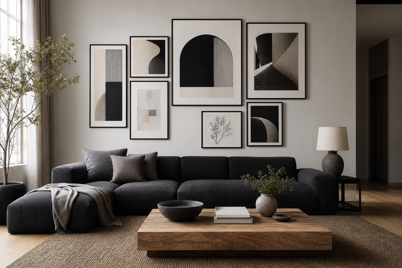
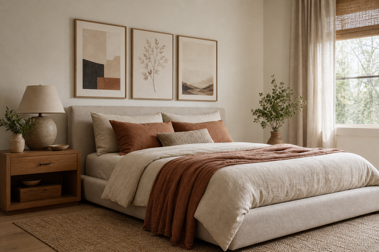
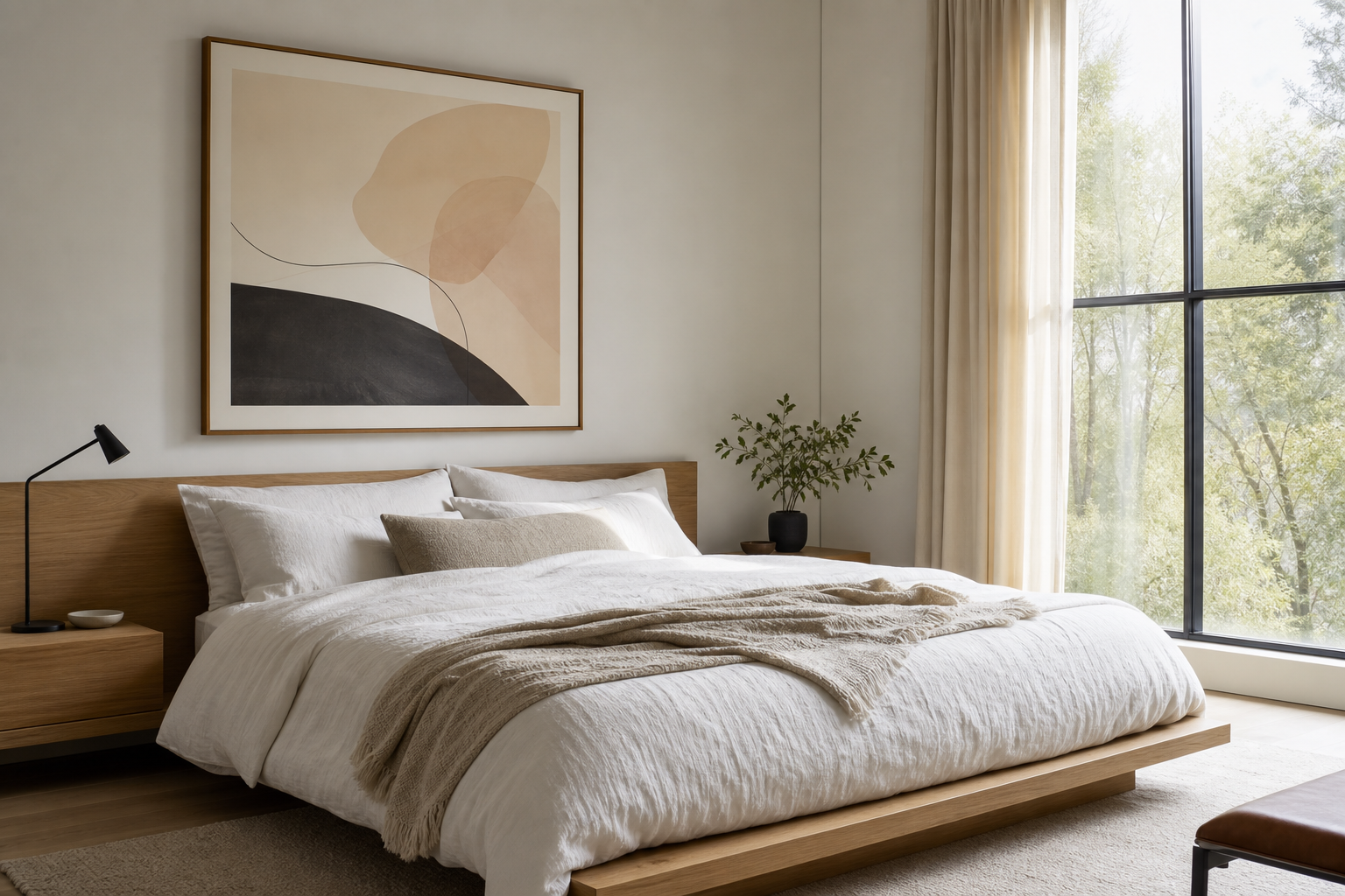
Black and white posters and prints stay relevant because they solve two design problems at once: they add contrast, and they reduce visual noise. In a room with soft neutrals, monochrome art creates definition. In a room with stronger colors — rust, forest green, navy, camel — it acts as a steadying element that keeps the scheme from feeling overworked. That flexibility is why black and white posters and prints work in entryways, bedrooms, offices, and living rooms with equal ease.
Why Black and White Works Every Time
Monochrome art feels timeless because it relies on form, shadow, and composition instead of trend-led color palettes. A strong black line on a white background reads clearly from across the room, even at smaller sizes like 30x40 cm. Larger formats — 50x70 cm and 70x100 cm — bring even more impact because the contrast remains crisp without needing bright pigment to carry the piece.
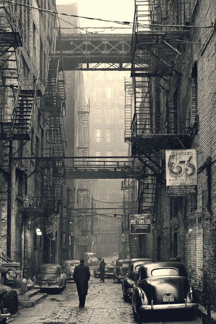
Another advantage is range. Black-and-white photography can feel refined and quiet, while graphic illustration can feel bold and modern. That means one palette can shift from classic to contemporary without clashing with your furniture. A vintage-inspired room can hold an old-world monochrome piece, while a cleaner space can lean into sharper photographic work such as Sleek Black Watch or a street scene like Vintage Urban Alley.
Monochrome also helps create cohesion between rooms. If your living room uses oak, black metal, and cream textiles, and your bedroom uses walnut, ivory, and grey linen, black-and-white wall art can connect both spaces without forcing them into the exact same style. That is one of the strongest reasons to build around black and white posters and prints when you want your home to feel edited rather than matched.
Choosing the Right Style of Print
The best style depends less on "what looks good" and more on what the room needs. Photography works well when you want depth, realism, and atmosphere. Architectural scenes, urban views, and close-up object photography suit offices, hallways, and modern living rooms because they add structure. If you prefer a cleaner, more graphic effect, illustration often reads better from a distance.
For a room that already has texture — boucle, linen, jute, ribbed wood — simple graphic pieces are often enough. A print with a strong silhouette or a clear subject creates presence without competing with the furnishings. That is where an illustration such as Black Wolf Among Sheep can work well in a study or a more characterful corner.

Animal imagery is another effective route if you want monochrome to feel less severe. A high-contrast animal portrait introduces movement and personality while still fitting a restrained palette. Pieces from our animal wall art collection can soften a minimal room, especially when paired with warm woods and off-white walls.

Typography and very text-led designs can work in some interiors, but in most rooms they date faster than photography, illustration, or vintage monochrome imagery. If your aim is longevity, choose art that relies on image composition rather than slogans. Vintage-style works such as Vintage Aviators Black-White or Vintage Linemen at Work bring history and character without locking the room into one design era.
How to Match Monochrome Art to Your Room
Minimalist rooms benefit from restraint. One large black-and-white piece above a sofa or bed usually looks stronger than three smaller pieces with busy compositions. Aim for one print around 60 to 75 percent of the furniture width below it. Above a 180 cm sofa, for example, wall art around 100 to 135 cm wide feels balanced.
Scandinavian spaces need softness as much as contrast. That means black-and-white art should be paired with pale woods, warm whites, and tactile fabrics. Choose subjects with open negative space rather than very dense imagery. Photography with mist, distance, or architectural simplicity tends to sit well in Scandi-inspired rooms, as do selected works from our black-and-white photography prints.
Industrial interiors can carry heavier contrast. Think black frames, exposed brick, darker walls, and stronger subject matter. A monochrome urban scene or a vintage mechanical image will hold its own in that setting. In a loft-style room, pieces like Classic Black Mustang can add weight without introducing color that fights with metal or concrete finishes.

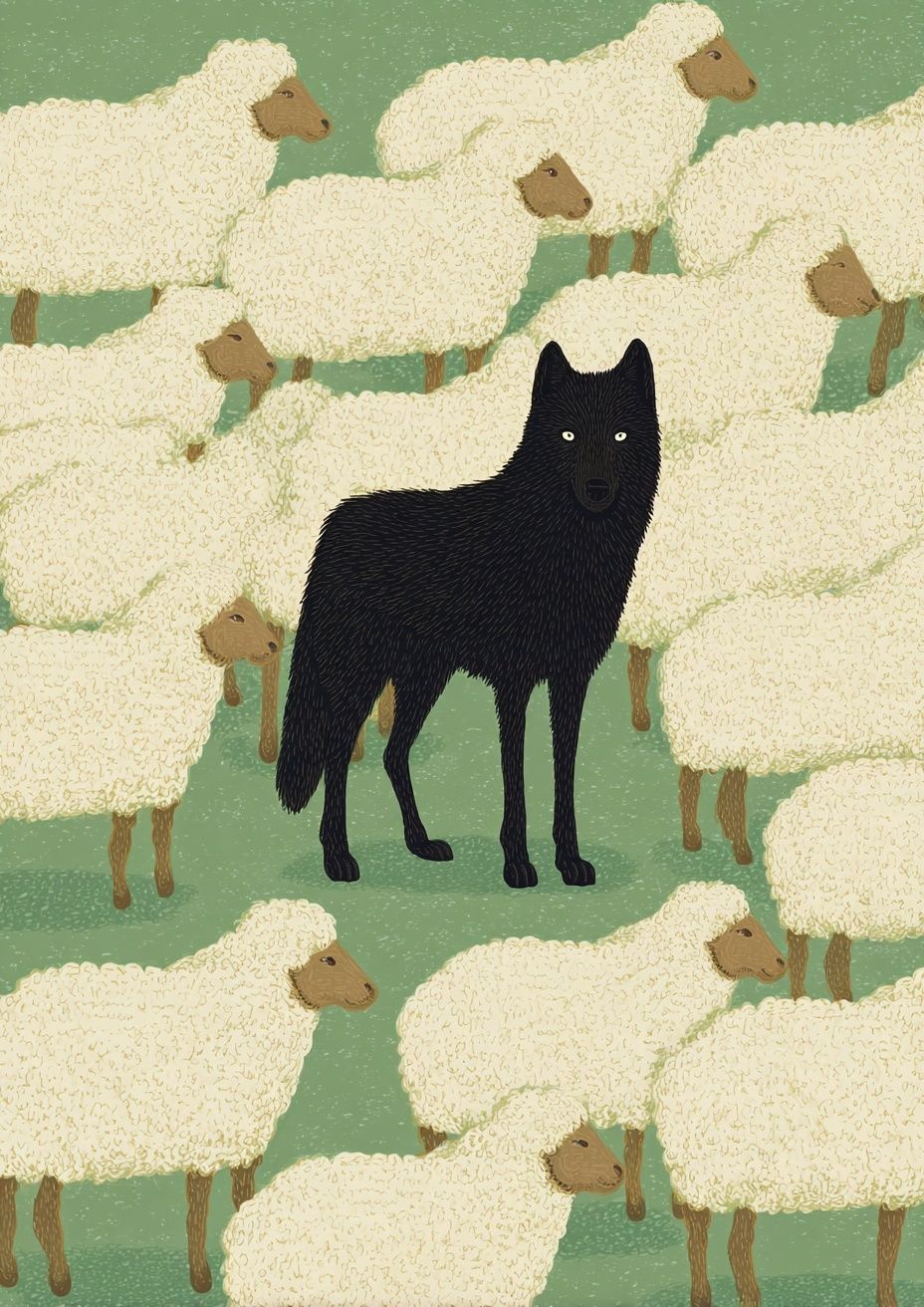

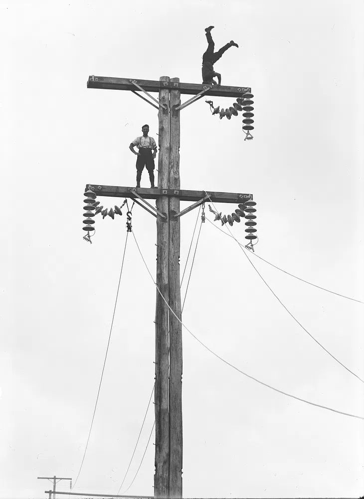
Contemporary spaces give you more freedom to mix categories. A clean room with sculptural furniture can take one photographic print, one animal study, and one vintage work if they share a common value range — deep black, soft grey, and plenty of white space. The easiest way to keep that mix intentional is to repeat one frame finish throughout the arrangement.

Sizing, Placement, and Framing Tips
Scale matters more in monochrome because contrast makes mistakes more visible. A print that is too small can look accidental. Over a console table 100 to 140 cm wide, choose a single 50x70 cm frame or a pair of 30x40 cm pieces. Over a king bed, a wide arrangement in the 100 to 140 cm total width range usually feels right. Leave 15 to 25 cm between furniture and the bottom of the frame so the art feels connected to the piece below it.
Hanging height is another frequent issue. The center of the artwork should sit around 145 to 150 cm from the floor in most homes. If the print is above furniture, adjust slightly lower so it relates to the room rather than floating too high. In gallery walls, keep gaps tight and consistent — 5 to 8 cm is usually enough.
Frame finish changes the mood. Black frames sharpen the contrast and suit graphic, urban, or contemporary work. Natural oak softens monochrome art and works better in bedrooms or Scandi spaces. White frames create a quieter effect but need enough wall contrast to avoid disappearing. If the print itself has dense dark areas, use a white mat mount to give the image more breathing room.

A single print works best when the subject is strong and the wall is narrow or already busy. A gallery wall works better on broad walls and in spaces that need rhythm, such as staircases, home offices, or long living rooms. For a first arrangement, use either two equal-size pieces side by side or four frames in a neat 2x2 grid before trying a more mixed layout.
Using Black and White to Create Mood
Black-and-white art is not automatically minimal or cold. The mood depends on image density, frame choice, and what sits around it. High-white compositions with fine line work feel calm and airy. Darker, richer imagery with deep shadows feels dramatic and cinematic. If you want a bedroom to feel restful, choose open compositions and softer greys. If you want a dining area or hallway to feel sharper, use stronger black shapes and tighter framing.
Subject matter matters too. Animal portraits can feel intimate and expressive. Urban photography brings edge and movement. Vintage monochrome prints often create a collected, layered mood because they suggest history and craft. For a room that needs personality more than polish, a piece like Black Cat, March (1896) can introduce character while staying within a black-led palette.
The surrounding materials change the effect by as much as the artwork itself. Pair monochrome prints with linen, wool, oak, and brushed brass for warmth. Pair them with glass, black metal, and polished concrete for a crisper, more architectural result. The art may stay the same, but the room will not feel the same.
Shop Smarter: Building a Monochrome Collection
A good monochrome collection should share one thing consistently: either subject, spacing, or framing. If every piece is radically different, the arrangement can feel like leftovers. Start with one anchor print in 50x70 cm or 70x100 cm, then add two to four supporting pieces around it. Keep at least 50 percent of the collection within a similar tonal range so the wall feels intentional.
The easiest way to mix styles is to combine one dominant category with one accent category. For example, build mainly from vintage black-and-white prints and add one photographic piece, or start with photography and introduce one animal study for softness. Avoid using every visual style at once. Two styles are usually enough for a wall under 200 cm wide.
Choose pieces you can live with for years, not just pieces that match one cushion or throw. Black and white posters and prints are strongest when they reflect your taste in subject matter — architecture, wildlife, heritage imagery, graphic form — rather than functioning as generic filler. If a print still interests you when you imagine it in three different rooms, it is probably a better investment than a trend-led piece.
Final thoughts
Black and white posters and prints work because they bring discipline to a room. They can calm a colorful interior, sharpen a minimal one, and give mixed materials a common thread. When the scale is right and the framing is consistent, even a simple monochrome piece can change the room more than a louder artwork in the wrong palette.
Build slowly, repeat what works, and pay attention to proportion. One strong print can finish a wall. A well-planned set can shape the whole space.
Frequently Asked Questions
What frame color is safest for black-and-white art?
Matte black is the most versatile because it reinforces contrast and suits modern, industrial, and classic interiors. Oak is the better choice if your room needs more warmth.
Can I mix black-and-white prints with colored art?
Yes — keep monochrome as roughly 60 to 70 percent of the arrangement and use color in one or two accent pieces. That keeps the wall cohesive rather than scattered.
What size should I choose for a small room?
For compact rooms, 30x40 cm and 40x50 cm are easy starting points. One medium-size print often looks cleaner than several very small frames.
Do black-and-white prints work on dark walls?
They do, but use white mats or lighter frames so the art stands out clearly. Without that border, the image can lose definition against charcoal, navy, or deep green paint.