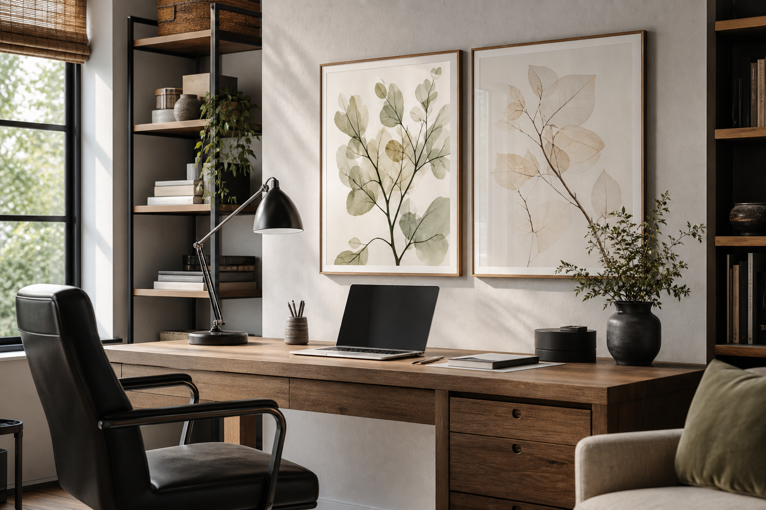
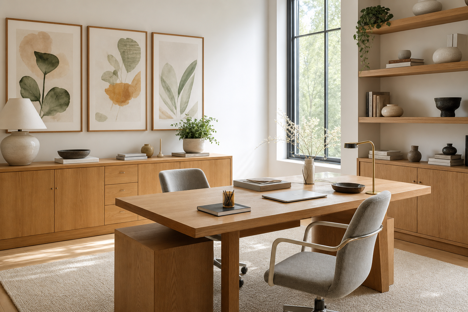
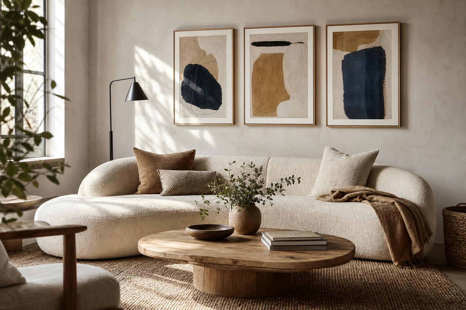
The best office posters do more than fill a blank wall. They set the pace of the room. In a home office, that can mean making a spare corner feel finished enough to focus in for six hours straight. In a shared workplace, it often means creating a backdrop that looks organised, credible, and aligned with the brand or team culture.
A well-chosen work wall also affects how a space is read in the first 5 seconds. Large-scale abstract art tends to make a room feel calmer and more intentional, while cluttered walls with mixed message styles often feel distracting. If your desk faces a screen all day, the art behind or beside it should reduce visual noise rather than compete with it. That is why office posters work best when they support concentration first and personality second.
Why Office Posters Matter
The wall behind a desk is one of the most visible surfaces in any office. It shows up on video calls, sits in your peripheral vision, and often frames the first impression for clients or colleagues. A blank wall can read unfinished. An overcrowded one can feel restless. A considered arrangement of office posters gives structure to the room and makes the workspace feel deliberate.
For productivity, the subject matters as much as the colour. Soft geometry, architectural photography, and restrained typography are easier to live with for 8-hour workdays than high-contrast graphics in several competing colours. If you want a quiet, modern base, explore our minimalist collection or abstract wall art for workspaces. Both categories suit offices because they bring shape and depth without adding narrative clutter.

Choose a Style That Fits the Way You Work
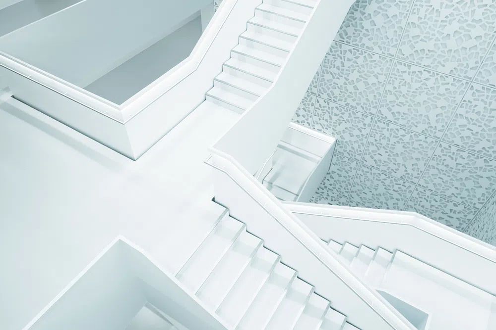
Minimal styles suit analytical work. If your day is built around spreadsheets, writing, coding, or strategy, cleaner compositions help the wall recede slightly so the room feels sharper. Pieces such as Modern White Staircase or Textured Concrete Wall work especially well in offices with black desks, pale oak furniture, or white shelving.

Abstract work is useful when you want energy without obvious messaging. It adds movement and colour, but does not tell you what to think every time you look up. That makes it ideal for hybrid spaces where two people may use the same desk on different days. If you like tonal texture, Textured White Abstract gives a workspace depth without heaviness.
Typography is a narrower choice, but effective when used with restraint. One typographic print can add rhythm to a clean office wall. Three or four often feel too literal. For a work zone, choose language that feels grounded rather than aggressively motivational. You can browse typography prints for office walls if you want one sharper accent among calmer pieces.
Vintage and architecture-led styles are strong for offices that need character. A creative studio can carry more visual identity than a finance desk in a spare bedroom. In those spaces, vintage office art or architectural prints can make the room feel collected rather than generic.
Get the Scale and Placement Right
Most office posters fail on size, not style. A single frame above a 140 cm desk should usually be at least 70 cm wide to feel anchored. For a gallery arrangement above the same desk, aim for a grouped width of roughly 90 to 120 cm, leaving 15 to 25 cm clear from the desk edge or shelf line below. If the art is too small, the wall looks fragmented. If it is too large, it starts to crowd your screen and lighting.
Hang the centre of the arrangement at around 145 cm from the floor in a room where you sit and stand regularly. If the piece is directly above a desk, keep the bottom edge 20 to 30 cm above the surface line. That gap gives the art breathing room and stops the wall from feeling compressed.
A practical mix for office posters is one of these three layouts: one oversized vertical frame beside shelving, two medium frames stacked or aligned over a desk, or a four-piece grid that reads as one visual block. If your office also has floating shelves, pinboards, or acoustic panels, let the art occupy one clear zone rather than weaving around every object.


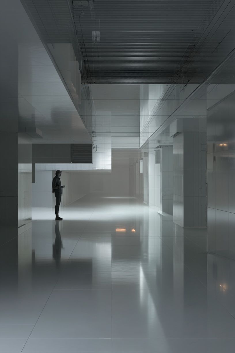
Match Posters to Your Colour Palette
The easiest way to make office posters look intentional is to repeat 2 or 3 colours already in the room. If your workspace has black metal, walnut wood, and cream walls, choose art with charcoal, taupe, stone, or muted rust. If the room is mostly white, pale grey, and oak, try tonal pieces that rely on texture more than contrast.
Bold colour works best when it appears once more somewhere in the office. A teal detail in artwork feels deliberate when it is echoed by a desk accessory, fabric seat pad, or book spine. Without that repetition, strong colour can look accidental. In rooms with brand colours, use the art to echo the palette by about 20 to 30 percent rather than matching it exactly. That keeps the wall professional instead of promotional.

Nature-inspired and mindfulness-led tones are useful when the office feels hard or screen-heavy. Sand, muted green, soft blue, and off-black reduce glare and visual fatigue. If your workspace needs that calmer note, mindfulness prints or Zen Garden Stones can soften a room full of straight edges and devices.

Frame It for a More Polished Finish
Framing changes the tone of office posters immediately. Black frames feel crisp and architectural. Oak frames add warmth and are easier in home offices with timber floors or shelves. White frames can work in bright, minimal spaces, but they need enough contrast against the wall to avoid disappearing.
For a more professional finish, keep the frame colour consistent across one wall. Mixed frame colours can work in living rooms, but in offices they often look improvised. Matting is useful for smaller prints — especially 30 x 40 cm pieces — because it gives them more visual presence and makes the arrangement feel cleaner. A 5 to 8 cm off-white mat is usually enough.
Paper finish matters too. Matte surfaces are better for offices because they cut glare from windows and overhead lighting. That is especially important if your wall sits opposite a monitor or appears in video meetings. Textural pieces and architectural photography both benefit from matte framing because the detail reads better from 1 to 2 metres away.

Ideas for Different Types of Offices
A home office usually needs flexibility. Choose office posters that can live with both work and domestic life — abstract textures, calm fine art, or minimal architecture all do that well. A good example is Window with Sheer Curtain, which adds softness without becoming decorative in a fussy way.

Creative studios can handle more contrast and stronger identity. This is where a vintage aviation print, a bold abstract, or a mid-century graphic piece can bring energy to the room. Reception areas benefit from cleaner, broader appeal — architectural photography and tonal abstract work tend to feel polished to a wide range of visitors.
Meeting rooms should stay visually quiet. One larger piece is usually better than several small ones because people need a focal point, not a distraction. In team rooms, avoid overly personal slogans or humour that can date quickly. For hybrid work corners carved out of bedrooms or living areas, keep the palette consistent with the rest of the home so the office does not feel dropped in as an afterthought.

Final Notes on Building a Better Work Wall
The strongest office posters are the ones that still suit the room after the desk moves, the chair changes, or the company branding shifts. That is why flexible subjects — abstract, architecture, minimal forms, and restrained typography — tend to last longer than trend-led graphics. Start with one anchor piece, add supporting work in the same palette, and keep the spacing disciplined.
If you are building from scratch, choose art in a clear order: first scale, then palette, then subject, then frame. That sequence makes better decisions than shopping by image alone. Office posters should help the room work harder, look calmer, and feel more finished every day.
Frequently Asked Questions
What size art works best for a small home office?
For a compact setup, start with one 40 x 50 cm or 50 x 70 cm frame. If you want a pair, two 30 x 40 cm pieces with 5 to 7 cm spacing usually fit neatly above a narrow desk.
Should office wall art be centred on the desk or the wall?
Centre it on the desk if the desk is the main feature and sits clearly in the room. Centre it on the wall only when the desk is off-set and the full wall composition matters more.
Are glass frames practical in offices?
Yes, but keep glare in mind near windows or task lights. Matte glazing or acrylic can be a better choice if the wall is often seen on video calls.
What pairs well with black office furniture?
Black desks and shelving work well with off-white abstracts, architectural photography, and warm oak frames. Add one muted accent colour — such as teal, rust, or olive — to stop the scheme feeling flat.