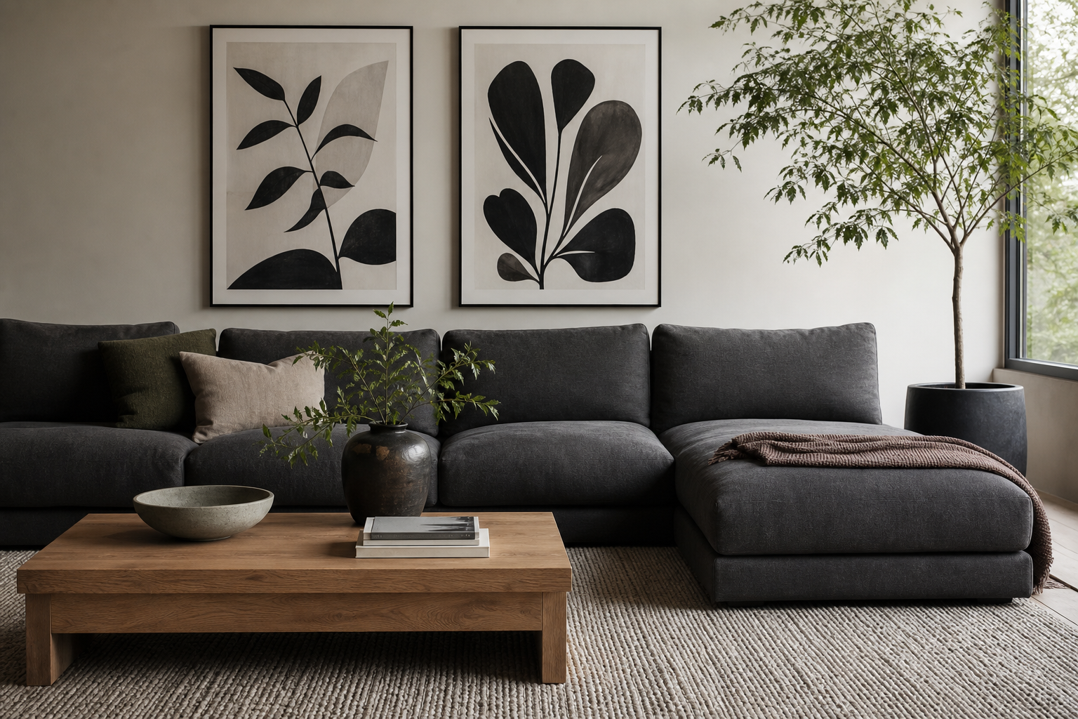
A black white poster is one of the simplest ways to sharpen a room without making it feel busy. It adds contrast fast, works with almost any material palette, and gives even soft interiors a clear focal point. In homes filled with beige, oak, linen, or concrete, a black white poster creates definition that color sometimes cannot.
Why Black and White Still Works
Monochrome art lasts because it is flexible. It can sit inside a minimal apartment, a traditional townhouse, or a Scandinavian-style bedroom and still feel considered. Black and white also bridges changing trends well — if you swap cushions, rugs, or paint colors later, the art rarely needs replacing. That makes it one of the safest long-term choices for renters and first-home buyers.
A second advantage is visual control. Strong color art often dominates a room, while black-and-white pieces usually organize it. They repeat the tones already found in window frames, lamps, shelving, kitchen hardware, or side tables. If you already like the clean look of our Minimalist collection, monochrome pieces fit naturally because they rely on shape, shadow, and negative space rather than loud palettes.
For a softer monochrome look, choose imagery with texture rather than hard edges. A piece like the Elegant White Fabric print brings movement through folds and highlights, which stops a black-and-white scheme from feeling flat.

Choose the Right Scale for Your Wall
Size matters more than most people expect. Above a sofa, the artwork should usually span 55% to 75% of the sofa width. For a 200 cm sofa, aim for a total art width of roughly 110 to 150 cm. That could be one large print at 70 x 100 cm, or two pieces at 50 x 70 cm each with 7 to 10 cm spacing.
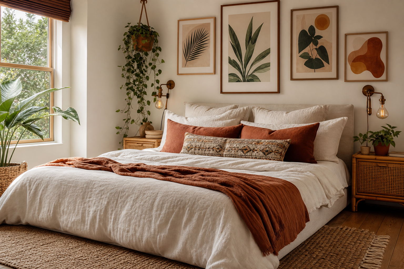
Above a bed, keep the arrangement slightly narrower than the headboard area. For a standard 160 cm bed, one 70 x 100 cm piece or a pair of 50 x 70 cm prints usually looks balanced. Over a desk, 40 x 50 cm or 50 x 70 cm works well because you want presence without visual weight pressing down on the workspace.
Hallways and entryways benefit from vertical formats. A narrow wall often looks better with one tall piece than several small ones. In compact areas, leave at least 15 to 20 cm from door trim or corners so the art does not look squeezed in.

If you want a graphic, high-contrast focal point for a main wall, the Torn Paper Black and White design is effective in larger sizes because the bold contrast reads clearly from across the room.

Framing Ideas That Make It Feel Intentional
The frame changes the mood almost as much as the artwork. Black metal or matte black wood makes a black white poster feel crisp and architectural. Natural oak softens the contrast and suits Nordic interiors. White frames reduce visual weight and are especially useful if the print includes a lot of white space.
Mounting style matters too. A wide white mat gives smaller works more presence and can make a 30 x 40 cm print feel collected rather than casual. If your room already has many strong lines — black shelving, grid windows, sharp-edged furniture — a thin frame of 1 to 2 cm keeps the composition clean. In softer rooms with plaster walls, linen curtains, or rounded furniture, a wider frame can add enough structure.
Frameless styling works best in very casual spaces or for temporary setups, but framed art nearly always looks more finished. If the goal is a polished result, frame it. A black white poster tends to look especially refined behind acrylic or glass because the contrast becomes sharper in daylight.

Texture-heavy monochrome pieces pair well with natural frames. If you like subtle surface detail, browse our abstract art prints or the quieter end of our Fine Art collection for options that feel layered rather than stark.
Where a Black and White Poster Works Best
Living rooms are the most obvious placement because monochrome art anchors the main seating area without competing with textiles. Hang the center of the composition around 145 cm from the floor, then adjust by 5 to 10 cm depending on ceiling height and furniture scale. This keeps the work connected to the room rather than floating too high.
Bedrooms benefit from calmer black-and-white subjects — soft botanical silhouettes, fabric studies, stone textures, or misty landscapes. In kitchens, monochrome works best when the imagery is simple and the frame is slim, especially if there are already many visual elements like tiles, utensils, and open shelving.
Home offices are ideal for sharper graphic pieces. Black-and-white art improves focus because it adds structure without introducing extra color stimulation. Entryways also work well because contrast is visible immediately, even in transitional light near the front door.

A restrained design such as the White Flower Silhouette print suits bedrooms and entryways because it brings line and contrast without harshness.

How to Build a Monochrome Gallery Wall
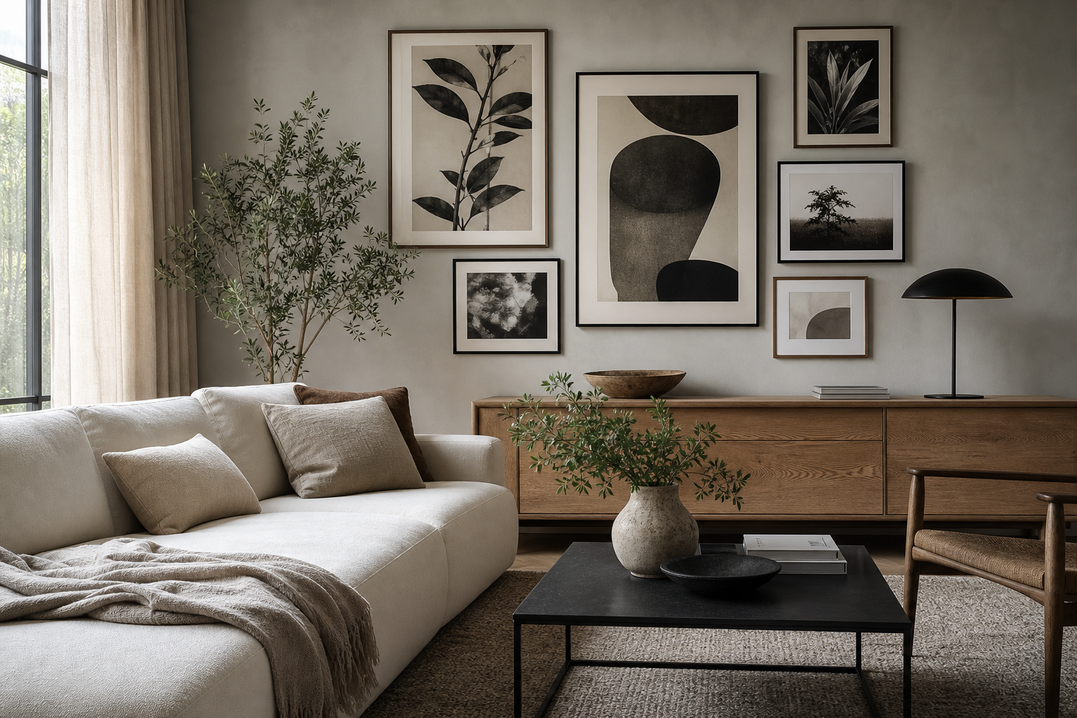
A good gallery wall needs one rule. The easiest rule is to keep the palette tight — black, white, charcoal, soft gray — and vary only subject matter and scale. Start with one anchor piece, then add 3 to 5 supporting prints. Use spacing of 5 to 8 cm between frames for a neat salon layout, or 8 to 12 cm for a more relaxed modern arrangement.
Mix at least two kinds of imagery so the wall does not feel repetitive. A torn-paper composition, a floral silhouette, a textured abstract, and a quiet figurative or landscape piece create enough variation while staying cohesive. Materials around the gallery matter too: a boucle chair, ribbed ceramic vase, smoked glass, or oak shelf adds depth that keeps monochrome from feeling cold.




For a more collected look, combine modern minimal pieces with one classic accent from our Fine Art prints. If you prefer a stricter contemporary grid, stay within our minimalist black-and-white styles and keep all frames identical.
Styling Tips for Different Interiors
Minimalist interiors need restraint. Use one large black white poster rather than many small pieces, and repeat its tones through one or two other elements — a black lamp base, dark side table, or graphite throw. White walls with 10% to 20% black accents usually feel balanced instead of severe.
Scandinavian rooms benefit from warmer contrast. Pair monochrome art with pale oak, off-white textiles, stoneware, and soft gray upholstery. If the print itself is delicate, such as the Vase with Flowers minimalist print, the result feels lighter and more domestic.
Industrial spaces can handle stronger graphic weight. Black frames, concrete surfaces, leather seating, and visible metal finishes all support higher-contrast imagery. In that setting, a piece from our abstract collection with bolder movement can hold the wall better than a faint line drawing.
Contemporary interiors often look best with contrast plus texture. Think white walls, dark joinery, brushed metal, and one tactile print that softens the room. A work like the Textured Fabric print keeps the palette controlled while adding depth.

Shop Smart: Picking a Poster You’ll Keep
Choose subject matter you can live with for years. Strong novelty fades quickly, but line, texture, architecture, botanicals, and quiet abstract forms usually stay relevant. If you are unsure, pick a design that still works when viewed from 3 meters away and also rewards a closer look with texture or tonal detail.
Paper and print quality matter most in monochrome because flaws are easier to spot. Muddy blacks, weak detail, or thin paper will make a black white poster look flat. Look for crisp tonal separation, clean whites, and enough visual depth that dark areas do not collapse into one solid block.
Also check how the print will behave with your light. North-facing rooms often suit higher-contrast black-and-white work because daylight is cooler and softer. Bright south-facing rooms can handle gentler grayscale and textured whites. If your room changes often, start with a piece that sits comfortably between bold and subtle — something graphic enough to anchor the wall but calm enough to survive a future paint change.
Final thoughts
A black white poster works best when it is scaled properly, framed with intention, and supported by the materials already in your room. The formula is simple: strong contrast, enough breathing space, and a subject that still feels right after the furniture moves.
If you want a result that feels timeless rather than temporary, use monochrome as structure, then let texture do the rest. That is what keeps black-and-white wall styling modern, calm, and easy to live with.
Frequently Asked Questions
What frame color is safest for a black-and-white print?
Matte black is the safest if you want contrast and definition. Natural oak is the best all-round alternative for softer interiors with warm wood tones.
Can I mix a black-and-white print with colored art?
Yes — keep the colored piece to 20% to 30% of the overall gallery wall so the monochrome work still leads. Repeating one tone from the color piece elsewhere in the room helps it feel connected.
Should I use glass or acrylic for large frames?
Acrylic is lighter and easier to hang for 70 x 100 cm and larger sizes. It is practical for bedrooms, hallways, and homes where weight matters.
How high should I hang art in a hallway?
Aim for the center of the frame at about 145 cm from the floor. In very narrow hallways, go slightly lower so the art relates better to the wall and does not feel top-heavy.
What decor pairs best with monochrome wall art?
Linen, oak, black metal, travertine, smoked glass, and textured ceramics all work well. These materials add depth so the room feels layered, not stark.