Why Black and White Never Goes Out of Style
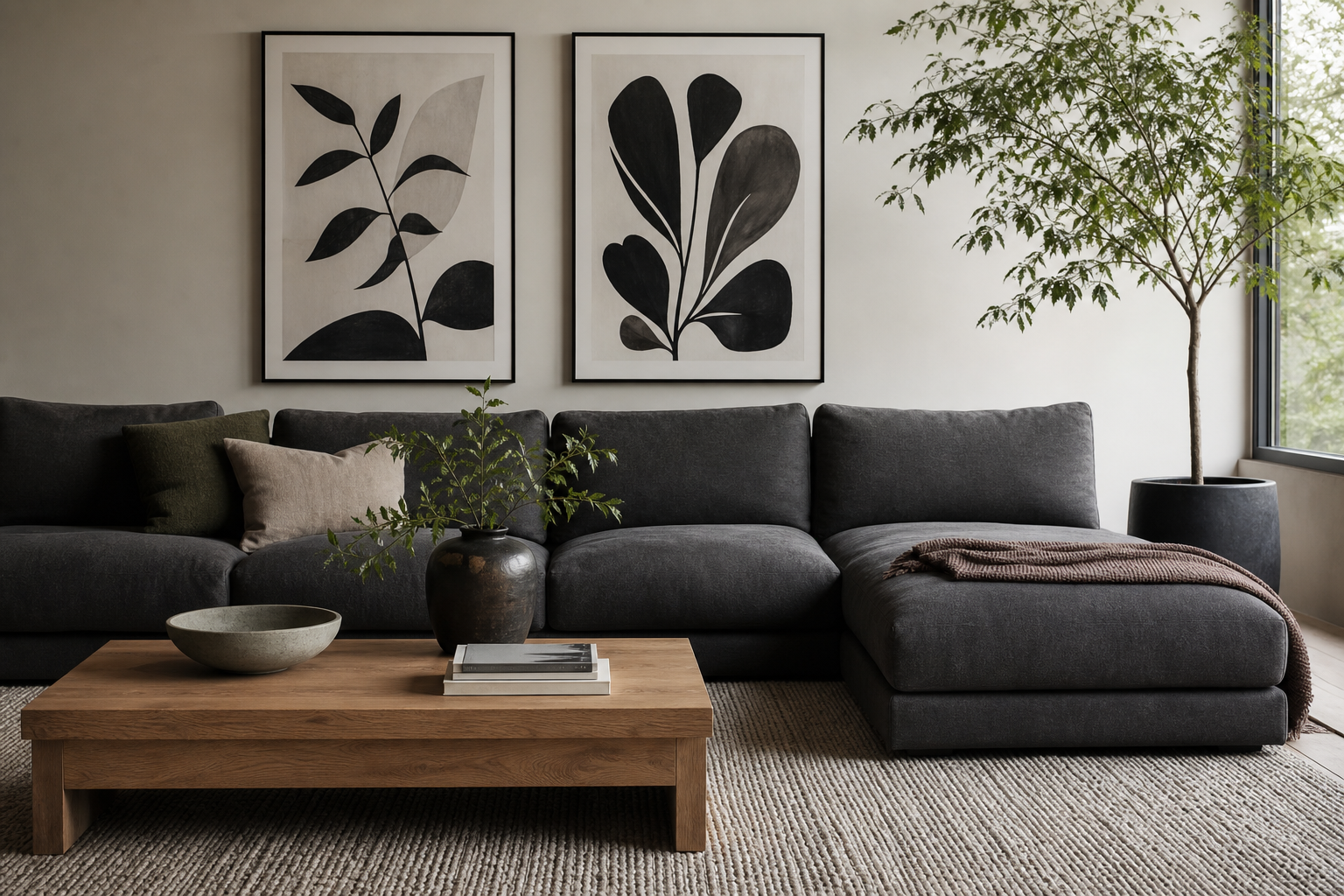
Black and white poster prints work because they simplify a room without making it flat. Removing color puts the focus on shape, contrast, texture, and negative space. That is why monochrome art sits comfortably in very different interiors — Scandinavian rooms with pale oak, industrial spaces with steel and concrete, and traditional homes with paneling and antique furniture. A black line or shadow reads clearly from across the room, which makes these prints especially effective on large blank walls.
They also solve a common styling problem: visual overload. If your room already has patterned textiles, warm wood tones, or mixed finishes, monochrome art acts as a visual pause. In practical terms, black and white poster prints can reduce the number of competing color stories in a room from four or five down to two strong tones. That gives your furniture, lighting, and textiles more room to breathe.
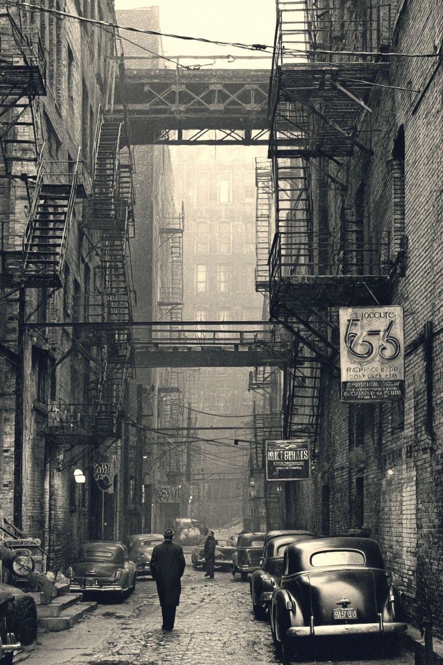
If you want a softer monochrome look rather than sharp graphic contrast, lean into pieces with grain, fog, shadow, or vintage detail. Our Vintage Urban Alley print is a good example of black-and-white imagery that feels atmospheric rather than severe, and it sits naturally alongside our photography collection when you want a quieter, editorial wall.
Choosing the Right Subject Matter
Subject matter changes the mood faster than frame color or wall paint. Black-and-white photography tends to feel sophisticated and grounded — especially street scenes, close-up objects, and landscapes with strong light and shadow. Architectural images bring order because they rely on line and repetition. Portraits feel intimate and usually work best in bedrooms, hallways, or reading corners where people view them at closer range.
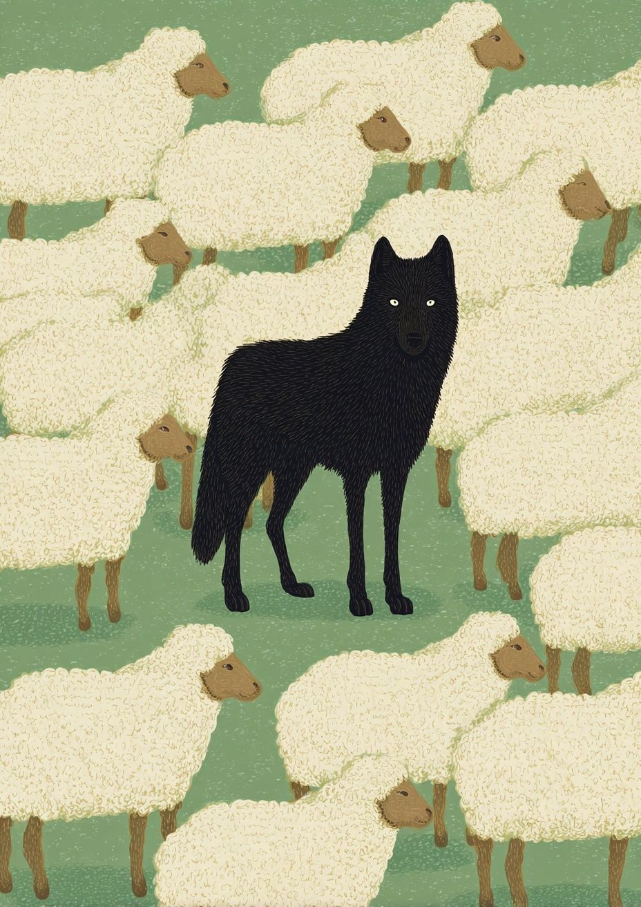
Abstract and illustrative pieces are better when you want movement or tension. Strong silhouettes, ink-like forms, and symbolic animal imagery can give a monochrome wall more personality than a neutral photograph. If your room feels too polished, an expressive print can stop the space from becoming generic. The key is to match subject matter to the room's purpose: calm subjects for rest, high-contrast subjects for energy, and nostalgic subjects for warmth.

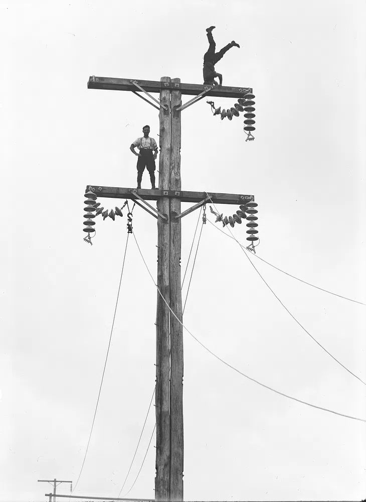
Animal imagery is particularly effective in monochrome because pattern and silhouette do the work that color usually does. A piece such as Zebras in Love — Black-White Print adds rhythm through stripes and shape, while Black Wolf Among Sheep brings a more graphic, conceptual edge. For vintage-led interiors, our vintage wall art offers black-and-white pieces with built-in character and a slightly softer tonal range than modern minimal photography.


Getting the Scale and Placement Right
The biggest mistake with wall art is choosing pieces that are too small. As a rule, art above furniture should span about 60 to 75 percent of the furniture width. Above a 200 cm sofa, aim for a composition around 120 to 150 cm wide. That could mean one large statement piece, two medium frames, or a gallery wall with even spacing. On a narrow console or desk, 50 to 70 cm wide is often enough.
Height matters just as much as width. The center of the arrangement should usually sit around 145 to 150 cm from the floor, which keeps the art at comfortable eye level. Above a sofa or headboard, leave 15 to 25 cm between the furniture and the bottom frame edge. In hallways, where people pass by quickly, go slightly lower and tighter to create a stronger visual connection.
Large black and white poster prints can handle more negative space than colorful art because the contrast carries across the wall. On a wide blank wall, one oversized monochrome photograph can look cleaner than six small frames. In smaller rooms, build impact with repetition instead — for example, three matching 30 x 40 cm frames lined horizontally above a sideboard.
Framing Ideas That Elevate the Look
Frames decide whether monochrome art feels crisp, warm, or museum-like. Black frames create the sharpest outline and work especially well with photography or graphic illustration. Oak frames soften the contrast and connect the prints to wood furniture, flooring, or shelving. White frames nearly disappear on pale walls, which is useful when you want the image to feel light rather than high contrast.
Matting is worth using when the artwork has fine detail or when the room needs a more finished look. A white mat of 5 to 8 cm can make a 30 x 40 cm print feel more substantial without increasing visual noise. Thin black frames with generous white mats are particularly effective for black and white poster prints because they preserve the clean edges while adding breathing room around the image.

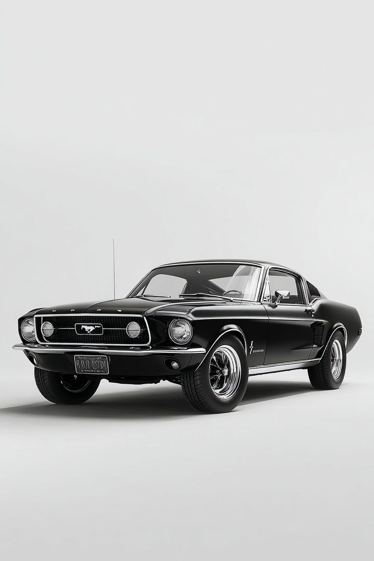
Finish matters too. Matte frames and non-reflective glazing suit low-contrast, editorial interiors because they reduce glare and feel understated. Glossy finishes can work in more glamorous spaces, but they tend to compete with monochrome imagery. If you are styling a vintage print such as Classic Black Mustang or Vintage Aviators Black-White Print, an oak or dark walnut-toned frame will usually look more intentional than bright white.
Room-by-Room Styling Inspiration
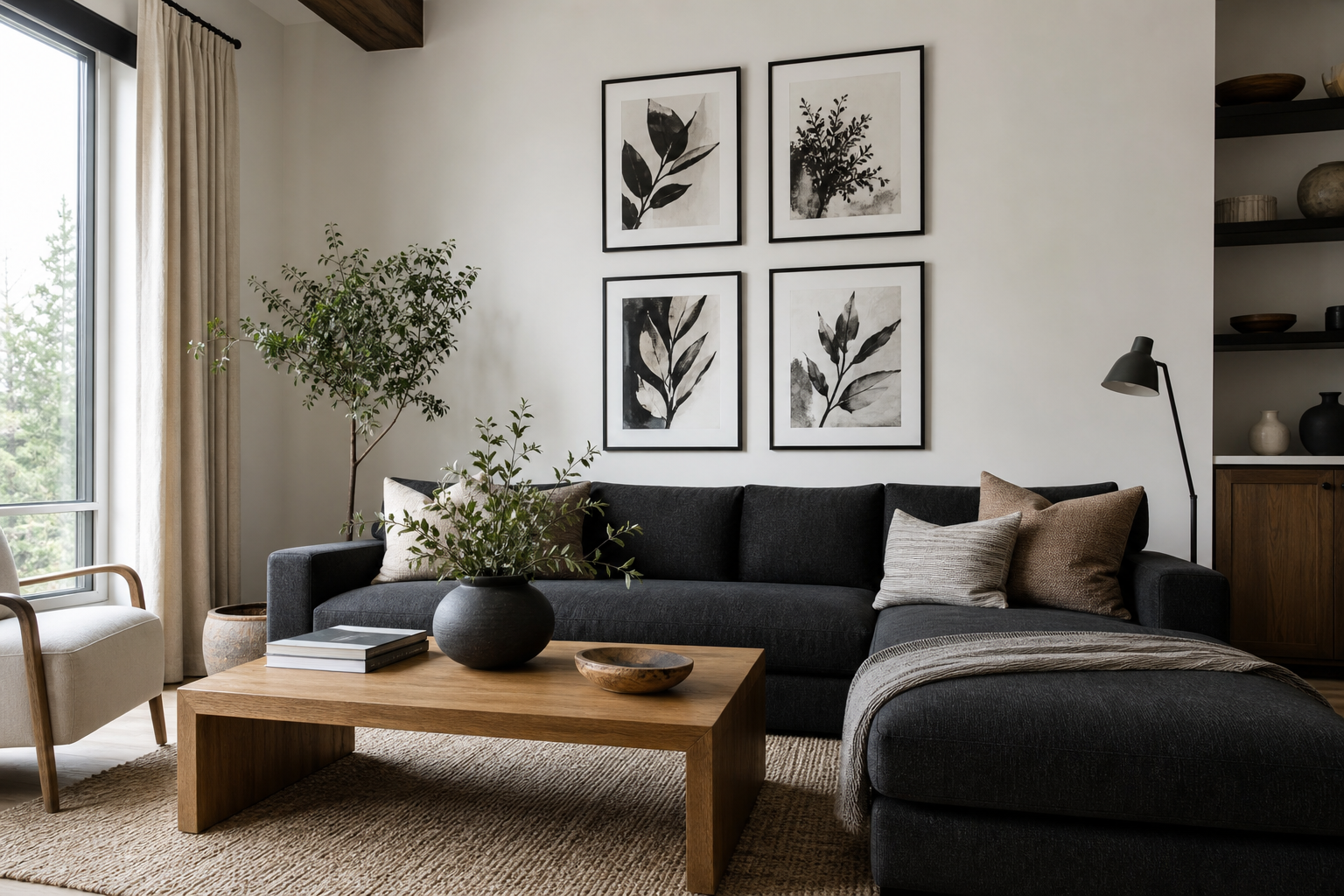
In living rooms, use black-and-white wall art to anchor the seating area. A single large frame above the sofa creates calm structure, while a pair of medium-size prints works well if the room already has a strong floor lamp, rug, or shelving unit. If your space includes beige upholstery, walnut wood, and brushed metal, monochrome art ties those finishes together without asking for another accent color.
Bedrooms benefit from softer monochrome subjects — misty streets, quiet portraits, or subtle animal studies. Place one wide arrangement above the headboard, or offset two vertical frames over one bedside table for a less expected layout. In hallways, repeat smaller frames in matching sizes to create rhythm. Kitchens and dining areas suit simpler, bolder imagery with strong outlines so the work still reads across open shelving and hard surfaces. Home offices benefit from sharper pieces with structure — architecture, watches, vintage machinery, or graphic illustration.

For a focused work zone, Sleek Black Watch — Photography Print has the kind of crisp detail that suits desks and offices. In a more playful hallway or guest room, Black Cat, March (1896) introduces historical character while staying within a mostly monochrome palette.

How to Build a Cohesive Gallery Wall
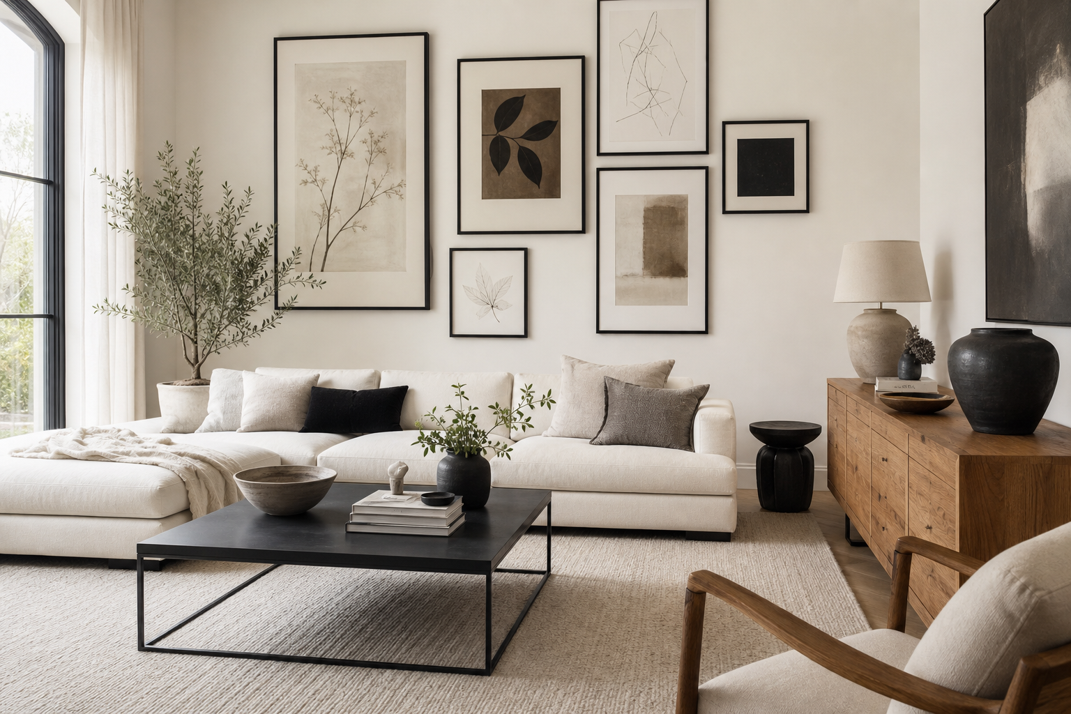
A strong gallery wall needs one clear rule. Keep the subject consistent, keep the frame consistent, or keep the spacing consistent. You do not need all three. For black-and-white walls, the easiest method is matching frames with mixed subjects. Use 5 to 7 cm spacing between frames for a neat salon-style grid, or 8 to 10 cm if the arrangement is larger and more relaxed.
Start with one anchor piece — usually the largest frame or the strongest image — then build outward. Mix close-up detail with wider scenes so the wall does not feel repetitive. If every print has the same tonal weight, the composition can become static. Balance one dark, high-contrast piece with two or three lighter images containing more white space. That shift in density helps the eye move across the arrangement.
A practical formula for beginners is one large piece, two medium pieces, and two small accents. Another reliable option is a symmetrical 2 x 2 grid using four 30 x 40 cm frames. If you want a cleaner result, lay everything out on the floor first and photograph the arrangement before hanging. That makes imbalances obvious in seconds.
Final Styling Tips for a Clean, Collected Finish
The best black and white poster prints do not need a perfectly black-and-white room. In fact, they often look better against warm whites, taupe, camel leather, mid-tone wood, and brushed brass than against stark pure white interiors. Add one or two tactile materials — linen curtains, a wool throw, a ribbed ceramic lamp, an oak bench — so the monochrome palette feels layered rather than cold.
Keep the editing tight. If a room already has strong contrast in a striped rug, black lighting, and dark shelving, choose quieter art with more white space. If the room is pale and minimal, use one bolder print to create definition. That balance is what makes black and white poster prints feel collected instead of formulaic.
Frequently Asked Questions
What frame color is safest for black-and-white art?
Black is the most versatile if you want crisp contrast. Oak is better when the room has warm wood furniture or a softer, more natural palette.
Can I mix vintage and modern black-and-white prints on one wall?
Yes — use one unifying element, usually matching frames or equal spacing. Keep the tonal range similar so the mix feels deliberate.
What size should I choose for a narrow hallway?
Vertical formats around 30 x 40 cm or 40 x 50 cm work well in tighter passageways. Hang them in a sequence with 8 to 10 cm between frames for a clean rhythm.
Do black-and-white prints work on colored walls?
They work especially well on muted wall colors such as greige, olive, clay, and soft blue-gray. Add a white mat if you want stronger separation from the wall color.
How do I keep a monochrome room from feeling too stark?
Use texture and warm materials — linen, wool, oak, leather, and matte ceramics. A room with contrast needs softness in surfaces, not more visual clutter.