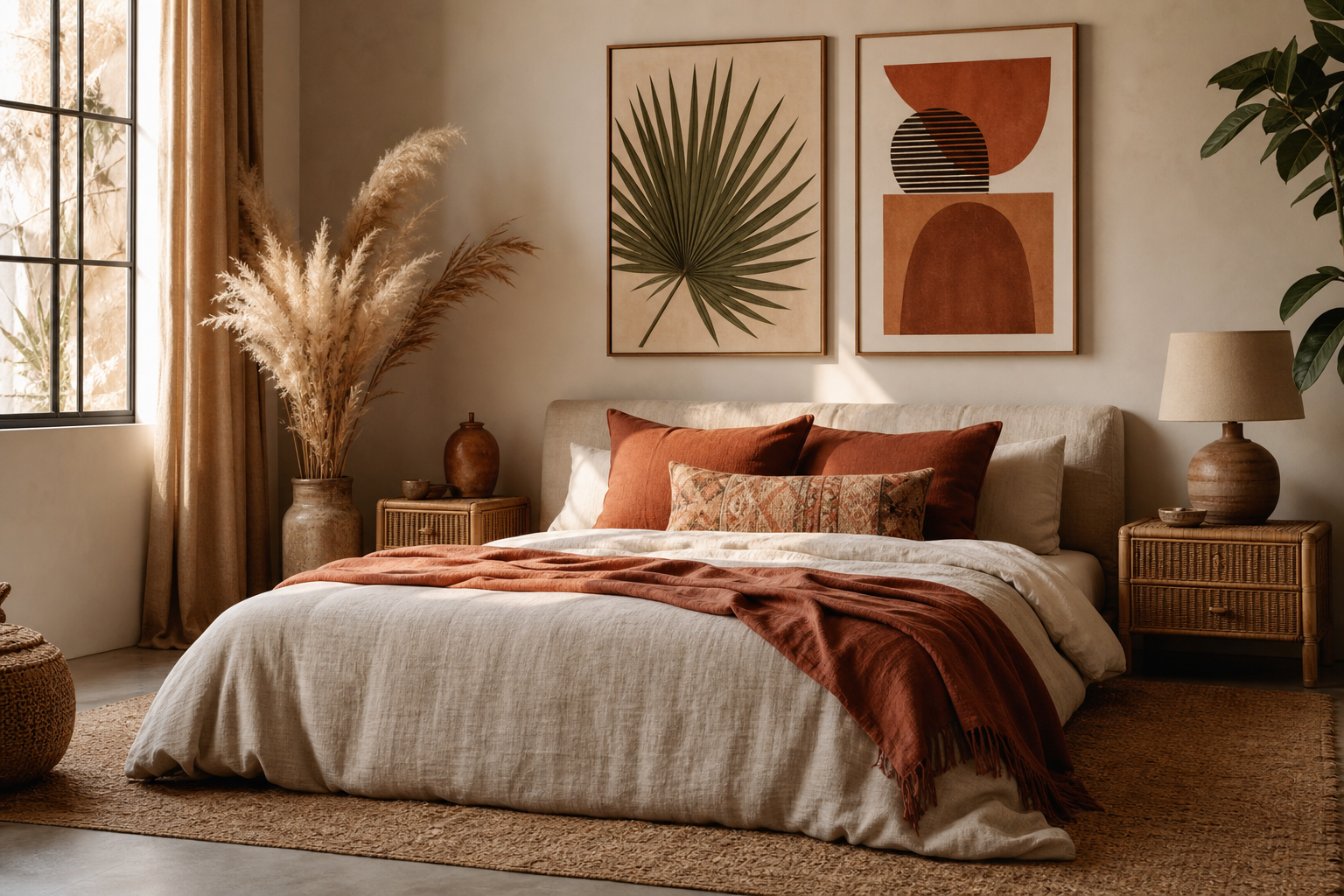
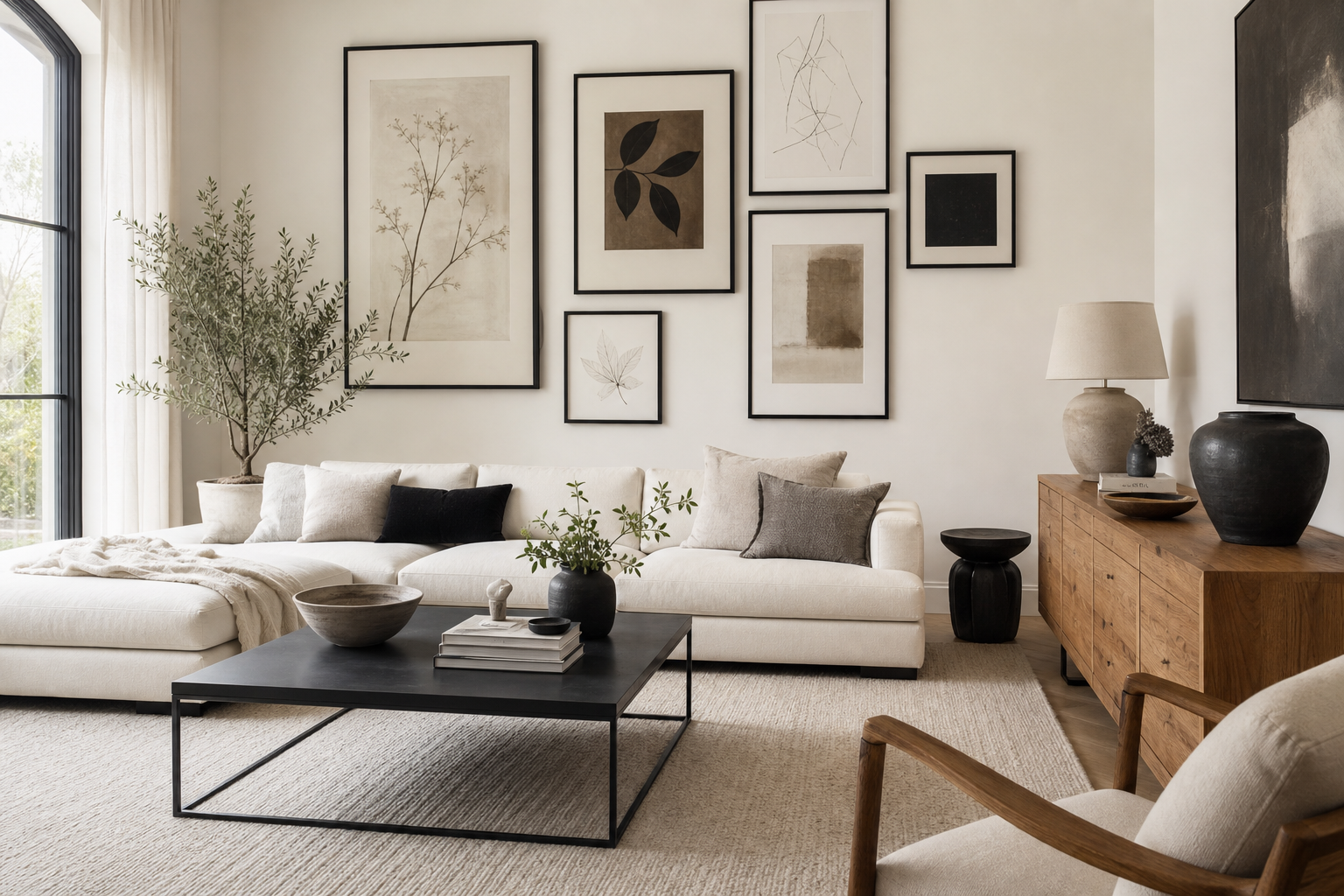
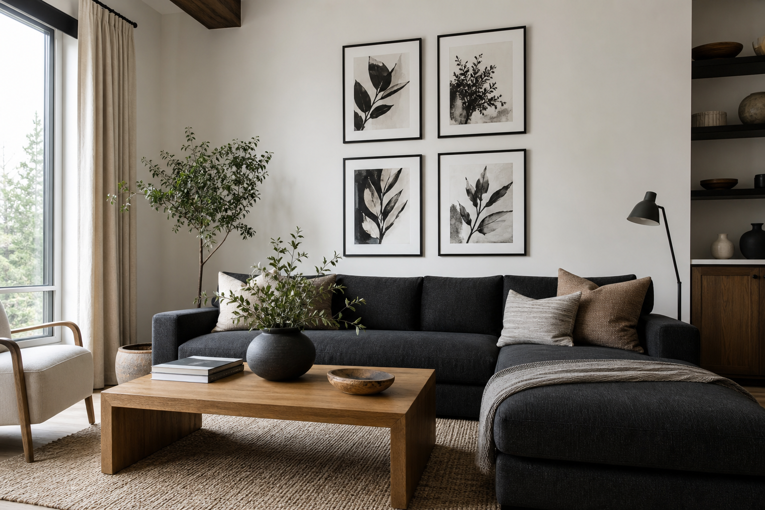
A black and white poster works because it creates contrast without fighting the room. It can sharpen a soft neutral scheme, bring order to a colorful interior, or add depth to a minimal space with just two tones. That flexibility is why monochrome art appears just as often in pared-back Scandinavian rooms as it does in industrial lofts, classic apartments, and compact home offices.
Why Black and White Always Works
Monochrome art has a built-in balance. Black adds weight, white adds breathing room, and the gap between them creates definition that reads clearly from across the room. In practical terms, a black and white poster is often easier to place than a color-led piece because it does not need an exact palette match to feel intentional. It sits comfortably with our minimalist collection, strong lines from architectural wall art, and softer tonal pieces in fine art prints.
It also helps control visual noise. If a room already has patterned curtains, textured upholstery, or open shelving, monochrome wall art gives the eye a clear focal point. That is especially useful in small rooms where too many competing colors can make walls feel busy. A 50x70 cm print in black and white often has more presence than a larger pastel piece simply because the contrast is stronger.
Choosing the Right Poster Style
The best black and white poster style depends on what the room already says. If the space is clean and modern, choose sharp composition and generous negative space. Photography, architectural forms, and restrained abstract work feel crisp without looking cold. A piece like Black White Photo Empire State suits rooms with straight lines, black metal accents, and simple furniture.

If you want something softer, look for texture rather than heavy detail. Torn edges, plaster-like surfaces, and wave patterns make monochrome feel layered. In neutral interiors, that texture matters because it stops black and white from feeling flat. Torn Paper Black and White Poster is a good example of a minimal piece that still carries movement and depth.

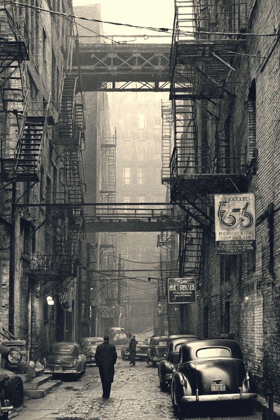
Graphic styles work best when you want a stronger statement. Bold silhouettes, urban scenes, and close-up forms create a more editorial feel. In a hallway or dining area, high-contrast imagery from our photography prints or the sharper pieces in abstract wall art can make the wall feel more deliberate and polished.

A vintage black and white poster brings a different mood entirely. It feels collected rather than strictly modern, which helps in homes with wood furniture, brass, or older architectural details. Pieces from the vintage collection can bridge classic and contemporary styling without looking staged.
How to Place It in the Home
Above a sofa is the most common placement, but scale matters more than location. Aim for wall art that spans about 60 to 75 percent of the furniture width below it. If your sofa is 200 cm wide, the ideal total art width is roughly 120 to 150 cm. That might mean one 70x100 cm statement print, two 50x70 cm frames, or a small grid.
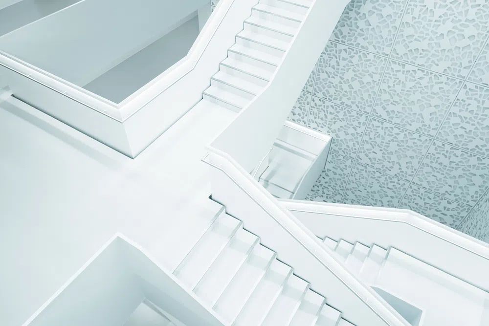
In bedrooms, monochrome works best when it supports the room's calm rather than overpowering it. A single black and white poster above the bed in 50x70 cm or 70x100 cm creates structure without adding color clutter. If the bedding is already patterned, choose simpler imagery such as Modern White Staircase or quiet texture-driven pieces from the minimalist range.


Small spaces benefit from tighter placements. In an entryway, one vertical print around 30x40 cm or 40x50 cm can finish the wall without crowding it. In a home office, a black and white poster above a desk keeps the setup focused and reduces the risk of visual distraction. Near shelves, hang art 10 to 15 cm above the top shelf line so the arrangement reads as one composition rather than separate floating elements.

Sizing, Framing, and Finish
A polished result comes from proportion first, frame second. For a single statement piece, 50x70 cm suits most apartment walls, while 70x100 cm gives more impact in larger rooms with ceiling heights above 240 cm. For gallery arrangements, use consistent frame sizes — such as four 30x40 cm frames or three 50x70 cm frames — and keep spacing between 5 and 8 cm for a professional, even rhythm.
Frame choice changes the mood fast. Black frames create sharper contrast and make photography feel more graphic. Oak or natural wood softens the look and pairs well with Scandinavian, Japandi, and warm neutral interiors. White frames can work, but they need enough wall contrast to avoid disappearing. If your wall is bright white, a white frame around a black and white poster usually needs a visible mat mount or strong black image area to hold its shape.
Paper finish matters more than many buyers expect. Matte finishes reduce glare and suit monochrome art particularly well because they preserve detail in darker areas. In rooms with strong daylight or lamps opposite the wall, matte is usually the safer option. If you prefer a cleaner, more photographic look, a slight satin finish can add crispness — but only if reflections are controlled.
Pairing It with Color and Texture
Black and white does not mean colorless styling. It means color can be used more precisely. Warm woods, brushed brass, boucle, wool, linen, and stone all stop monochrome art from feeling severe. A black and white poster next to oak, walnut, or travertine usually reads warmer than the same print in a room full of glossy white surfaces.
One accent color is often enough. Olive green, rust, camel, navy, and muted clay all pair well because they do not compete with the art's tonal structure. If you already have a beige or taupe room, monochrome art adds the contrast that soft palettes sometimes lack. If you have a darker room with charcoal or black furniture, bring in lighter fabrics or pale timber so the wall art still stands out.

Texture is the easiest way to make monochrome feel rich. Pair smooth frames with rough plaster walls, soft throws, ribbed glass, or ceramic objects. If the art itself is highly graphic, keep surrounding materials tactile. If the print is already texture-led, like concrete or torn paper, use cleaner furniture lines so the room does not become too layered.

Simple Styling Tips for a Gallery-Ready Look
Hang the center of the composition around 145 to 150 cm from the floor in most homes. That height feels natural at eye level and prevents art from drifting too high — the most common styling mistake. Above furniture, keep the bottom of the frame about 15 to 25 cm above the top edge of the sofa, bedhead, or console.
When grouping several pieces, repeat one element consistently. That could be all black frames, all white borders, or all photographic subjects. A mixed gallery works better when there is one obvious thread. For a strong monochrome arrangement, combine architecture, texture, and one figurative or urban image rather than four equally busy prints. This is where a black and white poster becomes part of a system rather than a standalone object.
If you want a less formal look, lean smaller frames on a shelf or picture ledge and overlap them slightly. Keep the largest frame at the back and vary heights by at least 10 cm so the setup feels intentional. This approach works especially well with pieces from Textured Concrete Wall — Minimalist Print and moodier city photography such as Vintage Urban Alley — Black-White Print.
Final Thoughts and Smart Shopping Tips
A black and white poster succeeds when it matches the room's pace. In calm interiors, choose texture and space. In sharper interiors, choose contrast and graphic definition. Measure the wall first, decide whether the art is meant to lead or support the room, and then choose a frame finish that connects with the materials already in place.
If you are buying for flexibility, start with one medium-size monochrome piece in 50x70 cm. It can move from bedroom to hallway to office with almost no styling friction. That is the real strength of a black and white poster — it stays relevant even as the rest of the room changes.
Frequently Asked Questions
What wall color works best with black and white art?
Soft white, warm beige, greige, and light stone tones are the easiest matches. On dark walls, use a wider white mat or lighter frame detail so the print does not disappear.
Should I choose a mat mount for a black and white print?
Yes, if you want a cleaner, more gallery-like finish. A white or off-white mat adds breathing room and makes smaller prints look more substantial.
Can black and white wall art work in a colorful room?
Yes — it often works better than another colorful piece because it gives the eye a place to rest. Keep one or two black accents elsewhere in the room so the art feels connected.
What is the easiest way to hang a pair of prints evenly?
Use painter's tape to mark the top line and leave 5 to 8 cm between frames. Measure from the center point of each frame, not the outer edge of the paper.
Do black frames always look better than wood frames for monochrome art?
No. Black frames feel sharper and more graphic, while oak or walnut feels softer and warmer. Match the frame to the furniture and metal finishes already in the room.