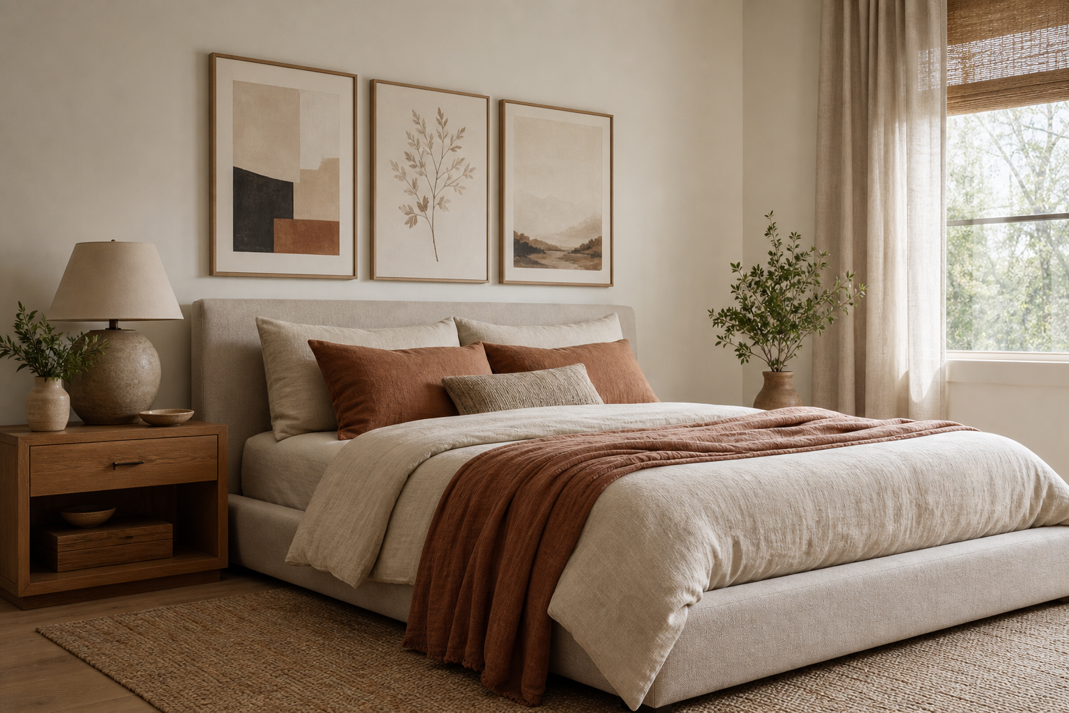
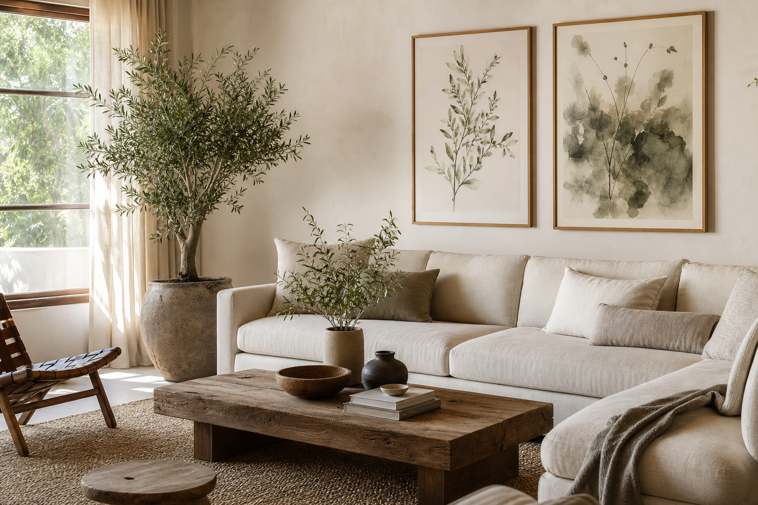
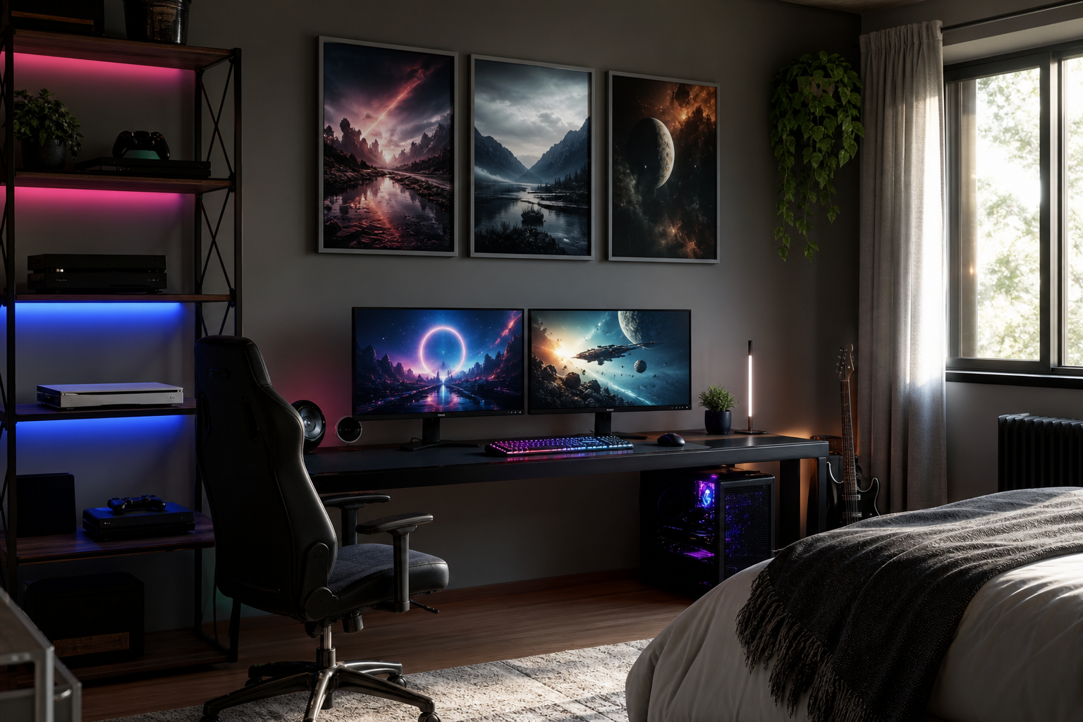
A well-chosen minimal poster does not just fill blank space. It controls visual noise, sets the pace of a room, and gives the eye a clear place to land. In rooms packed with textures, storage, screens, and daily objects, one restrained piece of wall art can bring more balance than five decorative accessories.
The strength of a minimal poster is precision. You are working with fewer elements — fewer colours, fewer shapes, less detail — so scale, framing, and placement matter more. Get those right, and the room feels intentional rather than empty.
What Makes a Minimal Poster Work
Minimal design relies on three things: negative space, a limited palette, and a clear focal point. Negative space is the blank area around the main subject, and it is not wasted space. On a print, it creates breathing room. On a wall, it makes the whole arrangement feel lighter.
A strong minimal poster often uses just one shape, one line drawing, or one quiet photographic subject. That could be a single flower silhouette, a fabric fold, a soft architectural curve, or a simple geometric composition. If the image reads clearly from 2 to 3 metres away, it usually has the restraint that minimal interiors need.
Colour is equally important. Cream, warm white, stone, sand, charcoal, and muted taupe are the most forgiving choices because they sit quietly with natural wood, black metal, and soft textiles. If you want more contrast, keep it controlled — one black-and-white print or one accent colour is usually enough for a wall under 2.5 metres wide.

If you want to build a calm scheme, start with pieces from our Minimalist collection or mix in spare compositions from our abstract art prints. Both categories work well when the room already has enough personality from materials like linen, oak, boucle, or concrete.
Choosing the Right Subject and Palette
The subject should match the room's mood. In a bedroom, soft organic forms work better than sharp, high-contrast graphics. In a home office, a cleaner architectural image or disciplined abstract composition can sharpen focus. In a hallway, simple line work or typography keeps the space open instead of crowded.
For soft interiors, choose motifs with curves and texture — fabric, petals, waves, mist, or quiet still-life forms. A piece like Elegant White Fabric adds movement without adding clutter. For stricter modern spaces, architectural images from our architecture wall art bring order through clean edges and repetition.
A minimal poster can also handle bold colour — but only when the room gives it room to breathe. If your walls, sofa, and rug are mostly neutral, one teal, rust, or ink-black piece can anchor the scheme. If the room already includes coloured upholstery, patterned cushions, or open shelving, stay with low-contrast tones so the art does not compete.



Typography can work in minimal interiors too, but only when the design is visually restrained. Avoid crowded layouts and dense blocks of text. Look instead at sparse designs from our typography prints where the composition matters as much as the wording.
How to Size and Place It Properly
A minimal poster needs enough scale to feel deliberate. Small art on a large empty wall often looks accidental. As a rule, wall art above a sofa, bed, or sideboard should span around 60 to 75% of the furniture width. Above a 180 cm sofa, that means a total artwork width of roughly 108 to 135 cm.
For single-piece styling, 50x70 cm and 70x100 cm are the most reliable sizes. A 30x40 cm print can work in tight corners, above a desk, or layered on a shelf, but it usually lacks presence over larger furniture. Minimal art depends on space around the piece, yet it still needs enough physical size to hold the wall.
Hang the centre of the piece around 145 cm from the floor in most homes. Above furniture, leave 15 to 25 cm between the top of the furniture and the bottom of the frame. These measurements keep the art visually connected to the room instead of floating too high.

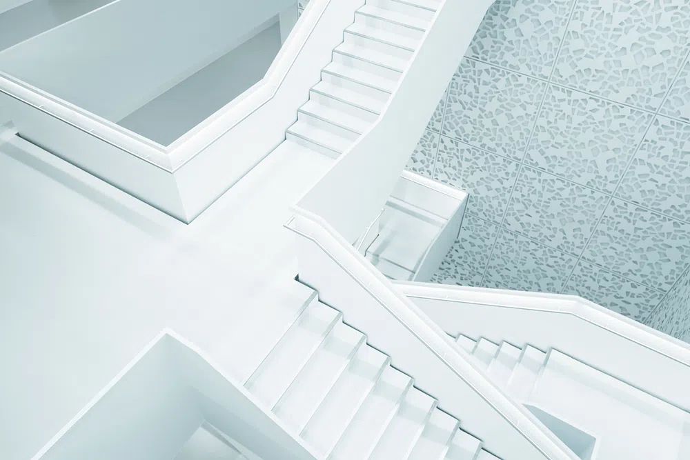
Minimal pieces look especially strong above low-profile furniture — platform beds, slim consoles, floating desks, or clean-lined sofas. A quiet composition such as Modern White Staircase works well in entryways and living rooms because the subject adds structure without visual heaviness.
Framing Ideas That Keep the Look Simple
Framing can either support a minimal poster or ruin the restraint. The safest choices are thin black, thin oak, or narrow white frames in matte finishes. Thick glossy frames tend to draw too much attention to themselves, especially on prints with subtle tonal variation.
Mounts are useful when the artwork itself is visually delicate. A white mount of 3 to 6 cm can make a 30x40 cm or 50x70 cm print feel more premium and more architectural. For larger prints with generous negative space already built in, skip the mount and keep the frame edge slim.
The glass finish matters too. Matte or low-reflection glazing is often the better choice in rooms with many windows because it reduces glare and keeps pale artwork readable throughout the day. This is especially important for white-on-white images and soft tonal pieces such as White Cream Texture or Textured White Abstract.

If your room already includes black lighting, dark handles, or steel accents, black frames create useful rhythm. If the room is built around ash, oak, or walnut furniture, natural wood frames are usually the calmer choice.
Styling a Minimal Poster with Other Decor
The easiest way to lose the effect of minimal wall art is to surround it with too many competing objects. Keep nearby surfaces edited. A console under the art might need only one ceramic vase, one stack of books, and one lamp. A shelf beneath a framed print should not be packed edge to edge.
Texture does the heavy lifting in a minimal room. Pair a quiet print with linen curtains, wool rugs, matte ceramics, brushed metal, plaster walls, or light timber. That mix adds depth without adding busyness. A piece like Textured Waves works well in these layered but restrained spaces because it echoes texture already present in the room.
Gallery walls can still be minimal — but only if you limit the palette and the number of pieces. A clean arrangement of 2 to 4 frames, aligned tightly with 5 to 7 cm spacing, feels much calmer than a loose salon wall. Stick to one frame finish and repeat either a colour family or a subject type.

For a softer look, blend minimal pieces from our Fine Art collection with pared-back images from our mindfulness prints. That combination works particularly well in bedrooms and reading corners where the goal is calm rather than contrast.
Where a Minimal Poster Fits Best
Bedrooms are often the best place for a minimal poster because the format supports rest. Choose low-contrast artwork above the bed, opposite the bed, or over a dresser. Avoid overly busy imagery and keep the palette within two or three dominant tones.
Home offices benefit from minimal wall art because it adds structure without distraction. One framed architectural print or disciplined abstract image behind the desk can make the whole work zone feel more intentional. In compact offices, even a single 40x50 cm piece can sharpen the space.
Hallways and entryways are ideal for narrow vertical prints or one medium-scale piece. These are transition spaces, so simple imagery works best. A Sailing Boat Minimalist Wall Art or a restrained monochrome composition keeps the visual tone calm from the moment you walk in.
Living rooms can handle slightly larger statements. If the room is already full of seating, cushions, plants, and lighting, choose one oversized minimal poster rather than several smaller pieces. One clear focal point creates more calm than a fragmented arrangement.
A Few Final Tips for Getting the Look Right
Buy for the room, not just for the print. Before choosing a minimal poster, note three things: the wall width, the dominant material tones in the room, and whether the surrounding decor is already quiet or busy. Those details will tell you whether the art should blend in or provide contrast.
If you are unsure, start with one large piece in a neutral palette. It is the most reliable route to a calm result, and it leaves room to build later. Minimal styling is less about owning less for its own sake, and more about choosing fewer things that do their job well.
Final thoughts
A minimal poster works best when every decision around it is clear: the subject is focused, the palette is restrained, the size suits the wall, and the frame does not compete. That is what gives minimal interiors their sense of ease.
If you want a room to feel cleaner, calmer, and more resolved, start with one piece that has space, balance, and a strong silhouette. One good minimal poster can change the whole rhythm of a room.
Frequently Asked Questions
What frame colour is safest for a minimal print?
Thin black, natural oak, and matte white are the easiest options. Choose the one that repeats another finish already in the room so the frame feels integrated.
Can minimal wall art work on coloured walls?
Yes — but contrast matters. On darker walls, choose lighter artwork or a white mount so the piece stays visible from across the room.
Should I use one large print or several small ones?
For a cleaner look, one large print is usually better. Several small frames can work, but only if spacing, palette, and frame style are tightly controlled.
Do minimal prints suit rented spaces?
They do, especially in 30x40 cm and 50x70 cm sizes that are easy to hang with low-damage methods. Leaning a framed piece on a shelf or console is another renter-friendly option.