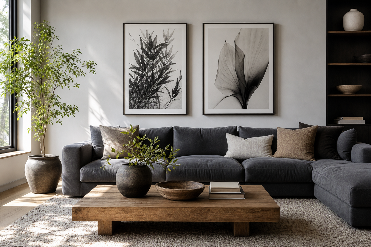
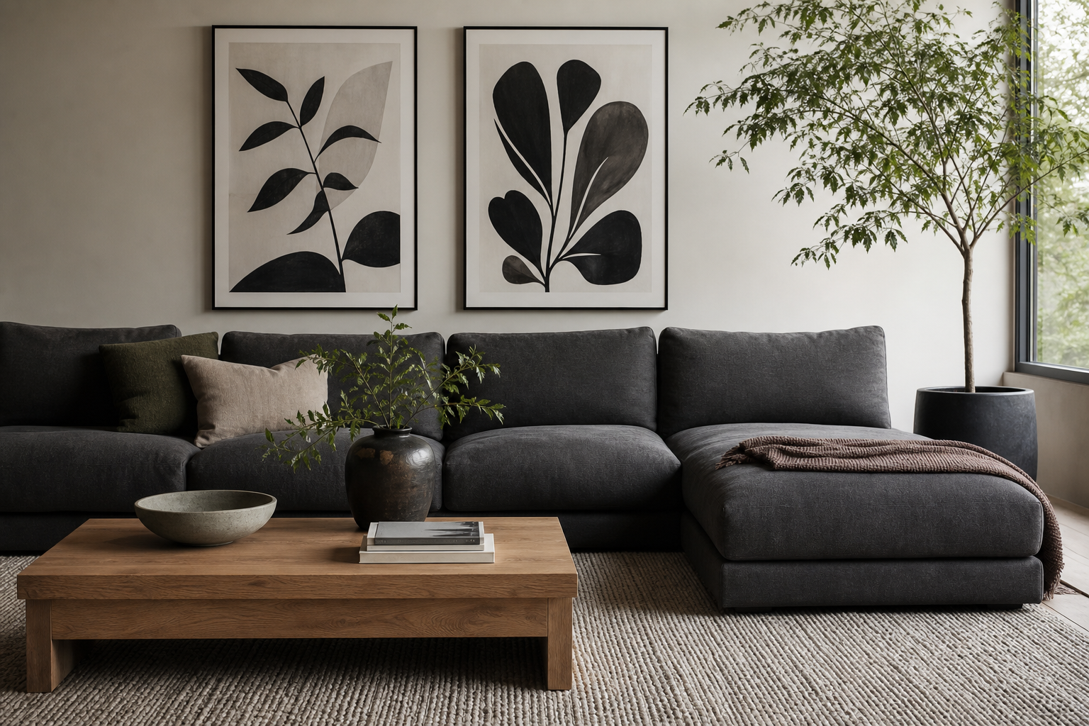
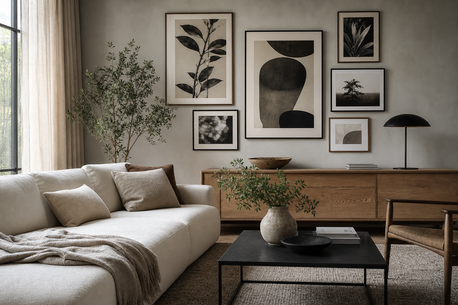
A black and white poster print is one of the easiest ways to make a room feel sharper, calmer, and more considered. It strips a composition down to contrast, form, and texture — which means it can sit comfortably in spaces that are modern, classic, Scandinavian, industrial, or softly traditional.
Because monochrome art does not compete with a room's palette, it often works harder than colorful wall art. A single black and white poster print can anchor a neutral room, while a grouped arrangement can bring order to spaces with mixed materials like oak, linen, steel, and plaster.
Why Black and White Always Works
Black and white art has a built-in sense of structure. Dark tones create definition, light tones leave visual space, and the gap between them gives even a simple composition more presence. That is why monochrome pieces tend to look polished at almost any size — from a compact 30 x 40 cm frame in a hallway to a 70 x 100 cm statement print above a bed.
It also adapts well across styles. In pared-back rooms, our Minimalist collection keeps the mood clean and architectural. In more layered interiors, Fine Art prints add softness and depth without disrupting the palette. If you want stronger realism or a more editorial look, black and white photography prints usually deliver the clearest focal point.

Choosing the Right Subject Matter
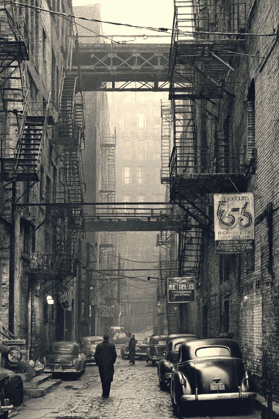
Some subjects become stronger in monochrome because they rely on silhouette, line, shadow, or surface detail rather than color. Photography is the most obvious example. Urban scenes, portraits, water studies, and close-up textures all gain intensity when reduced to black, white, and gray. A piece like Vintage Urban Alley suits rooms that need grit, depth, or a slightly cinematic edge.
Line art and minimalist subjects work particularly well in smaller rooms. They do not overfill the wall, and they leave more breathing room around furniture. If your home leans calm and understated, White Flower Silhouette or Torn Paper Black and White can keep the effect refined without feeling cold.

Abstract forms are useful when you want a monochrome look without a literal subject. Curves, smoke-like movement, sacred geometry, and textured surfaces all bring rhythm to a wall. You can browse our abstract black and white art if you want something more atmospheric than a photograph and more graphic than a botanical outline.
Typography can also work, but it needs care. Strong letter-based designs suit offices, entryways, and rooms with sharper styling. In soft bedrooms or relaxed family spaces, photographic or abstract black-and-white pieces tend to feel more timeless than word-led art.
Getting the Scale and Placement Right
Scale changes everything. A print that is too small will look accidental, especially above a sofa, headboard, or sideboard. As a rule, wall art should cover around 60 to 75% of the furniture width beneath it. Above a 180 cm sofa, that usually means one 100 x 70 cm frame, two 50 x 70 cm frames, or a gallery layout spanning roughly 110 to 135 cm.
Hanging height matters just as much. The center of the artwork should usually sit around 145 to 150 cm from the floor. Above furniture, leave 15 to 25 cm between the top of the sofa, console, or bed and the bottom of the frame. That distance keeps the arrangement connected to the room instead of floating too high.
A black and white poster print works especially well in transition zones where color can feel distracting. Hallways, stair landings, and home offices benefit from monochrome because it adds interest without visual clutter. In living rooms and bedrooms, larger formats create a calmer result than several undersized pieces.



Framing, Paper, and Finish Choices
The frame decides whether the art feels crisp, soft, formal, or relaxed. Black frames increase contrast and give monochrome work a more graphic edge. White frames reduce visual weight and suit airy interiors with pale walls. Oak or ash frames soften the black-and-white contrast and connect the print to natural flooring, shelving, or furniture.
Thin frames look cleaner and more contemporary, especially on minimalist or photographic work. Wider mouldings can suit classic fine-art pieces, but they can overpower simple monochrome imagery if the print itself is delicate. In most modern homes, a frame width of 1.5 to 2 cm is enough.
Paper and finish shape the mood at close range. Matte finishes reduce glare and make black-and-white photography feel more sophisticated in naturally bright rooms. A smoother finish can sharpen detail and deepen blacks, which works well for graphic abstracts and high-contrast images. If the room gets direct sun for several hours a day, avoiding heavy gloss is usually the safer choice.

For a softer monochrome look, fabric-like subjects and tonal studies can be more inviting than stark black blocks. Elegant White Fabric is a good example of how gentle contrast can still read as black and white while feeling warmer and less severe.

Styling with Colour and Texture
Monochrome art looks best when the room around it includes texture. Without that layer, black and white can feel flat. Linen curtains, boucle upholstery, ribbed ceramics, raw timber, brushed steel, and wool rugs all add depth that supports a grayscale palette.
Warm neutrals are especially effective partners. Cream, sand, mushroom, taupe, and soft greige stop black-and-white art from becoming too stark. If you want more contrast, add one darker element — a black side table, dark bronze lamp, or charcoal cushion — and repeat that tone two or three times around the room for balance.
Monochrome also pairs well with muted color. Olive, rust, dusty blue, and clay all sit comfortably beside a black and white poster print because they do not fight for attention. In these spaces, the wall art acts as the visual backbone while color stays in secondary layers like textiles and objects.
Where to Use It in the Home
In the living room, go larger than you think. A single bold photographic print or a pair of 50 x 70 cm works better over a sofa than several small frames. For a quieter look, choose gentle contrast and negative space. For a stronger focal point, a structured image from the Photography collection or a graphic composition from our Abstract collection will hold the wall better.
In bedrooms, softer monochrome is usually the safer choice. Look for fabric studies, floral silhouettes, calm landscapes, or tonal abstract pieces. Strong black blocks can feel too active above a headboard, while softer transitions create a more restful line of sight from the bed.

In hallways, one narrow vertical piece can add rhythm without crowding the passage. In kitchens, monochrome line work, still-life photography, or architectural subjects suit the cleaner surfaces and harder materials. In a home office, black-and-white typography or geometric art can bring focus, especially near a desk with metal or walnut details.
If you want a single piece with crisp visual structure, Sacred Geometry Black-White is effective in workspaces and hallways because its pattern reads clearly even from a distance.

A Few Final Styling Tips
Buy for contrast, not just subject. Before choosing a print, step back and look at the wall color, nearby furniture, and the amount of natural light. In a dim room, mid-tone monochrome can disappear, so clearer blacks and brighter whites usually perform better. In sun-filled rooms, softer grayscale and matte finishes often feel more elegant.
Think in pairs and repetition. If your black and white poster print includes curved lines, repeat that softness with a rounded lamp or boucle chair. If the art is sharp and architectural, echo it with squared furniture, black hardware, or linear shelving. Rooms feel finished when the artwork speaks the same design language as the objects around it.
Final thoughts
A well-chosen black and white poster print brings clarity to a room. It can calm a busy palette, strengthen a neutral scheme, or give shape to a wall that feels unfinished.
The best results come from matching subject, size, and framing to the room itself. Keep the palette simple, make scale intentional, and use texture to add warmth — that is how monochrome art feels designed rather than improvised.
Frequently Asked Questions
What frame color is safest for a black and white print?
Black is the most versatile if you want crisp contrast. Oak is the better choice when the room already has warm wood tones and soft neutrals.
Can I mix black and white prints with colored art?
Yes — use monochrome as the anchor and limit color pieces to one or two supporting works. Keep the frame style consistent so the wall still feels cohesive.
Should I use a mount around the artwork?
A white mount gives smaller prints more presence and makes the arrangement feel cleaner. It is especially useful for 30 x 40 cm and 40 x 50 cm formats.
Which rooms are best for high-contrast monochrome art?
Home offices, hallways, dining areas, and modern living rooms handle stronger contrast well. Bedrooms usually benefit from softer grayscale and gentler subject matter.
How far apart should frames be in a gallery arrangement?
Keep spacing consistent at 5 to 8 cm between frames. Tighter spacing looks more polished and helps separate pieces read as one composition.