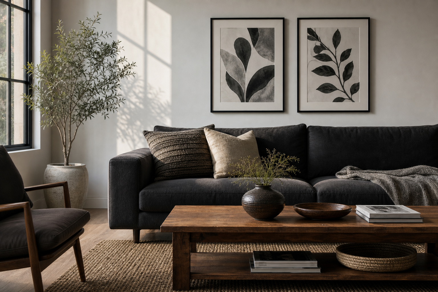
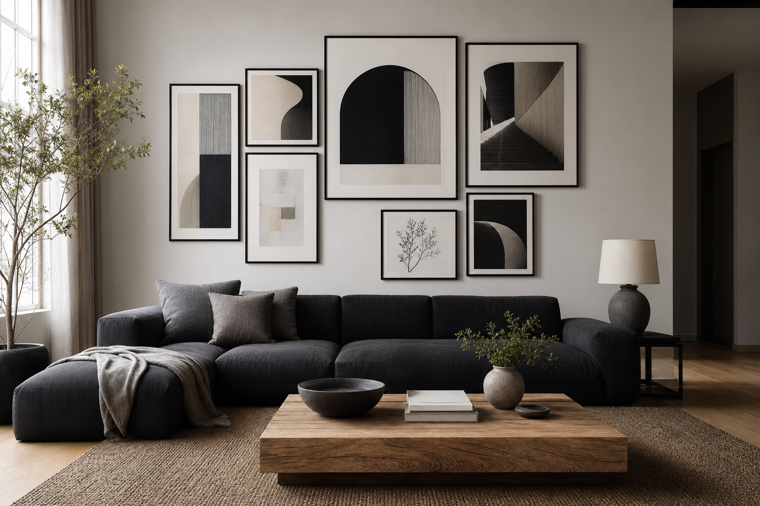
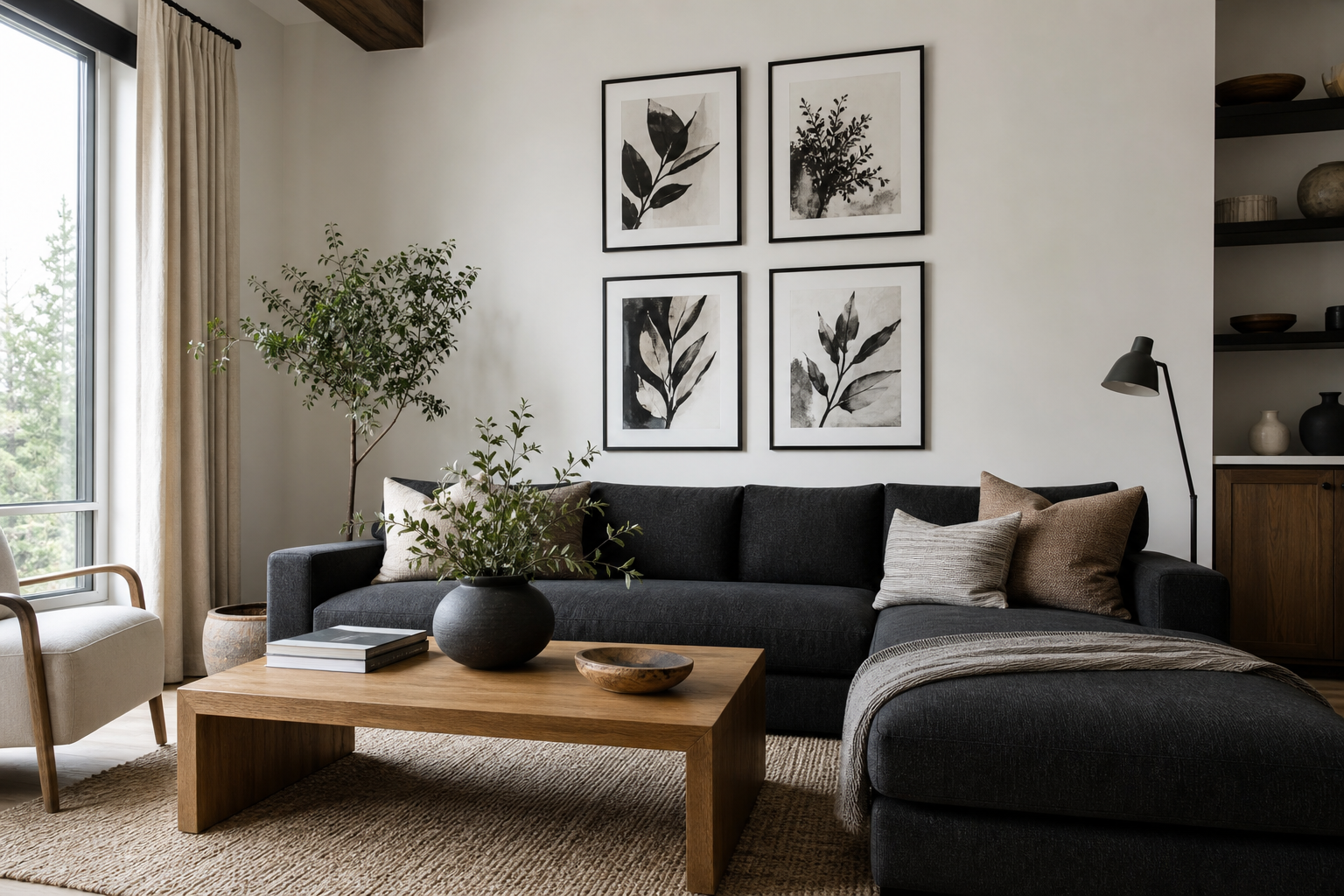
A strong anime wall art collection does not need colour to command attention. A well-chosen black and white poster anime piece relies on contrast, silhouette, and line quality — three things anime art already does exceptionally well. In a room, that means the print reads clearly from 2 to 4 metres away, even when the rest of the space is quiet and neutral.
Black and white poster anime also lasts longer stylistically than neon-heavy trends. Monochrome art sits comfortably with black metal frames, oak shelves, grey bedding, matte white walls, and even concrete or plaster finishes. If you want a room that feels personal but not visually overloaded, monochrome anime is one of the easiest ways to get there.
Why Black and White Anime Works So Well
Anime illustration often depends on dramatic outlines, expressive eyes, strong shadows, and sharp composition. Remove colour and those features become even more focused. Instead of competing with bright reds or electric blues, the eye lands on the pose, the face, and the rhythm of the line work. That is why black-and-white pieces often feel more mature than highly saturated character art.
Another practical advantage is balance. In smaller bedrooms or desk setups, large colourful prints can dominate the wall too aggressively. A black and white poster anime composition still gives impact, but with less visual noise. It can anchor a 50 x 70 cm wall section above a desk or fill a 70 x 100 cm space above a bed without making the room feel cramped.
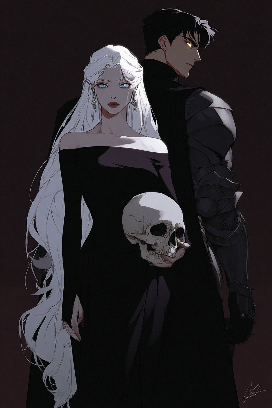
When you want the wall art to feel more cinematic and atmospheric, look for portraits with deep shadows, negative space, or a close crop. Pieces such as Dark Elegance — Anime Art Print show how monochrome styling sharpens mood and gives the subject more presence. For rooms with black accents, smoked glass, or graphite textiles, this kind of artwork tends to look especially cohesive.
Choosing the Right Anime Poster Style
There is more than one monochrome anime look, and choosing the right one depends on how the room should feel. Manga-panel inspired art works well if you like movement, layered detail, and a slightly raw graphic edge. Minimal character portraits suit cleaner interiors, especially if your furniture already has simple lines. Dramatic close-ups create a focal point, while vintage-inspired designs feel softer and more nostalgic.
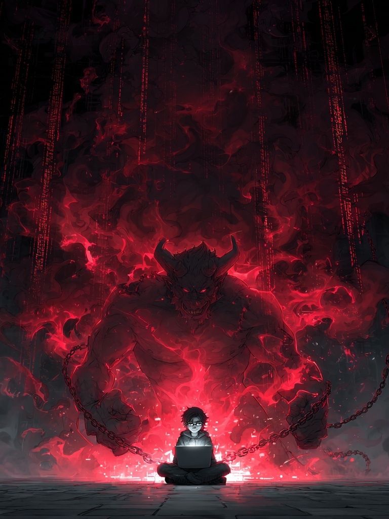
If your room already includes LED lighting, gaming gear, or dark furniture, a sharper, more intense piece will usually hold the space better than a delicate illustration. A work like Digital Demon — Anime Art Print brings strong shape and attitude, which helps the wall avoid looking flat in low light. In contrast, if your setup is lighter — white desk, pale wood, soft textiles — a quieter portrait such as Anime Character Portrait — Digital Art Print can feel more refined.

A useful styling rule is to match the print complexity to the room complexity. Busy room, simple print. Simple room, detailed print. If you already have open shelving, figures, books, and tech on display, one clean portrait will feel stronger than a collage of heavy detail. If the room is spare, a more layered anime illustration can add needed texture.
You can also broaden the mix with adjacent categories when building a black-and-white scheme. A few pieces from our minimalist print collection or selected works from illustration wall art can help break up an all-character wall without losing the monochrome theme.
Best Sizes and Placements for Impact
For a single statement piece above a bed, 50 x 70 cm is the safest minimum. On most double or queen-size beds, 70 x 100 cm creates a stronger proportion and prevents the art from looking undersized. The ideal width is usually around 50 to 70 percent of the furniture below it. Above a 140 cm desk, for example, aim for wall art spanning roughly 70 to 100 cm.
Bedrooms are the easiest place for black and white poster anime because monochrome tones already suit bedding, curtains, and rugs. In a gaming room, use one larger framed piece instead of several small ones if the rest of the setup already includes glowing screens and LEDs. In an office, keep the art at eye level and choose cleaner compositions that support concentration rather than distract from it.

Gallery walls work best when you keep spacing consistent — usually 5 to 8 cm between frames. A four-piece arrangement in 30 x 40 cm or 40 x 50 cm sizes is ideal for a sofa wall, side wall near a wardrobe, or the area above a narrow console. If you want a more editorial look, mix one larger anchor piece with two smaller supporting prints and one minimalist black-and-white design.

Framing, Paper, and Finish Choices
Monochrome art lives or dies on print clarity. Fine lines, ink-like shadows, and facial detail need crisp reproduction, so matte paper is usually the most dependable choice. It reduces glare by a noticeable margin compared with glossy finishes, especially in rooms with windows opposite the wall. If the print sits near a desk lamp, matte also keeps reflections from cutting across the image.
Frame colour matters just as much as the artwork. Black frames create the cleanest edge and make white borders look intentional. Oak frames soften the result and work well if the room includes natural wood furniture. White frames can work, but only when the wall colour is darker or the image itself has enough contrast to avoid blending into the background.

If you want a modern, sharper finish, pair black frames with generous white margins. If you want something more immersive, choose edge-to-edge artwork with a narrow frame. For clean contrast, a piece like Torn Paper Black and White Poster works especially well beside anime imagery because it repeats the monochrome palette without competing for attention.
How to Build a Cohesive Black-and-White Wall
The easiest way to make a black-and-white wall feel designed rather than improvised is to repeat the same three elements across the whole setup: frame finish, spacing, and tonal range. That means all-black frames or all-oak frames, gaps kept at 5 to 8 cm, and prints that share similar blacks, whites, and greys. Once those three stay consistent, you can vary subject matter more freely.
A strong formula is 70 percent character-led art and 30 percent supporting pieces. The supporting prints can be abstract monochrome designs, line-led illustrations, or minimal graphic works. This keeps the anime focus clear while stopping the wall from feeling like a merch display. Use one hero piece, one or two medium portraits, and one simpler print to give the eye somewhere to rest.

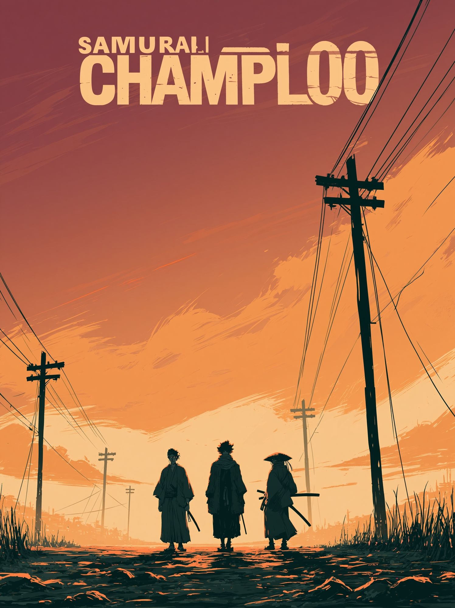
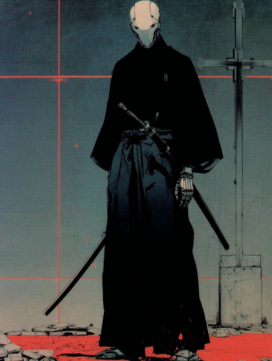
For example, a dramatic anime portrait can sit beside a graphic minimalist work and still feel intentional when both share the same black density and framing. That is why combining a piece from Samurai Champloo Anime Poster or Samurai Robot — Anime Print with monochrome designs from our minimalist black-and-white collection often produces a more polished wall than using four character pieces at once.
Shop Tips for Finding the Right Poster
Start with clarity. In black-and-white art, blurred edges and muddy shadows show up faster than in colourful prints. Zoom in on facial features, hair strands, and dark areas. If the shadows look crushed together or the fine lines disappear, the print will lose impact once framed and viewed from distance.
Next, think about character focus. A full-body action scene can work in a larger format, but smaller sizes often benefit from close-ups or half-length portraits because the emotion stays readable. If you are shopping for a 30 x 40 cm frame, choose artwork with a strong silhouette or face. If you are filling a 70 x 100 cm wall, more detail can be an advantage.

Finally, buy for the room first, then the character second. The best black and white poster anime choice is not always the most dramatic image on its own — it is the one that fits the scale, mood, and materials already in the room. If your space is clean and architectural, choose restraint. If it is dark, layered, and expressive, go bolder with contrast and attitude through pieces from our anime poster range.
Final thoughts
Black and white poster anime works because it sharpens what anime already does best — line, emotion, and contrast. It gives you character-led wall art that feels graphic and personal, while still fitting a modern interior with discipline.
Choose the style based on the room, not just the fandom. Get the size right, keep framing consistent, and mix in one or two quieter monochrome pieces for balance. That is what turns a few good prints into a wall with lasting edge.
Frequently Asked Questions
What frame size should I choose if the print has a white border?
Add 2 to 5 cm visually around the artwork when planning placement. A 50 x 70 cm print with a generous white margin can still read like a slightly smaller image on the wall, so hang it with enough surrounding space.
Does black-and-white anime art work in small rooms?
Yes — often better than bright multicolour art. Monochrome prints create contrast without adding visual clutter, especially in rooms under 12 square metres.
Should I match all the frames in a gallery wall?
For a tighter, more editorial result, yes. Mixing frame finishes can work, but only if the artwork selection is very restrained and the spacing is exact.
Is matte or glossy better for detailed anime line work?
Matte is usually better for line-heavy art because it reduces glare and keeps fine detail readable from different angles. Gloss can deepen blacks, but it reflects more light.
What colours pair best with monochrome anime prints?
Black, white, charcoal, warm grey, walnut, and oak are the easiest matches. For a sharper accent, add one controlled colour such as deep red, forest green, or steel blue in textiles or small decor.