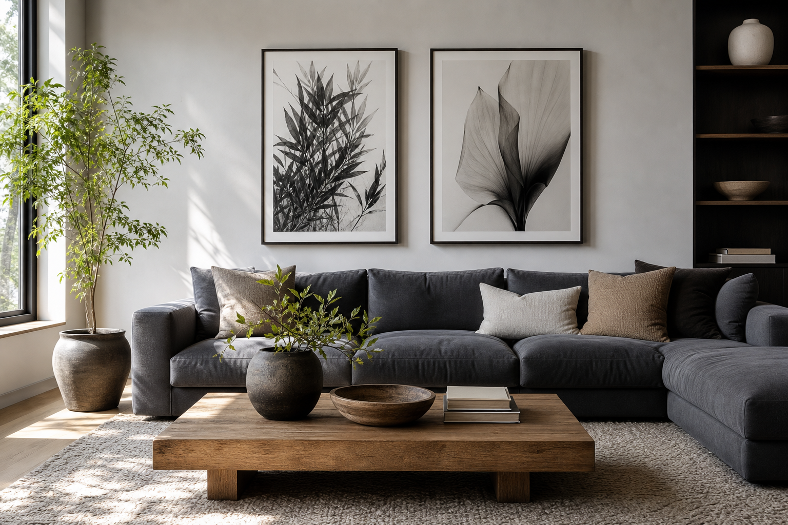
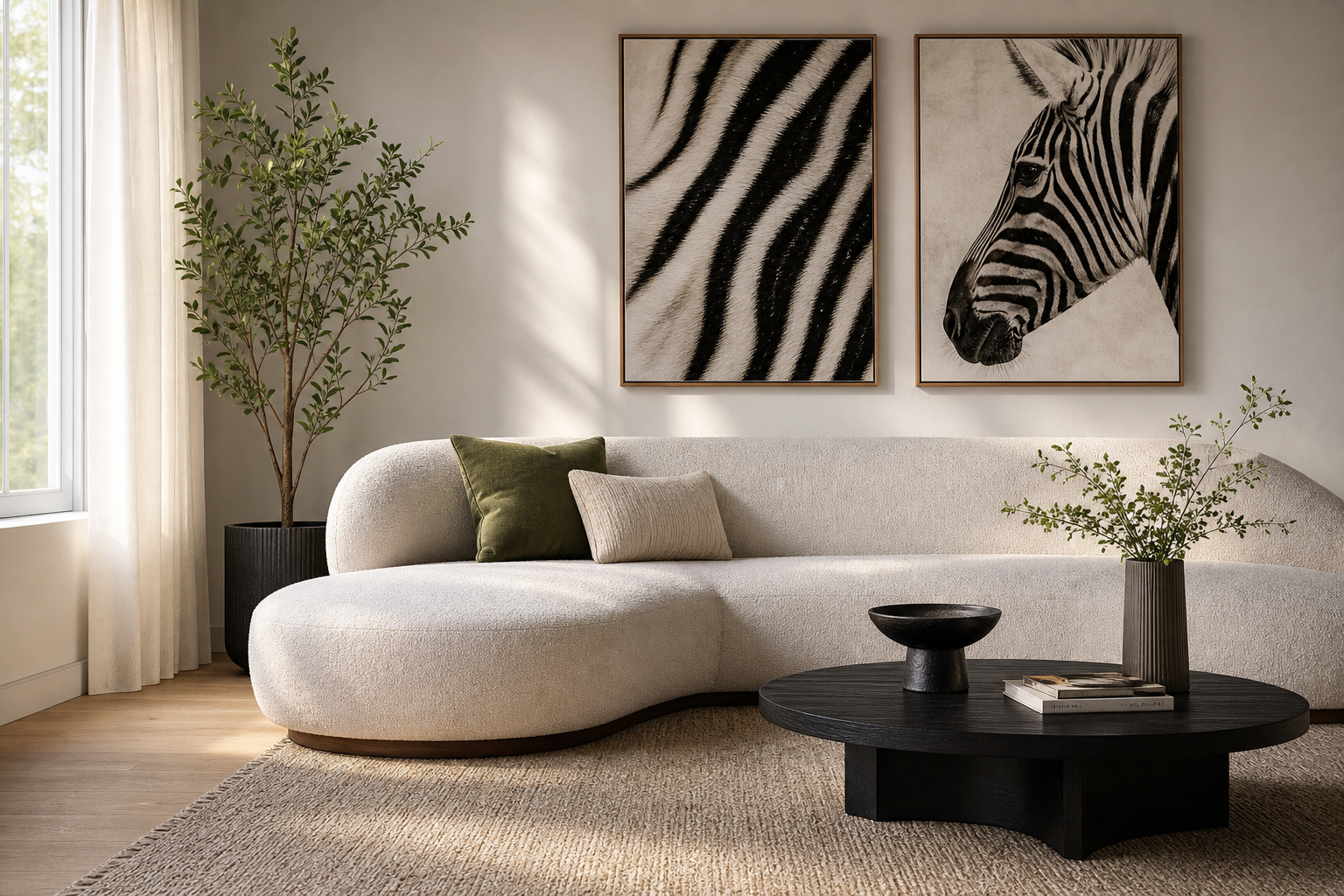
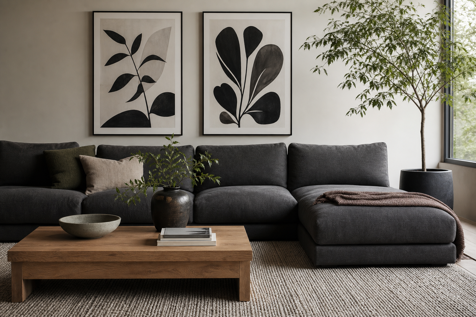
A well-styled black and white anime poster has two strengths at once: strong graphic contrast and emotional detail. It brings the expressive line work of anime into a room without the visual noise that bright colour can add. That makes it easier to live with every day, especially in bedrooms, study corners, and compact apartments where wall art needs to feel sharp but not chaotic.
Why Black and White Anime Works So Well
Monochrome anime art reads quickly from across a room. Black lines against a white or pale ground create high contrast, so even a 30 x 40 cm print can hold its own above a desk or beside a bed. At larger sizes like 50 x 70 cm, the effect becomes architectural — the artwork starts shaping the room rather than just decorating it.
A black and white anime poster also works across more interiors than a saturated design. It can sit comfortably with oak, walnut, black metal, concrete, linen, or white-painted walls. If your home already includes clean silhouettes and muted tones, pieces from our minimalist art print collection pair especially well with anime imagery because they echo the same restraint.
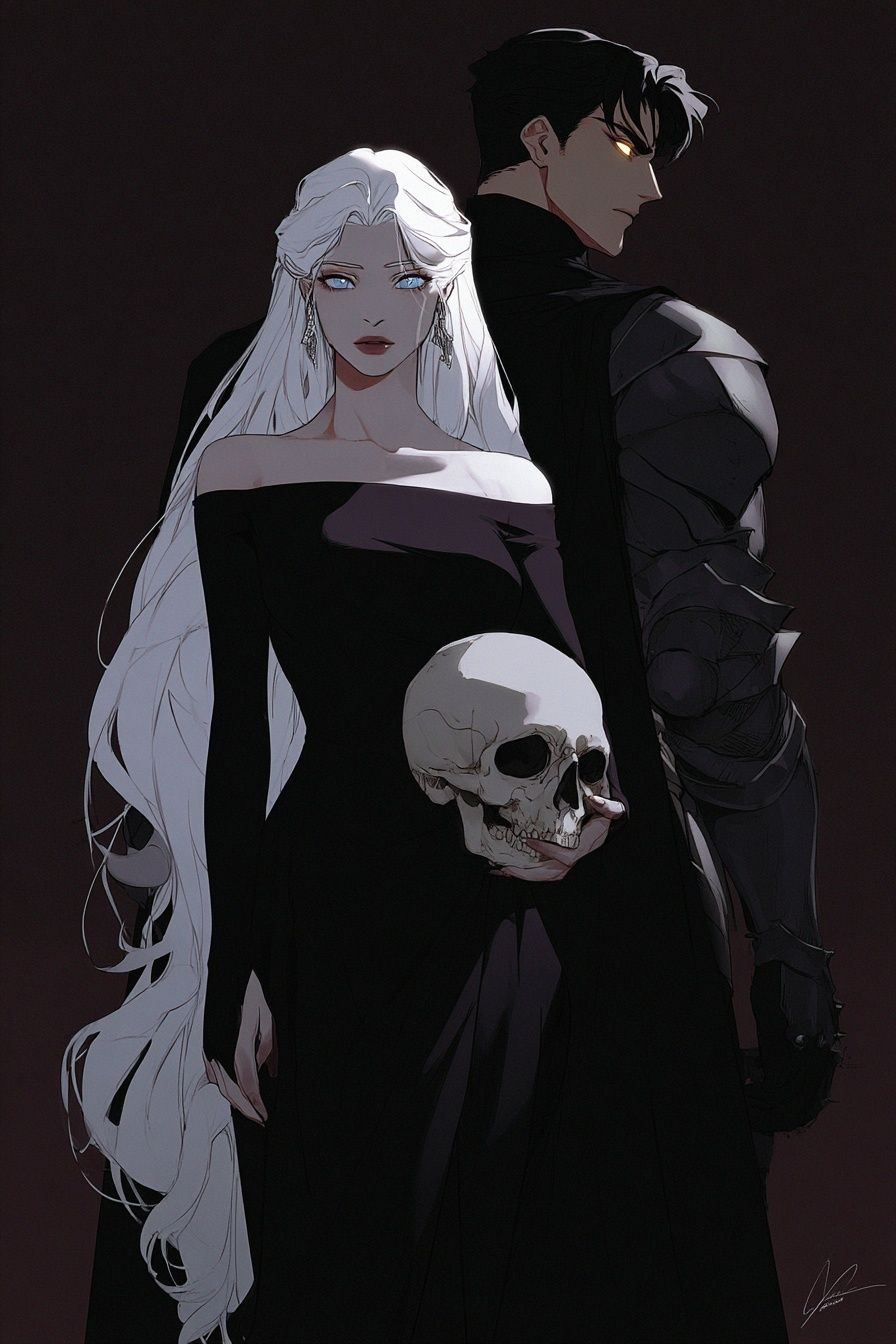
For a room that leans darker and more dramatic, character-driven artwork with strong shadows is often the best fit. Dark Elegance — Anime Art Print is a good example of how anime styling can feel refined rather than busy.
Choosing the Right Scene or Character
The subject matters as much as the colour palette. A close portrait creates intimacy, while a dynamic stance creates motion. In a bedroom, calm faces, side profiles, or still compositions usually feel better than combat-heavy scenes because they keep the wall restful. In a gaming nook or creative workspace, a sharper pose can add energy without overwhelming the whole room.
Portrait-style art tends to work best when you want the piece to feel personal. A focused character study like Anime Character Portrait — Digital Art Print suits reading corners, vanity areas, or the wall above a slim console. The composition feels contained, which is useful in smaller spaces where every object is visible at once.
If you want more edge, choose a scene with a strong silhouette. Figures with swords, coats, wind-swept hair, or urban details often translate beautifully into monochrome because the shape language carries the image. Our anime wall art collection includes several pieces that naturally suit a black-and-white styling approach even if the original concept is more dramatic.

Best Rooms and Wall Colours for the Look
The easiest places to style monochrome anime art are bedrooms, home offices, and hallways. These rooms benefit from visual clarity. In a bedroom, place the print 15 to 25 cm above the headboard so it feels connected to the furniture. In a desk setup, centre the frame at seated eye level or roughly 145 cm from the floor to the middle of the artwork.
Wall colour changes the effect more than most people expect. On crisp white walls, the artwork looks graphic and contemporary. On soft greys, it feels calmer and more blended. On deep charcoal or black-painted walls, use a white mat to prevent the image from disappearing into the background. If your room already has black fixtures, a white wall with one black frame usually gives the cleanest result.
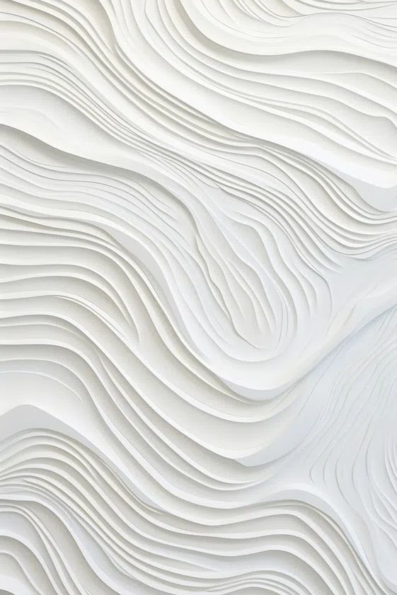
This look also pairs well with restrained textures. A monochrome anime print beside Torn Paper Black and White Poster or neutral abstract work creates cohesion without forcing everything into the same subject matter.



Sizing, Framing, and Finish Choices
Size should match viewing distance. For a narrow wall section — between a wardrobe and a window, for example — 30 x 40 cm or 40 x 50 cm is often enough. Above a double bed or sofa, 50 x 70 cm has better presence. If the furniture is wider than 140 cm, aim for artwork that spans about 50 to 70 percent of that width once framed.
Frames matter because anime line work can shift from casual to polished depending on the border. A matte black frame gives the strongest contrast and works especially well in modern interiors. A white frame feels lighter and more Scandinavian. Oak is useful when the room has warm timber flooring or shelving, but keep the profile slim — around 1.5 to 2 cm wide — so the frame does not overpower the illustration.
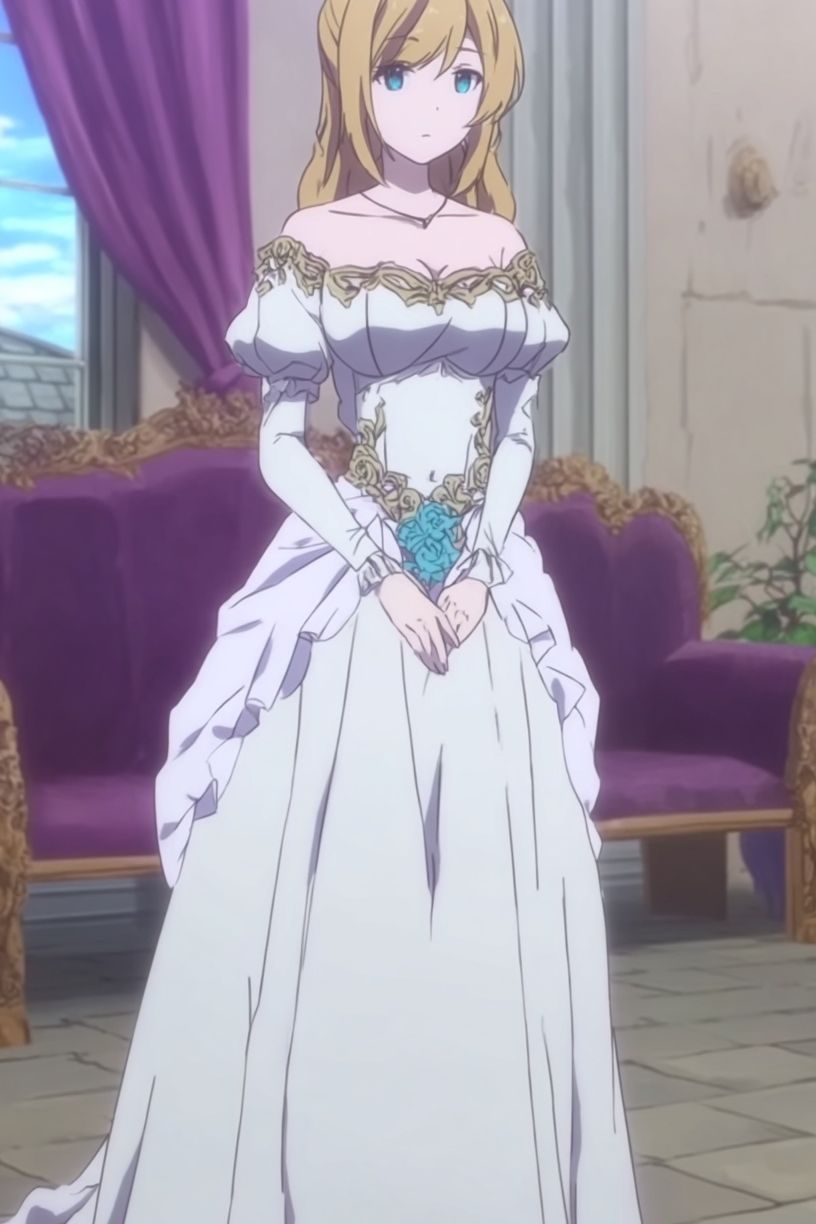
Matting is worth it for monochrome pieces. A white mount of 5 to 8 cm gives breathing room and makes a detailed drawing feel more gallery-like. This is especially effective for refined works such as Elegant Bride — Anime Print, where delicate lines benefit from extra space around the image.
For finish, matte paper is usually the stronger choice. It reduces glare under ceiling lights and preserves line detail. Gloss can increase contrast, but in bright rooms it often reflects windows and lamps too aggressively. If the print will hang opposite a large south-facing window, matte is the safer option by a wide margin.
How to Build a Gallery Wall Around One Poster
Start with one hero piece, then support it with quieter neighbours. If your main artwork is a black and white anime poster, surround it with two to four prints that share either the palette or the mood. Good companions include abstract textures, grayscale shapes, or one subtle figurative piece. The goal is contrast in subject, consistency in tone.
A reliable gallery formula is 1 large piece at 50 x 70 cm, 2 medium pieces at 30 x 40 cm, and 2 small pieces at 21 x 30 cm. Keep spacing tight — 5 to 7 cm between frames looks intentional. Wider gaps can make the arrangement feel disconnected, especially when the pieces are monochrome and depend on rhythm more than colour.
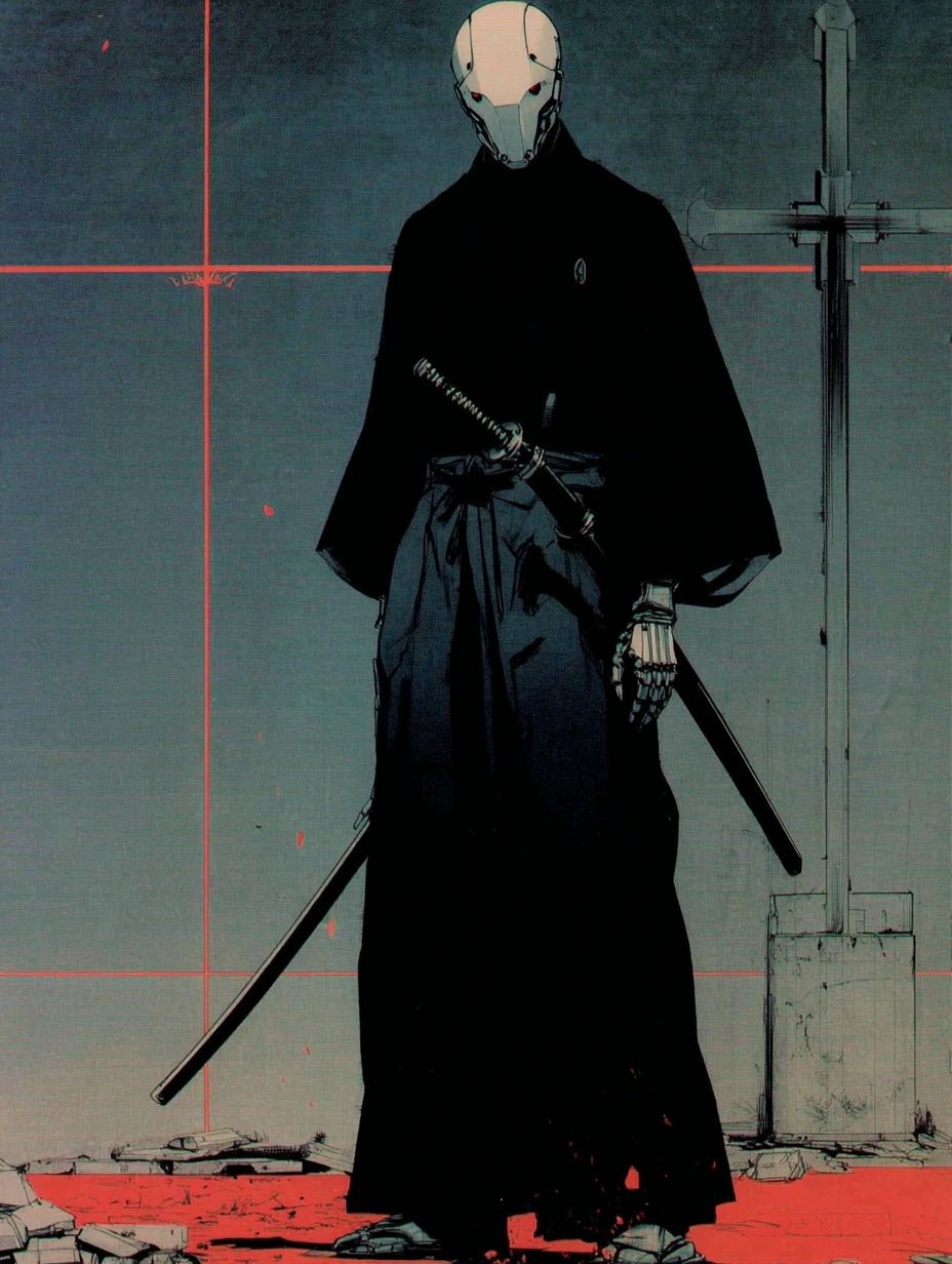
If you want a bolder focal point, place a stronger character piece off-centre and balance it with quiet texture. Samurai Robot — Anime Print works well in this role because the figure has presence, while surrounding minimalist pieces prevent the wall from feeling overloaded.

You can also echo the artwork elsewhere in the room. A black floor lamp, a charcoal throw, a steel desk accessory, or a white ceramic vase will repeat the palette without becoming theme decor. That is the difference between a stylish wall and a fandom corner that feels accidental.
Simple Styling Tips to Keep It Balanced
Use one strong contrast point per wall. If the artwork is intense, keep the shelf below it simple — one stack of books, one object, one plant. If the room already has patterned bedding or a busy rug, choose a calmer anime image with a clear silhouette rather than a highly detailed action scene.
Lighting should support the frame, not flatten it. Warm bulbs around 2700K to 3000K make black frames feel softer and more residential. Cool white light can make monochrome art feel harsh, especially in bedrooms. If possible, angle a picture light or wall sconce 30 degrees downward to reduce reflections on the glazing.
Balance also comes from negative space. Leave at least 10 to 15 cm between the frame and nearby shelves, lamps, or curtain lines. A black and white anime poster needs room around it so the line work stays legible. Crowding is the fastest way to make monochrome art feel messy.

If you want the look to feel more mature, pair anime art with materials that have weight: linen curtains, smoked glass, dark wood, powder-coated metal, or textured plaster. Combining expressive illustration with grounded materials gives the room depth. For more contrast-led pairings, browse our Textured Concrete Wall — Minimalist Print and related neutral pieces.
Wrap Up: Make the Poster Feel Personal
A black and white anime poster works best when it reflects both your taste in art and the way you use the room. Choose a scene that matches the mood you want, size it to the wall properly, and frame it with enough restraint that the illustration can lead. That is what makes the piece feel considered rather than temporary.
The most convincing rooms mix fandom with design discipline. Pull from our anime print collection when you want character and narrative, then anchor the look with neutral textures and clean framing. Done well, the result is expressive, modern, and easy to live with every day.
Frequently Asked Questions
What frame glazing works best for a black and white anime print?
Acrylic is lighter and safer for bedrooms or dorms, while glass gives a slightly crisper look. If the wall gets direct daylight, choose anti-reflective glazing when possible.
Can I mix a black and white anime poster with coloured decor?
Yes — keep the colour accents controlled. One or two repeat tones, such as deep green or muted red, are usually enough to keep the room cohesive.
Is this style suitable for small dorm rooms?
Very much so. A single 30 x 40 cm or 40 x 50 cm framed print above a desk or bed adds character without using any floor space.
Should all frames in a gallery wall match?
Not necessarily, but they should relate. Use one dominant finish — such as black — and introduce only one secondary frame tone like oak or white.
How do I hang art without damaging rental walls?
Use removable hanging strips for lighter frames and always check the weight rating. For larger framed pieces, a picture rail hook or a single small nail is often more secure and leaves less visible damage than multiple adhesive tabs.