Why Zebra Print Works So Well in Modern Interiors
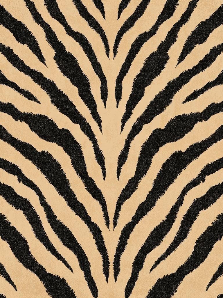
A black white zebra print works because it delivers contrast instantly. Black and white is the sharpest visual pairing you can bring into a room, and zebra markings add movement without relying on loud color. That makes the look flexible: it can sit comfortably in a pared-back apartment with our minimalist wall art collection or add a cleaner edge to layered spaces with richer textiles and darker furniture.
Zebra imagery also bridges styles that usually stay separate. In a contemporary room, the stripes read as graphic and sculptural. In a more classic space, a zebra study can feel collected and slightly vintage—especially when paired with pieces like the Zebra (1803) painting high resolution or the Zebra (1763) painting high resolution. If you want the subject to feel more modern and less traditional safari, choose cleaner compositions from our animals collection with strong negative space and tightly cropped detail.
A well-chosen black white zebra print also solves a common styling problem: how to make a neutral room feel intentional. Beige, white, charcoal, and oak can sometimes flatten out. Zebra art introduces a defined focal point, so the room gains structure without needing five extra decorative objects on every surface.
Choosing the Right Scale for Your Space
Scale changes the entire effect. A single 50x70 cm or 61x91 cm piece above a console gives you a crisp statement. Go up to 70x100 cm if the wall is wider than 180 cm and the surrounding furniture is low-profile. Large zebra artwork feels especially strong when the composition is simple—bold stripes, close-cropped face, or a centered silhouette—because the image can hold visual weight from across the room.
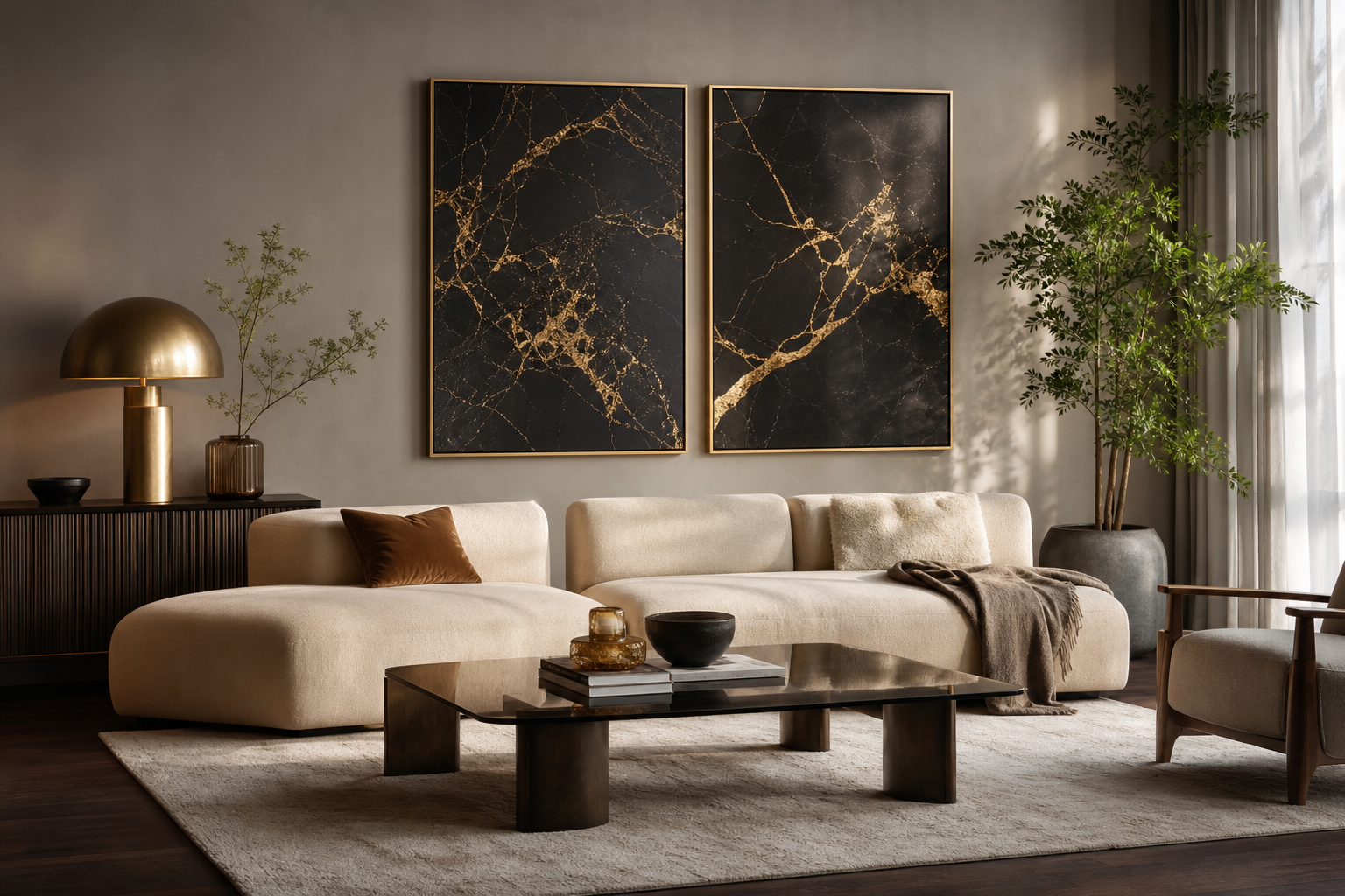
Pairs work well on walls between 120 and 180 cm wide. Two 40x50 cm frames with 5 to 7 cm spacing create symmetry without becoming stiff. One smart combination is an animal-led piece next to a more graphic stripe-based print, which gives variation while keeping the palette tight. If your room already has patterned upholstery or a rug, smaller formats such as 30x40 cm are safer because they add contrast without competing for dominance.
Avoid undersizing. One 21x30 cm frame above a 220 cm sofa will look accidental. As a quick guide, your art arrangement should span about 60 to 75 percent of the width of the furniture below it. That rule works for sofas, beds, sideboards, and desks.
Best Rooms for a Zebra Print Poster
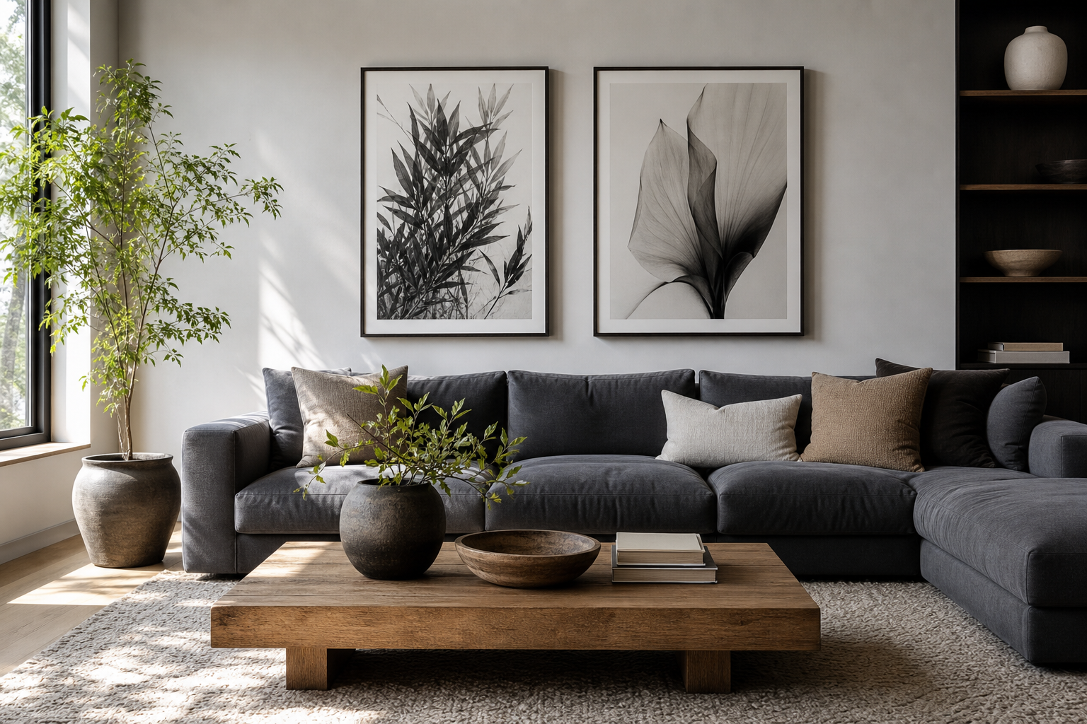
Living rooms are the easiest place to start because zebra art performs well as a focal point. Above a sofa, a monochrome zebra piece adds structure to soft materials like linen, boucle, wool, and light oak. If your living room palette is mostly cream and taupe, the stripes create enough tension to keep the scheme from drifting into bland territory.

Bedrooms benefit from zebra art when you want calm with character. Place one medium frame above the headboard or a pair above a bench. Keep bedding simple—white, greige, charcoal, or soft sand—and repeat black only in two or three places, such as bedside lamps, frame edges, or a thin striped throw. That rhythm makes the wall art feel integrated instead of dropped in at the end.
Hallways and home offices are strong choices too. A narrow corridor can handle one vertical zebra portrait because pass-through spaces benefit from bold imagery. In a home office, zebra art adds energy without the distraction of bright color. If your desk area already uses black hardware or a dark chair base, a monochrome animal print will feel precise and cohesive. For a softer study wall, pair zebra imagery with Textured White Abstract Poster or selections from our abstract print collection.
How to Balance Bold Pattern with Simple Decor
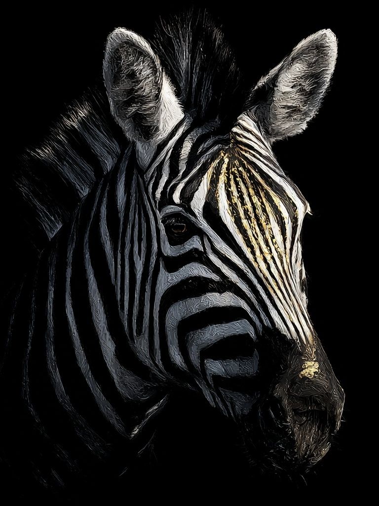
The best zebra styling uses restraint around the artwork. If the print is stripe-heavy, let the rest of the room rely on solids and textures. Think plaster walls, matte ceramics, woven baskets, boucle upholstery, brushed linen, or a ribbed glass lamp. These surfaces add depth without introducing more pattern.
Stick to a narrow base palette. A reliable formula is 70 percent light neutrals, 20 percent warm natural materials, and 10 percent black accents. In practice, that could mean off-white walls, oak furniture, a jute rug, and a few black elements like frames, candlesticks, or a side table. Zebra art then becomes the high-contrast note rather than one more busy layer.
If you want a more elevated fashion-led look, mix zebra with sculptural monochrome pieces rather than other animal motifs. A zebra print can sit neatly beside Elegant White Fabric — Minimalist Print or Torn Paper Black and White Poster because both echo movement and texture without repeating the same subject.



Framing and Finish Ideas That Elevate the Look
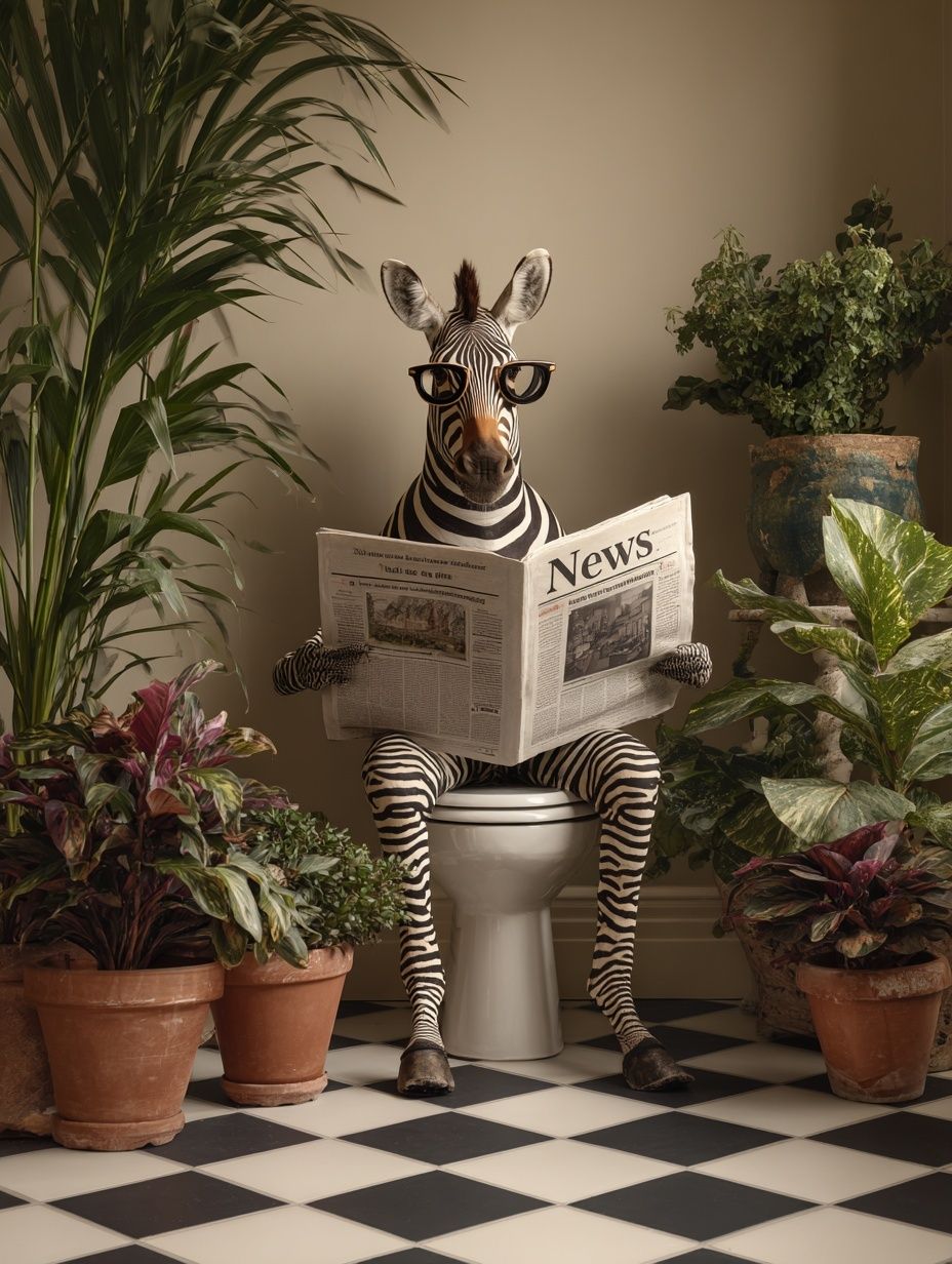
Frame choice determines whether zebra art feels casual, graphic, or polished. Black metal or slim black wood frames sharpen the contrast and suit modern rooms best. White frames soften the effect and work well when the wall color is mid-tone gray, taupe, or olive. Natural oak can also work—especially in Scandinavian-leaning interiors—but use a lighter oak with a matte finish so it does not pull the image toward rustic territory.
A mat mount gives zebra imagery more breathing room. For 30x40 cm art, a mat that expands the overall frame to 40x50 cm creates a more gallery-like result. On larger pieces, a 5 to 8 cm white border makes dense stripe patterns feel calmer and more expensive. This is particularly useful if you choose a detailed piece such as Zebras in Love — Black-White Print.
Paper finish matters more than many buyers expect. Matte paper reduces glare and keeps black areas rich rather than reflective, which is useful in rooms with large windows or overhead spotlights. If the room has directional natural light, keep the artwork opposite the brightest window rather than directly facing it to preserve contrast throughout the day.

How to Build a Cohesive Black-and-White Gallery Wall
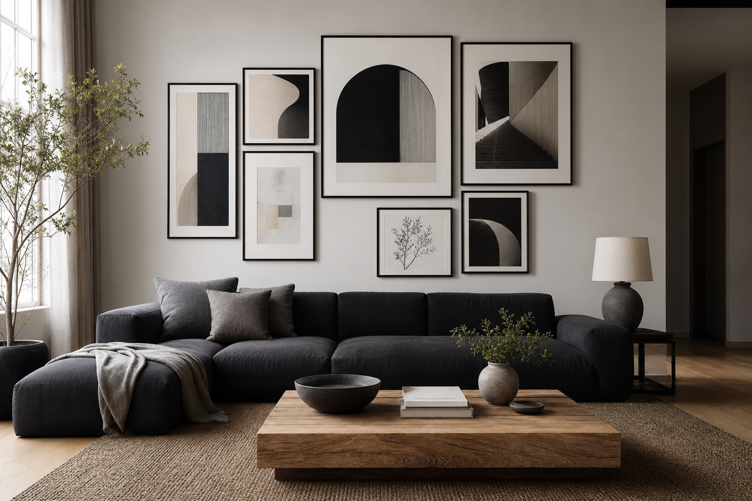
A gallery wall built around zebra art works best when the zebra piece is the anchor, not one of seven equally loud works. Start with one hero frame—usually the largest item at 50x70 cm—then add three to five supporting pieces in 30x40 cm or 40x50 cm sizes. Keep spacing consistent at 5 to 8 cm for a tailored look.
The easiest mix is one zebra artwork, one minimalist texture print, one line-led abstract, and one black-and-white subject with a different silhouette. That variation keeps the arrangement curated. For example, Wolf Portrait Black-White Poster introduces another monochrome animal form without duplicating the stripe rhythm, while Black Umbrella Minimalist Poster adds clean shape and negative space.
Use asymmetry carefully. If your zebra print has strong dark mass on one side, balance it with a lighter neighboring print rather than mirroring another heavy image. Before hanging, lay everything on the floor and photograph the arrangement from above. If one corner visually dominates, swap a darker piece toward the center.


Final Styling Tips for a Confident Zebra Look
Treat zebra art as a statement with discipline around it. Repeat black in small doses—frame edges, lighting, one vase, one cushion—so the artwork feels connected to the room. If you add more than one patterned textile, keep at least one of them low-contrast, such as a thin stripe or woven tonal check, not another bold animal motif.
Before you commit, check sightlines from the doorway and the main seat in the room. Zebra stripes read best when there is at least 1.5 to 2 meters of viewing distance for medium and large sizes. If the piece still feels too stark, soften the setting with warm whites, timber, and tactile fabrics rather than replacing the artwork. That keeps the look crisp, intentional, and easy to live with.
Frequently Asked Questions
What frame color is safest for zebra wall art?
Matte black is the most reliable choice because it reinforces the contrast without adding another tone. Light oak is a strong second option for softer Scandinavian-style rooms.
Can zebra prints work in small rooms?
Yes—choose one 30x40 cm or 40x50 cm piece and keep nearby decor simple. In compact rooms, one focused artwork is usually stronger than a crowded arrangement.
Should I use glass or acrylic for framed zebra art?
Acrylic is lighter and easier to hang on large formats, while glass gives a slightly crisper finish. In bright rooms, choose the least reflective option available to reduce glare on black areas.
What colors pair best with black and white zebra art?
Warm white, sand, greige, taupe, charcoal, and natural oak are the easiest partners. Olive and muted terracotta can also work in small accents if the rest of the room stays restrained.
How high should I hang zebra wall art above furniture?
Leave around 15 to 25 cm between the bottom of the frame and the top of a sofa, headboard, or console. That distance keeps the artwork visually connected to the furniture below.