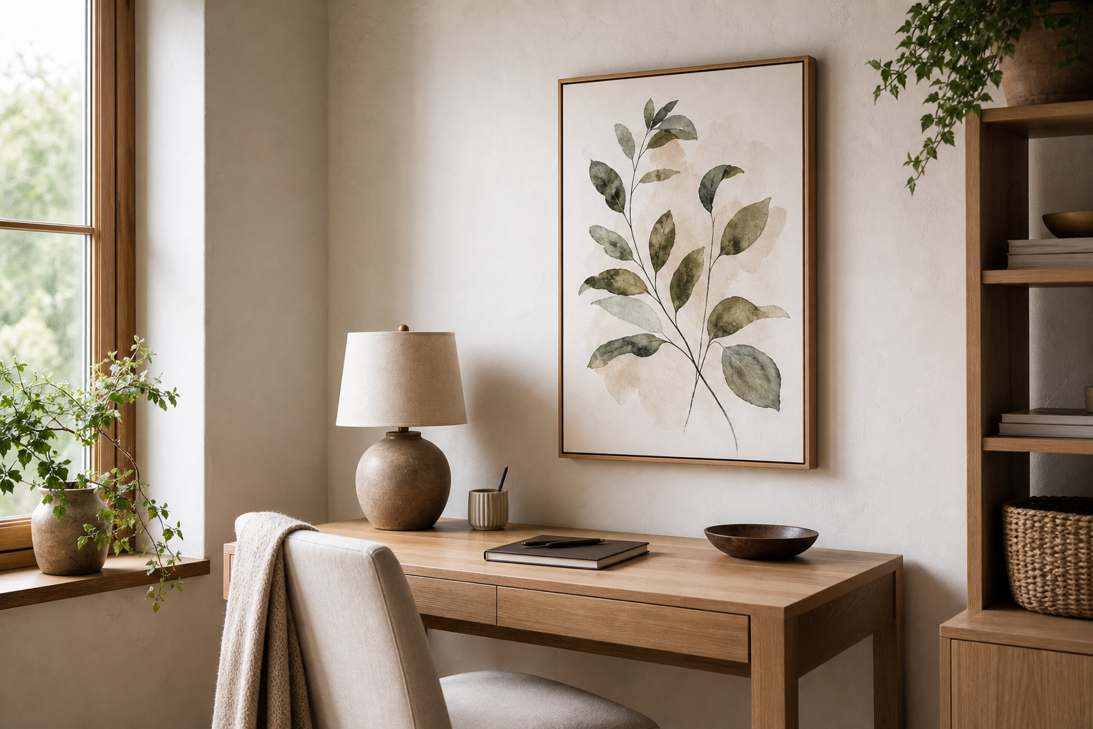
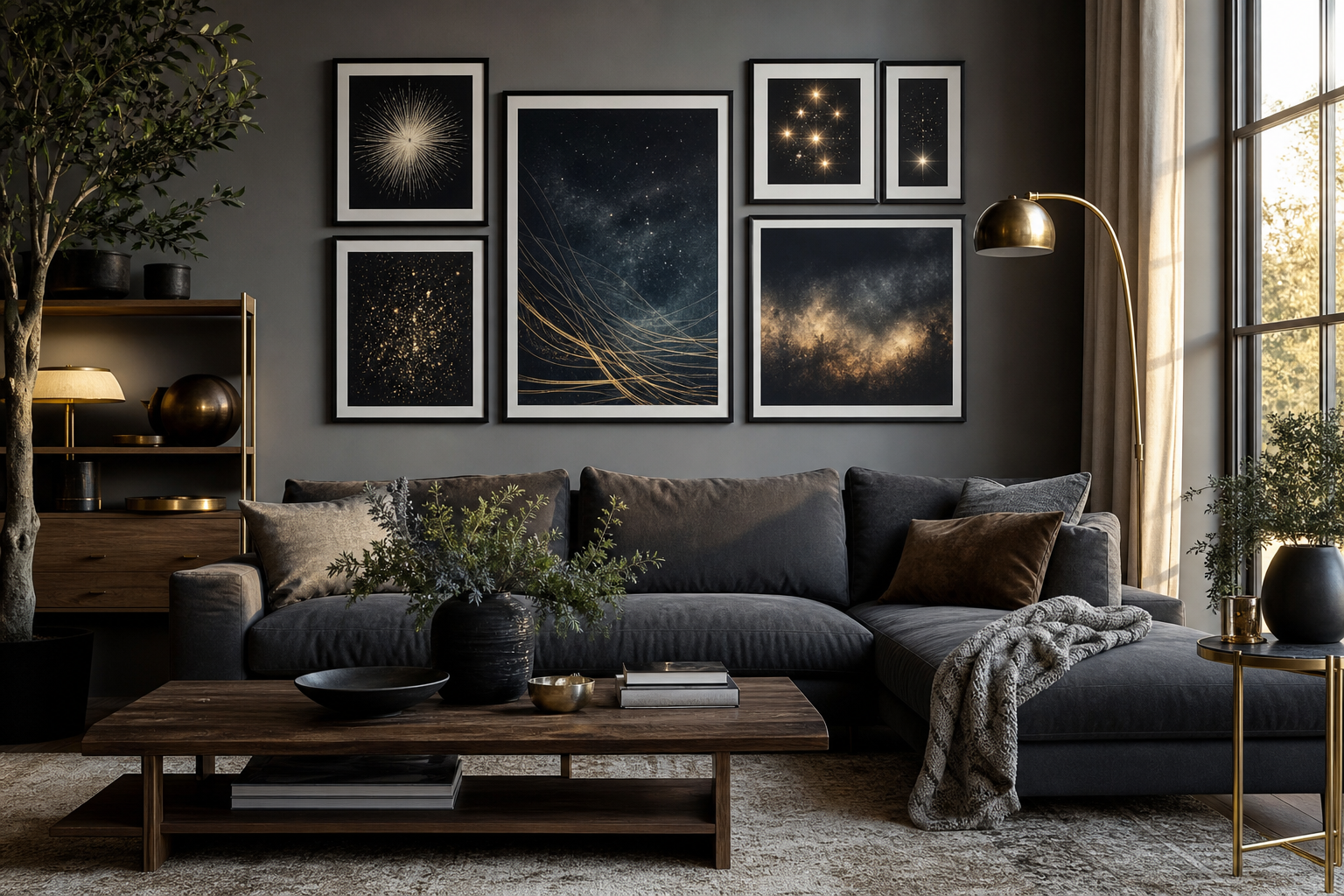
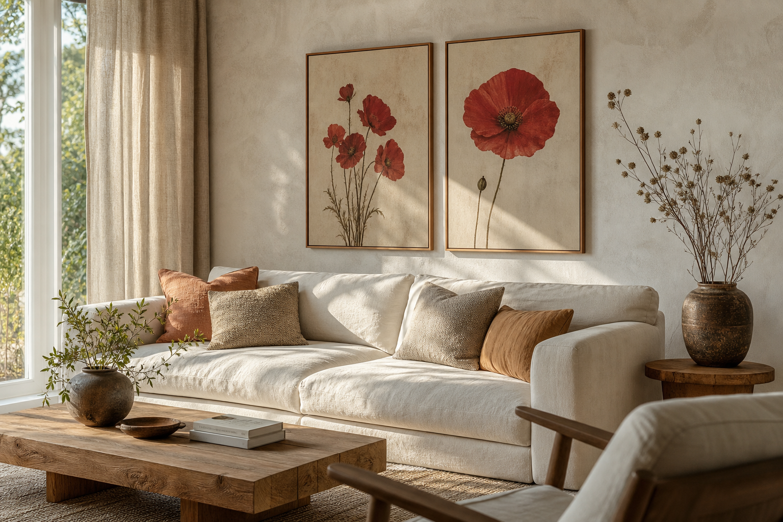
A beige poster works because it adds warmth without demanding attention. Compared with stark white, beige reflects less glare and feels softer on the eye, especially in rooms with warm bulbs in the 2700K to 3000K range. It also bridges materials that many homes already have — oak floors, cream upholstery, stone, rattan, and off-white paint — so the wall art feels integrated rather than placed as an afterthought.
Why Beige Works So Well on the Wall
Beige is one of the easiest neutrals to live with because it shifts gently with the light. In a north-facing room, it can read creamy and cocooning; in a bright south-facing room, it stays calm instead of washing out. That makes a beige poster especially useful in bedrooms and living rooms, where you want low visual noise but still need the wall to feel finished. If you already gravitate toward our Minimalist collection or soft abstract art prints with subtle tonal contrast, beige gives you that quiet structure.
A beige palette also supports a layered interior better than flat white. The trick is tonal variation: combine sand, oat, ivory, taupe, and a darker grounding shade within the same view. Even a 10 to 20 percent shift in tone between wall color, frame, mat, and artwork creates enough depth to keep the arrangement from feeling blank.
Choosing the Right Beige Poster for Your Space
The best beige poster is not just "neutral" — it should echo the textures and shapes already in the room. If your furniture is clean-lined and modern, choose simple geometry, soft gradients, or textural minimal pieces. If your room has more handmade character, look for woven surfaces, organic curves, botanical silhouettes, or painterly brushwork. In practical terms, smooth art suits lacquered furniture and polished metal, while textured visuals suit linen, boucle, jute, and wood grain.
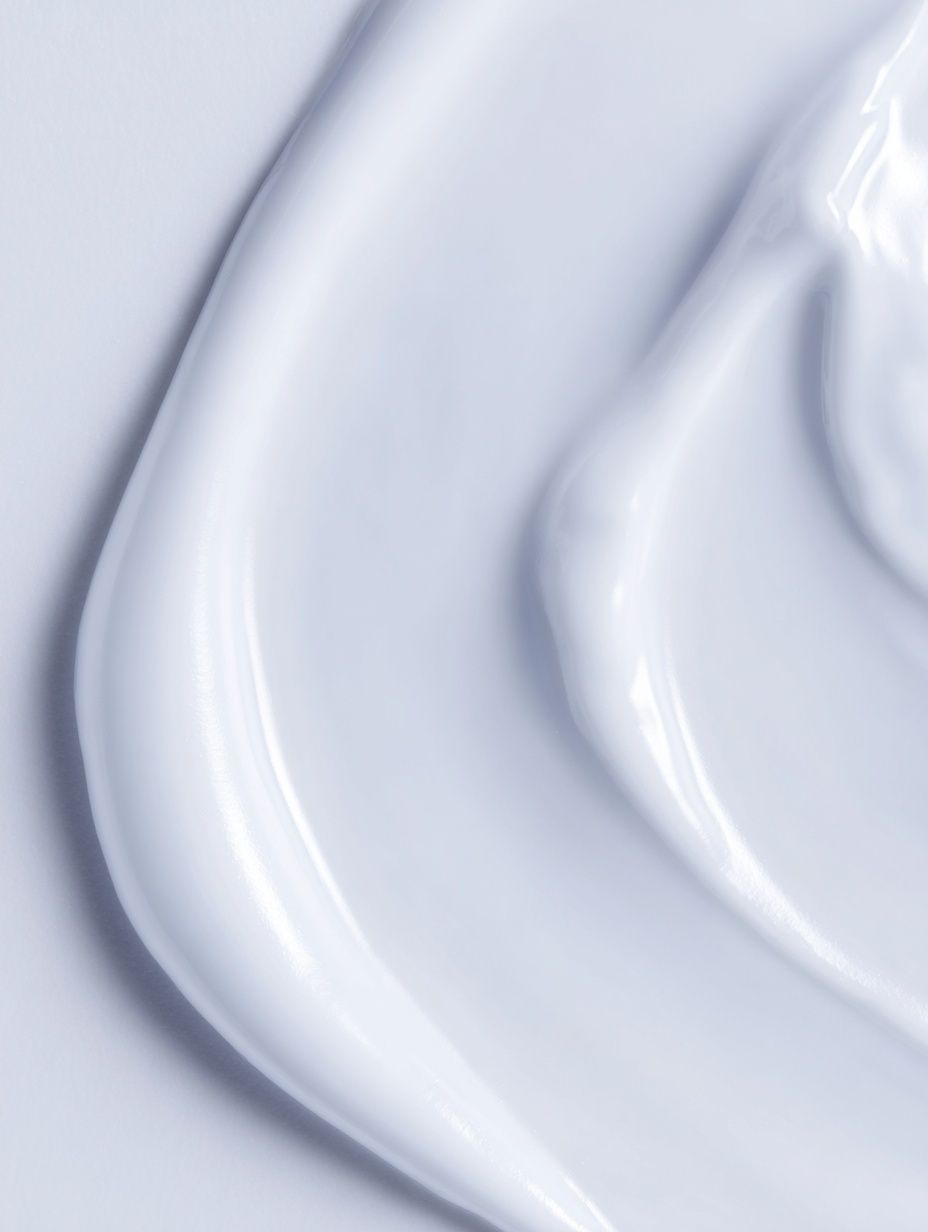
For a pared-back room, tone-on-tone texture does a lot of the work. White Cream Texture Poster is a good example of beige styling that stays minimal but never empty. The surface detail gives the eye something to land on from both 1 metre away and across the room. If your walls are already warm white or greige, a piece like this creates separation without introducing a new dominant color.
If you want more shape and movement, lean into gentle abstraction rather than busy detail. Textured Waves — Minimalist Print and Textured Waves — Abstract Print both work well in beige-led interiors because they add rhythm through form, not through high contrast. In open-plan rooms, that matters: large, low-contrast art keeps the eye moving without chopping the space up visually.

Best Frames and Finishes for Beige Artwork
Frame choice determines whether beige feels refined or simply faded. The safest option is natural oak — especially in widths between 15 and 25 mm — because it reinforces warmth and works with most neutral interiors. Black frames add precision and are useful when the art itself is very pale; the dark outline gives the composition enough definition to read from a distance of 2 to 3 metres. White frames can work, but only if the artwork has enough tonal depth to avoid disappearing into the border.
Matting is often what makes a beige poster look elevated. A white or soft ivory mat of 5 to 8 cm gives breathing room and makes modest artwork feel more intentional. This is especially useful for 30x40 cm or 50x70 cm prints, which can otherwise look slight on a large wall. If the artwork already has generous negative space, skip the mat and keep the frame profile slim.
Glass finish matters more than most buyers expect. In bright rooms with large windows, standard glass can throw distracting reflections across subtle beige details. A matte finish or low-reflection acrylic keeps the surface readable. This is particularly important for pieces like Window with Sheer Curtain — Fine Art Print, where the beauty comes from softness and tonal restraint rather than bold lines.

Where to Hang a Beige Poster Room by Room
In the bedroom, a beige poster works best above the headboard or opposite the bed, where it contributes calm rather than stimulation. For a double bed, aim for art that spans roughly 60 to 75 percent of the bed width. That usually means one 70x100 cm piece, two 50x70 cm frames, or a triptych arranged across 120 to 150 cm. Beige art with soft texture is especially effective here because it supports rest and does not compete with bedding and fabric layers.
In the living room, place a beige poster above the sofa with the bottom edge about 15 to 25 cm above the backrest. If the sofa is 200 cm wide, the artwork grouping should ideally land around 120 to 150 cm wide. Organic, sun-washed images and calm abstracts suit this zone well — particularly pieces from our Fine Art selection or the Bohemian collection when the room includes timber, boucle, or ceramics.
For hallways, keep the palette light and the composition vertical. Narrow spaces benefit from a single 30x40 cm or 50x70 cm print that does not crowd the wall. In a home office, beige art is useful behind a desk because it softens the background on video calls while still looking considered. A piece such as Late afternoon light beige wall fits this purpose well — simple, architectural, and not visually noisy.

Color Pairings That Make Beige Feel Intentional
Beige needs contrast, but not necessarily bright color. The easiest pairing is beige with broken white and natural wood, which creates a tonal range of light values and warm material variation. Add one darker note — black metal, espresso wood, or charcoal linen — and the whole room gains definition. That is often enough to keep a beige poster from fading into the background.
Terracotta is one of the strongest partners for beige because both colors share warmth but differ in depth. Olive green works for the same reason: it introduces earthiness without making the scheme heavy. If you prefer something cleaner, pair beige with black line work and stone grey. A room with 70 percent neutrals, 20 percent wood and natural textures, and 10 percent darker accents usually feels balanced rather than flat.
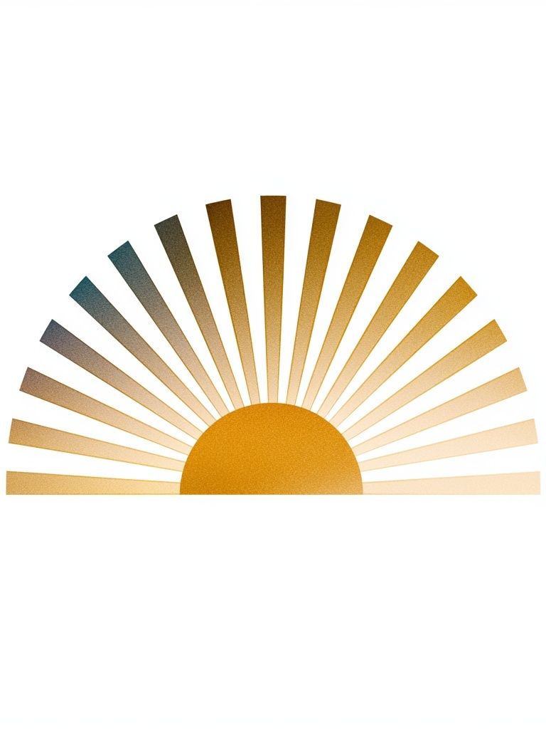

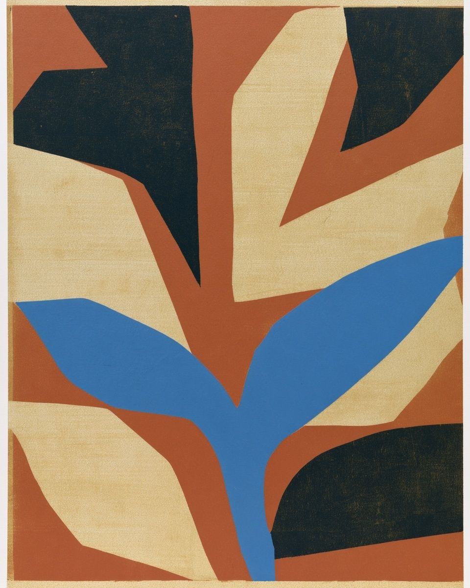

These combinations are particularly effective if you mix categories rather than styling everything from one source. A warm Golden Sunrise Minimalist Poster can sit comfortably beside earthy pieces from our Mid Century Modern prints or tactile designs from Ceramic Vases with Dried Branches. The link between them is not the subject matter — it is the shared temperature and restrained contrast.
How to Build a Calm Gallery Wall Around Beige
A gallery wall anchored by a beige poster works best when one element leads and the others support. Start with the largest piece first — usually 50x70 cm or 70x100 cm — then add two to four secondary works around it. Keep the spacing tight and consistent, ideally 5 to 7 cm between frames. Wide gaps make a neutral gallery feel scattered; controlled spacing makes it feel edited.
Use variation in subject, not in palette. Combine one textural print, one softer figurative or still-life piece, and one graphic shape-based piece, but keep all of them within a narrow tonal band. This is where a beige poster becomes useful as the anchor: it sets the temperature for the whole arrangement. If one piece is significantly darker, place it low or off to one side so it grounds the composition rather than overpowering it.
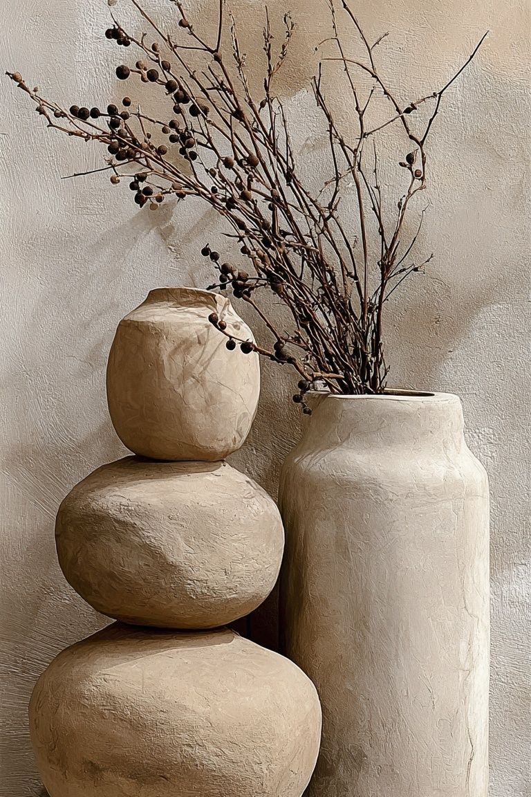
Beige also pairs especially well with tactile or nature-led pieces. Woven Bamboo Texture Poster adds a handmade feel, while Seamless wave pattern background, beige abstract design keeps the look more graphic and architectural. If your room already includes curved furniture, rattan, or soft drapery, those kinds of prints reinforce the same language on the wall.

Final Styling Tips for a Warm, Minimal Finish
The difference between soothing and bland usually comes down to contrast, scale, and material. Choose a beige poster with visible texture or shape, give it a frame that defines the edges, and place it where it relates clearly to furniture below. If the wall feels too quiet, add depth through oak, black, olive, terracotta, or woven texture rather than reaching for bright color too quickly.
A beige poster earns its place when it echoes the room rather than matching it exactly. Keep one tone lighter, one tone darker, and one tactile element in view — that formula makes neutral styling feel deliberate. If you want a simple place to start, explore our Minimalist range and soft abstract wall art first, then build outward with warmer fine art prints in muted tones.
Frequently Asked Questions
What frame size works best for a beige print in a small room?
In compact rooms, 30x40 cm and 50x70 cm are the easiest sizes to style. If the wall is narrow, use a mat to make the piece feel more substantial without increasing visual weight.
Should I choose matte or glossy glazing for beige artwork?
Matte or low-reflection glazing is usually better for beige art because subtle tonal details are easier to see. Glossy glass can work in dim rooms, but it often reflects windows too strongly.
Can beige wall art work on white walls?
Yes — but use contrast elsewhere. A wood or black frame, a white mat, or artwork with clear texture will stop the piece from blending into the wall.
What decor materials pair best with a beige poster?
Oak, walnut, linen, boucle, travertine, jute, and ceramic all pair naturally with beige. Mixing at least two of these materials gives the room more depth.
How high should I hang a single beige print?
The centre of the artwork should usually sit around 145 to 150 cm from the floor. Above furniture, keep the bottom edge roughly 15 to 25 cm above the top of the piece below.