Why Bedroom Wall Posters Work So Well
Bedrooms need visual softness more than visual noise. That is why bedroom wall posters work particularly well: they add identity, color, and structure without taking up floor space or making the room feel crowded. A well-placed print above a bed, dresser, or reading corner can anchor the entire layout in the same way a rug anchors a seating area.
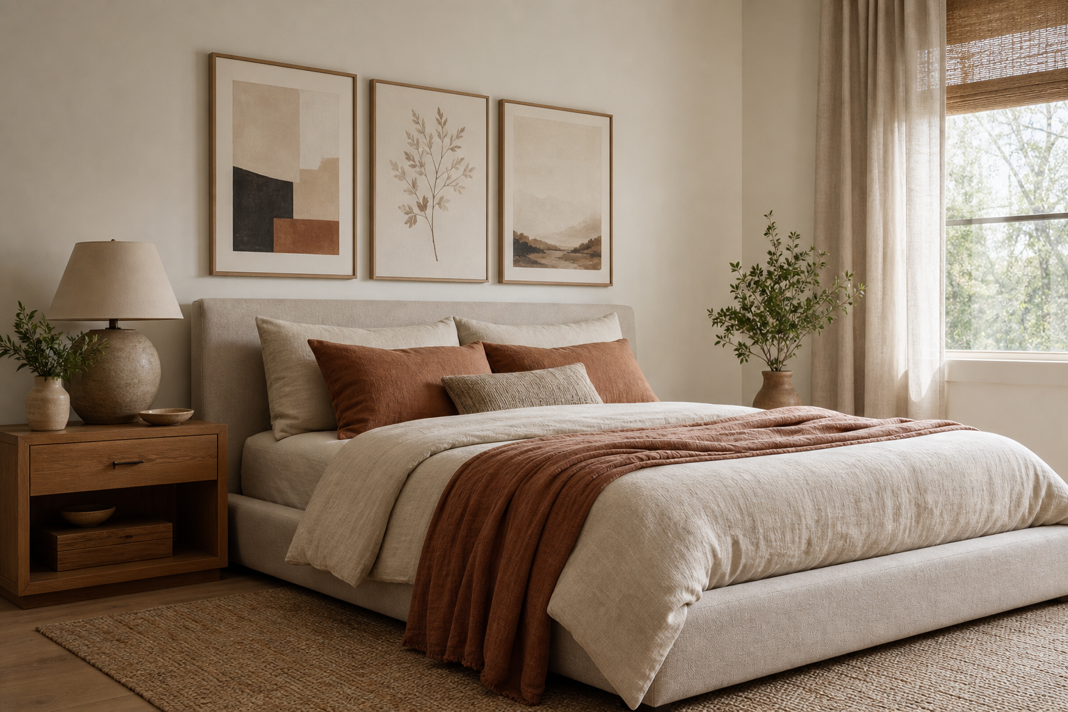
The best bedroom wall posters also help balance large blank surfaces. A standard double or queen bed is usually 135 to 160 cm wide, and the empty wall above it can look unfinished if left bare. Art fills that gap with proportion. As a rule, the artwork grouping above a bed should span about 60% to 75% of the bed width. For a 150 cm bed, that means a total art width of roughly 90 to 112 cm.
A bedroom is a personal room, so the imagery should feel lived-in rather than purely decorative. Soft abstractions, quiet landscapes, line-led florals, and restrained photography all work because they create mood without demanding attention. If you lean calm and modern, start with our minimalist collection. If you want more texture and warmth, bohemian wall art brings in a relaxed, layered look.

Choosing the Right Style for Your Space
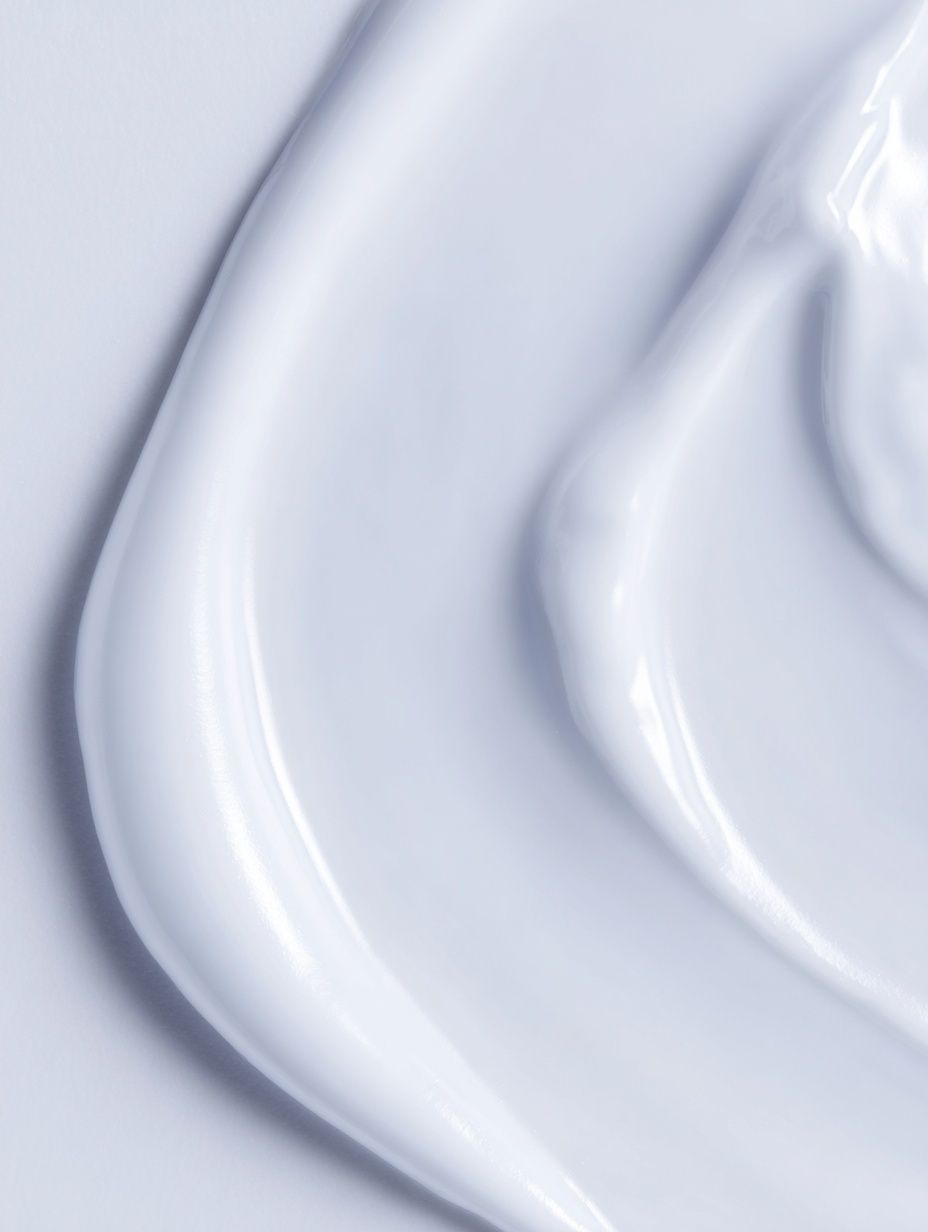
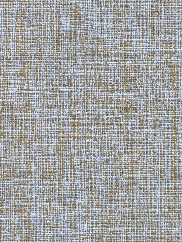
Start with the room you already have, not the one you plan to reinvent later. If your bedroom has clean lines, pale textiles, and limited clutter, choose art with breathing room — tonal shapes, soft textures, and simple silhouettes. Pieces from White Cream Texture or Textured Fabric suit that approach because they bring detail through surface and tone rather than high contrast.
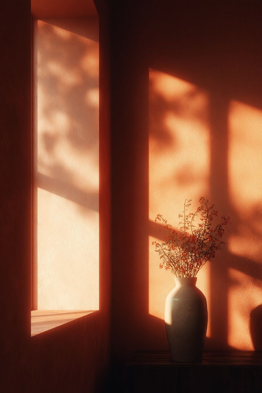
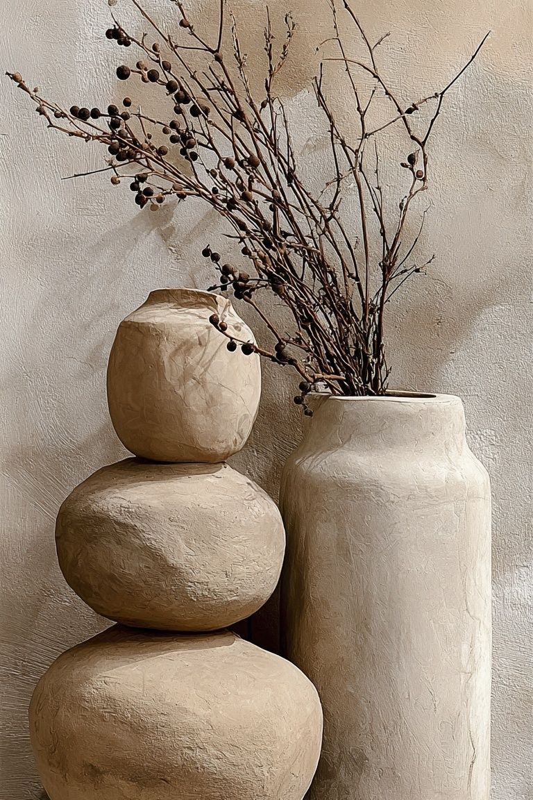
If your room feels warmer — think linen throws, timber furniture, terracotta, or rattan — use prints with organic forms. our bohemian collection and abstract wall art are strong options here because they add movement without becoming busy. Botanical or vase-led imagery works especially well in bedrooms because it mirrors the softness of fabrics and curved furniture.
Vintage-inspired bedrooms benefit from art that feels storied rather than slick. Fine art prints can do that beautifully, especially when paired with traditional frames or off-white mats. Window with Sheer Curtain is a good example of imagery that feels intimate and restful — ideal for a room meant for slowing down, not stimulation.
For a more contemporary bedroom, photography gives a crisp finish. Water, sky, floral close-ups, and distant landscapes are more sleep-friendly than urban scenes with heavy contrast. In rooms with white walls and black accents, bedroom-friendly photography prints can add realism without making the space feel hard.

Finding the Best Size and Layout
Most people choose art that is too small for the wall. A single 30 x 40 cm frame above a bed usually looks lost unless the bed is very narrow or the print is paired with sconces, shelves, or a headboard with strong presence. For most bedrooms, start with one of these formulas:
- One statement piece: 50 x 70 cm or 61 x 91 cm above a single or small double bed - A pair: two 40 x 50 cm or 50 x 70 cm prints with 5 to 8 cm between them - A trio: three 30 x 40 cm or 40 x 50 cm frames in one straight line - A gallery wall: 4 to 6 pieces over a dresser, bench, or larger king-size bed wall
The width rule matters more than the exact frame size. Aim for the full arrangement to cover around two-thirds of the furniture below it. If your headboard is 180 cm wide, your art grouping should land close to 110 to 135 cm wide. That proportion feels intentional from across the room.
Symmetry is the safest choice in bedrooms because it supports calm. Two matching prints above the bed, or one centered print above a dresser, will always feel more restful than an irregular salon wall. If you want variety, keep the frame finish consistent and let the images provide contrast.

For renters or anyone styling a small room, vertical art can be more useful than wide art. A 50 x 70 cm print beside a mirror or chest of drawers draws the eye upward and makes a lower ceiling feel taller. You can also use narrower works from our illustration prints to soften corners that would otherwise remain blank.
Color, Mood, and Sleep-Friendly Design
Color changes the emotional temperature of a bedroom faster than furniture does. That is why the strongest bedroom wall posters are often built around restrained palettes — oatmeal, stone, sage, dusty blue, muted blush, charcoal, and warm white. These shades absorb into the room instead of sitting on top of it.
If your bedding and walls are already neutral, art is the easiest place to introduce one accent color. One deep teal, rust, or ochre note repeated in a cushion or throw is enough. This creates a visible rhythm without making the room feel themed. Soft abstract work such as Blush Watercolor Abstract is useful here because it adds color in a diffused way.

Very bright red, acid yellow, and sharp black-and-white contrast can work in a bedroom, but they need tighter control. Use them as accents, not the whole composition. Bedrooms are where the eye should settle. Prints with washed edges, organic brushwork, or atmospheric photography usually feel easier to live with over time than highly graphic pieces.
Natural imagery also supports a calmer environment. Water scenes, florals, and open landscapes have a visual spaciousness that suits sleep spaces. Sunlit Water Surface is a good fit when you want a room to feel lighter and more open without introducing more objects.

Framing and Finishing Touches
A good frame makes bedroom wall posters feel permanent, even if you change the art later. Oak and ash frames warm up white walls and suit Scandinavian or bohemian rooms. Black frames sharpen softer art and work well if you already have black lamps, handles, or curtain rods. White frames can disappear beautifully into pale walls, especially in smaller bedrooms where visual lightness matters.
Matting is worth using when the artwork is detailed or when you want a more refined look. A 5 to 7 cm off-white mat can make a 30 x 40 cm print feel more substantial, and it gives breathing room around imagery above a bed. For textured or minimal pieces, full-bleed framing without a mat often feels more contemporary.
Hang the center of the arrangement around 145 cm from the floor as a starting point, then adjust for furniture. Above a headboard, leave 15 to 25 cm between the top of the bed and the bottom of the frame. Above a dresser, 10 to 20 cm usually looks right. Closer than that feels cramped; farther can make the art seem disconnected.

If you want a polished layered look, repeat one material from the art in the room. A print with sandy tones can connect to a boucle throw; botanical greens can echo a plant or olive-colored cushion. This is how bedroom wall posters stop feeling like add-ons and start feeling integrated.
How to Build a Bedroom Poster Setup You’ll Love Long Term
Choose one lead print first, then build around it. That first piece should match the mood you want the room to keep for the next few years — calm, romantic, minimal, earthy, or airy. Once that anchor is in place, add one or two supporting works that share either color, texture, or subject. This approach is more durable than buying a perfectly matched set all at once.
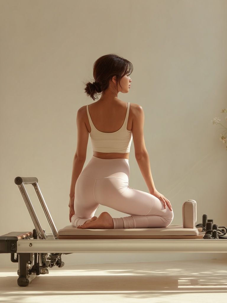
A practical mix for long-term flexibility is 70% timeless, 30% seasonal. Keep the large main artwork neutral enough to last through changes in bedding or paint, then rotate smaller pieces near a desk, shelf, or dresser. For example, a stable base from our fine art prints or Yoga Practice — Minimalist Print can be refreshed with a softer abstract or floral piece later.
Think in pairs of qualities, not just in themes: light and dark, smooth and textured, organic and geometric. That is how mixed walls feel designed instead of random. A room with one textured neutral print, one floral or landscape, and one simple line-based image usually has enough contrast to stay interesting without losing calm.
For shoppers starting from scratch, begin with bedroom wall posters in the 40 x 50 cm or 50 x 70 cm range. Those sizes are versatile, easy to frame, and large enough to have presence in most bedrooms from 9 to 16 square meters. You can always scale up later once you know what imagery you want to live with every day.

Final thoughts
The best bedroom wall posters do two jobs at once: they fill space with the right proportion, and they reinforce the mood you want to wake up and fall asleep in. When size, palette, and framing all connect to the furniture below, the room feels settled.
Start with one strong piece, keep the color story controlled, and frame it properly. A bedroom does not need many elements to feel personal — just the right ones.
Frequently Asked Questions
What frame color works best for a small bedroom?
Light oak, ash, or white frames usually keep a small bedroom feeling open. Black works too, but use it when you already have black accents elsewhere in the room.
Can I mix photography and abstract art above the same bed?
Yes — keep one shared element, such as a muted palette or matching frame finish. The easiest mix is one atmospheric photograph paired with one tonal abstract.
Should bedroom art be hung behind glass?
Glass or acrylic helps protect prints from dust and fading, especially near windows. Acrylic is lighter and often better for larger frames above beds.
How do I keep art from feeling too cold in an all-white bedroom?
Use prints with visible texture, warm undertones, or natural subjects like fabric, florals, or water. An off-white mat and wood frame also add warmth quickly.
What pairs well with beige bedding?
Soft charcoal, olive, dusty blue, blush, and warm white all pair well with beige. Look for art that includes at least two of those tones for a more layered result.