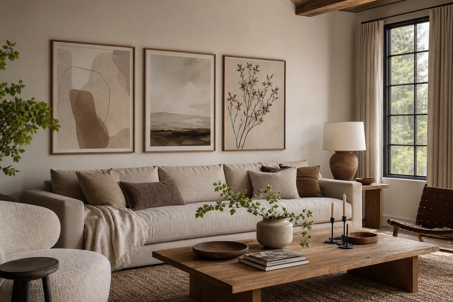
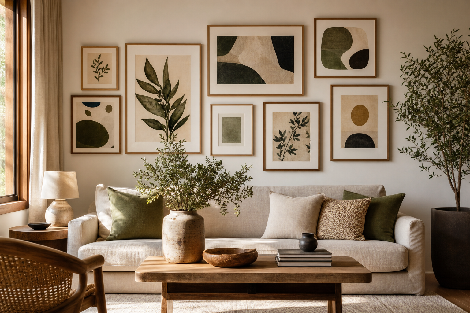
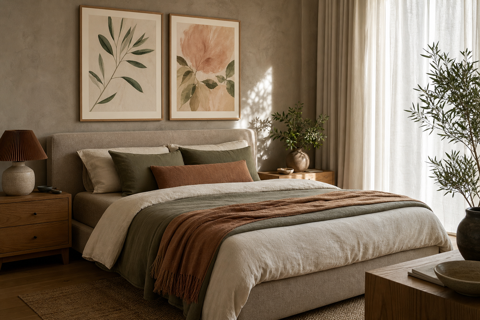
A hotel-like bedroom is not about filling every wall. It is about choosing cozy bedroom wall art that makes the room feel quieter, softer, and more finished the moment you walk in. The best setups use controlled color, generous spacing, and artwork that supports rest rather than demanding attention.
What Makes a Bedroom Feel Hotel-Like
A polished bedroom usually follows the 60-30-10 balance rule: around 60% of the room in a main base tone, 30% in a secondary tone, and 10% in a darker or warmer accent. Wall art plays into that ratio by repeating the bedding, curtains, rug, or headboard colors so the room feels connected rather than pieced together.
Hotels also rely on visual restraint. One oversized piece above the bed, or a pair of evenly sized frames, often feels more expensive than six small unrelated prints. If you want a calm, elevated look, start with art that leaves at least 5-8 cm of visible wall around the frame grouping, so the composition can breathe.
Muted texture works especially well in bedrooms because it adds depth without noise. That is why our minimalist collection and fine art prints with soft, painterly detail tend to suit sleep spaces better than high-contrast graphic styles.

Choose Artwork That Feels Calm and Restful
The easiest way to select cozy bedroom wall art is to focus on subjects that already feel still. Abstract washes, soft landscapes, fabric-inspired textures, botanical silhouettes, and water photography all work because they suggest motion without visual clutter. Busy city scenes and high-saturation graphics usually pull the eye too hard in a room meant for rest.
A good bedroom palette stays within about three to four closely related tones. Think cream, oat, sand, pale blush, faded olive, misty blue, or warm grey. If your bed linen is white or ivory, art in off-white and beige tones will make the room feel more layered rather than stark. If your bedding is greige or taupe, add one soft contrast like dusty rose or pale blue.
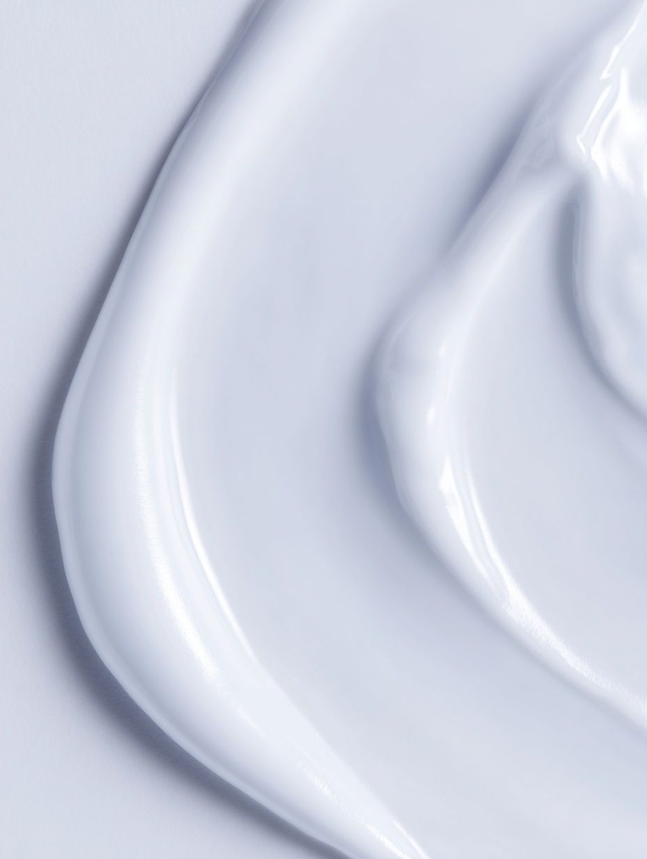
One strong example is the understated texture in Elegant White Fabric. It reads almost like a textile panel from a luxury suite, which makes it ideal for bedrooms that need softness more than color.

For a slightly warmer direction, abstract pieces with blush or sand undertones can keep a neutral room from feeling flat. Blush Watercolor Abstract is especially effective with cream bedding, light oak furniture, and brushed brass accents because it repeats warmth in a quiet way.
If you prefer nature-led calm, our photography collection includes serene options that bring in movement without heaviness. Water surfaces, soft horizons, and distant figures feel restful because they create depth while keeping the palette simple.



Find the Right Size and Placement Above the Bed
The most reliable rule for art above a bed is width: your artwork or full arrangement should span roughly 60-75% of the headboard width. If your headboard is 160 cm wide, aim for wall art between 96 and 120 cm across. That proportion looks intentional without feeling cramped.
For hanging height, keep the bottom of the frame about 15-25 cm above the top of the headboard. Anything higher can feel disconnected from the bed. In bedrooms with standard 240 cm ceilings, this lower placement helps the art feel grounded and hotel-like.
Single statement pieces work best above queen and king beds when the room already has enough texture from upholstery, cushions, and curtains. Diptychs or pairs are better if you want symmetry. A two-piece arrangement with each frame at 50x70 cm and a 5-7 cm gap between them suits many headboards from 150 to 180 cm wide. For narrower double beds, one 70x100 cm frame often looks cleaner than multiple smaller ones.

Gallery-style arrangements can work in bedrooms, but only if they stay disciplined. Limit the palette, repeat the same frame finish, and keep the total grouping rectangular. If you mix frame colors, image styles, and spacing, the bed wall starts to feel more like a hallway than a retreat.
Frame It Like a Boutique Hotel Room
The frame does at least half the work. Thin oak, matte black, walnut, and soft champagne finishes are the most versatile choices for bedrooms. Oak warms up white walls. Black adds definition in pale rooms. Walnut gives depth to beige and taupe schemes. Brushed metallic finishes should stay subtle — avoid anything too glossy near the bed.
Mats instantly make art look more expensive. A white or warm ivory mat of 5-8 cm adds breathing room around softer pieces and helps smaller artwork hold its own above a substantial headboard. This is especially useful with delicate works such as Window with Sheer Curtain, where extra margin enhances the airy effect.

Texture-on-texture is another hotel trick. If your bedding is linen or boucle, choose art with visible brushwork, fabric motifs, or tonal layering. Textured Fabric — Minimalist Print and related pieces from our abstract collection work well because they echo textile surfaces without adding pattern overload.

Build a Soft Color Story Around Your Walls
The most successful cozy bedroom wall art usually follows one of three color routes.
First, warm neutrals: cream, almond, oatmeal, camel, and clay. This palette works well in north-facing bedrooms because it offsets cool daylight. Pair white bedding with warmer art so the room does not feel clinical. White Cream Texture Poster fits this approach beautifully.
Second, dusty tones: blush, faded terracotta, muted mauve, sage, and foggy blue. These add personality without increasing visual volume. If your bedroom furniture is mid-tone oak or walnut, dusty colors often create the richest layered look.
Third, tonal contrast: one color family in light, medium, and dark values. For example, sand walls, taupe textiles, and darker mocha accents in the art. Tonal rooms often feel more expensive because they avoid sharp jumps between colors.
For a grounded, tactile direction, bohemian pieces can work if they stay muted. our bohemian collection is strongest in bedrooms when you choose woven textures, dried botanicals, and soft earthy forms rather than bold pattern clashes.

If your room needs a little more life, a restrained floral or abstract can bridge soft bedding and wood furniture without overpowering either. The key is staying under roughly 20% strong contrast within the artwork, so the wall still reads calm from across the room.
Easy Styling Tips to Finish the Look
Start with the bed wall first, then repeat one tone from the art at least twice elsewhere in the room. If your print includes warm sand, echo it in a throw blanket and lampshade. If it includes faded blue, repeat it in a cushion or bedside book stack. That repetition makes the art feel integrated rather than added later.
Match your lighting temperature to the mood of the artwork. Bedrooms look best with bulbs around 2700K for a warm, hotel-like glow. Cooler bulbs at 4000K or above can flatten beige and blush artwork, making soft colors look dull.
Keep bedside styling low and edited. A lamp, one book, and a small tray usually look better under framed art than tall branches or crowded shelves. Aim for different heights, but leave at least 20-30 cm of empty wall between the top of the bedside object and the bottom edge of the frame.

If you want the room to feel more intimate, choose one quietly emotional piece rather than a purely decorative one. Romantic imagery can work in bedrooms when it stays subtle and monochrome. Winter Lovers by the Window is a good example of mood-led art that still feels refined.
Final thoughts
A hotel-like bedroom is usually built on three decisions: calm subject matter, correct scale, and cohesive framing. When those pieces line up, even a simple room feels considered. Cozy bedroom wall art does not need loud color or complicated styling to make an impact — it needs proportion, softness, and repetition.
If you are choosing only one upgrade, start above the bed with art that spans about two-thirds of the headboard, framed in a finish that matches your furniture or lighting. That single move can make the whole bedroom feel more restful and more complete.
Frequently Asked Questions
What frame size works best for a small bedroom?
For compact rooms, 50x70 cm or 60x80 cm frames usually feel balanced without crowding the wall. If hanging above a narrow bed, keep the total artwork width under 100 cm.
Should bedroom art match the bedding exactly?
No. It should coordinate, not duplicate. Aim for shared undertones — such as warm beige with blush or cool grey with misty blue — rather than exact color matching.
Is glass or acrylic better for framed bedroom art?
Acrylic is lighter and safer above a bed, especially for larger sizes. Glass offers a slightly sharper finish, but weight matters if you are hanging over a headboard.
Can I mix photography and abstract art in one bedroom?
Yes, if both pieces share a restrained palette and similar framing. Keep one element consistent — color, frame finish, or subject mood — so the mix feels intentional.