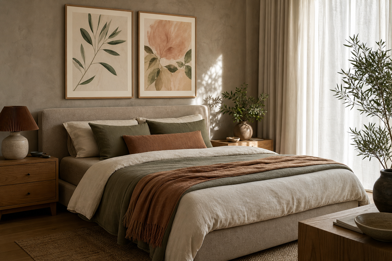
Good bedroom wall decor ideas begin with mood, not objects. Before you choose a frame, size, or colour, decide what the room should do for you at the end of the day. A bedroom that needs to calm a busy mind usually benefits from fewer pieces, softer contrast, and open wall space. A bedroom that feels plain often needs one focal point with enough scale to anchor the bed and give the room a point of view.
Wall decor changes how large a room feels. One oversized print above a queen bed can make a compact room look more ordered, while six small frames with tight spacing can make the same wall feel fragmented. In most bedrooms, art works best when it fills around 50 to 75 percent of the width of the furniture below it. That proportion keeps the wall connected to the bed, dresser, or bench instead of floating above it.
Start with the mood you want to feel
If you want the room to feel calm, start with subjects that already suggest stillness: soft landscapes, botanical silhouettes, water, sky, or quiet abstract forms. Minimal contrast helps too. Cream, stone, faded green, dusty blue, and muted clay tend to read as restful because they sit close in value and do not fight for attention. This is where our Minimalist collection and our Botanical collection are especially useful — both offer shapes and tones that settle into a bedroom rather than dominate it.
For a softer romantic mood, choose curves over sharp geometry and art with subtle movement. Florals, sheer fabrics, impressionist scenes, and gentle line work all support that direction. If your bedroom already has upholstered furniture, boucle, velvet, or washed linen, echoing those softer textures on the wall makes the whole room feel more cohesive. A print like Window with Sheer Curtain works well in bedrooms because it brings in lightness without visual noise.

If you prefer a cleaner, more pared-back look, limit yourself to one strong piece above the bed and one secondary piece elsewhere in the room. That simple formula often feels more intentional than filling every empty section of wall. Strong bedroom wall decor ideas are usually selective — one 50x70 cm print or one 70x100 cm statement piece can do more than four smaller frames competing with lamps, pillows, and bedside clutter.
Choose artwork that suits the scale of the room
The size of the room should decide both the size of the art and the number of pieces. In a small bedroom under roughly 10 square metres, a single vertical print around 40x50 cm or 50x70 cm often works well beside a dresser or on a narrow wall near a window. Above a double or queen bed, aim for a total arrangement width of around 90 to 140 cm. That could be one 70x100 cm piece, two 50x70 cm frames, or a row of three 30x40 cm prints with generous breathing room.
Large bedrooms need more than larger art — they need stronger visual weight. If the wall behind the bed is wide and uninterrupted, an undersized frame can feel accidental. In that case, look at bold but restful formats from our Abstract wall art or tonal works from our Fine Art collection. Abstract art is especially practical here because it fills space without adding too much narrative detail.
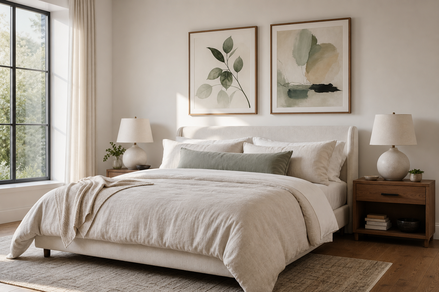
Awkward spaces need narrower formats and clearer hierarchy. A strip of wall between a wardrobe and a window might suit one 30x40 cm print. The wall above a chest of drawers usually looks better with a horizontal composition, especially if the furniture is wide and low. If your ceiling is under 240 cm, avoid stacking too many frames vertically — it can make the room feel compressed.



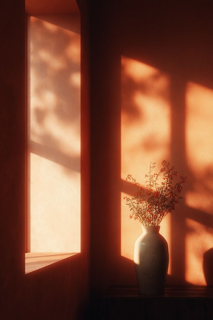
Build a palette that feels restful, not flat
A restful bedroom palette should include contrast — just not too much of it. The easiest formula is 60 percent base tone, 30 percent supporting tone, and 10 percent accent. In practice, that might mean warm white walls, taupe bedding, and a small amount of rust or olive in the artwork. Without that 10 percent accent, a bedroom can look washed out. With too many accents, it starts to feel busy.
The best art palette usually picks up at least one colour already in the room. If your headboard is camel, oak, or walnut, artworks with sand, terracotta, faded burgundy, or warm black will sit naturally nearby. If the room has cooler light and grey textiles, watery blues, sage, and off-white work better than strong orange or bright red. For bedrooms that need softness but not blandness, Blush Watercolor Abstract is an easy bridge between neutral bedding and warmer accessories.

Subject matter matters as much as colour. Botanical studies, horizon lines, water scenes, and quiet interiors feel settled because they contain natural rhythm. Highly saturated graphics or very dark compositions can still work in a bedroom, but they need more restraint around them — simpler bedding, fewer decorative objects, and wider margins on the wall. If you like vintage warmth, browse our Vintage art prints for pieces that bring patina and depth without introducing harsh contrast.
Create a gallery wall with bedroom-friendly balance
A bedroom gallery wall should feel softer than a living-room gallery wall. The room already has visual bulk from the bed, headboard, curtains, and textiles, so the art arrangement needs structure. Above a bed, the most reliable format is either a symmetrical row of two or three frames, or a centred salon-style cluster that stays within the width of the headboard. Keep spacing between frames at 5 to 8 cm for a tidy look.
If you are mixing subjects, repeat at least one element across all pieces — colour temperature, frame finish, mount style, or theme. That repetition is what makes a gallery wall feel curated instead of improvised. In bedrooms, combinations like botanical line work, muted abstracts, and soft landscape studies tend to work better than a highly eclectic mix. You can also pair one standout piece with quieter supporting works, which keeps the eye from bouncing across the wall.
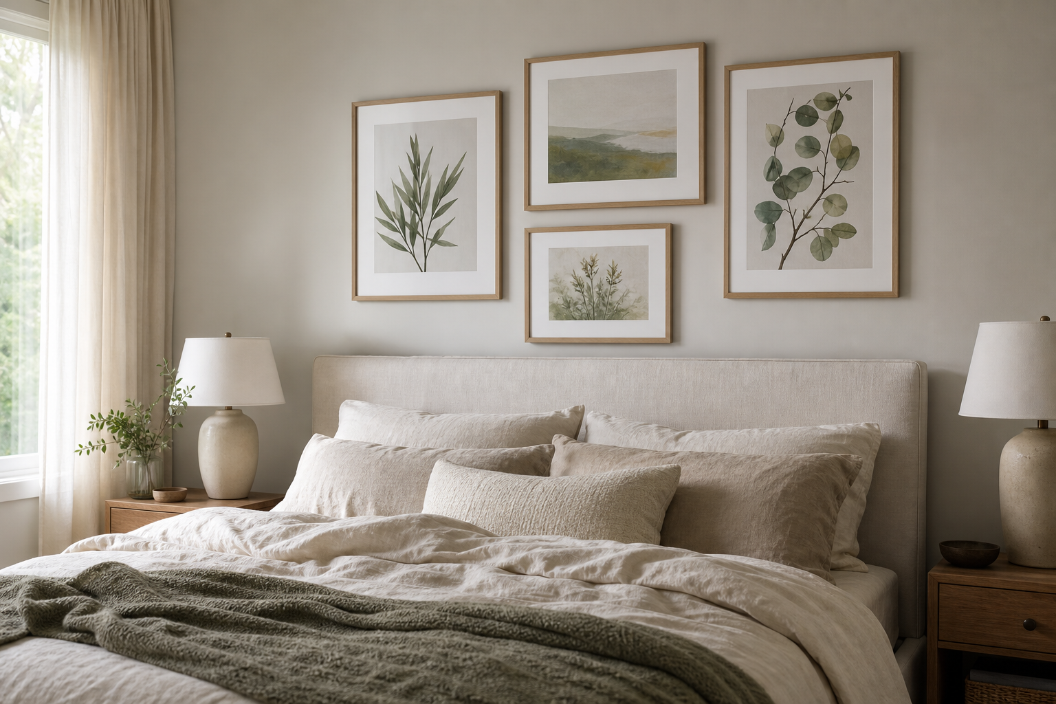
If you want a more romantic or expressive arrangement, use artworks with painterly softness rather than sharp outlines. Water Lilies and Woman with a Parasol are good examples of bedroom-friendly fine art because the brushwork feels airy, not heavy. For warmer, earthier bedrooms, pieces from our Bohemian collection can add pattern and warmth without needing bright colour.

Use framing and materials to finish the look
Frames are not a minor detail. In a bedroom, they often decide whether the art feels polished or disconnected. Oak and light wood frames add warmth and work well with linen, rattan, and pale walls. Black frames create more contrast and suit bedrooms with sharper lines, darker hardware, or monochrome palettes. White frames can be useful on coloured walls, but on plain white walls they sometimes disappear unless the artwork has enough internal contrast.
Mounts add breathing room. A 30x40 cm print with a generous mount inside a 40x50 cm frame often feels more elevated than the same print framed edge to edge. That extra border also softens busy images and gives smaller pieces more presence on larger walls. If you are styling a bedroom with low contrast and natural materials, paper texture and matte finishes usually look better than glossy surfaces because they reduce glare from bedside lamps and daylight.
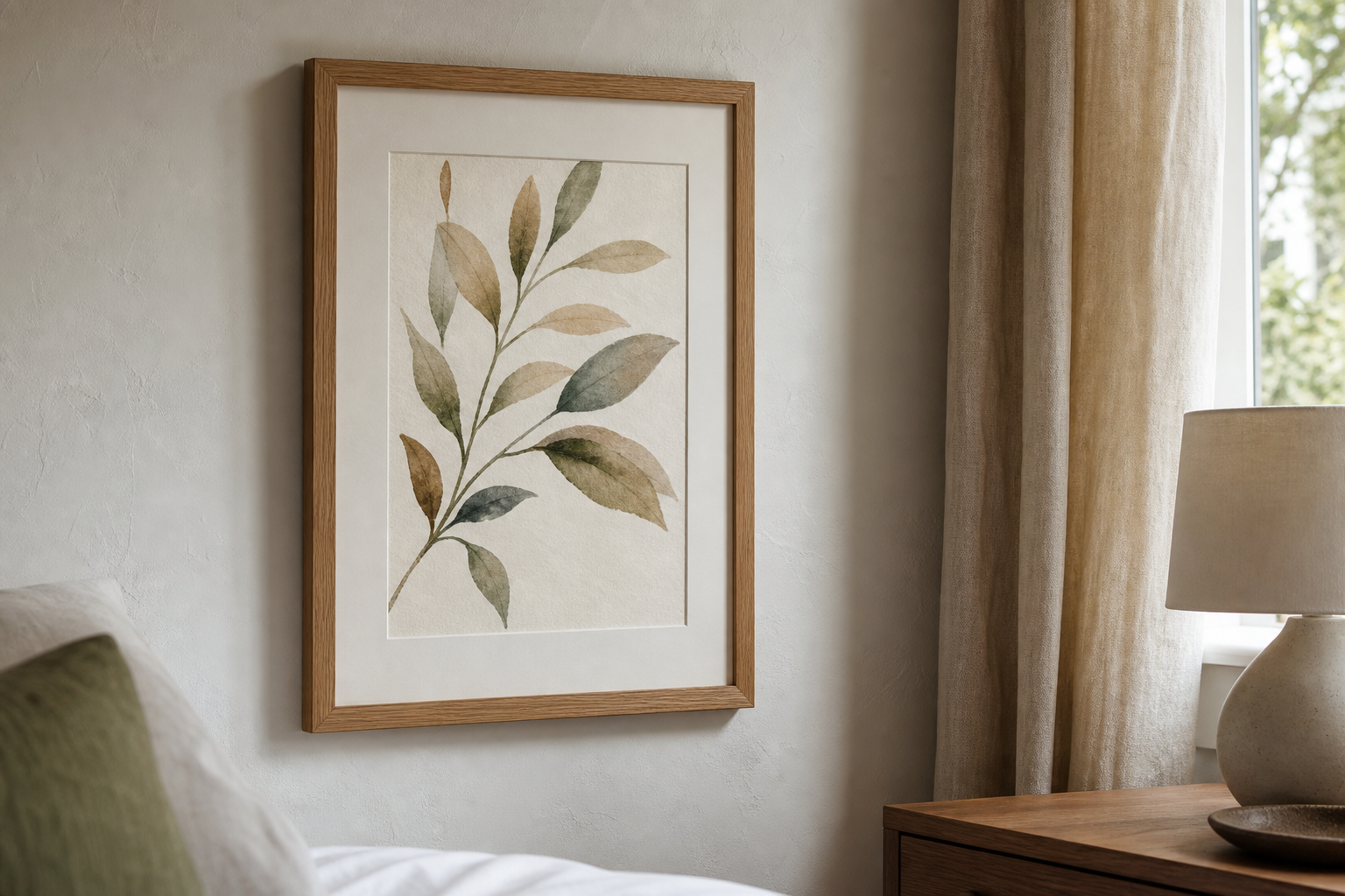
Texture can do the work of colour when the room is already neutral. Pieces such as Textured Waves — Minimalist Print or Textured White Abstract add depth through surface and shadow, which is especially useful in beige, white, or stone bedrooms that need interest without stronger hues.
Add personality with small details and seasonal swaps
Not every wall needs a large permanent arrangement. A picture ledge above a dresser or a narrow shelf near the bed lets you layer smaller frames, a mirror, or a ceramic object without committing to one fixed layout. This approach works well if you like to rotate art seasonally — lighter florals and softer tones in spring, richer rusts and deeper neutrals in autumn. Even changing one frame out of three can refresh the room.
A personal bedroom usually includes at least one unexpected detail. That might be a quiet interior scene, a vintage-inspired print, or a piece that reflects your own routines and pace. Vincent van Gogh's Bedroom is a smart choice for a reading corner or dresser wall because the subject already belongs to the room. It feels characterful without being loud.
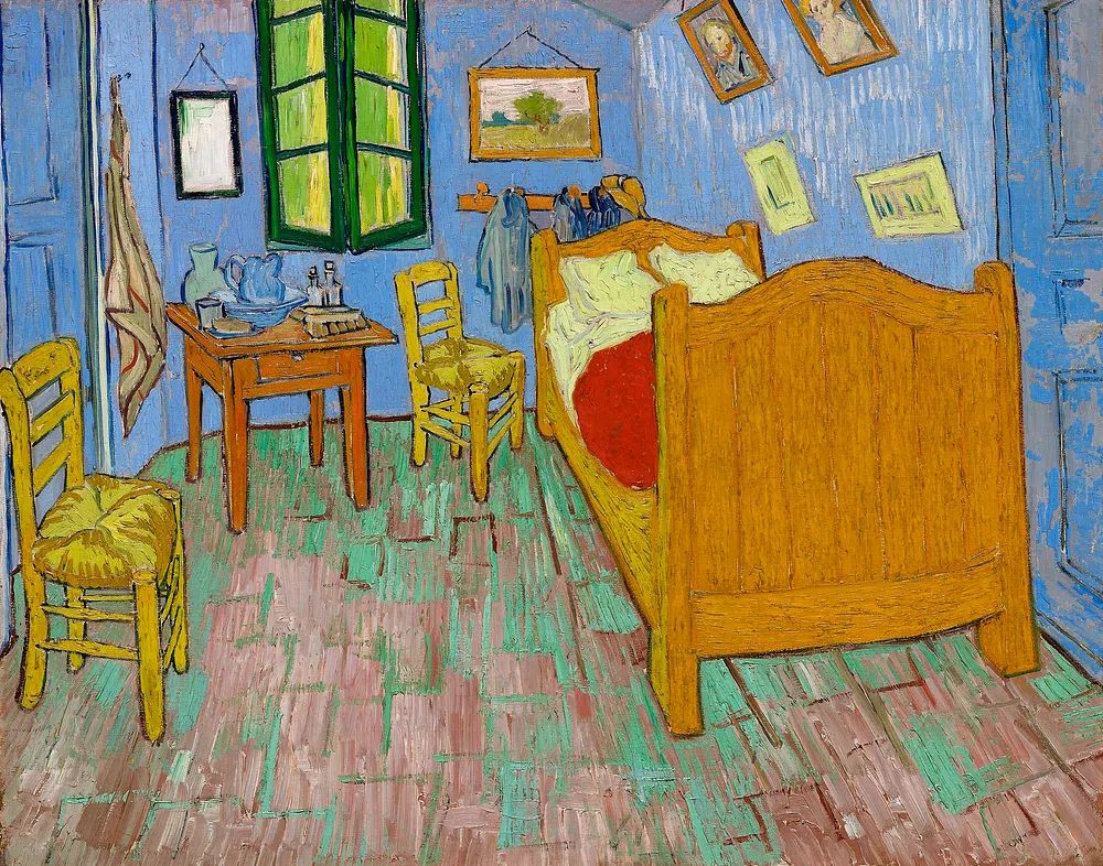
When you shop, measure first. Note the width of the bed, headboard, dresser, and any available wall sections, then sketch out likely frame sizes on paper or painter's tape. That 10-minute step prevents the most common mistake in bedroom wall decor ideas: buying pieces that are beautiful on their own but too small, too busy, or too disconnected from the room they are meant to complete.
Final thoughts
The strongest bedroom wall decor ideas are usually the simplest ones executed well — art scaled to the bed, colours that echo the room, frames that suit the materials already in place, and enough empty space for the eye to rest. A bedroom does not need many pieces to feel personal. It needs the right pieces in the right proportion.
If you start with mood, follow the size of the wall, and finish with thoughtful framing, your bedroom wall decor ideas will feel settled rather than staged. That is what makes the space more personal: not more decoration, but better decisions.