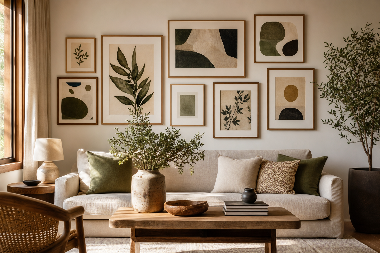
The best gallery wall layout ideas start before you pick the first frame. A wall that feels curated usually follows one clear direction — calm and airy, graphic and modern, collected and eclectic, or playful and layered. When every piece supports that mood, even a mixed arrangement looks intentional.
Start with the Feeling You Want the Wall to Create
If you want a quiet, spacious look, keep your palette tight and lean toward soft neutrals, texture, and negative space. Pieces from our Minimalist collection or Fine Art prints work especially well here because they give the eye room to rest. In a living room, that often means 5 to 7 frames with generous spacing and at least 30 to 40 percent visible wall around the composition.
For a more energetic wall, build contrast on purpose. Combine graphic shapes, line work, color blocks, and one or two bolder accents from our Abstract wall art or Typography prints. The key is to repeat something across the mix — black frames, warm beige tones, or one accent color such as teal or rust — so the wall still reads as one composition rather than separate purchases.
A useful shortcut is to choose three words before shopping: for example, "soft, natural, balanced" or "bold, urban, structured". Those words filter every decision, from image subject to frame finish. That is what makes gallery wall layout ideas feel edited rather than improvised.

Choose a Layout Style That Fits Your Space
Some layouts are naturally tidy. A grid is the most structured option — ideal above a sofa, sideboard, or bed where you want symmetry. Use frames of the same size, such as four 40x50 cm pieces or six 30x40 cm pieces, and keep spacing consistent at 5 to 7 cm. Grid layouts suit calm interiors and pair beautifully with White Flower Silhouette or other restrained works.
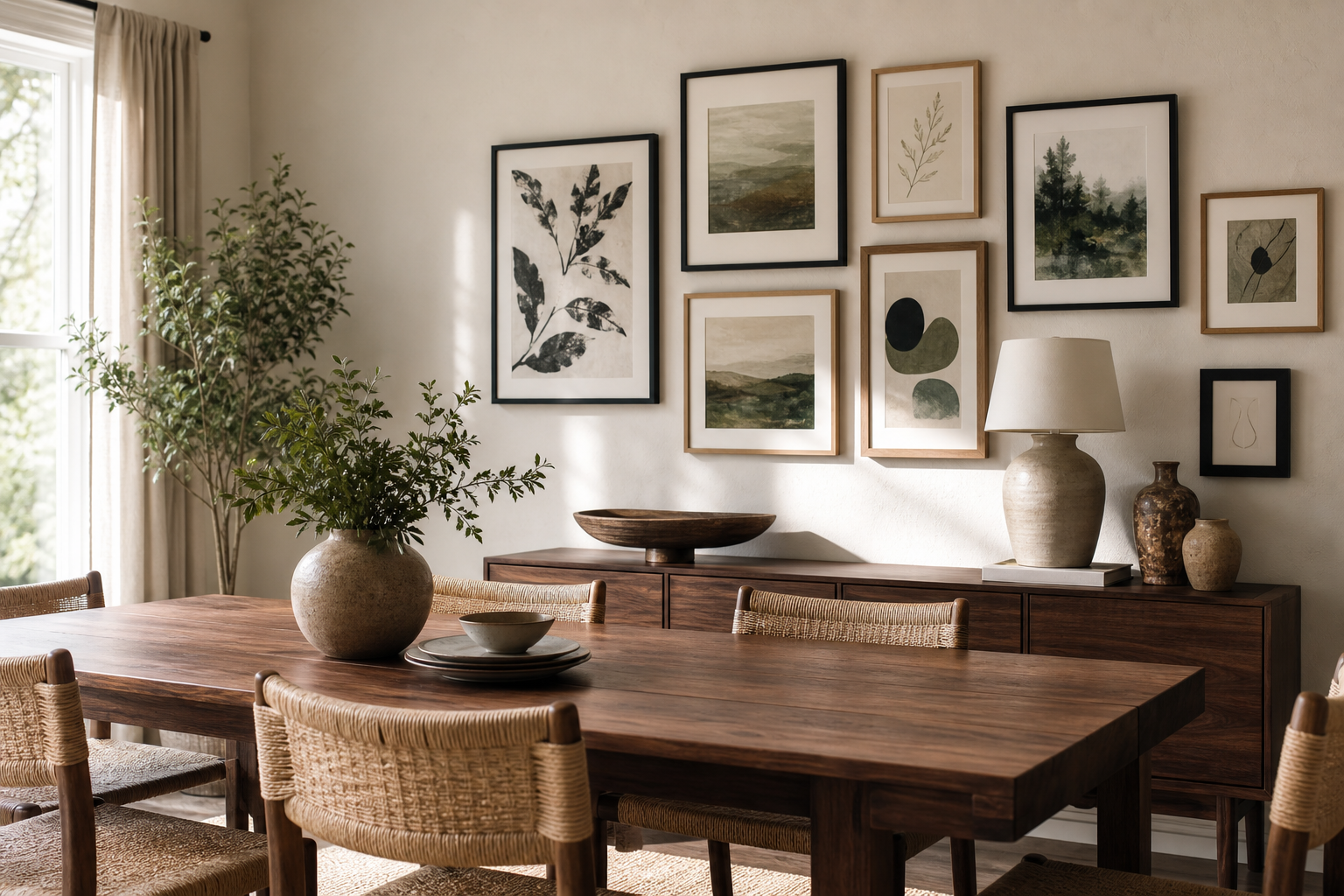
A salon-style arrangement is looser and more collected. It mixes sizes and often grows over time, but it still needs an outer shape. Think rectangle, square, or gentle oval. If the pieces spread too far without a boundary, the wall starts to look cluttered. Salon-style works well in hallways, staircases, and dining areas where movement makes a layered display feel natural.
Linear layouts are useful in narrow spaces. Hang 2 to 4 pieces in one horizontal line above a headboard, desk, or console, or use a vertical line in a tight corner. This format is one of the simplest gallery wall layout ideas for renters because it is easy to measure and hard to overbuild.
Centered clusters are the most flexible. Start with one anchor piece in the middle, then add supporting works around it. This works especially well above furniture because the central frame aligns the whole arrangement with the object below. In staircases, step the composition upward so the midpoint of each frame follows the rise of the handrail rather than staying level.



Get the Spacing and Scale Right
Most gallery walls fail on spacing, not taste. The sweet spot between frames is usually 5 to 8 cm. Go tighter than 4 cm and the wall can feel cramped. Go wider than 10 cm and the arrangement starts to break apart visually. If you are using very large frames — 70x100 cm, for example — spacing can stretch to 8 to 10 cm without losing cohesion.
Scale matters just as much. A gallery wall above furniture should usually span about 60 to 75 percent of that furniture's width. Above a 200 cm sofa, aim for a composition roughly 120 to 150 cm wide. If the arrangement is much narrower, it looks undersized; much wider, and it can overpower the room.
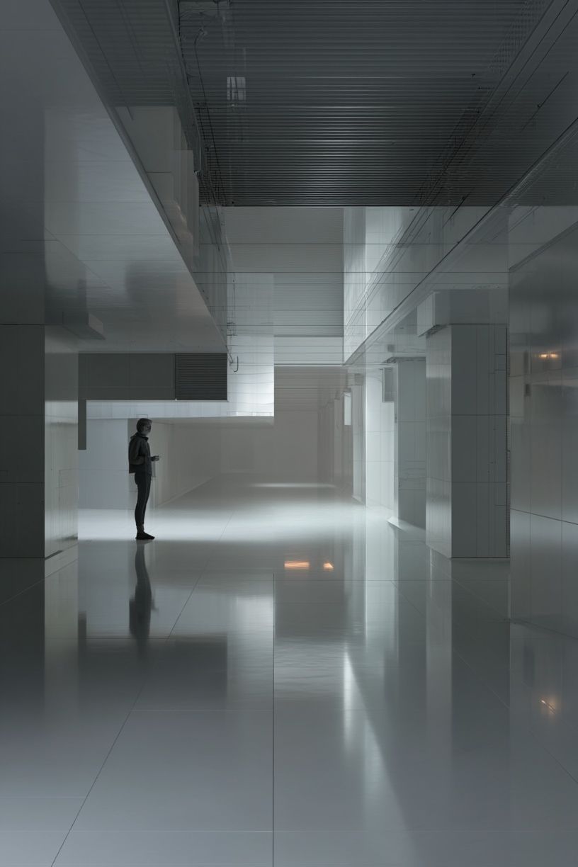
Visual weight is not only about frame size. Dark images, thick frames, and high-contrast pieces look heavier than pale, airy works of the same dimensions. Spread those heavier pieces across the arrangement instead of letting them collect on one side. If you use one dramatic piece like Modern Minimalist Architecture as an anchor, balance it with two or three lighter pieces nearby.
Another practical rule: hang the center of the overall composition around 145 cm from the floor in rooms where people stand and walk. Above sofas and headboards, measure from the furniture instead — leave 15 to 25 cm between the top of the furniture and the bottom of the lowest frame.
Mix Art, Photos, and Objects for Depth
A gallery wall feels more personal when it mixes formats. Art prints give the arrangement style and structure, personal photos add memory, and one or two objects — a small mirror, wall-mounted sculptural piece, or shallow shelf — add depth. The mix works best when flat pieces still make up about 70 to 80 percent of the wall. Too many objects create shadows and visual noise.
Keep one element consistent across all media. That could be a muted palette, all black-and-white photography, warm wood frames, or recurring organic shapes. If your family photos are colorful and busy, pair them with quieter works from our Abstract collection or Bohemian art prints so the overall wall does not become too descriptive.
In practical terms, try this ratio for a 7-piece arrangement: 4 art prints, 2 personal photos, 1 object. For a 10-piece wall, use 6 art prints, 3 photos, 1 object. That keeps the wall layered without losing visual order.
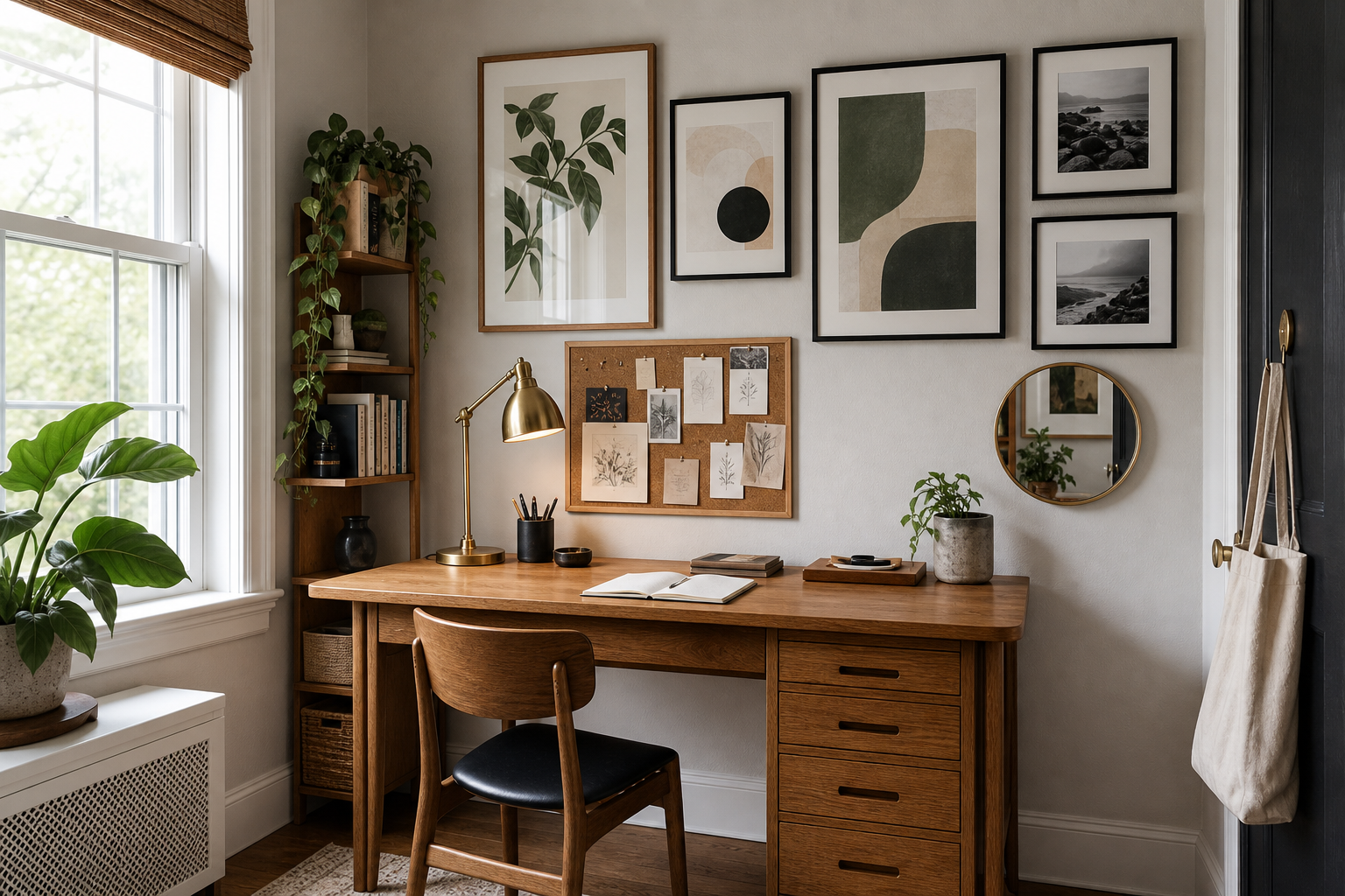
If you want a softer mixed-media look, Water Lilies and Elegant White Fabric are easy companions to family photography because their tones are understated and their subjects do not compete for attention.

Use Frames and Color to Tie Everything Together
Frames do more work than most people think. Matching every frame creates instant order, especially in eclectic arrangements. Black frames sharpen contrast and suit architecture, abstract work, and typography. Oak frames warm up fine art, soft photography, and neutral interiors. White frames can disappear into pale walls, which is useful if you want the art, not the framing, to carry the composition.
Matting helps mixed sizes feel deliberate. A small 21x30 cm print can hold its own next to a 50x70 cm piece if it has a wide mat. As a guide, use mats between 4 and 8 cm wide for small and medium frames. This gives smaller works more presence without adding visual heaviness.
Color discipline is what stops variety from turning into clutter. Limit the whole wall to two main neutrals plus one accent color. For example: black, ivory, and muted teal. Or oak, cream, and terracotta. If you love more variety, repeat that accent at least three times across the arrangement so it feels intentional.
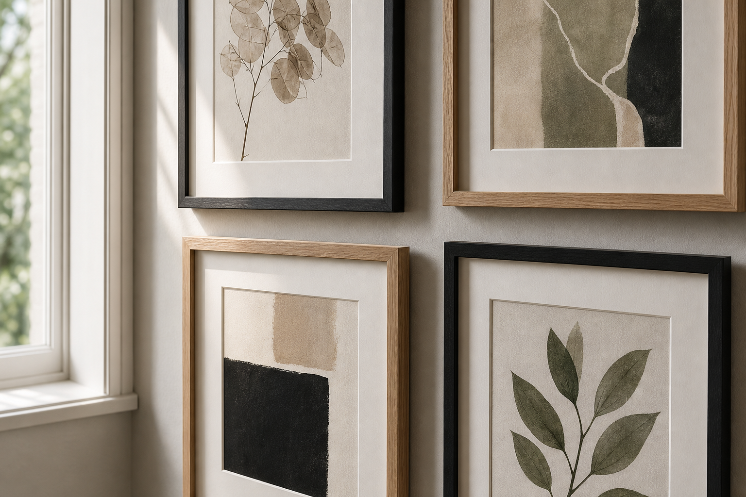
This is where focused pieces help. A work like Yin Yang Teal Abstract can introduce one accent color for the room, while quieter pieces from our Minimalist prints keep the arrangement balanced. If you prefer a more graphic wall, build around selections from our Typography collection but keep the frame style consistent.
How to Plan and Hang It Without Stress
Lay everything on the floor first. Mark out the wall width with painter's tape and test the arrangement full-size before making holes. This saves time and lets you check proportion against nearby furniture. Take a photo from above — imbalances are easier to spot on a screen than in real time.
Paper templates make installation simpler. Cut kraft paper to the exact size of each frame, tape the templates to the wall, and adjust until spacing looks right. Once you are happy, mark the hook points on each template. This method is especially useful for staircase layouts and asymmetrical clusters where one misplaced nail can throw off the whole rhythm.
Use a short checklist before hanging the final piece: is the composition centered over the furniture, are gaps consistent within 1 cm, is the outer shape clear, and is there one repeated thread — frame finish, palette, or subject — connecting everything? The strongest gallery wall layout ideas are rarely the most complicated. They are the ones with a clear structure you can read in three seconds.
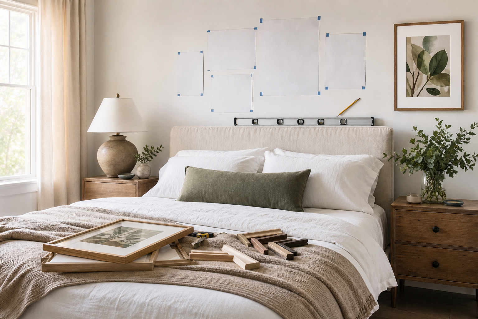
If you are starting from scratch, choose one anchor piece first, then add support from related categories such as Fine Art, Architecture prints, or Textured White Abstract depending on how quiet or bold you want the room to feel.
Final thoughts
Good gallery wall layout ideas balance personality with restraint. Pick a mood, choose a layout that suits the wall, keep spacing consistent, and repeat one or two framing or color decisions across the whole arrangement.
A gallery wall does not need dozens of pieces to look complete. In most rooms, 4 to 8 well-chosen frames arranged with clear spacing will feel more polished than a crowded wall of 15. Edit hard, measure twice, and let the composition breathe.