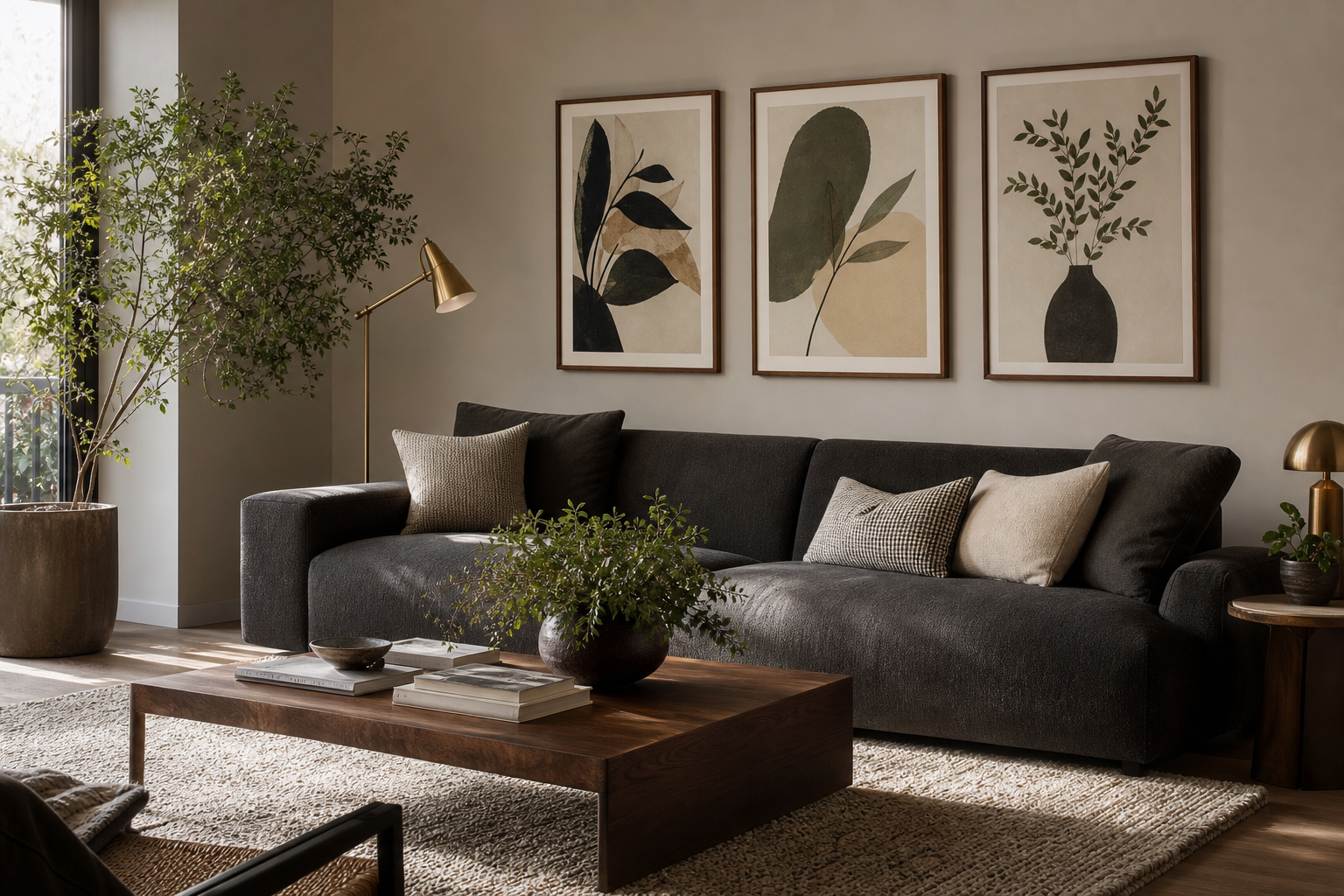
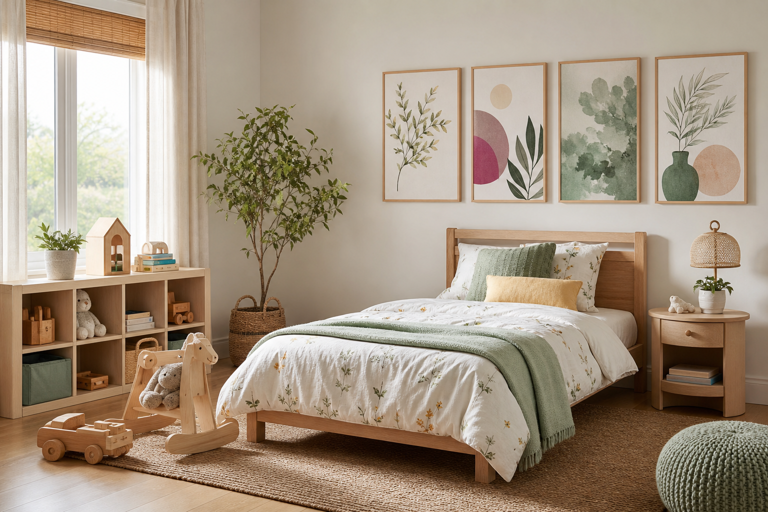
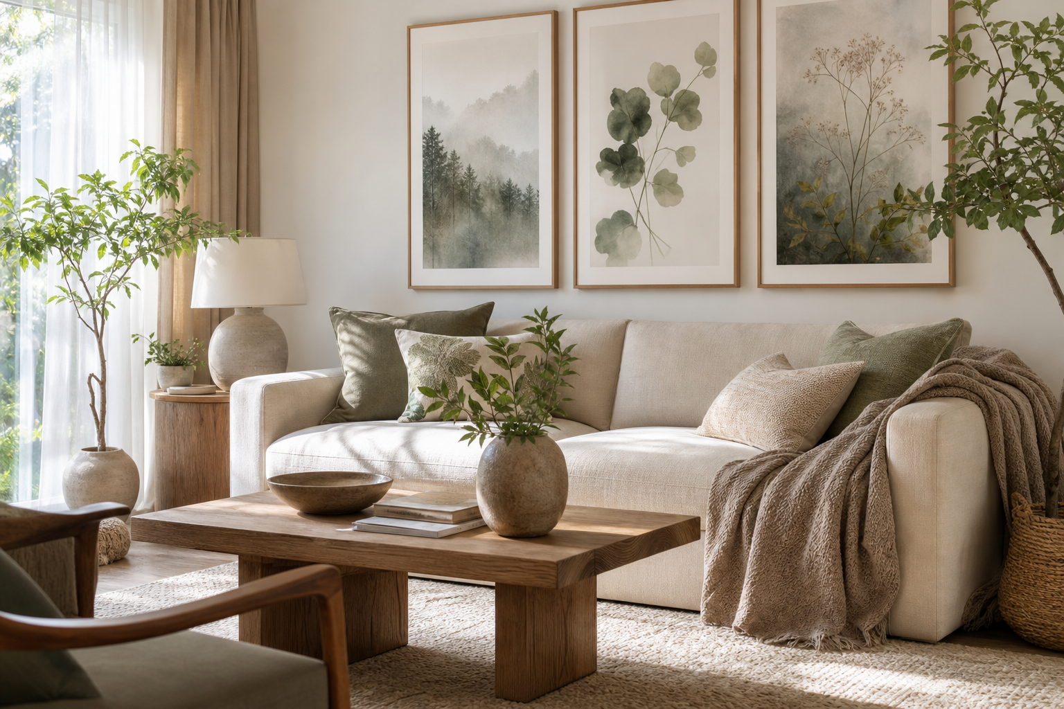
Decorating with kids for the living room works best when the art feels intentional rather than temporary. A shared space does not need to choose between polished and playful. If the colours are edited, the frames match, and the scale suits the furniture, children's artwork can make a living room feel warmer, more personal, and easier to live in every day.
Why Kids’ Art Works in Shared Spaces
Living rooms are used by everyone, so the artwork should reflect that. Kids' illustrations, soft animal motifs, and simple character-led pieces bring energy to a room that can otherwise feel flat or overly formal. They also soften hard lines from large sofas, media units, and coffee tables. One well-placed print above a side chair or a set of three above a sofa can shift the mood from "styled showroom" to "real family home" in minutes.
A good rule is to treat children's art the same way you would any other collection: repeat a visual language. That can mean watercolor textures, soft neutrals, or a theme such as animals, boats, or storybook scenes. If you keep to one or two visual threads, kids for the living room feels curated instead of scattered. Browse our Kids collection alongside the Illustration collection for pieces that already share gentle lines and family-friendly colour palettes.

Animal artwork is especially useful in a shared room because it appeals across ages. A zebra, ducklings, or a turtle feels playful for a child but still graphic enough for an adult space — especially when the drawing style is clean and the palette is restrained. If your living room already includes natural wood, cream upholstery, black accents, or woven textures, animal-led prints from our Animals collection slot in easily.
Choose a Style That Feels Grown-Up Too
The easiest way to make kids' art feel suitable for the living room is to avoid overly saturated rainbow palettes in large doses. Instead, choose prints with 3 to 5 dominant colours and let at least two of them connect to the room. Think sage, dusty blue, sand, terracotta, muted yellow, charcoal, or off-white. Watercolour pieces and minimal illustrations usually sit more comfortably in shared spaces than highly busy designs.

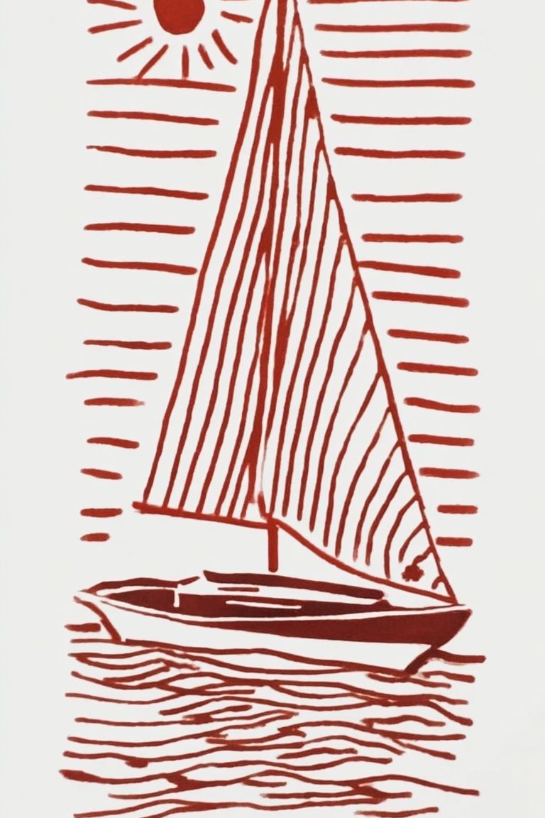
If your room leans modern, choose simpler forms from our Minimalist art prints and combine them with one or two child-friendly illustrations. A pared-back piece such as Sailing Boat Minimalist Wall Art works well beside softer figurative art because it gives the arrangement breathing room.
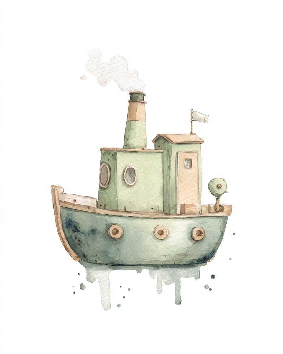
Storybook scenes also work well when they feel painterly rather than loud. For example, Whimsical Tugboat Watercolor Poster suits coastal, Scandinavian, and neutral interiors because the subject is child-friendly but the execution is soft and refined. The same principle applies to countryside and village imagery from our Fine Art collection — especially if you want a room that feels family-oriented without looking nursery-specific.
Where to Hang Kids’ Posters in the Living Room
The most effective placement is usually where the family naturally pauses. Above the sofa is the obvious choice, but not always the best one. If the living room already has a television, shelving, or a large window on the main wall, use secondary zones instead: above a reading chair, next to low shelving, over a toy basket area, or beside a window bench. These spots feel integrated and reduce visual competition.
For art above a sofa, aim for a total arrangement width of 60 to 75 percent of the sofa width. On a 200 cm sofa, that means a composition around 120 to 150 cm wide. Hang the center of the arrangement roughly 145 cm from the floor, then adjust slightly lower if the room has deep seating. Keep 15 to 25 cm between the top of the sofa and the bottom of the lowest frame so the art feels connected to the furniture.

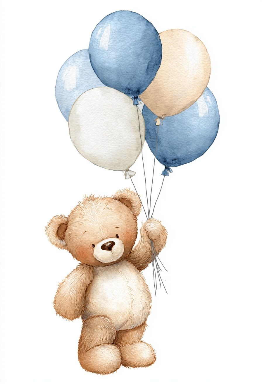
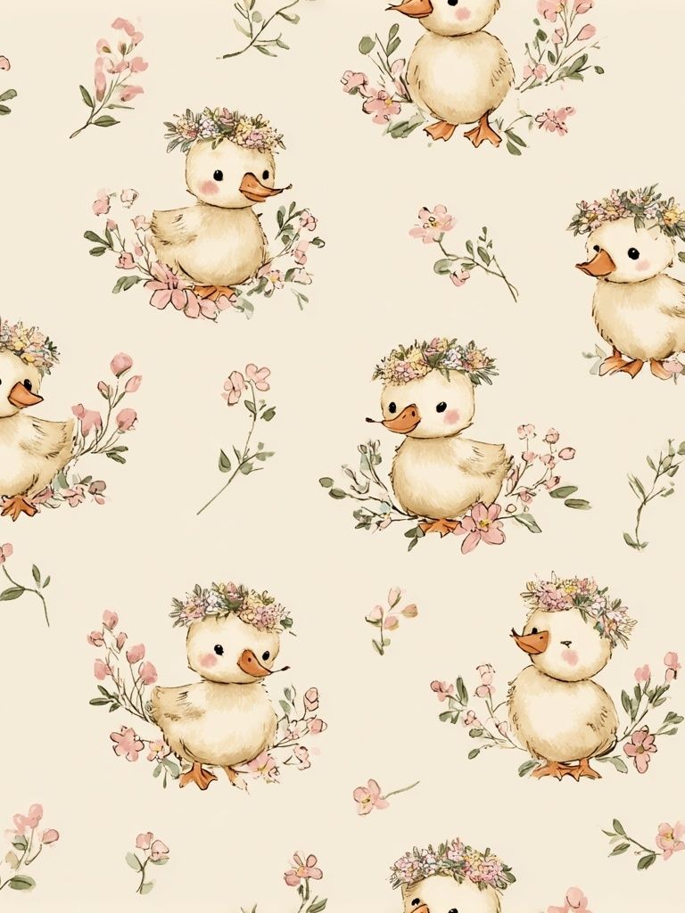
Reading corners benefit from smaller, more intimate formats. A single 30x40 cm print or a pair of 40x50 cm frames can define the zone without overpowering it. Near toy storage or a play nook, use cheerful pieces that still echo the main room palette, such as Teddy Bear with Balloons or Cute Ducklings with Flowers.
Pick the Right Size, Frame, and Finish
In busy family spaces, scale matters as much as subject. Small art on a large wall tends to look accidental. As a baseline, use 50x70 cm or 70x100 cm for a main focal point, and 30x40 cm or 40x50 cm for supporting pieces. If you are grouping several works, keep at least one size repeated twice to create structure.
Frame choice can instantly move a children's print into grown-up territory. Oak frames warm up soft illustrations and work well with neutral or Scandinavian interiors. Black frames sharpen pastel or watercolor art and help it stand up against darker furniture. White frames are useful when the wall colour is stronger and you want the print itself to feel light. In most living rooms, matching all frames is the safest option. If you mix finishes, limit the room to two frame colours maximum.
Glazing is worth considering if the room gets heavy use. Acrylic glazing is lighter and more shatter-resistant than glass, which makes it practical in homes with younger children. Matte paper finishes also help quieter illustrations feel more premium because they reduce glare from windows and floor lamps.
For rooms that already feature sharper modern lines, balance softer kids' motifs with graphic artwork like Zebras in Love — Black-White Print or more restrained pieces from our Abstract wall art collection. The contrast keeps the display from feeling overly sweet.
Build a Gallery Wall That Grows With Them
A gallery wall is the most flexible option if you want the room to evolve over time. Start with four to six frames and mix subject types: two child-friendly illustrations, one minimalist print, one family photo, and one calmer landscape or fine art piece. This 40/30/30 balance — 40 percent playful, 30 percent neutral art, 30 percent personal imagery — usually keeps the wall family-focused without becoming chaotic.


One smart method is to keep the outer frame layout fixed and rotate only the inner content. That means the wall always looks composed, even as interests change from boats to animals to fairy-tale scenes. Pieces such as Baby Fairy Garden Illustration Poster can be swapped seasonally, while more timeless anchors remain in place.

Try leaving 5 to 7 cm between smaller frames and 7 to 10 cm between larger ones. Consistent spacing does more for a polished result than perfectly matching subjects. Before hanging, lay everything on the floor or tape paper templates to the wall. This helps you check that the arrangement aligns with nearby furniture edges, lamps, and shelving.
Easy Styling Tips for a Cohesive Look
Repetition is what makes mixed artwork feel deliberate. Pull one accent colour from the prints — perhaps muted yellow, dusty blue, or forest green — and repeat it in a cushion, vase, throw, or book spine. Even a 10 to 15 percent repeat of the wall art palette across the room can make the entire setup feel connected.
Keep the surrounding styling simple. If the wall art is playful, avoid cluttering the console beneath it with too many decorative objects. A stack of books, one lamp, and one ceramic object is often enough. Let the frames do the work. If the room already includes bold upholstery or a patterned rug, choose quieter wall art such as Soap Bubbles Minimalist Print to give the eye a place to rest.

Refresh the display once or twice a year rather than constantly replacing it. Swapping 1 or 2 pieces out of a 5-piece arrangement is enough to keep the room current while preserving the structure you built. That is the real advantage of decorating with kids for the living room — the space can stay stylish while still keeping up with family life.
Final thoughts
The best living rooms with children's art are not the ones filled with the most colour. They are the ones with clear choices: a controlled palette, the right scale, consistent framing, and placement that relates to how the room is actually used. Start with one strong print or a simple four-piece gallery, then build around it slowly.
When you treat children's artwork as part of the room rather than an exception to it, the result feels relaxed, thoughtful, and lasting. That is how kids for the living room becomes a design choice, not just a practical one.
Frequently Asked Questions
What frame size works best for a small living room?
In compact rooms, 30x40 cm and 40x50 cm frames are usually enough. Use 2 to 4 pieces maximum on one wall so the space still feels open.
Should kids' prints match the sofa colour?
No — but they should relate to it. Aim for at least one shared tone, such as beige, grey, blue, or brown, so the art feels connected to the seating area.
Is acrylic better than glass in a family living room?
Yes for most homes with children. Acrylic is lighter, more impact-resistant, and easier to handle when rehanging or updating a gallery wall.
Can I mix kids' art with black-and-white photography?
Yes, if the frames match and the spacing stays consistent. Black-and-white pieces help balance sweeter illustrations and make the overall wall look more mature.
How high should I hang art above a console or shelf?
Leave roughly 15 to 20 cm between the furniture top and the bottom of the frame. That gap keeps the art visually linked to the piece below it.