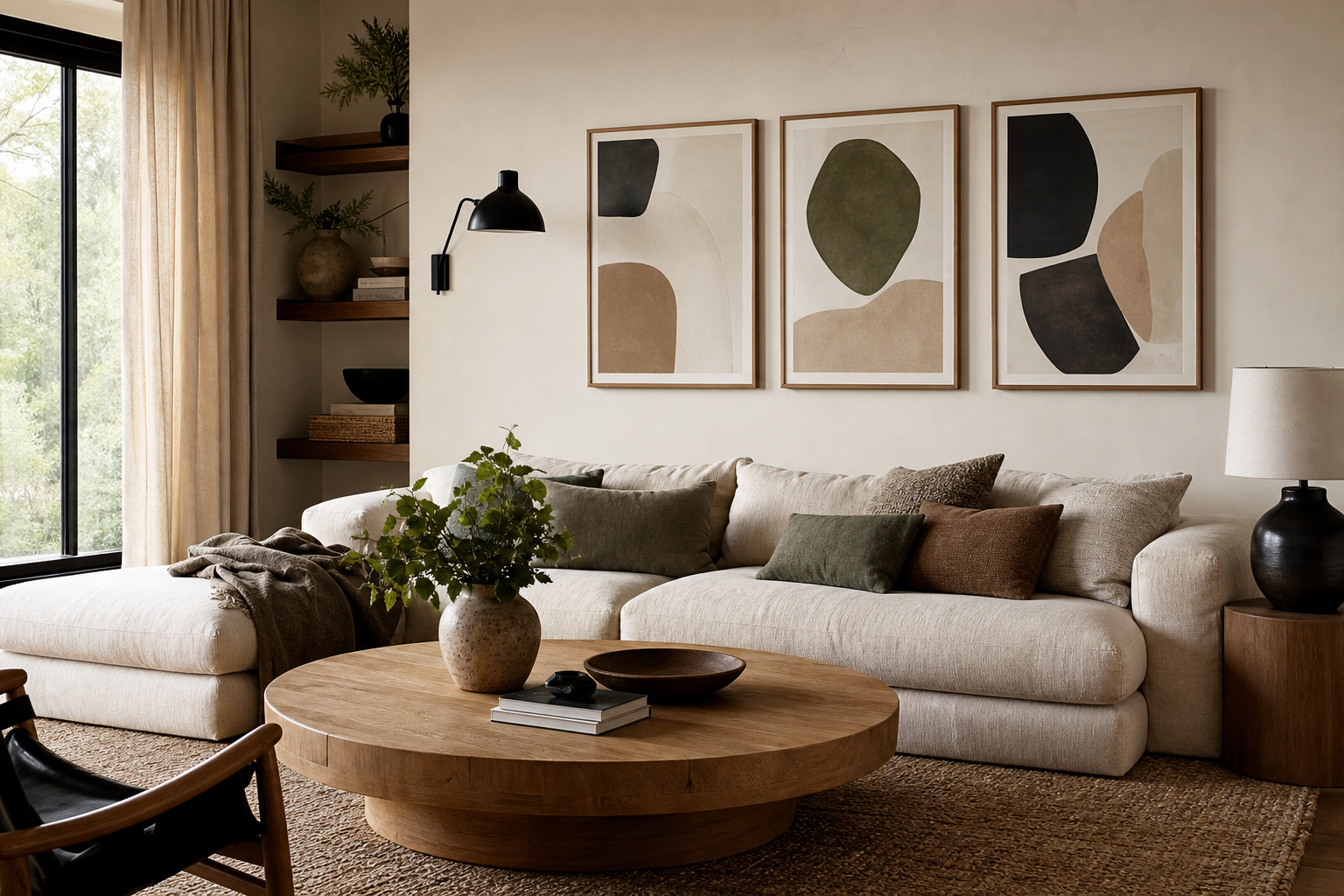
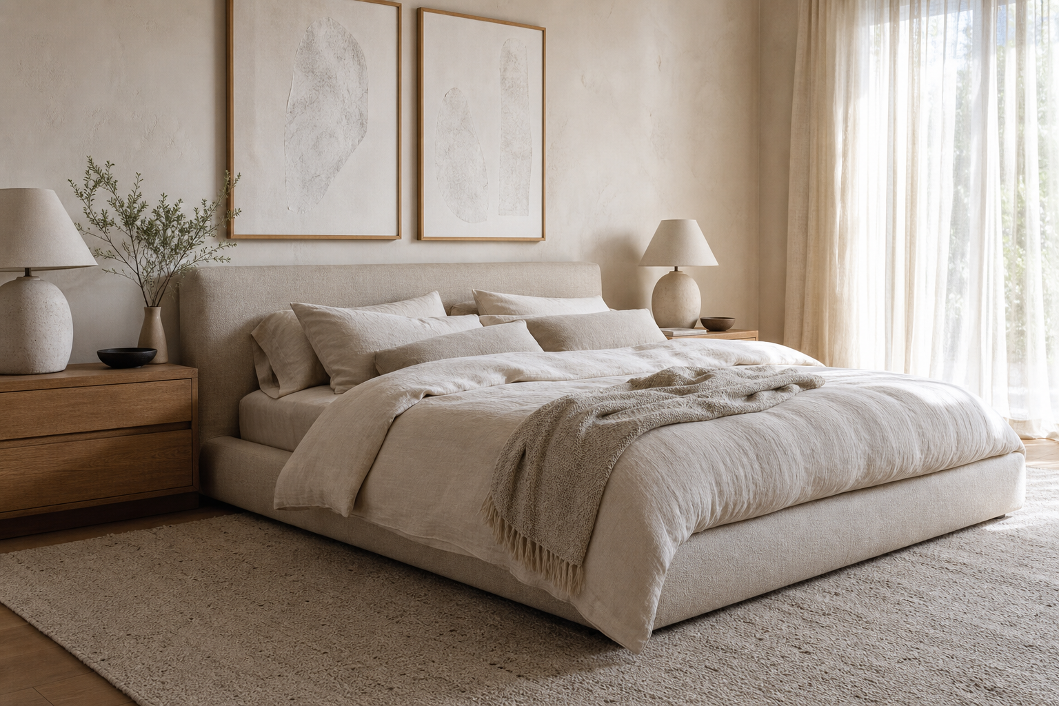
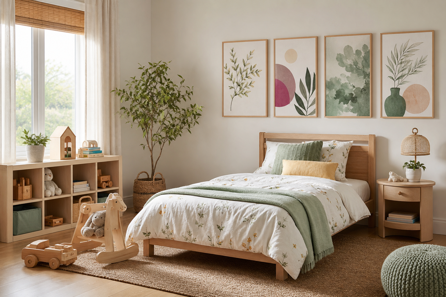
Art posters abstract work because they add energy without locking a room into one strict theme. A landscape tells a literal story. An abstract piece sets a mood instead — calm, sharp, playful, dramatic — and lets the furniture, textiles, and lighting finish the sentence. That makes abstract art especially useful in rooms that already mix styles, such as a modern sofa with a vintage wood cabinet or a minimalist bed with layered natural fabrics.
Another advantage is range. You can use bold pieces from our abstract collection in a high-contrast living room, or choose quieter compositions from our minimalist art prints for a softer space. If your home leans warmer, shapes and textures from Mid Century Modern wall art often bridge abstract form with earthy tones. The result feels designed rather than accidental.
Why Abstract Posters Work So Well
Abstract artwork is flexible because it speaks through composition, scale, and color rather than subject matter. A large piece with sweeping lines can make a small room feel less boxy. A print built from soft tonal layers can smooth out a space with many hard edges — metal shelving, sharp-armed seating, stone surfaces. This is where art posters abstract become practical design tools, not just decoration.
Rooms with neutral bases benefit most. If your walls are white, warm beige, greige, or pale gray, abstract prints add movement without visual clutter. In a room with many patterns already — striped rugs, checked cushions, ribbed throws — choose abstract designs with broad forms and 2 to 4 dominant colors. In plainer rooms, you can afford something more graphic.

Texture also matters. Prints that suggest brushwork, plaster, haze, or layered pigment feel richer than flat blocks of color, especially when paired with tactile materials such as bouclé, walnut, linen, or brushed brass. A piece like Textured Waves — Abstract Print works well when you want visual depth but not loud contrast.
Choosing the Right Palette for Your Space
Start with the 60-30-10 rule. In most interiors, 60% is the main color of the room, 30% is the secondary tone, and 10% is the accent. Your abstract art should usually repeat at least one of the first two and either introduce or reinforce the accent. In a room with cream walls and an olive sofa, for example, a print with muted green, sand, and black linework will feel tied in. In a room with charcoal upholstery and oak floors, a rust, amber, or cobalt accent can wake things up.

Warm palettes — terracotta, blush, ochre, rust, brown — suit wood-heavy interiors and layered textiles. Cooler palettes — teal, slate, navy, gray, black-white — sharpen modern rooms with glass, chrome, or concrete finishes. If you want a balanced middle ground, look at fine art prints with painterly depth or quieter pieces from abstract wall art in neutral palettes.


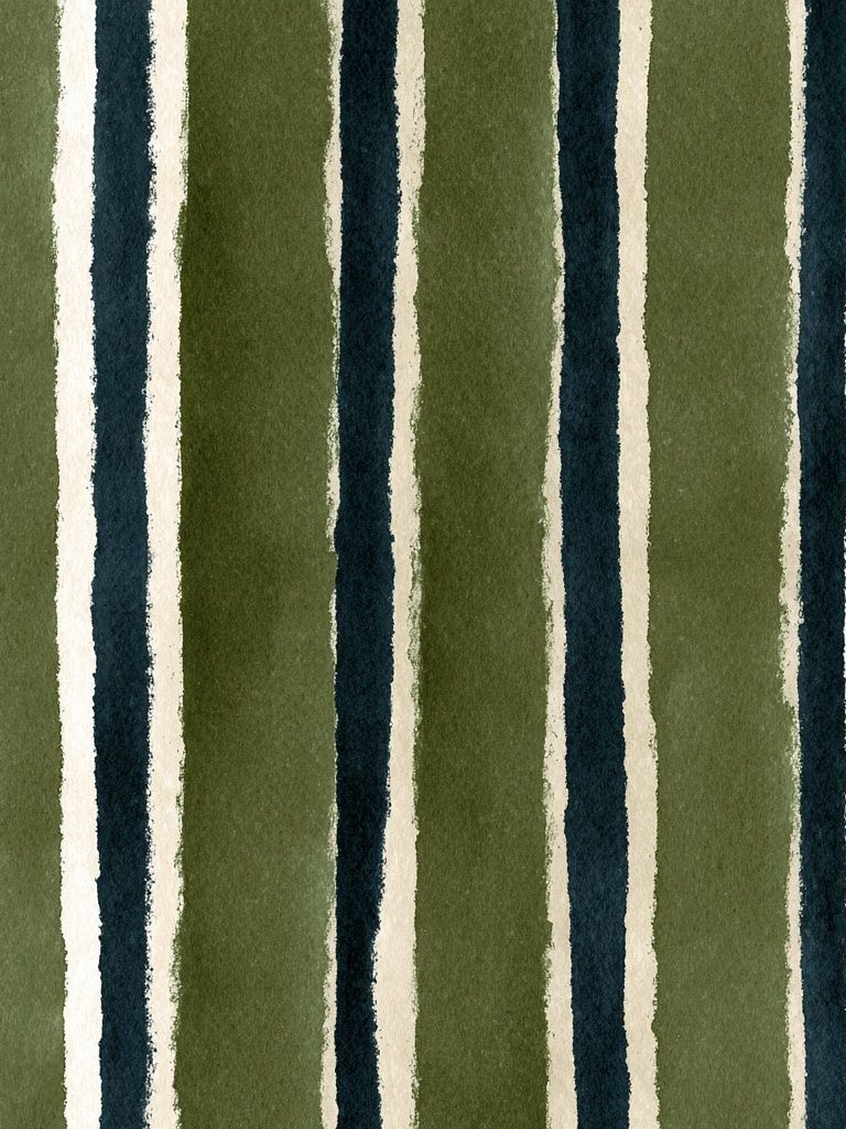
For low-contrast rooms, stay within a 20% to 30% shift in tone. That means cream with sand, taupe, and soft black rather than cream with saturated red. For rooms that feel flat, bring in one decisive accent color through the art and echo it once more in a cushion, vase, or throw. One repeat is usually enough.
Finding the Best Size and Layout
Art that is too small is the most common mistake. Above a sofa, your framed arrangement should span about 60% to 75% of the sofa width. For a 200 cm sofa, aim for a total art width between 120 and 150 cm. Above a queen bed, 100 to 140 cm wide usually looks balanced. In a hallway, one oversized piece often works better than several small ones because it reads clearly in motion.
Single statement prints are best when the composition has strong movement or strong color. Multi-piece arrangements work when you want rhythm. A diptych can stretch a room visually, especially over long furniture like sideboards or desks. A four-piece grid feels ordered and architectural — ideal for cleaner interiors.

Leave 5 to 8 cm between smaller frames and 7 to 12 cm between larger ones. Hang the center of the arrangement around 145 cm from the floor in most homes, then adjust slightly if the furniture is very low. If your ceiling is under 240 cm, avoid stacking too many small frames vertically — it can make the wall feel busy and shorter.

If you prefer a more restrained look, pair one bold abstract with one tonal companion from White Cream Texture Poster or browse bohemian wall art for softer pattern-led alternatives in relaxed spaces.
How to Frame Abstract Art Posters
Frames should support the artwork, not compete with it. Black frames define and sharpen. Oak frames warm up cooler palettes and connect art to wooden furniture. White frames almost disappear on pale walls and are useful when you want the composition itself to do all the work. For most abstract pieces, a frame width of 1.5 to 2.5 cm looks clean and current.
Matting is most helpful for smaller works or detailed compositions. A white mat of 4 to 8 cm gives the art more presence and makes a 30 x 40 cm print feel more substantial. For large abstract prints — 50 x 70 cm and up — no mat often looks stronger, especially if the artwork has edge-to-edge color or texture.

Glazing affects finish. Acrylic is lighter and safer for bedrooms, rentals, and busy family spaces. Glass gives a slightly crisper surface but weighs more. If the room gets strong direct sun, position the art away from the brightest exposure or use UV-protective glazing for pieces you plan to keep up long term.

Minimal frames pair especially well with textural minimalist prints and monochrome pieces such as Sacred Geometry Black-White Poster when you want a quieter, gallery-style look.
Styling Abstract Posters by Room
In living rooms, abstract art should usually anchor the main seating area. Choose one large horizontal piece for a calm, edited look, or a pair of medium vertical pieces if the wall is tall and narrow. Colors can be slightly stronger here because the room is social and active. Teal, amber, black-white, and layered neutrals all read well from a distance.
Bedrooms benefit from softer edges and lower contrast. Think washed blush, cream, sand, dusty blue, or muted olive. Position the artwork 15 to 25 cm above the headboard so it feels connected to the bed rather than floating. If you already have patterned bedding, keep the art looser and less detailed.

In home offices, abstract art can help define focus. Linear, geometric, or high-contrast work tends to feel sharper near a desk. Try mixing one piece from our abstract prints with one from Mid-Century Abstract Leaves Poster if you want structure with a little warmth.
Hallways need clarity. Since people see the art while moving, choose compositions that read from 1.5 to 3 meters away. Strong shapes, fewer colors, and generous frame sizes work better than intricate details. If the corridor is dark, select pieces with white space or pale grounds to bounce more light visually.
Finishing Touches and Shop Tips
Paper quality changes the entire impression. Heavier stock typically looks flatter, cleaner, and more premium on the wall, especially for artwork with tonal transitions or visible texture. Surface finish matters too — a matte finish is usually best for abstract prints because it reduces glare and lets layered color appear deeper.
Build a collection by repeating one element across pieces: the same undertone, the same frame, or the same visual tempo. You do not need every print to match exactly. A stronger approach is to keep 70% consistent and let 30% shift. That might mean all-neutral bases with one brighter accent piece, or all-black frames with varied color inside.
If you are buying your first set, start with one anchor piece and one supporting piece. A vivid focal work like Colorful Stained Glass Abstract Poster can lead the palette, while a quieter companion in cream, gray, or soft texture keeps the wall balanced. This is often more effective than buying three equally bold prints at once.
Final thoughts
Abstract wall art earns its place by solving real design problems: adding movement to plain rooms, giving structure to open walls, and tying scattered colors together. The best results come from getting three things right — palette, proportion, and frame finish.
If you want your room to feel more layered without becoming busy, start with art posters abstract that repeat your existing tones and add one new accent. Then size them generously, hang them with intention, and let the wall do more of the work.
Frequently Asked Questions
What size abstract print works best above a console table?
A good rule is 50% to 70% of the console width. For a 120 cm console, aim for artwork around 60 to 84 cm wide.
Should abstract prints match in a gallery wall?
No — they should coordinate, not duplicate. Keep one unifying element such as frame color, undertone, or similar spacing between pieces.
Do abstract prints work on colored walls?
Yes, especially if the print repeats the wall color in a lighter or darker shade. Add a mat or lighter frame if the wall tone is deep and you want more separation.
Which frame color is safest if I plan to move the art between rooms?
Black and natural oak are the most versatile. Both work across warm and cool interiors and suit most abstract compositions.
How can I test placement before hanging?
Mark the frame size with painter's tape or use kraft paper templates. Live with the layout for 24 hours before making holes.