The best abstract art posters do two jobs at once: they fill a wall, and they sharpen the character of the room. Because abstract work is not tied to a literal subject, it can shift between calm, graphic, playful, or architectural depending on color, scale, and framing. That flexibility is exactly why curated interiors often rely on abstract pieces instead of overly specific imagery.
A room feels collected when the artwork relates to the space in a clear way. That usually means repeating one or two colors already present in the room, choosing a scale that suits the wall, and limiting visual noise. If you want abstract art posters to feel intentional rather than random, think less about "matching" and more about rhythm, proportion, and finish.
What Makes Abstract Art Work in Modern Interiors
Abstract work adds movement where furniture often stays rigid. A sofa, bed, desk, or shelving unit is built from straight lines and fixed proportions; abstract shapes soften that structure and stop a room from feeling too static. In modern interiors especially, that contrast matters. A clean-lined room becomes more inviting when you add fluid forms, layered texture, or painterly color fields from our abstract collection.
Another strength is range. Soft tonal pieces suit restrained spaces, while graphic compositions hold their own in bolder rooms. If your home leans clean and quiet, a work from the minimalist art prints category keeps the atmosphere refined. If your space already has richer woods, woven textiles, or handmade accents, pieces from our bohemian wall art selection can bridge abstraction with warmth.

The most successful abstract art posters often carry one strong visual idea: a directional sweep, a repeated stripe, a textured field, or a color block that anchors the wall. That clarity is what makes them feel edited. A piece such as Textured Waves — Abstract Print works because it creates motion without demanding too much attention from the rest of the room.
Choosing Colors That Echo Your Space
Start with a simple 60-30-10 rule. If roughly 60% of the room is your dominant tone — for example warm white walls and beige upholstery — then your art can pick up the 30% secondary color such as walnut, rust, sage, charcoal, or muted blue. The final 10% is where abstract art posters can bring a sharper accent without making the room feel disconnected.
In neutral rooms, tonal abstract pieces tend to look more expensive than high-contrast ones. Cream, stone, taupe, black, and dusty brown create a layered result that feels calm and architectural. A print like Blush Watercolor Abstract Poster is useful when you want warmth without introducing heavy contrast.

If your room already has strong upholstery or patterned textiles, choose art that repeats one color from the room and lets the rest stay subdued. That is often more effective than trying to mirror every color exactly. In a blue-gray living room, teal or smoky navy can add depth. In a terracotta space, dusty pink or rust works better than bright red.

Contrast is useful when a room feels flat. One or two stronger pieces can wake up a monochrome scheme, especially in spaces with black metal, glass, or concrete. If you want more energy, the fine art print collection and Colorful Stained Glass Abstract Poster direction makes sense — but use bright work sparingly on smaller walls.
Finding the Right Scale for Each Wall
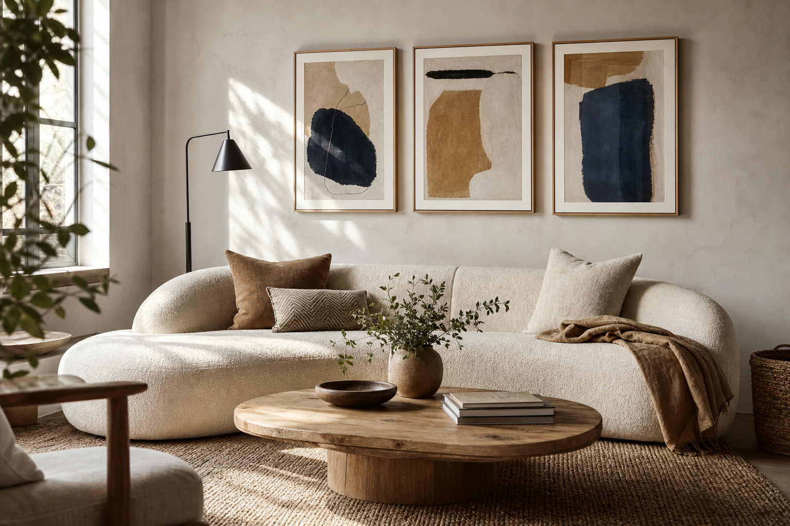
Scale is the detail most likely to make art feel either curated or accidental. As a rule, wall art should fill about 60% to 75% of the width of the furniture below it. Over a 200 cm sofa, aim for a total art width between 120 and 150 cm. Over a 160 cm bed, 95 to 120 cm usually looks balanced.
For a single statement piece, 50x70 cm works on narrow walls, while 70x100 cm has enough presence for a main living area. If you are hanging two pieces side by side, keep the gap between 5 and 8 cm for a tight, collected look. Wider gaps can make even good art feel disconnected.

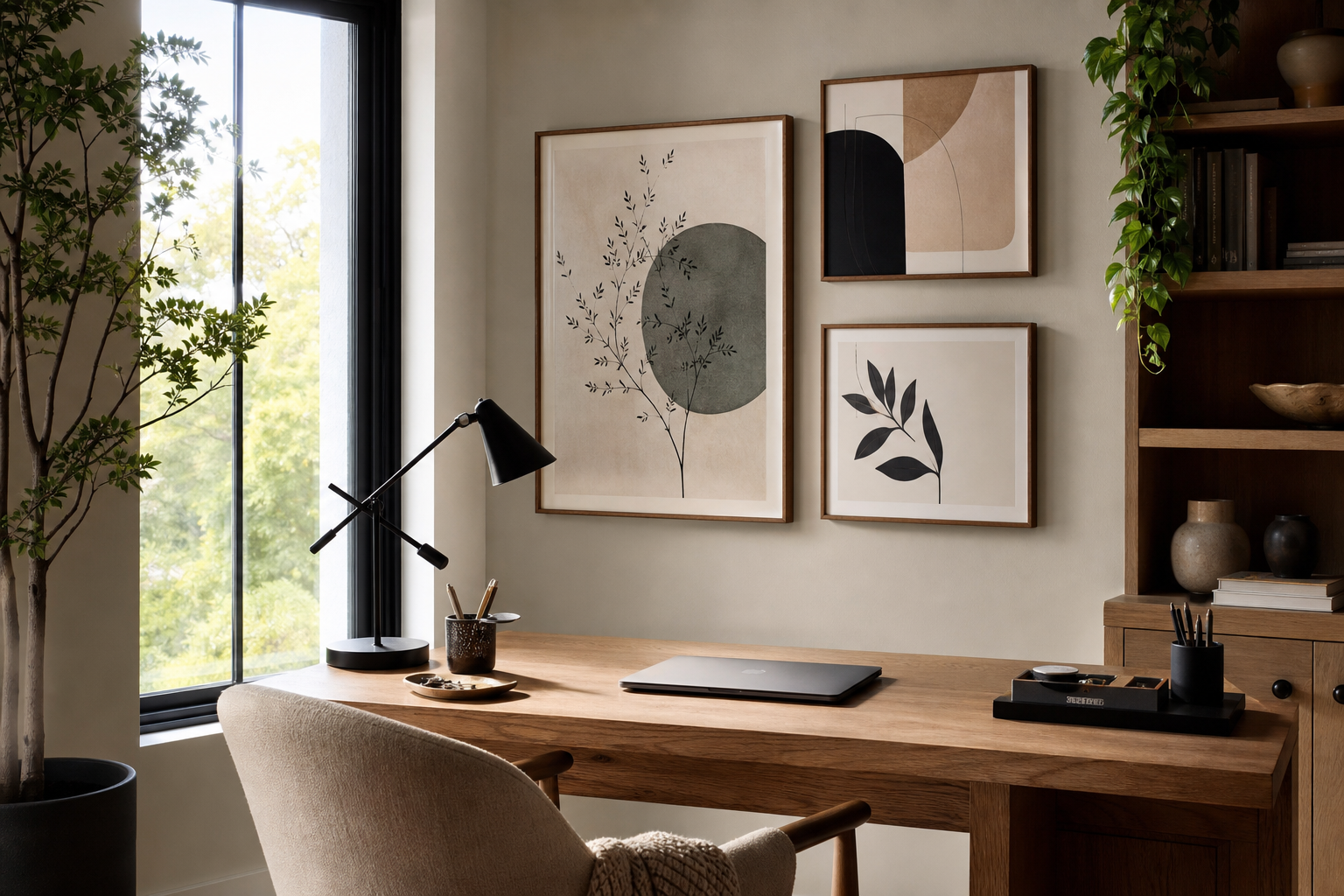
Hallways and small entry walls respond well to vertical formats because they guide the eye upward. Bedrooms often benefit from wider pairings with softer color transitions. Home offices can take more graphic shapes or directional lines, especially near a desk where the art is viewed from a shorter distance of 1 to 2 meters.
A mix of sizes can work, but the hierarchy needs to be obvious. One anchor piece should be at least 1.5 times larger than any supporting work. That is why many shoppers start with one hero print from the abstract wall art range and then build outward with quieter companions.
Framing and Finishes That Change the Feel
The same artwork can shift dramatically depending on the frame. Thin black frames sharpen edges and suit modern, high-contrast rooms. Natural oak frames soften geometric work and tie art into floors, tables, and shelving. White frames reduce visual weight, which helps in small rooms or spaces with very pale walls.
Matting adds breathing room. A white mat of 5 to 7 cm around smaller works can make a 30x40 cm piece feel more substantial. On more textural abstract pieces, going without a mat often feels more contemporary because the image sits closer to the room. If you lean minimal, combine quiet surfaces with pieces from our Textured Waves — Minimalist Print or Torn Paper Black and White Poster for a tighter finish.

Paper finish also affects mood. Matte surfaces reduce glare and make color transitions look richer, especially in bedrooms and reading corners. Cleaner, crisper designs can handle a sharper presentation, but heavily reflective finishes tend to fight with daylight and lamps. For abstract art posters, texture usually reads as more considered than shine.
How to Build a Gallery Wall Around Abstract Prints
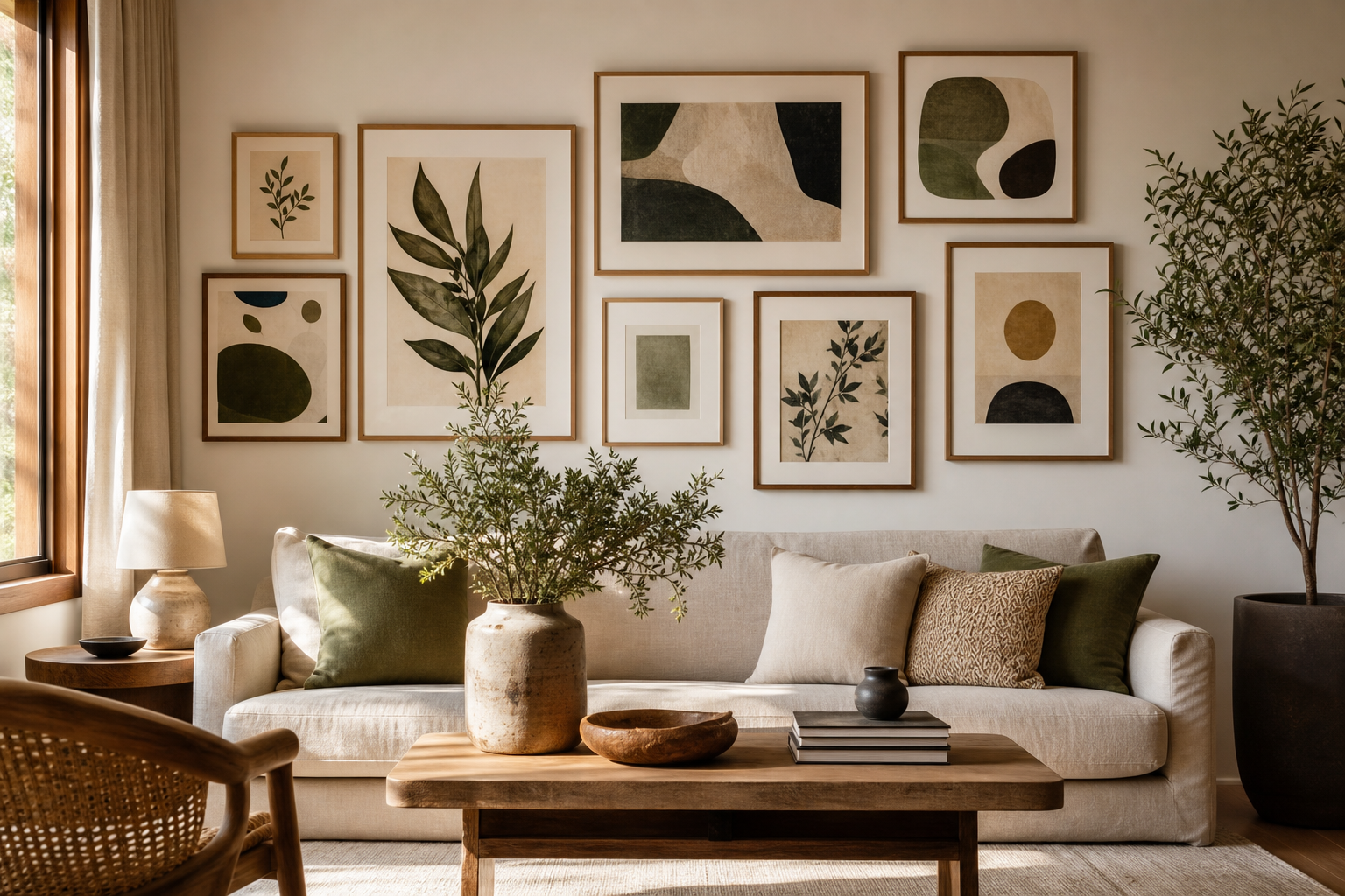
A good gallery wall needs one repeating element. That can be a shared palette, matching frame color, consistent margins, or a common theme such as line, texture, or shape. Without that repetition, mixed walls start to look like leftovers rather than a collection.
Abstract pieces are excellent anchors because they create mood instead of narrative. Build around them with restrained additions: a line drawing, a textural minimalist piece, or one graphic pattern. If you use four to six works, let at least half of them share a similar tonal range. A 2:1 ratio of quiet pieces to bold ones keeps the wall balanced.


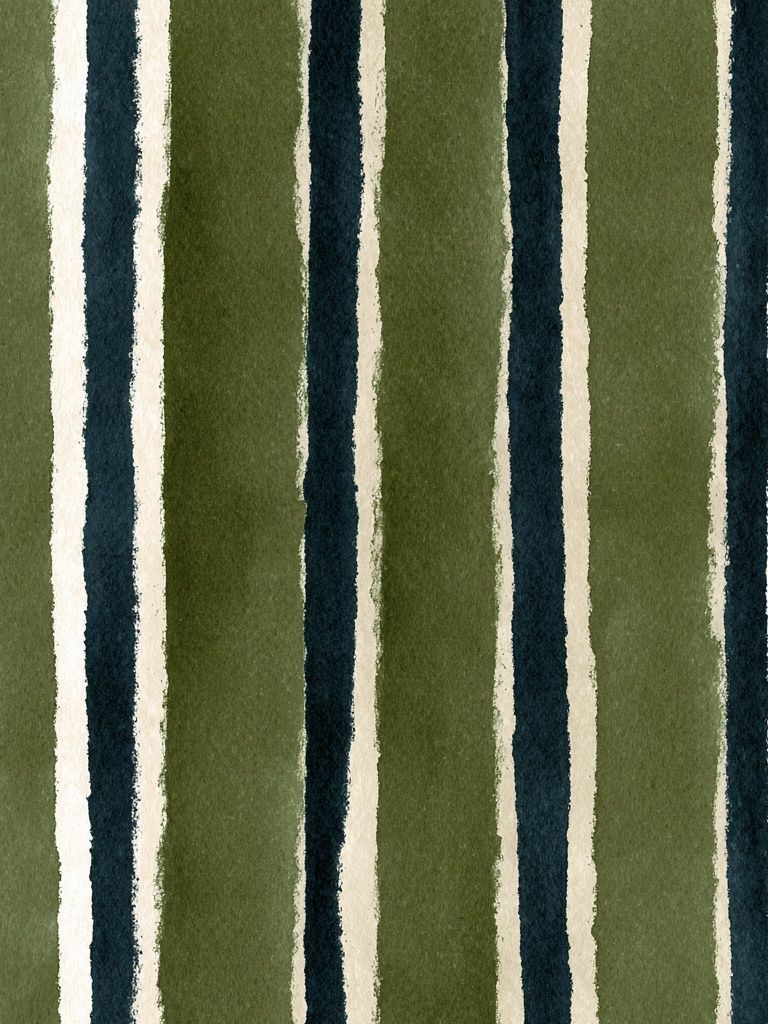

If you want a salon-style arrangement, lay everything out on the floor first and keep outer edges visually compact. In grid arrangements, align either the top edges or the center lines — not both randomly. For rooms with Scandinavian or restrained modern furniture, a hybrid mix of Textured White Abstract Poster and quieter work from the minimalist collection creates cohesion fast.
Styling Ideas by Room and Mood
In a calm bedroom, choose low-contrast abstract art posters in sand, blush, fog, or off-black. Two 50x70 cm pieces above the bed create symmetry without feeling formal. Pair them with linen bedding, rounded lamps, and pale timber so the art feels integrated rather than decorative.
In a living room that needs energy, use one bolder abstract piece and keep the rest of the space controlled. Stronger options with red, teal, or stained-glass tones work especially well against neutral upholstery. If your furniture is mostly cream, gray, or black, the wall art can carry 80% of the room's color story on its own.

For home offices, directional patterns and higher contrast help the wall feel sharper and more focused. In playful spaces — a creative studio, reading corner, or expressive hallway — you can introduce more saturated work, but keep at least one grounding neutral in the frame, rug, or nearby furniture.

Rooms with boho or layered interiors benefit from patterned abstraction rather than stark geometry. A piece from the Watercolor Checkered Pattern Poster direction or the Mid Century Modern collection can make abstract styling feel softer and more lived-in.
Final Tips for Buying Abstract Art Posters You’ll Love Long-Term
Choose pieces that still make sense if the room changes. A sofa might be replaced in 5 years; good abstract art posters should survive that shift. Prints built around versatile tones — black, cream, rust, muted blue, soft green, dusty pink — usually outlast trend-driven neons or hyper-specific motifs.
Buy with placement in mind, not just taste. Measure the wall, note the furniture width, and decide on frame color before you order. If a piece works with at least two rooms in your home, it is usually a stronger long-term choice than something that only suits one setup. The most timeless abstract art posters feel specific in composition but flexible in styling.
Putting it together
A curated wall rarely comes from finding the "perfect" piece in isolation. It comes from making a few disciplined choices about color, scale, framing, and repetition. Once those are in place, abstract work becomes one of the easiest ways to make a room feel finished.
If you want the safest route, start with one medium or large abstract print, frame it well, and build slowly. That measured approach almost always looks better than filling a wall too quickly.
Frequently Asked Questions
What frame color works best for abstract prints in a neutral room?
Natural oak and thin black frames are the most versatile. Oak warms up beige and off-white spaces, while black gives softer abstracts a cleaner edge.
Can I mix abstract art with patterned textiles?
Yes — keep one shared color between the art and the textile, and let one of them dominate. If the rug is busy, choose art with larger shapes and fewer color shifts.
How high should I hang abstract wall art?
As a guide, place the center of the artwork around 145 to 150 cm from the floor. Above furniture, leave 15 to 25 cm between the top of the furniture and the bottom of the frame.
Should abstract prints in a gallery wall all have matching frames?
Not always, but they should share at least one framing detail such as color, thickness, or mat style. Too many unrelated frames weaken the curated effect.
Are large abstract pieces better than several small ones?
For most living rooms, one large piece is easier to get right and often looks more expensive. Several small works can look excellent too, but only when spacing and alignment are consistent.