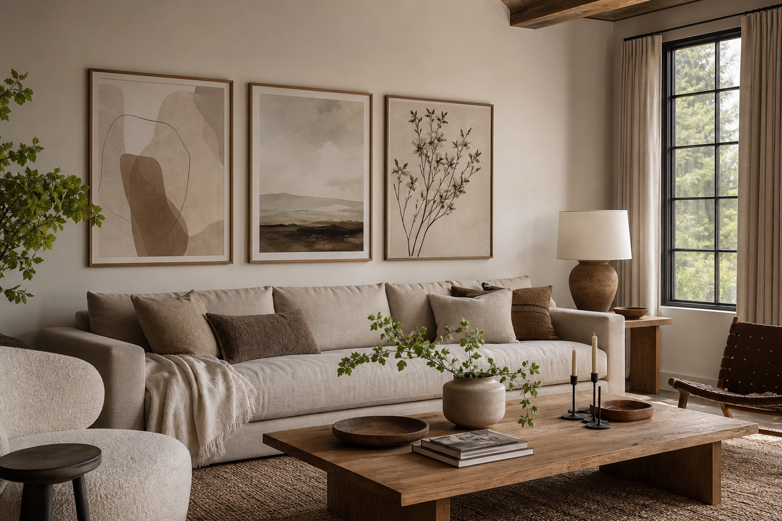
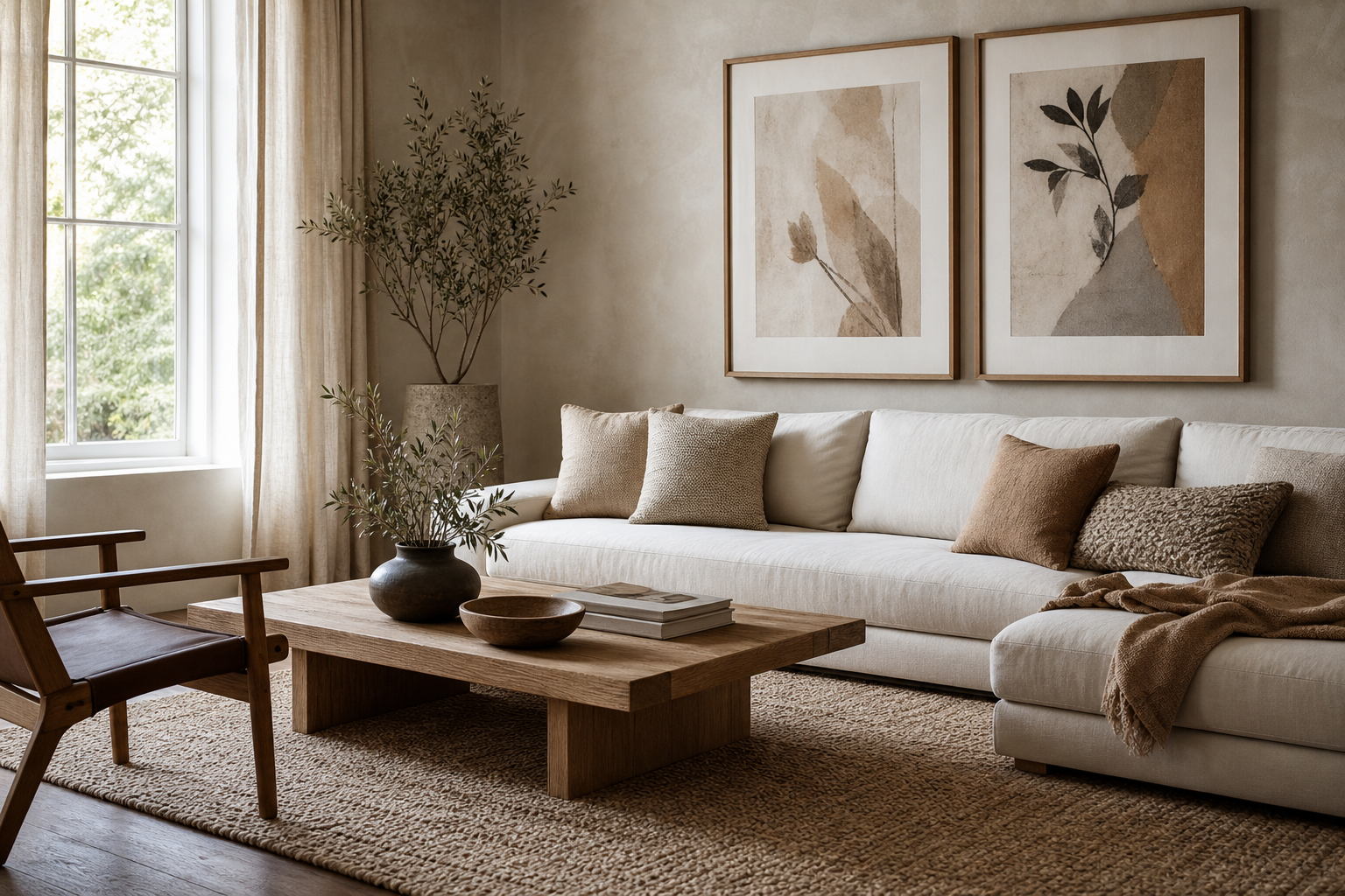
Architecture for the living room works because it brings order without making a space feel cold. Strong lines, repeating forms, facades, staircases, and windows all give the eye something structured to rest on. In a room used for reading, talking, and switching off, that sense of visual clarity matters.
Why Architectural Art Works So Well in Living Rooms
Architectural imagery has a built-in balance. Even dramatic buildings usually rely on symmetry, grid systems, and proportion, so the artwork feels composed from the start. That makes our architecture collection especially effective in living rooms where you want calm rather than clutter.
It also ages well. A trend-led colour block can date quickly, but buildings, interiors, arches, and clean facades have a timeless quality. If your room already includes oak, walnut, boucle, linen, black metal, or stone, architectural wall art usually looks intentional within minutes because those materials already speak the same design language.
A good example is imagery with strong geometry but soft tonality. It creates focus above a sofa without overpowering the whole room.
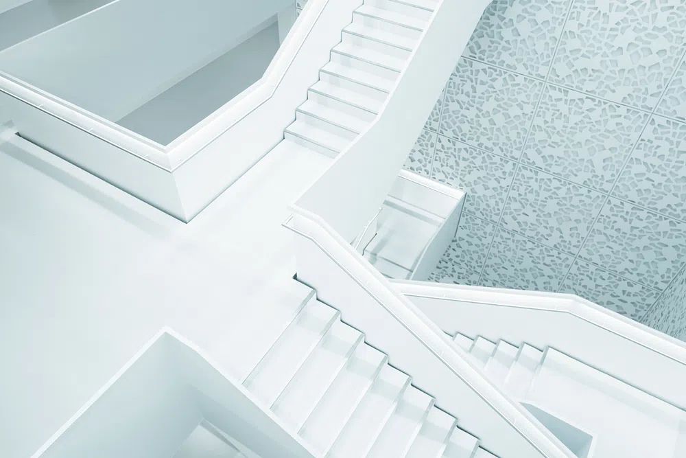
If you want architecture for the living room to feel warm rather than formal, choose scenes with natural light, shadow, or visible materials. Concrete, stucco, wood, glass, and travertine photographed or illustrated well can echo the finishes in the room itself. That is why a piece like Modern White Staircase feels crisp but still easy to live with.
Choosing the Right Style: Minimal Plans, City Skylines, or Landmarks
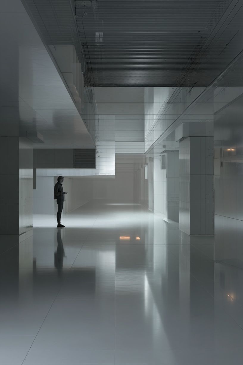
Minimal architectural prints are the safest choice for small or medium living rooms. Think staircases, white facades, quiet modern homes, or line-based building studies. These work particularly well with minimalist wall art because both styles rely on negative space and restrained detail. If your sofa is under 220 cm wide, one 50x70 cm print or a pair of 40x50 cm prints usually feels cleaner than a busy multi-piece set.
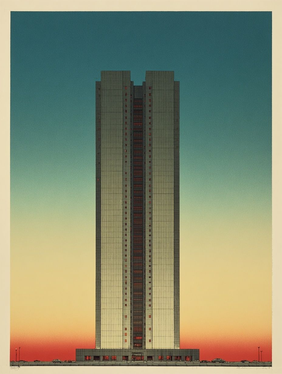
For more character, skyline and high-rise imagery add drama. Vertical towers, reflective glass, and urban repetition create a sharper, more metropolitan mood. These pieces suit rooms with black accents, smoked glass, chrome, or darker textiles. A loft-style scheme, for instance, can handle stronger contrast than a soft neutral family room.
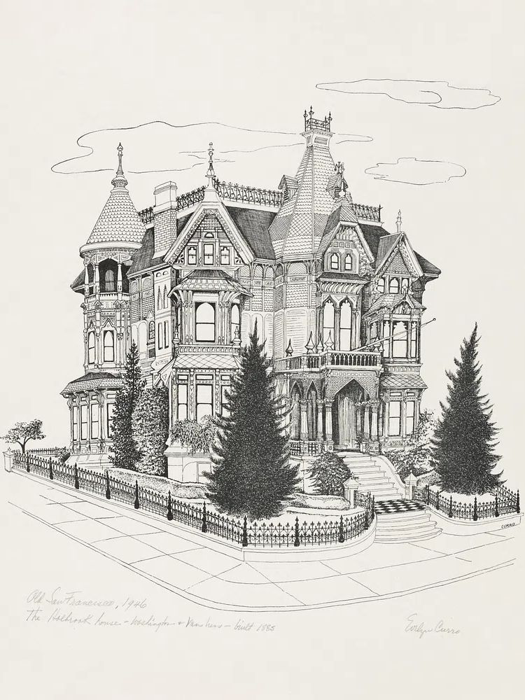
Landmarks and classic buildings bring more romance. Townhouses, villas, and historic facades soften the look and often introduce subtle colour. That can be useful if the room feels too severe. Charming Italian Village or Victorian Mansion Illustration can shift the mood from strict modernism to something more collected.

A practical rule: choose one dominant architectural mood and one supporting mood. For example, pair modern minimal building imagery with one vintage facade, or a skyline with one softer interior detail. Three competing directions in one wall arrangement usually make the display feel accidental.
Finding the Best Colours and Tones for Your Space
Colour decides whether architecture for the living room feels serene or sharp. In neutral rooms, the most reliable choice is a palette within 15 to 20 percent of your existing tones. If your walls are warm white, greige, sand, or light taupe, architectural prints with stone, cream, charcoal, and muted terracotta will sit naturally.
Monochrome rooms benefit from tonal variation rather than pure black-and-white overload. A white sofa, black floor lamp, and grey rug need some softness between them. That is where pieces from our abstract collection can support architectural prints. A textured off-white or smoky neutral abstract beside a building image can stop the wall from looking too hard-edged.

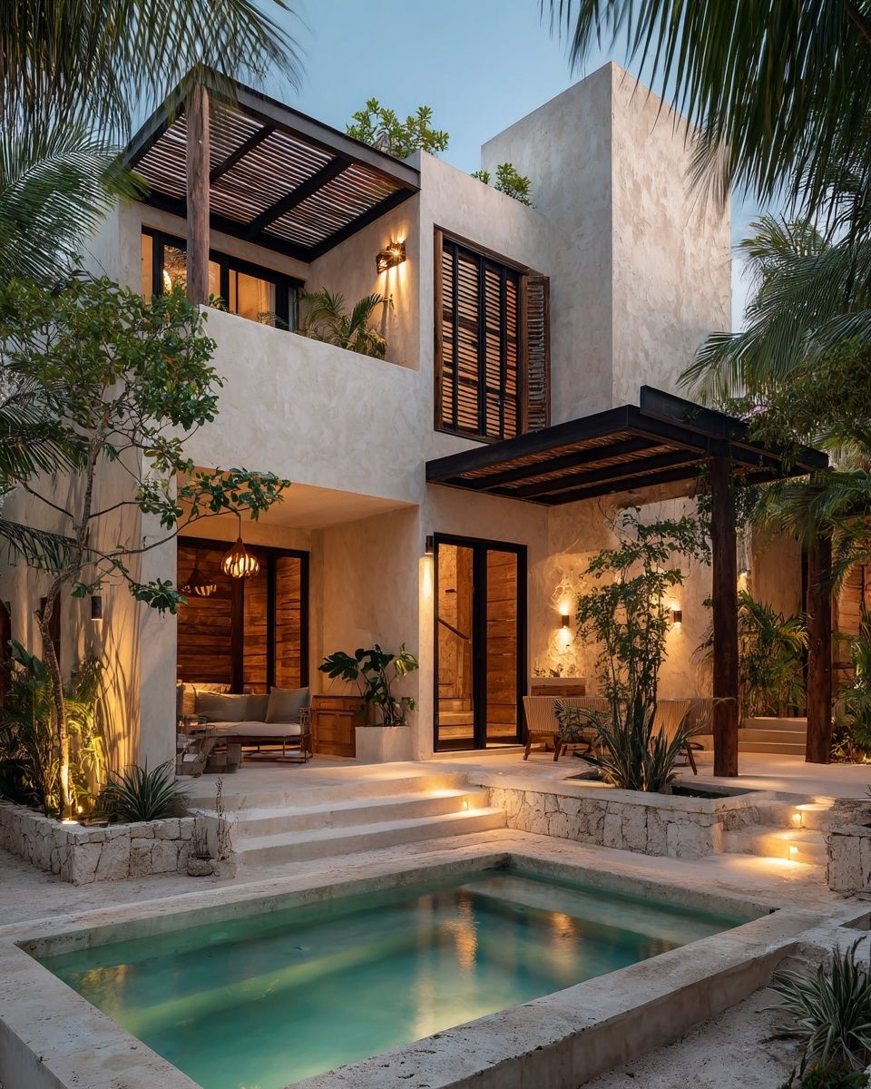
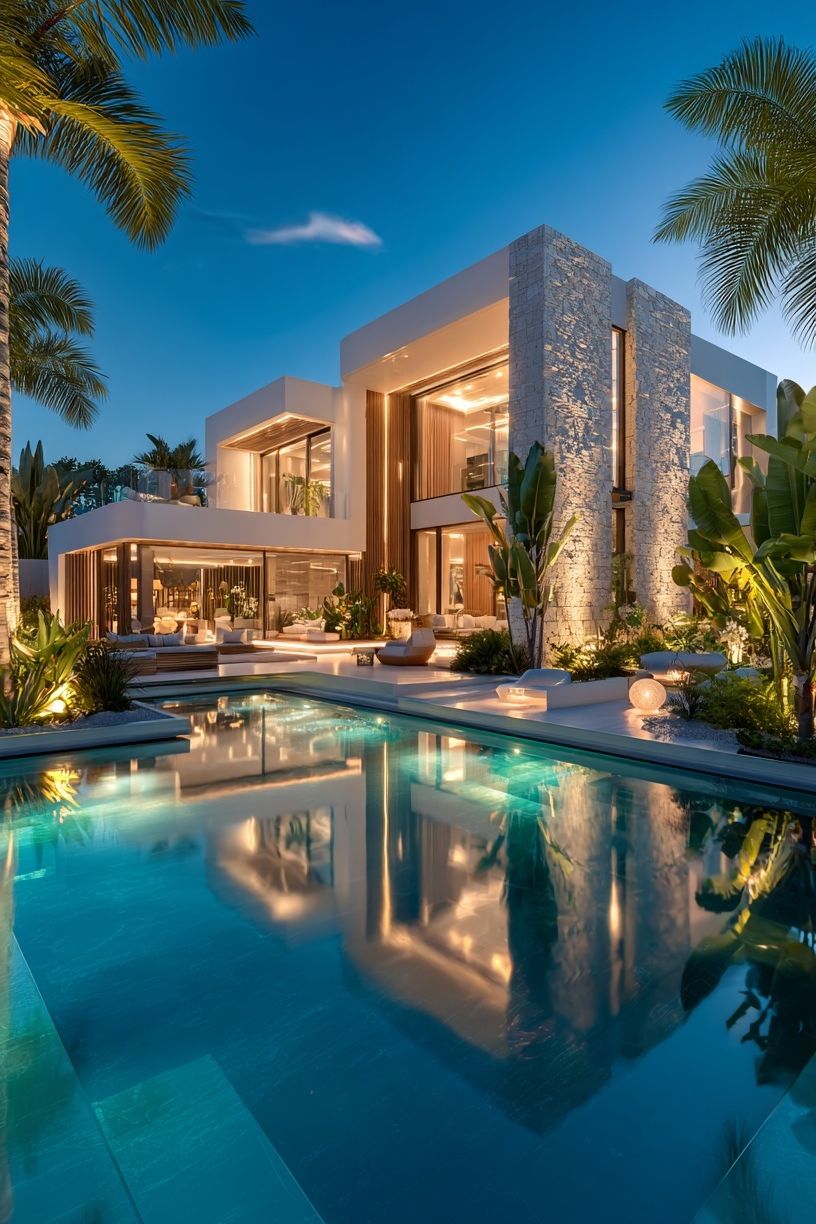
Warm earthy schemes work well with villas, sunlit facades, and buildings photographed at dusk. Beige linen, cognac leather, walnut, and rust cushions all pair easily with Modern Luxury Villa at Dusk or Modern Villa at Sunset because the shared warmth ties the room together.
Muted brights need more discipline. If your living room includes olive, dusty blue, or faded terracotta, keep the artwork palette to one or two of those notes. One blue-accented facade is elegant; four different saturated architectural prints can quickly turn restless.
Sizing and Placement Rules That Make Art Feel Intentional
The best width for art above a sofa is usually 60 to 75 percent of the sofa width. Over a 200 cm sofa, aim for a combined artwork width of roughly 120 to 150 cm. That could be one 70x100 cm piece, two 50x70 cm prints, or a gallery wall built within that footprint.
Hang the centre of the arrangement around 145 cm from the floor in most homes. Above a sofa back, leave 15 to 25 cm between the furniture and the bottom of the frame. If the gap is larger than 30 cm, the art starts to float away from the furniture and loses connection.

On side walls or above a console, vertical architecture prints are especially useful because they echo doorways and windows. A single 50x70 cm print can make a narrow wall feel taller. If you are styling a larger uninterrupted wall, use either one strong oversized piece or a clean grid. Randomly scattered sizes rarely flatter architectural subjects.
Framing Ideas That Enhance the Architectural Look
Frames should reinforce precision. Black, dark walnut, oak, and slim brushed metal are the most dependable choices. For contemporary rooms, a 1.5 to 2 cm frame profile usually looks cleaner than thick traditional moulding. Architectural subjects already carry detail, so the frame should support, not compete.
White matting works well when the artwork includes line work, facades, or pale space around the image. A mat of 5 to 8 cm gives the piece more breathing room and makes even a modest 30x40 cm print feel more considered. This is especially effective with pieces such as Modern Minimalist Architecture and Modern Mountain House.
Anti-glare acrylic or glass is worth considering in bright rooms with large windows. Architectural art depends on lines and edges; heavy reflections blur those details. If your wall faces direct afternoon light, low-reflection glazing will make the image easier to read from across the room.

How to Create a Gallery Wall with Architectural Prints
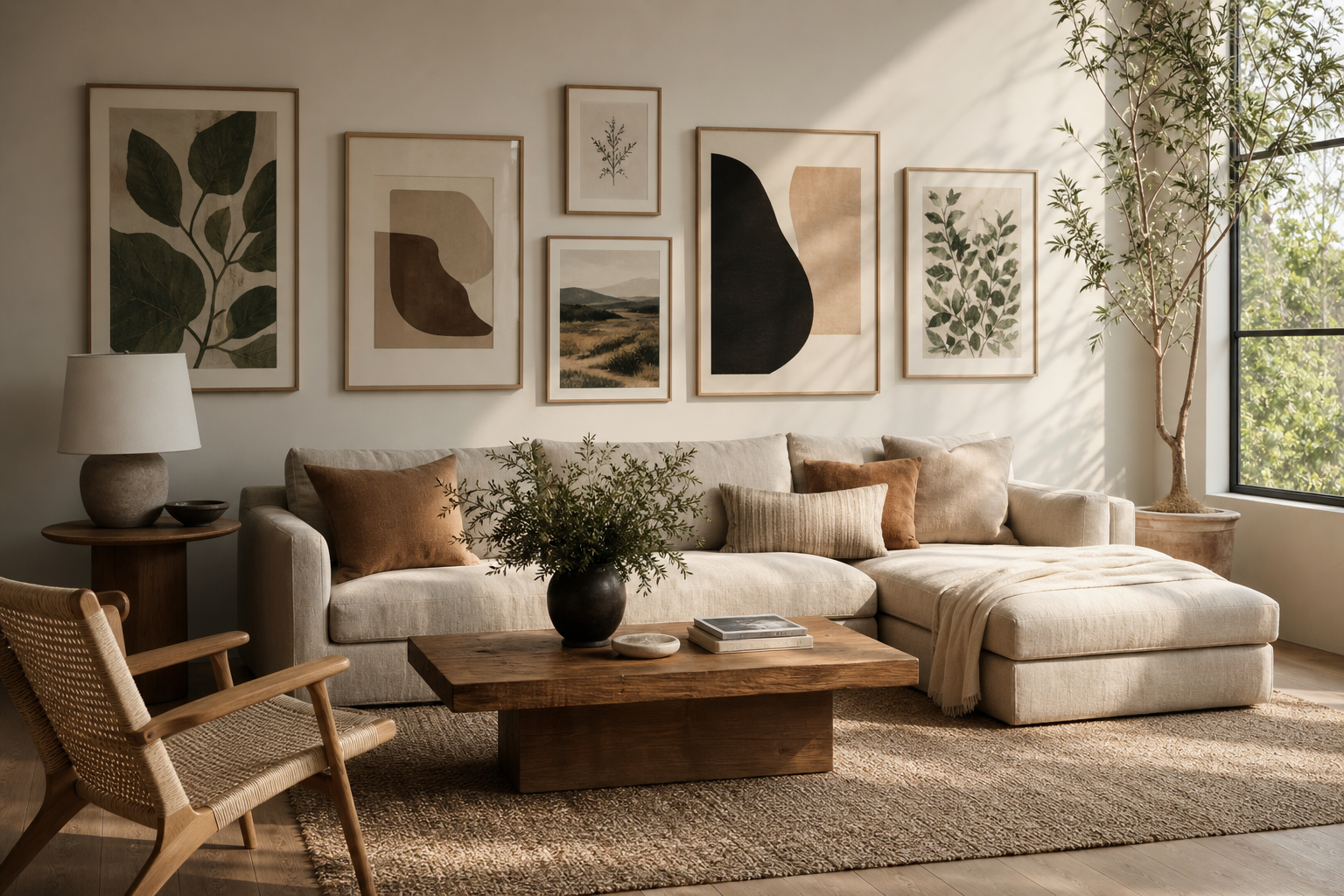
A strong architectural gallery wall needs consistency in at least two areas: palette, frame finish, or spacing. Keep gaps between frames at 5 to 7 cm for a tidy look. Once the spacing widens too much, the group starts to read as separate pieces rather than one composition.
Mix subject matter, but keep the rhythm controlled. A good four-piece arrangement might include one facade, one staircase or interior, one skyline, and one softer supporting print. That supporting print can come from fine art prints or a restrained abstract if the architecture feels too rigid on its own.
Orientation matters. If your sofa is long and low, use mostly horizontal or medium-vertical prints arranged in a broad rectangle. For a compact wall between window and shelving, stack two vertical prints. Architecture is already about proportion, so the layout should respect the room's shape.
If you want a more layered, editorial feel, combine a strict architectural piece with one interior-focused image and one textural neutral work. Modern Loft Living Room is useful in that role because it bridges building lines with lived-in space. It helps architecture for the living room feel inviting rather than museum-like.
Final Styling Tips for a Living Room That Feels Collected
The easiest way to make architectural art feel personal is to repeat one element from the print elsewhere in the room. That could be black metal from a skyscraper image echoed in a floor lamp, warm stone from a villa scene echoed in a travertine side table, or pale concrete tones repeated in a rug or cushion. Small links like these make the room feel designed as a whole.
Start with one anchor piece, then add support. For most living rooms, that means one main architectural print above the sofa and one or two quieter companions nearby. Browse architectural prints for the living room alongside minimalist designs or subtle textural abstract art to build a wall that feels calm, stylish, and easy to keep for years.
Frequently Asked Questions
What frame colour works best with architectural prints in a beige living room?
Oak, walnut, and slim black frames are the safest options. Oak warms up pale rooms, while black adds definition if the space needs more contrast.
Can I mix architectural art with abstract pieces?
Yes — it often improves the result. Use architecture as the structured anchor and add one abstract in a similar colour range to soften the wall.
Should all architectural prints in a gallery wall be the same size?
No, but they should share a clear structure. A common approach is two larger pieces paired with two smaller ones, all aligned within one outer rectangle.
Is matte or glossy better for living room wall art?
Matte is usually better in living rooms because it reduces glare from windows and lamps. It also suits the clean, refined look that architectural imagery tends to have.
How do I style architecture prints if my living room has lots of soft textiles?
Use that contrast to your advantage. Crisp architectural lines look especially good against linen, boucle, wool, and plush rugs because they add definition without changing the room's comfort.