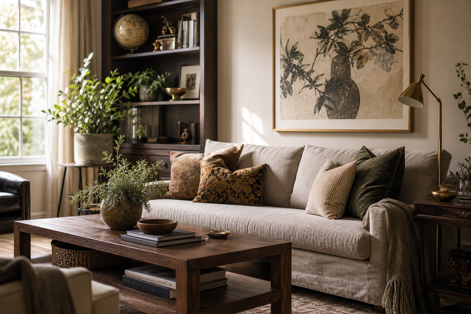
Why Map Posters Never Go Out of Style
Map art works because it does two jobs at once. It fills a wall with structure — lines, coastlines, borders, typography, muted colour blocks — while also carrying personal meaning. A good piece of map poster decor can remind you of where you grew up, where you got engaged, or where you still want to go. That mix of graphic order and emotional memory is why maps stay relevant long after short-lived decor trends pass.
Maps also suit more than one decorating language. A softly aged atlas print can sit naturally in a room with dark wood and antique brass, while a clean city plan feels right in a pared-back apartment with oak, black metal, and off-white walls. If you like decor that feels collected rather than theme-driven, our Maps Travel collection is one of the easiest places to start.
A map does not need loud colour to hold attention. Many of the best pieces rely on beige, slate, faded blue, olive, and charcoal — tones that already live well with common interiors. That makes map poster decor especially practical for people who want a travel reference on the wall without turning the room into a souvenir corner.
Choosing the Right Map for Your Space
Start with scale and geography. A world map or national map works best when you want broad visual impact over a sofa, sideboard, or desk. City maps feel more intimate and personal, so they suit tighter spaces such as entryways, reading corners, or bedrooms. If you want the room to feel rooted in one place, choose a city or region. If you want it to feel expansive, choose a larger territory.
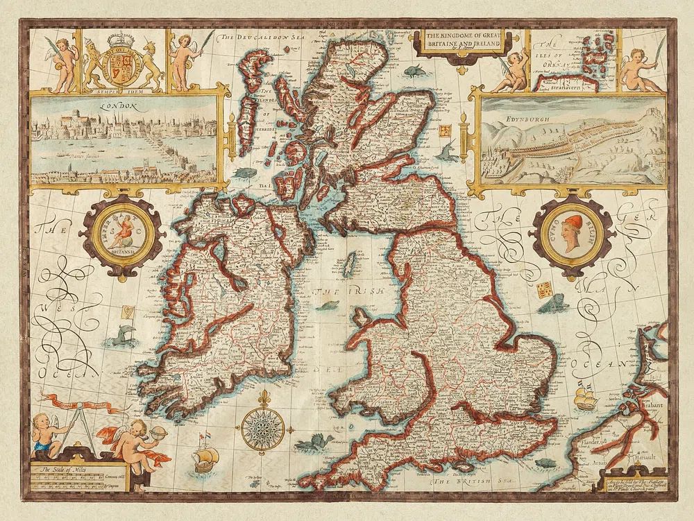
Vintage maps tend to bring warmth. Their aged paper tones, decorative borders, and softened linework pair well with wood furniture, leather, rattan, and classic frames. For that look, the Vintage Map of Great Britain and Ireland or pieces from our Vintage collection create instant depth without needing many surrounding accessories.
Cleaner city layouts work better in modern interiors. If your room already has straight-lined furniture, matte black lighting, or a restrained palette, a simpler cartographic print will feel more intentional than an ornate antique-style piece. In compact rooms, minimal visual clutter matters — especially on walls narrower than 120 cm.
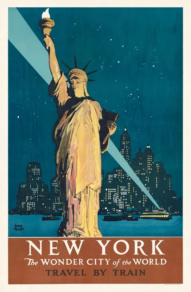
A travel-inspired room does not have to rely on literal maps only. You can mix a cartographic print with destination imagery or landmark art to build a broader story. A city map paired with architectural New York art feels richer than a single print on its own, especially if the place has meaning for you.
How to Style Map Posters in Different Rooms
In living rooms, the easiest formula is one larger piece centred above the sofa. Keep the total width at roughly 60 to 75 percent of the sofa width. So if your sofa is 200 cm wide, your framed map should land around 120 to 150 cm wide. That usually means one 70x100 cm piece or a pair of 50x70 cm prints. Hang the centre point at around 145 cm from the floor for a balanced eye line.
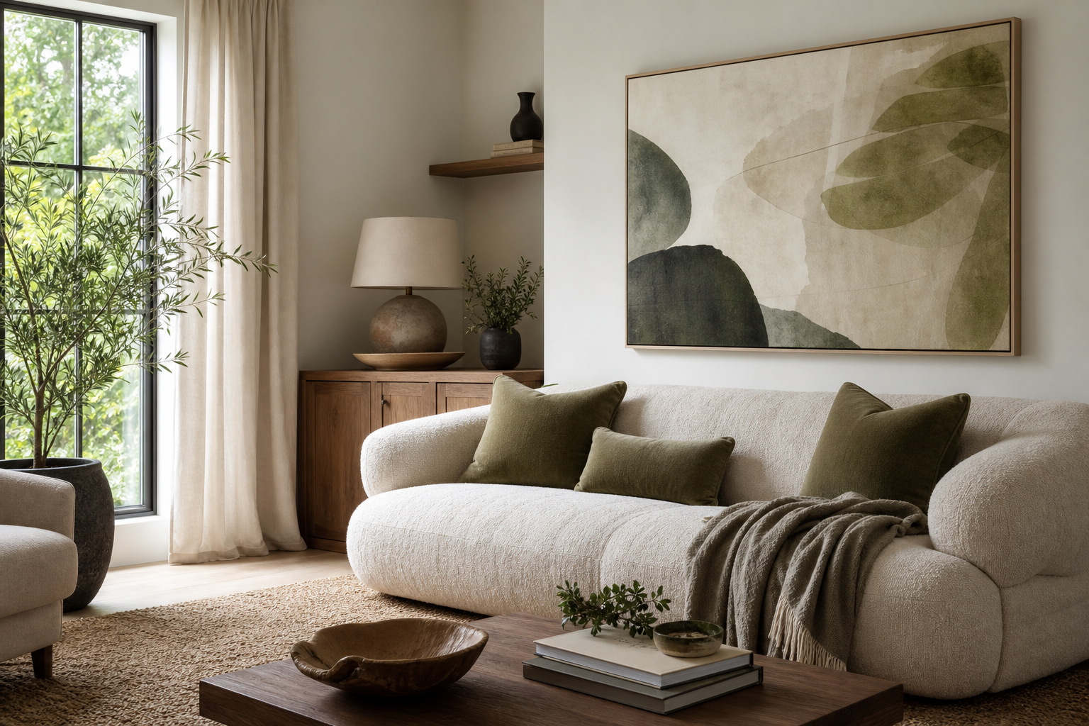
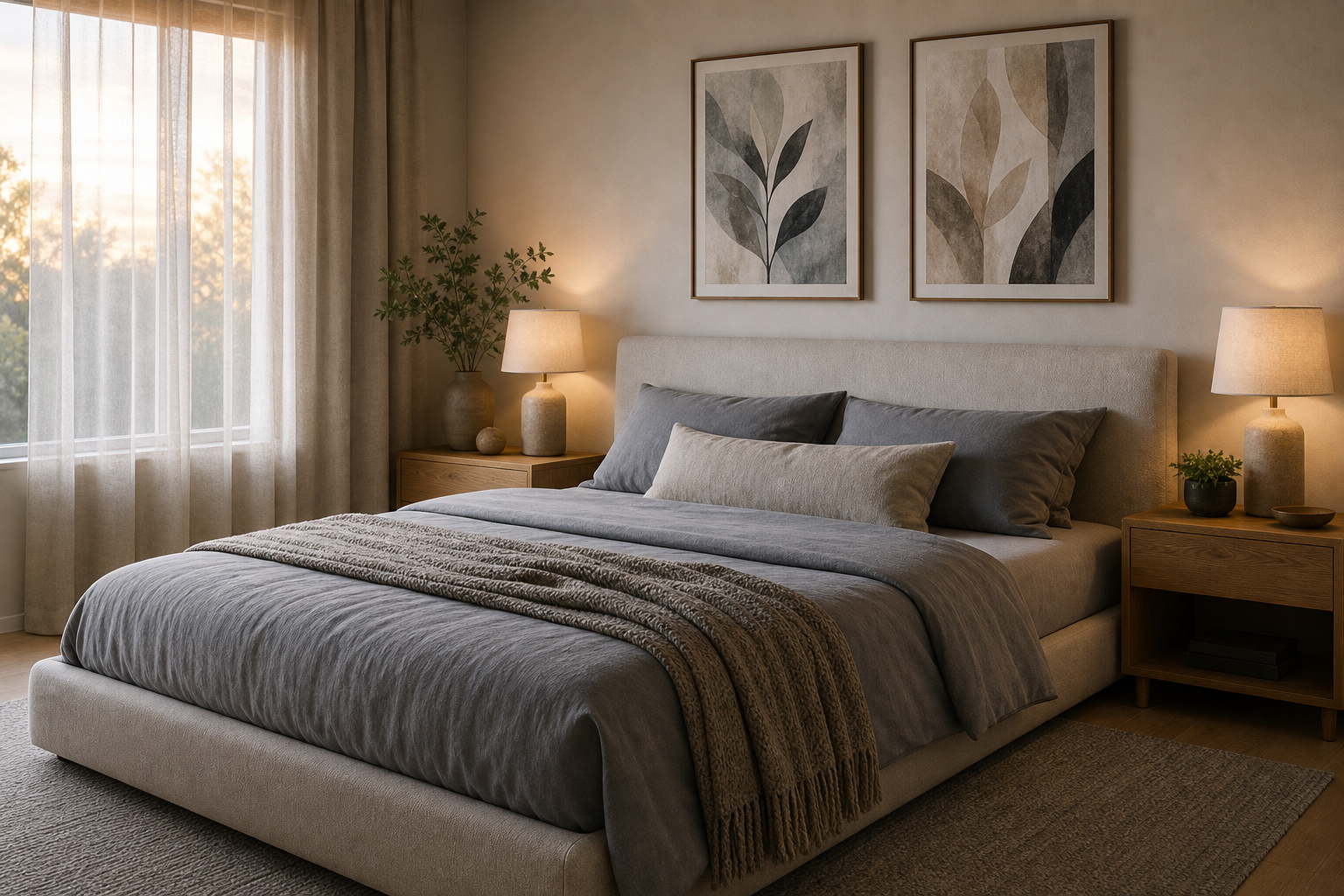
In bedrooms, maps work best above the headboard or on the wall opposite the bed. Go softer here — muted colours, washed vintage tones, or subtle city plans. Strong black-and-white contrasts can feel too sharp in a room meant for rest. If the bed is 160 cm wide, a 50x70 cm or 70x100 cm framed print usually feels proportionate.
Home offices benefit from more detailed map art because you view it at closer range. A city print behind a desk creates focus without becoming distracting. Maps are also ideal for offices because they suggest movement, ideas, and perspective — useful energy in a work setting. For a cleaner desk wall, pair map art with pieces from our Minimalist collection rather than overcrowding the area with shelves and objects.
Hallways are often overlooked, but they suit vertical map arrangements well. Two framed prints at 30x40 cm or 40x50 cm can turn a narrow passage into a destination-led gallery. If you want more narrative, mix one map with one travel scene.
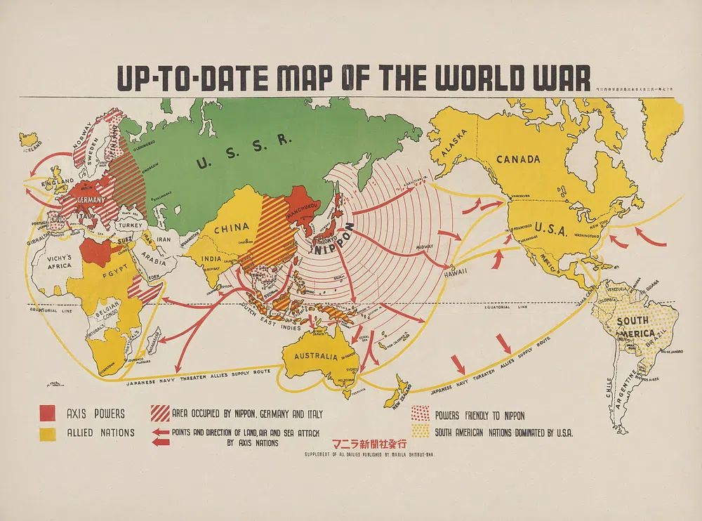
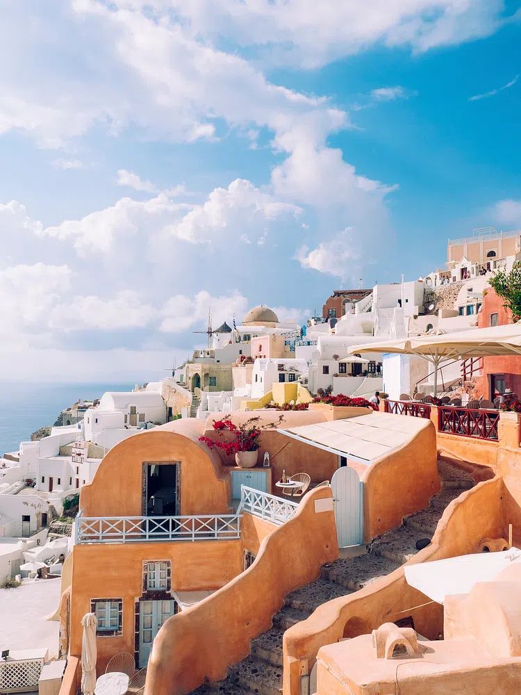
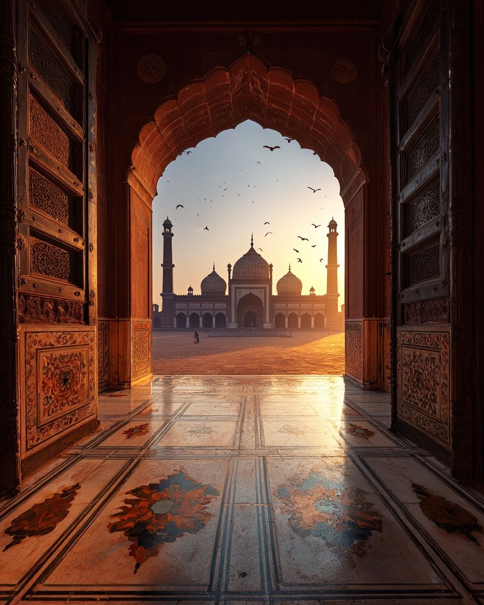
For kids' spaces or teen rooms, choose maps that spark curiosity instead of looking overly formal. A world map can support learning, but a city or country map tied to family roots often feels more personal. Use acrylic or lightweight frames for safety in rooms with bunk beds, play zones, or low furniture.
Sizing, Framing, and Layout Tips
The biggest styling mistake is choosing a map that is too small. A 30x40 cm print above a full sofa usually looks lost unless it is part of a wider gallery wall. For most feature walls, 50x70 cm is the minimum starting point. If you want a map to act as the main focal point, 70x100 cm is more convincing.
Frame finish changes the mood fast. Black frames sharpen modern city maps and suit industrial or minimalist rooms. Oak frames warm up pale maps and work well in Scandinavian, coastal, and casual interiors. Walnut or darker wood makes vintage cartography feel more collected and library-like. If your room already includes three or more wood tones, choose either black or one wood finish that closely matches the largest furniture piece.
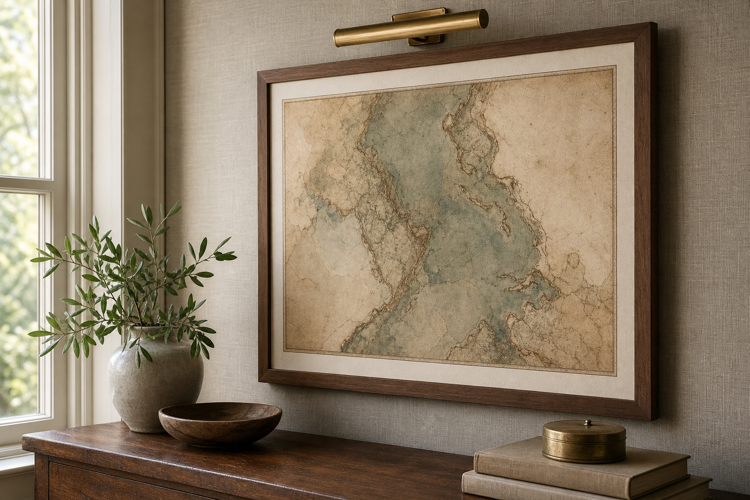
A single large map creates calm. A gallery wall creates story. Choose one statement print if the room already has patterned upholstery, bookshelves, or strong architectural features. Choose a gallery if the wall is plain and you want more layers. Keep 5 to 8 cm between frames for a neat arrangement, and repeat at least one common element — frame finish, mount colour, or subject tone.
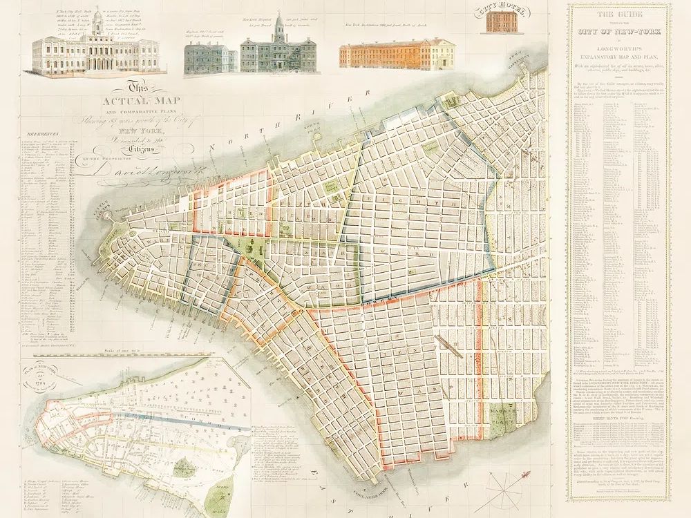
If you want to build a travel wall with more than maps alone, combine cartography with destination prints or landmarks. A New York map, for example, can sit naturally with a vintage New York travel print or an Empire State Building cityscape. That gives the display both structure and atmosphere.
Colour Palettes That Make Map Art Pop
Neutral rooms benefit from maps because they add pattern without noise. In a palette of warm white, taupe, camel, and black, choose maps with parchment backgrounds or faded navy details. These tones create depth even when the room is intentionally restrained. This is one reason map poster decor works so well in Scandinavian and transitional homes.
Coastal interiors pair nicely with maps that include sea blue, sandy beige, and weathered whites. Think oak frames, striped textiles, ceramic lamps, and soft blue accents. In these settings, destination-led pieces from our Maps Travel art blend naturally with airy furniture and linen fabrics.
For vintage-inspired spaces, lean into deeper tones — tobacco brown, moss green, oxblood, brass, and cream. Antique-looking cartography can sit beside older-style travel prints without feeling forced. A room with a leather chair, dark bookshelf, and warm lamp light is exactly where these pieces earn their keep.
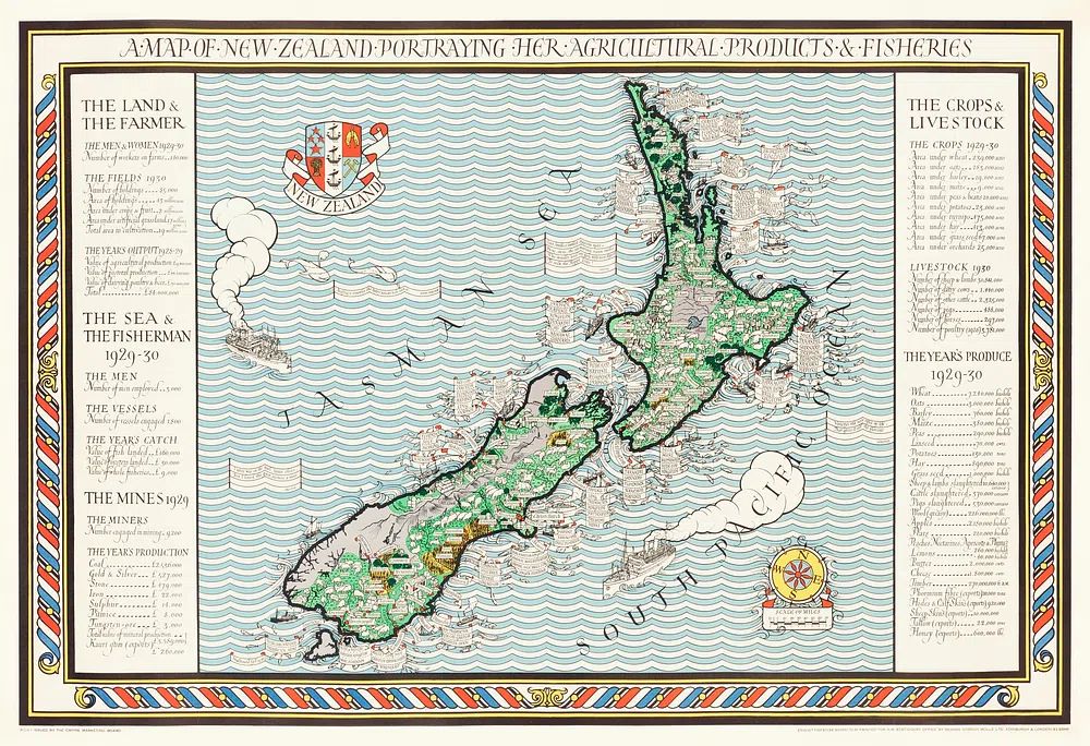
If your home is bolder — terracotta, cobalt, mustard, emerald — use the map as the calmer anchor. Let the wall art carry detail while the room carries colour. This balance keeps travel-inspired styling from becoming visually crowded. If you enjoy more expressive layering, selected pieces from our Bohemian collection can pair well with maps in textured, globally influenced spaces.
Making It Personal with Places That Matter
The best map walls are specific. A print of your hometown, honeymoon destination, first solo trip, or dream country will always feel more grounded than a random decorative map chosen only for colour. Personal relevance is what turns map poster decor from "nice wall art" into something you keep for years.
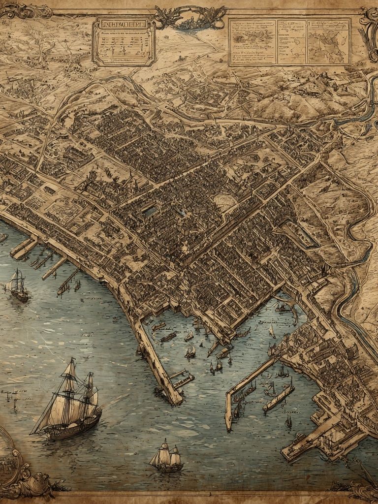
City maps are especially good for memory-based styling because they suggest exact streets, neighbourhoods, and routes. A piece like this vintage city map print can mark where you studied, lived, or fell in love. A country map can honour heritage, family travel, or a once-in-a-lifetime trip. Even a hallway gallery becomes more meaningful when every frame answers a real question: "Why this place?"
You can also use map art to reflect future plans. A home office with a map of a destination you are saving for adds aspiration without feeling gimmicky. In shared homes, couples often choose one place each and add a third print that represents where they met or live now. Three related locations usually make a cleaner visual story than six unrelated ones.
If you want to broaden the look beyond maps while keeping the same narrative, blend in destination architecture or classic travel imagery. Pairing a city map with an Amalfi Coast scene or a Tower Bridge travel print keeps the collection personal but visually varied.
Final Tips for Building a Travel-Inspired Wall
The strongest travel wall is edited, not crowded. Pick one colour direction, one frame finish, and two to four places that mean something. That is usually enough to make the room feel layered and intentional. If you are building from scratch, start with one larger map, then add supporting pieces only after you have lived with it for a few weeks.
Map poster decor lasts when it feels tied to your life rather than a passing trend. Choose locations you would still want to see every day in five years, size them generously, and frame them properly. A well-chosen map does more than decorate a blank wall — it keeps memory, ambition, and design in the same frame.