Typography can do something that many other art styles cannot: it communicates fast. In a kitchen, that means adding energy and character without crowding already busy surfaces. In a workspace, it can sharpen the mood, create structure, and reinforce the clean lines that modern desks, shelving, and task lighting already bring. Done well, typography wall art kitchen office styling feels edited rather than decorative.
The strongest typography pieces work because they combine message and form. A short word, a restrained quote, or a graphic arrangement of letters can fill a wall visually while still reading as modern design. If your room already includes practical elements like upper cabinets, floating shelves, pinboards, or monitors, typography often fits more naturally than detailed landscapes or heavily layered figurative art. For a clean starting point, browse our Typography collection alongside minimalist art prints to see how text-led pieces sit in pared-back interiors.
Why Typography Works in Functional Spaces
Functional rooms need art that holds its own without creating visual noise. Kitchens have hard finishes — tile, stone, glass, steel — and offices often rely on straight lines, screens, and storage units. Typography introduces contrast through shape and rhythm. Even black text on an off-white ground can soften these surfaces while keeping the room disciplined.
In practical terms, typography wall art kitchen office setups also solve scale problems. A narrow wall beside a pantry, the area above a coffee station, or the strip of wall above a desk can look unfinished with nothing there, but overloaded with image-heavy artwork. Text-based prints tend to read clearly from 1.5 to 3 meters away, which makes them ideal for these transitional zones.
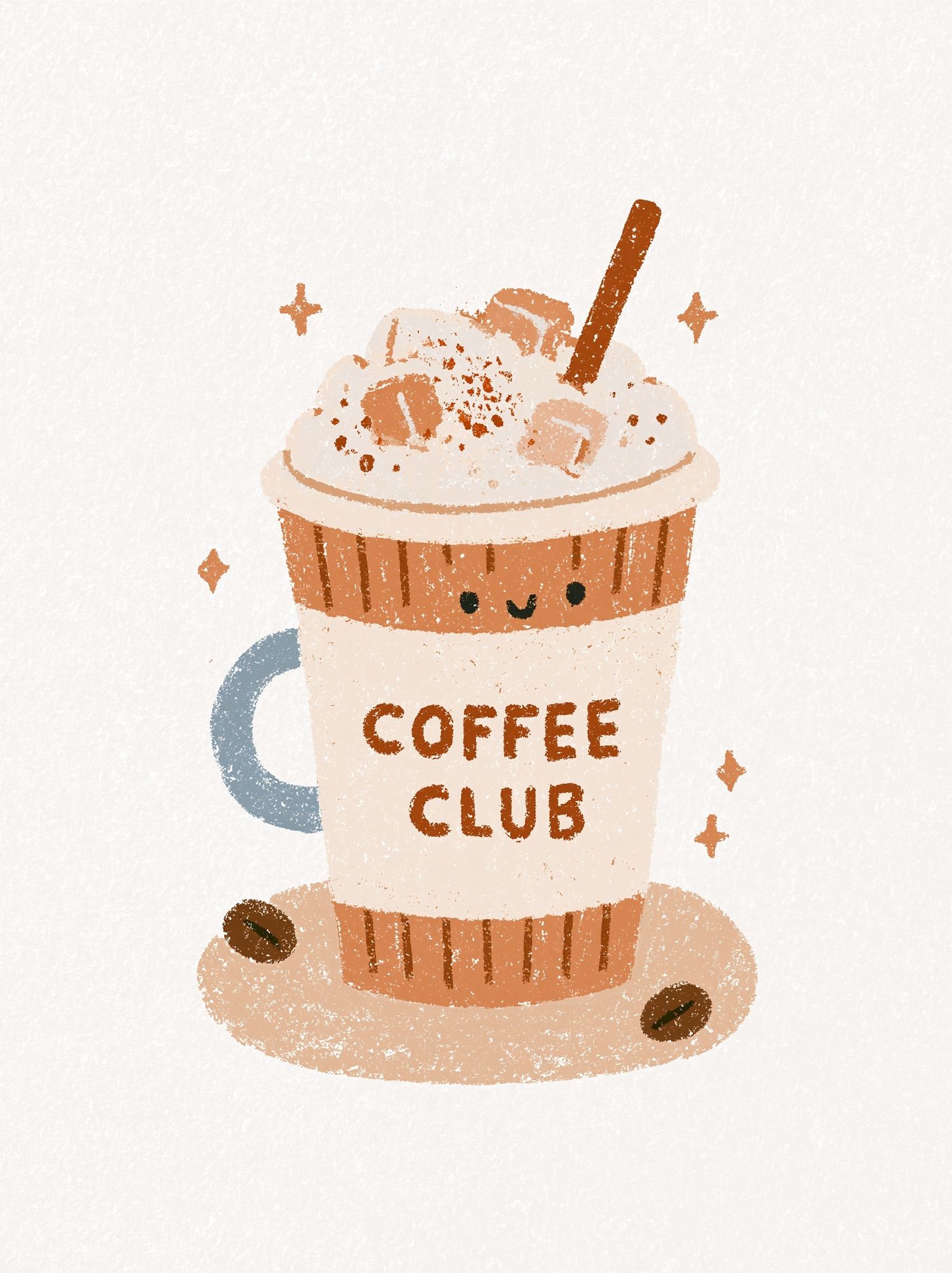
A kitchen is often the best place for typography with a hint of humor or ritual. A coffee corner, breakfast nook, or open shelf wall can handle a more casual piece that references daily routine. In a home office, the same idea works when the message is shorter and the layout more restrained. If you prefer a refined look over witty wording, Dark Luxury Typography Poster shows how text art can feel tailored rather than playful.
Choosing the Right Tone: Playful, Minimal, or Motivational
The tone should match how the room is used for most of the day. In a relaxed family kitchen, a graphic print with a food, coffee, or gathering reference can land well because it reinforces the social side of the space. For a kitchen that opens into a dining room or living area, minimal type in neutral colors usually integrates better with the rest of the home.
For offices, keep the message tighter than you think. One or two words, or a short phrase, is usually enough on a wall viewed for 6 to 8 hours a day. Long quotes become background clutter quickly. A disciplined option is to pair one typography piece with one non-text print from our abstract collection so the room gets both clarity and visual relief.

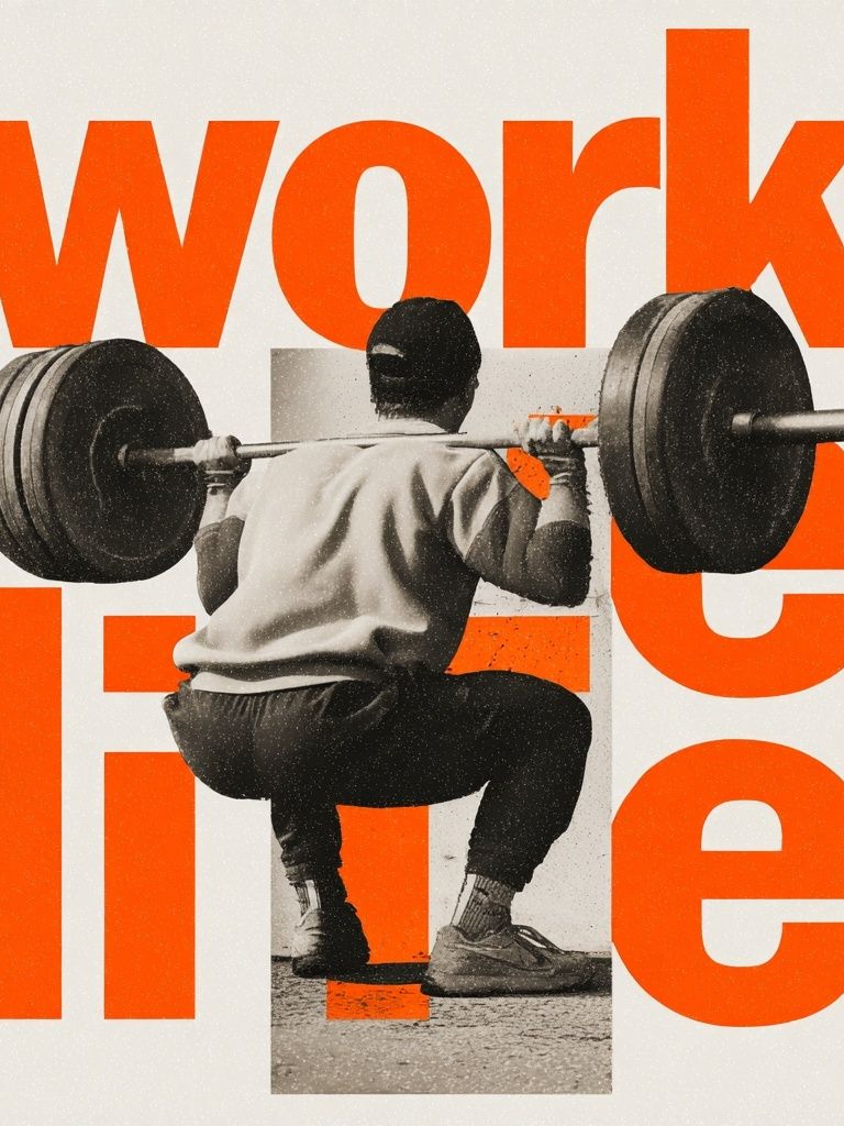
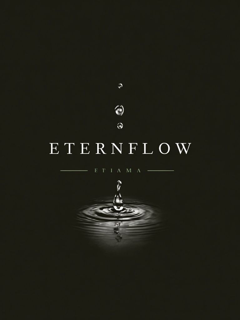
If you want a softer modern look, choose typography with generous spacing, lighter weight letterforms, and muted backgrounds. The Water Drop Minimalist Typography Poster fits especially well in kitchens or compact office corners where you want the text-led look without a heavy block of black. For a more assertive work zone, Work Hard Typography Poster is better suited to a desk wall than a dining banquette, because its message is direct and task-oriented.
Best Sizes and Placements for Kitchens and Offices
Most placement mistakes come from going too small. Over a desk that is 120 to 160 cm wide, a single framed piece should usually be 50 x 70 cm or 61 x 91 cm to feel intentional. If the print is under 40 x 50 cm, it often disappears behind monitors, task lamps, and shelving unless grouped with other art.
In kitchens, keep typography away from direct heat and heavy steam. A safe rule is at least 40 to 60 cm from a cooktop and not directly above a kettle station if that wall gets daily condensation. Better positions include above a sideboard, over a breakfast bench, beside pantry doors, or on the short return wall near a dining transition. If you are hanging above a counter splashback, leave 15 to 25 cm between the frame and the counter line so the art feels connected but not cramped.

For awkward vertical spaces — such as between a cabinet and a doorway — choose a portrait-oriented print around 30 x 40 cm or 40 x 50 cm. For wider empty walls, two matching prints spaced 6 to 8 cm apart often look cleaner than one undersized piece floating alone. If you want supporting artwork nearby, pull from our Architecture prints or Scandinavian-inspired minimalist wall art to keep the palette controlled.
Framing, Color, and Material Tips
Frames matter more with typography than with many image-led prints because the eye notices edges, margins, and contrast immediately. Black aluminum or slim black wood frames are the most reliable choice in offices, especially with white walls and dark desk accessories. Oak frames work well in kitchens with timber cabinetry, open shelving, or dining furniture. White frames are useful only when the wall color is deeper than the print background — otherwise they can disappear.
Color should connect to at least one fixed finish already in the room. In kitchens, repeat a tone from bar stools, cabinet hardware, grout, or stone veining. In offices, repeat a shade from the rug, chair upholstery, or storage boxes. As a rough guide, keep 70% of the display neutral and let 30% carry accent color if you want the space to stay modern.

If your kitchen has warm woods and cream stone, pair typography with quieter companions such as Textured Concrete Wall — Minimalist Print or White Cream Texture Poster. In sharper office interiors with black, charcoal, or chrome finishes, geometric companions like Sacred Geometry Black-White Poster keep the look crisp. Glare is another practical issue — in rooms with strong windows, matte finishes usually read better than glossy ones because letterforms stay legible throughout the day.

How to Layer Typography with Other Wall Decor
Typography works best when it is given one clear role in the composition. Let it be the anchor, the accent, or the connector — not all three. If you are building a gallery wall in an office, place the text piece at eye level and use quieter supporting art around it, such as tonal abstracts or minimal architectural lines. This keeps the words readable while preventing the arrangement from feeling like signage.
A useful ratio is 1 typography print to 2 or 3 non-text pieces. That mix brings enough contrast without overloading the wall with messages. In kitchens, one typography print can also sit above a shelf with ceramics, cookbooks, or glassware, but keep the shelf styling low-profile. Tall bottles, crowded spice jars, or multiple objects in front of the frame will make the wall feel chopped up.

For a balanced mix, combine text art with one textured neutral from Textured Fabric — Minimalist Print or one graphic abstract from Textured White Abstract Poster. If the room already has strong cabinetry, visible appliances, or open shelves, avoid adding more than 3 to 5 total wall elements in one sightline.
Quick Styling Ideas for a Finished Look
A polished result usually comes from repeating details. Match frame finish to chair legs or cabinet pulls. Echo one print color in a mug, file box, tea towel, or desk accessory. Keep spacing consistent — 6 to 8 cm between frames is an easy standard for most modern interiors. If you use a ledge shelf instead of hanging directly, overlap only slightly so every piece still reads from across the room.
Typography wall art kitchen office styling also improves when the surrounding surfaces stay edited. Clear counters, one tray for essentials, one plant or vase, and one stack of books is often enough. In offices, leave at least 20 to 30% negative space on the wall around the art so the setup feels calm during long work sessions.
Final thoughts
The best typography displays in kitchens and offices are clear, scaled correctly, and tied to the room's materials. Choose a message that fits the room's purpose, hang it large enough to be read easily, and support it with restrained color and framing.
If you treat typography wall art kitchen office styling as part of the room's architecture — not just an accessory — the result feels sharper, more modern, and much easier to live with over time.
Frequently Asked Questions
What frame size works best for a small kitchen wall?
For a narrow wall section, 30 x 40 cm or 40 x 50 cm is usually enough. If the wall sits above a bench or sideboard, 50 x 70 cm will create a stronger focal point.
Can I hang typography art in a kitchen with lots of steam?
Yes, but keep it away from direct steam and heat sources. Use a sealed frame and place it on a drier wall, ideally at least 40 cm from cooktops and kettles.
What colors are safest for a professional office look?
Black, white, charcoal, soft beige, and muted taupe are the most flexible. One accent color is enough if the rest of the room already includes strong furniture or tech elements.
Should typography be centered on the wall or aligned with furniture?
Aligning with furniture usually looks more intentional. Center the piece over the desk, shelf, or sideboard rather than the full wall when those elements define the zone.