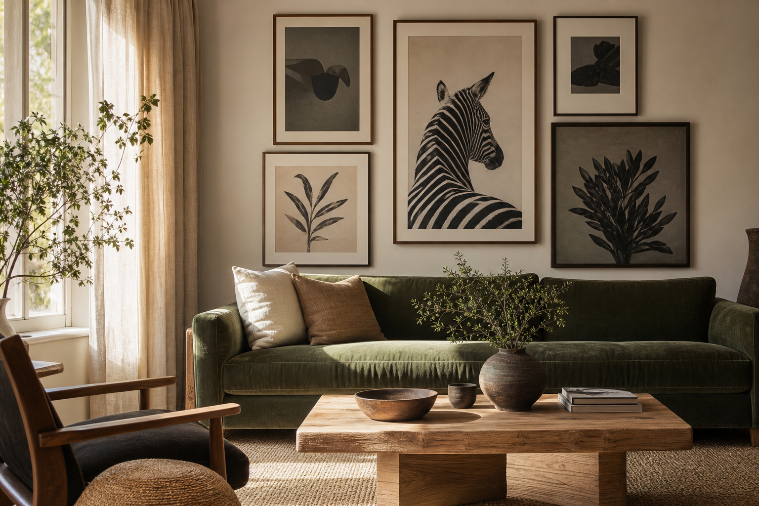
Food imagery is not limited to kitchens and dining corners. The right food drink for the living room brings the same social energy people naturally associate with sharing a table — warmth, ease, and conversation. A lounge often needs exactly that: artwork that softens the room and makes it feel lived in, not staged.
Why Food and Drink Belong in the Living Room
Living rooms work best when they reflect habits, not just decor trends. If your home revolves around coffee in the morning, wine at dusk, or long weekend meals with friends, culinary art makes that visible. It adds personality without becoming overly literal, especially when you choose still lifes, illustrated cocktails, or vintage-inspired pieces rather than bright commercial-style graphics.
Food and drink subjects also suit the scale of a living room. A sofa wall often needs imagery with enough visual richness to hold a width of 160 to 240 cm. A still-life with glassware, fruit, or a table scene naturally carries detail, texture, and tonal depth across that span. If you want to browse broadly, our Food Drink collection offers the strongest starting point, while Vintage wall art gives the look more patina and character.
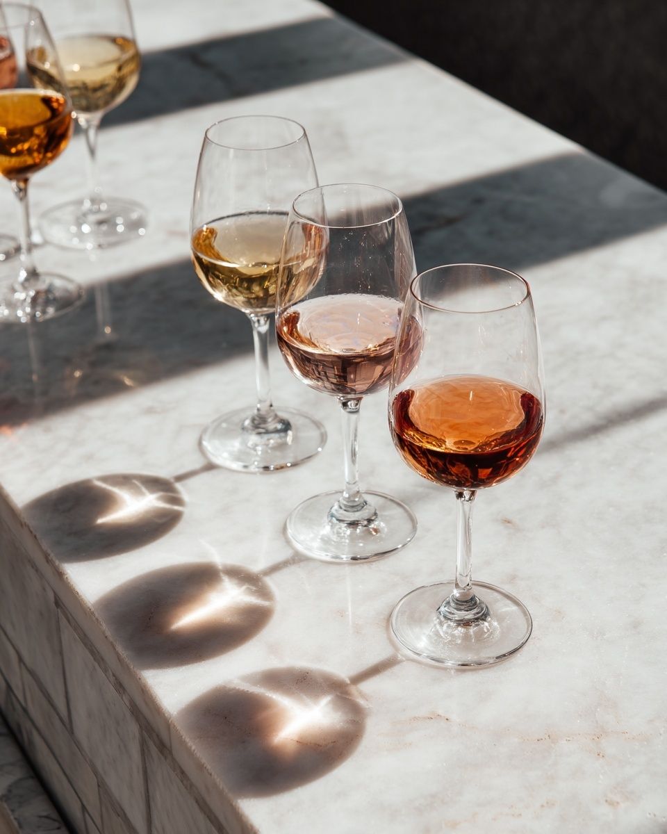
A good example is art that feels sociable rather than decorative. A piece such as Wine Glasses on Marble Table suggests an evening mood instantly — relaxed, polished, and adult without looking formal.
Choose a Mood: Bistro, Vintage, Minimal, or Playful
The style direction matters more than the subject alone. "Food drink for the living room" can read elegant, nostalgic, clean, or witty depending on composition and colour.
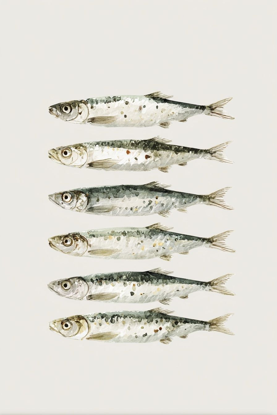
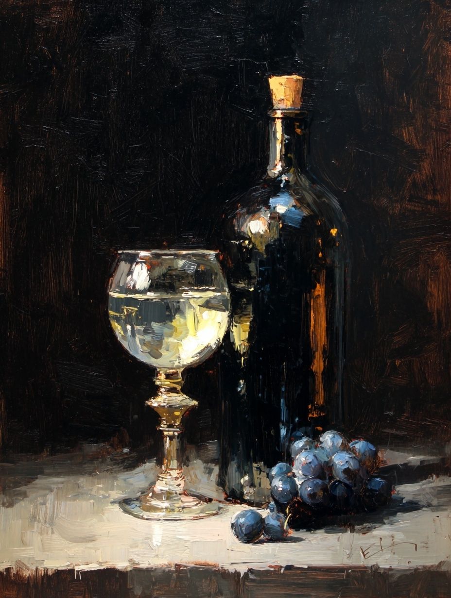
A bistro look suits apartments and older homes with architectural detail. Think wine bottles, marble tabletops, sardines, olives, or pasta motifs. These pieces pair especially well with dark wood, brass lamps, and textured neutrals. If your room already has oak furniture or linen upholstery, a piece like Wine and Grapes Still Life gives that European, collected effect without overpowering the wall.
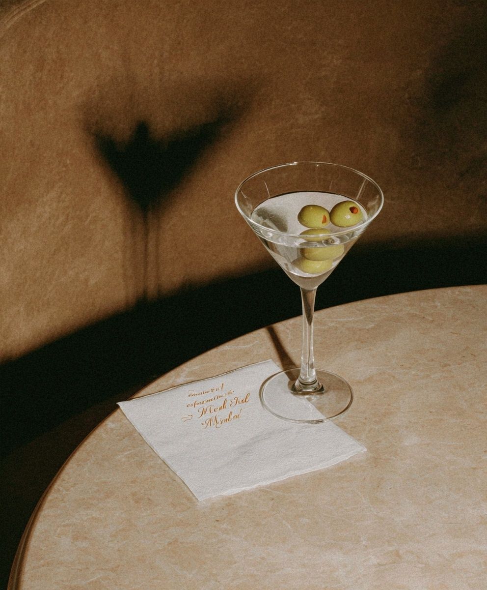
Vintage cocktail art shifts the room toward glamour. It works best in living rooms with curved furniture, smoked glass, velvet cushions, or warm metallics. You can lean into that with Martini Cocktail — Vintage Print or explore adjacent styles through our illustration art prints and vintage collection.

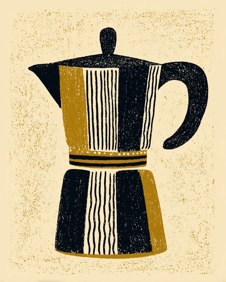
If your space is calmer and more architectural, minimal food imagery is stronger than busy compositions. A single bottle, glass, fruit shape, or moka pot with lots of negative space works well in rooms with low-contrast palettes and clean-lined furniture. In that case, mix food-themed pieces with Minimalist wall art so the result feels editorial rather than themed.
Playful options are useful when the room feels too serious. One witty illustrated drink print can break up a wall of beige, grey, or white furniture and make the space more approachable. This works particularly well in compact living rooms, rented flats, or open-plan spaces where the lounge blends into the dining area.
Finding the Right Colours and Palette Balance
Colour is where most living room schemes either settle beautifully or feel accidental. Food and drink prints tend to bring reds, wine tones, olive greens, butter cream, peach, amber, and charcoal into the room. The easiest method is to repeat one of those colours at least twice elsewhere — in a cushion, ceramic object, throw, lampshade, or rug detail.
For beige or greige sofas, choose richer prints with burgundy, black, forest green, or terracotta. Wine imagery works well here because the dark glass and deep liquid tones create contrast. For white walls and pale oak floors, warmer illustrations and vintage tones prevent the room from feeling flat. If your room already has colour, match the art by temperature rather than exact hue — warm art with warm wood, cooler photography with chrome, marble, or blue-grey textiles.
A useful ratio is 70/20/10. Keep 70% of the room in base neutrals, 20% in supporting tones such as wood and textiles, and 10% in accent colour through art and objects. That makes food drink for the living room feel integrated instead of dominant.
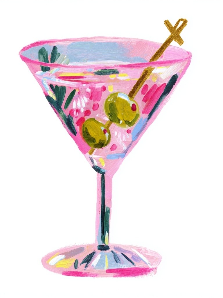
Pink cocktail tones, for example, work especially well with walnut, cream boucle, and muted burgundy accents. If you prefer something softer and lighter, a piece such as White Wine and Flowers brings in cream, pale green, and gentle highlights rather than heavy contrast. For rooms that need a visual bridge between themed art and modern decor, abstract companions from our abstract print collection can help tie everything together.

Best Poster Sizes and Placement Ideas
Scale should follow furniture width. Above a standard 180 cm sofa, aim for art spanning roughly 100 to 130 cm total — around 55 to 70% of the sofa width. That could mean one large 70x100 cm statement piece, two 50x70 cm prints, or a four-piece gallery with even spacing of 5 to 7 cm between frames.
Single statements work best when the artwork has strong composition and enough breathing room. A large wine still life or bold cocktail illustration can anchor the room on its own. Gallery walls are better when you want a layered, personal look. In living rooms, keep them tighter than in hallways. A neat rectangle reads calmer and more intentional above seating.
Hang the centre of the arrangement around 145 cm from the floor in most homes. If the art sits above a sofa or console, leave 15 to 25 cm between the furniture top and the frame bottom. That keeps the wall art connected to the furniture rather than floating.

If you want a low-risk formula, use one hero print in the middle and smaller supporting works beside it. A living room arrangement might combine a central wine image with two lighter illustrations and one tonal abstract. This is also where product choice matters: Wine Pouring — Watercolor Print suits a looser, painterly wall, while Wine Bottle and Glass — Still Life Print gives a more grounded focal point.
Framing and Styling for a Polished Finish
Frames decide whether food art feels sophisticated or overly themed. Black, dark walnut, and slim brushed gold are the safest options for living rooms. White frames can work in very bright interiors, but they often reduce depth in richer culinary pieces. If the print contains cream or off-white margins, a mat can elevate it instantly — especially on 30x40 cm and 50x70 cm sizes.
Match frame tone to the room's hard materials. Walnut or oak frames suit timber furniture and linen-heavy interiors. Black frames sharpen modern rooms with metal lighting, marble surfaces, or graphic rugs. Gold works best when repeated at least once in the room through a lamp, side table, or mirror trim.
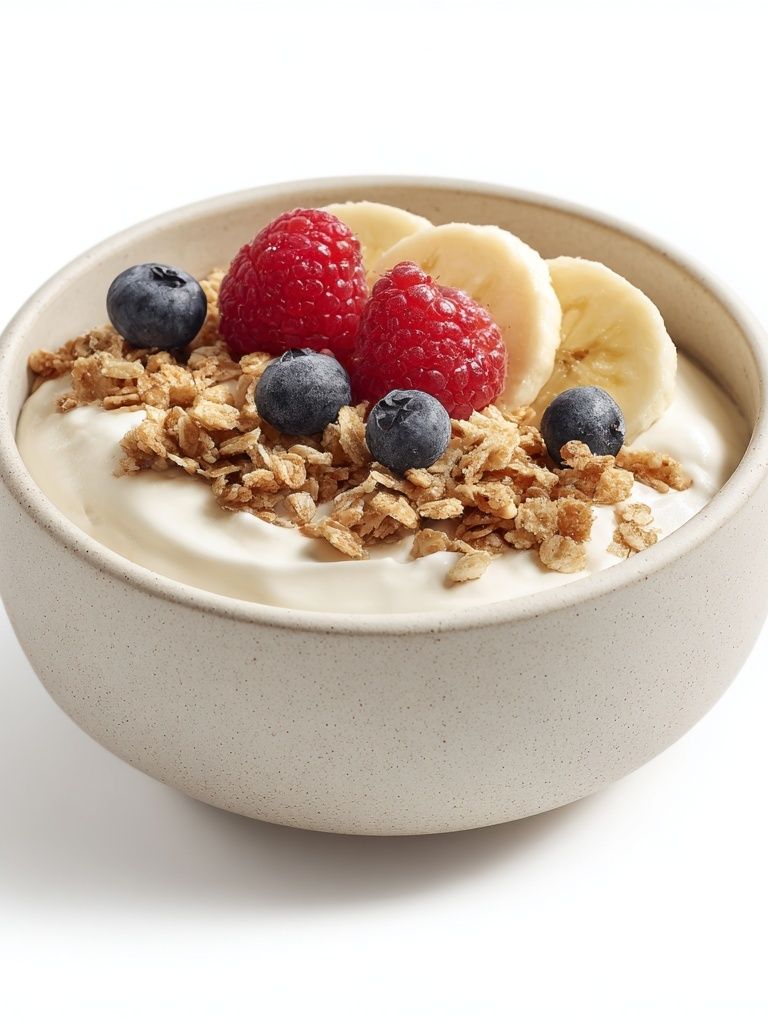
Avoid styling every surrounding accessory around the same food theme. One bowl of citrus, a stack of art books, and a ceramic vase is enough. The room should suggest hospitality, not imitate a restaurant. If you like mixing genres, try one food print with one figurative illustration and one understated abstract. That is often the easiest way to make Yogurt Bowl with Berries or similar subjects feel at home in a lounge rather than a breakfast nook.

How to Create a Living Room Look That Feels Easy and Inviting
Start with one piece that sets the tone, then build outward. If your room is neutral and understated, begin with a wine or cocktail print that adds mood. If the room already has colour and pattern, choose a simpler food image with cleaner lines. The easiest combinations are one dominant piece, one supporting piece, and one connector — usually an abstract or minimalist print that repeats a key colour.
Keep the visual message consistent. Rustic pasta art, glamorous martini illustrations, and ultra-minimal black-and-white line work can all look good individually, but together they often compete. Choose one lane and stay within it for at least 70% of the wall. Then add one unexpected note — a playful illustration, a mid-century coffee print, or a tonal abstract — to avoid making the room feel too coordinated.
Final thoughts
The best food drink for the living room does not feel novelty-led. It feels atmospheric, social, and rooted in how you actually use the space. Wine still lifes, vintage cocktails, coffee motifs, and painterly food subjects all work when their colour, scale, and framing connect clearly to the furniture around them.
Focus on three decisions first: mood, palette, and placement. Once those are right, the room looks collected rather than decorated — and the artwork brings character without trying too hard.
Frequently Asked Questions
What frame size works best for a 50x70 cm food print in a living room?
A 50x70 cm print works well in either a same-size frame for a clean look or a larger frame with a mat for more presence. If the wall is wide, matting can help the piece hold its own above a sofa or sideboard.
Can I mix food and drink art with abstract prints?
Yes — this is one of the easiest ways to make the wall feel more refined. Choose an abstract piece that repeats one or two colours from the food-themed artwork rather than introducing a completely new palette.
Should I use glass or acrylic in living room frames?
Acrylic is lighter and safer for large frames, especially above seating. Glass gives a slightly crisper finish but can create more glare if the room has strong daylight.
How many prints should I hang above a standard three-seat sofa?
Two to four prints usually look best. More than four can work, but only if the arrangement is tightly planned and the total width stays visually connected to the sofa below.
What decor pairs well with cocktail-themed wall art?
Use materials with a little polish — walnut, brass, marble, smoked glass, or velvet. Keep accessories restrained so the artwork remains the focal point.