Why Fashion Posters Work So Well in Home Decor
Fashion posters bring movement, polish, and personality to a room faster than most wall art categories. A single black-and-white runway image can sharpen a neutral space, while a vintage illustration adds softness and glamour. That range makes our fashion collection especially useful in homes that want an editorial edge without feeling theme-heavy.
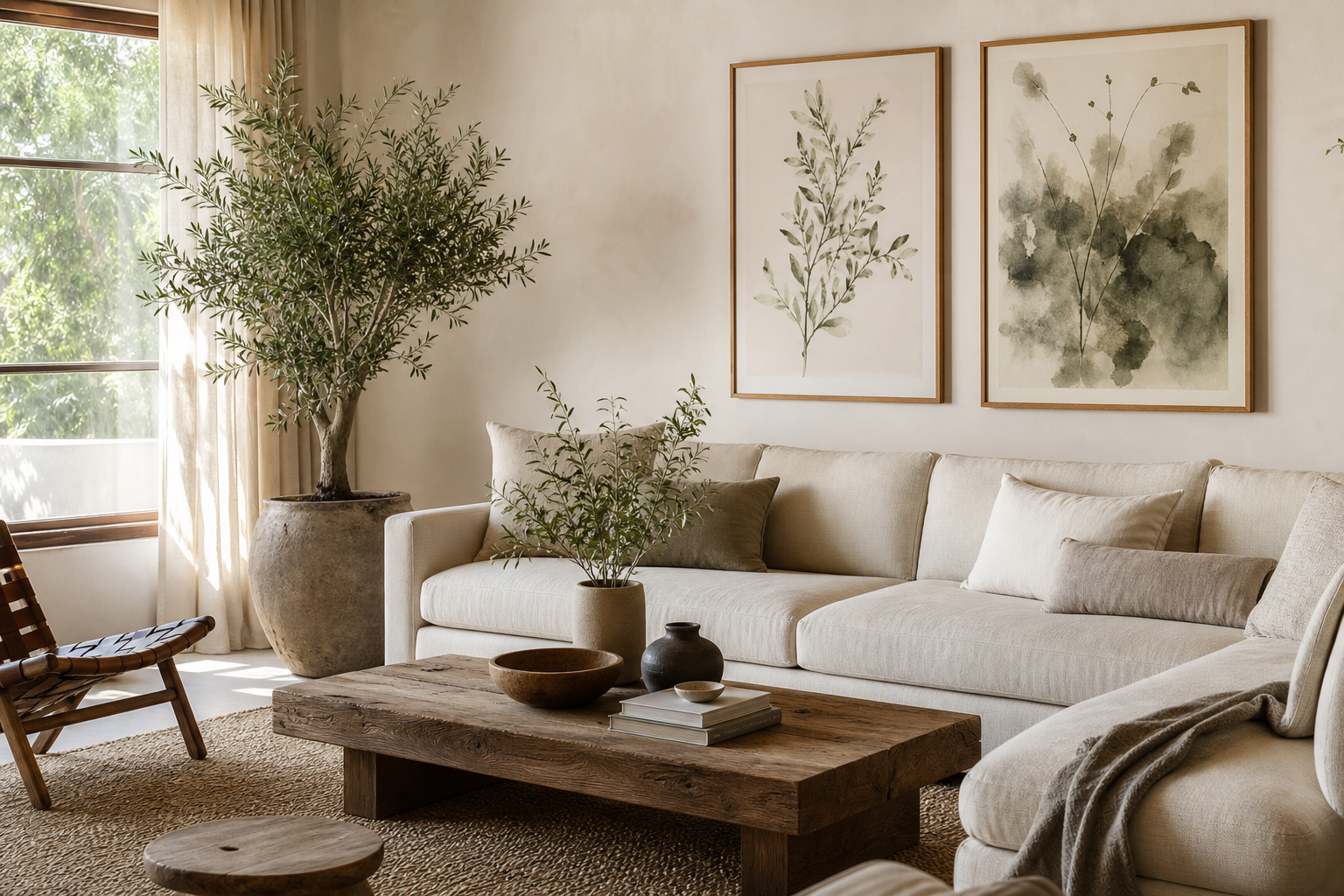
They also work across more rooms than people expect. In a bedroom, fashion posters can replace generic headboard art with something more personal. In a living room, they introduce figure, gesture, and contrast that balance plain upholstery and clean-lined furniture. In a home office or dressing area, they reinforce a creative, styled atmosphere that feels intentional rather than decorative for decoration's sake. If you already use photography prints or minimalist wall art, fashion imagery layers in naturally.
A strong fashion image often carries its own composition — body line, fabric movement, negative space, and color accent all in one frame. That means fashion posters can do the job of both subject matter and design element. You are not just filling wall space; you are shaping the room's rhythm.
Choosing the Right Fashion Poster Style
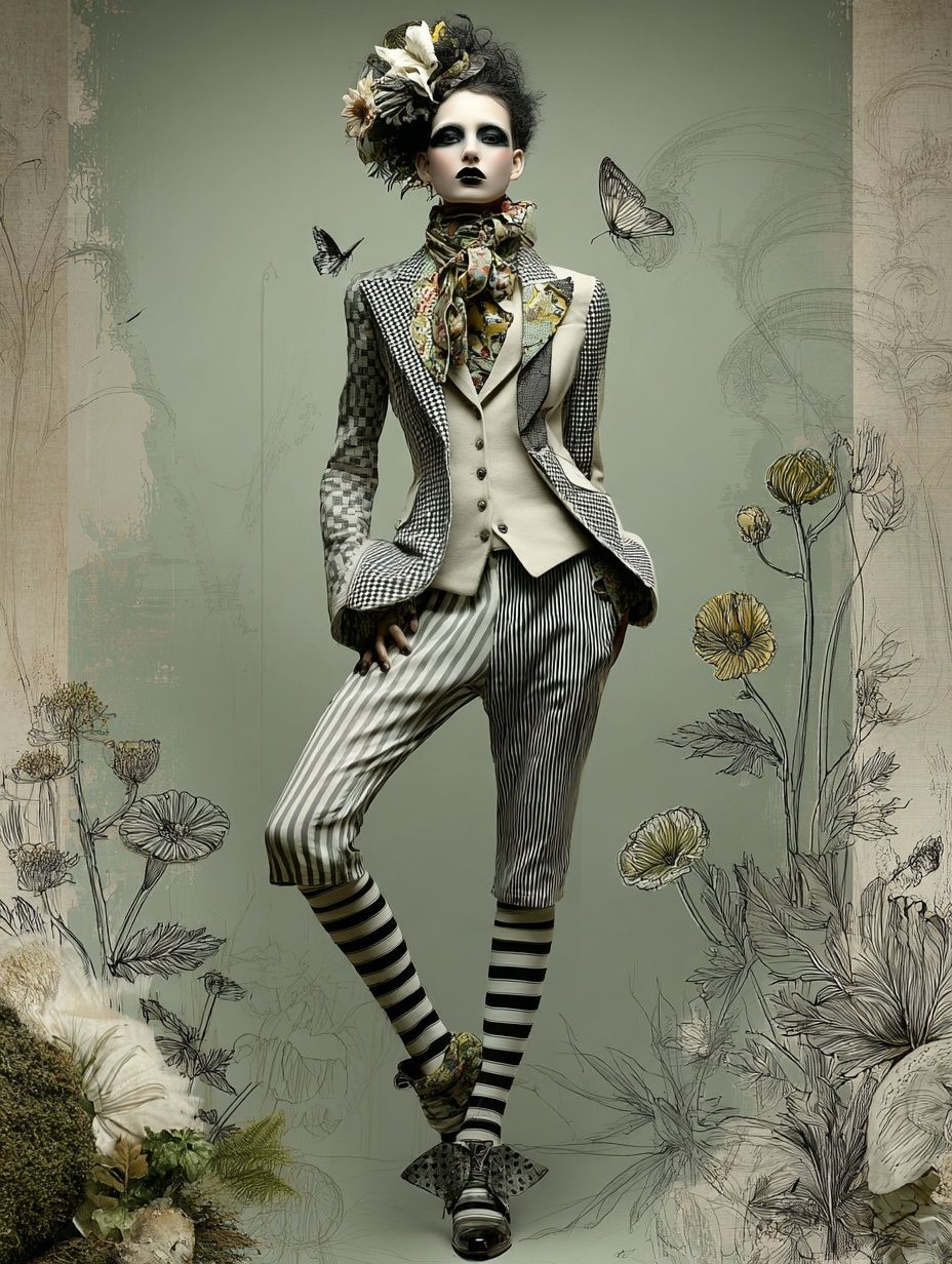
Start with the mood of the room, not the trend of the moment. If your space is classic — think walnut furniture, cream textiles, antique brass — vintage covers and archival-style illustrations make sense. Pieces such as Au Revoir (1920) fashion illustration or fashion illustration vintage prints feel elegant because the line work and palette are already time-tested.
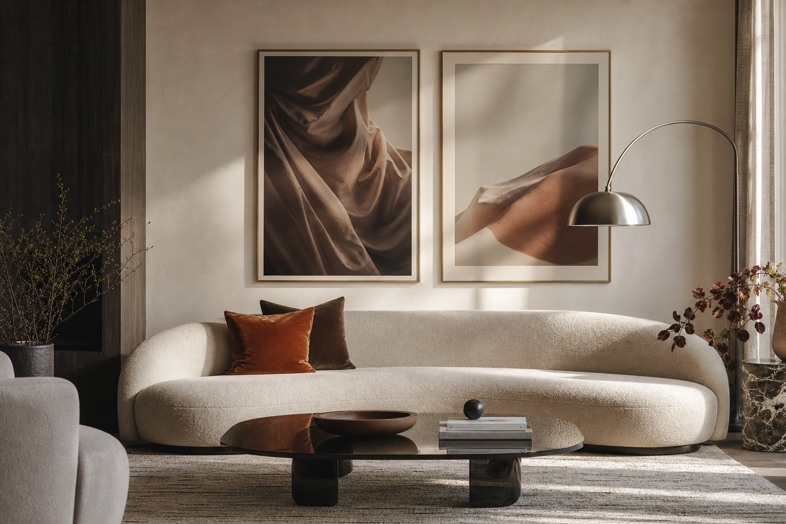
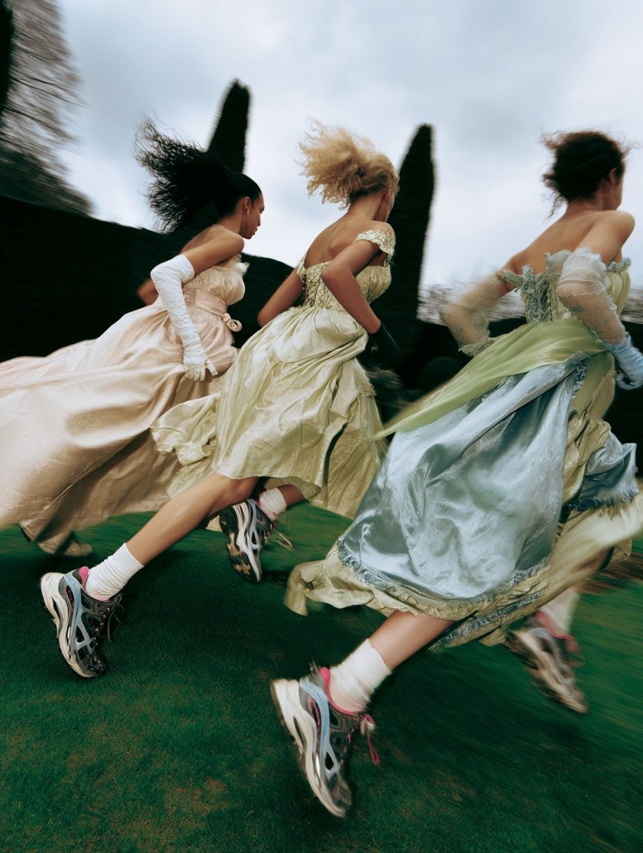
If the room is more contemporary, runway photography and street-style imagery hold up better. Clean compositions with strong silhouettes suit apartments with black metal, glass, boucle, and polished plaster. A piece like Fashion Runway — Contemporary Print works well in spaces where the furniture is simple and the art needs to create the drama.
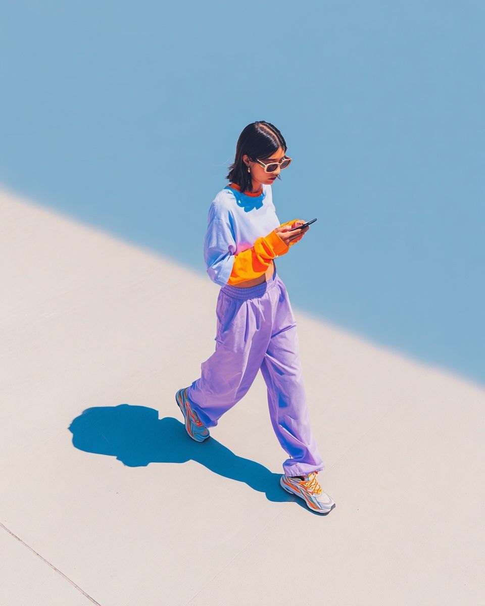
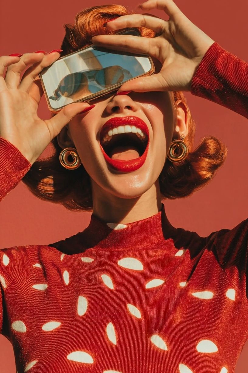
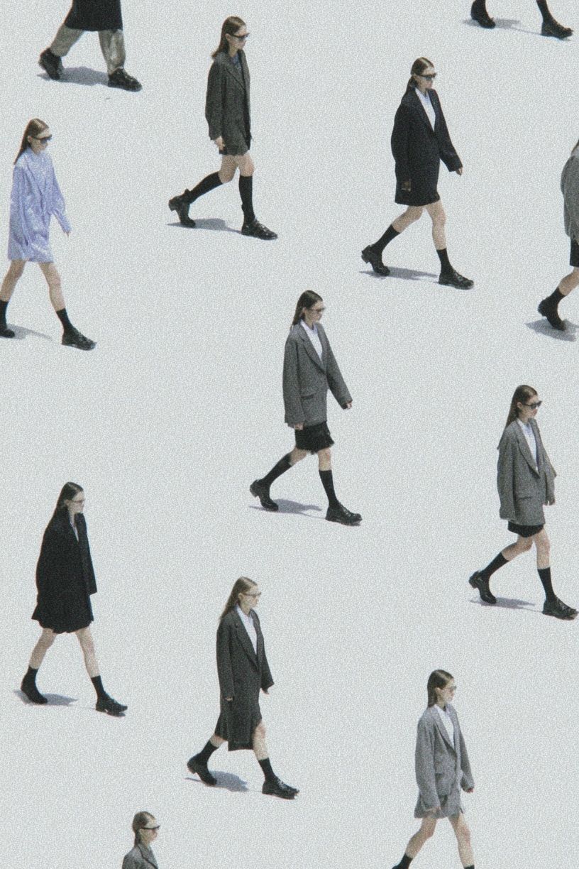
Minimal rooms benefit from restraint. Look for one-figure compositions, crisp backgrounds, and limited color. Fashion Walk — Minimalist Print is a good example of how fashion can read as refined rather than busy. In contrast, bolder homes can carry saturated red, pink, or graphic styling without losing balance.

One useful rule is to match image energy to room function. Bedrooms usually suit softer portraits, muted palettes, and fewer visual interruptions. Hallways and dressing areas can take sharper contrast and more attitude. Workspaces often respond best to confident but uncluttered pieces — one striking fashion portrait is usually stronger than five smaller loud images.
Picking Colours and Themes That Fit Your Room
The easiest way to make fashion posters feel expensive is to repeat one or two colors already present in the room. If you have camel leather, dark wood, and ivory upholstery, warm sepia and neutral portrait prints will look integrated. If your room includes black accents, chrome, or white lacquer, high-contrast monochrome photography usually lands better.
For rooms that need a focal point, use one concentrated color hit. Red is particularly effective in fashion imagery because it reads as deliberate, not random. In a neutral room, one print with red clothing or accessories can animate beige, taupe, charcoal, or cream without requiring a full palette change. That is why a piece like Fashionable Woman with Red Bag — Fashion Print works so well in restrained interiors.
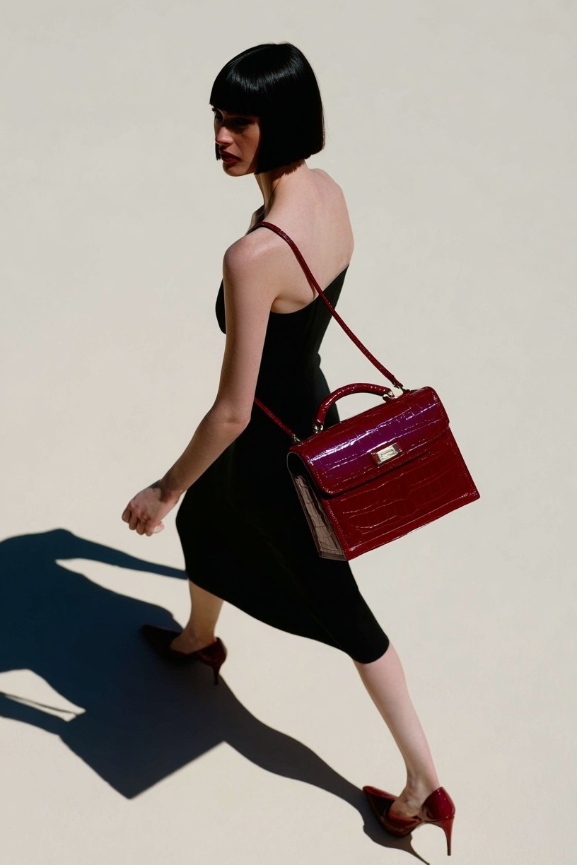
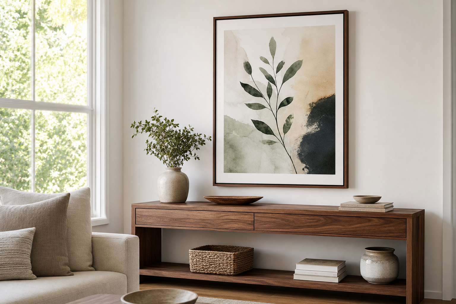
Texture matters as much as color. Glossy imagery feels sharper beside marble, glass, lacquer, and polished metals. Vintage fashion art sits better with linen, rattan, aged wood, and brushed brass. If your home already leans organic, pull from our vintage collection or even soften a fashion arrangement with one piece from bohemian wall art to avoid a too-styled result.
Themes should stay consistent within a room. If one wall centers on runway movement, keep the surrounding art fashion-forward or abstract. If you prefer old-world elegance, combine vintage portraits, illustration, and gentle fine art references such as Woman with a Parasol — Impressionist Print rather than dropping in a hard-edged street-style image that pulls the eye in a different direction.
Sizing, Framing, and Placement Tips
Most fashion posters look best when they have enough scale to preserve the figure and styling details. Above a bed, aim for a total arrangement width covering 60% to 75% of the headboard width. Above a 160 cm bed, that usually means one 70x100 cm piece or a pair of 50x70 cm frames. Above a sofa, keep the art grouping around two-thirds of the sofa width for a balanced look.
Frame finish changes the message. Black frames make fashion imagery look graphic and editorial. Thin brass frames introduce warmth and work well with vintage-inspired art. Oak frames soften photography and help modern homes feel less stark. If you want the most polished result, add a white mat around smaller images — especially 30x40 cm and 40x50 cm sizes — because matting gives the composition breathing room.

Hanging height is often the reason good art looks wrong. Keep the center of the main piece around 145 cm to 150 cm from the floor in living spaces. Above furniture, leave 15 to 25 cm between the top of the sofa, headboard, or console and the bottom of the frame. In dressing areas, slightly lower placement can work better because the art is viewed at closer range.
Different rooms call for different formats. Bedrooms suit pairs or one large vertical piece. Living rooms handle larger horizontal groupings. Home offices benefit from one statement print behind the desk or a narrow trio above shelving. Dressing corners and walk-in closets are ideal for fashion posters because the subject matter aligns naturally with mirrors, lighting, and personal style rituals.
How to Build a Fashion-Inspired Gallery Wall
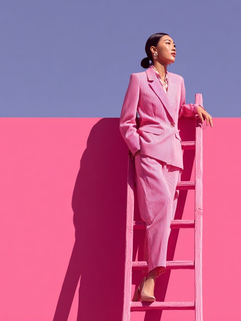
A good gallery wall needs variation in subject, but discipline in structure. Start with one anchor image — usually the largest piece, around 50x70 cm or 70x100 cm — then build around it with 30x40 cm and 40x50 cm frames. Keep spacing between frames tight and consistent, ideally 5 to 8 cm.
Fashion art pairs well with portrait photography, abstract line work, mirrors, and a small amount of vintage illustration. The trick is to repeat either frame finish or palette across the whole grouping. If every piece has a different tone, the wall reads accidental. If all frames are black and the palette stays within black, cream, tan, and one accent color, the mix feels curated.

For a softer arrangement, mix one or two pieces from illustration prints into a predominantly photographic wall. For a sharper arrangement, keep the imagery photographic and vary only crop, scale, and pose. If you want a strong starting point, build around Retro Fashion Portrait Poster and then add supporting works with similar contrast or color restraint.
Styling Tips for a High-End Editorial Look
Luxury in wall styling usually comes from editing. Leave more empty wall around the art than you think you need. One large framed image with a generous mat often looks richer than three smaller unframed pieces. Symmetry also helps — matching bedside lamps, aligned frame edges, and centered placement create the disciplined look associated with fashion editorials.
Layering is effective when it is controlled. Lean one medium frame on a console, then hang one larger piece above it, and add a sculptural object or stack of books below. This works particularly well in bedrooms and dressing spaces. Use warm bulbs around 2700K to 3000K so skin tones and neutral textiles stay flattering rather than stark.
If you want fashion posters to feel timeless, avoid choosing every piece from the same visual trend. Mix one directional image with one classic portrait and one restrained minimalist work. That balance keeps the arrangement current for years, and it is easier to refresh one print seasonally than to replace a whole wall.
Wrap-Up: Simple Ways to Shop and Style Fashion Posters
The best fashion posters are the ones that connect with both the room and your personal taste. Choose imagery with a clear point of view, repeat colors already present in the space, and size the work generously enough to hold the wall. A carefully framed 50x70 cm print will usually do more for a room than several undersized pieces.
If you want flexibility, begin with one hero piece from our fashion posters collection and build slowly. Add vintage or photographic support only when it strengthens the story. That approach keeps the room polished, and it gives you space to evolve the look over time rather than decorating all at once.
Frequently Asked Questions
What frame color works best for fashion wall art?
Black is the most versatile for an editorial look, while brass feels warmer and more glamorous. Oak works well if your room has soft neutrals and natural textures.
Can I hang fashion posters in a small room?
Yes — just keep the composition simple. One 40x50 cm or 50x70 cm piece often looks cleaner than several small frames in a compact space.
Should I use glass or acrylic glazing?
Acrylic is lighter and safer for large frames or rentals, while glass offers a slightly sharper finish. For bright rooms, choose anti-glare glazing if possible.
What pairs well with fashion posters on the same wall?
Mirrors, abstract line art, and restrained portrait photography pair best. Keep at least one element consistent — frame color, palette, or subject tone.
How do I keep a fashion gallery wall from looking cluttered?
Limit the palette to two or three dominant tones, use matching frames, and keep spacing consistent at around 5 to 8 cm. Edit out any piece that does not support the overall mood.