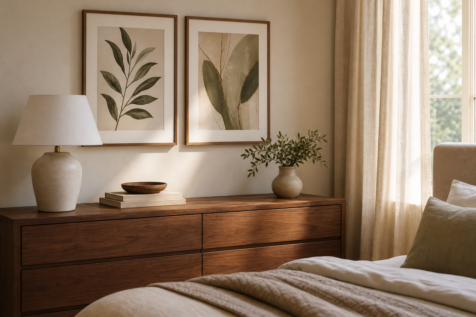
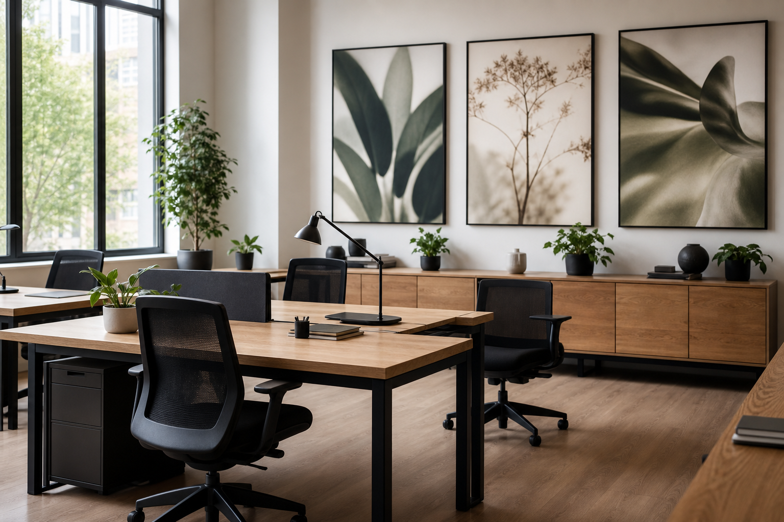
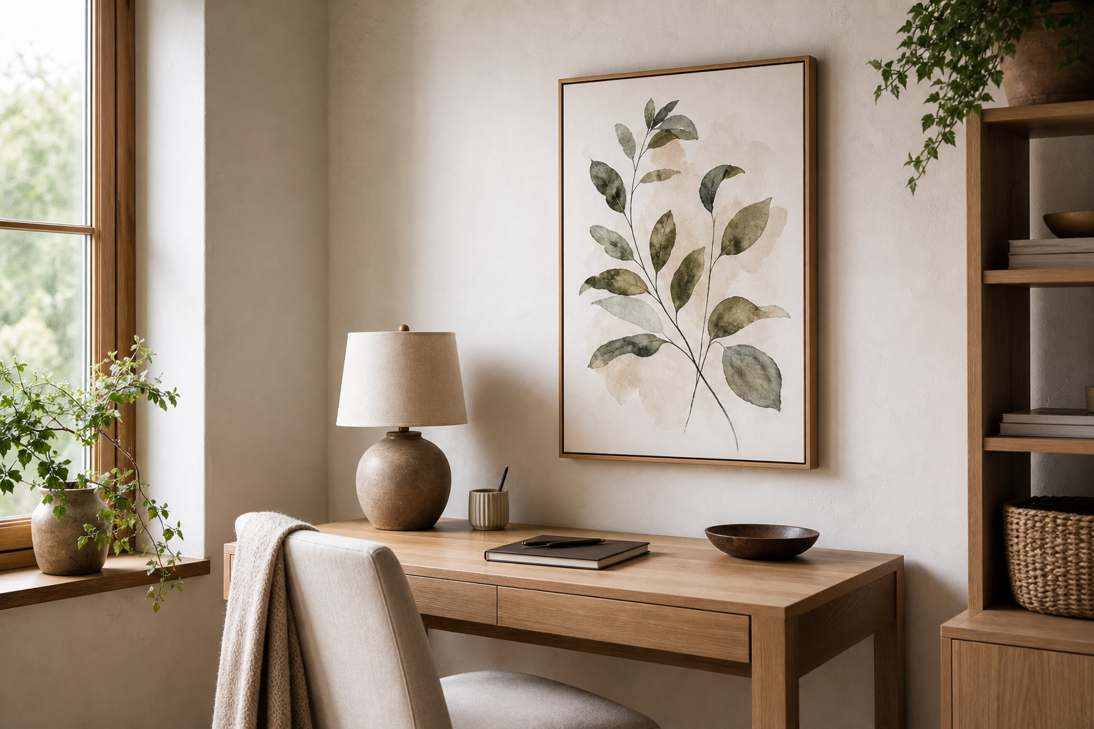
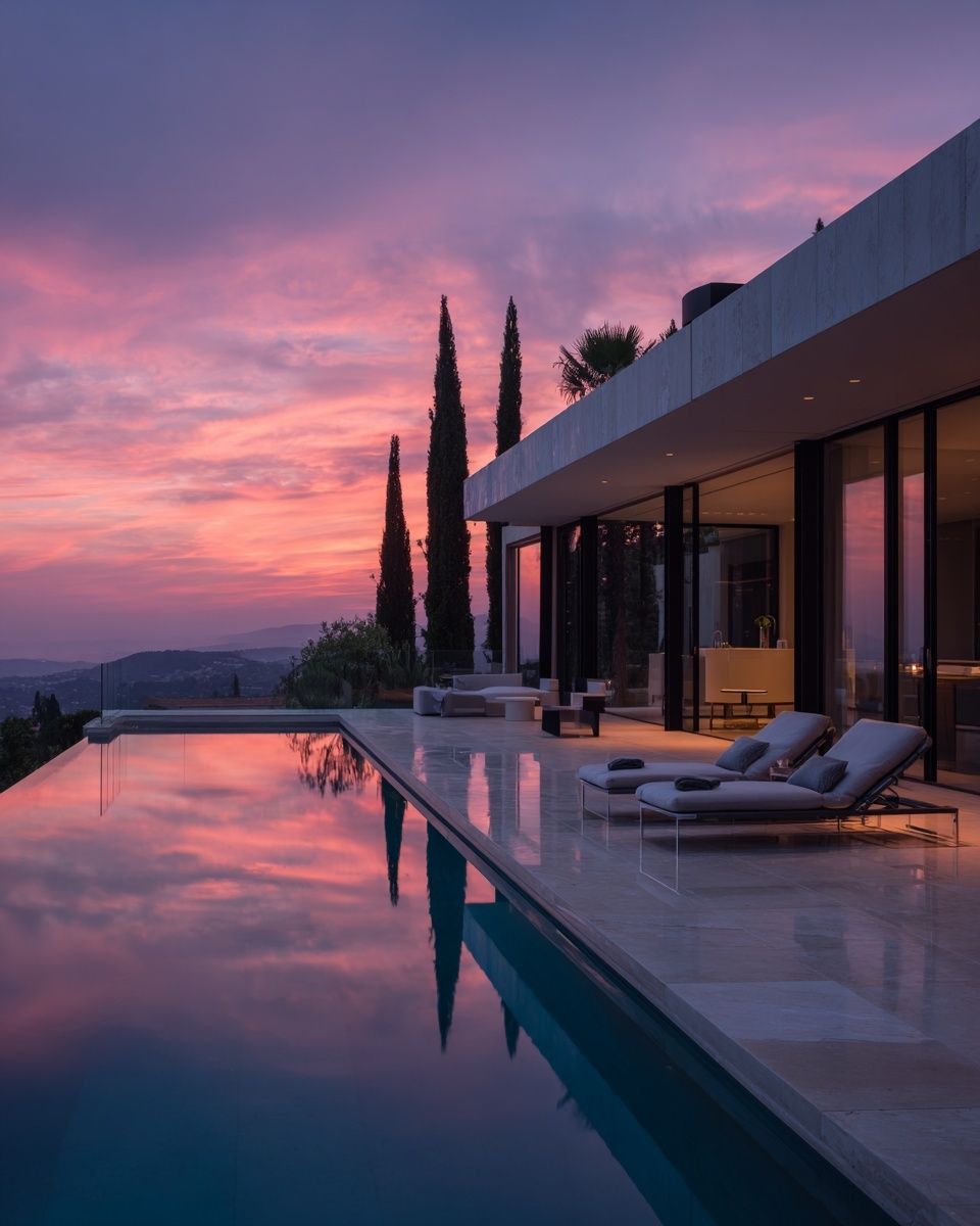
A coastal villa ii poster print works because it combines architecture, landscape, and restraint in one image. You get the structure of a villa, the openness of the shoreline, and a palette that usually stays within soft sand, pale blue, warm white, and muted stone. That mix feels polished rather than themed, which is why it fits homes that want a coastal reference without ropes, anchors, or obvious beach decor.
The strongest coastal interiors rely on tonal range more than contrast. A good coastal villa ii poster print often sits in a narrow value scale — roughly 70% light tones, 20% mid-tones, and 10% darker accents. That balance gives a room visual calm. If you already like pared-back architectural pieces such as modern minimalist architecture prints, this kind of artwork will feel like a natural extension rather than a decorative departure.
What makes Coastal Villa II feel so timeless
Timelessness usually comes from three things: classic subject matter, controlled colour, and enough negative space. A coastal villa scene avoids trend fatigue because homes, sea views, and simple geometry have lasting appeal. Unlike louder travel-inspired pieces, it does not demand a Mediterranean or nautical room around it. It simply adds atmosphere.
Soft architectural imagery also bridges categories well. It sits comfortably beside our architecture collection, but it can also work with minimalist art prints or quieter pieces from the vintage collection. That flexibility matters if you are styling a room gradually and want one print that still works when furniture, textiles, or paint colours change.
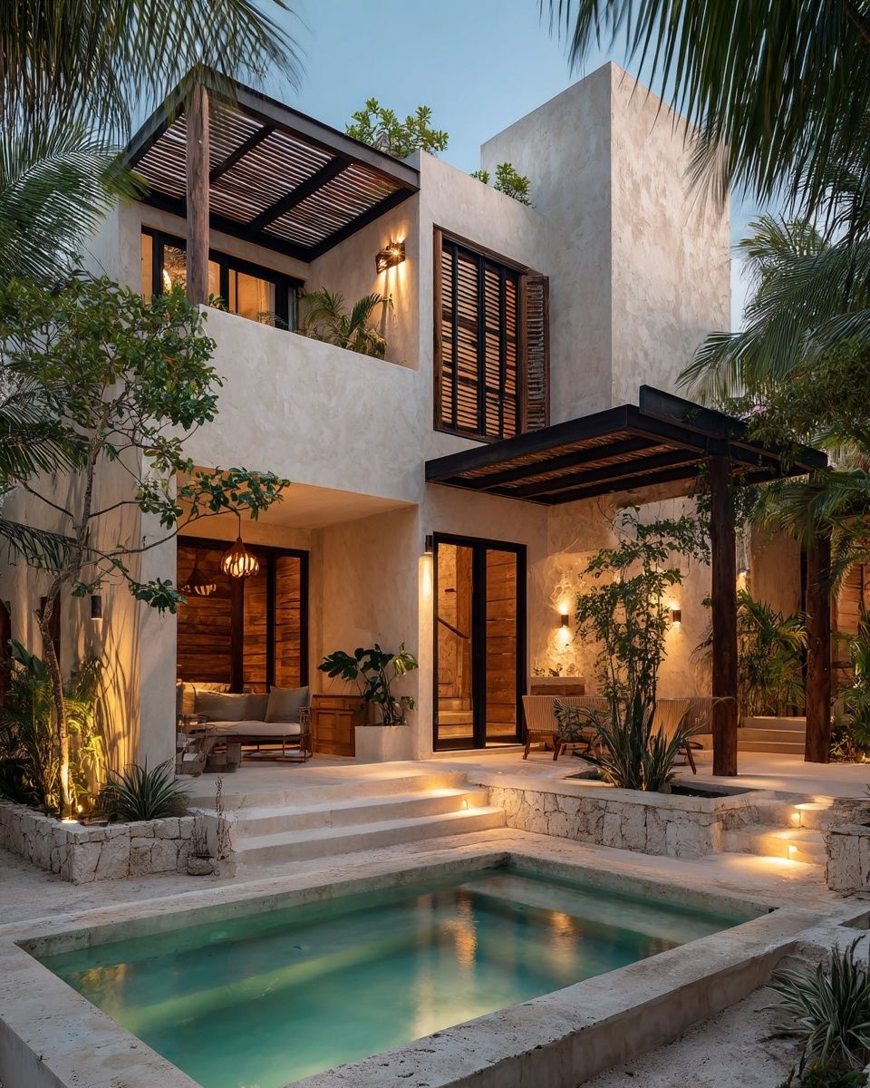
If you want a comparable look with clean lines and a warm coastal mood, architectural villa imagery is a reliable reference point. Prints with open facades, sea-adjacent settings, and low-contrast skies tend to feel expensive because they mimic the calm composition used in boutique hotels and editorial interiors.
Best rooms for a coastal-inspired print
The living room is the easiest place to use this artwork. Above a 180-220 cm sofa, choose a print around 70x100 cm or 80x120 cm if you want a single focal point. A piece this size should cover about 60-75% of the sofa width, which keeps the wall balanced without looking undersized. If the room has pale upholstery, travertine, oak, or boucle, the print will reinforce the softness already in the space.

Bedrooms suit this style especially well because the subject is restful. Above a queen bed, 50x70 cm works for a subtle accent, while 70x100 cm creates a stronger anchor over a wide upholstered headboard. Keep bedding simple — white, flax, or light grey — and avoid busy prints that compete with the scene. In this setting, the artwork should feel like a window rather than a headline.
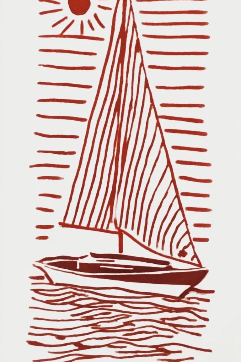
Hallways and reading corners benefit from narrower formats and lighter framing. In a corridor, a 40x50 cm or 50x70 cm version can break up a long wall without making the passage feel crowded. In a reading nook, pair it with one tactile material — woven wood, rattan, or brushed linen — to make the coastal reference feel intentional. If you enjoy softer seascape pairings, Whale Tail in Ocean and Sailing Boat Minimalist Wall Art are natural companions.
How to choose the right size and placement
Most people hang wall art too high. The centre of the frame should usually sit 145-150 cm from the floor, which aligns with average eye level. Above furniture, leave 15-25 cm between the top of the sofa, console, or headboard and the bottom of the frame. That gap keeps the artwork visually connected to the furniture instead of floating separately above it.
If you are styling the coastal villa ii poster print on its own, let it breathe. Leave at least 20-30 cm of clear wall space on either side in smaller rooms, and more in open-plan spaces. Solo placement works best when the artwork has enough internal detail and tonal depth to hold attention without support.
For a gallery arrangement, build around one dominant piece and three quieter companions. The main print should be about 40-50% of the total arrangement width. Choose supporting works with one shared feature — similar horizon lines, muted palette, or architectural subject. This is where coastal and architectural works overlap particularly well.
Frames and finishes that suit the artwork
Frame choice changes the mood more than most buyers expect. Light oak gives the most natural coastal look — warm, understated, and easy to pair with pale woods in the room. Matte black creates more definition and suits sharper modern interiors, especially if you already have black lighting, window frames, or side tables. White frames are the quietest option, but only work well if the wall colour is not stark white; otherwise the artwork can lose definition.

A mat border helps if the artwork has delicate tones. A 5-7 cm off-white mount gives the image room and makes a 50x70 cm print feel more substantial. For glazing, acrylic is practical in family homes because it is lighter and more shatter-resistant, while glass offers slightly sharper clarity. In bright rooms, anti-glare glazing is worth the upgrade because coastal scenes often rely on subtle detail that disappears under reflections.

If you want a layered wall, mix one detailed coastal piece with one simpler architectural work such as Modern White Staircase. That pairing keeps the display refined instead of overly decorative.
Colours and textures to pair with Coastal Villa II
The safest palette is built from five core tones: chalk white, sand, oat, misty blue, and driftwood brown. Use those across walls, upholstery, and accessories, then add one darker note such as charcoal, bronze, or deep taupe in small doses. A room that stays within this band feels cohesive even when you combine multiple materials.
Texture matters as much as colour. Linen curtains, boucle seating, jute or wool rugs, limewash walls, and brushed oak all support the softness of a coastal villa ii poster print. Glossy finishes are less effective because they compete with the calm mood. If you want pattern, keep it low-contrast — fine stripes, woven checks, or subtle natural grain.

This print also pairs well with other restrained landscapes. For a softer, painterly direction, browse our nature art prints or combine it with Serene Landscape — Watercolor Print for a room that feels airy rather than thematic.
Simple styling tips for a polished result
Start by reducing visual noise around the artwork. If the wall already has open shelving, a television, or strong architectural lines, keep accessories below the frame low and simple. One stack of books, one ceramic vase, and one table lamp is often enough. The goal is not to fill every surface, but to keep the eye returning to the wall art.
Scale your decor to the print. A large 70x100 cm piece needs furniture with presence under it — a full sofa, wide console, or substantial headboard. A smaller 40x50 cm print can disappear above oversized furniture, so in that case either size up or place it in a tighter area such as an entry niche or reading corner.

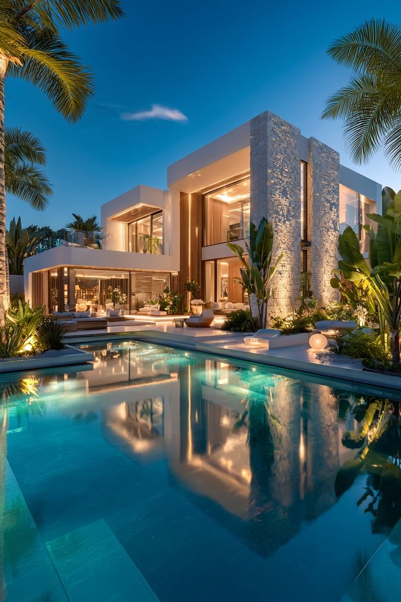
To keep the room from feeling too staged, repeat the artwork's tones at least three times elsewhere. That could mean blue-grey in a cushion, sandy beige in a rug, and warm white in curtains. Repetition creates cohesion fast. If you want one more complementary piece, Coastal Landscape with Figure can add a more classic note, while Modern Luxury Villa at Dusk leans cleaner and more contemporary.
A few final tips before you shop
Check print size against the full wall, not just the empty spot. Tape the dimensions directly on the wall with painter's tape — for example 50x70 cm, 70x100 cm, and 80x120 cm — then step back 2-3 metres. This gives a much more accurate sense of scale than measuring on paper or screen.
Paper and finish affect the overall impression. Smooth matte paper is usually the best choice for coastal imagery because it keeps colours soft and avoids glare. If the room gets strong daylight for more than 4 hours a day, place the work out of direct sun or use UV-protective glazing to reduce fading over time.
Final thoughts
A coastal villa ii poster print suits calm interiors because it brings structure, lightness, and an easy palette in one piece. Style it with measured proportions, natural textures, and a frame that supports the image rather than competing with it.
The best result comes from planning the wall as part of the whole room. Match the artwork to your furniture scale, repeat its tones in a few materials, and keep nearby decor edited. That is what makes coastal styling feel modern instead of themed.
Frequently Asked Questions
What frame width works best for this type of print?
A frame width of 1.5-2.5 cm suits most modern coastal interiors. Wider mouldings can work for large formats, but slim profiles usually keep the look cleaner.
Should I choose a mat border for a 30x40 cm print?
Yes, especially at smaller sizes. A mat helps the artwork feel more substantial and prevents delicate tones from looking visually compressed.
Can this style work in a room without blue accents?
Yes. Sand, ivory, taupe, and weathered wood tones are enough to support a coastal look without introducing visible blue.
What wall colour is hardest to pair with coastal artwork?
Very yellow cream can clash with cooler sea and stone tones. If your walls are warm, choose frames and textiles with balanced neutral undertones to bridge the gap.
Is it better to hang this print alone or with others?
If the wall is under 140 cm wide, hanging it alone usually looks stronger. On wider walls, a two- or four-piece arrangement can add balance if the palette stays restrained.