To buy vintage poster pieces well, start by treating the decision like part collecting, part interior styling. The right print adds age, depth, and narrative to a room, but it also needs to hold up at scale, suit your palette, and feel intentional beside your furniture. A timeless choice usually balances three things: a subject with staying power, colors that already exist in your room, and finishing details that make the print feel substantial.
What Makes a Vintage Poster Worth Buying?
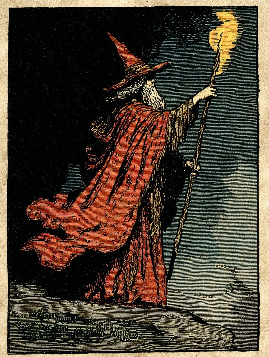
A vintage print feels enduring when it has a clear visual language tied to a period, not just an "old-looking" filter. Look for hallmarks such as limited color palettes, aged paper tones, traditional illustration, serif lettering, or period-specific composition. Travel graphics from the 1920s to 1950s, scientific diagrams, old advertisements, and portrait studies often age better than novelty pieces because they carry strong design structure.
There is also a useful distinction between "original vintage" and "vintage-inspired." An original piece was printed in its own era and may show natural wear, fold lines, or slight color softening. A vintage-inspired print is newly produced but references older imagery or composition. For most interiors, a well-made reproduction from a curated vintage collection is the more practical choice — easier to source, easier to frame, and available in cleaner condition.
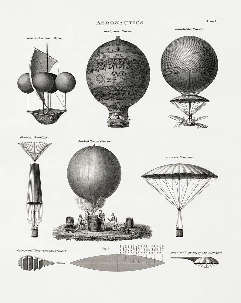
A collectible look often comes from subject matter with inherent character. Scientific illustrations, historical portraits, and transport themes tend to feel grounded rather than decorative-only. Aeronautics Vintage Print is a strong example: technical imagery brings instant structure to an office, hallway, or study without feeling trendy.
How to Spot Style, Subject, and Era
The fastest way to buy vintage poster art that works in your home is to match the subject to the room's architecture and furniture lines. Travel and transport designs suit spaces with natural wood, leather, cane, or brass. Old-world portraiture works well with plaster walls, deeper paint colors, and more traditional silhouettes. Quirky advertising pieces fit eclectic rooms where you want one unexpected note.
If your home leans classic, explore fine art prints with historical character alongside vintage pieces. A room with oak furniture and off-white walls can handle softer painterly works such as Woman with a Parasol just as easily as antique-style prints. If your furniture is cleaner and more geometric, the better match may be mid-century modern art prints with 1940s to 1960s influence.
Travel, advertising, and scientific subjects are the safest entry point because they read clearly from 2 to 3 metres away. Portraits and darker narrative scenes are stronger when you want intimacy — over a console, beside a bookshelf, or in a bedroom corner. For a lighter, more playful take on nostalgia, Vintage Woman with Banana Phone shows how humor can still feel period-referenced when the styling is right.




Condition, Print Quality, and Authenticity Checks
Before you buy, inspect the image itself before the subject. Good vintage-style wall art should have controlled grain, readable details, and tonal depth in the shadows. Muddy blacks, overly orange paper backgrounds, or pixelated edges are common signs of a weak reproduction. If the piece is designed to mimic age, the wear should look integrated into the artwork — not like a low-resolution overlay.
Paper and finish matter just as much as the design. Heavier paper stock generally sits flatter in the frame and looks more premium at larger sizes such as 50x70 cm or 70x100 cm. On vintage imagery, a matte finish is usually the safest choice because it reduces glare and keeps the surface closer to the character of older printed matter. Strong gloss tends to fight the subject.
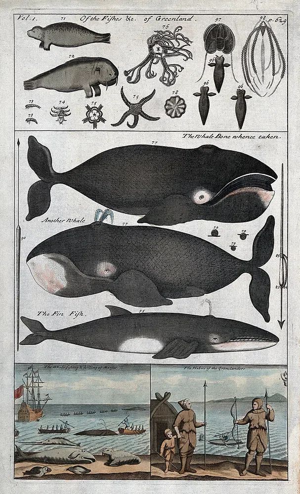
For authenticity, ask a simple question: does the seller clearly describe whether the work is an original, a reprint, or a vintage-inspired design? Transparent labeling is a good sign. If you are choosing between several antique-style options, historical subjects like Whale Anatomy and Hunting or Winston Churchill Portrait often feel more convincing than generic faux-aged graphics because the source material already carries period credibility.
Choosing the Right Size for Your Wall
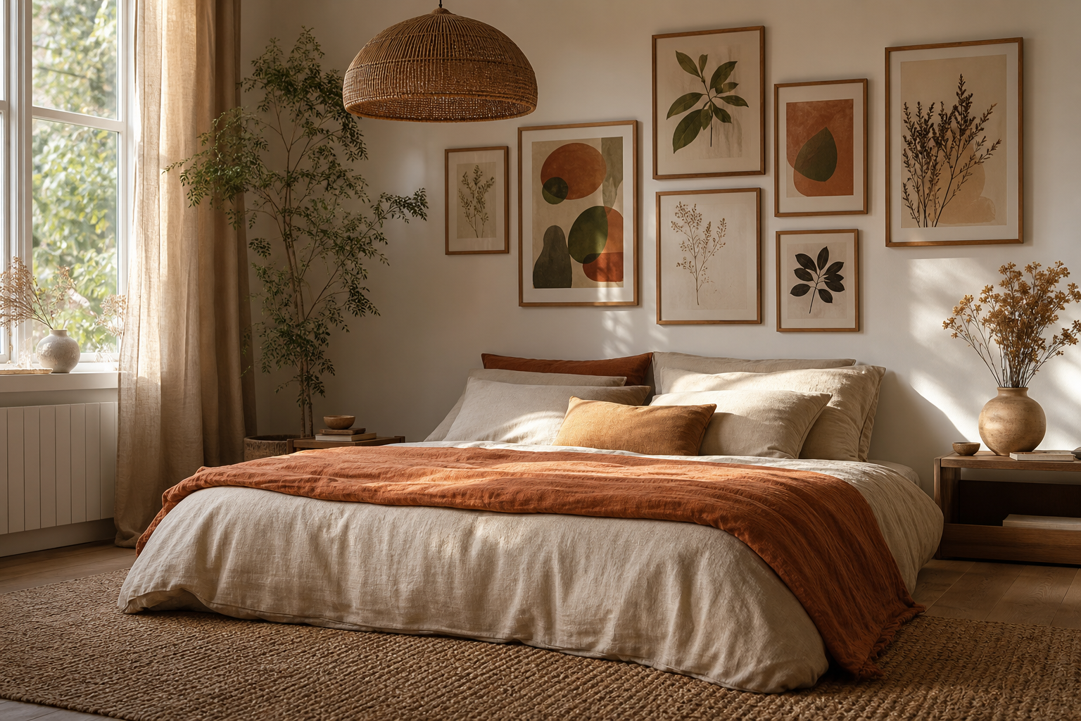
Scale is where many vintage pieces lose impact. As a rule, wall art above a sofa or bed should span about 60% to 75% of the furniture width. If your sofa is 200 cm wide, aim for a total art width between 120 and 150 cm. That could mean one 70x100 cm print, two 50x70 cm frames, or a small salon-style grouping.
In narrow spaces such as entryways or hallways, vertical formats work better because they pull the eye upward without crowding the walkway. A single 40x50 cm or 50x70 cm frame is often enough if the wall is less than 120 cm wide. For gallery walls, keep spacing consistent at 5 to 8 cm between frames so the arrangement feels collected rather than scattered.
Vintage subjects with fine detail — maps, anatomy, diagrams, architectural studies — benefit from slightly larger formats because viewers need room to read the image. Simpler silhouettes or portrait studies can hold their own at smaller sizes. If you are mixing periods, one anchor piece from the Vintage range with supporting works from minimalist prints or illustration wall art keeps the wall from feeling too theme-heavy.
Framing and Finishing Touches That Elevate the Look
Frame choice can shift a print by decades. Thin black frames make vintage subjects feel sharper and more contemporary. Medium walnut or dark oak frames add warmth and collector energy. Antique gold works best in smaller doses — portraits, still lifes, or one feature piece — because too much gilt can make a modern room feel costume-like.
A mount is useful when the artwork has dense detail or darker edges. A white or warm ivory mount of 4 to 8 cm gives the image breathing room and makes modest sizes look more important. For glazing, standard acrylic works in most rooms, but UV-protective glazing is worth considering in spaces with strong daylight, especially near south-facing windows.

If your room already includes curved forms, tapered legs, or teak furniture, vintage and mid-century can coexist beautifully. In that case, pieces such as Mid-Century Cocktail Bar or Moka Pot Mid-Century Poster can complement older-looking prints without diluting the mood.
How to Style a Vintage Poster in Different Rooms
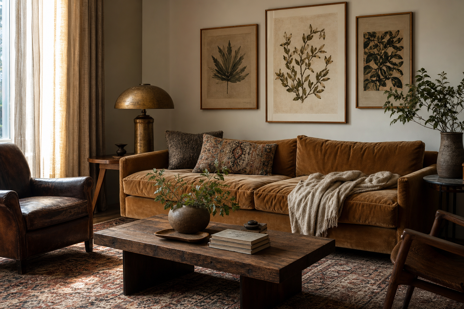
In living rooms, use vintage wall art to create one strong focal line. Above a sofa, three coordinated frames usually work best when the overall width stays under the sofa edges by at least 15 cm per side. Scientific and transport subjects look especially good with leather, linen, and wood. Portrait pieces are stronger in more intimate corners — over a sideboard, above a drinks cabinet, or layered on a picture ledge.

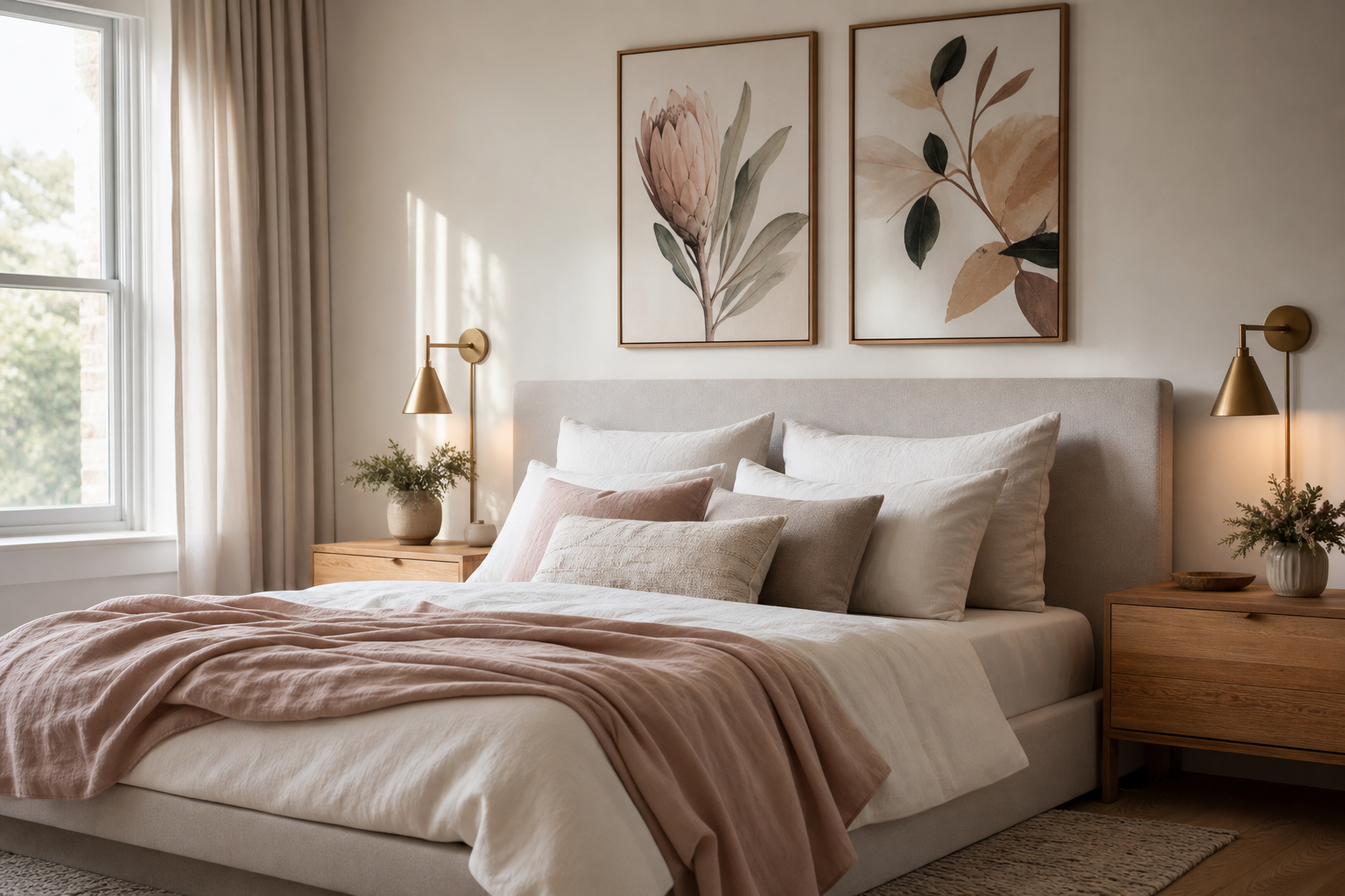
Bedrooms benefit from softer vintage choices — florals, portraits, pastoral scenes, or muted fine art. A pair hung 15 to 20 cm above the headboard usually feels balanced. For kitchens and dining corners, look for still lifes, café references, old packaging aesthetics, or food-related graphics. Wine Table Still Life is a practical fit because its subject naturally belongs near wood tables, ceramics, and warm-toned walls.
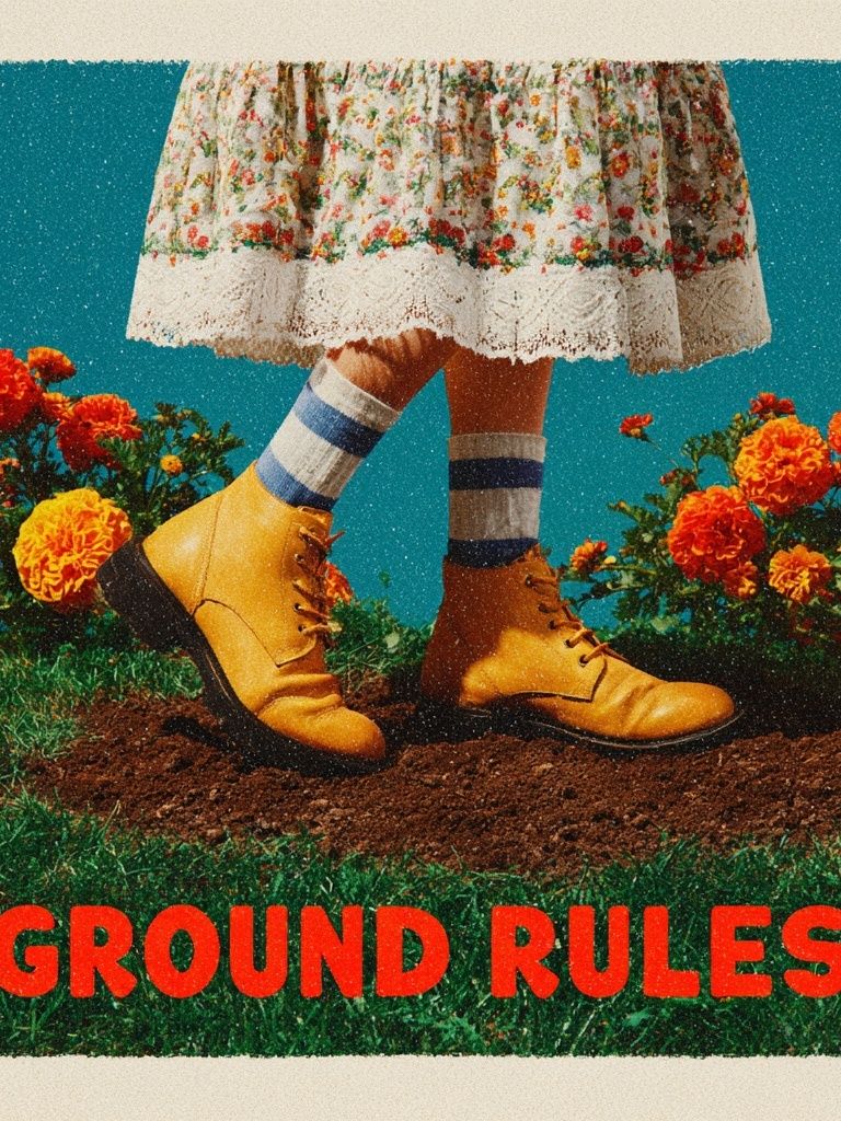
Home offices can take the most graphic approach. Technical diagrams, old typography, and historical figures add energy without visual clutter. If you want one print with conversational edge, Ground Rules — Retro Typography Print works especially well in a study with black metal shelving, walnut desks, or industrial task lighting.
For a more layered arrangement, combine one larger vintage anchor with three supporting works in adjacent styles. This keeps the wall from feeling staged around a single theme while still giving you period character.

Final Tips Before You Buy
Set a budget before you compare styles, because size and framing change the final cost quickly. As a rough rule, moving from 30x40 cm to 50x70 cm can nearly double visual impact, while custom framing may add 40% to 100% to the artwork cost depending on materials. If the subject is highly detailed, spend on size first, then frame second.
To buy vintage poster art with confidence, use a five-point check: subject, scale, palette, print clarity, and frame plan. If a piece works on all five, it will usually outlast trend-driven choices. Start with one image you would still want to live with in five years, not one that only fills an empty wall this week.
Frequently Asked Questions
Should vintage wall art match the exact colors in my room?
No — it should repeat 1 or 2 tones already present, not mirror the whole scheme. A print with muted browns, faded reds, or warm cream usually integrates easily.
Is matte or glossy better for a vintage-style print?
Matte is usually better because it reduces reflections and keeps the finish closer to older printed paper. Gloss can make aged imagery look too slick.
Can I hang a vintage print in a kitchen?
Yes, but keep it away from direct steam and splashes. Use glazing and leave at least 40 cm clearance from hobs or sinks.
What frame color is safest if I am unsure?
Walnut is the most versatile choice for vintage subjects. It adds warmth, works with both light and dark walls, and suits traditional as well as mid-century furniture.
How high should I hang a single framed print?
A good starting point is to place the center of the artwork about 145 to 150 cm from the floor. Adjust slightly lower in seating areas so the art connects visually with the furniture.