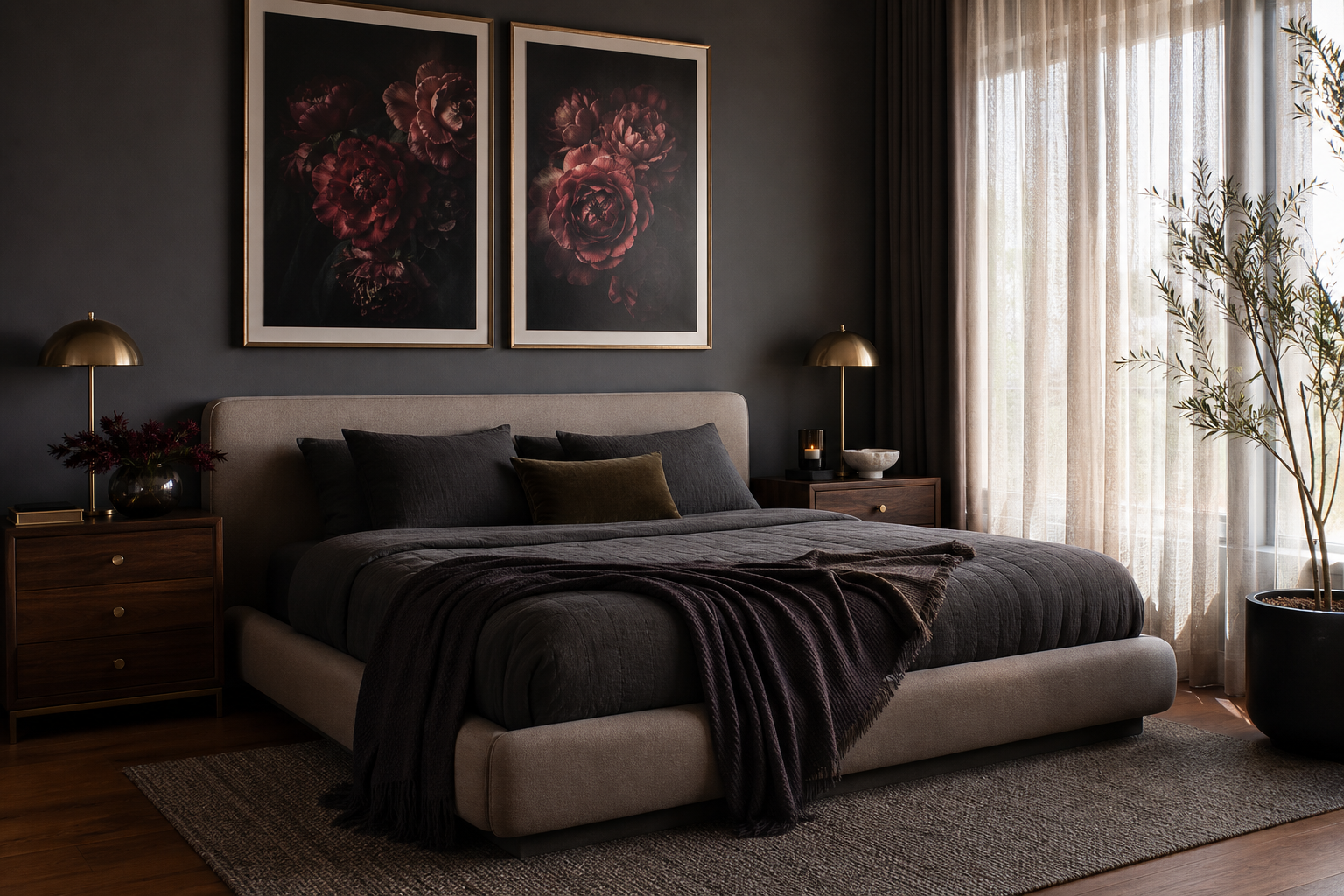
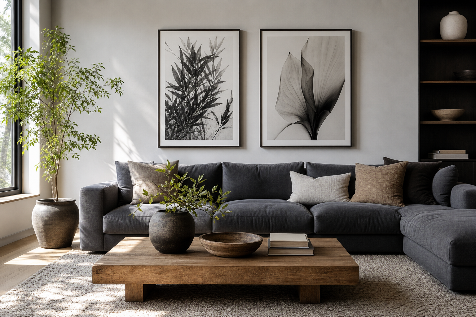
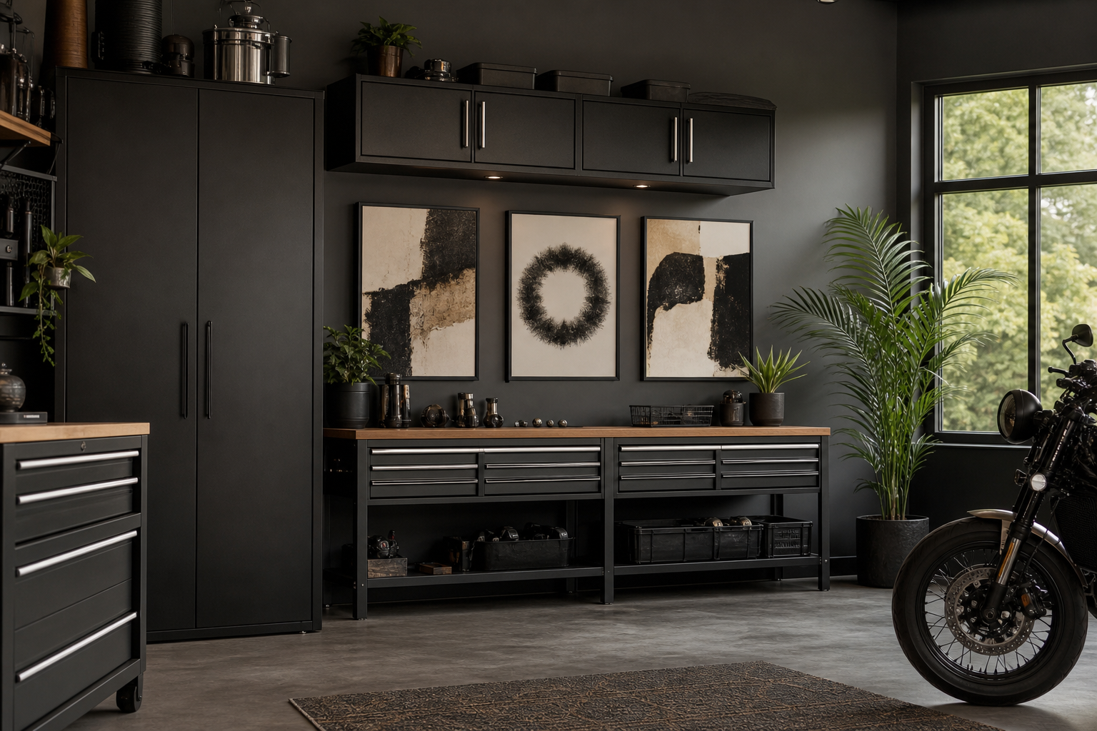
A "black wolf among sheep" image does one job exceptionally well: it creates tension in a single glance. The eye reads the contrast first — dark against light, outsider against group, movement against calm — and that is why the motif stays memorable even in a restrained room. Unlike softer wildlife scenes, it does not fade into the background after a week.
The strongest versions also balance symbolism with clean composition. In a well-designed Black Wolf Among Sheep illustration print, the animal grouping is easy to read from 2 to 4 meters away, which matters on a living-room or office wall. If you want artwork that feels decisive rather than decorative, black wolf among sheep is a smart direction.
What the black wolf among sheep image suggests
This motif usually signals individuality, nonconformity, and controlled power. A single black wolf set among white sheep reads as the one figure willing to stand apart. That interpretation works for people who see their home as an extension of their point of view — founders, creatives, independent professionals, or anyone drawn to imagery with a sharper edge.
It also carries a psychological weight that simpler animal portraits often do not. A solo wolf portrait can feel noble or wild, but a wolf placed inside a flock creates narrative. There is a before and after implied in the scene, which gives the artwork more tension than a static headshot. That is why people often respond strongly to both black wolf portrait wall art and the more conceptual black wolf among sheep design — one is iconic, the other is symbolic.
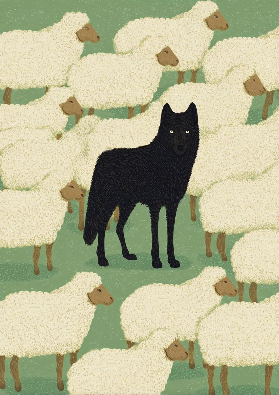
A monochrome or near-monochrome palette adds to the authority of the image. Black, white, and soft grey usually feel cleaner and more architectural than multicolor wildlife art. That makes the motif easier to place in urban interiors, where oak, black steel, smoked glass, and concrete already dominate the room.
Why this poster works in modern interiors
Modern interiors benefit from clarity. A composition with one dark focal figure and repeated lighter forms gives you exactly that. From a distance, the image reads as a strong shape pattern; up close, it reveals narrative detail. That dual effect is ideal in rooms where furniture lines are simple and visual clutter is low.
The black wolf among sheep motif also fits the current preference for high-contrast art with disciplined palettes. In spaces built around white walls, greige upholstery, walnut wood, or black accents, this kind of print looks intentional instead of random. It can sit comfortably near black-and-white geometric art or pared-back pieces from our abstract wall art collection because the palette speaks the same language.

Another practical advantage is proportion. Repeated sheep forms create visual rhythm across the frame, while the wolf provides the anchor point. That makes the design effective in wider formats — above a 180 to 220 cm sofa, for example — where a single centered portrait might feel too isolated.
Best rooms for a black wolf among sheep print
A home office is one of the best placements for this motif. The symbolism suits focused work, and the graphic contrast holds up well behind a desk on video calls. In a workspace, 50x70 cm is often enough; above a sideboard or shelving unit, 70x100 cm makes a stronger statement without overwhelming the room.
Entryways are another smart option because the message lands immediately. A narrow hall with white walls, a black bench, and one substantial framed print can feel finished with very little else. The image adds personality in the first 3 seconds someone enters your home.
Living rooms work especially well if your furniture is understated. A low-profile sofa, clean-lined lamps, and dark side tables leave enough visual room for the artwork to lead. If you prefer a more atmospheric setting, pair it with pieces from our nature wall art selection such as forest or winter scenes to keep the mood grounded rather than aggressive.
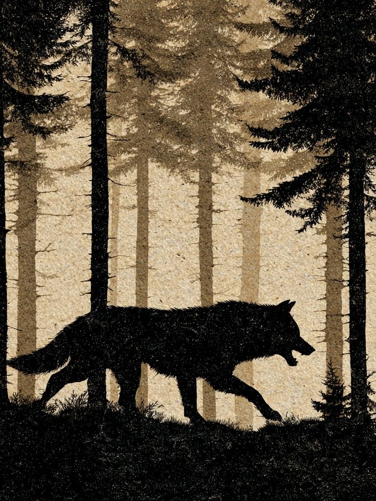
Studios and creative workspaces also suit this design because they can handle stronger visual ideas. If your interior already includes exposed brick, matte black shelving, or raw wood, a wolf motif feels aligned with the architecture. Bedrooms can work too, but only if the overall palette stays calm — think soft grey bedding, black reading lamps, and no more than one or two competing accent colors.
How to style it with other wall art
The easiest way to style this print is to keep it the darkest piece in the arrangement. That gives it hierarchy. Build around it using simpler supporting works — abstract textures, misty landscapes, or restrained line-driven compositions — rather than adding several equally dramatic animal images.
A good four-piece gallery wall often uses one lead image, two quieter supports, and one textural counterpoint. For example, black wolf among sheep can sit beside a winter landscape, a smoky abstract, and a black-white geometric design. That mix gives contrast in subject matter while keeping tonal cohesion between 70% and 80% monochrome.


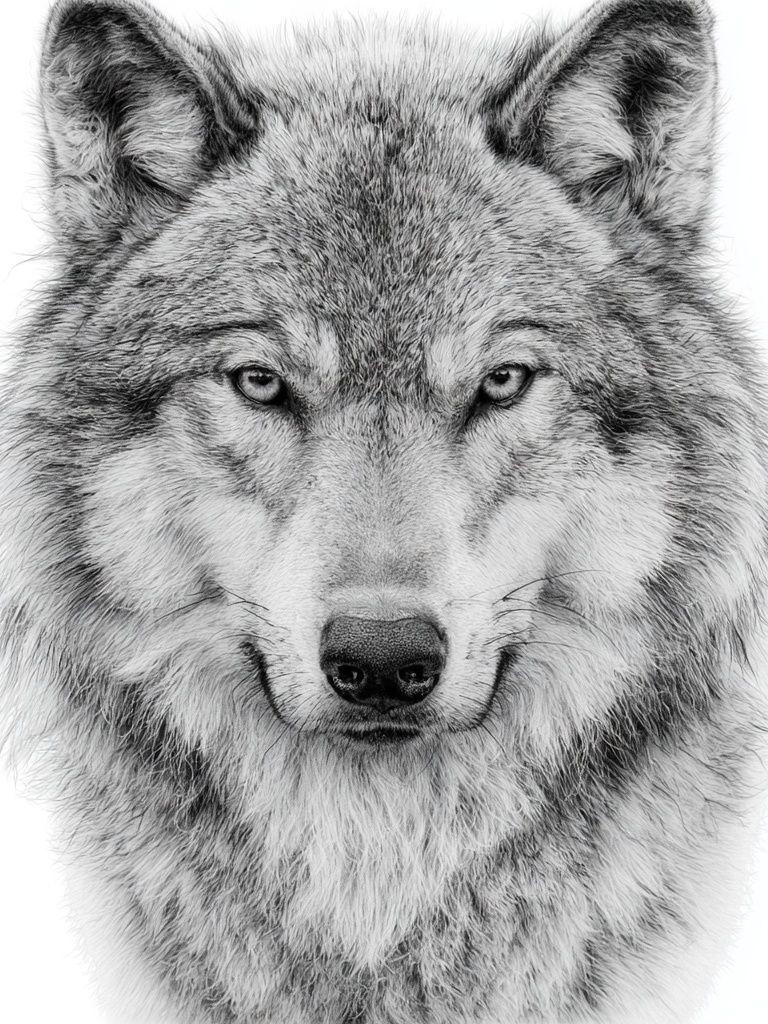

Nature-inspired pairings are especially effective because they broaden the story without diluting the impact. A print like Moonlit Winter Landscape or misty forest watercolor art extends the atmosphere around the main piece. If you want something more graphic than scenic, our black-and-white wolf portrait keeps the theme tight.
What usually does not work is pairing this motif with overly playful animal art or bright candy-color abstracts. The emotional register is too different. If you introduce color, limit it to one controlled accent — muted olive, rust, or deep burgundy — and keep the frames consistent.
Framing, size, and finish choices
For most homes, 50x70 cm and 70x100 cm are the most useful sizes. Use 50x70 cm in smaller offices, hallways, and apartment walls under 2.4 meters wide. Use 70x100 cm above a sofa, sideboard, or bed where the artwork should span roughly 50% to 65% of the furniture width beneath it.
Frame choice changes the tone more than people expect. A matte black frame gives the image maximum contrast and a more editorial feel. Dark walnut softens the severity and works well with warmer interiors — oak floors, leather seating, camel textiles. Thin metal frames suit modern spaces; thicker wood mouldings feel more grounded and classic.

Finish matters too. Matte presentation is the safer choice because it reduces glare from windows and overhead lighting. In rooms with multiple light sources, gloss can bounce reflections back at eye level and flatten darker detail. If the print hangs opposite a window, matte glass or acrylic typically keeps the image readable throughout the day.
When to choose this design over softer animal art
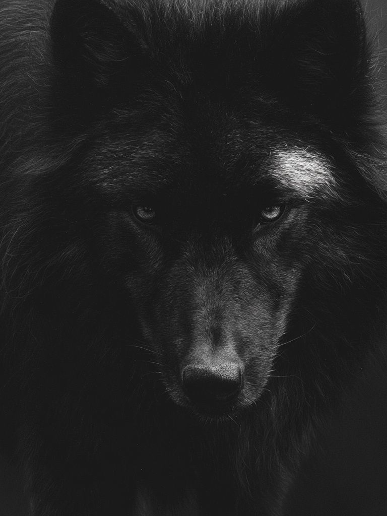
Choose this motif when you want the wall art to say something clear. A deer in a meadow or a watercolor bird can be beautiful, but they usually create calm. A black wolf among sheep creates position. It suggests independence, edge, and a willingness to stand apart, which is why it suits more assertive interiors.
It is especially effective in masculine-leaning spaces, modern minimalist homes, creative studios, and offices where the decor already includes dark accents. It also works for people who like symbolism in art but do not want anything ornate or overly mystical. If you want a related idea with a more direct portrait feel, explore our animal wall art collection and compare it with stronger single-subject pieces.
If your home is built around soft pastels, light rattan, curved cream furniture, and airy botanical styling, this motif may feel too severe. In that case, a more atmospheric wildlife image or lighter illustration often integrates better. The goal is not to force drama into the room; it is to match the artwork’s intensity to the interior’s character.
Shop tips for making the motif feel intentional
Start by locating the darkest element already in the room — a black lamp, charcoal rug, iron shelving, dark wood cabinet. Place the print where it can visually connect to that element. That small repetition helps the artwork feel embedded in the room rather than simply added to a blank wall.
Then control the surrounding palette. If the art is predominantly black and white, keep nearby decor within 2 or 3 supporting tones: warm white, grey, taupe, walnut, or muted olive. That restraint makes the motif look sophisticated. You can browse our illustration art prints and fine art wall decor if you want companion pieces with a similarly composed feel.
Lighting should be directional, not harsh. A wall light, picture light, or floor lamp positioned 30 to 45 cm away from the wall will define the frame and deepen the blacks without creating heavy glare. If the room is dim, choose the larger size — bold monochrome imagery often reads better at scale.
Final thoughts
Black wolf among sheep is compelling because it combines visual simplicity with narrative charge. It brings contrast, symbolism, and structure to a wall in a way that suits modern interiors especially well.
Used with restraint, it becomes the focal point that organizes the rest of the room. Keep the styling tight, give it enough breathing space, and let the image do what it does best — stand apart.
Frequently Asked Questions
What frame color works best if my room has oak furniture?
Dark walnut is usually the best bridge between the artwork and oak. It softens the black tones while still giving the print enough definition.
Can I hang this motif in a bedroom?
Yes, if the rest of the room is calm. Use soft bedding, limited contrast elsewhere, and avoid pairing it with several other intense artworks.
How high should I hang a 70x100 cm print?
A good rule is to place the center around 145 to 150 cm from the floor. Above furniture, leave 15 to 25 cm of space between the top of the furniture and the frame.
Does this design work with colored walls?
It works best on light grey, warm white, taupe, or muted olive walls. Very saturated wall colors can weaken the clean black-white contrast that gives the motif its impact.