Why Black Marble With Gold Veins Feels So Luxurious
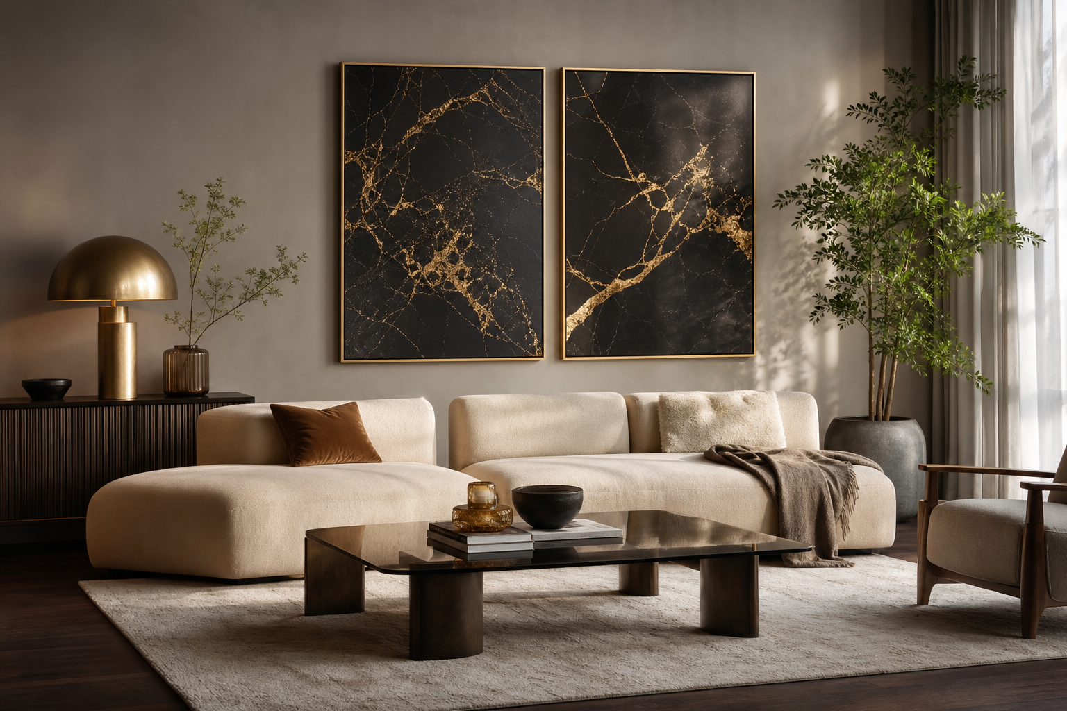
Black marble with gold veins works because it combines two signals of visual richness at once: deep contrast and reflective warmth. The black base creates weight and drama, while the gold lines introduce movement that catches the eye from across the room. In interiors, that pairing reads more polished than flat black and more contemporary than ornate gold used on its own.
This look also borrows from materials people already associate with premium spaces — hotel lobbies, cocktail bars, high-end bathrooms, and tailored modern apartments. That is why black marble with gold veins feels strong even in a simple room with only three or four key pieces. You do not need carved furniture or heavy styling around it; one well-placed print can do most of the visual work.
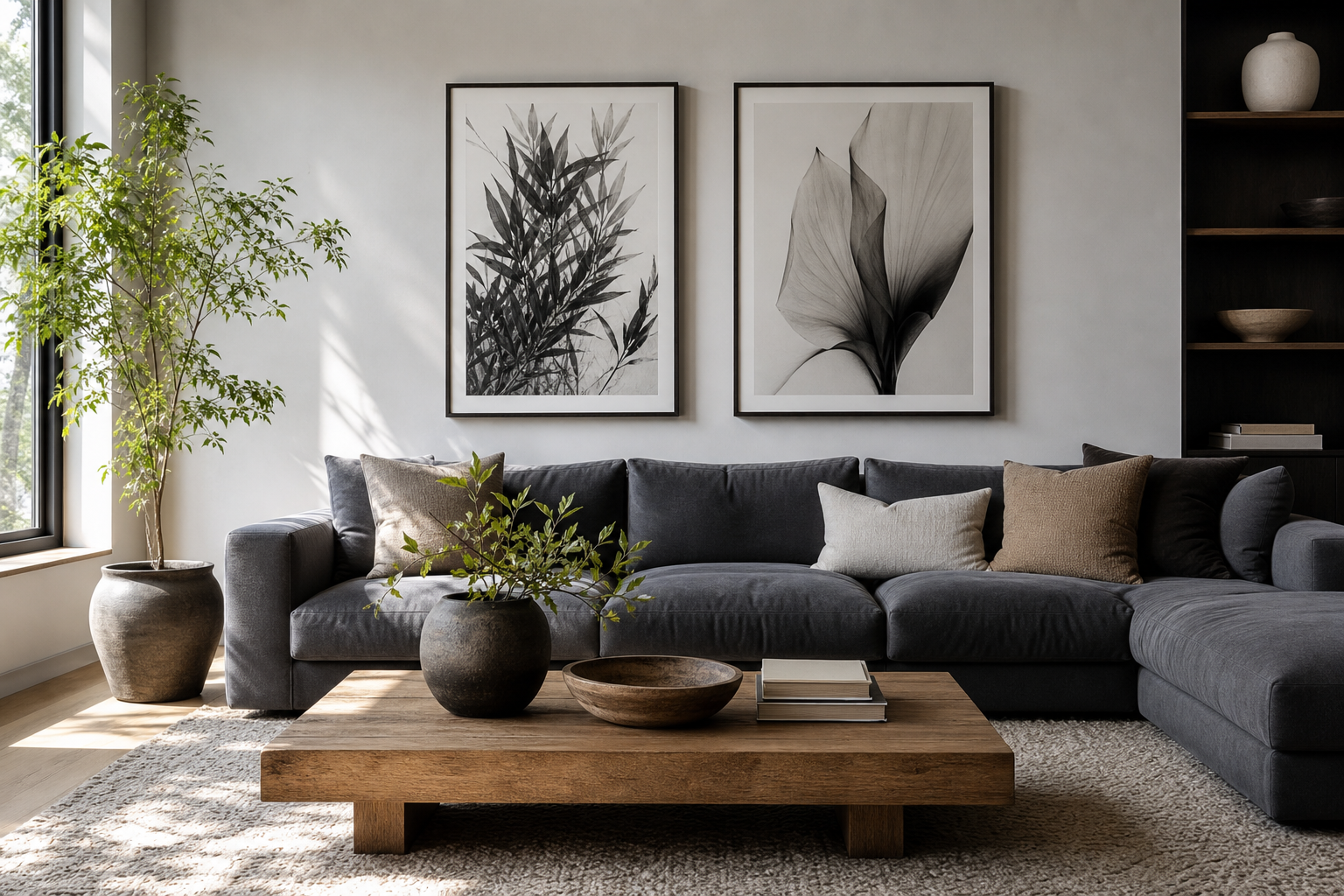
If you want to keep that luxurious mood clean rather than flashy, pair it with restrained shapes. A few minimalist art prints or crisp pieces from our abstract collection help the marble motif feel editorial instead of decorative.
Best Colour Palettes to Pair With It
The safest palette is black, ivory, warm white, and muted gold. Aim for a ratio of about 60% light neutrals, 30% dark grounding tones, and 10% metallic or high-contrast accents. That balance lets the artwork stand out without making the room feel visually heavy. Walls in soft white or pale greige work particularly well because they stop the black from flattening the space.
A second strong option is black marble paired with deep jewel tones. Forest green, aubergine, navy, and oxblood all hold their own against the dark base. Keep those shades in textiles rather than on every large surface — a velvet chair, a throw, or curtains is enough. When too many saturated tones compete with the gold veining, the result looks busy.
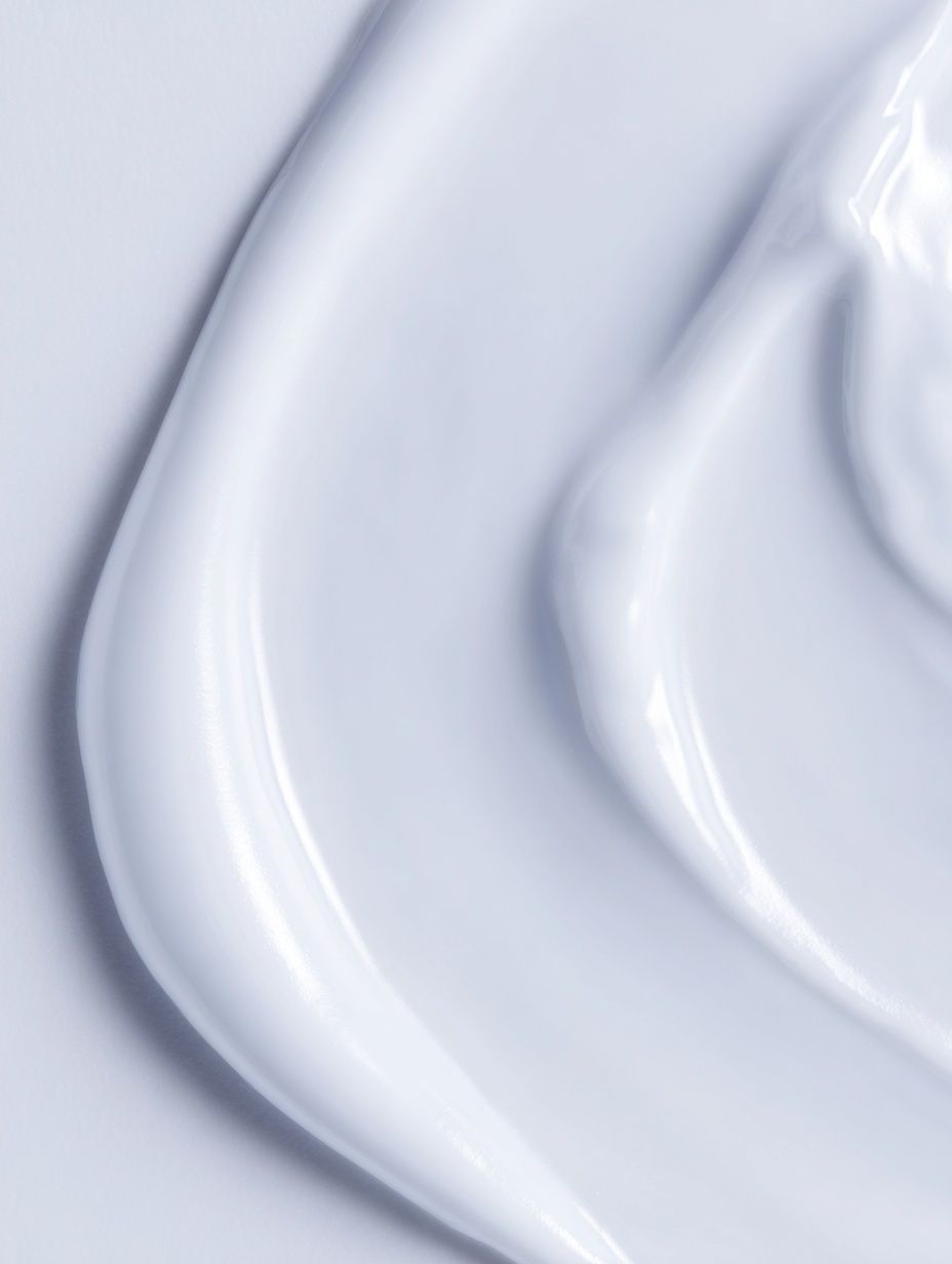
For a softer version, use chalky beige, taupe, camel, and stone. These shades make the black feel less stark and bring out the warmth in the gold. Pieces with texture are especially useful here, such as Elegant White Fabric or White Cream Texture. They echo the layered feel of marble without copying the exact pattern.



A sharper palette can also work in modern spaces: black, white, graphite, and one bright accent such as rust or cobalt. In that case, keep metallic finishes to brushed brass or antique gold rather than polished yellow gold. Matte or satin surfaces look more expensive next to marble effects than mirror-shiny ones.
Choosing the Right Size and Placement
Above a sofa, the easiest rule is to choose art that spans 60% to 75% of the sofa width. For a 200 cm sofa, that means a piece or arrangement roughly 120 to 150 cm wide. If you are hanging one statement print, leave 15 to 25 cm between the sofa back and the frame. That gap keeps the composition connected without feeling cramped.
In hallways, go vertical when the wall is narrow and horizontal when you need to visually widen the space. A hallway piece should usually sit with its centre at about 145 cm from the floor. If your ceiling is under 240 cm, avoid oversized art that nearly touches the skirting line and cornice — it can make the area feel compressed rather than grand.
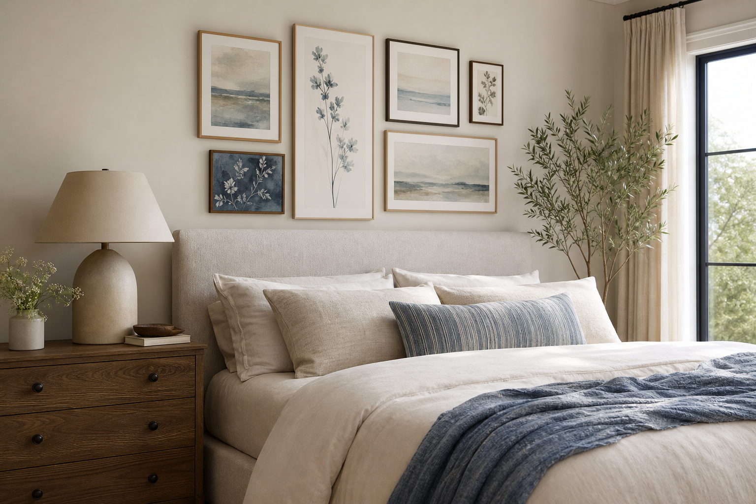
Bedrooms suit black marble with gold veins particularly well when the rest of the room is calm. Hang artwork 15 to 20 cm above the headboard, and keep bedding in solid colours rather than strong prints. In smaller bedrooms or studio flats, one medium print around 50 x 70 cm often looks cleaner than a busy gallery wall.

If your room already has bold architectural elements, scale back the art size and let the surfaces breathe. A sleek piece from Modern Luxury Villa at Dusk or the broader architecture wall art collection can pair well nearby, especially in open-plan spaces where you want visual continuity rather than one dominant focal point.

Frame Ideas That Enhance the Look
Thin black frames are the cleanest match. A width of 1 to 2 cm gives definition without stealing attention from the marble effect. This is the best option in modern apartments, monochrome rooms, and spaces with black hardware already in view — think window frames, cabinet pulls, or floor lamps.
Warm metallic frames can look excellent too, but the finish matters. Choose brushed brass, muted champagne gold, or antique bronze rather than bright reflective gold. A narrow metallic frame works better than a wide ornate one because black marble with gold veins already contains enough movement. Too much gilding around it can push the look into costume rather than luxury.
For softer rooms, oak or walnut frames create useful contrast. They stop the black from feeling severe and link the art to natural furniture tones. If you are building a mixed wall, combine the marble-inspired piece with quiet textures from Textured Fabric or Textured Waves so the finish variation feels intentional.

Room-by-Room Styling Inspiration
In the living room, use black marble artwork as the anchor above the main seating area or sideboard. Then repeat black and gold only two or three times elsewhere — for example in a lamp base, a tray, and one small cushion detail. That repetition keeps the room coherent without turning every object into a theme piece.
In bedrooms, the marble motif works best against upholstered headboards, layered bedding, and matte wall colours. Add one softening element nearby such as a boucle bench, linen curtains, or a textured cream throw. A companion print like Window with Sheer Curtain helps introduce lightness and prevents the bed wall from feeling too dark.

Kitchens and dining areas benefit from black marble styling when there is already a hard-surface story in the room — stone counters, dark cabinetry, or brass pendants. Keep the art slightly smaller here, especially if it hangs near shelving or splashback lines. Too many heavy rectangles in one zone can make practical spaces feel crowded.
Home offices can carry a darker palette well because focus-oriented rooms suit stronger contrast. Pair marble-inspired art with clean desks, black task lighting, and a restrained accessory edit. If you want a second piece on the same wall, choose something structural from Modern Minimalist Architecture or a geometric work like Sacred Geometry Black-White.
Bathrooms are one of the smartest places for this look, provided the art is framed and kept away from direct steam. Black marble with gold veins echoes taps, mirrors, and stone finishes naturally. In compact powder rooms, a single vertical print can add depth more effectively than decorative shelving.


How to Keep the Look Balanced, Not Overdone
The fastest way to make this style feel overdone is to repeat black and gold at full intensity everywhere. Instead, spread the weight across different textures. If the art is glossy-looking and dramatic, balance it with matte paint, boucle, raw wood, linen, plaster, or ribbed glass. A good room usually mixes at least three material families — hard, soft, and reflective.
Light matters more than most people expect. Black marble visuals absorb attention, so rooms need either daylight or layered artificial lighting to keep them open. Use one ambient source, one task light, and one accent light if possible. In practical terms, that might mean a ceiling fitting, a floor lamp, and a table lamp. The gold veining reads far better under warm bulbs around 2700K to 3000K than under cold white lighting.
Spacing also helps. Leave negative space around the artwork, especially if the wall colour is dark. A margin of 20 to 30 cm from shelves, sconces, or tall furniture stops the composition from feeling boxed in. If you want one more piece nearby, make it quieter — a tonal print from our fine art collection or something architectural with lighter values works better than another high-contrast statement.
Finish Strong: Simple Shop Tips for a Polished Result
When buying wall art for this scheme, look closely at finish and sharpness. Marble effects rely on crisp edges, tonal depth, and visible detail in the veining. If the print quality is muddy, the whole room loses that refined look. Choose designs with clear contrast and enough negative space around the main pattern so they read from 2 to 3 metres away.
Paper and frame finish should support the mood of the room. Smooth paper often suits sleek interiors, while slightly textured stock can soften a formal setup. If you are pairing several works, limit yourself to one dominant statement and two supporting pieces. That simple hierarchy gives black marble with gold veins room to lead.
Final thoughts
Black marble with gold veins looks best when the room around it is edited, layered, and intentional. Let the artwork bring the drama, then support it with soft neutrals, controlled metallics, and materials that add relief.
A polished result usually comes down to three decisions: the right scale, the right frame, and enough breathing room around the piece. Get those right, and even a simple interior will feel more elevated.
Frequently Asked Questions
What frame colour is safest if I am unsure?
Choose matte black. It works in nearly every setting and keeps the focus on the artwork rather than the border.
Can I mix silver hardware with black-and-gold marble art?
Yes, but keep the mix deliberate. Use gold in the art and one or two accents, then let black or silver hardware stay understated elsewhere.
What size should I choose for a narrow hallway?
A 50 x 70 cm or 61 x 91 cm vertical piece usually fits well. Leave at least 10 to 15 cm clearance from door frames or consoles so the wall does not feel crowded.
Does this style work in small rooms?
Yes — one medium piece is often enough. Keep surrounding colours light and avoid adding multiple dark decorative objects in the same area.
What other art pairs well with black marble with gold veins?
Soft textural minimal pieces, restrained geometric prints, and light architectural photography all work well. They add contrast without competing for attention.