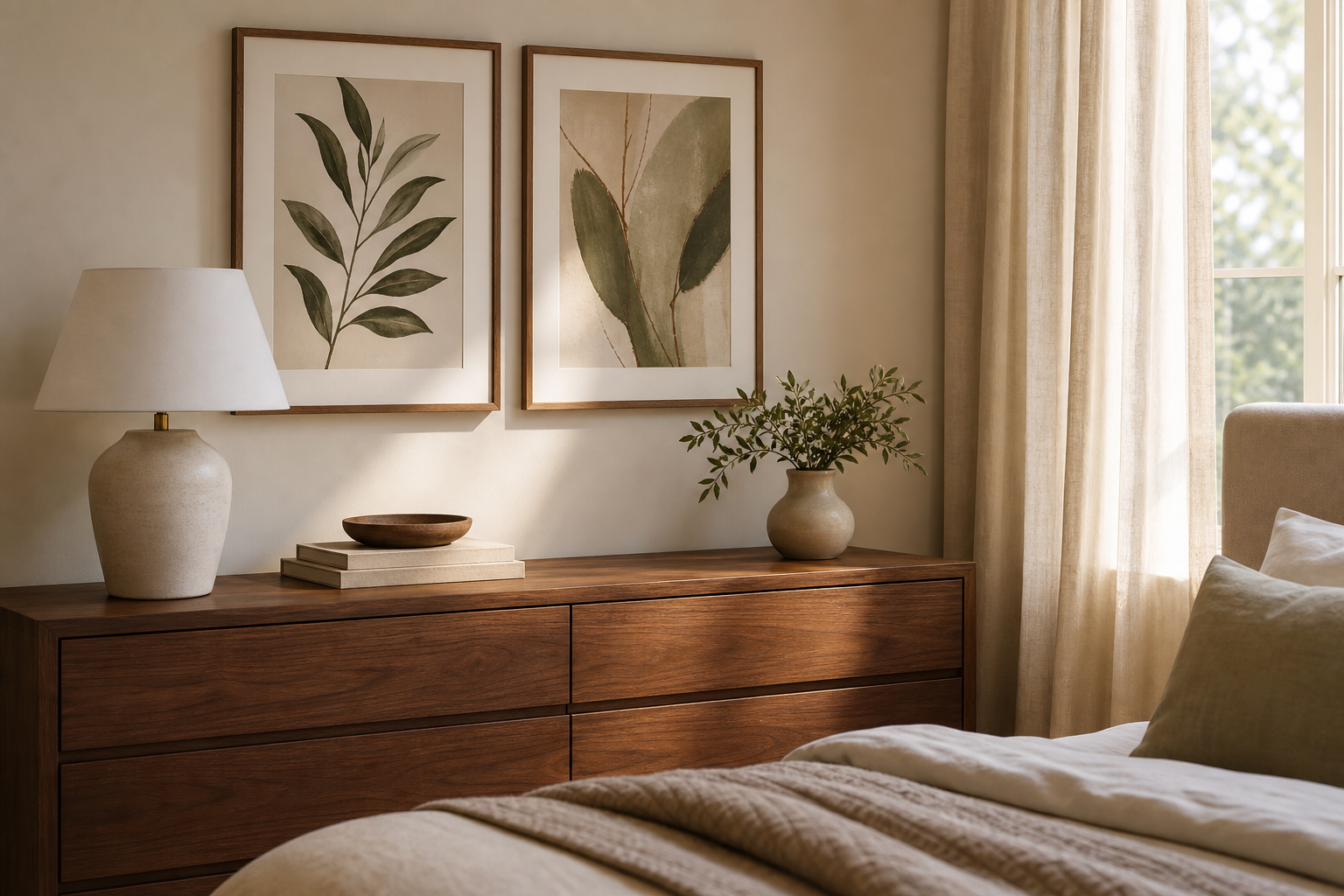
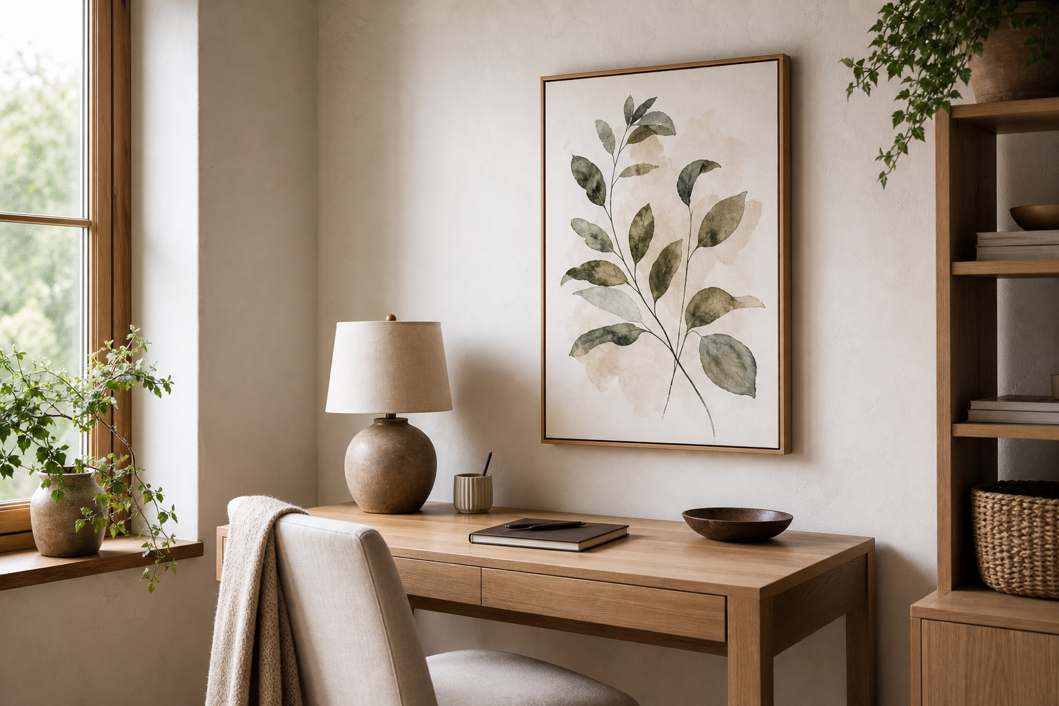
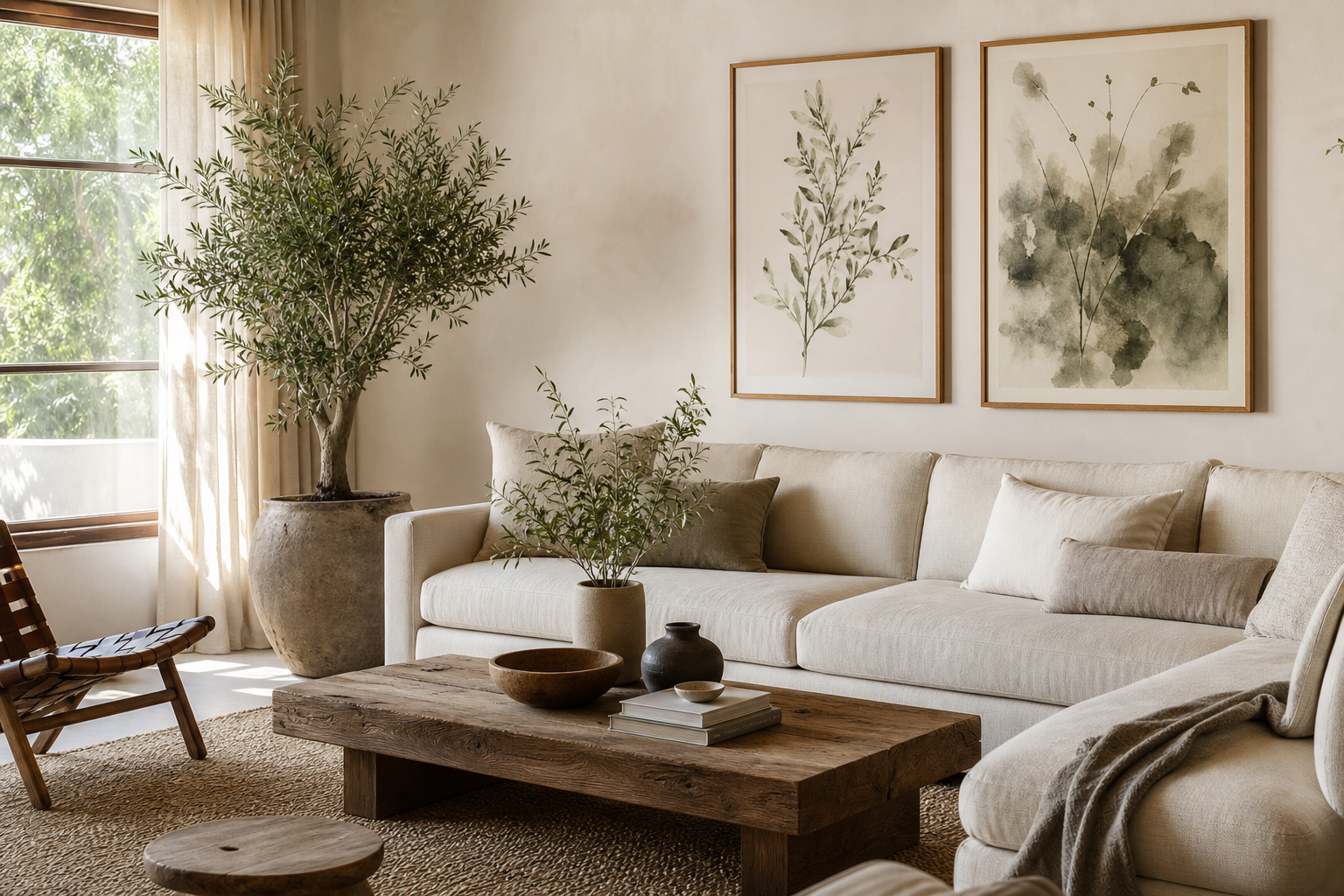
Art deco portraits work best when the room around them echoes their precision. Think strong silhouettes, polished materials, and a little contrast. The appeal of art deco portraits is their mix of glamour and structure — they feel decorative, but never careless.
What Makes Art Deco Portraits So Distinctive
Art deco portraits are defined by symmetry, elongated forms, sharp contour lines, and a sense of controlled drama. Faces are often stylized rather than naturalistic, with clean profiles, arched brows, geometric hair shapes, and backgrounds built from fans, rays, or stepped forms. That visual order is what gives them presence on a wall — even a single piece can anchor a room.
They also sit naturally between categories. If you want a softer take, look at pieces from our Vintage collection with elegant figures and restrained palettes. If you prefer a sharper, fashion-led direction, our Fashion art prints bring the same poised attitude with a more modern finish. The key is choosing portrait art that feels deliberate rather than sentimental.
A strong example is a poised female figure with a limited palette and confident silhouette. It gives you the streamlined glamour associated with deco styling without requiring a fully period room.

Choosing the Right Palette and Mood
The classic palette for art deco portraits is black, ivory, gold, emerald, burgundy, and deep navy. These combinations create contrast, and contrast is essential. A portrait with dark linework against a pale mount, or a warm figure against a charcoal wall, will read more clearly from 2 to 3 metres away.
If your room is lighter, keep the artwork sophisticated by pairing art deco portraits with mushroom, greige, stone, or warm white walls instead of stark bright white. Soft neutrals let metallic frames and rich portrait tones do the work. In a darker scheme, matte charcoal or deep olive walls can make portrait details feel richer by roughly 20 to 30 percent visually, especially under warm lighting around 2700K.

Red is particularly effective in deco-inspired spaces because it adds theatrical focus. Used once or twice — in artwork, a cushion, or a lacquered box — it sharpens the entire composition. A piece like Futuristic Woman in Red can pull a room toward deco glamour when the rest of the styling stays disciplined.

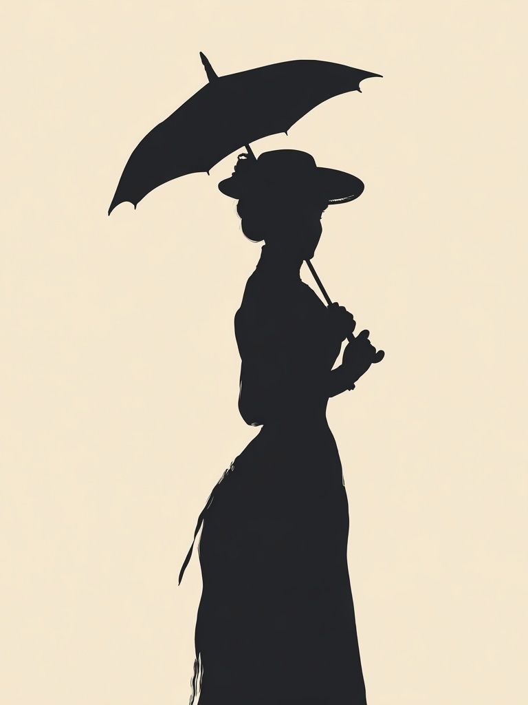
For a warmer mood, mix portrait art with muted gold, tobacco brown, blush beige, and cream. In that case, look to pieces such as Radiant Woman or Elegant Woman Silhouette. Both have enough decorative character to feel aligned with the look without turning the room into a period set.
Where Art Deco Portraits Work Best in the Home
Living rooms are the easiest place to start because art deco portraits can act as a focal point above a sofa, console, or fireplace. For a standard 200 to 240 cm sofa, aim for artwork or a grouped arrangement that spans about 60 to 75 percent of the sofa width. That usually means one large portrait at 70x100 cm, or two medium pieces at 50x70 cm each.
Bedrooms suit art deco portraits particularly well when the artwork reinforces softness with structure. Above a bed, choose one statement piece centred over the headboard, or a balanced pair with equal spacing of 7 to 10 cm between frames. Dressing areas and walk-in wardrobes are also ideal because deco portraiture naturally connects with mirrors, fashion references, and polished finishes.
Hallways benefit from narrower vertical formats. A portrait around 40x50 cm or 50x70 cm can add height to a compact wall, especially when paired with a slim brass sconce or a round mirror. If your hallway is short on daylight, use portraits with lighter backgrounds so the space does not feel compressed.

If you want portraiture that feels collected rather than themed, blend across categories carefully. A room might include one key portrait from our Elegant Portraits print, then support it with pieces from our Fine Art collection or Mid Century Modern prints that repeat the same confidence of line.
Sizing, Framing, and Finish Tips
Art deco portraits need crisp presentation. Thin black, antique gold, walnut, and brushed brass-toned frames all work well because they reinforce the graphic structure of the image. Avoid heavily distressed wood or rustic whitewash finishes — they fight the polish that this style depends on.
For sizing, use this rule: in a small wall section under 90 cm wide, stay with 30x40 cm or 40x50 cm. Above furniture between 120 and 180 cm wide, 50x70 cm is the most reliable choice. For large statement placement above a mantel or bed, 70x100 cm gives enough scale to read the portrait’s geometry clearly across the room.
Matte finishes are usually the safest option because they reduce glare from lamps and windows. If the artwork has dark blocks of colour or fine line detail, matte helps preserve legibility. Gloss can work in low-glare spaces with controlled lighting, but it tends to reflect too much in living rooms with multiple light sources. Textured paper or fine-art surfaces suit deco-inspired work when you want the piece to feel more collected and less commercial.

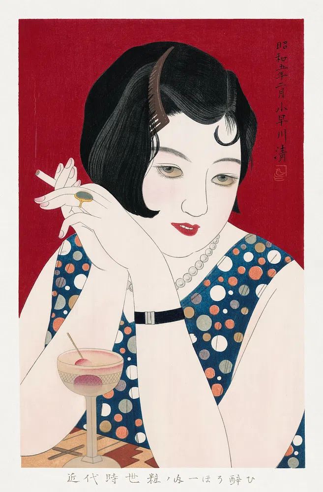
A clean example of this balance is Elegant Woman with Cocktail. In a slim gold frame with a generous off-white mount, it reads refined and architectural instead of busy.
How to Build a Gallery Wall with Deco Flair
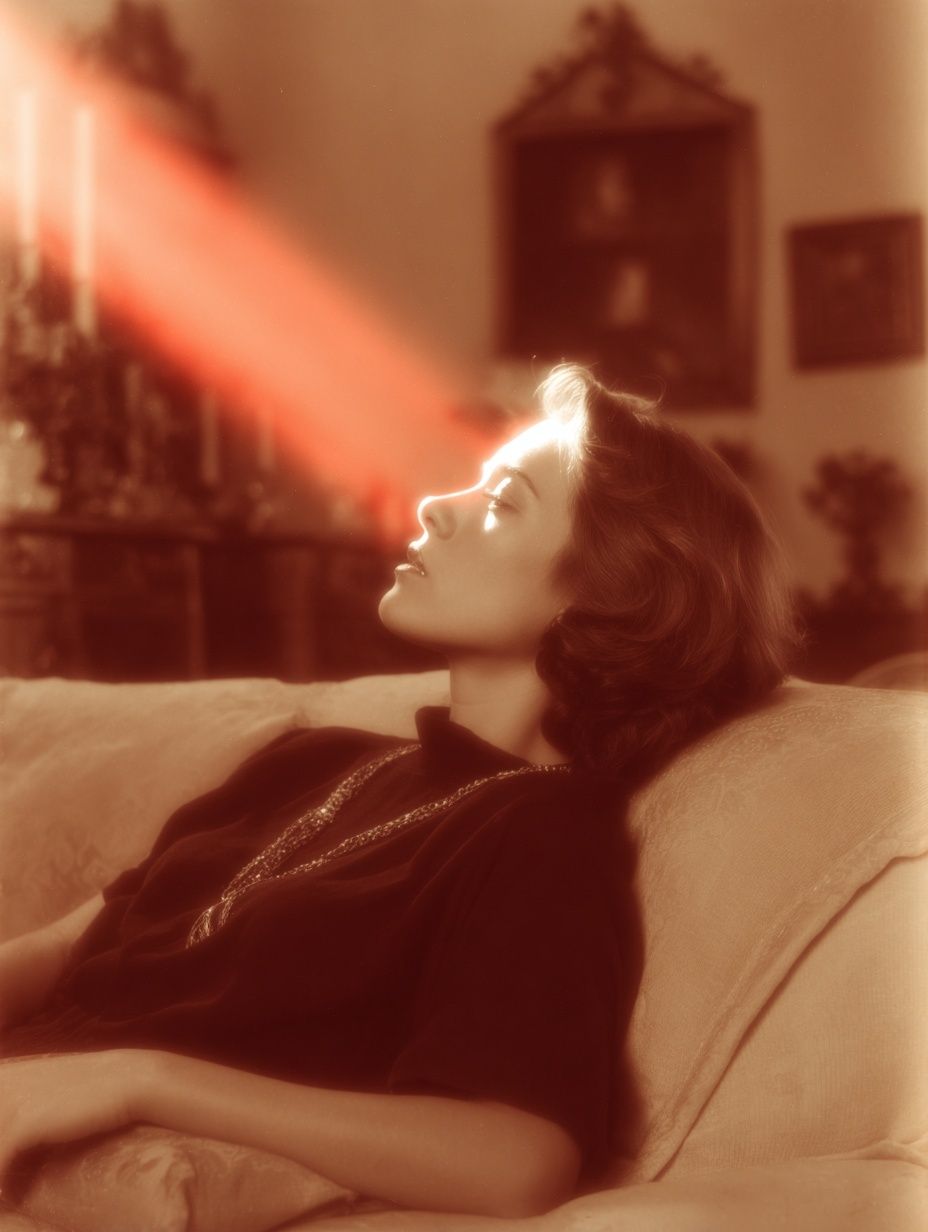
A deco gallery wall should feel edited. The best approach is 3 to 5 elements, not 9 to 12. Start with one dominant portrait, then add supporting pieces that repeat either the palette, the line quality, or the era reference. A common arrangement is one 50x70 cm hero piece, two 30x40 cm companions, and a mirror or sculptural wall object.
Mirrors are especially useful because they are authentically deco. A rounded, fan-edged, or geometric mirror breaks up the paper surfaces and adds light bounce. Abstract works also help — especially if they echo arcs, rays, checkerboard, or stepped architecture. For cleaner pairings, browse our Minimalist collection and choose pieces with strong negative space rather than soft organic forms.
One effective combination is a fashion-led portrait beside a more classic vintage figure. That mix stops the wall from feeling costume-like. A piece such as Retro Fashion Portrait can add a sharper edge next to a softer vintage print.

Keep spacing consistent. Use 6 to 8 cm between small and medium frames, or 8 to 10 cm if you are mixing a mirror with artwork. Align either the centre line or the outer edges — random placement rarely suits deco styling because the whole movement relies on order.
Styling Ideas for a Modern Look
The easiest way to keep art deco portraits current is to limit the number of decorative references in the room. If the art is glamorous, the furniture should stay simple: curved sofa, plain headboard, pedestal side table, or streamlined desk. Let one or two materials carry the luxury — velvet, marble, smoked glass, or brass — rather than layering all four in equal measure.

Lighting matters more than most people expect. Art deco portraits look best with directional light that creates a little contrast on the wall surface. A picture light, shaded table lamp, or wall sconce placed 20 to 30 cm from the frame edge can make dark tones feel deeper and metallic elements look cleaner. Keep bulb warmth around 2700K to 3000K so skin tones and gold frames stay flattering.
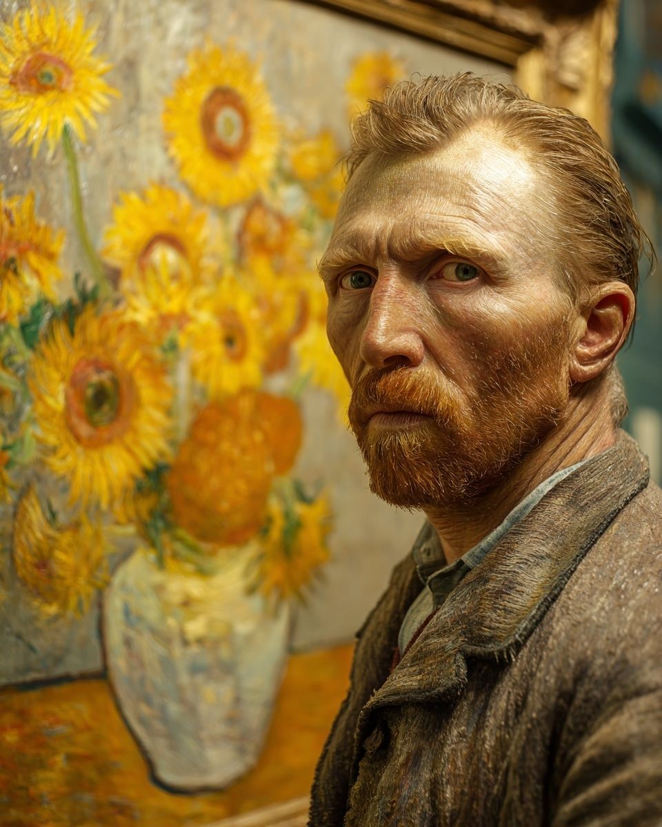
To modernize the look further, mix in one unexpected element. That might be a contemporary boucle chair, a crisp black floor lamp, or a minimal sideboard beneath a classic portrait. If you want a bridge between eras, Freckled Portrait Mid-Century is a smart companion piece — still portrait-led, but more relaxed in shape and color handling.
Final Styling Notes and Shop-Ready Tips
Art deco portraits succeed when the room gives them contrast, structure, and enough breathing space. Choose a palette with depth, hang at a scale that suits the furniture, and keep frames sharp and intentional. One excellent portrait in the right position will usually outperform a crowded wall of vaguely matching pieces.
Before you buy, check three things: wall width, viewing distance, and existing metal finishes. If the art will hang above furniture, keep the bottom of the frame roughly 15 to 25 cm above it. If the room already has chrome, black, or brass accents, match the frame to the dominant finish rather than introducing a third or fourth metal. That is what makes art deco portraits feel integrated rather than added late.
Frequently Asked Questions
What frame color works best for art deco portraits?
Black and antique gold are the most reliable choices. Use black for sharper contrast and gold when you want a softer, dressier finish.
Can I style art deco portraits in a small apartment?
Yes — choose one vertical piece in 40x50 cm or 50x70 cm and keep the surrounding decor simple. Small spaces benefit from one strong focal point instead of several competing accents.
Should I use a mat mount around the artwork?
An off-white mat is useful for portrait art with dark edges or detailed linework. It adds visual breathing room and makes medium-size prints feel more substantial.
What other decor pairs well with deco-style portrait art?
Smoked glass, ribbed lighting, marble trays, and geometric mirrors all work well. Stick to 2 or 3 accent materials so the room stays polished rather than busy.
How high should I hang portrait art in a hallway or dressing area?
Use eye level as your guide — the centre of the artwork should sit around 145 to 150 cm from the floor. If it hangs above a console, leave about 15 to 20 cm between the furniture and the frame.