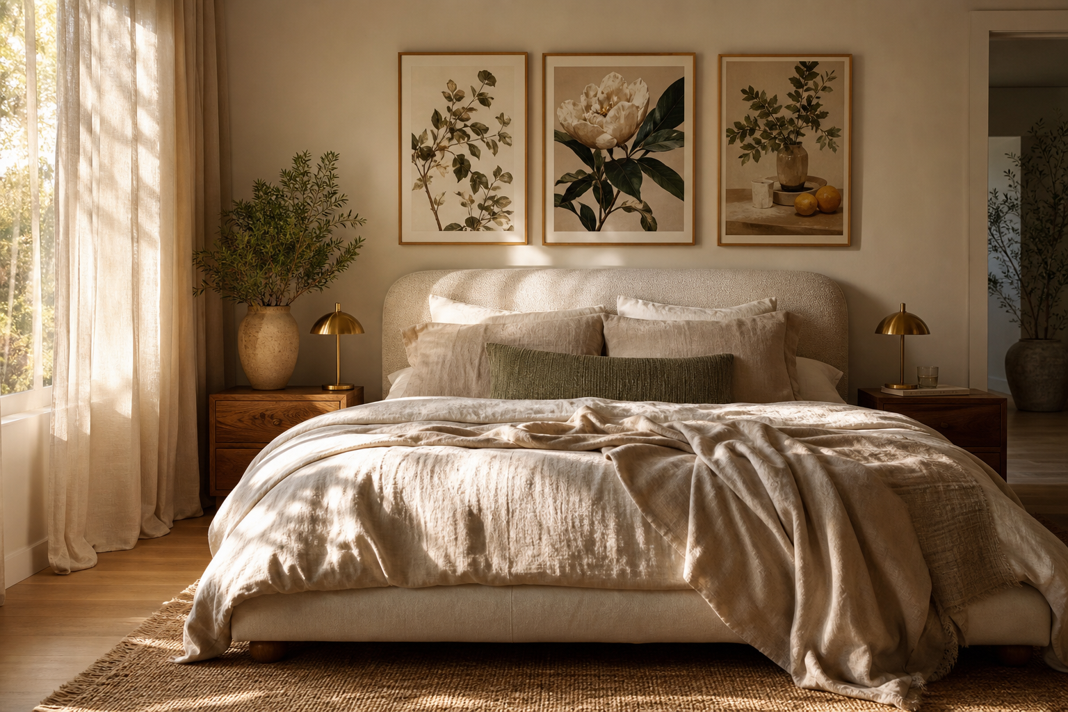
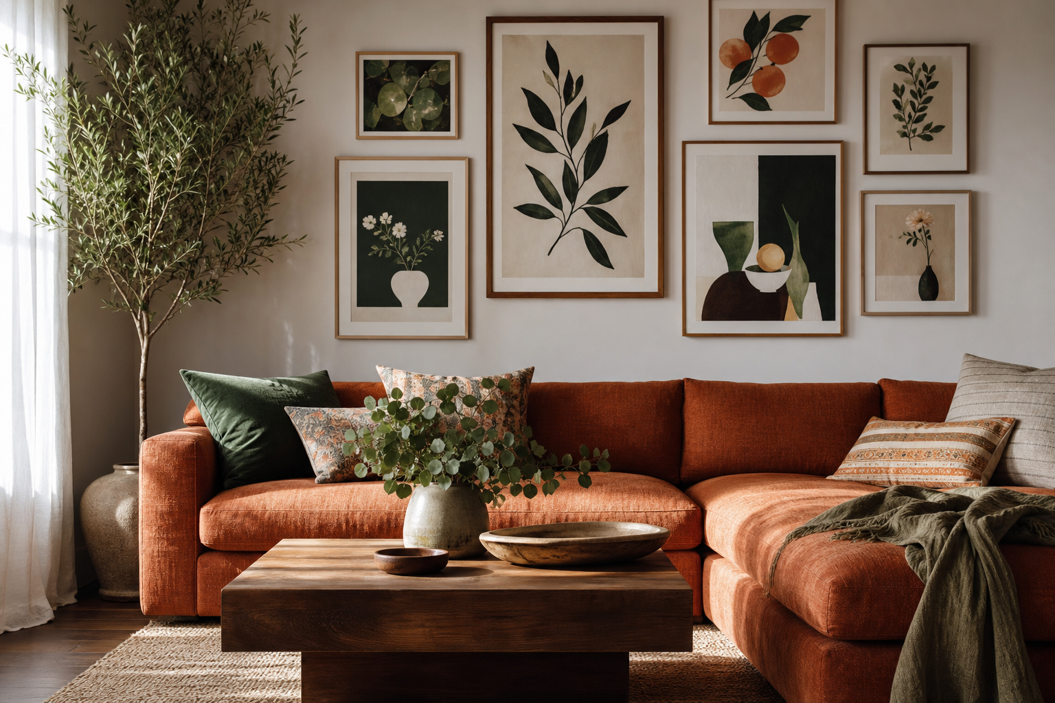
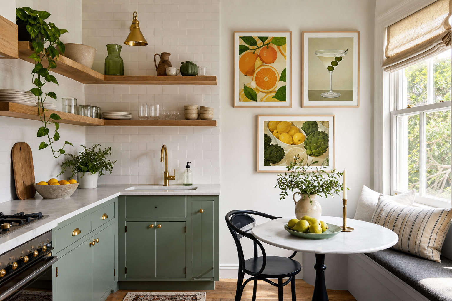
Well-styled communal areas do more than fill blank walls. The right approach to food drink for the office makes a kitchen, coffee point, or lunch room feel intentional, easier to use, and noticeably more welcoming within a few seconds of entering. In offices where desks are highly functional and meeting rooms stay restrained, the break area is often the one place that can carry more warmth, color, and personality without looking unprofessional.
Why Office Break Spaces Deserve Better Styling
A break space works best when it signals a clear shift from task mode to recharge mode. Even a small 2 x 3 metre kitchenette feels better when the walls support that purpose. Food imagery, drink references, and light typographic pieces help employees read the room quickly — this is where you pause, reset, and return with more focus. That visual cue matters in hybrid offices, where company culture is often communicated through shared spaces rather than daily rituals.
Most office kitchens are built from hard surfaces: laminate cabinetry, stone counters, glass splashbacks, and stainless steel appliances. Those materials are durable, but they can also make the room feel cold. Framed wall art softens the edges. A pair of 40 x 50 cm prints above a bench or one 50 x 70 cm focal piece near a dining table can add enough contrast to balance the practical finishes.
If the room is used by clients or visitors, styling also becomes part of brand perception. A sparse, neglected coffee station suggests the space is an afterthought. A curated arrangement using pieces from our Food Drink collection or clean text-based works from our Typography collection feels more considered. That does not require a full redesign — often 3 to 4 coordinated frames, better placement, and a tighter color palette are enough.

Choosing the Right Food and Drink Artwork
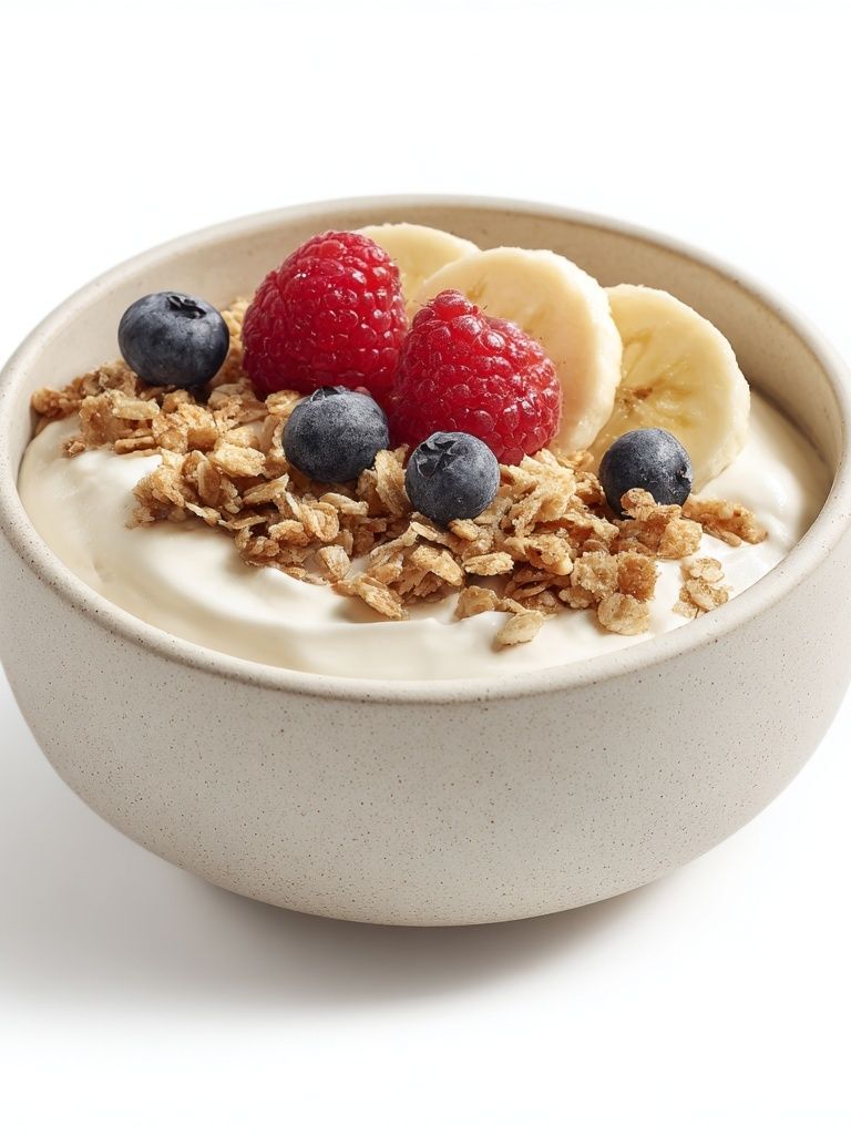
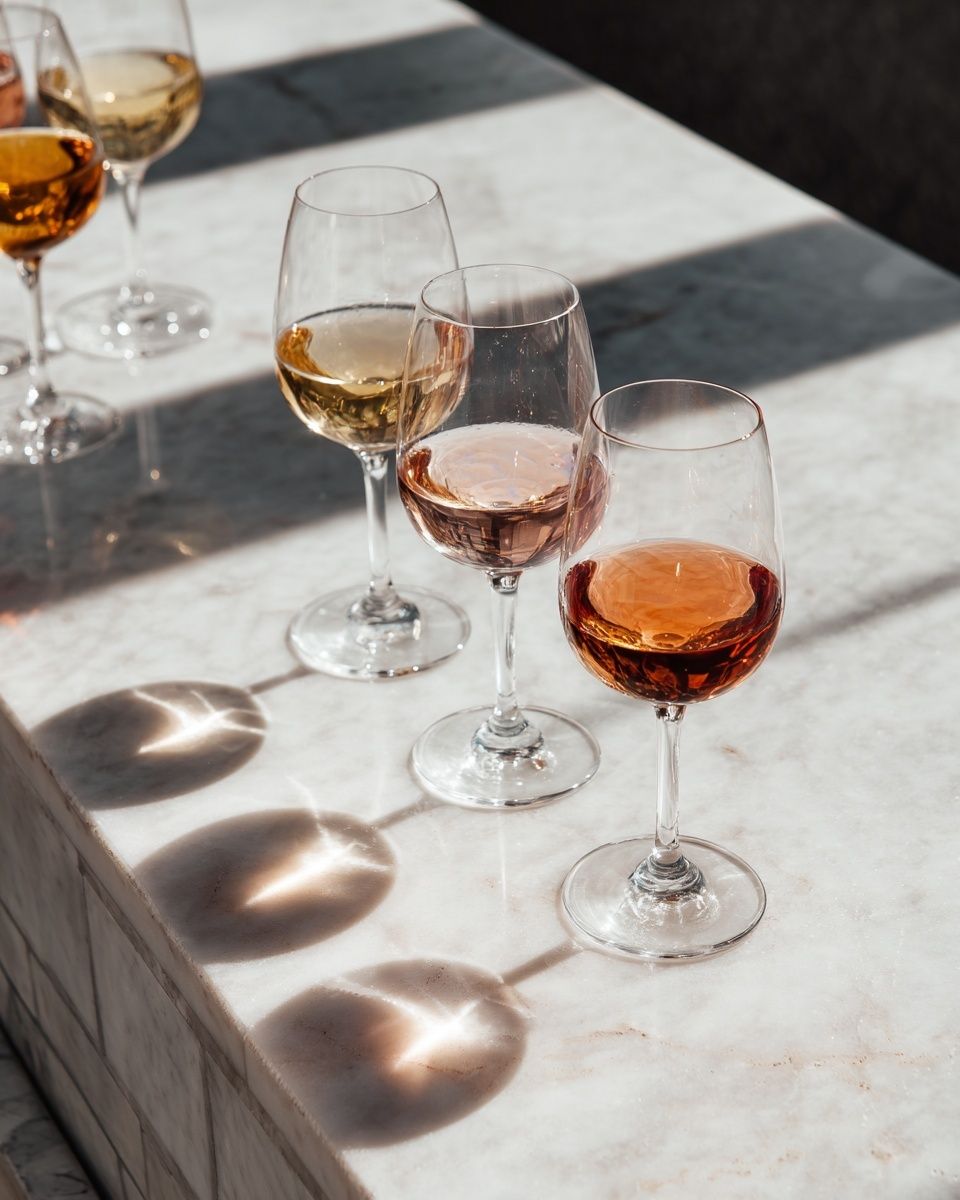
The best subjects for office use are familiar, upbeat, and broad enough to suit different tastes. Coffee, citrus, pastries, pasta, fruit, wine still lifes, and simple cocktail illustrations all work well because they feel social rather than personal. In a shared space, that matters. You want art that encourages ease, not pieces so specific that they dominate the room.
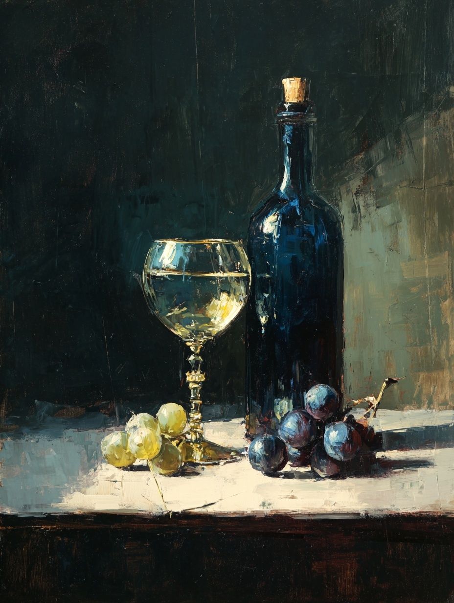
For a casual creative office, illustrated drink pieces and brighter food photography can bring energy to a coffee corner or canteen wall. For a quieter corporate setting, choose cleaner compositions with more negative space. A restrained fruit print, a still-life bottle composition, or a subtle typography design tends to sit well with standard office finishes like white walls, charcoal flooring, and ash wood tables. If you want a polished place to start, browse minimalist art prints for softer compositions, then mix in one stronger food-led piece for character.
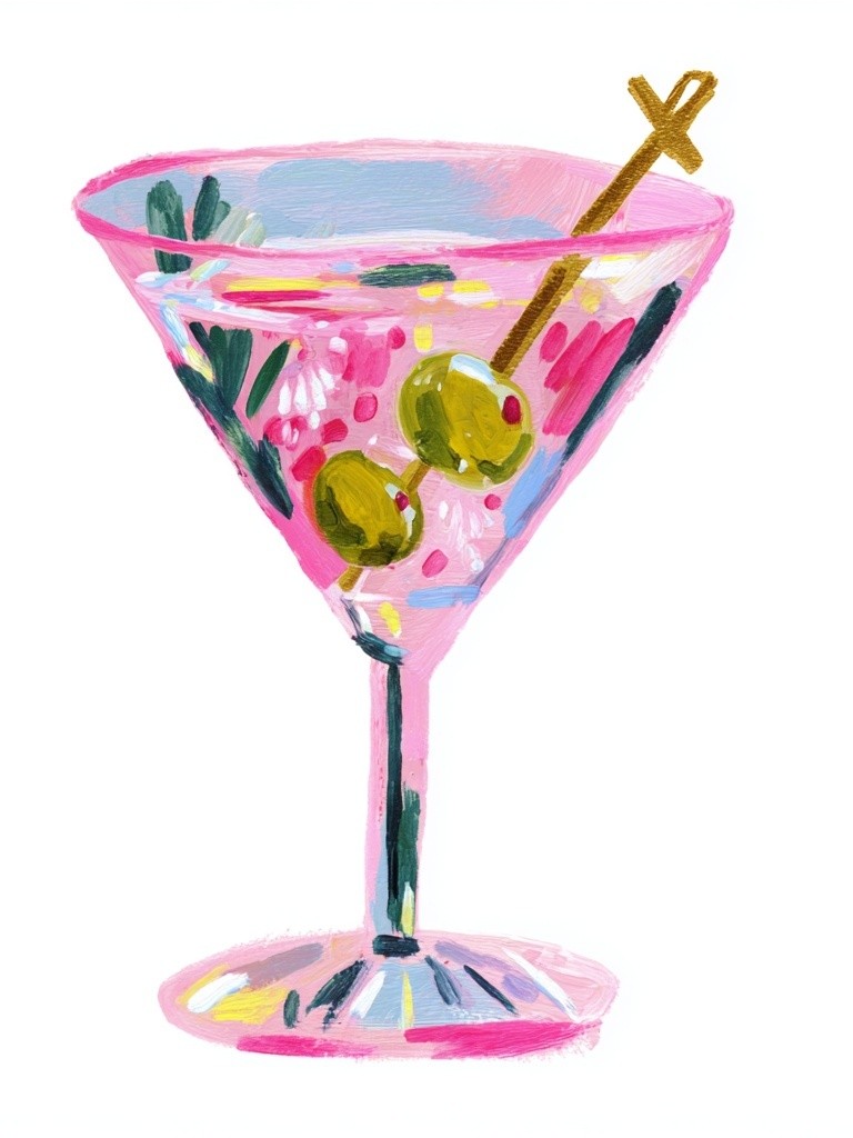
Tone should match the brand. A startup with colorful furniture can handle playful work such as Pink Martini or a retro-inflected typographic accent. A law office or consultancy usually benefits from still lifes and quieter visuals, such as Wine Bottle and Glass or fruit photography with a neutral background. If your office already uses brand colors in upholstery or signage, repeat one of those tones in the artwork rather than introducing five new shades.
A good rule is 70/20/10. Keep 70% of the wall styling neutral, 20% tied to your existing materials, and 10% more expressive. In practice, that might mean black frames, off-white mats, oak furniture, and one accent print with coral, olive, or burgundy. This keeps food drink for the office feeling curated rather than decorative for decoration's sake.

Best Placement for Kitchens, Coffee Corners, and Lunch Rooms
Placement should follow sightlines first, then wall size. The strongest position is usually the wall people face while waiting — above the coffee machine zone, opposite the sink, or next to a shared table. In a narrow galley kitchen, one vertical 50 x 70 cm piece often works better than two small frames because it reads quickly without creating visual noise. In a wider lunch room, a row of three 30 x 40 cm prints spaced 6 to 8 cm apart gives better rhythm.
Do not hang artwork too close to steam, splashes, or food prep. Leave at least 20 to 30 cm between the edge of a frame and a countertop backsplash, and avoid positioning unprotected art directly above kettles or toasters. In shared kitchens, durable glazed frames are worth it because they can be wiped down weekly. This is especially important in high-traffic offices where 20 to 50 people may use the room each day.

For walls above seating, hang the centre of the composition at roughly 145 cm from the floor. If the art sits above a sideboard, bench, or banquette, keep the bottom edge 15 to 25 cm above the furniture. That distance looks intentional and helps the arrangement feel connected to the room. In open-plan offices with several break points, repeat one framing style across all areas so different rooms still feel related.
Colours and Styles That Work in Professional Spaces
Professional does not have to mean bland. The best office-friendly palettes usually sit in one of three directions: warm neutrals, muted vintage tones, or crisp color blocks with plenty of white space. Warm neutrals work well in Scandinavian-style interiors with light timber and matte black hardware. Vintage food and bar imagery suits more characterful spaces — especially rooms with checkerboard flooring, café tables, or deeper wall colors.
If the room already has strong materials, choose simpler art. For example, a kitchen with green cabinetry and terrazzo counters may look better with pared-back pieces from our Minimalist collection or selective works from our Typography wall art. If the room is plain — white walls, grey flooring, standard joinery — vintage and illustration styles can do more of the heavy lifting.
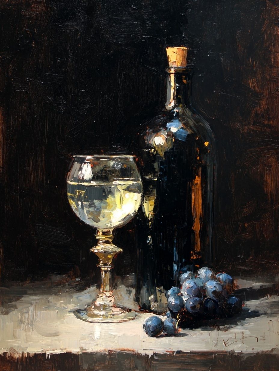
Black, oak, and white frames cover most office needs. Black gives contrast and structure, oak softens the room, and white frames are useful when walls are darker than usual. In practical terms, black frames tend to suit photography and bold illustration, while oak works especially well with vintage art prints and natural food subjects. If you are mixing styles, keep the frame finish identical across the set.
How to Create a Cohesive Look Across the Office
Consistency matters more than matching. A cohesive office does not need the same print repeated in every room, but it should use a shared visual language. That can be one repeated frame color, one dominant palette, or one subject family — food, drink, and light typography across all communal areas. When those elements recur, the office feels planned rather than pieced together over time.
A practical setup is to assign one mood per zone. Keep the coffee point slightly more energetic with drink-led images and brighter hues. Make the lunch room warmer and calmer with food photography or still-life pieces. Add one lighter text-based print in a corridor or refill station to bridge the spaces visually. Collections like our food and drink wall art pair especially well with subtle sign systems and neutral furniture because they add character without fighting for attention.

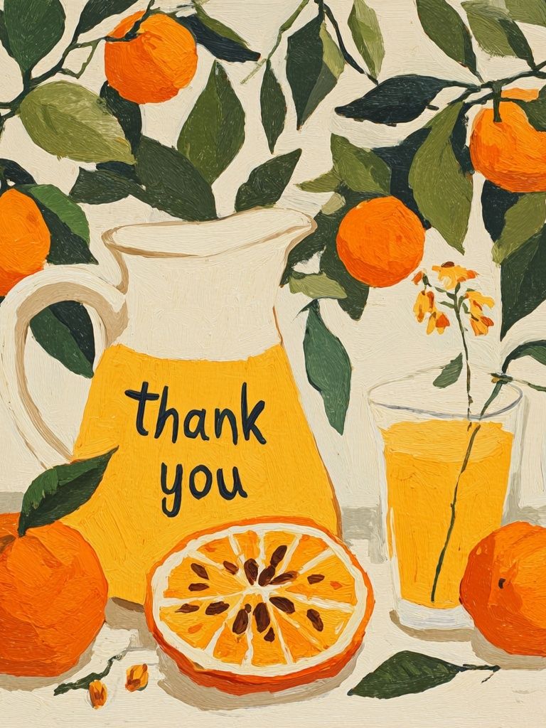
You can also use repetition in layout. If one office kitchen has two stacked 30 x 40 cm frames, mirror that approach in another floor's pantry using different images in the same sizes. That kind of structure is useful in larger workplaces because it creates recognisable zones without becoming repetitive. For more graphic spaces, a product such as Orange Still Life Thank You can bridge food imagery and typography in one piece.
Quick Styling Tips for a More Inviting Break Area
Use one large piece when the wall is under 120 cm wide. Use two medium pieces when the wall is 140 to 180 cm wide. Use a gallery of three or four only when the room has enough breathing space around it. Small crowded walls filled with too many frames make a break area feel busier, not better.
Symmetry is your safest choice in professional settings. Two matching 40 x 50 cm frames above a bench, or three aligned 30 x 40 cm pieces above a dining table, usually look cleaner than an informal salon wall. If you want variety, mix subject matter rather than frame size — for example, one drink still life, one fruit print, and one typographic design in identical frames.
Choose materials that can handle routine cleaning. Aluminium or sealed wood frames with acrylic or glass fronts are better than unprotected paper pinboards in kitchens. In high-use areas, non-glare glazing is worth considering because overhead strip lighting can create harsh reflections on standard glass.

One final tip: leave some blank wall. A break room does not need every surface filled. If 25% to 40% of the visible wall area stays clear, the artwork has room to work and the whole space feels calmer.
Final thoughts
Good break-room styling is rarely about adding more. It is about choosing the right scale, the right subject, and the right placement so the room feels easier to use. Food drink for the office works best when it reflects how the space actually functions — quick coffee stops, shared lunches, and small pauses between meetings.
Start with one wall, one frame finish, and one clear mood. Then build from there using coordinated pieces from our Food Drink range and supporting designs from our Typography selection or Vintage collection. The result is not just better decor — it is a better shared space.
Frequently Asked Questions
What frame size works best for a small office kitchen?
For compact kitchens, 30 x 40 cm or 40 x 50 cm usually works best. One larger piece is often cleaner than several small frames on a narrow wall.
Are food and drink prints suitable for formal offices?
Yes, if the imagery is restrained. Still lifes, fruit studies, and minimal typography feel polished enough for professional settings.
What frame finish is easiest to maintain in a shared break room?
Black aluminium and sealed oak-style frames are practical because they wipe clean easily. Use glazed fronts to protect the artwork from moisture and cooking residue.
Can I mix typography with food imagery in the same space?
Yes — keep the palette tight and the frame style consistent. A ratio of two image-based pieces to one typographic piece usually feels balanced.
How high should artwork hang above a coffee station or sideboard?
Keep the bottom of the frame about 15 to 25 cm above the furniture. That gap looks connected without feeling cramped.