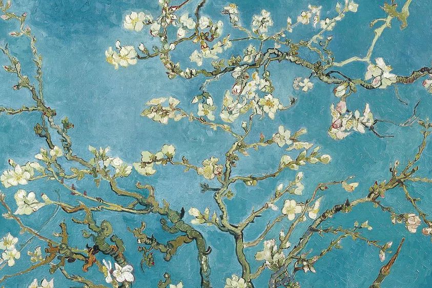
A blossom in blue poster print does two jobs at once: it brings floral detail into a room, and it introduces blue in a softer, less predictable way than a solid accent wall or bold upholstery. The result feels calm, decorative, and considered. Blue blossom imagery also bridges styles easily, sitting just as naturally near classic wood furniture as it does beside cleaner contemporary lines.
Why Blue Blossom Artwork Feels So Fresh
Blue reads as restful because it visually lowers intensity in a room. In interiors, soft to mid-tone blue can make a space feel up to 15% lighter and more open, especially when paired with white, oat, sand, or pale grey. Blossom imagery adds movement and detail, so the art never feels flat. That mix of calm colour and organic form is exactly why a blossom in blue poster print works in both decorative and minimal settings.
If your room already has neutral basics, blossom art introduces pattern without the heaviness of dense geometric prints. Delicate petals, branches, and painterly edges soften straight furniture lines and hard materials like metal, glass, or concrete. A piece such as Almond Blossom — Fine Art Print is especially effective when you want something floral that still feels grown-up and gallery-led.
Blue floral art also layers well with related categories. If you like a quieter wall, combine blossom pieces with selections from our minimalist art prints. If you want a more decorative composition, explore our botanical collection or tonal landscapes from the nature range. This is one of the strongest advantages of blue blossom artwork: it coordinates widely without becoming generic.
Choosing the Right Room for the Look
Bedrooms are the most natural setting for this style because blue supports a slower visual rhythm. Above a 140 to 180 cm bed, a single 50x70 cm or 70x100 cm print creates a clear focal point without crowding the wall. Keep the art width at roughly 60% to 75% of the bed width for balance. In this setting, blossom imagery feels especially effective when repeated in textiles through one or two small accents only — such as a blue-edged cushion or a washed cotton throw.

Living rooms suit blossom art when you want a softer focal point than a bold abstract. Above a 200 cm sofa, aim for art that spans 120 to 150 cm total — either one statement piece or two coordinated frames. If the room already includes textured bouclé, oak, and chalky paint, a blossom print prevents the scheme from looking too flat. Pair it with a textural abstract print or a gentle landscape from Serene Landscape — Watercolor Print for a layered but still airy wall.
Hallways and home offices benefit from blue blossom artwork for a different reason: it keeps narrow or task-driven spaces from feeling severe. In a hallway, 30x40 cm or 40x50 cm works well above a console. In an office, place the print within your eyeline but not directly behind a monitor to reduce visual competition. A blossom piece near a desk pairs well with White Flower Silhouette — Minimalist Print if you want a tighter, cleaner composition.

How to Pair It with Colour and Texture
The easiest palette with blue blossom art is a 60-30-10 ratio: 60% warm neutral base, 30% supporting materials, 10% blue accents. Think off-white walls, light timber furniture, and touches of slate, denim, or dusty blue. This keeps the artwork in charge instead of forcing it to compete with the room.
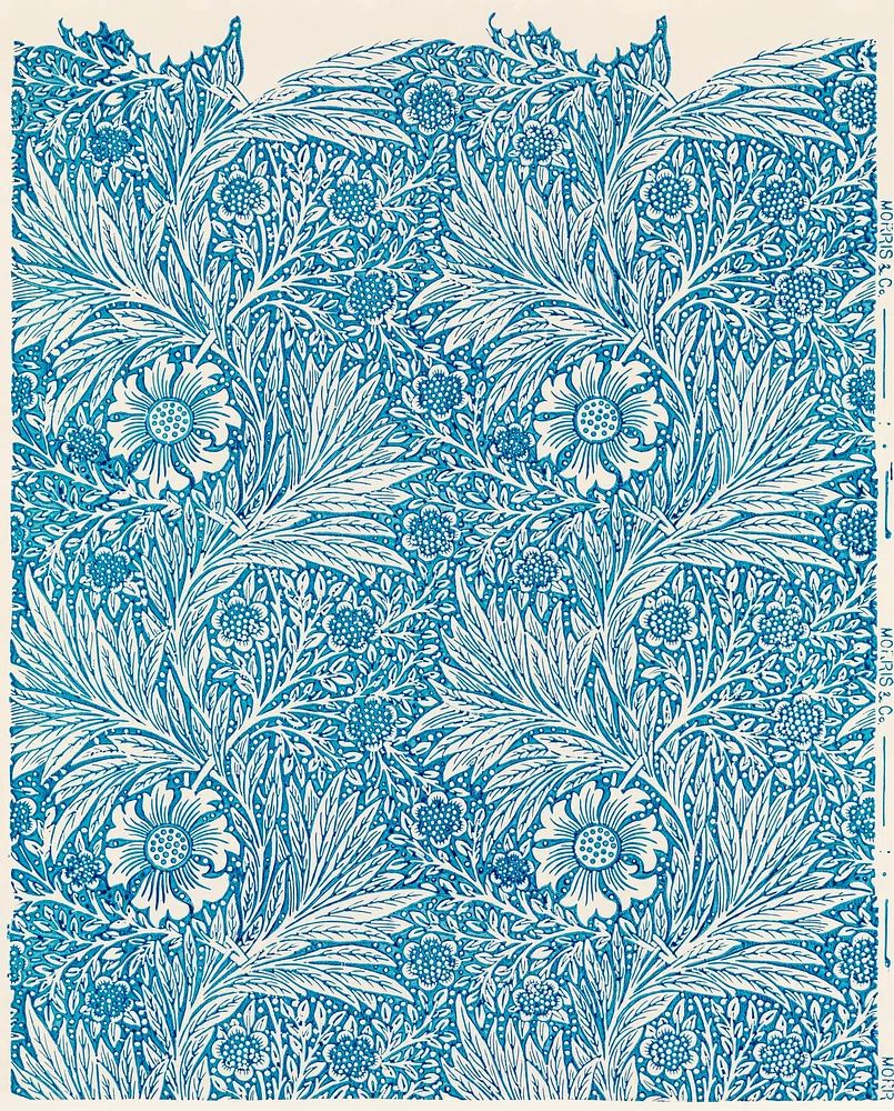
For more contrast, use the print against greige, mushroom, or muted olive. Those shades make blue petals stand out while still feeling natural. If you want the floral note to feel more classic, combine it with antique brass, walnut, and detailed textiles. A strong reference point is William Morris 's (1834-1896) Blue, which proves that blue botanical pattern can carry more depth when supported by richer materials.


Texture matters as much as colour. Washed linen, matte ceramics, limewashed walls, ribbed glass, and light oak all echo the softness of floral painting. High-gloss finishes and overly saturated colours tend to fight the mood. If your room needs a modern edge, introduce one crisp material only — for example, a slim black side table or a steel floor lamp — and let the art provide the organic detail.
Sizing and Placement Tips That Make It Shine
A solo blossom print usually looks best when given breathing room. Leave 15 to 25 cm between the top of a sofa and the bottom of the frame. When hanging above a console or sideboard, keep the art centered and make the total arrangement around two-thirds the width of the furniture below. Standard eye-level placement is 145 cm from the floor to the center of the frame, but above furniture you should adjust slightly lower for better connection.
If you prefer a gallery wall, build around the blossom piece as the anchor. Start with the largest work at 50x70 cm, then add smaller companions in 30x40 cm or 40x50 cm. Keep spacing consistent at 5 to 8 cm between frames. One successful mix is a blue floral hero print, one tonal landscape, one minimalist floral silhouette, and one subtle abstract. That gives you variation in subject while maintaining a linked palette.

Smaller rooms often benefit from one larger print rather than several small ones. A 70x100 cm piece can make a compact wall look cleaner because it reduces visual breaks. If you have a long hallway or staircase wall, use two matching 50x70 cm frames side by side with 7 cm spacing for a more architectural look. The blossom in blue poster print feels strongest when the placement is simple and intentional.
Framing Ideas for a Polished Finish
White frames sharpen blue petals and brighten the whole composition. They work well in Scandinavian-style rooms, especially when walls are warm white rather than stark brilliant white. Choose a frame width of 1.5 to 2 cm for a clean look. Add a white mount if the artwork has intricate blossom detail and you want more visual pause around the image.
Natural wood frames pull blue blossom art toward a softer, more lived-in direction. Oak and ash suit pale blue pieces particularly well because they warm the scheme without muddying it. This is a smart choice when the room includes woven textures, beige upholstery, or timber floors. If you already have several wood finishes in the room, keep the frame pale rather than red-toned to avoid clutter.

Slim black frames give floral art a more graphic outline. They are useful in home offices, hallways, or modern living rooms where you need a little structure. Black is best when repeated elsewhere at least once — in a lamp, table leg, window frame, or hardware. For a decorative blue botanical story, you can also borrow ideas from William Morris's vintage chrysanthemum flower and other pieces in our fine art collection that balance intricate detail with controlled framing.

Shop the Blossom in Blue Look
When choosing your final piece, focus on how much detail your room needs. If the space is plain and tonal, a more painterly floral work adds life. If the room already has patterned upholstery, rugs, or curtains, choose a blossom print with more open background space so it reads clearly from 2 to 3 metres away. That is often the difference between a room feeling curated and a room feeling busy.
A blossom in blue poster print also works best when the blue already appears somewhere else in a restrained way — one cushion, a book spine, a glazed vase, or a throw is enough. For a layered wall, start with Almond Blossom — Fine Art Print as the main floral note, then add supporting pieces from our abstract collection or watercolour nature prints. Keep the palette soft, the spacing even, and the framing consistent.
Final thoughts
A blossom in blue poster print is one of the easiest ways to make a room feel calmer without stripping it of personality. It introduces colour, movement, and softness in a format that works across bedrooms, living rooms, hallways, and workspaces.
The styling formula is straightforward: choose the right scale, keep surrounding colours muted, repeat blue lightly, and frame the piece with intention. Once those elements are in place, the artwork carries the room with very little effort.
Frequently Asked Questions
What wall colour works best if I already have a blue blossom print?
Warm white, light greige, pale taupe, and soft sage are the safest choices. They keep the blue clear and prevent the floral detail from looking cold.
Should I use a mount around floral artwork?
Use a mount if the print has fine detail or if you want a more gallery-like finish. A 5 to 7 cm white mount gives the image more space and makes mid-size frames feel more substantial.
Can blue blossom art work in a room with dark furniture?
Yes — it often looks sharper against walnut, smoked oak, or black-stained wood. Add one lighter element nearby, such as a linen lamp shade or pale ceramic vase, to keep the balance right.
What glass finish is best for framed floral prints?
Anti-glare acrylic or glass is ideal in bright rooms because it reduces reflections without dulling colour. Standard clear glazing works well in lower-light spaces and often gives slightly crisper contrast.