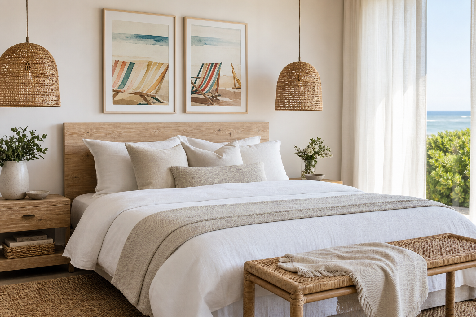
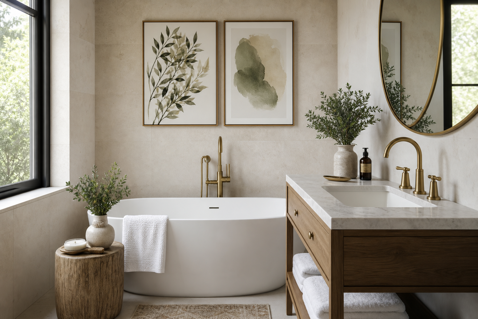
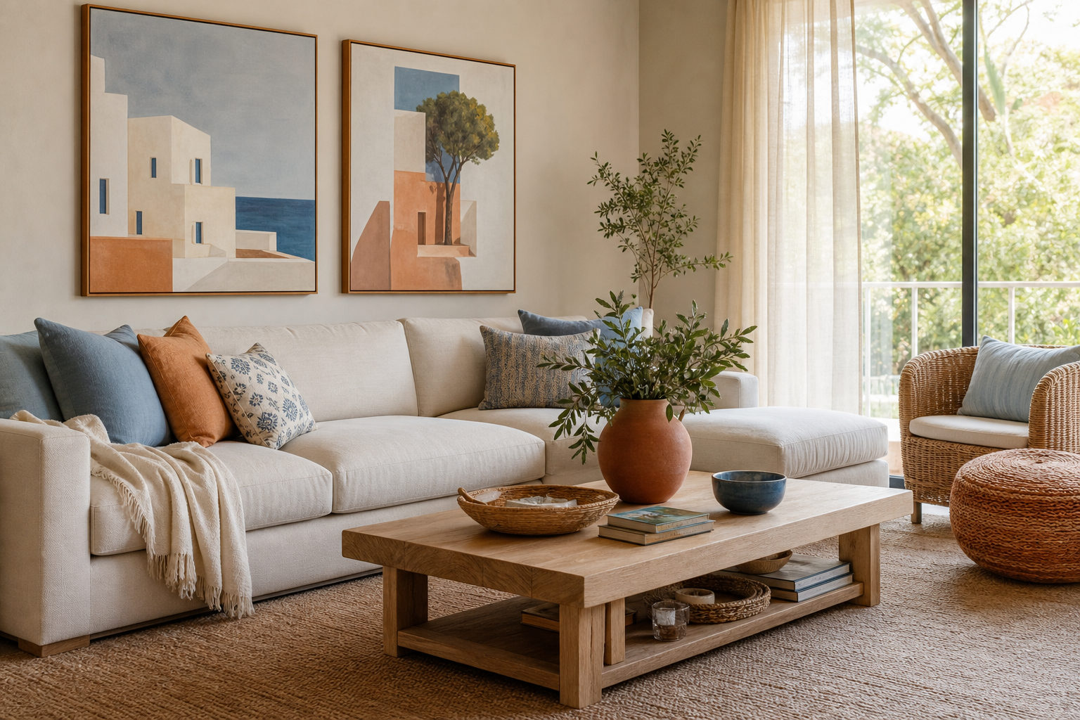
A beach chair poster print does one job exceptionally well: it makes a room exhale. The image carries built-in stillness — open sky, low horizon lines, simple seating, and the suggestion of time spent outdoors with nowhere urgent to be. That calm reads clearly in interiors, especially when a room already uses natural fibres, white walls, or muted blue accents.
Why a Beach Chair Poster Print Feels So Relaxed
The motif works because it balances structure and softness. A chair gives the eye a clear focal point, while the beach setting keeps everything loose and airy. That combination suits both clean, pared-back rooms and more nostalgic spaces with weathered wood, striped textiles, or vintage coastal references. If you want a similar easygoing seaside atmosphere, Mediterranean beach photography captures the same open-air calm in a more panoramic format.
A beach chair poster print also avoids the problem of overdecorated coastal art. Instead of ropes, anchors, and obvious marine symbols, it hints at the coast through composition. That makes it easier to live with year-round. In a neutral room, the subject feels restful rather than seasonal — more "summer house restraint" than novelty beach decor.
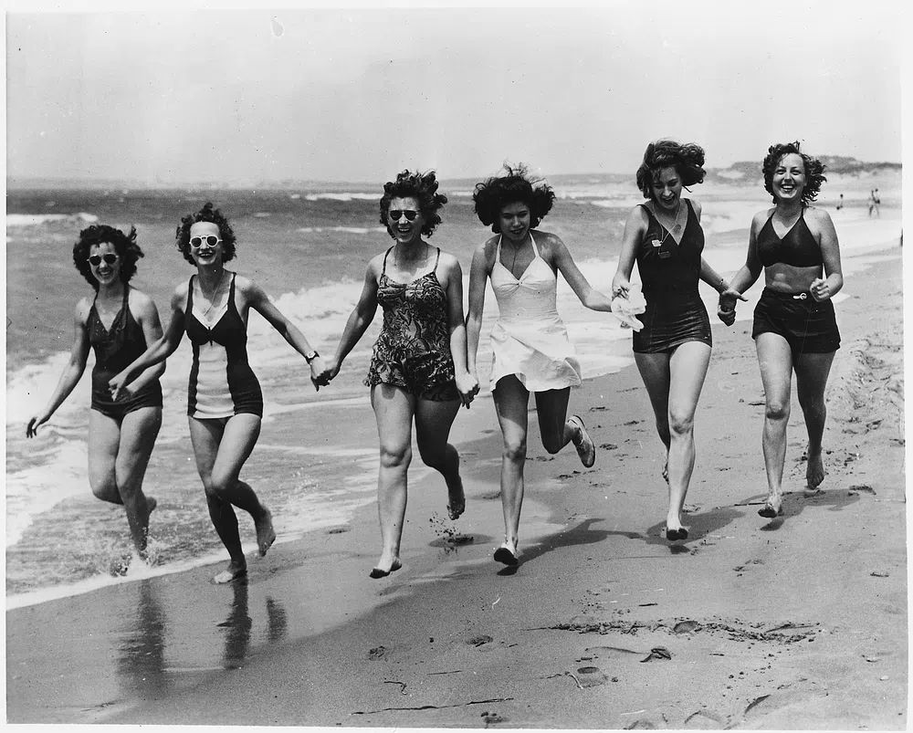
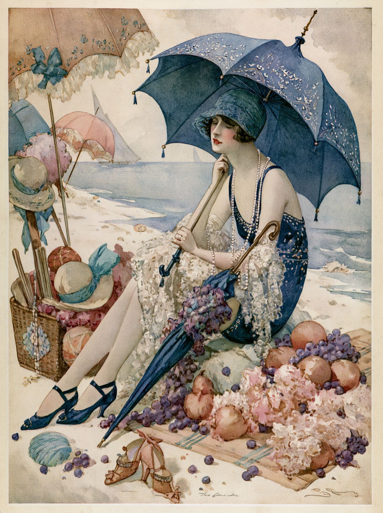
Vintage versions bring a slightly different mood. They add sun-faded colour, retro swimwear, or postcard styling that feels collected rather than staged. If that is the direction you prefer, Tropical Beach Postcard Vintage Print and Beach Scene — Vintage Print lean into a softer, nostalgic coastal look without becoming kitsch.
Choosing the Right Colour Palette
A good coastal palette starts with sand, salt, and sky. That usually means 60% neutrals — off-white, oat, driftwood, pale beige — then 30% soft blue or sea-glass green, with 10% deeper contrast such as navy, charcoal, or faded black. A beach chair poster print in these tones slips easily into Scandinavian, coastal, and relaxed contemporary rooms.
If your home is already light and minimal, choose artwork with low contrast. Pale dunes, white beach chairs, washed-out timber, and misty blue water keep the visual rhythm gentle. This works particularly well with Vinyl Beach Dreamscape Print, which introduces a dreamier beach mood and soft tonal blending.
For a crisper scheme, blue-and-white is the easiest route. Pair navy-striped cushions, white walls, and a slim oak or white frame. That combination feels fresh in bathrooms, breakfast nooks, and narrow hallways because it reflects light well and keeps the room looking clean. If you want more punch, brighter summer palettes — coral, turquoise, lemon, and saturated aqua — can work in small doses, especially in holiday homes or guest rooms. Keep one colour dominant and limit strong accents to 2 or 3 elements so the wall does not compete with rugs, throws, and ceramics.

A useful rule is to match the artwork to the room's warm or cool bias. Sandy beiges, cream mats, and sun-faded yellows suit warmer interiors with rattan and honey-toned wood. Sea blue, crisp white, and greyed driftwood tones fit cooler spaces with chrome, pale oak, or stone surfaces. When in doubt, repeat one colour from the art at least twice elsewhere in the room — once in textiles, once in a smaller accessory.
Best Sizes and Placements for the Home
Scale changes the effect of coastal art more than most people expect. A 30x40 cm print feels intimate and works well on a shelf, in a bathroom, or as part of a mixed wall. A 50x70 cm format is the easiest all-rounder for bedrooms and hallways. Above a sofa or bed, 70x100 cm has enough presence to hold the wall on its own, especially if the furniture is at least 180 cm wide.
In bedrooms, hang the artwork 15 to 25 cm above the headboard for a calm, grounded look. In hallways, keep the centre of the frame at roughly 145 cm from the floor, or a little lower if the corridor is narrow and you want the wall to feel more connected to consoles and benches. Bathrooms can handle smaller prints, but choose a frame with acrylic glazing or keep the piece away from direct steam if ventilation is poor.

Living rooms benefit from either one substantial beach image or a measured pair. If you are styling above a 200 cm sofa, aim for art that covers around 60% to 75% of the sofa width. That means one 100x140 cm statement piece, or two 50x70 cm works hung with 5 to 8 cm between them. For a coordinated wall,



Framing Ideas That Enhance the Look
Frames control whether coastal art feels polished or casual. Natural oak is the most versatile choice because it echoes driftwood, floors, and woven materials without looking too themed. White frames sharpen blue tones and feel clean in bathrooms or bright modern spaces. Black works best when the print includes stronger contrast or when the room needs a bit more visual structure.
Matting is worth using when you want the artwork to feel more elevated. A white or warm ivory mat around 4 to 6 cm wide gives a beach chair poster print breathing room and helps modest sizes look more substantial. For small prints — 30x40 cm especially — a mat can make the piece feel closer to a 40x50 cm visual presence on the wall.
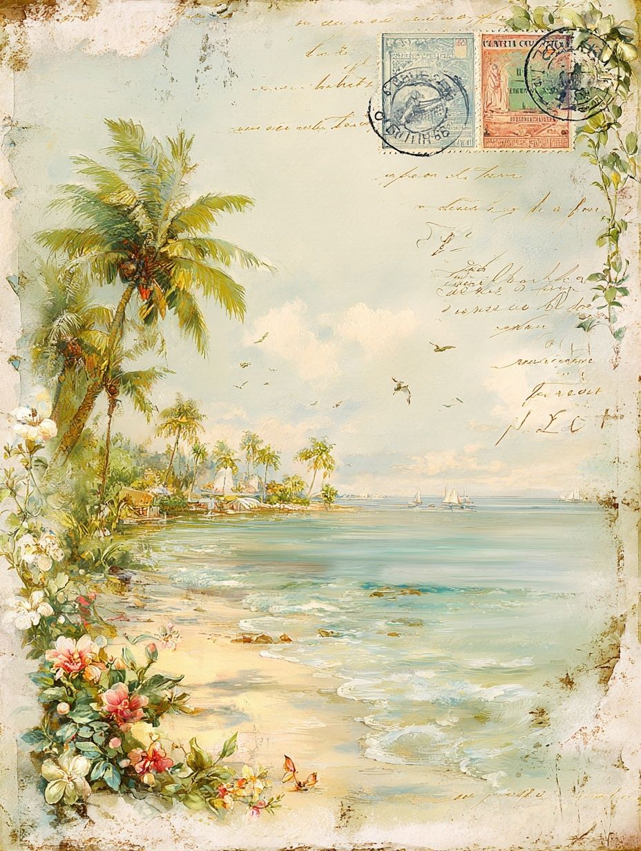
Paper texture matters too. Smooth paper looks crisp and contemporary, which suits architectural beach scenes or minimal photography. A slightly textured fine-art surface adds softness and works beautifully with faded postcard imagery and painterly beach compositions. If your room already includes a lot of texture — boucle, jute, slub linen — keep the frame finish simple so the wall does not become visually busy.

How to Style It with Other Coastal Pieces
The easiest pairing strategy is one hero image plus supporting pieces that vary in subject and scale. A beach chair scene works well with wave photography, sun-faded vintage beach imagery, or one abstract print in seafoam and sand tones. What you want to avoid is repeating the same motif three times — that turns a curated arrangement into a themed set too quickly.
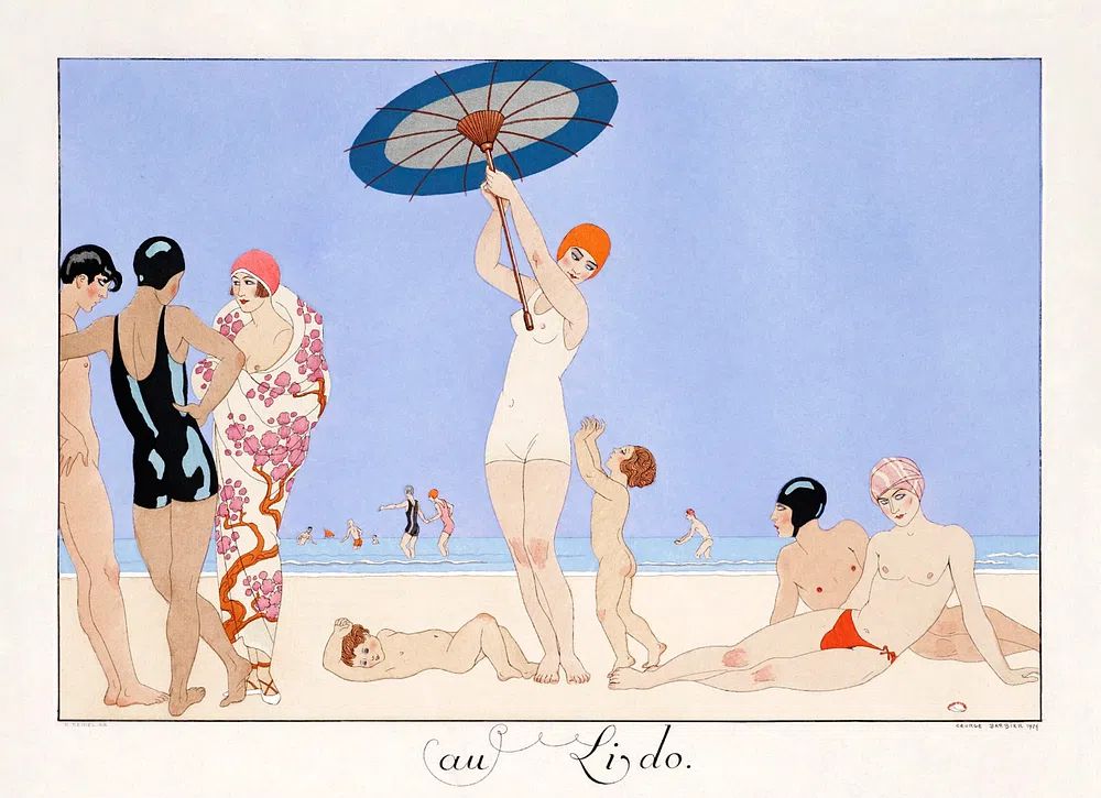
Try a three-piece wall with one larger beach chair print, one horizontal shoreline image, and one smaller vintage piece. Keep spacing between 5 and 7 cm, and repeat frame colour across all three. If you prefer a collected wall on picture ledges, overlap frames slightly and mix heights, but limit the palette so the arrangement still feels calm. Women beach (1930–1945), vintage postcard is a strong companion when you want a human element, while Local Ocean Isle Beach Surf Poster adds a more graphic, destination-style note.
One practical styling rule: for every obvious coastal item, include one plain grounding element. If the wall has beach art, use a solid ceramic lamp rather than a shell-shaped accessory. If the room has striped cushions, choose a simple woven basket instead of more printed textiles. The goal is 70% calm foundation, 30% coastal detail.
When a Beach Chair Print Works Best
This kind of wall art is especially effective in spaces that need a mental reset. Guest bedrooms, reading corners, bathrooms, and entryways all benefit from imagery that lowers visual noise. A beach chair poster print can also soften urban apartments, where the contrast between city life and a coastal image creates a welcome pause.
It is also a strong seasonal layer that does not need to be packed away in autumn. In summer, pair it with lighter linen, blue glass, and striped textiles. In cooler months, keep the art and swap the styling around it — thicker throws, darker wood, and muted ceramics still work because the image itself remains quiet and timeless. For gifting, coastal prints are particularly good for summer birthdays, holiday-home owners, and housewarmings where the recipient prefers neutral decor over bold trend pieces.
If you are styling a second home or rental by the sea, beach imagery helps establish place fast. Use one larger print in the main living area and smaller supporting works in bedrooms or hallways. That repetition creates continuity without needing every room to match exactly.
Wrap-Up: Simple Tips for a Coastal Wall That Lasts
A lasting coastal wall comes down to restraint. Choose one strong beach chair image, keep the palette to 2 or 3 main tones, and use natural materials — oak, linen, jute, ceramic — to support the art rather than compete with it. A beach chair poster print works best when the room around it stays edited and light.
If you want the look to stay fresh over time, change the surrounding accents before you change the art. Swap cushion covers, move a smaller companion print, or update the frame finish from white to oak. The artwork keeps the room anchored, while the styling around it can shift with the season.
Frequently Asked Questions
What frame size should I choose for a 50x70 cm beach print?
A standard 50x70 cm frame works well, but adding a mat means sizing up to 61x91 cm or similar depending on the border width. A 4 to 6 cm mat gives the image a more finished, gallery-style look.
Does coastal wall art work in a bathroom?
Yes, especially in powder rooms and well-ventilated bathrooms. Use acrylic glazing or hang the frame away from direct steam to protect the print.
Should I choose oak, white, or black for beach-themed artwork?
Oak is the most flexible and natural-looking option. White feels crisp and airy, while black is best if the room needs stronger contrast or more definition.
Can I mix a beach chair print with non-coastal art?
Yes — pair it with abstracts in sand, blue, or off-white for a less literal look. Shared colour and frame style matter more than matching subject matter.
What is the easiest way to hang a small coastal gallery wall straight?
Start by laying the arrangement on the floor and keeping gaps consistent at 5 to 7 cm. Mark the centre line on the wall first, then build outward from the largest frame.