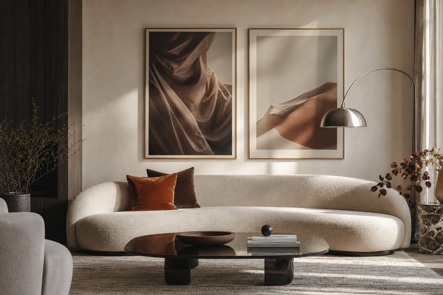
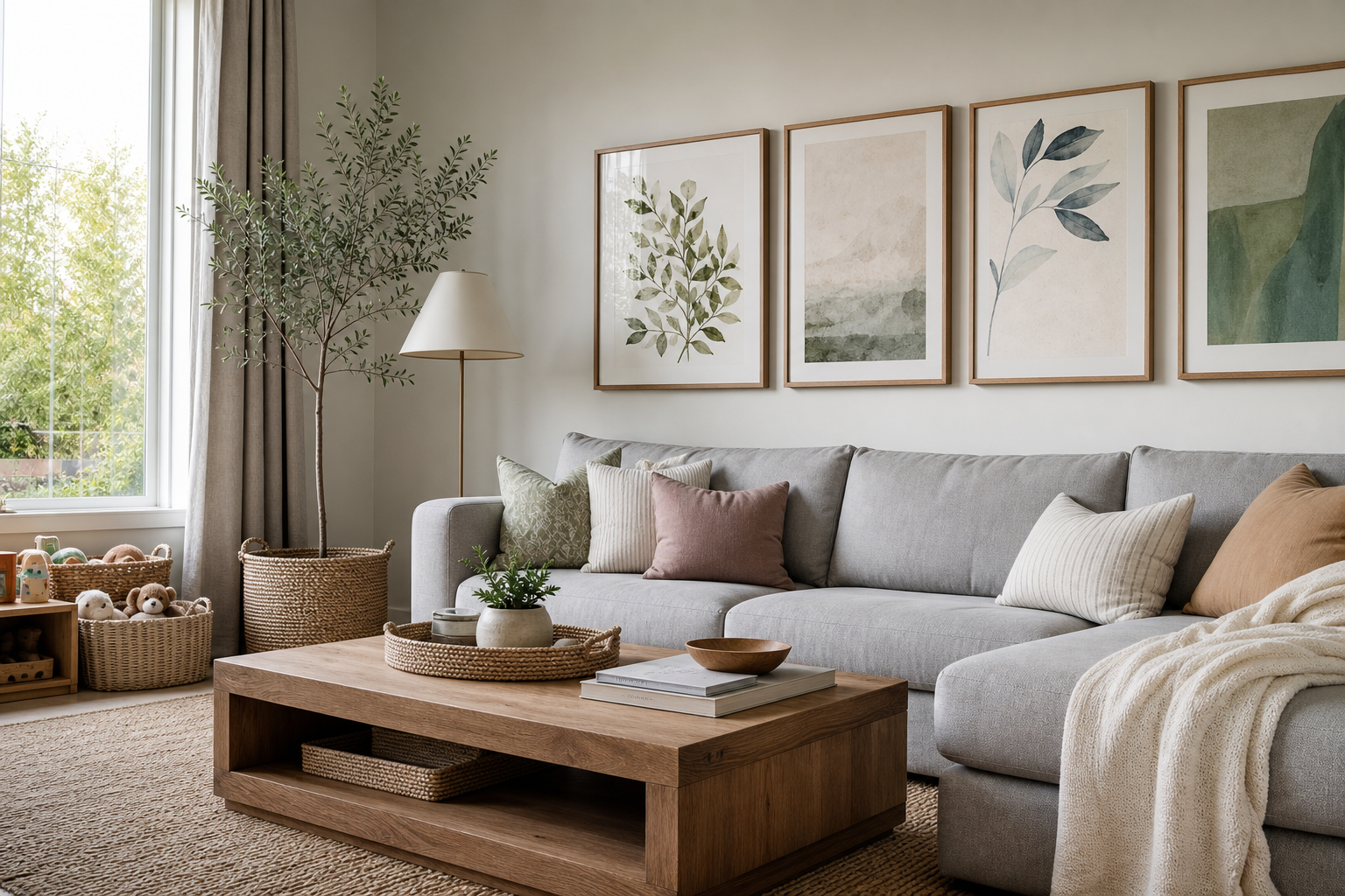
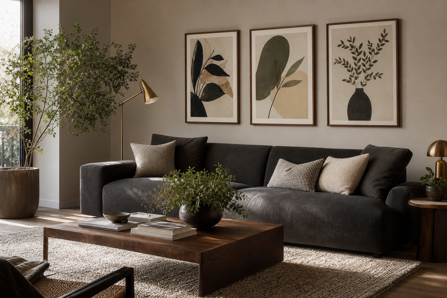
A 16x20 print sits in a sweet spot between small accent art and oversized wall décor. At 40.6 × 50.8 cm, it is large enough to read clearly from across a room, but compact enough to fit above a nightstand, desk, console, or narrow stretch of wall without crowding the space. That balance is exactly why this format works in so many interiors.
Why a 16×20 Print Works So Well
A 16x20 print has enough presence to stand alone, especially on walls that are 60 to 90 inches wide. Over a small sofa, dresser, bench, or entry console, it creates a clear focal point without the commitment of a 24×36 or 30×40 piece. In bedrooms, it can feel calm and proportional. In living rooms, it works as a supporting statement. In offices and hallways, it adds character where larger art would feel heavy.
Because the ratio is close to many classic art formats, framing is straightforward and the result tends to look polished. This size also adapts well across styles: one piece from our minimalist collection can feel clean and architectural, while something from our fine art prints adds softness and history. If you prefer a more expressive scheme, a work from our abstract wall art collection gives a 16x20 print stronger visual energy without demanding an oversized wall.

Choosing the Right Wall and Viewing Distance
The best placement depends on what sits below the artwork. A 16x20 print usually looks strongest when centered over furniture that is roughly 1.5 to 2.5 times wider than the frame. Above a 48-inch console, for example, a single 16×20 can look intentional with negative space on both sides. Above a 72-inch sofa, it often works better as part of a pair or a grouped arrangement.
Hang height matters more than most people expect. The center of the artwork should usually land around 57 to 60 inches from the floor — a standard gallery rule that keeps the piece at a natural sightline. If the print hangs above furniture, leave 6 to 10 inches between the bottom of the frame and the top of the furniture. Less than 4 inches can feel cramped; more than 12 inches makes the art look disconnected.
Viewing distance changes the impact. In a narrow hallway where you see the piece from 3 to 5 feet away, even subtle textures read well. In an open-plan living room where the wall is viewed from 8 to 12 feet away, bolder shapes and clearer contrast perform better. That is where graphic pieces from the illustration category or high-contrast abstracts can be especially effective.

Framing Ideas That Change the Look
The same 16x20 print can feel entirely different depending on the frame. A thin black frame gives clean definition and suits modern interiors, especially with monochrome or high-contrast art. Natural oak softens the edges and works well with linen, boucle, warm whites, and Scandinavian-inspired rooms. White frames lighten the look and are useful when the wall color is already strong.
Matting changes proportion. Adding a 2- to 4-inch mat around a 16x20 print increases visual breathing room and can make the finished piece feel more expensive. A 16×20 image in an 22×26 frame with mat looks more formal and is often better for traditional bedrooms, dining rooms, or layered gallery walls. Without a mat, the result is sharper and more contemporary.
For minimal interiors, a restrained work such as Elegant White Fabric or Textured Concrete Wall pairs well with slim frames in black, oak, or off-white. If you want a stronger statement, use deeper frame profiles — around 20 to 30 mm — to give the piece more object quality.


How to Pair a 16×20 Print with Other Decor
A single 16x20 print looks best when nearby elements echo something in the artwork — color, line, material, or mood. If the art has soft cream and gray tones, repeat those shades in a throw pillow, ceramic vase, or area rug. If the print includes warm ochre, rust, or terracotta, a cushion or table book in a similar family makes the composition feel deliberate.
Leave room around the art. Crowding a 16×20 with shelves, sconces, or tall plants can make it feel smaller than it is. Aim for at least 6 inches of clear space on one or two sides so the eye can register the frame cleanly. On shelves, you can also lean a 16x20 print against the wall and layer one smaller object in front — usually no more than one-third of the print's height — to avoid blocking too much of the image.
Subject matter should support the room’s function. For a bedroom, quieter choices such as Window with Sheer Curtain or Zen Garden Stones help the space feel settled. In a work area, geometric or rhythmic compositions from our abstract prints can add energy without visual clutter.
Building a Gallery Wall Around a 16×20 Print
A 16×20 makes an excellent anchor piece because it is substantial enough to lead the arrangement but not so large that it dominates. Start with the 16×20 near the center or slightly off-center, then build outward with smaller pieces such as 8×10, 11×14, or 12×16 formats. Keep spacing consistent — usually 2 to 3 inches between frames for a tighter modern look, or 3 to 4 inches for a more relaxed layout.
Symmetrical arrangements work well in formal rooms. Place the 16×20 in the middle, then mirror smaller frames on both sides. For a looser salon-style wall, keep the anchor print just below eye level and let the top and side edges stagger naturally. The key is not perfect symmetry but visual weight — if one side has darker artwork, balance it with either a similar tone or two lighter pieces on the other side.



If you are combining styles, unite them with one constant: matching frame finish, similar margin widths, or a shared palette. A 16×20 abstract anchor can sit comfortably beside softer works from our fine art collection if the frames and colors speak the same language.

Color, Mood, and Subject Matter
Color decides whether a 16×20 print whispers or leads. In calm rooms, low-contrast palettes — cream, stone, taupe, faded green, soft charcoal — keep the wall integrated with the rest of the décor. Pieces like White Cream Texture or White Flower Silhouette are effective when you want visual texture more than strong color.

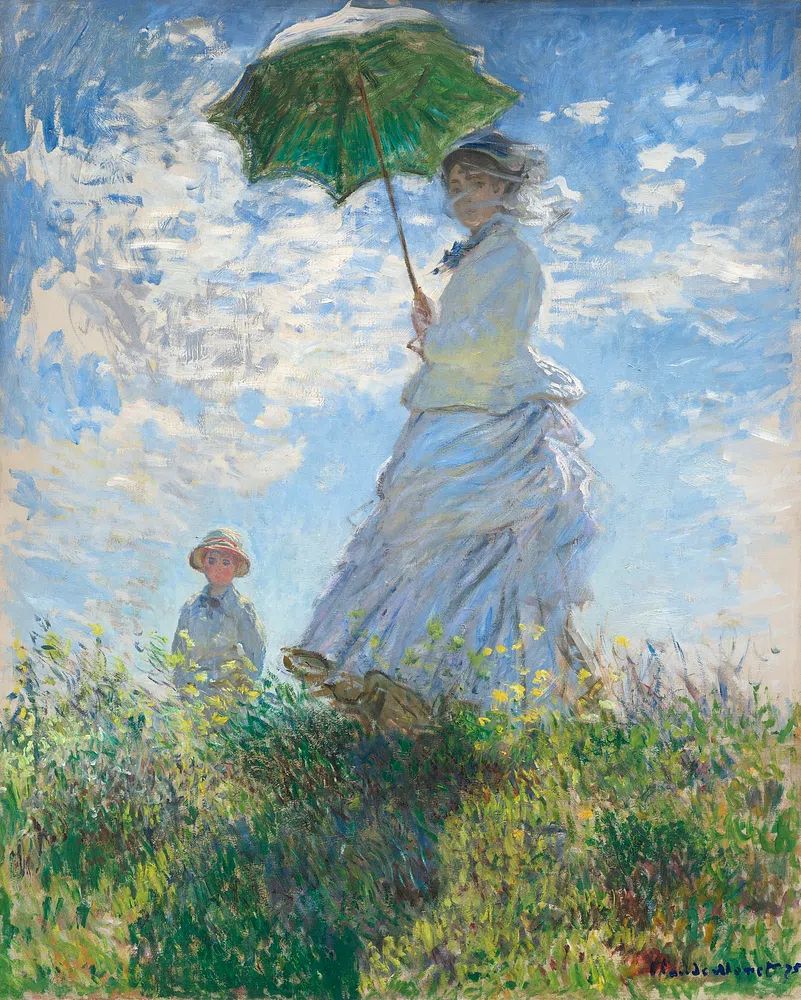
For more expressive spaces, choose a defined color story and repeat it twice elsewhere in the room. A bold print with teal, red, yellow, or black feels grounded when one of those shades appears in a cushion, lamp base, or rug detail. Colorful Stained Glass Abstract works particularly well in rooms that need a shot of saturated color, while Water Lilies softens a scheme with layered blues and greens.
Subject should also match pace. Bedrooms benefit from botanical forms, fabric studies, quiet landscapes, or gentle figures. Living rooms can handle bolder abstract movement. Hallways are a good place for linear or graphic work that reads quickly as you pass by. Home offices often benefit from art with clear structure — enough interest to keep the wall alive, but not so much detail that it competes with concentration.

Final Styling Tips for Getting It Right
Before hanging anything, test the scale with painter’s tape. Mark a 16×20 rectangle on the wall and step back 6 to 8 feet. That quick check shows whether the piece has enough presence on its own or needs company. If the wall is wide and the taped outline looks modest, consider adding sconces, a second print, or a few smaller frames.
A 16x20 print is also one of the easiest formats to refresh seasonally. Swap a bright abstract for summer, a textured neutral for winter, or move the same piece from bedroom to hallway with a different frame finish. Small changes — mat color, frame depth, surrounding objects — can make the same artwork feel new without replacing everything.
Final thoughts
A 16x20 print works because it is flexible, readable, and easy to style around real furniture. It can stand alone on a compact wall, anchor a gallery composition, or bring color and structure to a room that feels unfinished.
The best results come from getting three things right: proportion, placement, and mood. Choose a wall with enough breathing room, hang at a natural viewing height, and match the artwork to the room’s pace rather than forcing a statement where one is not needed.
Frequently Asked Questions
Should I use glass or acrylic for a 16×20 frame?
Glass gives a clearer, more premium look and resists scratches better. Acrylic is lighter and safer for high-traffic areas, kids' rooms, or gallery walls with multiple pieces.
Can a 16×20 print sit on a picture ledge instead of being hung?
Yes — a ledge at least 3.5 to 4 inches deep will usually support it well. Add a smaller frame or object beside it, not directly in front of the main focal area.
What wall color makes a 16×20 print stand out most?
Soft white, warm greige, muted clay, and pale sage are reliable choices because they create contrast without fighting the artwork. Very bright white works best with high-contrast or minimalist pieces.
How do I stop one framed print from looking lost on a big wall?
Use the print above furniture, add a mat to increase its visual footprint, or pair it with lighting or smaller companion frames. The goal is to build a composition, not leave the frame floating alone.