Why Words Feel So Personal on a Wall
Typography wall art works differently from image-based decor because the viewer reads it before fully noticing color, composition, or frame. That split-second of recognition creates a stronger emotional response. A landscape can set a mood, but a phrase can define one. In an entryway, one short line can make a room feel welcoming. In a home office, a sharper message can create focus within 2 to 3 seconds of walking in.
Words also shape identity more directly than imagery. A room with our typography collection feels edited and intentional because the content on the wall says something specific about the person living there. That message can be playful, reflective, romantic, or disciplined. If you prefer a quieter look, mix text with minimalist art prints or abstract wall art so the room carries meaning without feeling visually crowded.
A good text print does not need a long quote. In most interiors, 1 to 7 words read best from normal viewing distances of 1.5 to 3 meters. Longer passages can work in reading corners or bedrooms, where people engage more closely with the wall. For living rooms and hallways, short wording usually feels more architectural.
Choosing the Right Quote, Word, or Phrase
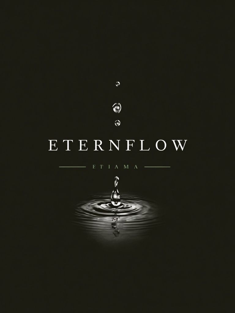
The most timeless typography wall art usually sounds natural when spoken out loud. If a phrase feels forced, overly trendy, or too tied to one moment, it often dates the room quickly. A single word like "breathe" or "play" can hold up for years because it acts more like a design principle than a slogan. Literary lines, family sayings, and short affirmations work best when they already have personal weight.
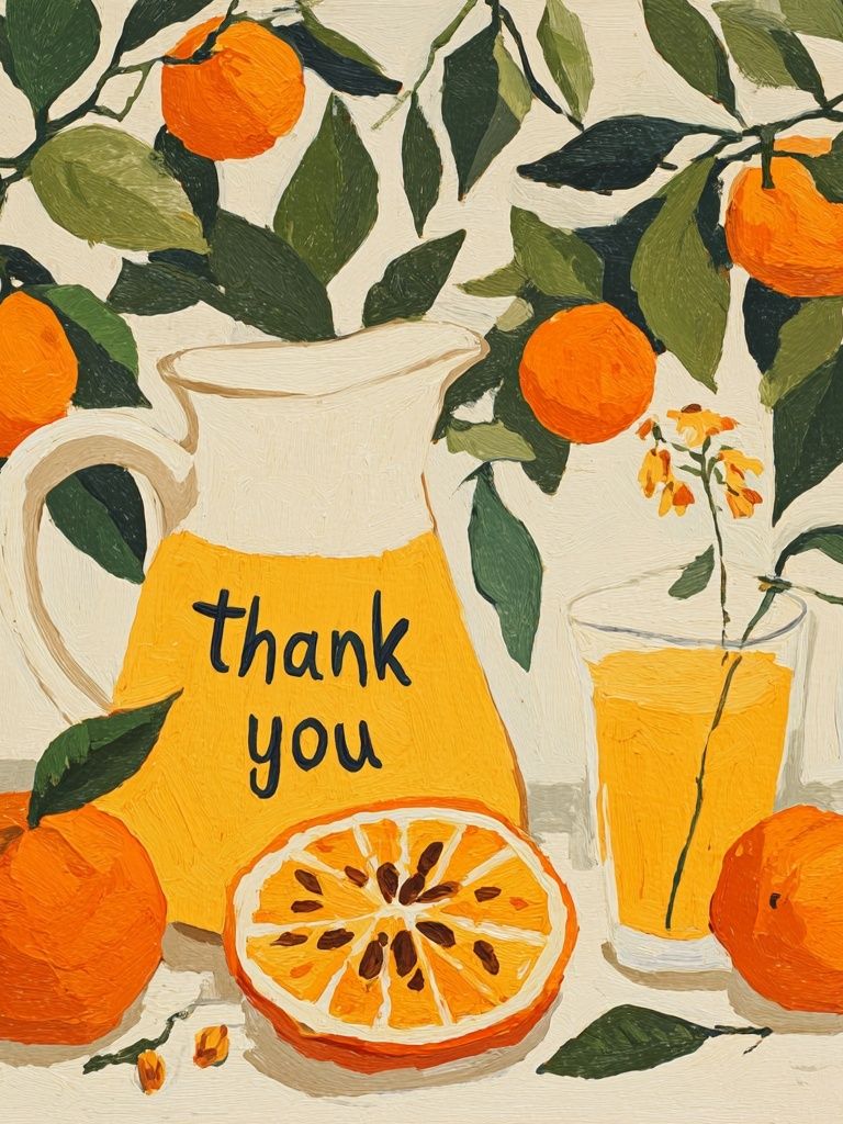
For kitchens and casual spaces, lighter wording tends to land better than something solemn. In bedrooms, softer and more intimate phrases suit the pace of the room. For offices, clarity matters more than inspiration overload. One confident statement framed well often does more than a cluster of five motivational pieces competing for attention.
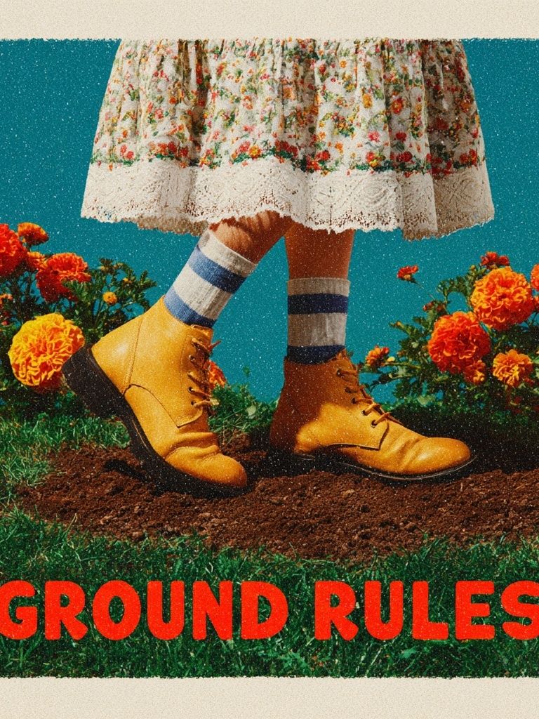
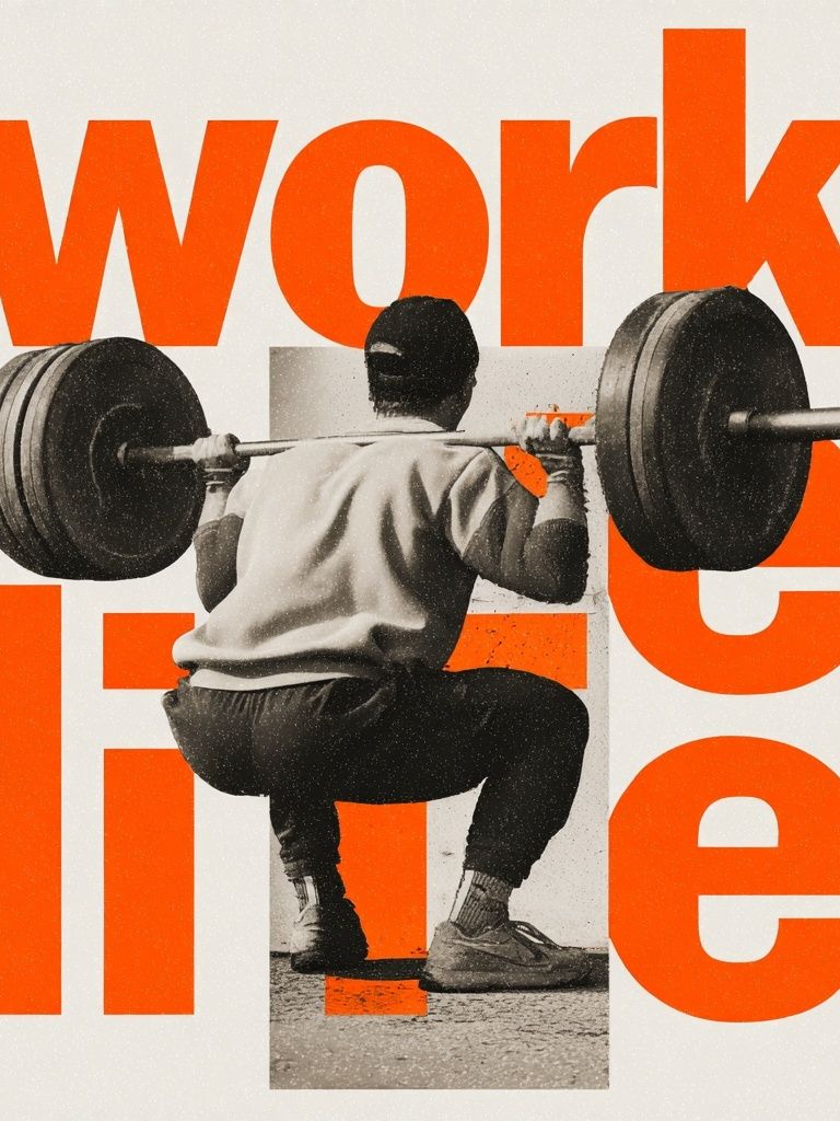
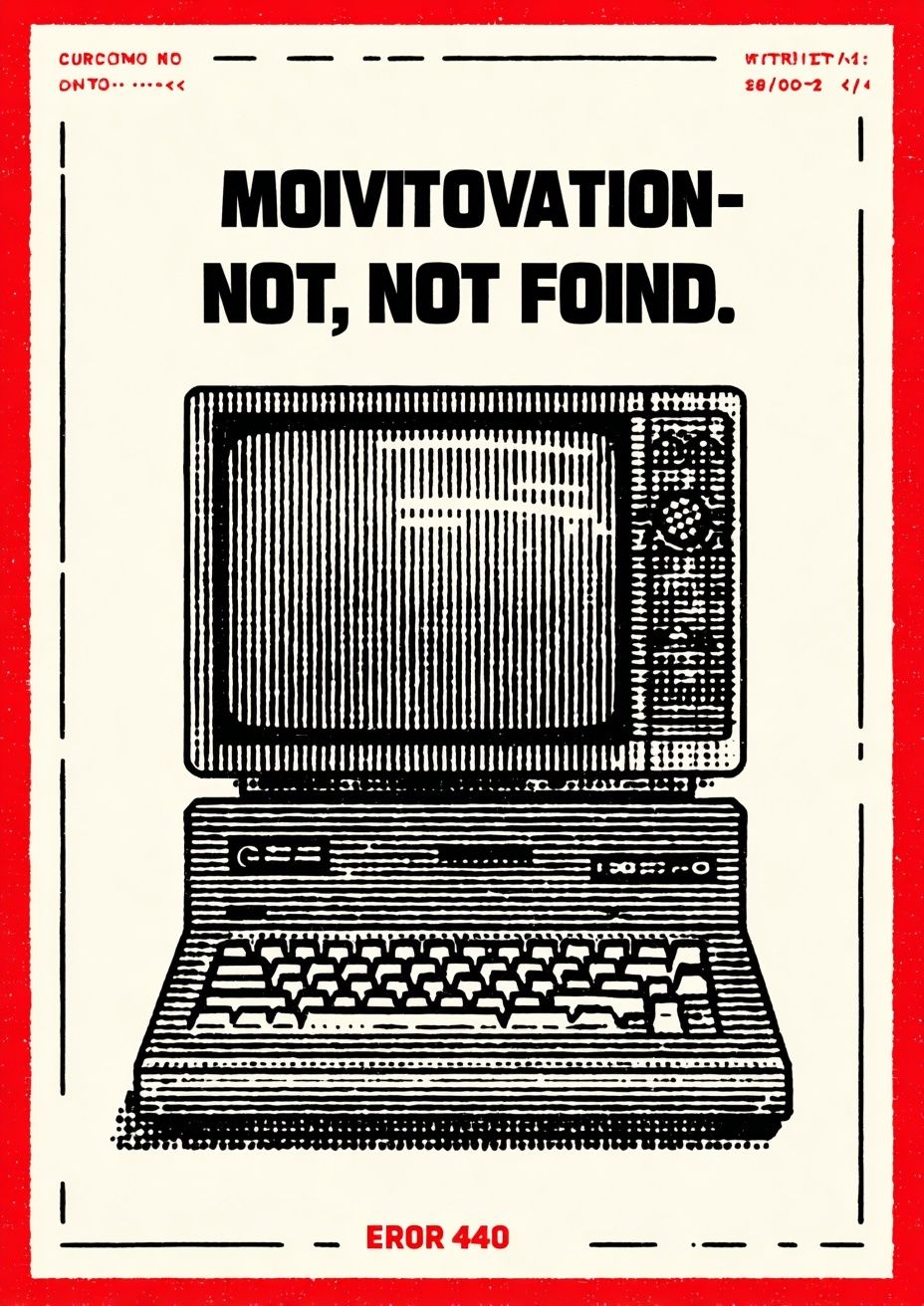
If you want typography that feels expressive without becoming loud, look for layouts where spacing and balance do as much work as the words themselves. The composition should still look strong from across the room, even before the text is readable. Pieces like Ground Rules — Retro Typography Print bring personality through both language and visual rhythm.
Pairing Typography with Your Interior Style
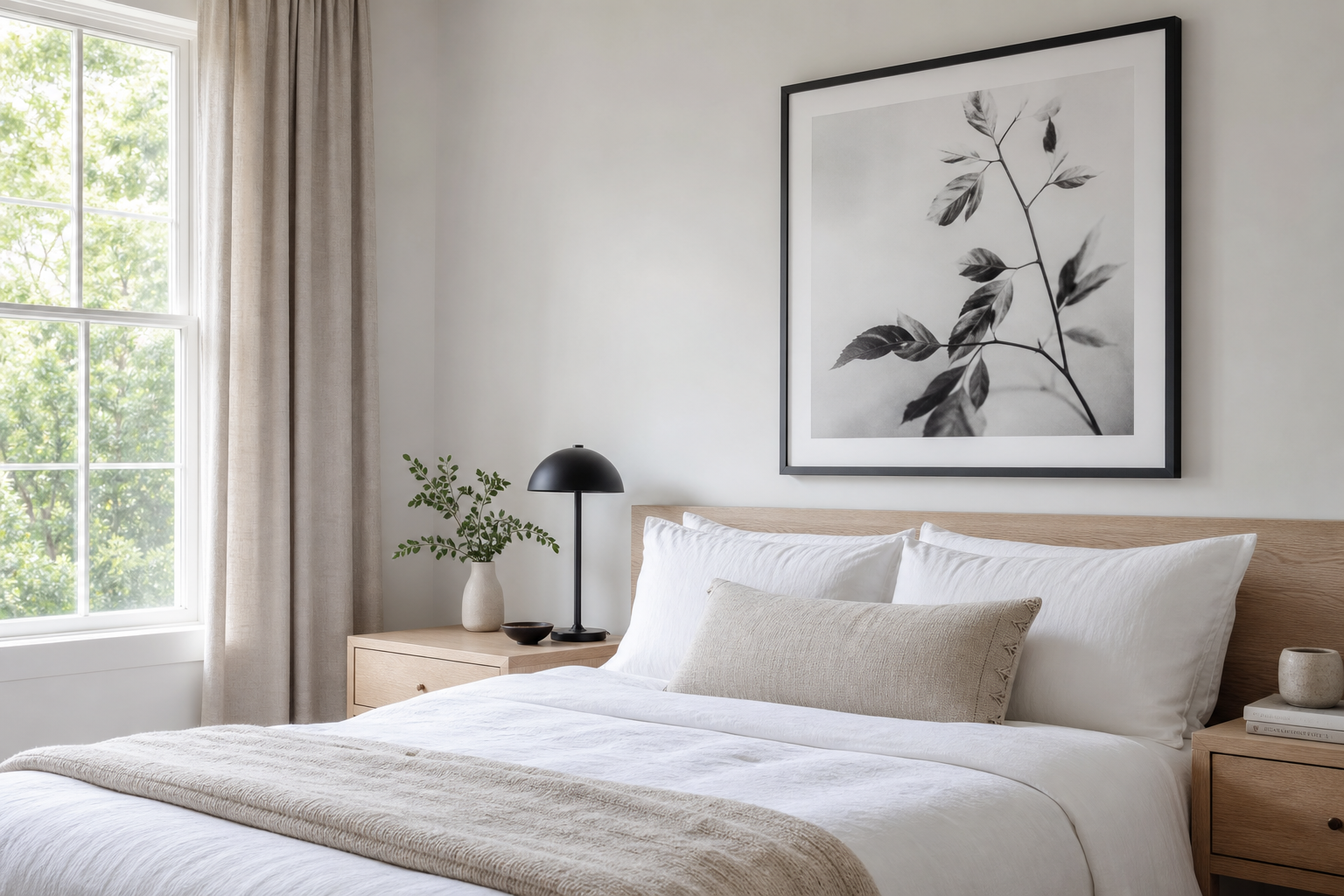
Typography wall art should match the visual language of the room, not just the message. In minimalist interiors, black, white, sand, and soft grey palettes work best with clean sans-serif lettering and generous margins. That approach pairs naturally with Scandinavian-style minimalist prints and restrained textures like oak, linen, and brushed metal.
Vintage and eclectic rooms can handle more personality in both font choice and color. Serif lettering, faded tones, off-white paper effects, and retro layouts feel at home beside warm woods, patterned rugs, or second-hand furniture. If your room already includes layered textiles and collected objects, typography with a bit of nostalgia will feel more integrated than a stark modern composition.
Modern spaces often benefit from contrast. A room with smooth surfaces and simple furniture can feel more human with one witty or expressive text piece. If you want that balance, combine typography with a quieter supporting print from our abstract collection or a sculptural design from mid-century modern wall art. The room stays polished, but it does not become sterile.

Where Typography Wall Art Works Best
Entryways are one of the strongest places for typography because the message sets the tone immediately. A print at eye level — usually centered around 145 cm from the floor — reads clearly and gives a narrow wall a focal point. In small hallways, choose vertical or medium-size formats around 30x40 cm or 50x70 cm to avoid overpowering the space.
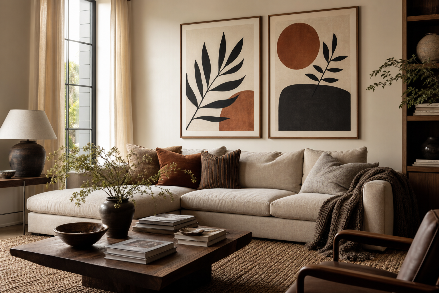
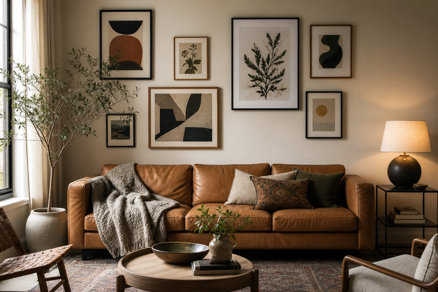
Living rooms suit typography wall art best when the piece is large enough to hold visual weight above furniture. Over a standard 180 to 220 cm sofa, aim for art that spans roughly 60 to 75 percent of the sofa width. That usually means one 70x100 cm frame, one 100x150 cm statement piece, or a pair of 50x70 cm prints with 5 to 8 cm spacing between them.
Bedrooms are better with softer wording and calmer color contrast. Place a text print above the headboard only if the message supports rest rather than stimulation. Home offices are the opposite: this is where direct language can work well, especially behind a desk or on the wall opposite a screen. For a more meditative workspace, blend text with mindfulness wall art to keep the room focused rather than aggressive.
Kitchens and breakfast corners also respond well to text-based pieces, especially smaller formats. In these practical spaces, 30x40 cm and 40x50 cm prints are often enough. Moisture-resistant framing and glass with low glare are smart upgrades if the print hangs near steam, sunlight, or cooking surfaces.
Sizing, Framing, and Layout Ideas
Typography is highly dependent on scale. If the text is too small, the piece reads like a page on a wall rather than art. For most rooms, 50x70 cm is the safest starting point because it gives words enough breathing room while staying versatile. For larger walls, 70x100 cm has more presence and allows letterforms to act almost like graphic architecture.
Frame choice changes the mood fast. Thin black metal makes typography feel crisp and modern. Oak softens it and works well in Nordic, bohemian, or warm neutral rooms. White frames reduce visual contrast and can be useful if the words are bold but the room needs a lighter touch. Mats are especially helpful for text prints because a 5 to 8 cm border gives the composition more authority.
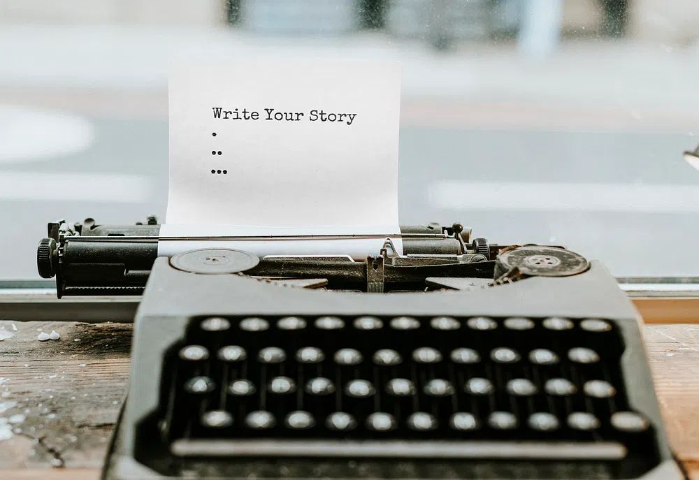
Single prints feel assertive and clean. Grouped pieces feel conversational. If you are building a pair, keep one dominant piece and one supporting design so the arrangement does not turn into a wall of competing statements. A good formula is one typography print plus one abstract or figurative piece. For gallery walls, keep gaps consistent at 5 to 7 cm and repeat at least one frame finish throughout the arrangement to create order.
How to Build a Room Around the Message
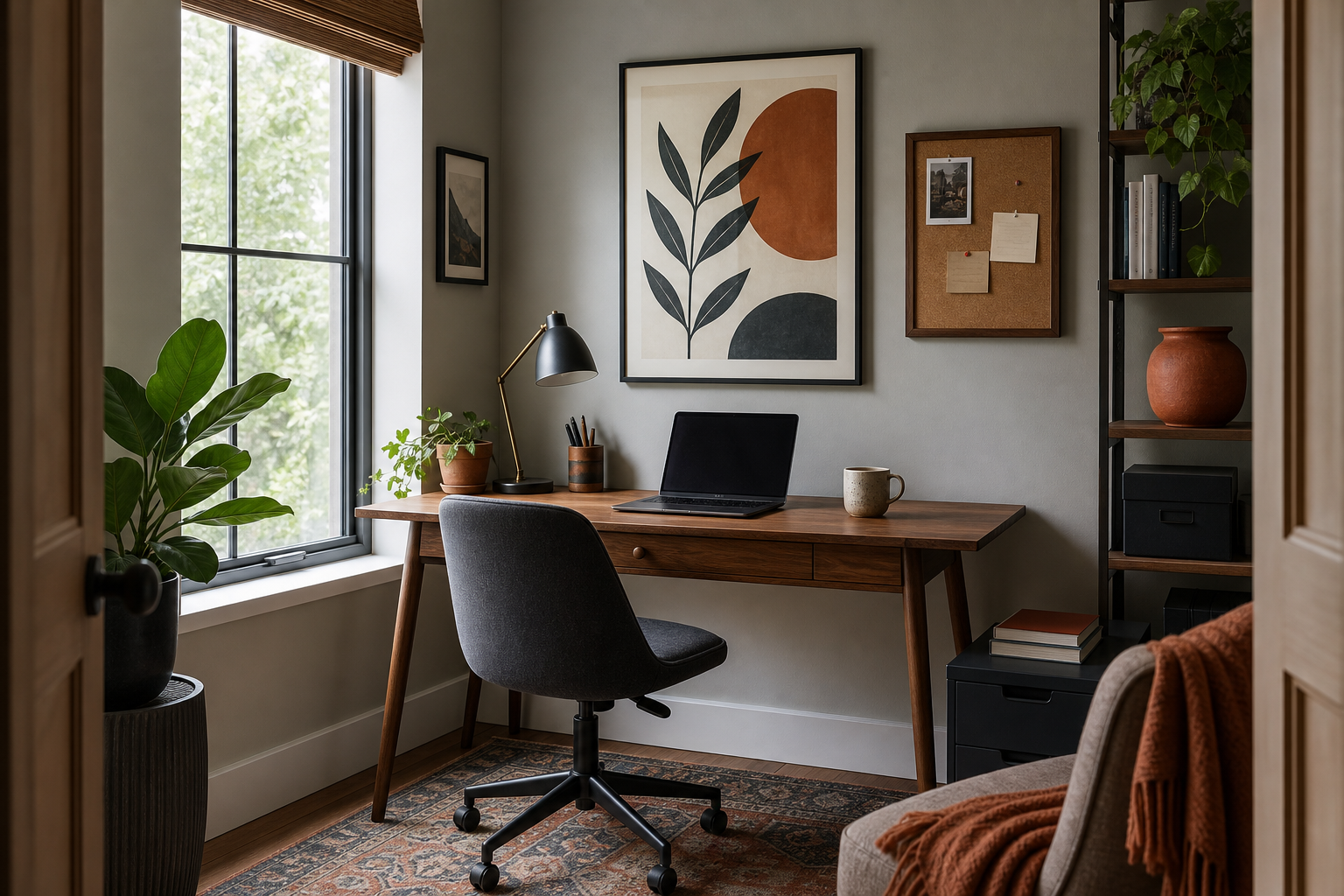
The easiest way to design around typography wall art is to pull one or two colors from the print into the room. If the artwork uses black and cream, echo that in lampshades, textiles, or ceramics. If it includes rust, olive, or faded blue, repeat that tone in smaller doses — around 10 to 15 percent of the room is enough to make the connection feel deliberate.
The tone of the message should influence the furniture and styling around it. A playful print invites lighter forms, curved silhouettes, and casual layering. A disciplined message works better with cleaner lines, fewer accessories, and stronger contrast. This is where typography wall art can act like a briefing note for the whole room. It gives the rest of the decor a clear direction.
For gallery walls, use text as the anchor piece rather than the filler. Put the typography print slightly off-center, then build around it with quieter supporting works from our bohemian collection, fine art prints, or soft symbolic pieces from romantic wall art. The result feels layered, but the message still leads.
Final Styling Tips for a Polished Finish
Typography wall art looks best when the surrounding styling stays disciplined. If the words are bold, reduce clutter on nearby shelves. If the phrase is subtle, increase contrast through frame color, wall paint, or lamp placement. Aim for one clear focal point per wall. Two strong text pieces in the same sightline can dilute each other.
Before hanging, test the placement with painter's tape cut to the exact frame size. This simple step prevents the most common mistake: choosing typography that is right in style but wrong in scale. If you are deciding between two sizes, the larger option is usually the better one for text-based art because readability is part of the design.
Final thoughts
Typography wall art succeeds when message, scale, and room style all agree. The best pieces do not just fill empty wall space — they sharpen the atmosphere, give the room a voice, and make everyday spaces feel more intentional.
Choose words you would still want to live with in three years, frame them with care, and give them enough space to breathe. Done well, typography wall art becomes less like decoration and more like part of the architecture of the room.