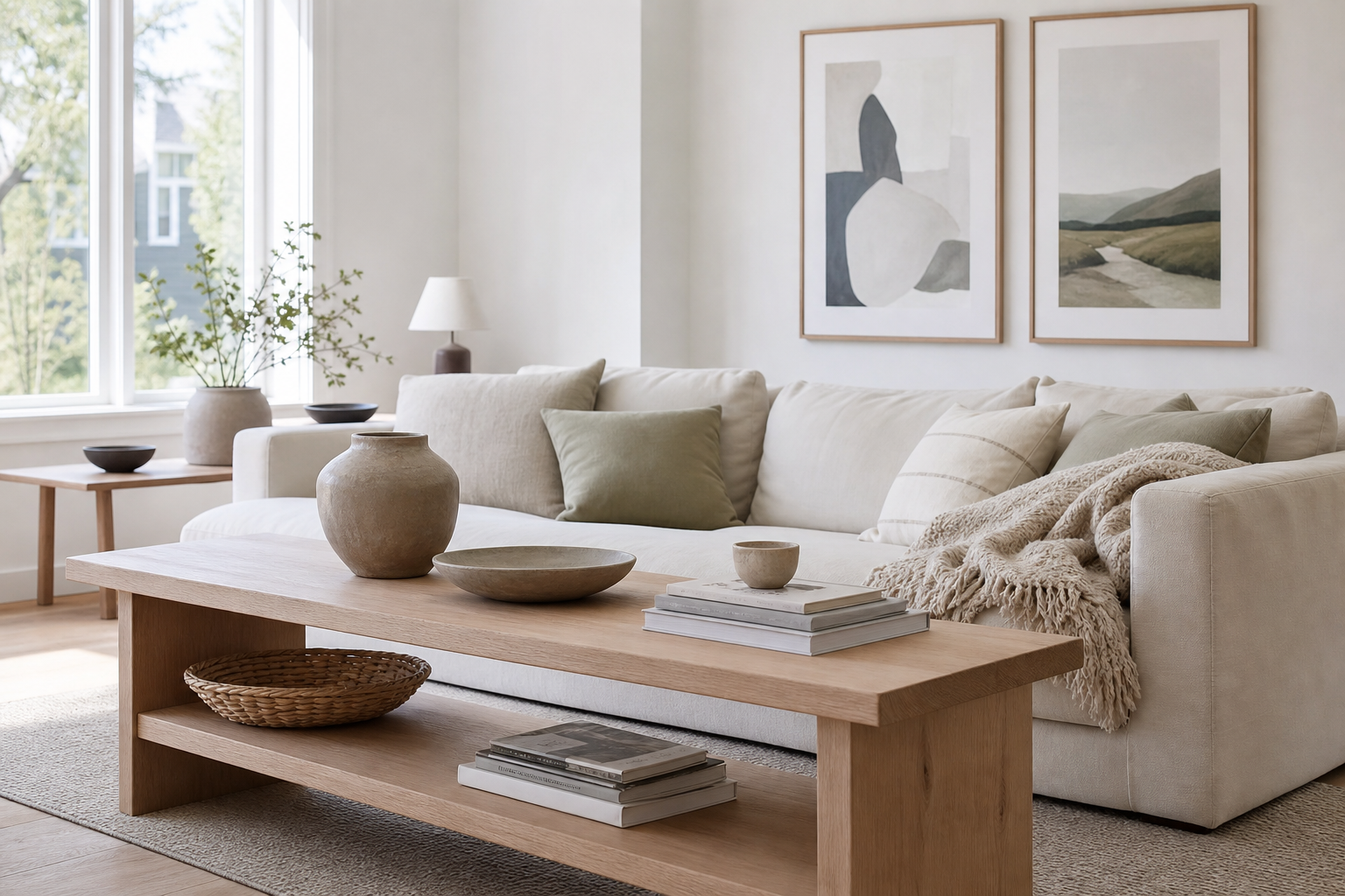
Scandinavian interior posters work best when they support the room rather than dominate it. The style is built on light, space and restraint, so the right print adds quiet structure, soft contrast and a little personality without breaking the calm. If you want walls that feel finished but still airy, this is one of the easiest styles to get right.
Most successful Scandinavian interior posters share three traits: simple composition, muted colour and visible breathing room around the subject. That is why pieces from our Minimalist collection and soft abstract wall art are such a natural fit for Nordic spaces. They echo the same principles you see in Scandinavian furniture — clean silhouettes, natural materials and careful use of negative space.
What Defines Scandinavian Poster Style
Scandinavian poster style is recognisable because it avoids visual noise. Instead of dense patterns or heavy contrast, it leans on pale backgrounds, fine lines, soft texture and balanced layouts. A print does not need to be plain — it needs to feel edited. One strong shape, one quiet landscape or one tactile surface often has more impact than a busy composition with five competing ideas.
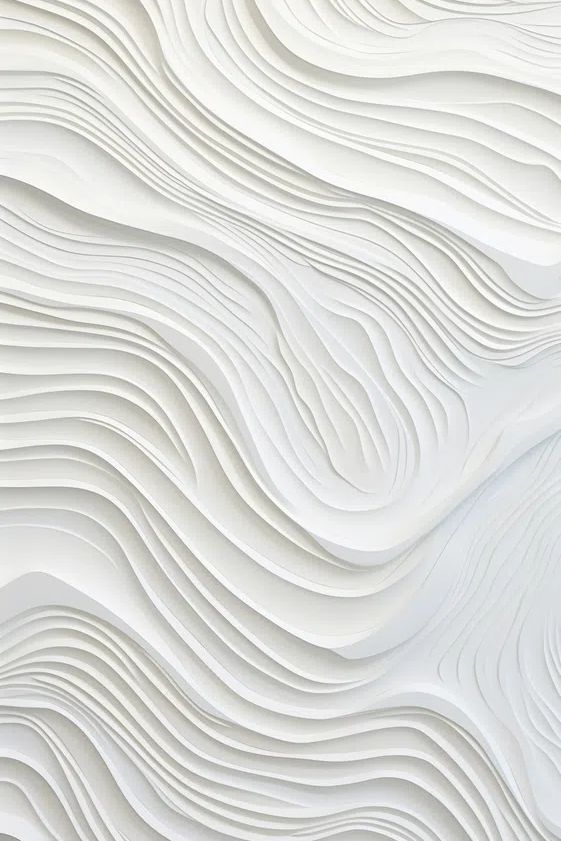
Natural texture matters as much as colour. In Scandinavian rooms, smooth white walls are usually balanced by oak, wool, linen, boucle or paper shades. Art should continue that material story. Prints with subtle texture — like plaster, fabric, paper grain or soft brushwork — feel more at home than glossy, high-saturation graphics. That is why textile-inspired minimalist prints and white textured abstracts work especially well in Nordic interiors.

A practical rule is this: if your room already has strong furniture lines, choose softer art; if the room is full of soft curves and textiles, choose a print with a little graphic structure. That balance keeps Scandinavian interior posters from feeling either too stark or too decorative.
Choosing Colours That Feel Calm and Bright
The classic Scandinavian palette stays within a narrow, workable range: warm white, stone, pale grey, sand, taupe, muted sage and soft black. Rooms feel brighter when about 70% of the visible palette stays light, 20% sits in mid-tone neutrals, and only 10% is used for darker accents. Art should follow the same ratio.
If your walls are white, avoid prints that are bright white with no warmth unless the room gets strong south-facing light. In most homes, an off-white, oatmeal or light greige background feels less clinical. Black accents are still useful — just use them in thin lines, small shapes or narrow frames. The goal is gentle definition, not hard contrast.
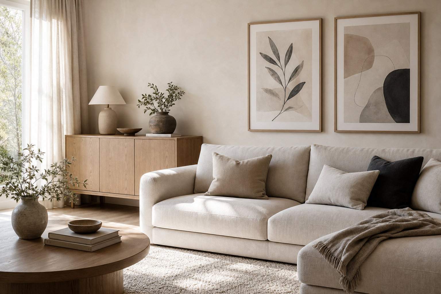
For colour-led rooms, one muted print can connect everything. A sandy abstract can bridge oak furniture and beige upholstery. A pale green botanical or landscape can soften white walls and tie into plants. If you like cooler Nordic schemes, airy light-filled fine art prints and soft white draped compositions help maintain brightness without flattening the room.



Best Poster Subjects for a Nordic Home
The safest subjects for a Nordic home are landscapes, abstract forms, line-led botanicals, architectural studies and quietly observed everyday objects. These subjects feel grounded and timeless, which suits a style built around longevity rather than trend.
Landscapes work because they bring depth into light interiors. Look for mist, shoreline, open sky, snow, water or distant horizon lines rather than dramatic sunset colour. Abstract pieces work when they use shape, rhythm and texture more than saturated pigment. Botanical and floral prints should feel pared back — one stem, one silhouette or one vase is usually enough.

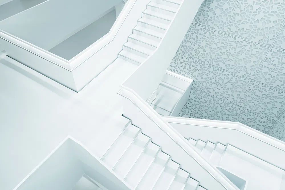
Architecture is another strong choice, especially in homes with modern Scandinavian furniture. Clean staircases, white facades and structured interior scenes mirror Nordic design language without feeling literal. Pieces from our Architecture collection can work beautifully in dining rooms, hallways and home offices, especially if your space already includes black metal lighting or pale stone finishes. For a more organic look, Zen Garden Stones is a useful example of a subject that feels quiet, tactile and balanced.
Typography can work, but use it sparingly. Scandinavian rooms rarely benefit from multiple text-based prints because words add visual density quickly. One typographic piece in a hallway or study is enough. In living spaces and bedrooms, image-led work usually feels softer.
How to Size and Place Posters Room by Room
Sizing is where good Scandinavian interior posters can go wrong. Prints that are too small make the room feel unfinished. As a rule, wall art above furniture should cover roughly 60% to 75% of the furniture width beneath it. Above a 180 cm sofa, aim for art or a grouped arrangement around 110 to 135 cm wide. Above a 160 cm bed, around 100 to 120 cm is usually balanced.
In living rooms, one large 70 x 100 cm print or a pair of 50 x 70 cm frames works well when the rest of the room is quiet. If the wall is wide and the furniture low, a gallery wall can add structure — but keep spacing tight and controlled, usually 5 to 7 cm between frames. Use matching frame finishes and stay within one palette family.
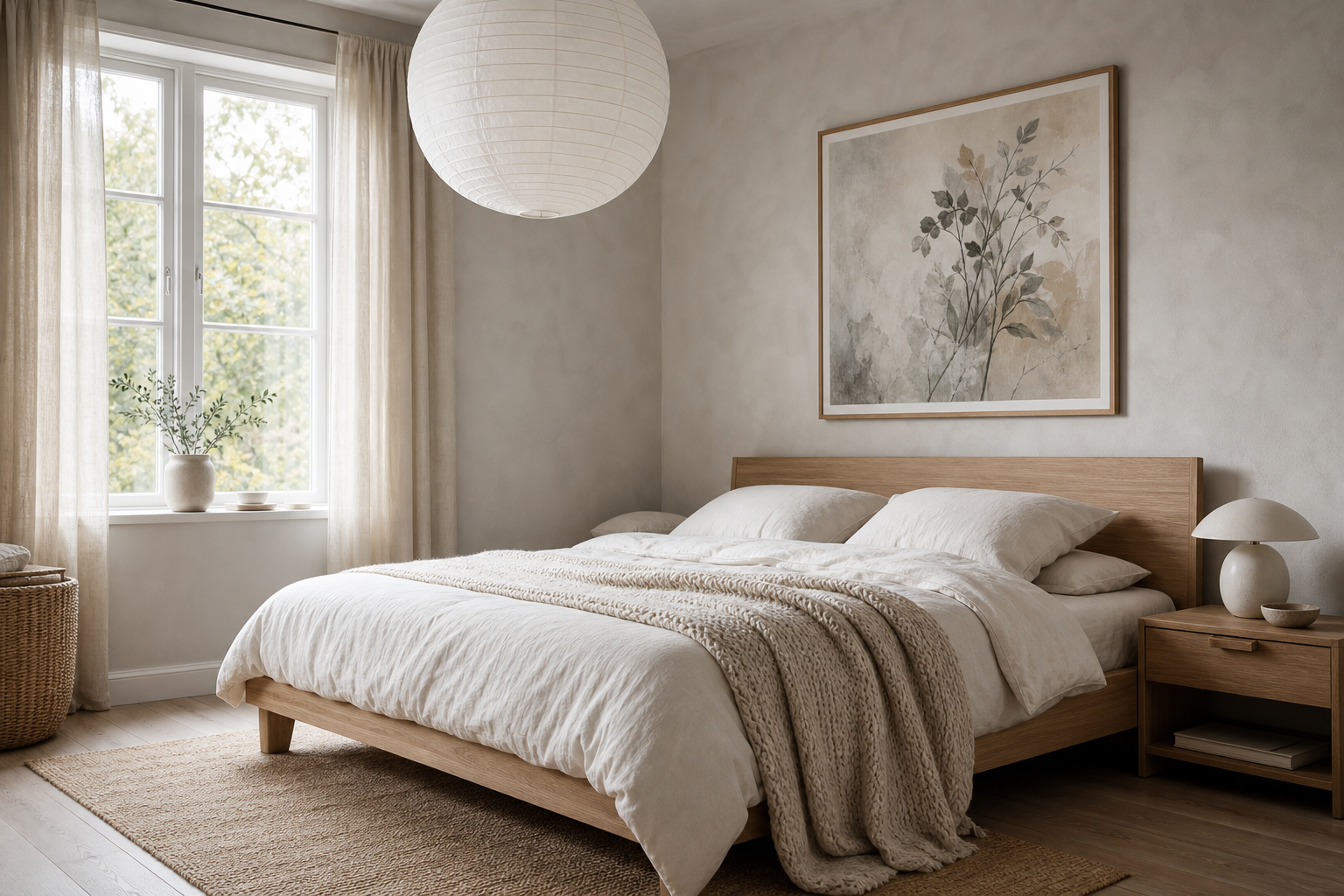
Bedrooms benefit from fewer, larger pieces. A single print above the bed often feels calmer than three small frames. In hallways, vertical formats such as 30 x 40 cm or 50 x 70 cm help stretch the wall visually. Kitchens can handle smaller works — 21 x 30 cm or 30 x 40 cm on a shelf or narrow wall is often enough.
If you like a more composed gallery arrangement, start with a visual anchor in the largest size and build around it. Keep at least one repeated element across every piece — the same background tone, the same frame, or the same black line detail. That is the difference between a Scandinavian gallery wall and a random mix.
Framing Choices That Finish the Look
Frames do a lot of work in Scandinavian styling. Light oak is the most forgiving option because it connects naturally with flooring, chairs and shelves. White frames disappear into pale walls and make the artwork itself feel lighter. Black frames are best used when the print already contains black line work or when the room needs sharper definition.
Matting is especially useful for Scandinavian interior posters because it creates extra breathing room. A 4 to 8 cm white mat can make a 40 x 50 cm print feel more considered and more architectural. This works particularly well for line art, photography and minimal abstract pieces. If the print is already very pale, choose a soft off-white mat rather than bright optic white to avoid a cold look.
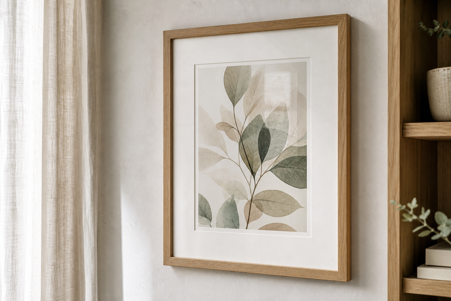
For glazing, non-glare acrylic or museum-style glass is worth considering in bright rooms with large windows. Scandinavian homes often rely on daylight, and reflections can flatten a subtle print. A matte or low-reflection finish keeps texture visible from different angles.
Styling Tips for a Warm, Lived-In Finish
The fastest way to make Scandinavian walls feel cold is to style art in isolation. The room needs supporting materials around it. Pair framed prints with wool throws, pleated lampshades, ceramic vessels, books, pale timber and one or two plants with soft shapes rather than glossy tropical leaves. The contrast between clean lines and tactile objects is what makes the style feel human.
A shelf-led arrangement often works better than a rigid grid if you want a more relaxed result. Lean one 50 x 70 cm frame against the wall, layer a smaller 30 x 40 cm piece slightly in front, then add a ceramic vase or lamp to one side. That setup gives Scandinavian interior posters presence without forcing the room into perfect symmetry.
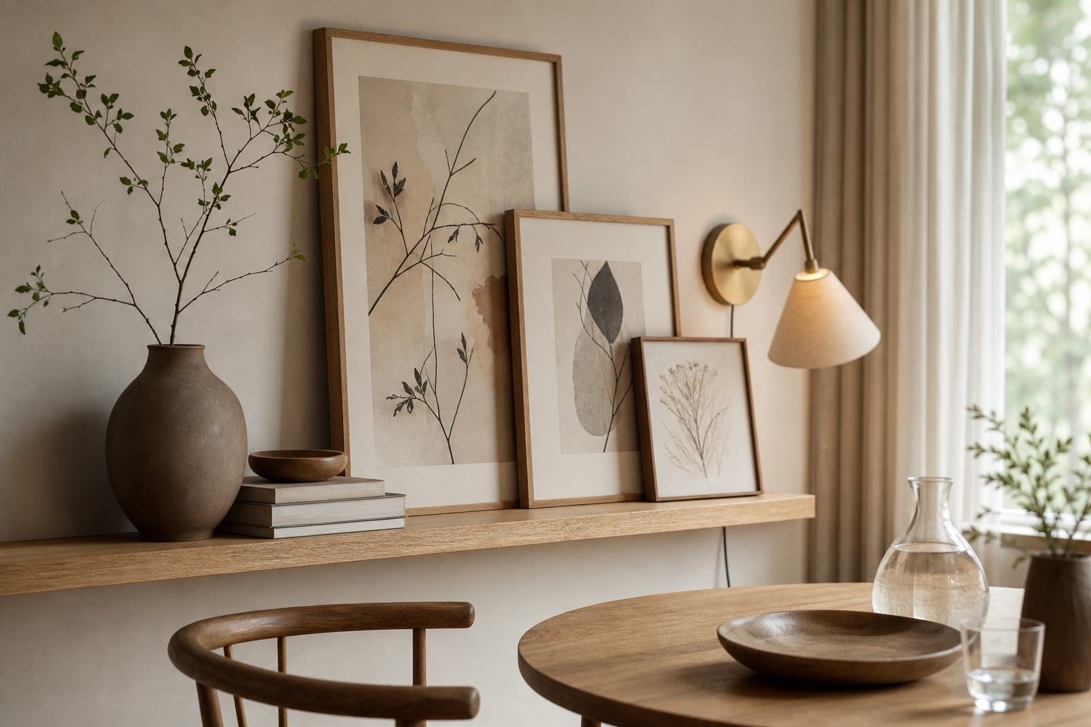
If your room feels too beige, bring in one cooler element through art — misty grey, stone blue or muted green. If it feels too crisp, add warmth through a wood frame, sandy abstract or textile-inspired print. White Cream Texture is useful for adding warmth through tone, while modern minimalist architecture prints can add structure to softer interiors.
A Simple Shop-Ready Checklist
Start with the room, not the print. Measure the wall, note the width of the furniture below it, and decide whether you want one focal piece or a grouped arrangement. Then list the colours already doing most of the work in the room — walls, flooring, sofa, curtains, rugs. Your art should either repeat one of those tones or gently contrast with it, never fight all of them at once.
Choose subject matter that matches the mood you want. For calm bedrooms, look for texture, soft florals or quiet landscapes. For hallways and workspaces, architecture and graphic abstracts often give more structure. For living rooms, a balanced mix of softness and shape tends to work best. If you are building from scratch, browsing our Fine Art collection alongside minimal Scandinavian-style prints is a practical way to compare texture-led and line-led options.
A final buying rule: if you hesitate between two pieces, choose the one that still feels right after imagining it in the room for five years. Scandinavian decorating relies on staying power. The best Scandinavian interior posters do not shout for attention — they make the whole room feel clearer, calmer and better resolved.