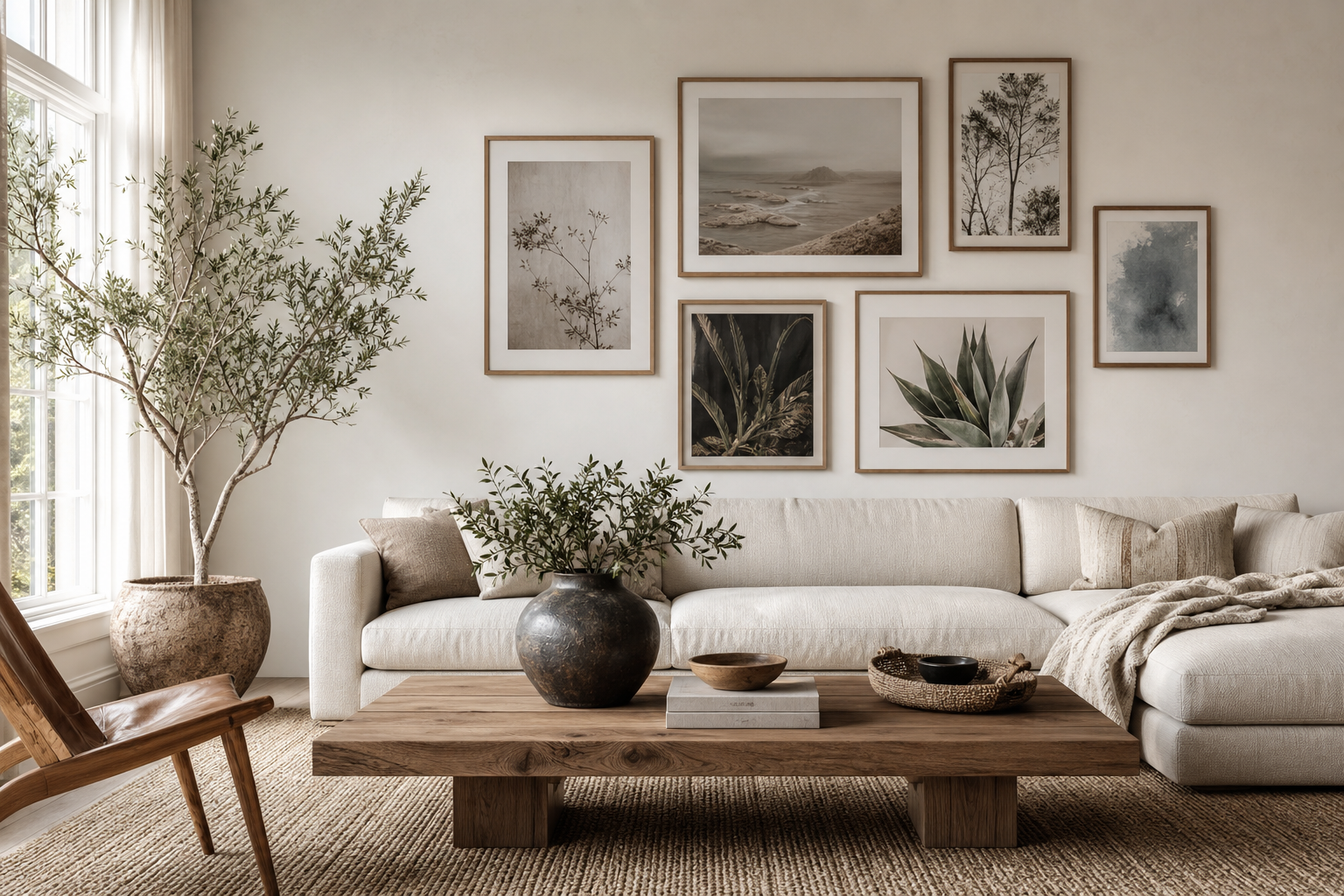
A good photography print brings detail, atmosphere, and a sense of place that painted art cannot always match. The camera captures real light, real texture, and real moments — which is why photography works so well in rooms that need depth without visual clutter. This photography prints guide starts with one simple idea: choose images that shape the feeling of the room first, then match size, frame, and placement to the space.
Photography also gives you range. A foggy landscape can calm a bedroom, a sharp architectural shot can sharpen a hallway, and a warm portrait can make a reading corner feel personal. If you want a broad starting point, our photography collection offers the most flexibility, while architecture photography prints and nature-led wall art help narrow the mood fast.
Why Photography Prints Work So Well at Home
Photography prints feel familiar because they are grounded in the real world. That realism helps a room feel collected rather than overly styled. A single image of water, sky, or landscape can introduce movement and light without adding more objects to a shelf or table.
They also work across decorating styles. In a minimalist room, photography adds texture without busy lines. In a layered interior, it creates pauses between patterned fabrics, books, and decorative pieces. Black-and-white images are especially useful because they can reduce visual noise by 20 to 30 percent compared with high-contrast multicolour art in the same area.
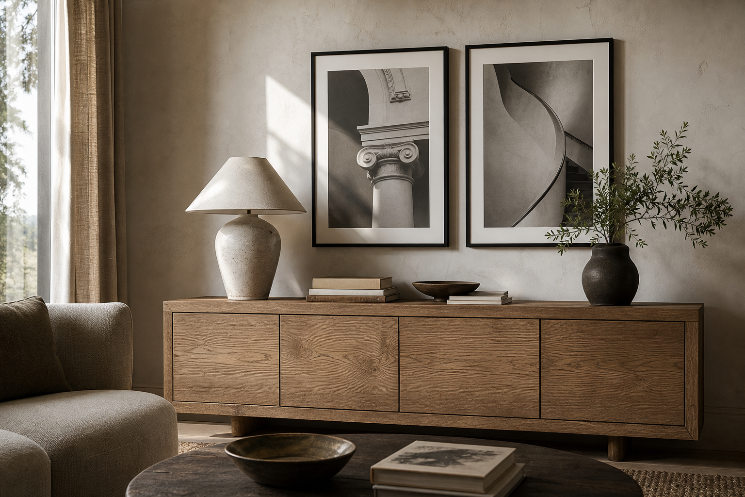
If you want that gallery feeling at home, consistency matters more than cost. Matching frames, a repeated subject, or a controlled tonal palette will make even a small arrangement look intentional. This is where a strong minimalist print selection or a restrained group from fine art wall pieces can pair beautifully with photography rather than compete with it.
Choosing the Right Style for Your Space
Black-and-white photography is the easiest entry point. It suits living rooms, hallways, and home offices because it reads as structured and calm. Architectural shots, street scenes, and close-cropped portraits tend to work best in these spaces, especially when furniture already carries strong colour or pattern.
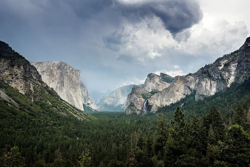
Landscape photography is the most versatile option for larger walls. Mountains, coastlines, forests, and open sky all create visual breathing room, which is useful above beds and sofas. A wide-format image like Yosemite National Park. Original image gives a room a horizon line — something the eye can settle on.
Abstract and detail-based photography works well when you want softness without a literal subject. Water surfaces, shadows, textures, and close-up natural forms are ideal for modern interiors, guest rooms, and calm office spaces. They bring movement but stay quiet enough to live with every day.
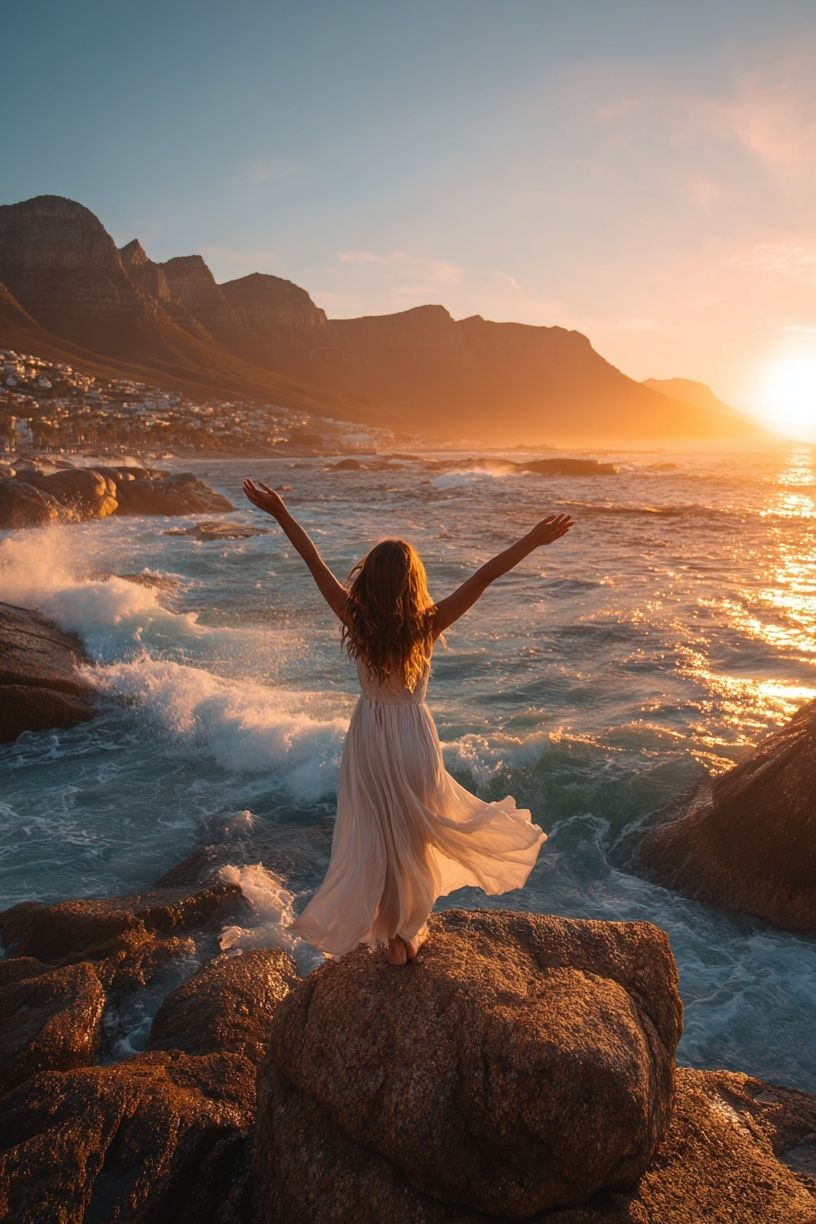
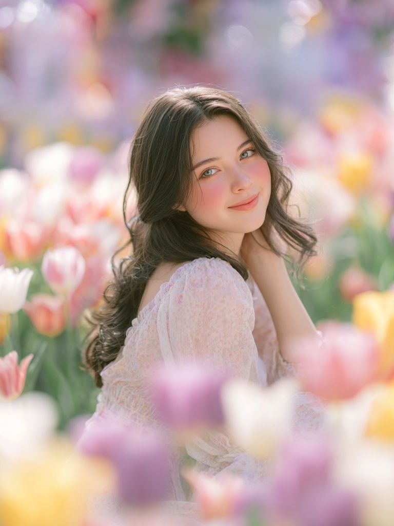
Portrait and travel photography feel more personal. They are strongest in smaller zones where you view them up close — beside a desk, over a console, or in a hallway transition. A piece such as Warm Mirror Portrait is less about filling a wall and more about adding a human note.


Getting the Size and Scale Right
Scale is where many walls go wrong. Art that is too small makes furniture look oversized; art that is too large can crowd a room. Above a sofa, your total arrangement should cover about 60 to 75 percent of the sofa width. For a 200 cm sofa, aim for art spanning roughly 120 to 150 cm. Above a queen bed, 140 to 180 cm wide usually feels balanced. Above a narrow console, 70 to 100 cm is often enough.
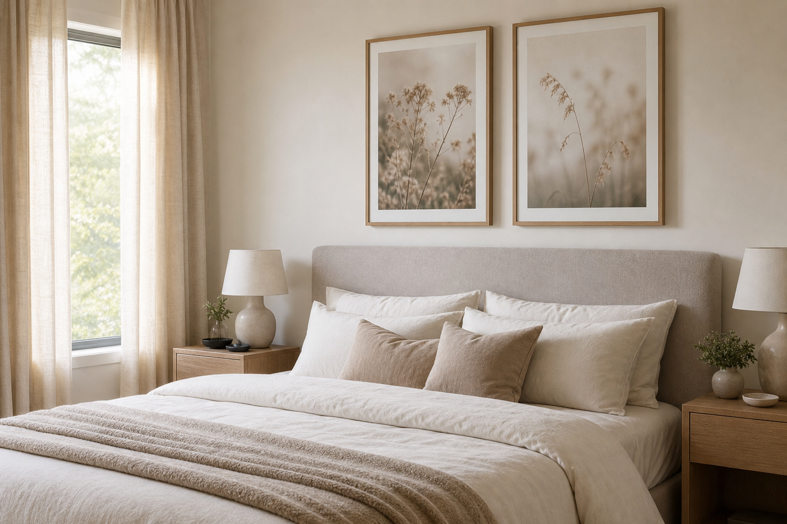
For a single statement piece, use one large print rather than several small ones. In most living rooms, 70x100 cm or 80x120 cm has enough presence to anchor a wall. Pairs work well over beds, sideboards, and dining banquettes — two 50x70 cm frames with 5 to 8 cm between them is a reliable formula.
Gallery walls need structure. Keep spacing between 5 and 7 cm, and build around one consistent rule: shared frame colour, shared orientation, or shared tonal range. If your wall is busy already, combine photographs with spare pieces from abstract wall art or clean minimalist prints to keep the composition from feeling heavy.
Framing and Finishing Details That Elevate the Look
A photography print looks more expensive when the frame matches the image tone. Black frames sharpen black-and-white work and urban subjects. Oak or walnut frames warm up landscapes and travel photography. White frames make bright, airy images feel lighter still, especially in Scandinavian-style rooms.
Matting changes how substantial a print feels. A 5 to 8 cm white mat can turn a mid-size 40x50 cm print into a more gallery-like presentation. It also gives detailed photographs breathing room, which helps portraits and close-up compositions read more clearly from a distance.
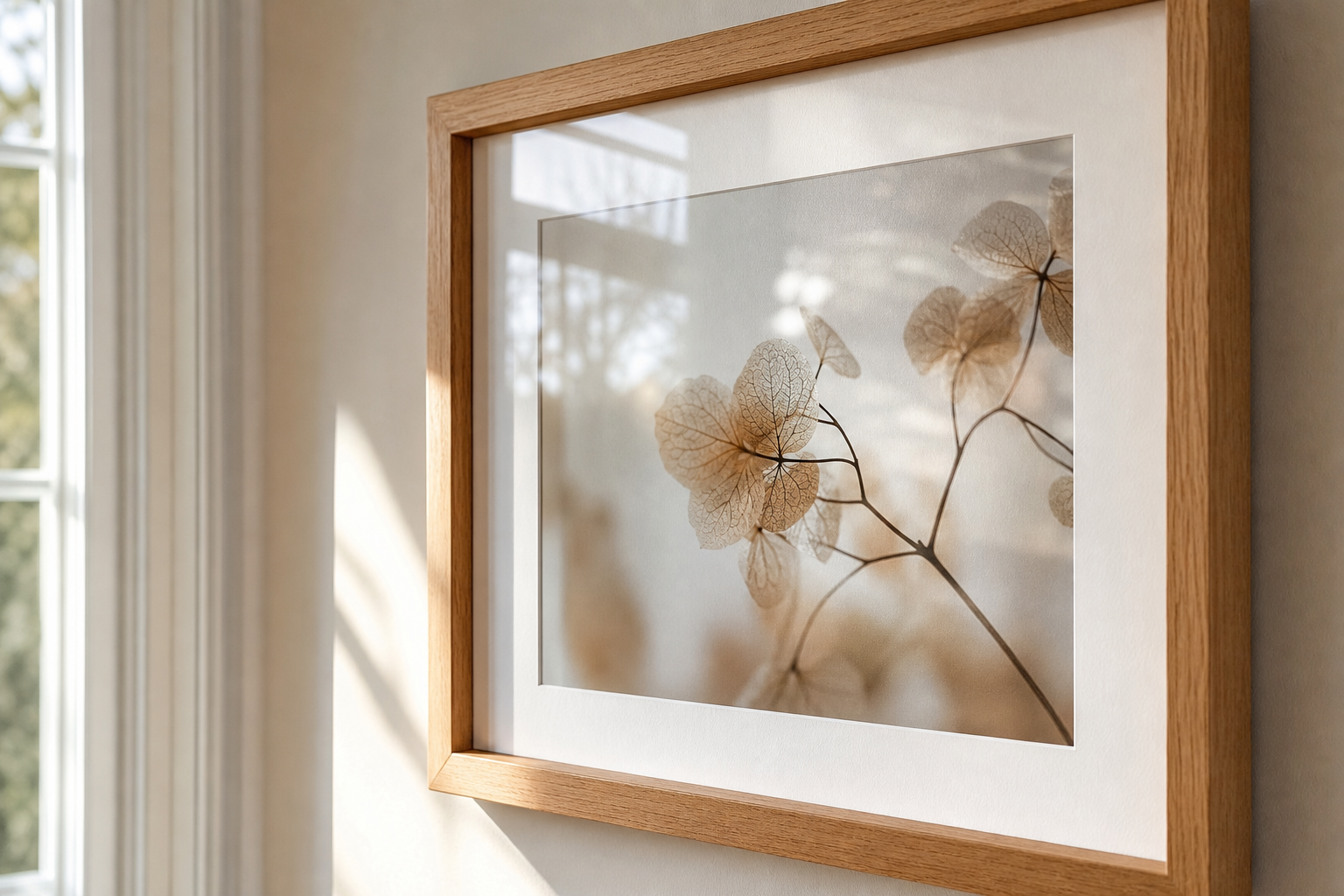
Surface finish matters too. Images with water, sky, or soft gradients usually benefit from a clean, low-glare presentation. High-contrast architectural images can take a crisper finish. If you like a museum-style pairing, combine photography with restrained adjacent art such as Window with Sheer Curtain or use photography next to Elegant White Fabric for a tonal, material-led wall.

Where to Place Photography Prints in Every Room
In the living room, photography prints usually work best above the sofa, fireplace, or console. Choose one dominant image or a pair with a shared horizon line. Landscapes, water imagery, and city scenes all perform well here because they can be appreciated from 2 to 4 metres away.
In the bedroom, softer subjects are stronger than busy detail. Think low-contrast portraits, coastal scenes, botanical photography, or muted landscapes. Keep the lower edge of the frame 20 to 25 cm above the headboard so the art feels connected to the bed rather than floating.
Hallways can take bolder series work because you view the images in motion. Three vertical frames at 40x50 cm each can define a corridor beautifully. Kitchens suit tighter, more playful subjects — wine, fruit, architecture, or travel snapshots. Home offices benefit from imagery with clear lines and open space, including Empire State Building — Cityscape Print or atmospheric nature views that offset screens and hard surfaces.
How to Build a Cohesive Collection
A cohesive collection does not mean every image must match exactly. It means each piece shares one or two traits. The easiest unifiers are colour temperature, subject family, and frame style. For example, warm-toned travel and nature images can sit together if they all carry golden light. Black-and-white portraits and architecture can mix if the contrast level is similar.
A useful ratio is 70/30. Let 70 percent of the wall follow one clear direction — monochrome, coastal blue, desert neutrals, urban structure — then use 30 percent for contrast. That contrast may come from one portrait among landscapes or one detail shot among wider scenes.

If you are combining photography with other categories, keep photography as the anchor and let other pieces act as visual pauses. A snowflake study such as Wilson Bentley's Snowflake 920 can sit surprisingly well beside natural photography because it shares texture and observation. The best photography prints guide advice here is simple: repeat something the eye can recognise — tone, frame, spacing, or subject — and the wall will hold together.
Final Tips for Hanging and Shopping Well
Hang the centre of your arrangement at about 145 to 150 cm from the floor in most rooms. If the art sits above furniture, measure from the furniture top instead: leave 15 to 25 cm of space so the two elements read as one composition. Use picture lights or angled lamps carefully — glare is the fastest way to flatten a good photograph.
When shopping, look first at image clarity, crop, and tonal balance, then at trend. A strong photograph still works five years later because composition lasts longer than novelty. Zoom in on details when buying online, check whether the image needs a mat, and decide in advance whether the wall needs one statement piece or a grouped arrangement. A clear plan prevents the common mistake of buying beautiful work at the wrong scale.
Putting it together
Photography prints succeed when they match the function of the room and the scale of the wall. Choose the mood first, keep sizing generous, and use framing to give the image authority. That combination is what turns a simple print into something that feels gallery-placed.
Use this photography prints guide as a practical filter: subject, size, frame, placement. Once those four decisions are right, the wall usually resolves itself quickly — and your home feels more personal, finished, and considered.