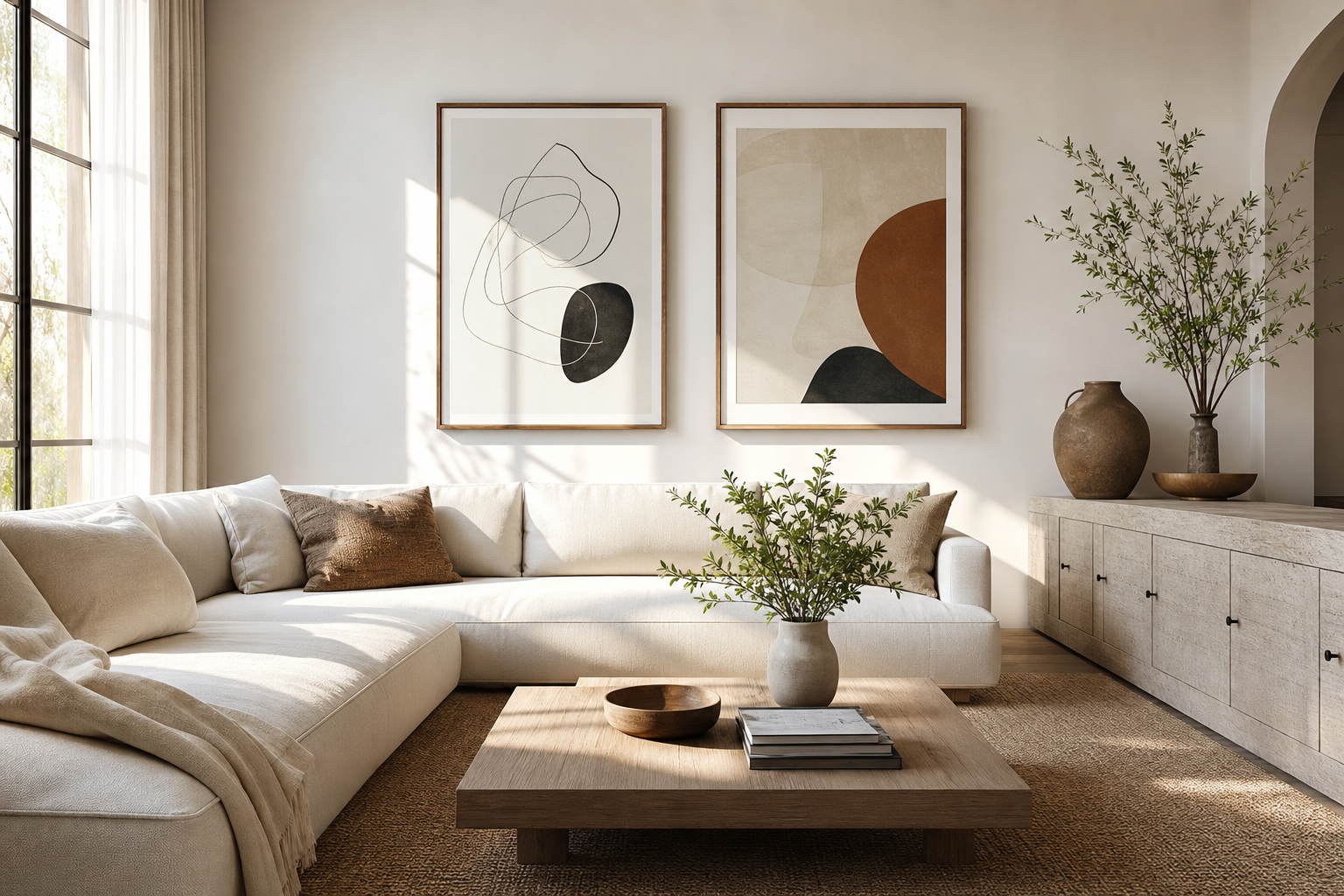
Minimalist poster ideas work best when they reduce visual noise rather than compete for attention. In a modern interior, that usually means fewer shapes, more breathing room, and compositions that leave 40 to 60 percent of the surface visually open. A restrained print can sharpen the architecture of a room, echo the lines of a sofa or console, and make the whole space feel more deliberate. If you already lean toward uncluttered furniture, soft textures, and a limited palette, our Minimalist collection gives you the clearest starting point.
Why Minimalist Posters Work in Modern Interiors
Minimalist art suits contemporary rooms because modern interiors are already built around line, proportion, and material. A wall print with one strong form, a subtle texture, or a quiet tonal contrast supports those features instead of distracting from them. In practical terms, minimalist poster ideas tend to make a room look more expensive because the eye reads order first. One framed piece over a 180 cm sofa often looks more refined than five smaller pieces fighting for attention.
Negative space is a major reason these works feel calm. Empty space is not wasted space — it acts like a pause in the room. When a print uses a large field of off-white, pale gray, sand, or black, it gives furniture and lighting more visual room to breathe. That is why clean photography, spare abstracts, and architectural compositions perform so well in architecture art prints and abstract wall art collections meant for modern homes.
Choose Motifs That Feel Simple, Not Empty
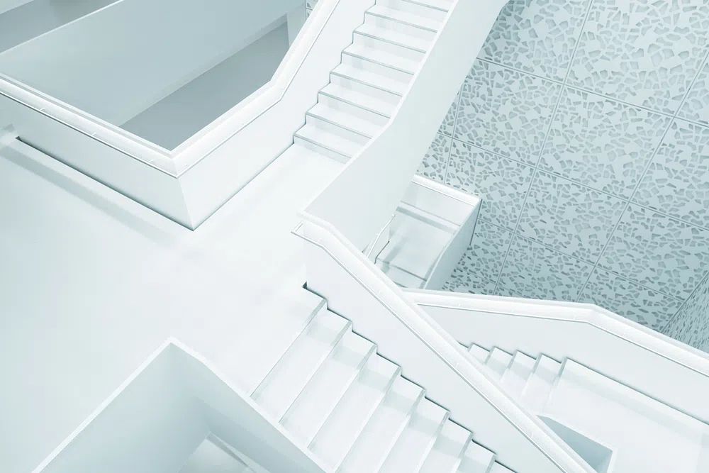
The strongest minimalist walls rely on subject matter with structure. Line art is a safe choice because it creates movement without heaviness. A single botanical contour, a curved figure study, or a vessel outline can hold a wall without overfilling it. Architectural imagery is equally effective — staircases, facades, windows, and strong geometric planes naturally align with modern furniture. If you want a crisp, graphic look, browse minimal typography prints or Modern Minimalist Architecture Poster for pieces that already carry that clean rhythm.
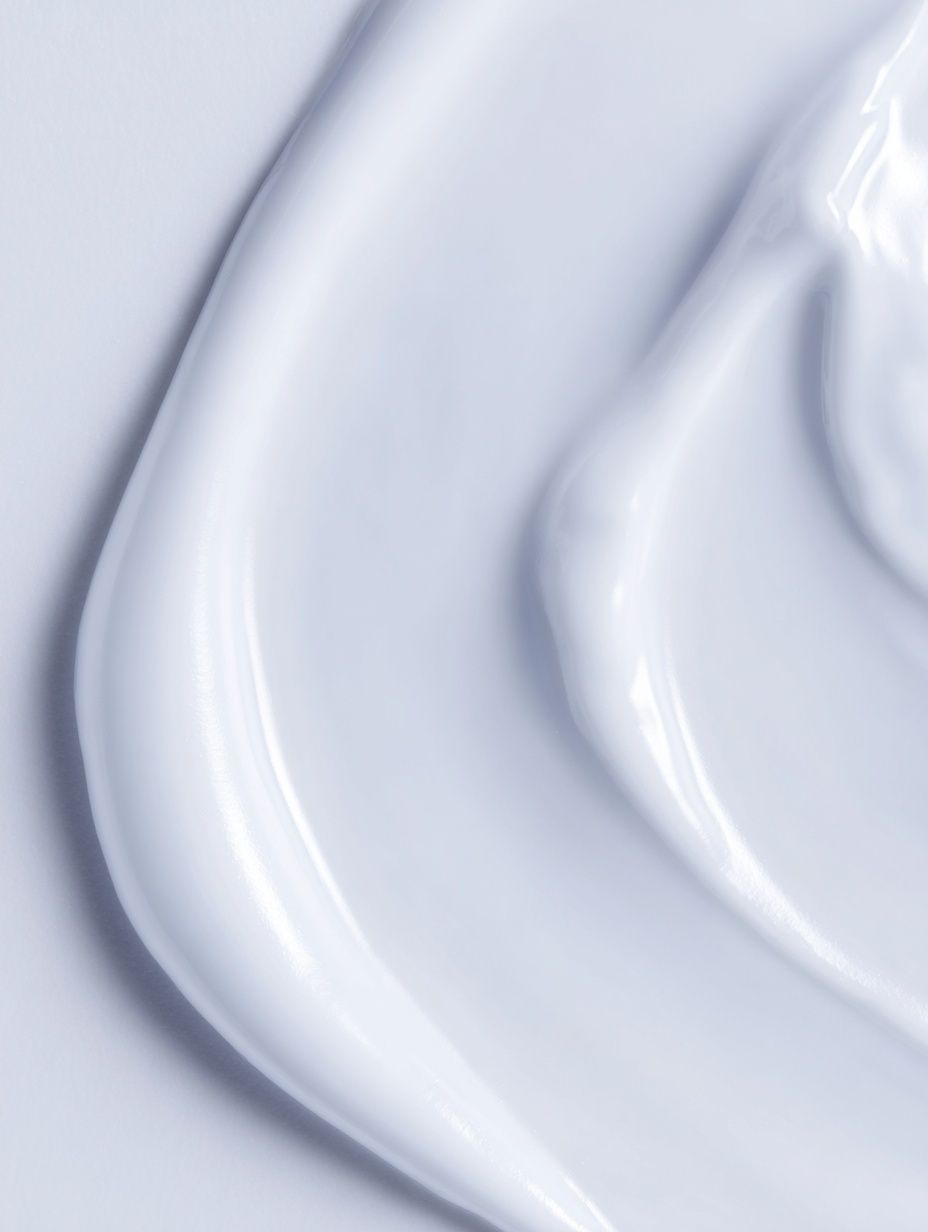
Abstract motifs are useful when you want softness rather than strict geometry. Look for broad brush textures, folded fabric studies, blurred smoke, stone, water, or tonal gradients. The key is clarity. If a print has six competing colors or dozens of focal points, it stops feeling minimalist. Better options are works with one dominant idea — one wave, one shape, one material, one line direction. That is where thoughtful textured white abstract art or a quiet piece from our Fine Art selection can anchor the room without making it busy.
A good test is distance. Stand 2 to 3 meters away from the print. If you can understand the composition in one glance, it will usually read clean on the wall. If you need to decode many layers, it may belong in a more eclectic space instead.
Build a Calm Palette That Matches the Room
Color decides whether minimalist poster ideas feel serene or sterile. The easiest route is to repeat tones already present in the room. If your sofa is warm beige and your rug has oat and taupe notes, choose art with cream, sand, clay, or muted black rather than cold blue-gray. In a room with white walls, adding 10 to 20 percent warm neutral through the artwork can prevent the space from feeling flat.



Monochrome schemes work especially well in apartments and smaller rooms because they create visual continuity. Black and white prints feel sharper and more graphic, while tonal ivory and gray feel softer and more tactile. If you want a little color, keep it contained. One muted accent — sage, dusty blush, deep teal, or terracotta — is often enough. In most modern rooms, a ratio of roughly 80 percent neutrals, 15 percent secondary tones, and 5 percent accent color keeps the wall polished.

Texture can substitute for color when you want depth without contrast. Plaster-like surfaces, folded textiles, concrete, and soft wave patterns add dimension while staying restrained. That is why pieces such as textured concrete wall art or Elegant White Fabric fit naturally into calm, modern spaces.
Pick the Right Size, Scale, and Layout
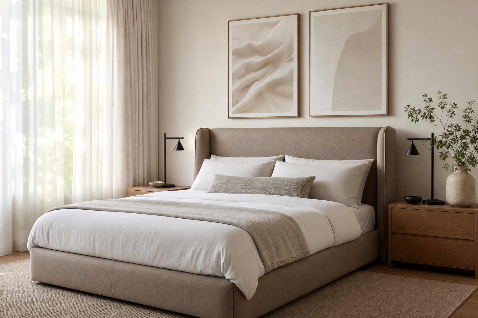
Scale matters more than people expect. Art that is too small is the fastest way to make a clean room feel unfinished. As a rule, wall art above furniture should span about 60 to 75 percent of the furniture width. Above a 200 cm sofa, aim for a composition around 120 to 150 cm wide. That could be one 70x100 cm piece, two 50x70 cm frames side by side, or a three-piece arrangement with even spacing.
Single statement pieces are best for rooms with strong architecture or limited wall space. One large print above a sideboard, bed, or sofa keeps the look disciplined. Pairs work well when you want symmetry — especially over beds from 140 to 180 cm wide, desks, or long benches. Small grid layouts are useful in hallways or home offices, but keep them tight and consistent. Four 30x40 cm frames with 5 to 7 cm spacing can look orderly; six mixed-size frames often look accidental.
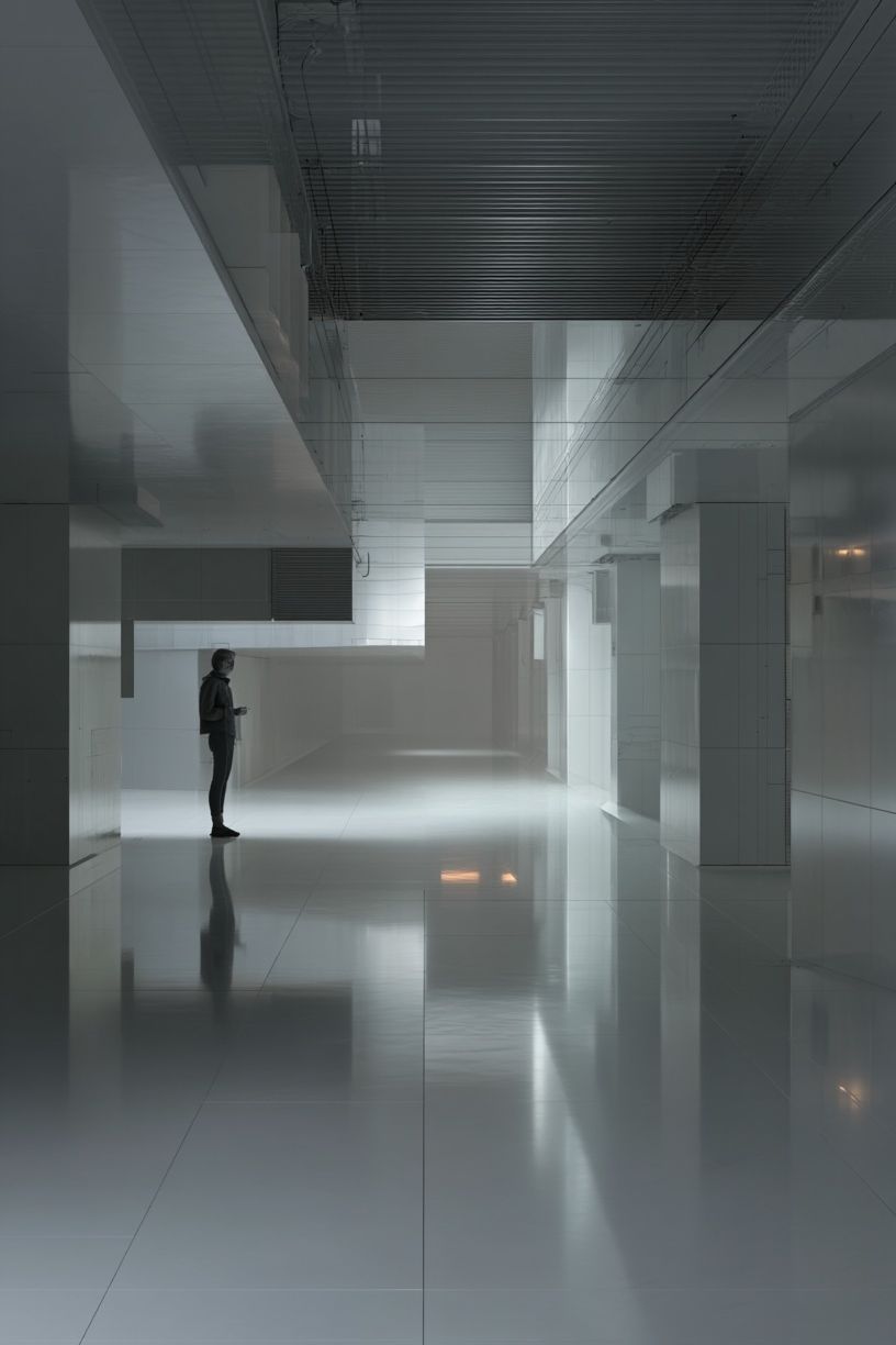
Leave enough margin around the art. A minimalist wall should not feel packed edge to edge. On a blank wall, 15 to 25 cm from furniture to frame base is a reliable starting point. If you are styling a narrow console or shelf, align the art to the furniture width rather than centering it on the entire wall. That keeps the composition grounded.
Frame Minimalist Art the Right Way
Framing is where many minimalist setups either sharpen or collapse. Slim frames — usually 1 to 2 cm wide — suit this style better than ornate or bulky profiles. Black metal gives a precise, architectural edge. Natural oak warms up white or cream prints. White frames can work, but they need enough contrast against the wall to avoid disappearing completely.
Matting is useful when the artwork itself is visually quiet. A white mat of 4 to 8 cm can make a small or medium print feel more gallery-like and intentional. It also increases negative space, which is central to minimalist poster ideas. If the print already has a broad border or a very spare composition, skip the mat and keep the frame simple.
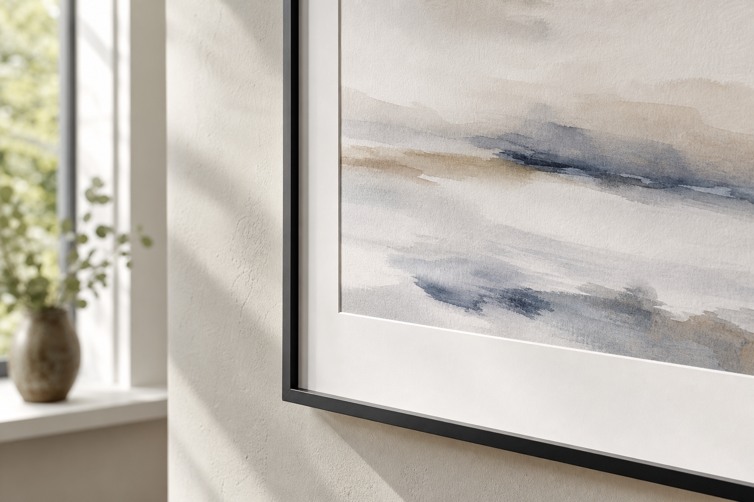
Glass finish matters too. In bright rooms with large windows, anti-glare acrylic or matte glass helps the image stay visible from more angles. Standard glass can look crisp in lower-light spaces, but reflections are more noticeable. If your room gets direct sun for several hours a day, UV-protective glazing is worth considering for preserving paper tones and keeping whites from yellowing over time.
Where to Place Minimalist Posters Room by Room
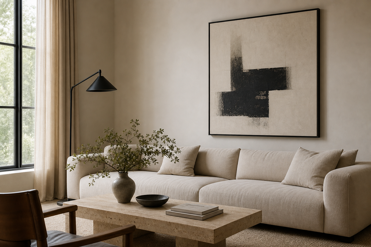
In living rooms, the most reliable placement is above the sofa or sideboard. Keep the center of the composition near eye level — around 145 cm from the floor in many homes — and use one or two pieces rather than a sprawling gallery wall. A calm abstract or a clean interior image such as Modern Loft Living Room can reinforce the architectural feel of the room.
In bedrooms, use softer motifs and quieter contrast. Fabric studies, wave forms, pale botanicals, and meditation-inspired silhouettes help the room stay restful. Over the bed, pairs are often stronger than a single narrow frame because they balance the width of the headboard. If the room is especially pared back, mindfulness prints or Window with Sheer Curtain can add softness without visual weight.
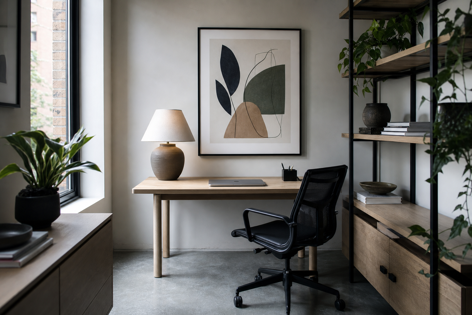
Home offices benefit from structure. Architectural prints, restrained typography, or monochrome abstracts keep the wall focused and professional. Kitchens and dining nooks can handle simpler, more graphic pieces — think one strong shape, one object study, or one understated still-life. Hallways are ideal for narrow vertical works or small pairs, especially if the corridor is under 120 cm wide and cannot support oversized frames comfortably.
Wrap-Up: Simple Styling Tips for a Polished Finish
The best minimalist poster ideas come down to editing. Choose fewer pieces, size them properly, and repeat tones that already exist in the room. Keep spacing consistent, frames slim, and motifs easy to read from across the space. If one wall starts feeling crowded, remove one piece before adding another.
A clean, modern interior does not need blank walls — it needs considered walls. Start with one strong print, build around proportion and palette, and use White Flower Silhouette or other restrained works from our Minimalist collection to keep the result calm, sharp, and intentional.