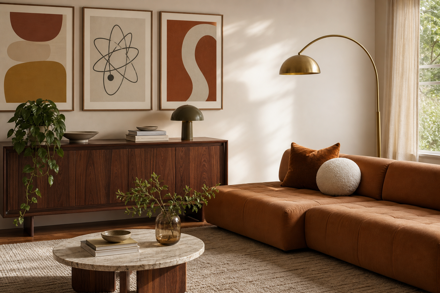
Mid century modern art has a rare advantage in contemporary interiors: it feels composed rather than nostalgic. The look is built on clear geometry, controlled colour, and organic silhouettes, so it slips easily into homes with open-plan layouts, neutral walls, and streamlined furniture. If you want wall decor that adds personality without visual clutter, this style is one of the safest and strongest choices.
What Defines Mid-Century Modern Art
Mid-century work is usually easy to spot because the visual language is disciplined. Expect rounded forms, elongated lines, asymmetrical balance, and a palette that mixes earthy restraint with bright accents. Olive, rust, mustard, teal, black, cream, and walnut-brown are the classic anchors. Shapes often float with generous negative space, which keeps the composition calm even when the colours are bold.
A second defining trait is simplicity with intention. Good mid-century modern wall art does not overfill the page. It tends to rely on 2 to 5 dominant shapes, a limited palette, and one strong focal movement — an arc, an orbit, a stem, a cut-out silhouette. That restraint is why the style still looks relevant next to minimalist art prints and contemporary furniture.

The era also borrowed heavily from nature and industry at the same time. You see leaf-like curves, pebbled forms, sunbursts, architectural lines, and abstract references to movement or machinery. That mix gives mid century modern art its character: warm, graphic, and practical rather than sentimental.
Why It Works So Well in Contemporary Homes
Most contemporary rooms need three things on the wall: structure, warmth, and scale. Mid-century pieces provide all three. Strong geometry helps organize a large blank wall, while retro colour softens hard modern finishes like concrete, white paint, black metal, and glass. Even a single framed print can make a room feel more finished because the style introduces shape without chaos.
This is especially useful in homes where the furniture is simple. A beige sofa, oak dining table, or platform bed can look flat if every element follows the same neutral language. Add one or two pieces of abstract wall art with mid-century proportions, and the room gains rhythm. The look remains clean, but not cold.
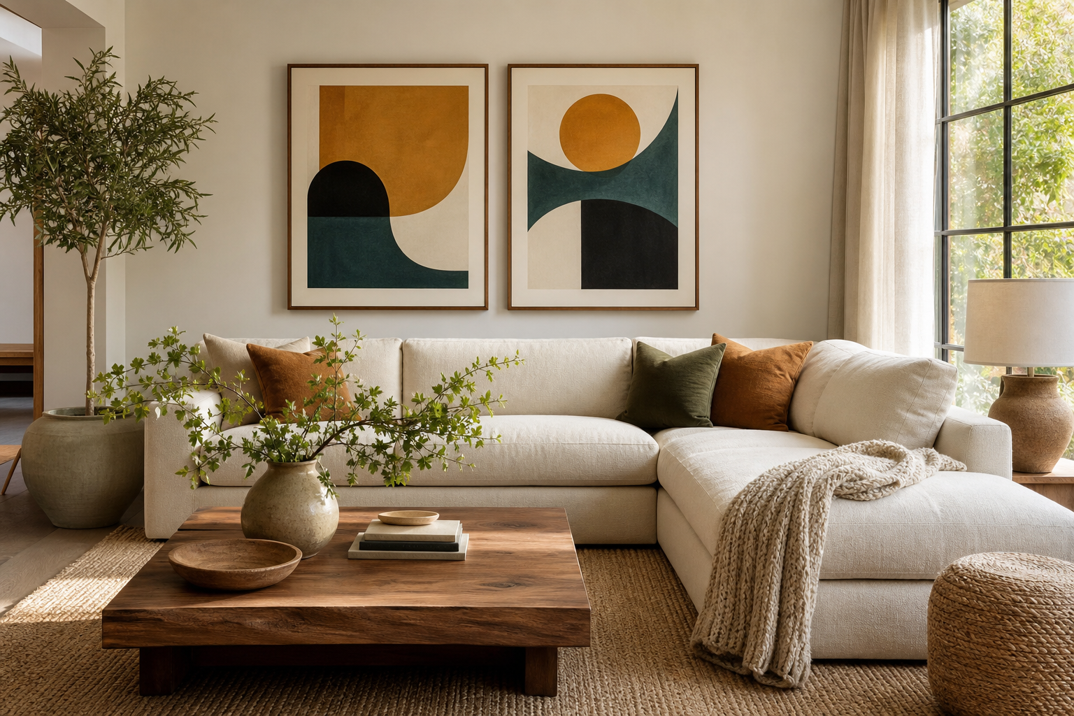
Another reason this style works is its flexibility across decades of furniture. It pairs naturally with walnut and teak, but it also sits well with boucle, limewash, matte black lighting, and contemporary oak. If your room is 70 percent modern and 30 percent vintage, mid century modern art often becomes the bridge that makes the mix feel deliberate.
Best Colours, Forms, and Subjects to Look For
Start with a palette that echoes the room rather than matching it exactly. In a neutral space, look for art with 20 to 30 percent accent colour — enough to energize the wall without taking over. Teal, terracotta, muted gold, burnt orange, and chocolate brown work particularly well with modern interiors that already contain cream, taupe, or charcoal.
For form, prioritize arches, circles, off-centre grids, tapered lines, and abstract cut-outs. These shapes reference the period clearly without making the room feel like a themed set. If you prefer something softer, line-led compositions and wave patterns deliver the same balance with a lighter touch. Our Mid-Century Orbit Abstract is a strong example of how circular movement and restrained contrast can create impact without noise.


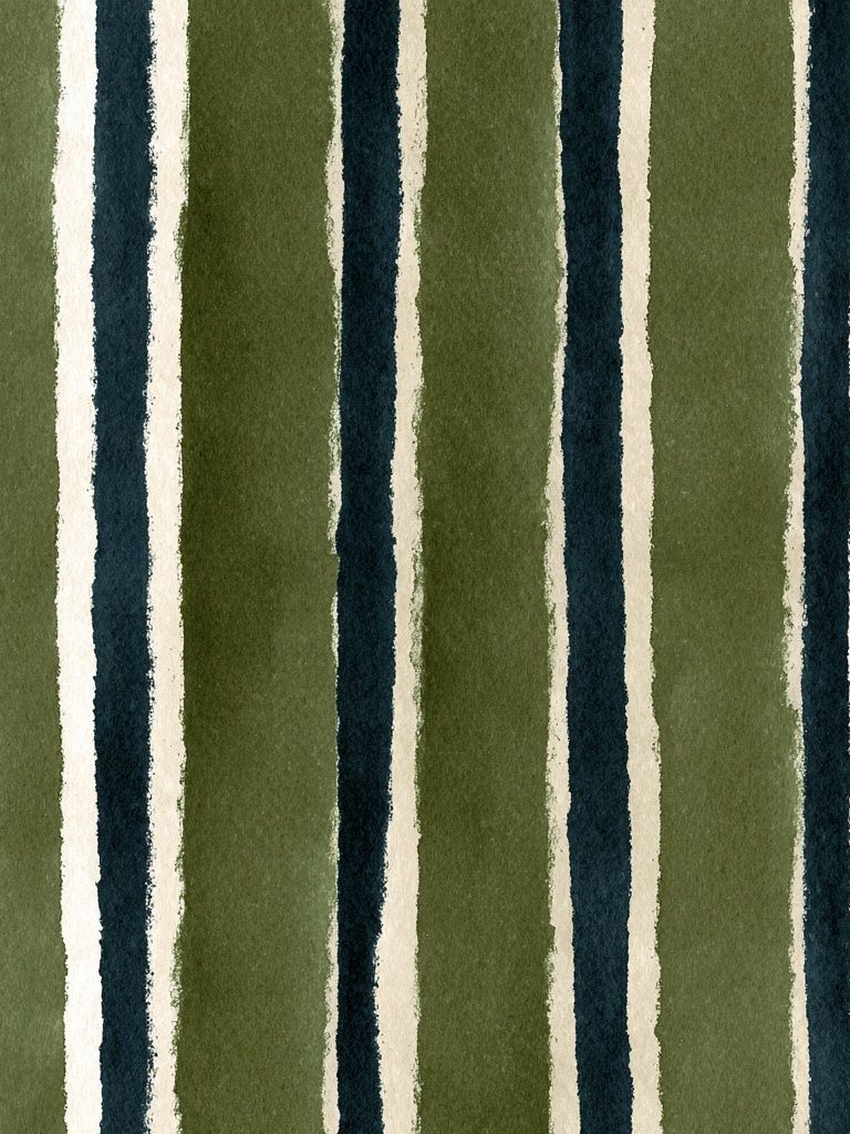

Subjects matter too. The best fits are abstract compositions, stylised domestic objects, architectural references, and nature reduced to simple silhouettes. A coffee pot, leaf form, sun, stair, or orbit motif can say "mid-century" more effectively than a crowded retro scene. If your home already contains wood grain and warm metals, consider Moka Pot Mid-Century for a direct nod to the era.
How to Style It Room by Room
In the living room, hang the main piece 15 to 25 cm above the sofa back, and keep the total arrangement around two-thirds to three-quarters of the sofa width. That ratio usually looks balanced. One oversized artwork at 70 x 100 cm works well above a compact sofa, while a pair or trio suits wider seating areas. If the room already has a lot of texture — boucle, ribbed wood, woven rugs — choose cleaner compositions with more empty space.
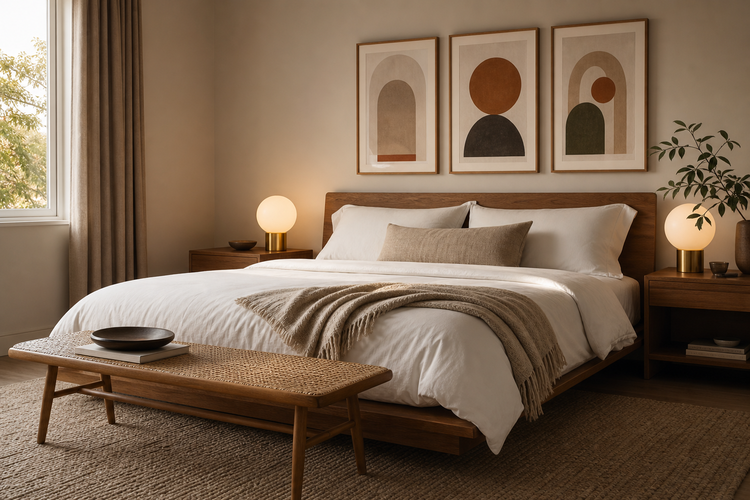
In bedrooms, softer palettes perform better than high-contrast graphics. Place art 20 to 30 cm above the headboard, or use a ledge shelf if you want flexibility. One long horizontal arrangement above a queen bed often looks more relaxed than several small frames. Pair mid-century forms with tactile elements such as linen, wool, and wood veneer to keep the room calm rather than sharp.
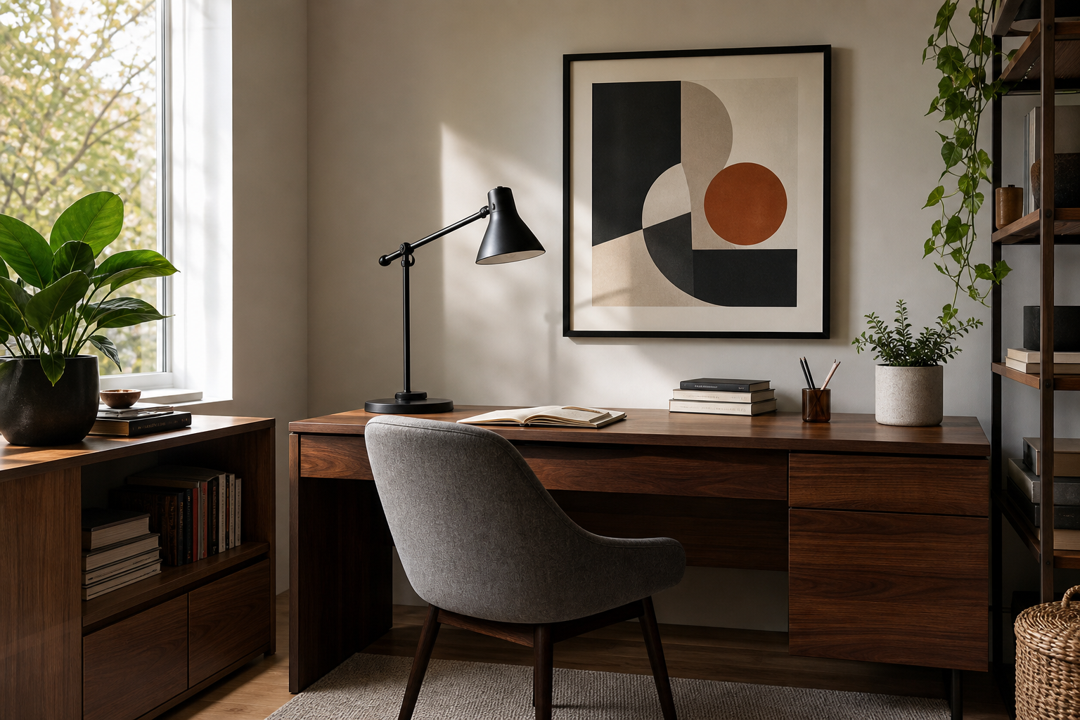
For hallways, think vertically. Narrow walls suit one 50 x 70 cm print, or a stack of two 30 x 40 cm pieces. Hallways often lack furniture, so the artwork needs presence. Pieces with bold silhouettes or stronger contrast hold up best from a distance. In a home office, use one focal artwork behind the desk or slightly offset from it, especially if shelving already occupies one wall. A graphic piece can sharpen the whole work zone without feeling corporate.

If you want to build a focal wall, stay within one palette family and vary only scale. A common formula is one 70 x 100 cm piece plus two 30 x 40 cm companions. Keep frame finishes consistent and spacing tight — usually 5 to 8 cm between frames. For cleaner results, combine our mid-century modern collection with a few pieces from the abstract collection rather than mixing too many subjects.
Choosing the Right Size, Frame, and Finish
Scale is what separates an intentional installation from wall art that feels undersized. As a rule, the artwork or grouping should cover roughly 60 to 75 percent of the furniture width beneath it. Above a 180 cm sideboard, aim for a composition around 110 to 135 cm wide. In a narrow entry, one larger piece usually looks stronger than four small ones.
Frame choice matters because mid-century styling is tied closely to material. Walnut, medium oak, black, and thin brass-tone frames all work well. Walnut and oak feel warmer and more authentic to the era, while black creates a sharper contemporary edge. If the artwork includes earthy colours, wood frames usually integrate it better than bright white frames.
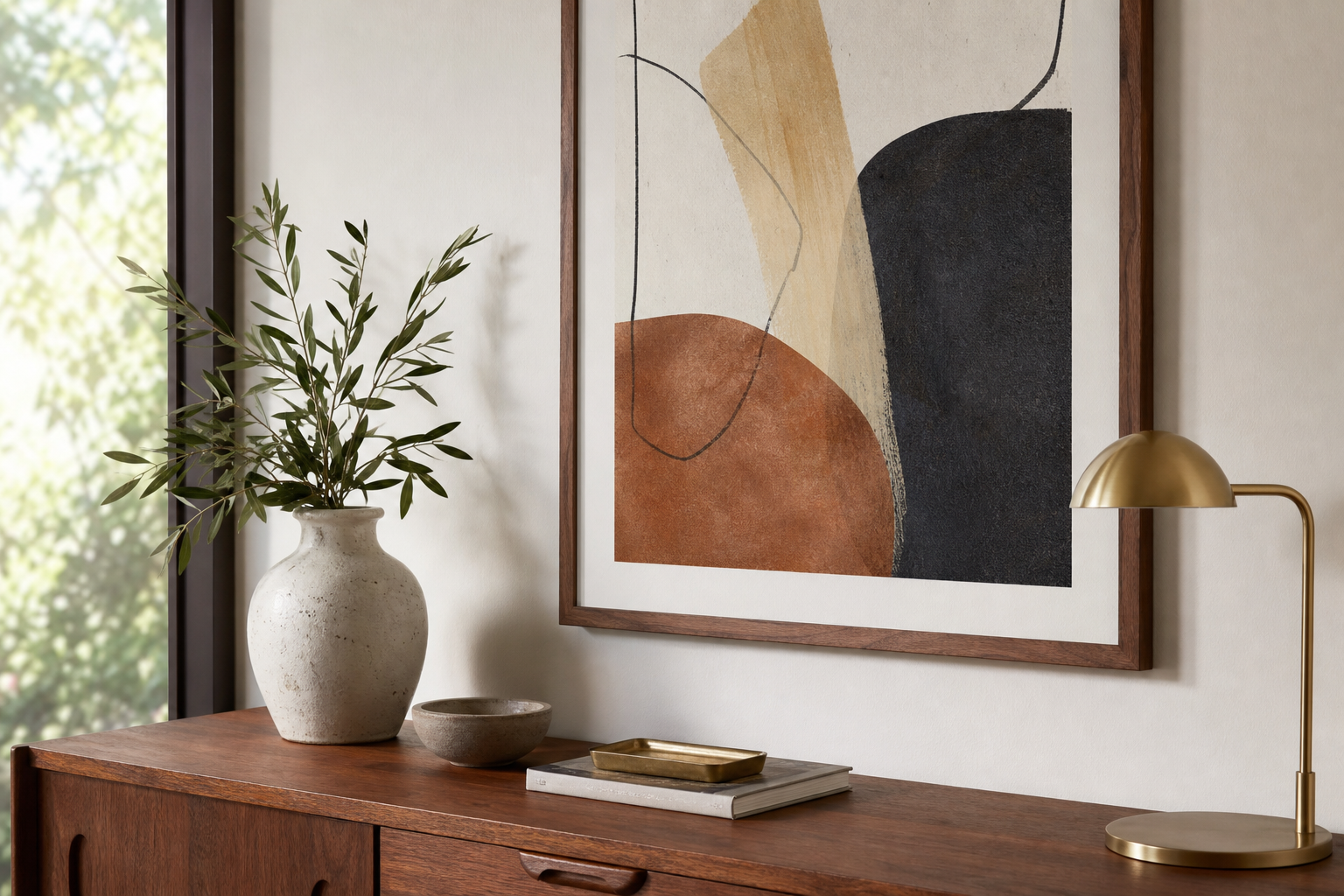
Finish should follow the room. Matte presentation suits living rooms, bedrooms, and offices because it reduces glare and lets texture show. Gloss can work in darker hallways or more graphic settings, but it reflects light more aggressively and can flatten subtle colour. If you're choosing between two options, matte is usually the safer fit for mid century modern art because the style depends on material warmth and controlled colour rather than shine.
Mixing Mid-Century Art with Other Design Styles
Mid-century art blends particularly well with minimal interiors because both styles value editing. In a sparse room, choose pieces with stronger colour blocks or graphic movement so the wall does not disappear into the background. A print such as Yin Yang Teal Abstract works well where a room needs one controlled hit of colour.
With Scandinavian decor, keep the palette lighter and the linework softer. Oak furniture, off-white walls, and wool textiles can handle retro shapes well, but the art should not be too dense. Browse minimalist pieces alongside mid-century designs if you want this balance. The overlap is often in negative space and organic form.

Industrial rooms need warmth most of all. Mid-century compositions with rust, tan, olive, or cream counterbalance steel, exposed brick, and black fixtures. If your space leans eclectic, repeat one colour from the artwork in a cushion, ceramic object, or lampshade. Repetition at even 2 or 3 points around the room makes the art feel anchored instead of isolated. Architectural imagery from our architecture collection can also pair well when you want a more structured take on the style.
Final Styling Tips for a Cohesive Look
Choose your anchor piece first, then build around it. That one decision sets the palette, line quality, and overall mood. If the main print contains teal and rust, repeat those tones lightly elsewhere and keep supporting art simpler. Two well-scaled pieces will almost always look more polished than five unrelated ones.
Mid century modern art works best when the room has breathing space around it. Leave visible wall margin, avoid overcrowding shelves directly beneath the frame, and keep your arrangement consistent in finish and spacing. The result is timeless rather than trend-led — graphic enough to stand out, calm enough to live with every day.